A Claude HTML dashboard is the thing assistants are best at producing, and it arrives with the same five flaws almost every time. The shape is conventional, the CSS is well-trodden, and the first attempt usually looks better than what most people would hand-build.
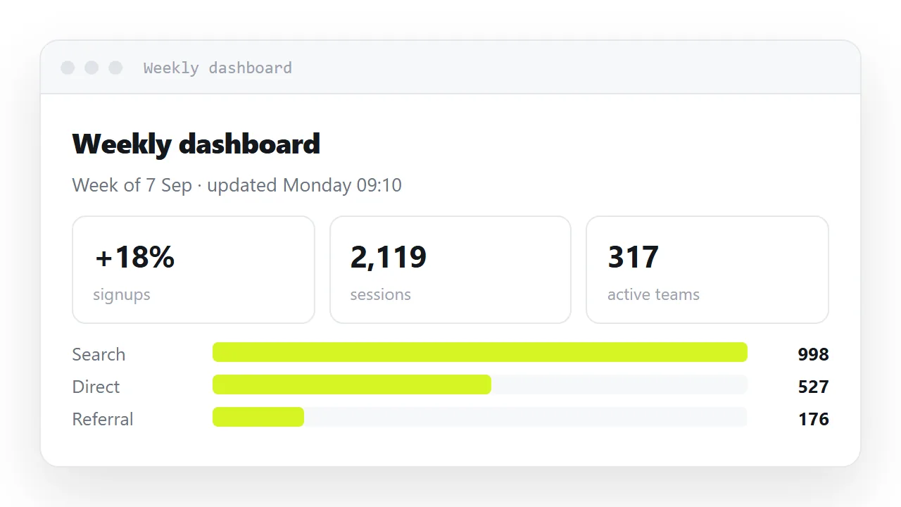
Then somebody quotes a number from it in a meeting, and the number was invented to fill the card.
This guide lists the five things to check, the prompt that prevents most of them, and the four steps to share the dashboard so the figures stay current.
Dashboards are what assistants are best at generating — the shape is conventional, the CSS is well-trodden, and the first attempt usually looks better than what most people would hand-build. The flaws are consistent enough to list.
The five things to check in a Claude HTML dashboard
1. Invented numbers left in place
Generated dashboards come pre-filled with plausible figures. Plausible is the danger: 1,284 signups, up 12.4% looks like a real measurement, and if it survives to the version you send, somebody will quote it.
Either replace every number or label the page as a sample, prominently. There is no third option that is safe.
2. No timestamp
The most valuable line on a shared dashboard, and almost never generated:
<p class="when">Figures through 12 Sep · updated Mondays</p>
Without it a reader cannot tell whether they are looking at this week or last quarter, and a stale dashboard looks identical to a current one.
3. Percentages without denominators
Conversion 4.2% is unverifiable. 4.2% (54 of 1,284) can be checked. Assistants produce the first form because it is what dashboards usually look like; the second form is what makes a dashboard trustworthy.
Same for changes: +12.4% needs vs last week next to it or it means nothing.
4. Fixed widths
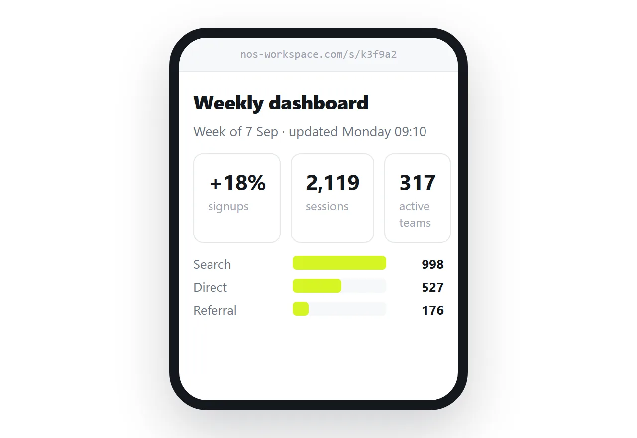
Generated layouts often use fixed pixel widths or a hard-coded column count, which produces sideways scrolling on a phone. What you want:
.cards {
  display: grid;
  grid-template-columns: repeat(auto-fit, minmax(170px, 1fr));
  gap: 10px;
}
auto-fit with a minimum means four cards on a laptop and one on a phone with no media query at all. See CSS grid and AI HTML and mobile layout.
5. A chart library loaded from elsewhere
If the file references an outside script, the dashboard is blank wherever that address is unreachable — inside restricted previews, on an offline machine, and permanently if the address changes.
Bars need no library:
<span class="track"><i class="fill" style="width:78%"></i></span>
with .fill { display: block; height: 100%; }. The display: block is essential — an inline element ignores width and height, which produces a chart with no bars and no error.
How to tell which numbers are real
Open the file and search for the figures you supplied. Anything that is not one of them is a placeholder, whatever it looks like. If you supplied none, every number on the page is a placeholder.
The fastest safe habit is to have the assistant put all figures in one DATA object at the top of the script and to fill that object yourself; then the question never arises, because the markup renders from your data and nothing else.
Ask for it right the first time
Single self-contained HTML dashboard. No libraries, no external fonts.

- KPI cards in a grid using repeat(auto-fit, minmax(170px, 1fr))
- bar rows built from divs, not a charting library
- every percentage shown with its base number, e.g. "4.2% (54 of 1,284)"
- a dated line at the top: "Figures through <date>"
- put all figures in one DATA array at the top of the script
- system font stack, numbers right-aligned with tabular-nums
- readable at 360px wide
- use obviously fake placeholder numbers and mark the page SAMPLE
The last two lines are the important ones. One puts every figure in a single place you can edit; the other stops invented data being mistaken for measurement.
Keeping it current
A dashboard is defined by being current, so the sharing method decides whether it is any use. A screenshot in a channel is wrong within a week and looks authoritative the whole time.
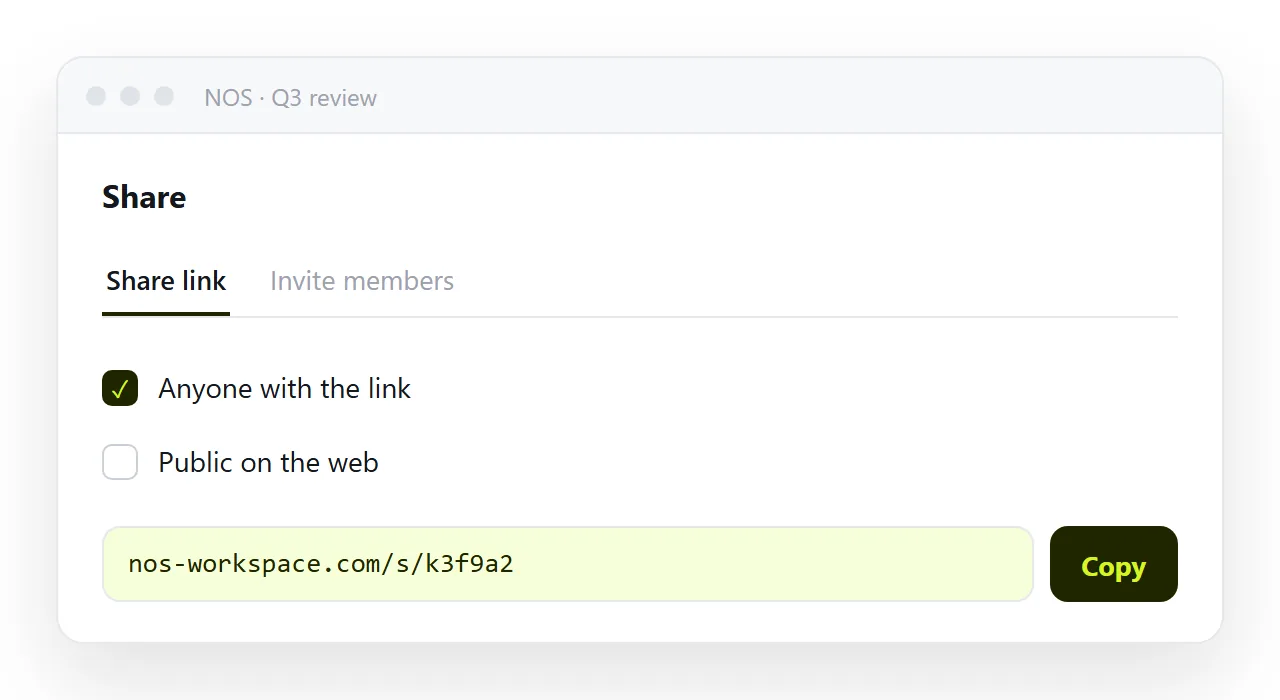
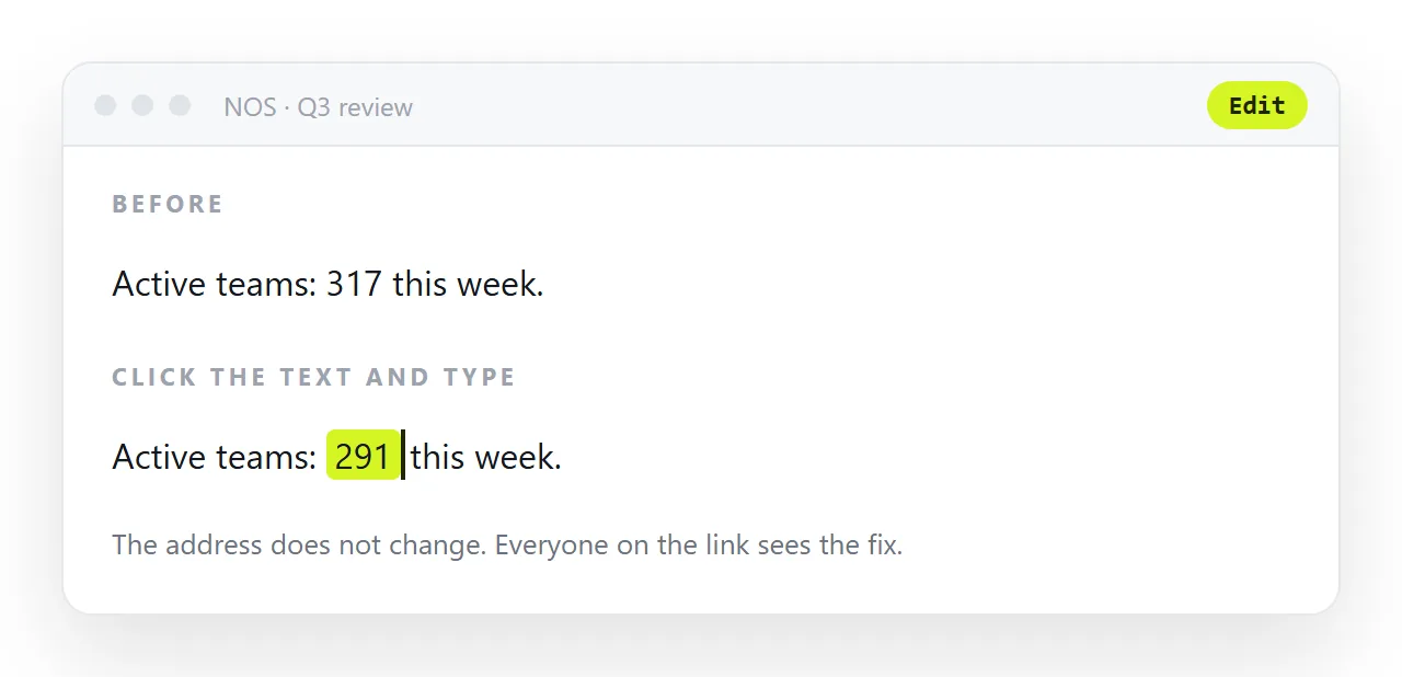
Put it at an address and send the link. In NOS the pasted dashboard renders exactly as written and every number in it is clickable text — so the weekly update is typing over the figures, and the link you gave the team in January is still showing this week.
That also settles the "will it update automatically" question for most cases. Owning a data endpoint is worthwhile for something watched daily. For a weekly summary, one page and one edit beats it on reliability and takes less time.
Cards that look like a template
Generated dashboards default to heavy shadows, large rounded corners and a gradient somewhere, which reads as a template before anyone reads a number. Ask for hairline borders, one accent colour, and a system font, and the same layout looks like something a person decided on. It is also lighter and renders faster.
The chart that is not a chart
A generated dashboard often includes a chart that is really a decoration: a sparkline with invented points, a donut of three made-up segments. If a chart does not come from your data, delete it rather than fixing it.
A dashboard with three true numbers beats one with three true numbers and a decorative chart that somebody will read as a fourth.
Sharing the dashboard: 4 steps
- Replace every number, or mark the page SAMPLE. Generated figures are plausible by construction and survive review. Put your data in the
DATAobject, or leave the SAMPLE marker on until you do. - Add the date line and the base numbers.
Figures through 12 Sepat the top;4.2% (54 of 1,284)on every percentage;vs last weekon every change. - Fix the width and the library. Cards in
repeat(auto-fit, minmax(170px, 1fr)), bars from divs withdisplay: block, nothing loaded from another address. Check it at 360px in the HTML viewer. - Put the dashboard at an address and copy the link. Share, then Share link, then Create link. Next week, type over the numbers. The link you sent stays the same, and everyone opening it sees this week. Turning HTML into a link is this step.