In short
A useful design tokens website pairs every name and value with a visible result.
Group colors, type, spacing, and corners by role, then apply the same tokens to a small component specimen.
Check the reference in its default state and in any alternate density or theme before sharing the reader link.
NOS Team built a fictional token reference for Juniper UI, a made-up reading-list product. The finished page shows four foundation groups, then applies them to a card, buttons, and a text field. We also added compact-spacing and dark-preview controls so the same components could expose decisions that a swatch list would hide.
This is different from a brand palette page. A palette tells you which colors exist. A token reference also tells you what each value is called, what job it has, and how several values behave together.
What should a design tokens website include?
Start with the smallest set that can explain the interface you already have. For the Juniper example, that meant:
- Color roles: canvas, surface, ink, muted text, accent, soft accent, and border.
- Typography roles: one display family, one body family, and three visible text treatments.
- Spacing steps: a short scale that can be compared by width instead of read as isolated numbers.
- Corner roles: small, medium, and large radii shown on the same shape.
- A specimen: a card, two button levels, and a field using those shared choices.
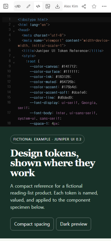
The code view made the relationship explicit: the values were defined together near the top, and the components referred to those names rather than repeating unrelated values.
How should design tokens be named?
Name a token for the decision it carries. --color-accent explains a role; --green only describes the current appearance. The role name remains understandable if the accent changes in a later theme.
The same rule helps beyond color. --space-6 belongs to a spacing scale. --radius-sm signals that the value is the smaller corner option. Names do not need to narrate every use, but a reader should be able to tell whether a value controls color, type, space, or shape.
The Design Tokens Community Group format report defines a file format for exchanging token data between tools. This example is not an export in that format. It is a visual HTML reference that uses CSS custom properties, which makes the rendered result the main deliverable.
How do you show tokens in context?
Put the raw value and the rendered use close together. Our color rows show a swatch, the token name, and its base value. The type section prints actual words in the display, body, and caption treatments. Spacing appears as bars with different widths, while corner tokens appear on matching boxes.
View mode then shows whether those separate pieces form a coherent page. On a phone, the foundation panels stack into one column. The opening still identifies the reference as fictional before anyone reaches the component specimen.
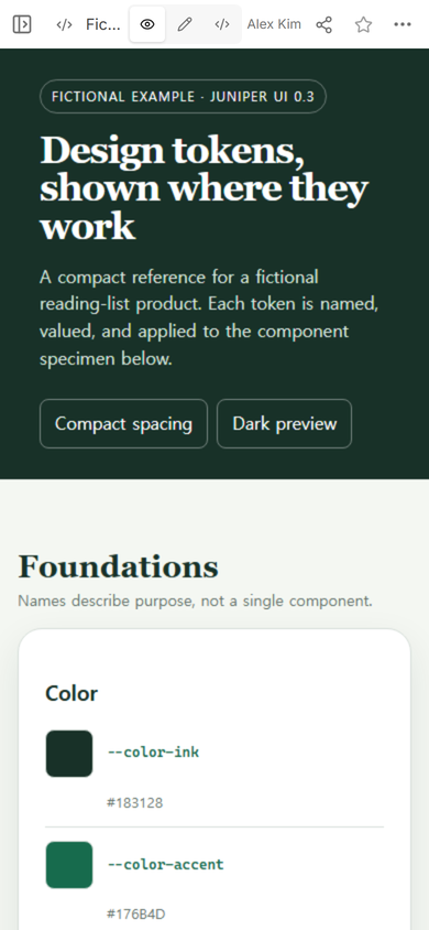
A reference becomes more useful when it answers a concrete question. “Which green is the accent?” is one question. “What does the accent look like on a primary button beside a neutral button?” is the better one because it exposes hierarchy as well as color.
How do you make a design token page easy to scan?
- Lead with the purpose. Say which product or surface the tokens belong to and mark invented material clearly.
- Keep foundation groups separate. A reader looking for spacing should not have to search through button variants.
- Show names and values together. A swatch without a transferable value is only a picture.
- Add one representative specimen. Use enough components to reveal hierarchy, padding, borders, and corners without turning the reference into a full component catalog.
- Test a narrow screen. Token names and values must remain attached to the correct swatch when columns collapse.
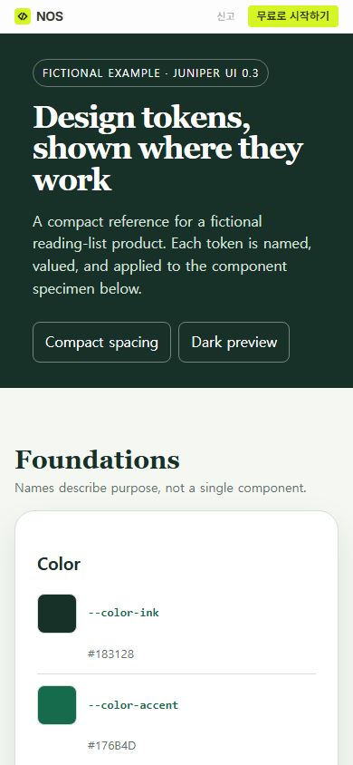
The public version kept the opening, both preview controls, and the start of the color group readable in one phone-width flow.
Should a design tokens website show themes and density?
Show an alternate state when it changes the decisions a reviewer needs to assess. The Juniper reference has two focused controls. Compact spacing reduces shared gaps and panel padding. Dark preview replaces the page roles with a dark set while preserving the same structure.
We pressed each control on the public reader page. Compact spacing tightened the color panel and marked the control as active. Dark preview changed the canvas, surfaces, text, lines, accent, and component treatment without moving the content into a separate example.
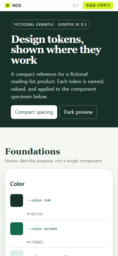
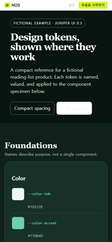
Keep the claim narrow: these controls demonstrate two states in this fictional reference. They do not prove that every product screen has adopted the tokens or that the palette meets an accessibility standard.
What can go wrong when you build the reference?
The easiest mistake is documenting values that the specimen does not use. If the list says the card corner is medium but the specimen has a different hard-coded radius, the page contains two competing answers. In the example, the specimen uses the same named values shown in the foundation groups.
Another mistake is hiding the meaning behind a large inventory. A page with every possible tint but no role labels shifts the decision back to the reader. Start with the roles used by a real component, then add a token when a new decision actually appears.
Finally, do not judge only the editing view. Open the reader link, press the controls, and inspect the narrow layout. The public NOS frame isolates the rendered page from the surrounding site, so we used the visible controls themselves to verify the compact and dark states.
How do you share a design tokens website?
Finish the HTML reference, inspect it in View, and then open Share. The captured Share panel for this example states that anyone with the link can read the page without signing in and cannot edit it. It also keeps search indexing off unless the owner chooses the public-web option.
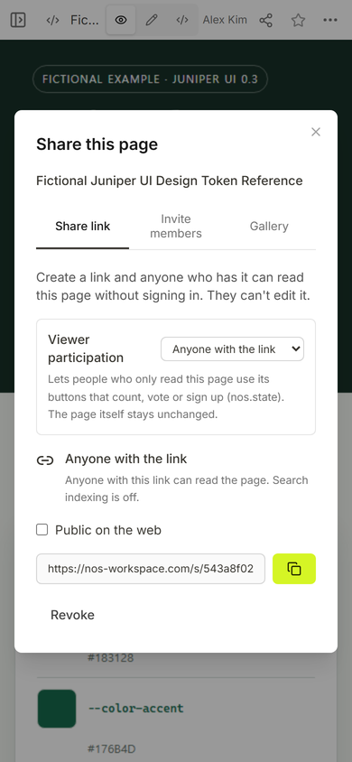
Send the reader address, not the workspace address. Reopen that reader address at phone width and test every state you expect someone to review. The editable source remains in the existing NOS page while readers receive the rendered reference.
When not to do this
- Do not publish internal product names, unreleased colors, licensed fonts, or private component decisions on a public reader page.
- Do not use a visual reference as proof that the tokens are implemented across a product. Check the actual consumer screens separately.
- Do not replace source data required by design and development tools with screenshots alone. Keep the maintained token source and the human-readable reference connected.
Using NOS for a design token reference
NOS Workspace held the complete fictional HTML, displayed its rendered reference in View, and created a reader link from Share. In the tested reader page, both preview controls remained usable. NOS did not create or validate the design system; it provided one address where the authored reference could be viewed and tested. Check the current pricing page if plan details matter to your project.
Continue from the reference
Use the CSS variables guide to understand the mechanism behind the named values. If the next task is documenting when a component belongs, continue with the design system documentation template. For a narrower palette change on generated HTML, read the color variables guide.