CSS variables (the specification calls them custom properties) are properties whose name starts with --. Declare them once on :root, read them anywhere with var(--name), and changing one value updates every rule that uses it.
:root {
  --brand: #2563eb;
  --radius: 10px;
}
.button {
  background: var(--brand);
  border-radius: var(--radius);
}
Try it. The pickers below change three variables on :root, and the whole sample restyles as you drag. The box underneath prints the current :root block.
<!doctype html>
<html lang="en">
<head>
<meta charset="utf-8">
<meta name="viewport" content="width=device-width, initial-scale=1">
<title>CSS variables theme editor</title>
<style>
  /* 1. Define the variables once, on :root */
  :root {
    --brand: #2563eb;
    --radius: 10px;
    --space: 16px;
  }

  body { margin: 0; padding: 14px; font-family: system-ui, sans-serif; background: #f4f5f7; color: #1d2330; }
  .wrap { display: grid; grid-template-columns: 1fr 1fr; gap: 14px; }
  @media (max-width: 560px) { .wrap { grid-template-columns: 1fr; } }

  .controls label { display: flex; align-items: center; justify-content: space-between; gap: 10px; margin-bottom: 10px; font-size: 14px; }
  .controls input[type=range] { flex: 1; max-width: 140px; }
  pre { margin: 6px 0 0; padding: 10px 12px; background: #1d2330; color: #e5e7eb; border-radius: 8px; font-size: 13px; line-height: 1.5; }

  /* 2. Use them with var(), everywhere */
  .card {
    background: #fff;
    padding: var(--space);
    border-radius: var(--radius);
    border-top: 4px solid var(--brand);
    box-shadow: 0 4px 14px rgba(0, 0, 0, .08);
  }
  .card h3 { margin: 0 0 calc(var(--space) / 2); color: var(--brand); }
  .card p { margin: 0 0 var(--space); font-size: 14px; line-height: 1.5; }
  .card input {
    width: 100%; box-sizing: border-box; margin-bottom: var(--space);
    padding: calc(var(--space) / 2); border: 1px solid #d5d9e0; border-radius: var(--radius); font: inherit;
  }
  .btn {
    padding: calc(var(--space) / 2) var(--space);
    border: 0; border-radius: var(--radius);
    background: var(--brand); color: #fff; font: 600 14px system-ui, sans-serif; cursor: pointer;
  }
  .btn.ghost { background: transparent; color: var(--brand); box-shadow: inset 0 0 0 2px var(--brand); }
</style>
</head>
<body>
<div class="wrap">
  <div class="controls">
    <label>--brand <input type="color" id="brand" value="#2563eb"></label>
    <label>--radius <input type="range" id="radius" min="0" max="24" value="10"></label>
    <label>--space <input type="range" id="space" min="8" max="32" value="16"></label>
    <pre id="out"></pre>
  </div>

  <div class="card">
    <h3>Newsletter</h3>
    <p>Every colour, corner and gap here reads from three variables on :root.</p>
    <input placeholder="you@example.com">
    <button class="btn">Subscribe</button>
    <button class="btn ghost">Later</button>
  </div>
</div>

<script>
  const root = document.documentElement;
  const units = { brand: '', radius: 'px', space: 'px' };

  function show() {
    // read the current values back from :root
    const css = getComputedStyle(root);
    document.getElementById('out').textContent =
      ':root {\n' +
      Object.keys(units).map((k) => '  --' + k + ': ' + css.getPropertyValue('--' + k).trim() + ';').join('\n') +
      '\n}';
  }

  Object.keys(units).forEach((k) => {
    document.getElementById(k).addEventListener('input', (e) => {
      // 3. Change a variable from JavaScript: everything using it updates
      root.style.setProperty('--' + k, e.target.value + units[k]);
      show();
    });
  });

  show();
</script>
</body>
</html>
Defining variables on :root and reading them with var()
A variable is declared like any other property, inside a rule. The name must start with two dashes, and it is case-sensitive: --Brand and --brand are two different variables.
:root matches the <html> element. Custom properties inherit, so a variable declared there reaches every element on the page. That is why most stylesheets keep their shared values in one :root block at the top.
To use a value, write var(--name) where a value would go. It works as a whole value, as one part of a shorthand, or inside calc():
.card {
  padding: var(--space);
  border: 1px solid var(--brand);
  margin-bottom: calc(var(--space) * 2);
}
Fallback values in var()
var() takes an optional second argument, used when the variable is not defined at all:
color: var(--text, #1d2330);
font-family: var(--font, Georgia, serif);
padding: var(--pad, var(--space, 12px));
Everything after the first comma is the fallback, commas included, so Georgia, serif is one fallback. A fallback can itself be another var().
The fallback does not step in when the variable exists but holds a wrong value. That case behaves differently, and it is the one that surprises people.
Scope: overriding a variable in a component or a media query
A variable follows the same inheritance as color: an element sees the nearest declaration above it in the tree.
Redefine the variable on a class, and that element and everything inside it get the new value, while the rest of the page keeps the old one.
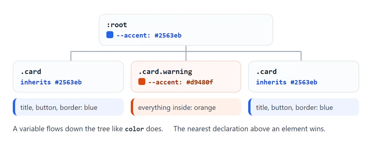
The same card appears three times below. The middle one sets --accent on itself. The button sets --accent on the row that holds all three, and only the two cards without their own value follow it.
<!doctype html>
<html lang="en">
<head>
<meta charset="utf-8">
<meta name="viewport" content="width=device-width, initial-scale=1">
<title>CSS variable scope</title>
<style>
  :root {
    --accent: #2563eb;
    --pad: 20px;
  }

  /* Narrow screens: one override, every card gets smaller padding */
  @media (max-width: 560px) {
    :root { --pad: 10px; }
  }

  body { margin: 0; padding: 14px; font-family: system-ui, sans-serif; background: #f4f5f7; color: #1d2330; }
  .row { display: grid; grid-template-columns: repeat(3, 1fr); gap: 12px; }
  @media (max-width: 560px) { .row { grid-template-columns: 1fr; } }

  .card {
    background: #fff;
    padding: var(--pad);
    border-radius: 10px;
    border-left: 5px solid var(--accent);
  }
  .card b { color: var(--accent); }
  .card code { display: block; white-space: pre; margin-top: 6px; font-size: 12.5px; color: #4b5563; }

  /* Override inside one card only. Its children inherit the new value. */
  .card.warning { --accent: #d9480f; }

  button { margin-top: 14px; padding: 8px 14px; border-radius: 8px; border: 1px solid #c9ced6; background: #fff; font: inherit; cursor: pointer; }
</style>
</head>
<body>
<div class="row" id="row">
  <div class="card"><b>Default</b><code></code></div>
  <div class="card warning"><b>.warning</b><code></code></div>
  <div class="card"><b>Default</b><code></code></div>
</div>
<button id="toggle">Set --accent on the row</button>

<script>
  const row = document.getElementById('row');
  const cards = row.querySelectorAll('.card');

  function show() {
    // each card reports the value it actually sees
    cards.forEach((c) => {
      const s = getComputedStyle(c);
      c.querySelector('code').textContent =
        '--accent: ' + s.getPropertyValue('--accent').trim() + '\n--pad: ' + s.getPropertyValue('--pad').trim();
    });
  }

  document.getElementById('toggle').addEventListener('click', (e) => {
    const on = row.style.getPropertyValue('--accent');
    if (on) { row.style.removeProperty('--accent'); e.target.textContent = 'Set --accent on the row'; }
    else { row.style.setProperty('--accent', '#0f9d58'); e.target.textContent = 'Remove it again'; }
    show();
  });

  addEventListener('resize', show);
  show();
</script>
</body>
</html>
.card.warning { --accent: #d9480f; }

@media (max-width: 560px) {
  :root { --pad: 10px; }
}
The media query line is the common pattern for responsive spacing: the condition stays a plain number, and only the variable's value changes inside it. Media queries covers the conditions themselves.
Changing CSS variables with JavaScript
Variables are live. Set one from a script and every rule that reads it updates, with no class toggling and no loop over elements.
const root = document.documentElement;

// write
root.style.setProperty('--brand', '#e11d48');

// read the value an element actually sees
getComputedStyle(root).getPropertyValue('--brand').trim();

// remove the inline value, so the stylesheet value applies again
root.style.removeProperty('--brand');
Two details matter. root.style.brand and root.style['--brand'] do not set a custom property; use setProperty. And a value set this way lives in the element's inline style, so it wins over the :root rule in your stylesheet until you remove it.
To read what a nested element sees, call getComputedStyle on that element, not on :root. The scoping example above does exactly that for each card.
Theming: light, dark and more with data-theme
Name the roles, not the colours: --bg, --surface, --text, --brand. Components only ever use those names. A theme is then one rule that redefines the roles, selected by an attribute on <html>.
:root { --bg: #f4f5f7; --text: #1d2330; --brand: #2563eb; }
[data-theme="dark"] { --bg: #16181d; --text: #e8eaed; --brand: #7aa2ff; }
document.documentElement.dataset.theme = 'dark';
<!doctype html>
<html lang="en" data-theme="light">
<head>
<meta charset="utf-8">
<meta name="viewport" content="width=device-width, initial-scale=1">
<title>Design tokens with CSS variables</title>
<style>
  /* Tokens: the default theme */
  :root {
    --bg: #f4f5f7;  --surface: #ffffff;  --text: #1d2330;  --muted: #5b6472;  --border: #e1e4ea;
    --brand: #2563eb;  --on-brand: #ffffff;
    --ok: #0f7b3f;  --ok-bg: #e3f6ea;
    --warn: #9a5b00;  --warn-bg: #fff3d6;
    --danger: #b42318;  --danger-bg: #fde8e6;
    --radius: 10px;  --space: 14px;
  }
  /* Each theme only redefines the tokens that change */
  [data-theme="dark"] {
    --bg: #16181d;  --surface: #20242b;  --text: #e8eaed;  --muted: #a0a7b3;  --border: #343a44;
    --brand: #7aa2ff;  --on-brand: #10131a;
    --ok: #6fdc9b;  --ok-bg: #173325;
    --warn: #ffcf66;  --warn-bg: #3a2e12;
    --danger: #ff8f84;  --danger-bg: #3d1c1a;
  }
  [data-theme="forest"] {
    --bg: #eef3ec;  --surface: #fbfdf9;  --text: #1f2a1c;  --muted: #56644f;  --border: #d3dfcd;
    --brand: #2f6b3a;  --on-brand: #ffffff;
    --radius: 2px;  --space: 16px;
  }

  /* Components: only var(), no colour written twice */
  body { margin: 0; padding: var(--space); font-family: system-ui, sans-serif; background: var(--bg); color: var(--text); transition: background .2s, color .2s; }
  .bar { display: flex; flex-wrap: wrap; gap: 8px; margin-bottom: var(--space); }
  .btn {
    padding: 8px 14px; border-radius: var(--radius); font: 600 14px system-ui, sans-serif; cursor: pointer;
    border: 1px solid var(--border); background: var(--surface); color: var(--text);
  }
  .btn.primary { background: var(--brand); border-color: var(--brand); color: var(--on-brand); }
  .btn[aria-pressed="true"] { box-shadow: inset 0 0 0 2px var(--brand); }

  .grid { display: grid; grid-template-columns: 1fr 1fr; gap: var(--space); }
  @media (max-width: 520px) { .grid { grid-template-columns: 1fr; } }
  .card { background: var(--surface); border: 1px solid var(--border); border-radius: var(--radius); padding: var(--space); }
  .card h3 { margin: 0 0 6px; font-size: 16px; }
  .card p { margin: 0 0 12px; color: var(--muted); font-size: 14px; line-height: 1.5; }

  .alert { margin-top: 10px; padding: 10px 12px; border-radius: var(--radius); font-size: 14px; border-left: 4px solid currentColor; }
  .alert.ok { color: var(--ok); background: var(--ok-bg); }
  .alert.warn { color: var(--warn); background: var(--warn-bg); }
  .alert.danger { color: var(--danger); background: var(--danger-bg); }
</style>
</head>
<body>
<div class="bar" id="themes">
  <button class="btn" data-set="light" aria-pressed="true">Light</button>
  <button class="btn" data-set="dark" aria-pressed="false">Dark</button>
  <button class="btn" data-set="forest" aria-pressed="false">Forest</button>
</div>

<div class="grid">
  <div class="card">
    <h3>Starter plan</h3>
    <p>Buttons, cards and alerts share one set of tokens.</p>
    <button class="btn primary">Choose plan</button>
    <button class="btn">Details</button>
  </div>
  <div class="card">
    <h3>Status</h3>
    <div class="alert ok">Payment received.</div>
    <div class="alert warn">Card expires next month.</div>
    <div class="alert danger">Two invoices are overdue.</div>
  </div>
</div>

<script>
  // Switching theme = changing one attribute. CSS does the rest.
  document.getElementById('themes').addEventListener('click', (e) => {
    const name = e.target.dataset.set;
    if (!name) return;
    document.documentElement.dataset.theme = name;
    document.querySelectorAll('[data-set]').forEach((b) =>
      b.setAttribute('aria-pressed', b.dataset.set === name));
  });
</script>
</body>
</html>
A theme only needs to list the tokens it changes. The forest theme above changes colours and also --radius, so the corners go square without touching any component rule.
This article does not repeat how to follow the reader's system setting. Dark mode CSS covers prefers-color-scheme and the details of dark palettes, and CSS colour variables shows how to replace the palette of a generated page.
Invalid values: why a variable is silently ignored
The browser does not check a variable's value when it reads the stylesheet, because --space: 20 could be meant for anything. It checks only when a property uses it. If the result is not valid for that property, the property becomes invalid at computed-value time.
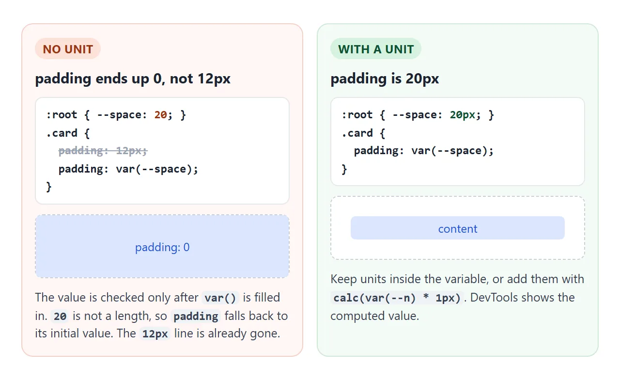
In that case the property acts as if it were unset: an inherited property such as color takes the parent's value, and a non-inherited one such as padding takes its initial value.
It does not go back to an earlier declaration of the same property, because the cascade already discarded that one.
The fix is to keep the unit inside the variable (--space: 20px), or add it with calc(var(--space) * 1px). Writing var(--space)px does not glue the two together.
Where var() does not work
var() substitutes a value inside a property declaration. Anything outside a declaration is off limits: media query conditions, selectors, and property names.
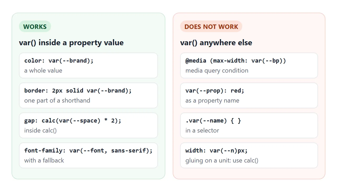
| Where | Works? | Use instead |
|---|---|---|
| A property value | Yes | - |
Inside calc() |
Yes | - |
| A media query condition | No | Write the number, change variables inside the query |
| A selector or property name | No | A class or attribute selector |
Joined to a unit, as in var(--n)px |
No | calc(var(--n) * 1px) |
When it does not work
| What you see | Cause | Fix |
|---|---|---|
| The rule has no effect | The name lacks --, or the value lacks var() |
--brand: red to define, var(--brand) to use |
| The fallback shows instead of your value | Typo, or a case difference such as --Brand |
Copy the exact name from the definition |
| The property resets to default | The value is not valid for that property | Check units; inspect the computed value in DevTools |
| The media query never matches | var() used in the condition |
Write the number in the condition |
| One element ignores the variable | It is defined on a sibling, not an ancestor | Move it to :root or a shared parent |
| A script change does nothing | Set with style.name instead of setProperty |
el.style.setProperty('--name', value) |
For background colours in particular, CSS background-color lists the formats a variable can hold.
Share it as a link
A theme is easier to judge by clicking than by reading hex codes. A screenshot shows one theme, and an .html attachment may open as plain code on a phone.
To send the working version, paste the page into a NOS document and choose Create share link. HTML to link walks through it.
The page renders as written and its scripts run, so the people you send it to can switch themes and drag the sliders themselves. If you change the code later, the same link shows the new version.