color-mix() takes two colours and returns a blend of them. You write the colour space to mix in, then each colour with an optional percentage.
For example, color-mix(in oklch, var(--brand) 20%, white) is a light tint of your brand colour. The browser does the maths, so the tint follows the variable when it changes.
Try it. Pick two colours, move the slider and switch the colour space.
<!doctype html>
<html lang="en">
<head>
<meta charset="utf-8">
<meta name="viewport" content="width=device-width, initial-scale=1">
<title>color-mix() mixer</title>
<style>
  body { margin: 0; padding: 16px; font-family: system-ui, sans-serif; background: #f4f5f7; color: #1d2330; }
  .controls { display: flex; flex-wrap: wrap; gap: 10px 16px; align-items: center; }
  label { font-size: 14px; display: flex; align-items: center; gap: 6px; }
  input[type=color] { width: 44px; height: 32px; border: 0; padding: 0; background: none; }
  input[type=range] { width: 140px; }
  .swatches { display: flex; gap: 8px; margin: 16px 0 10px; }
  .sw { flex: 1; height: 90px; border-radius: 10px; border: 1px solid rgba(0, 0, 0, .1); }
  #result { flex: 2; }
  pre { margin: 0; padding: 10px 12px; background: #1d2330; color: #e6edf3; border-radius: 8px;
        font: 13px/1.5 ui-monospace, Consolas, monospace; white-space: pre-wrap; word-break: break-all; }
  h3 { font-size: 13px; margin: 14px 0 6px; color: #4b5563; font-weight: 600; }
  .row { display: grid; grid-template-columns: repeat(3, 1fr); gap: 8px; }
  .row div { height: 44px; border-radius: 8px; border: 1px solid rgba(0, 0, 0, .1);
             font: 12px ui-monospace, Consolas, monospace; display: grid; place-items: end start; padding: 0 0 4px 6px; color: #fff; text-shadow: 0 1px 2px #0008; }
</style>
</head>
<body>
<div class="controls">
  <label>A <input type="color" id="a" value="#0000ff"></label>
  <label>B <input type="color" id="b" value="#ffff00"></label>
  <label>A amount <input type="range" id="p" min="0" max="100" value="50"> <output id="pv">50%</output></label>
  <label>Space
    <select id="space">
      <option>srgb</option><option>oklch</option><option>hsl</option>
    </select>
  </label>
</div>

<div class="swatches">
  <div class="sw" id="swA"></div>
  <div class="sw" id="result"></div>
  <div class="sw" id="swB"></div>
</div>
<pre id="css"></pre>

<h3>The same two colours at the same amount, in each space</h3>
<div class="row">
  <div id="m-srgb">srgb</div><div id="m-oklch">oklch</div><div id="m-hsl">hsl</div>
</div>

<script>
  const $ = (id) => document.getElementById(id);

  function update() {
    const a = $('a').value, b = $('b').value, p = $('p').value, space = $('space').value;
    const mix = (s) => `color-mix(in ${s}, ${a} ${p}%, ${b})`;

    $('pv').textContent = p + '%';
    $('swA').style.background = a;
    $('swB').style.background = b;
    $('result').style.background = mix(space);
    ['srgb', 'oklch', 'hsl'].forEach((s) => { $('m-' + s).style.background = mix(s); });

    // show the CSS, and the colour the browser computed from it
    const computed = getComputedStyle($('result')).backgroundColor;
    $('css').textContent = `background: ${mix(space)};\n/* browser computes: ${computed} */`;
  }

  document.querySelectorAll('input, select').forEach((el) => el.addEventListener('input', update));
  update();
</script>
</body>
</html>
The default pair is blue and yellow on purpose. In srgb they meet in grey. In oklch they pass through teal. The rest of this guide explains why, and how to build a palette on top of it.
How color-mix() works
The function has three parts, always in this order:
color-mix(in <colour space>, <colour A> <A%>, <colour B> <B%>)
- The colour space is the model the blend is calculated in:
srgb,oklch,hsl,oklaband others. Always name it. Recent versions of the specification let you leave it out, but browsers that shippedcolor-mix()earlier treat a missing space as an error. - The colours can be any CSS colour: a keyword, hex,
rgb(),currentColor,transparentor avar(). - The percentages are optional. Leave both out and you get 50/50.
The percentages have rules of their own, and they explain most surprising results:
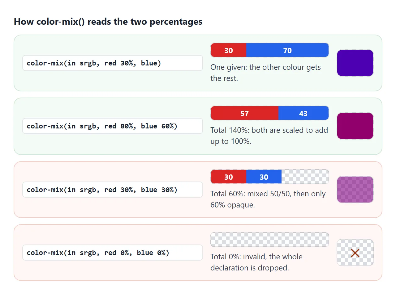
- Give one percentage and the other colour gets the rest.
red 30%, blueis 30% red and 70% blue. - If the two add up to more than 100%, both are scaled down.
red 80%, blue 60%becomes about 57% and 43%. - If they add up to less than 100%, the colours are mixed in proportion and the result becomes partly transparent.
red 30%, blue 30%gives an even mix at 60% opacity. - Two zeros make the whole value invalid.
Transparency without a second colour
The third rule is useful on purpose. Mix a colour with the keyword transparent and you get that colour at the given opacity:
.ring { box-shadow: 0 0 0 4px color-mix(in srgb, var(--brand) 35%, transparent); }
This is the clean way to fade a colour that lives in a variable.
You cannot add an alpha to a hex value stored in --brand, but you can mix it with nothing. For fading a whole element, including its text, CSS opacity is the tool instead.
srgb, oklch or hsl: which space to mix in
The colour space decides the path between the two colours. The same pair can give a grey or a vivid colour depending on it.
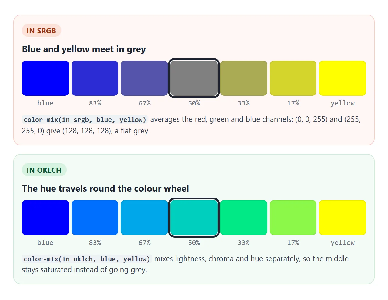
srgb averages the red, green and blue channels of the screen colour. The arithmetic is simple, but opposite colours cancel out to grey. oklch blends lightness, chroma (how colourful) and hue separately, so the hue turns and the middle stays colourful.
| Space | What it blends | Good for | Watch out for |
|---|---|---|---|
srgb |
Red, green and blue channels | Fading to transparent, plain channel averages |
Muddy or grey middles between distant hues |
oklch |
Lightness, chroma and hue | Tints, shades, blends between hues | Hue can swing through a third colour |
oklab |
Lightness and two colour axes | Smooth blends without a hue swing | Slightly less vivid middles than oklch |
hsl |
Hue, saturation and lightness | Rotating hues | Lightness that does not match what you see |
For tints and shades of one colour, oklch is the safe default.
Mixing a colour with white in srgb can drift its hue: pure blue mixed with white in srgb turns slightly purple as it gets lighter, while the same mix in oklch keeps the blue's hue.
Relative colour syntax: change one channel
color-mix() blends two colours. Relative colour syntax takes one colour, splits it into channels and lets you rewrite any of them:
/* same colour, 0.1 lighter */
--brand-light: oklch(from var(--brand) calc(l + 0.1) c h);

/* same colour, opposite hue */
--brand-opposite: oklch(from var(--brand) l c calc(h + 180));

/* same colour at 50% opacity */
--brand-half: rgb(from var(--brand) r g b / 50%);
After from, the letters l, c and h stand for the source colour's lightness, chroma and hue. Keep a letter to keep that channel, or wrap it in calc() to change it. In oklch, l runs from 0 (black) to 1 (white).
This is where oklch beats hsl for lightening. Both have a lightness channel, but only one of them matches what the eye sees:
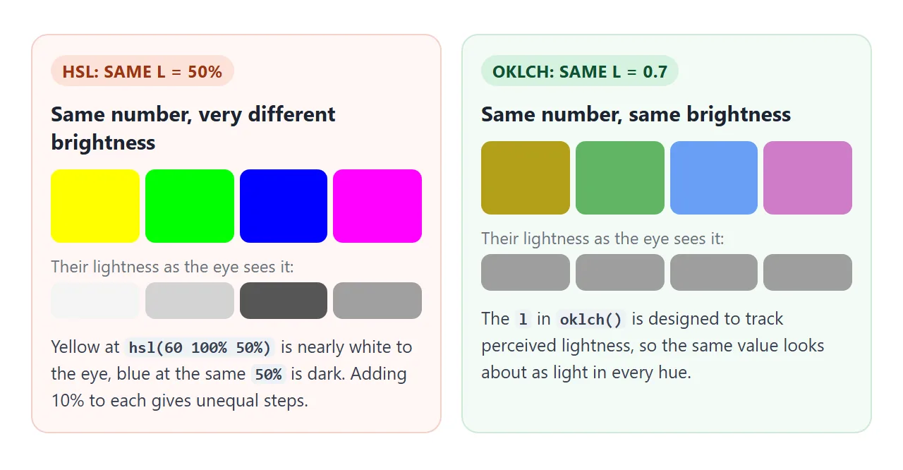
Adding 10 to the lightness of an hsl yellow barely changes it, while the same step on a blue is obvious. In oklch, a step of 0.1 looks like a similar step in every hue. That is what makes a palette look even.
A full palette from one brand colour
With either tool, one variable can become a nine-step scale from near-white to near-black. The top row mixes the brand with white and black. The bottom row keeps the brand's hue and sets lightness and chroma with relative colour syntax.
<!doctype html>
<html lang="en">
<head>
<meta charset="utf-8">
<meta name="viewport" content="width=device-width, initial-scale=1">
<title>Palette from one colour</title>
<style>
  :root { --brand: #2563eb; }  /* the only colour you choose */

  body { margin: 0; padding: 16px; font-family: system-ui, sans-serif; background: #fff; color: #1d2330; }
  label { font-size: 14px; display: flex; align-items: center; gap: 8px; }
  input[type=color] { width: 44px; height: 32px; border: 0; padding: 0; background: none; }
  h3 { font-size: 13px; margin: 16px 0 6px; font-weight: 600; }
  h3 code { font-weight: 400; color: #4b5563; }
  .strip { display: grid; grid-template-columns: repeat(9, 1fr); gap: 3px; }
  .strip button { height: 54px; border: 0; border-radius: 6px; cursor: pointer;
                  font: 11px ui-monospace, Consolas, monospace; display: grid; place-items: end center; padding-bottom: 4px; }
  .strip button:nth-child(-n+4) { color: #1d2330; }
  .strip button:nth-child(n+5) { color: #fff; }
  .strip button.on { outline: 3px solid #1d2330; outline-offset: 1px; }
  pre { margin: 14px 0 0; padding: 10px 12px; background: #1d2330; color: #e6edf3; border-radius: 8px;
        font: 12.5px/1.5 ui-monospace, Consolas, monospace; white-space: pre-wrap; word-break: break-word; }

  /* 1) color-mix(): brand mixed with white (tints) or black (shades) */
  .mix .s100 { background: color-mix(in oklch, var(--brand) 15%, white); }
  .mix .s200 { background: color-mix(in oklch, var(--brand) 35%, white); }
  .mix .s300 { background: color-mix(in oklch, var(--brand) 55%, white); }
  .mix .s400 { background: color-mix(in oklch, var(--brand) 75%, white); }
  .mix .s500 { background: var(--brand); }
  .mix .s600 { background: color-mix(in oklch, var(--brand) 80%, black); }
  .mix .s700 { background: color-mix(in oklch, var(--brand) 62%, black); }
  .mix .s800 { background: color-mix(in oklch, var(--brand) 45%, black); }
  .mix .s900 { background: color-mix(in oklch, var(--brand) 30%, black); }

  /* 2) relative colour: take l, c, h from the brand and change only what you name */
  .rel .s100 { background: oklch(from var(--brand) calc(l + (1 - l) * 0.85) calc(c * 0.25) h); }
  .rel .s200 { background: oklch(from var(--brand) calc(l + (1 - l) * 0.65) calc(c * 0.5) h); }
  .rel .s300 { background: oklch(from var(--brand) calc(l + (1 - l) * 0.45) calc(c * 0.75) h); }
  .rel .s400 { background: oklch(from var(--brand) calc(l + (1 - l) * 0.25) c h); }
  .rel .s500 { background: var(--brand); }
  .rel .s600 { background: oklch(from var(--brand) calc(l * 0.85) c h); }
  .rel .s700 { background: oklch(from var(--brand) calc(l * 0.7) c h); }
  .rel .s800 { background: oklch(from var(--brand) calc(l * 0.55) calc(c * 0.85) h); }
  .rel .s900 { background: oklch(from var(--brand) calc(l * 0.42) calc(c * 0.7) h); }
</style>
</head>
<body>
<label>Brand colour <input type="color" id="brand" value="#2563eb"></label>

<h3>color-mix() <code>with white and black, in oklch</code></h3>
<div class="strip mix"></div>

<h3>Relative colour <code>oklch(from var(--brand) ...)</code></h3>
<div class="strip rel"></div>

<pre id="rule">Tap a swatch to see its CSS.</pre>

<script>
  const steps = [100, 200, 300, 400, 500, 600, 700, 800, 900];
  const rule = document.getElementById('rule');

  // build the 9 swatches in each strip
  document.querySelectorAll('.strip').forEach((strip) => {
    steps.forEach((n) => {
      const b = document.createElement('button');
      b.className = 's' + n;
      b.textContent = n;
      b.addEventListener('click', () => show(b));
      strip.append(b);
    });
  });

  // print the CSS rule behind a swatch, and what the browser computed
  function show(b) {
    document.querySelectorAll('.on').forEach((x) => x.classList.remove('on'));
    b.classList.add('on');
    const sel = '.' + b.parentElement.classList[1] + ' .' + b.className.split(' ')[0];
    const r = [...document.styleSheets[0].cssRules].find((x) => x.selectorText === sel);
    rule.textContent = r.cssText + '\n/* computes to: ' + getComputedStyle(b).backgroundColor + ' */';
  }

  // one variable changes, all 18 swatches follow
  document.getElementById('brand').addEventListener('input', (e) => {
    document.documentElement.style.setProperty('--brand', e.target.value);
    const on = document.querySelector('.on');
    if (on) show(on);
  });
</script>
</body>
</html>
The two methods differ at the ends. Mixing with white or black pulls chroma down along with lightness, because white and black have none. Relative colour lets you choose the chroma for each step, so light tints can stay a little more colourful.
The step rules look like this:
:root { --brand: #2563eb; }

/* tint with color-mix: 35% brand, 65% white */
.s200 { background: color-mix(in oklch, var(--brand) 35%, white); }

/* tint with relative colour: 65% of the way to white, half the chroma */
.s200 { background: oklch(from var(--brand) calc(l + (1 - l) * 0.65) calc(c * 0.5) h); }
Both lines change when --brand changes. If you are new to storing colours in variables, CSS variables covers :root, var() and changing them from JavaScript. For choosing the four or five base colours of a page, see CSS colour variables.
Hover, active and dark mode from one variable
Components need more than a scale. A button needs a hover colour, a pressed colour, a focus ring and readable text. Each of those can be a variable defined from --brand, so the component never names a colour directly.
<!doctype html>
<html lang="en">
<head>
<meta charset="utf-8">
<meta name="viewport" content="width=device-width, initial-scale=1">
<title>Components from one brand variable</title>
<style>
  :root {
    color-scheme: light;          /* the toggle switches this to dark */
    --brand: #2563eb;             /* the only colour you pick */

    /* light-dark(light value, dark value) follows color-scheme */
    --surface: light-dark(#ffffff, #17191e);
    --text:    light-dark(#1d2330, #e6e8ec);

    /* everything below is derived from --brand */
    --brand-hover:  light-dark(color-mix(in oklch, var(--brand), black 15%),
                               color-mix(in oklch, var(--brand), white 15%));
    --brand-active: light-dark(color-mix(in oklch, var(--brand), black 30%),
                               color-mix(in oklch, var(--brand), white 30%));
    --brand-soft:   color-mix(in oklch, var(--brand) 12%, var(--surface));
    --brand-border: color-mix(in oklch, var(--brand) 45%, var(--surface));
    --brand-text:   light-dark(color-mix(in oklch, var(--brand), black 35%),
                               color-mix(in oklch, var(--brand), white 45%));
    --brand-ring:   color-mix(in srgb, var(--brand) 35%, transparent);
    /* white on dark brands, black on light ones */
    --on-brand: oklch(from var(--brand) clamp(0, (0.65 - l) * 1000, 1) 0 0);
  }

  body { margin: 0; padding: 16px; font-family: system-ui, sans-serif;
         background: var(--surface); color: var(--text); }
  .bar { display: flex; flex-wrap: wrap; gap: 10px 14px; align-items: center; margin-bottom: 16px; font-size: 14px; }
  .bar label { display: flex; align-items: center; gap: 6px; }
  input[type=color] { width: 44px; height: 32px; border: 0; padding: 0; background: none; }

  .btn { font: 600 15px system-ui, sans-serif; padding: 10px 18px; border-radius: 8px; cursor: pointer;
         border: 1px solid var(--brand); background: var(--brand); color: var(--on-brand); }
  .btn:hover  { background: var(--brand-hover);  border-color: var(--brand-hover); }
  .btn:active { background: var(--brand-active); border-color: var(--brand-active); }
  .btn:focus-visible { outline: none; box-shadow: 0 0 0 4px var(--brand-ring); }

  .btn.outline { background: transparent; color: var(--brand-text); border-color: var(--brand-border); }
  .btn.outline:hover  { background: var(--brand-soft); }
  .btn.outline:active { background: color-mix(in oklch, var(--brand) 25%, var(--surface)); }

  .alert { margin-top: 16px; padding: 12px 14px; border-radius: 10px;
           background: var(--brand-soft); border: 1px solid var(--brand-border); border-left-width: 5px; }
  .alert b { color: var(--brand-text); }
  .alert p { margin: 4px 0 0; font-size: 14px; }

  .chips { display: flex; flex-wrap: wrap; gap: 6px; margin-top: 16px; }
  .chip { font: 12px ui-monospace, Consolas, monospace; padding: 6px 8px; border-radius: 6px;
          border: 1px solid color-mix(in srgb, var(--text) 20%, transparent); display: flex; align-items: center; gap: 6px; }
  .chip i { width: 16px; height: 16px; border-radius: 4px; background: var(--c); }
</style>
</head>
<body>
<div class="bar">
  <label>--brand <input type="color" id="brand" value="#2563eb"></label>
  <button class="btn outline" id="mode" aria-pressed="false">Dark mode</button>
</div>

<button class="btn" id="primary">Save changes</button>
<button class="btn outline">Cancel</button>

<div class="alert" role="status">
  <b>Heads up</b>
  <p>Background, border, heading and both buttons are mixed from one variable.</p>
</div>

<div class="chips">
  <span class="chip"><i style="--c: var(--brand)"></i>brand</span>
  <span class="chip"><i style="--c: var(--brand-hover)"></i>hover</span>
  <span class="chip"><i style="--c: var(--brand-active)"></i>active</span>
  <span class="chip"><i style="--c: var(--brand-soft)"></i>soft</span>
  <span class="chip"><i style="--c: var(--brand-border)"></i>border</span>
  <span class="chip"><i style="--c: var(--brand-text)"></i>text</span>
</div>

<script>
  const root = document.documentElement;

  // change one variable; every derived colour recomputes
  document.getElementById('brand').addEventListener('input', (e) => {
    root.style.setProperty('--brand', e.target.value);
  });

  // switching color-scheme flips every light-dark() at once
  document.getElementById('mode').addEventListener('click', (e) => {
    const dark = root.style.colorScheme !== 'dark';
    root.style.colorScheme = dark ? 'dark' : 'light';
    e.target.textContent = dark ? 'Light mode' : 'Dark mode';
    e.target.setAttribute('aria-pressed', dark);
  });
</script>
</body>
</html>
The core of it:
:root {
  color-scheme: light;   /* the toggle sets this to dark */
  --brand: #2563eb;
  --surface: light-dark(#ffffff, #17191e);

  --brand-hover:  light-dark(color-mix(in oklch, var(--brand), black 15%),
                             color-mix(in oklch, var(--brand), white 15%));
  --brand-soft:   color-mix(in oklch, var(--brand) 12%, var(--surface));
  --brand-border: color-mix(in oklch, var(--brand) 45%, var(--surface));
}
.btn:hover { background: var(--brand-hover); }
- Hover and active darken the brand on a light page and lighten it on a dark one, so the change stays visible either way.
- Soft backgrounds and borders mix the brand into the surface colour, not into white. In dark mode the surface is dark, so the alert's tint is dark too.
light-dark(a, b)returnsawhen the element'scolor-schemeis light andbwhen it is dark. It only works ifcolor-schemeis set. Withcolor-scheme: light darkon:root, it follows the reader's system setting.
The demo also picks black or white button text from the brand's lightness with oklch(from var(--brand) clamp(0, (0.65 - l) * 1000, 1) 0 0). It is a threshold, not a contrast check, so test your real colours.
Dark mode CSS covers the prefers-color-scheme side in more depth.
Fallbacks for older browsers
color-mix(), relative colour syntax and light-dark() come from CSS Color Module Level 5. Current Chromium-based browsers support all three; check MDN's compatibility tables for the browsers you need. Where one is missing, how the page degrades depends on where you wrote it.
Written directly in a property, an unknown function makes the browser skip that one declaration. Put a plain colour first:
.alert {
  background: #e8effd;                                            /* older browsers */
  background: color-mix(in oklch, var(--brand) 12%, white);       /* newer browsers */
}
Inside a variable, that trick does nothing. A custom property accepts almost any text, so the browser stores the color-mix() without checking it.
The error only appears when background: var(--brand-soft) is computed, and by then the earlier declaration has already lost. The property falls back to its inherited or initial value, often transparent. Wrap those variables in a feature query:
:root { --brand-soft: #e8effd; }
@supports (color: color-mix(in srgb, red, blue)) {
  :root { --brand-soft: color-mix(in oklch, var(--brand) 12%, white); }
}
When it does not work
| What you see | Cause | Fix |
|---|---|---|
| The colour is ignored in an older browser | color-mix() or from is not supported there |
Put a plain colour declaration before it |
| A variable-based colour turns transparent or black | The value inside the variable is invalid, so the property is unset | Use @supports to set a plain value, or check the variable's text |
| The result is see-through | The two percentages add up to less than 100% | Make them add up to 100%, or give only one |
| Two percentages do not give the mix you typed | They add up to more than 100% and were scaled | Make them add up to 100% |
| A mix between two hues is grey or muddy | It was mixed in srgb |
Mix in oklch or oklab |
| Lighter steps look uneven across colours | Lightness was changed in hsl |
Change l in oklch instead |
light-dark() always shows the light value |
color-scheme is not set, or is only light |
Set color-scheme: light dark on :root |
The whole color-mix() is dropped |
A colour inside it is invalid, or both percentages are 0% | Check each colour and percentage on its own |
To see what the browser actually computed, select the element in developer tools and look at the Computed tab. The first demo prints the same value under the swatches.
Share it as a link
A palette is easier to judge in a browser than in a screenshot. The reader can pick their own brand colour, hover the buttons and flip dark mode, and a static image shows none of that.
To send the working version, paste the page into a NOS document and choose Create share link. HTML to link walks through it.
The page renders as written and its scripts run, so the people you send it to can change the colour and try the states themselves. If you change the code later, the same link shows the new version.