Dark mode CSS is a single media query, @media (prefers-color-scheme: dark), that redefines the page's colour variables when the reader's operating system is set to dark.
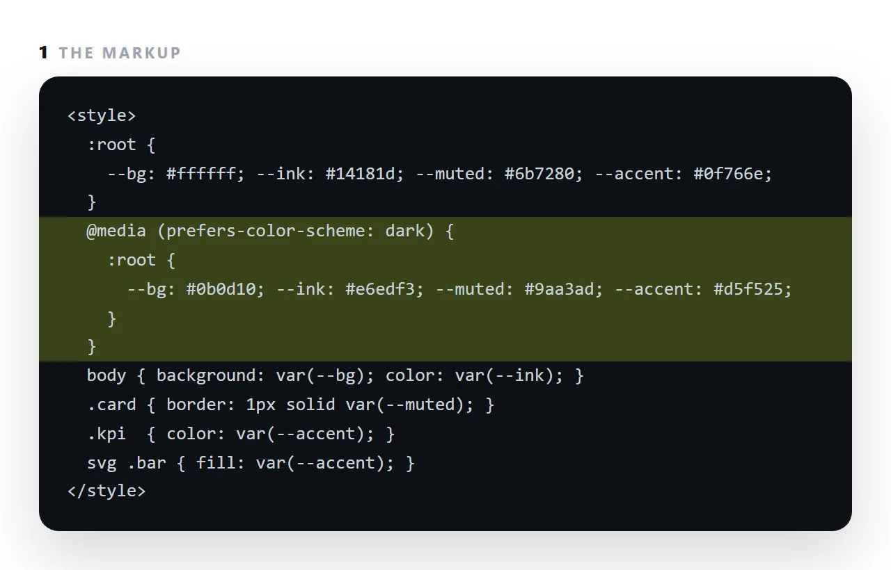
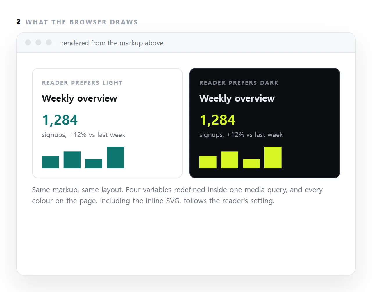
If the page draws every colour from a variable, background, ink, muted and accent, the whole page follows in one block of four lines, including inline SVG charts whose fills use the same variables.
If colours are hard-coded, each one has to be found and paired. This guide covers the choices that matter, contrast in both schemes, images and diagrams, and a manual toggle for readers who want to override the system.
:root {
  --bg: #ffffff;
  --fg: #18181b;
  --fg-2: #52525b;
  --line: #e7e7ea;
  --accent: #d5f525;
}

@media (prefers-color-scheme: dark) {
  :root {
    --bg: #18181b;
    --fg: #e7e7ea;
    --fg-2: #a1a1aa;
    --line: #333338;
    --accent: #d5f525;
  }
}

body { background: var(--bg); color: var(--fg); }
That is the whole pattern. Everything that uses the variables follows automatically.
Which is the real argument for defining colours as variables in the first place — see putting your colours into generated HTML. Hard-coded hex values mean dark mode is a rewrite rather than a block.
Dark mode CSS: choices that matter
Not pure black
#000 with #fff text produces uncomfortable glare and, on OLED screens, visible smearing on scroll. A very dark grey — around #18181b — with slightly-off-white text reads better.
Lower the contrast slightly, not the legibility
Light text on dark appears heavier than dark on light at the same weight. Two adjustments help:
@media (prefers-color-scheme: dark) {
  body { font-weight: 380; }          /* if the font supports it */
  strong { font-weight: 650; }
}
Borders need to be lighter, not darker
In light mode a border is darker than the background. In dark mode it must be lighter — #333338 against #18181b. Reusing the light-mode border value makes every border vanish.
Shadows do not work
A drop shadow is a darkening, and darkening a dark background is invisible. Use a border instead:
.card { border: 1px solid var(--line); }
@media (prefers-color-scheme: dark) {
  .card { box-shadow: none; }
}
Images and diagrams
A fixed-colour PNG diagram stays light-themed while the page goes dark, which looks like a bug.
Inline SVG solves it, because its colours can come from your variables:
<svg viewBox="0 0 200 40">
  <rect width="140" height="20" fill="var(--accent)"/>
  <line x1="0" y1="34" x2="200" y2="34" stroke="var(--line)"/>
</svg>
Every diagram on this site works this way. For photographs, nothing needs to change. For a screenshot with a white background, a subtle border keeps it from looking like a hole in the page.
Form controls
:root { color-scheme: light dark; }
One line, and browser-drawn UI — form field backgrounds, scrollbars, date pickers — switches to its dark variant. Without it you get a dark page with bright white input fields, which is the most common visible oversight.
The icon too
A favicon can respond as well, since an SVG can carry its own media query:
<svg xmlns="http://www.w3.org/2000/svg" viewBox="0 0 32 32">
  <style>
    .mark { fill: #202600 }
    @media (prefers-color-scheme: dark) { .mark { fill: #d5f525 } }
  </style>
  <path class="mark" d="M13 9 L7 16 L13 23"/>
</svg>
Testing
Switch your operating system's appearance setting, or use the emulation control in the browser's developer tools — most have a way to force prefers-color-scheme.
Four things to check: borders are still visible, no white panels remain, form fields are dark, and any diagram has followed.
Why it is worth the twenty minutes
A large number of readers have dark mode on permanently, particularly on phones. A page that ignores it arrives as a bright rectangle at night, and the usual response is to close it.
Since a shared link is most often opened on a phone, this is not a refinement — it is part of whether the page gets read.
The checklist
| Element | Light | Dark | Common mistake |
|---|---|---|---|
| Background | #fff |
#18181b |
Using pure black |
| Body text | #18181b |
#e7e7ea |
Using pure white |
| Borders | Darker than background | Lighter than background | Reusing the light value, so borders vanish |
| Cards | Shadow | Border | Keeping the shadow, which is invisible |
| Form fields | Browser default | Needs color-scheme |
White boxes on a dark page |
| Diagrams | Any | Must follow | A fixed-colour image staying light |
| Accent | Brand colour | Often the same | Contrast failing against the dark background |
The border row is the one that catches everyone, because nothing looks broken — the page simply loses its structure and reads as a wall of text.
Letting the reader choose as well
The media query follows the operating system. If you want a toggle, drive it from an attribute and keep the query as the default:
:root { --bg: #fff; --fg: #18181b; }
@media (prefers-color-scheme: dark) {
  :root { --bg: #18181b; --fg: #e7e7ea; }
}
[data-theme="dark"]  { --bg: #18181b; --fg: #e7e7ea; }
[data-theme="light"] { --bg: #fff;    --fg: #18181b; }
Set data-theme on the <html> element and store the choice — see local storage, and wrap the call, because it throws inside restricted frames. With no attribute set, the reader's system preference still applies, which is the correct default.
A manual toggle
Some readers want dark mode regardless of their system setting, or light mode on a dark system.
A toggle is a class on the root element, html.dark, with the same four variables redefined under it, and a few lines of script that set the class and remember the choice in local storage.
Keep the media query as the default and let the class override it, so a reader who never touches the toggle gets their system preference.
What dark mode is not
It is not an inverted page. Inverting swaps every colour, turns photographs into negatives and makes the accent muddy. Dark mode is a second palette chosen for a dark background: near-black rather than black, off-white rather than white, an accent bright enough to carry, and photographs left alone. Four variables is enough because the palette is small on purpose.
Adding dark mode: 4 steps
- Put every colour in a variable. Four is usually enough: background, ink, muted, accent. Replace hard-coded values with
var(). Restyling generated HTML is the same exercise. - Redefine them inside the media query. A dark background, light ink, a muted grey that still reads, and an accent that carries on dark.
- Check contrast in both schemes. 4.5 to 1 for body text in each. The accent that worked on white often needs to change on dark.
- Use the variables in SVG and images too.
fill: var(--accent)on inline charts; light and dark versions of a logo swapped by the same query.