A CSS toggle switch is an ordinary <input type="checkbox"> with a new look. Put it inside a <label> with two empty spans, a track and a knob, hide the checkbox from the eye (not with display: none), and paint the spans from :checked.
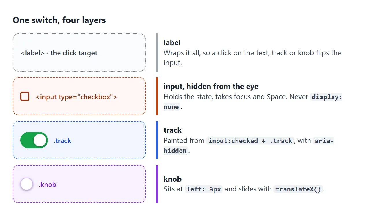
Try it first. Click the switch, or press Tab and then Space. The two boxes below show the layers the switch is made of.
<!doctype html>
<html lang="en">
<head>
<meta charset="utf-8">
<meta name="viewport" content="width=device-width, initial-scale=1">
<title>Toggle switch anatomy</title>
<style>
body { margin: 0; padding: 18px; font-family: system-ui, sans-serif; background: #f4f5f7; color: #1d2330; }
.stage { max-width: 420px; margin: 0 auto; background: #fff; border-radius: 14px; padding: 22px 18px; box-shadow: 0 4px 16px rgba(0,0,0,.08); }
/* 1. the label holds the text, the real checkbox and the drawing */
.switch { display: inline-flex; align-items: center; gap: 12px; cursor: pointer; font-size: 17px; }
/* 2. the real checkbox: hidden from the eye, still focusable (never display: none) */
.switch input {
position: absolute; width: 1px; height: 1px; margin: -1px;
overflow: hidden; clip: rect(0 0 0 0); white-space: nowrap; border: 0;
}
/* 3. the track */
.track {
position: relative; flex: none; width: 52px; height: 30px; border-radius: 99px;
background: #c7ccd4; transition: background-color .2s;
}
/* 4. the knob: always left: 3px, moved only by transform */
.knob {
position: absolute; left: 3px; top: 3px; width: 24px; height: 24px; border-radius: 50%;
background: #fff; box-shadow: 0 1px 3px rgba(0,0,0,.35); transition: transform .2s;
}
/* states come from the checkbox */
.switch input:checked + .track { background: #16a34a; }
.switch input:checked + .track .knob { transform: translateX(22px); }
.switch input:focus-visible + .track { outline: 3px solid #2563eb; outline-offset: 3px; }
@media (prefers-reduced-motion: reduce) {
.track, .knob { transition: none; }
}
/* layer views for this demo only */
.show-input .switch input { position: static; width: 18px; height: 18px; margin: 0; clip: auto; overflow: visible; outline: 2px dashed #c2410c; outline-offset: 2px; }
.outline .track { outline: 2px dashed #2563eb; outline-offset: 2px; }
.outline .knob { outline: 2px dashed #9333ea; }
.outline .switch { outline: 1px dotted #6b7280; outline-offset: 6px; }
.layers { display: flex; flex-wrap: wrap; gap: 8px 16px; margin-top: 22px; padding-top: 14px; border-top: 1px solid #eef0f3; font-size: 14px; }
.layers label { display: flex; gap: 6px; align-items: center; cursor: pointer; }
.key { margin: 10px 0 0; font-size: 12.5px; color: #5b6270; line-height: 1.6; }
.key b.i { color: #c2410c; } .key b.t { color: #2563eb; } .key b.k { color: #9333ea; }
#out { margin-top: 12px; padding: 9px 12px; border-radius: 10px; background: #1d2330; color: #e5e7eb; font: 13px/1.5 ui-monospace, Consolas, monospace; }
</style>
</head>
<body>
<div class="stage" id="stage">
<label class="switch">
<input type="checkbox" role="switch" id="wifi">
<span class="track" aria-hidden="true"><span class="knob"></span></span>
Wi-Fi
</label>
<div class="layers">
<label><input type="checkbox" id="l-input"> Show the hidden input</label>
<label><input type="checkbox" id="l-outline"> Outline label, track, knob</label>
</div>
<p class="key"><b class="i">orange</b> input · <b class="t">blue</b> track · <b class="k">purple</b> knob · dotted = label</p>
<div id="out" aria-live="polite"></div>
</div>
<script>
const wifi = document.getElementById('wifi');
const stage = document.getElementById('stage');
const out = document.getElementById('out');
// the drawing never holds state: read it from the real checkbox
function show() { out.textContent = 'input.checked = ' + wifi.checked; }
wifi.addEventListener('change', show);
show();
// layer toggles for this demo
document.getElementById('l-input').addEventListener('change', (e) => stage.classList.toggle('show-input', e.target.checked));
document.getElementById('l-outline').addEventListener('change', (e) => stage.classList.toggle('outline', e.target.checked));
</script>
</body>
</html>
The drawing never stores anything. The checkbox holds the state, and the CSS only reflects it. This guide goes deep on the switch itself. For how labels connect text to any control, see the label guide.
The markup: one label, one input, two spans
<label class="switch">
  <input type="checkbox" role="switch">
  <span class="track" aria-hidden="true"><span class="knob"></span></span>
  Wi-Fi
</label>
- The label wraps everything. A click on any part flips the checkbox.
- The input comes right before the track, so
input:checked + .trackcan reach it. - The track and knob are
aria-hidden. They are paint, and the input already says everything.
Hide the checkbox, but keep it working
Hiding the input with display: none looks fine with a mouse, because the label still flips it. But an element with display: none cannot get focus. Tab skips it, Space does nothing, and screen readers do not find it.
Hide it from the eye only. This is the usual visually hidden pattern:
.switch input {
  position: absolute; width: 1px; height: 1px; margin: -1px;
  overflow: hidden; clip: rect(0 0 0 0); white-space: nowrap; border: 0;
}
Because the input is still there, Space toggles it like any checkbox. Since it is invisible, show its focus on the drawing instead:
.switch input:focus-visible + .track {
  outline: 3px solid #2563eb;
  outline-offset: 3px;
}
:focus-visible shows the ring for keyboard focus and usually not for a mouse click, so it does not flash on every tap.
role="switch" and the label text
Without a role, a screen reader describes the control as a checkbox that is checked or not checked. With role="switch", it describes a switch that is on or off. The exact words depend on the screen reader.
The label text is the switch's name. Keep it fixed, such as "Wi-Fi", and let the role carry the on or off state. If the label itself changes between "On" and "Off", the name and the announced state repeat or contradict each other.
Animate the knob with transform
The knob starts at left: 3px. When the input is checked, it moves by the track width minus the knob width, minus the two gaps:
.knob {
  position: absolute; left: 3px; top: 3px;
  width: 24px; height: 24px; border-radius: 50%;
  transition: transform .2s;
}
.switch input:checked + .track .knob { transform: translateX(22px); }

@media (prefers-reduced-motion: reduce) {
  .track, .knob { transition: none; }
}
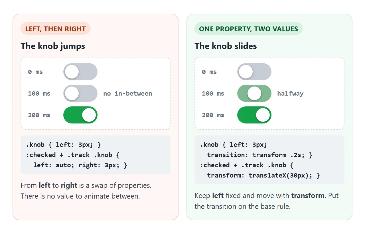
Two details matter. The transition goes on the base rule, so it runs in both directions; on the :checked rule alone, only turning it on animates.
And the prefers-reduced-motion block lets people who turned off animation in their system settings get an instant flip. CSS transform covers translateX() in more detail.
Variants: size, colour, icons, text, disabled
Size the switch with three custom properties, and the knob and its travel follow:
.sw { --w: 48px; --h: 28px; --pad: 3px; }
.knob { width: calc(var(--h) - 2 * var(--pad)); }
.sw input:checked + .track .knob {
  transform: translateX(calc(var(--w) - var(--h)));
}
<!doctype html>
<html lang="en">
<head>
<meta charset="utf-8">
<meta name="viewport" content="width=device-width, initial-scale=1">
<title>Toggle switch variants</title>
<style>
  body { margin: 0; padding: 14px; font-family: system-ui, sans-serif; background: #f4f5f7; color: #1d2330; }
  .grid { max-width: 560px; margin: 0 auto; display: grid; grid-template-columns: 1fr 1fr; gap: 10px; }
  .card { background: #fff; border-radius: 12px; padding: 12px 14px; box-shadow: 0 3px 12px rgba(0,0,0,.07); }
  .card h2 { margin: 0 0 10px; font-size: 12px; color: #6b7280; text-transform: uppercase; letter-spacing: .4px; }
  .row { display: flex; flex-wrap: wrap; align-items: center; gap: 10px 16px; }
  @media (max-width: 420px) { .grid { grid-template-columns: 1fr; } }

  /* one switch, sized by three variables */
  .sw { --w: 48px; --h: 28px; --pad: 3px; --on: #16a34a;
        display: inline-flex; align-items: center; gap: 8px; cursor: pointer; font-size: 14px; }
  .sw input { position: absolute; width: 1px; height: 1px; margin: -1px; overflow: hidden; clip: rect(0 0 0 0); white-space: nowrap; border: 0; }
  .track { position: relative; flex: none; width: var(--w); height: var(--h); border-radius: 99px;
           background: #c7ccd4; transition: background-color .2s; }
  .knob { position: absolute; left: var(--pad); top: var(--pad);
          width: calc(var(--h) - 2 * var(--pad)); height: calc(var(--h) - 2 * var(--pad));
          border-radius: 50%; background: #fff; box-shadow: 0 1px 3px rgba(0,0,0,.35);
          display: grid; place-items: center; transition: transform .2s; }
  .sw input:checked + .track { background: var(--on); }
  .sw input:checked + .track .knob { transform: translateX(calc(var(--w) - var(--h))); }
  .sw input:focus-visible + .track { outline: 3px solid #2563eb; outline-offset: 2px; }
  .sw input:disabled + .track { opacity: .45; }
  .sw:has(input:disabled) { cursor: not-allowed; color: #9ca3af; }

  /* sizes */
  .sm { --w: 34px; --h: 20px; --pad: 2px; font-size: 13px; }
  .lg { --w: 64px; --h: 36px; --pad: 4px; font-size: 16px; }
  /* colours */
  .blue { --on: #2563eb; } .red { --on: #dc2626; } .ios { --on: #34c759; --w: 51px; --h: 31px; --pad: 2px; }

  /* icons inside the knob: show one or the other */
  .knob svg { width: 60%; height: 60%; }
  .knob .ic-on { display: none; }
  .sw input:checked + .track .ic-on { display: block; }
  .sw input:checked + .track .ic-off { display: none; }

  /* text inside the track */
  .txt { --w: 62px; }
  .txt .track::before { content: "OFF"; position: absolute; right: 8px; top: 50%; transform: translateY(-50%); font: 700 10px system-ui, sans-serif; color: #4b5563; }
  .txt input:checked + .track::before { content: "ON"; left: 9px; right: auto; color: #fff; }

  /* text outside: the word follows the checkbox */
  .state::after { content: "Off"; color: #6b7280; }
  .sw input:checked ~ .state::after { content: "On"; color: #15803d; }

  /* button version: the state lives in aria-pressed */
  .tbtn { display: inline-flex; align-items: center; gap: 8px; border: 0; background: none; padding: 0; font: inherit; font-size: 14px; color: inherit; cursor: pointer; }
  .tbtn .track { --w: 48px; --h: 28px; --pad: 3px; }
  .tbtn[aria-pressed="true"] .track { background: #7c3aed; }
  .tbtn[aria-pressed="true"] .knob { transform: translateX(20px); }
  .tbtn:focus-visible .track { outline: 3px solid #2563eb; outline-offset: 2px; }
  .tbtn:focus-visible { outline: none; }

  @media (prefers-reduced-motion: reduce) { .track, .knob { transition: none; } }

  #log { max-width: 560px; margin: 10px auto 0; box-sizing: border-box; padding: 9px 12px; border-radius: 10px; background: #1d2330; color: #e5e7eb; font: 12.5px/1.5 ui-monospace, Consolas, monospace; }
</style>
</head>
<body>
<div class="grid">
  <div class="card"><h2>Sizes</h2><div class="row">
    <label class="sw sm"><input type="checkbox" role="switch" name="small"><span class="track" aria-hidden="true"><span class="knob"></span></span>Small</label>
    <label class="sw"><input type="checkbox" role="switch" name="medium" checked><span class="track" aria-hidden="true"><span class="knob"></span></span>Medium</label>
    <label class="sw lg"><input type="checkbox" role="switch" name="large"><span class="track" aria-hidden="true"><span class="knob"></span></span>Large</label>
  </div></div>

  <div class="card"><h2>Colours</h2><div class="row">
    <label class="sw blue"><input type="checkbox" role="switch" name="blue" checked><span class="track" aria-hidden="true"><span class="knob"></span></span>Blue</label>
    <label class="sw red"><input type="checkbox" role="switch" name="red" checked><span class="track" aria-hidden="true"><span class="knob"></span></span>Red</label>
    <label class="sw ios"><input type="checkbox" role="switch" name="ios" checked><span class="track" aria-hidden="true"><span class="knob"></span></span>iOS look</label>
  </div></div>

  <div class="card"><h2>Icon in the knob</h2><div class="row">
    <label class="sw lg"><input type="checkbox" role="switch" name="dark"><span class="track" aria-hidden="true"><span class="knob">
      <svg class="ic-off" viewBox="0 0 24 24" fill="none" stroke="#f59e0b" stroke-width="2.5"><circle cx="12" cy="12" r="4"/><path d="M12 2v3M12 19v3M2 12h3M19 12h3M4.9 4.9l2.1 2.1M17 17l2.1 2.1M4.9 19.1 7 17M17 7l2.1-2.1"/></svg>
      <svg class="ic-on" viewBox="0 0 24 24" fill="#16a34a"><path d="M20 14.5A8 8 0 0 1 9.5 4a8 8 0 1 0 10.5 10.5z"/></svg>
    </span></span>Dark theme</label>
  </div></div>

  <div class="card"><h2>Text inside / outside</h2><div class="row">
    <label class="sw txt"><input type="checkbox" role="switch" name="inside"><span class="track" aria-hidden="true"><span class="knob"></span></span>Inside</label>
    <label class="sw"><input type="checkbox" role="switch" name="outside"><span class="track" aria-hidden="true"><span class="knob"></span></span>Outside: <span class="state" aria-hidden="true"></span></label>
  </div></div>

  <div class="card"><h2>Disabled</h2><div class="row">
    <label class="sw"><input type="checkbox" role="switch" name="locked-off" disabled><span class="track" aria-hidden="true"><span class="knob"></span></span>Off</label>
    <label class="sw"><input type="checkbox" role="switch" name="locked-on" checked disabled><span class="track" aria-hidden="true"><span class="knob"></span></span>On</label>
  </div></div>

  <div class="card"><h2>Button + aria-pressed</h2><div class="row">
    <button type="button" class="tbtn" aria-pressed="false" id="mute"><span class="track" aria-hidden="true"><span class="knob"></span></span>Mute</button>
  </div></div>
</div>
<div id="log" aria-live="polite">Click any switch.</div>

<script>
  const log = document.getElementById('log');

  // checkbox switches: the browser flips .checked for us
  document.querySelectorAll('.sw input').forEach((input) => {
    input.addEventListener('change', () => {
      log.textContent = input.name + ': ' + (input.checked ? 'on' : 'off');
    });
  });

  // button switch: we flip aria-pressed ourselves
  const mute = document.getElementById('mute');
  mute.addEventListener('click', () => {
    const on = mute.getAttribute('aria-pressed') !== 'true';
    mute.setAttribute('aria-pressed', on);
    log.textContent = 'mute (button): aria-pressed="' + on + '"';
  });
</script>
</body>
</html>
| Variant | How | Watch out for |
|---|---|---|
| Small or large | Change --w, --h, --pad |
Keep the whole label big enough to tap |
| Colour | Change the :checked background |
The off track needs contrast with the page too |
| Icon in the knob | Two inline SVGs, one shown per state | Mark them aria-hidden with the track |
| On/Off text inside | ::before text that swaps on :checked |
Leave room for longer words |
| On/Off text outside | A span after the input, filled by :checked ~ .state |
Keep it aria-hidden; the role says it |
| Disabled | The disabled attribute and :disabled + .track |
Also dim the text and change the cursor |
The disabled switches cannot be focused or flipped. That comes from the real input, not from the CSS.
A button switch with aria-pressed
Sometimes the control is not a setting but an action you can undo, such as Mute in a player. A <button> with aria-pressed suits that. Screen readers announce it as a toggle button that is pressed or not pressed.
<button type="button" class="tbtn" aria-pressed="false">
  <span class="track" aria-hidden="true"><span class="knob"></span></span>
  Mute
</button>
A button holds no checked state, so a script flips aria-pressed on click, and the CSS reads [aria-pressed="true"]. A button answers both Enter and Space, and it is not sent with a form. The last card in the variants demo shows this version.
Switch or checkbox?
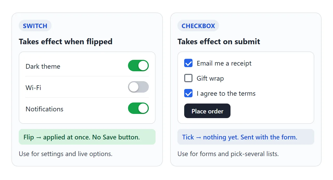
A switch looks like a light switch, so people expect the change to happen the moment they flip it. Use one where that is true: settings, a theme, turning notifications on.
If nothing happens until the user presses Save or Submit, use a plain checkbox.
In an order form, "Gift wrap" is a choice sent with the order, not something that takes effect right away. For simple two-way questions, yes and no buttons may fit better than either.
A finished example: settings that apply at once
This panel has no Save button. Each switch runs its change on the change event: the theme turns dark, the text grows, and the main notifications switch disables the two below it.
<!doctype html>
<html lang="en">
<head>
<meta charset="utf-8">
<meta name="viewport" content="width=device-width, initial-scale=1">
<title>Settings with live switches</title>
<style>
  :root { --bg: #f4f5f7; --panel: #fff; --text: #1d2330; --muted: #6b7280; --line: #eef0f3; --off: #c7ccd4; --on: #16a34a; }
  body.dark { --bg: #0f141c; --panel: #1b2230; --text: #e5e7eb; --muted: #9aa3b2; --line: #2a3344; --off: #4b5563; --on: #22c55e; }
  body.big { font-size: 18px; }
  body { margin: 0; padding: 16px; font-family: system-ui, sans-serif; font-size: 15px; background: var(--bg); color: var(--text); transition: background-color .25s, color .25s; }

  .panel { max-width: 440px; margin: 0 auto; background: var(--panel); border-radius: 14px; padding: 4px 16px; box-shadow: 0 4px 16px rgba(0,0,0,.1); }
  h1 { font-size: 1.05em; margin: 12px 0 2px; }
  h2 { font-size: .75em; letter-spacing: .5px; text-transform: uppercase; color: var(--muted); margin: 14px 0 0; }

  /* each row is one label: text + hidden checkbox + drawing */
  .row { display: flex; align-items: center; justify-content: space-between; gap: 12px; padding: 12px 0; border-top: 1px solid var(--line); cursor: pointer; }
  .row small { display: block; color: var(--muted); font-size: .8em; margin-top: 2px; }
  .row.sub { padding-left: 16px; }
  .row:has(input:disabled) { cursor: not-allowed; opacity: .5; }

  .row input { position: absolute; width: 1px; height: 1px; margin: -1px; overflow: hidden; clip: rect(0 0 0 0); white-space: nowrap; border: 0; }
  .track { position: relative; flex: none; width: 46px; height: 26px; border-radius: 99px; background: var(--off); transition: background-color .2s; }
  .knob { position: absolute; left: 3px; top: 3px; width: 20px; height: 20px; border-radius: 50%; background: #fff; box-shadow: 0 1px 3px rgba(0,0,0,.35); transition: transform .2s; }
  .row input:checked + .track { background: var(--on); }
  .row input:checked + .track .knob { transform: translateX(20px); }
  .row input:focus-visible + .track { outline: 3px solid #3b82f6; outline-offset: 2px; }

  @media (prefers-reduced-motion: reduce) { body, .track, .knob { transition: none; } }

  #status { max-width: 440px; margin: 12px auto 0; box-sizing: border-box; padding: 10px 12px; border-radius: 10px; background: #1d2330; color: #e5e7eb; font: 13px/1.5 ui-monospace, Consolas, monospace; }
  body.dark #status { background: #000; }
</style>
</head>
<body>
<div class="panel">
  <h1>Settings</h1>

  <h2>Display</h2>
  <label class="row"><span>Dark theme<small>Changes the page right away</small></span>
    <input type="checkbox" role="switch" id="dark"><span class="track" aria-hidden="true"><span class="knob"></span></span></label>
  <label class="row"><span>Larger text</span>
    <input type="checkbox" role="switch" id="big"><span class="track" aria-hidden="true"><span class="knob"></span></span></label>

  <h2>Notifications</h2>
  <label class="row"><span>Allow notifications<small>Turn off to silence everything below</small></span>
    <input type="checkbox" role="switch" id="notify" checked><span class="track" aria-hidden="true"><span class="knob"></span></span></label>
  <label class="row sub"><span>Email</span>
    <input type="checkbox" role="switch" id="email" checked><span class="track" aria-hidden="true"><span class="knob"></span></span></label>
  <label class="row sub"><span>Push</span>
    <input type="checkbox" role="switch" id="push"><span class="track" aria-hidden="true"><span class="knob"></span></span></label>
</div>
<p id="status" role="status">No changes yet.</p>

<script>
  const $ = (id) => document.getElementById(id);
  const status = $('status');

  // a switch acts the moment it changes: no Save button
  function say(name, on) { status.textContent = name + ' ' + (on ? 'on' : 'off') + '. Applied.'; }

  $('dark').addEventListener('change', (e) => {
    document.body.classList.toggle('dark', e.target.checked);
    say('Dark theme', e.target.checked);
  });

  $('big').addEventListener('change', (e) => {
    document.body.classList.toggle('big', e.target.checked);
    say('Larger text', e.target.checked);
  });

  // the main switch enables or disables the two below it
  $('notify').addEventListener('change', (e) => {
    $('email').disabled = $('push').disabled = !e.target.checked;
    say('Notifications', e.target.checked);
  });

  $('email').addEventListener('change', (e) => say('Email', e.target.checked));
  $('push').addEventListener('change', (e) => say('Push', e.target.checked));
</script>
</body>
</html>
- One listener per switch:
changefires for a click, a tap and Space. - Theme with variables: the dark switch adds a class to
body, and CSS custom properties swap the colours. Dark mode CSS covers the full pattern. - Status line: a
role="status"box repeats the last change, so it is announced too.
When it does not work
| What you see | Cause | Fix |
|---|---|---|
| Works with a mouse, but Tab skips it | The input is display: none or visibility: hidden |
Use the visually hidden pattern |
| Clicking the knob or track does nothing | The spans sit outside the label, or for does not match the input id |
Put everything inside the label, or match for and id exactly |
| The track colour never changes | The spans come before the input, so + finds nothing |
Put the input directly before .track |
| The knob jumps instead of sliding | It moves from left to right, or the transition is only on :checked |
Keep left fixed, move with transform, transition on the base rule |
| No focus ring on the switch | The ring is on the hidden input | Style input:focus-visible + .track |
| Screen reader says checkbox, or no name | No role="switch", or no text in the label |
Add the role and visible label text |
| Users flip it and wait for something | The switch sits in a form that only applies on submit | Apply the change at once, or use a checkbox |
Share it as a link
A switch is something people want to click, and a screenshot cannot be clicked. An .html attachment may open as plain text, or not at all, on a phone.
To send the working version, paste the page into a NOS document and choose Create share link. HTML to link walks through it.
The page renders as written and its scripts run, so the people you send it to can flip the switches and watch the theme change. If you change the code later, the same link shows the new version.