An HTML checkbox is <input type="checkbox">. Give it a name and a value, add checked if it should start ticked, and wrap it in a <label>. When the form is submitted, a checked box sends name=value. An unchecked box sends nothing at all.
<label>
  <input type="checkbox" name="sms" value="yes" checked>
  Text messages
</label>
Try it first. Click the boxes and watch the two columns. The .checked property follows your clicks. The checked attribute does not move.
<!doctype html>
<html lang="en">
<head>
<meta charset="utf-8">
<meta name="viewport" content="width=device-width, initial-scale=1">
<title>checked attribute vs .checked property</title>
<style>
  body { margin: 0; padding: 16px; font-family: system-ui, sans-serif; background: #f4f5f7; color: #1d2330; }
  form { background: #fff; border-radius: 12px; padding: 12px 16px; box-shadow: 0 2px 8px rgba(0, 0, 0, .08); }
  label { display: flex; align-items: center; gap: 10px; padding: 8px 0; cursor: pointer; }
  input[type="checkbox"] { width: 18px; height: 18px; margin: 0; }
  .buttons { display: flex; gap: 8px; margin-top: 6px; flex-wrap: wrap; }
  button { font: inherit; padding: 6px 12px; border-radius: 8px; border: 1px solid #c9ced6; background: #fff; cursor: pointer; }
  table { width: 100%; border-collapse: collapse; margin-top: 12px; font-size: 13px; background: #fff; border-radius: 12px; overflow: hidden; }
  th, td { text-align: left; padding: 7px 8px; border-bottom: 1px solid #eceef1; }
  th { background: #f8f9fb; font-weight: 600; }
  code, pre { font-family: ui-monospace, Consolas, monospace; font-size: 12.5px; }
  pre { margin: 12px 0 0; padding: 10px 12px; background: #1e2330; color: #d6f2df; border-radius: 10px; white-space: pre-wrap; }
</style>
</head>
<body>
<form id="form">
  <!-- checked in the HTML = the starting state -->
  <label><input type="checkbox" name="newsletter" checked> Newsletter <small>(no value)</small></label>
  <label><input type="checkbox" name="sms" value="yes"> Text messages <small>(value="yes")</small></label>
  <div class="buttons">
    <button type="reset">Reset form</button>
  </div>
</form>

<table>
  <thead><tr><th>name</th><th>.checked</th><th>getAttribute('checked')</th></tr></thead>
  <tbody id="rows"></tbody>
</table>
<pre id="sent"></pre>

<script>
  const form = document.getElementById('form');
  const boxes = form.querySelectorAll('input[type="checkbox"]');

  function show() {
    // .checked = what the box shows now; the attribute = what the HTML said
    document.getElementById('rows').innerHTML = [...boxes].map((box) =>
      `<tr><td>${box.name}</td><td>${box.checked}</td><td>${JSON.stringify(box.getAttribute('checked'))}</td></tr>`
    ).join('');

    // What a submit would send: unchecked boxes are simply missing
    const entries = [...new FormData(form)].map(([k, v]) => `${k}=${v}`);
    document.getElementById('sent').textContent =
      'FormData sends: ' + (entries.length ? entries.join('&') : '(nothing)');
  }

  form.addEventListener('change', show);
  form.addEventListener('reset', () => setTimeout(show)); // reset runs after this event
  show();
</script>
</body>
</html>
The checked attribute vs the .checked property
The checked attribute in the HTML is the starting state. The .checked property in JavaScript is the current state, the one the user sees. Clicking changes the property and leaves the attribute alone.
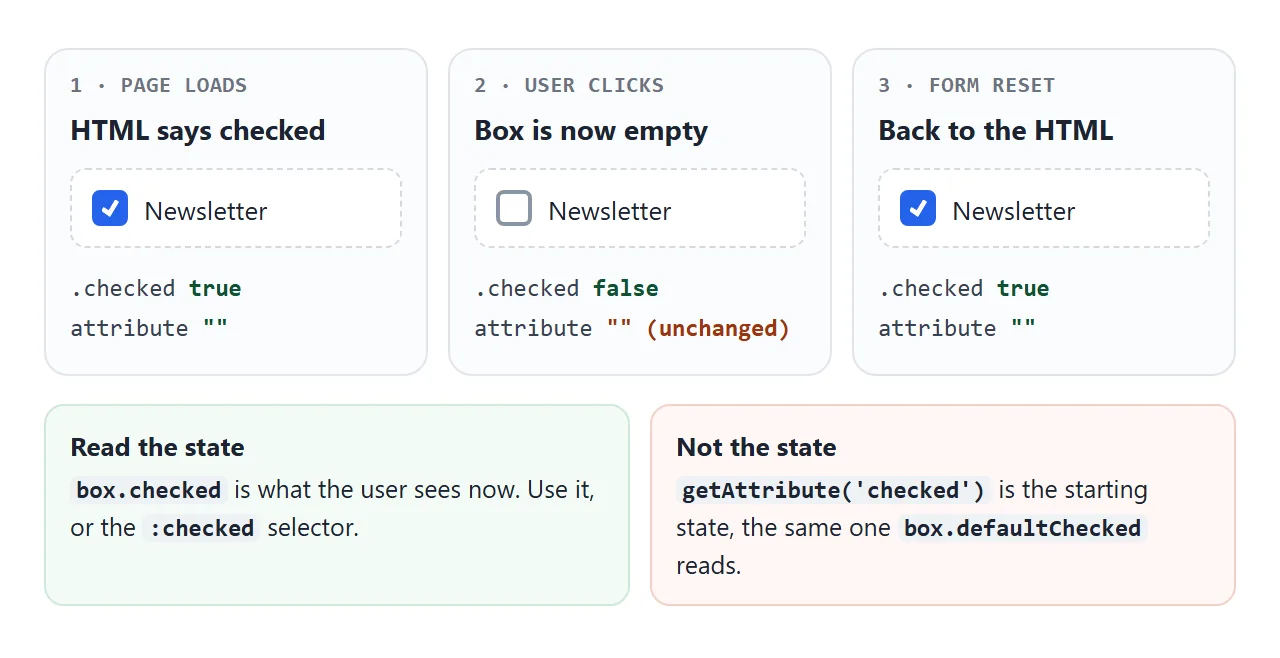
That is why getAttribute('checked') gives the wrong answer after a click. It reads the same starting state as the defaultChecked property. Read the current state like this:
const box = document.querySelector('input[name="sms"]');
box.checked;            // true or false, right now
box.checked = true;     // tick it from code
box.defaultChecked;     // what the HTML attribute said
checked is a boolean attribute. Its presence is what counts, so checked="false" still starts the box ticked.
Once the user or your script has changed the box, adding the attribute with setAttribute no longer changes it. A form reset clears that and returns every box to its attribute.
What gets submitted: value and "on"
A checkbox adds one name=value pair to the form data when it is checked, and nothing when it is not. If the input has no value attribute, the browser sends the string on.
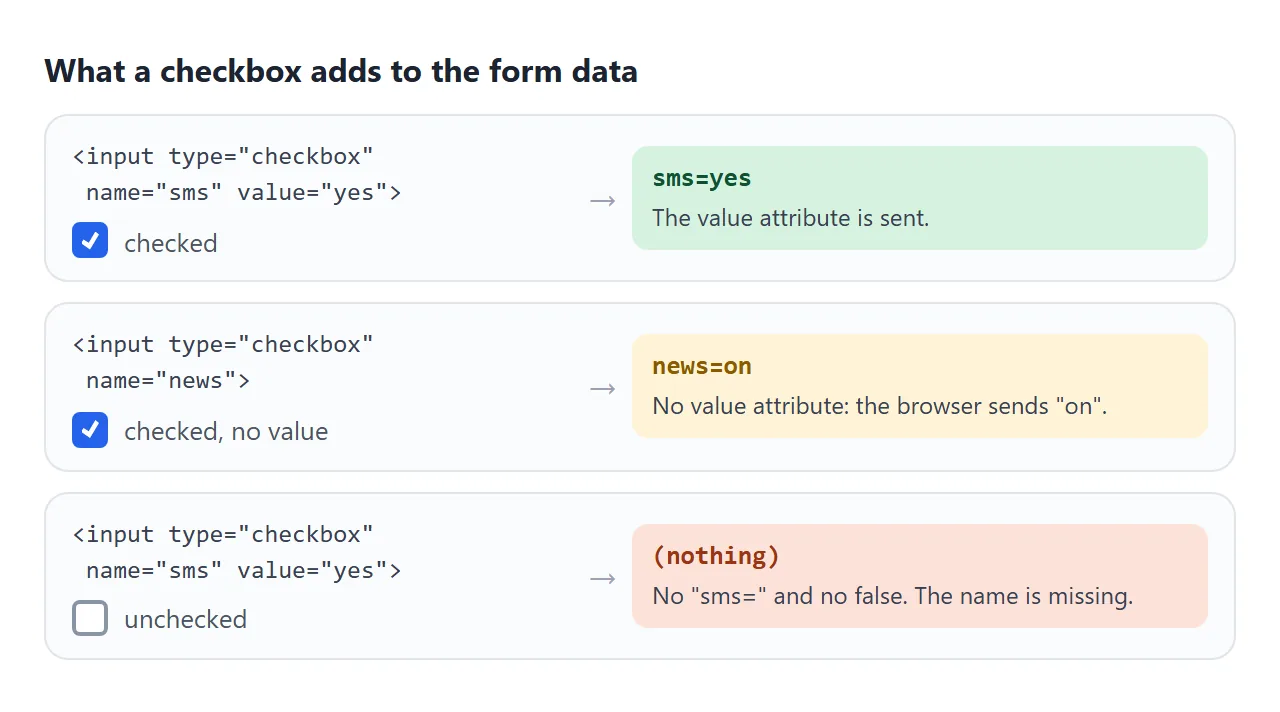
| Box | Sent with the form |
|---|---|
Checked, value="yes" |
sms=yes |
Checked, no value |
news=on |
| Unchecked | Nothing. The name is missing |
| Disabled, even if checked | Nothing |
Checked, but no name |
Nothing |
So "missing" means "unchecked". On the server, check whether the name exists rather than looking for a false. In JavaScript, new FormData(form).has('sms') answers yes or no. FormData in JavaScript covers reading the rest of the form.
If the server needs an explicit no, a form can add <input type="hidden" name="sms" value="no"> before the checkbox. When the box is checked, both values arrive under one name and the server must pick one. Treating a missing name as unchecked is simpler.
Labels and groups: label, fieldset, legend
A bare checkbox is about the size of one letter. A connected label makes its text toggle the box too, which matters most on a phone. Wrapping works without ids:
<label><input type="checkbox" name="news"> Send me the newsletter</label>
The other way is <label for="news"> with a matching id="news" on the input. The two must match exactly, including case. Label HTML covers both forms and what a screen reader reads out.
Several boxes that answer one question belong in a <fieldset>, with the question in its <legend>. The legend names the whole group, so a screen reader can give the question along with each box: "Read your files" in the group "What can this app do?".
<fieldset>
  <legend>What can this app do?</legend>
  <label><input type="checkbox" name="perm" value="read"> Read your files</label>
  <label><input type="checkbox" name="perm" value="write"> Edit your files</label>
</fieldset>
Give the boxes in a group the same name and different values. The form then sends perm=read&perm=write, and FormData.getAll('perm') returns ["read", "write"]. More on the group element in Fieldset HTML.
Reading checked values with :checked
The :checked selector matches checkboxes that are ticked right now. Combine it with the name to collect a group:
const values = [...document.querySelectorAll('input[name="perm"]:checked')]
  .map((box) => box.value);   // ["read", "calendar"]
Keep the input[name=...] part. A bare :checked also matches checked radio buttons and selected <option> elements in a <select>.
To react to changes, listen for change on the box, or once on the form, since the event bubbles. Setting box.checked from code does not fire change. If a script ticks boxes, it must update the page itself.
"Select all" and the indeterminate state
A "Select all" box has three looks: empty when none are ticked, ticked when all are, and a dash when some are. The dash is the indeterminate state.
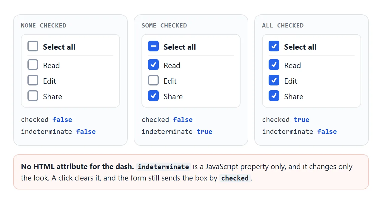
There is no HTML attribute for it. Set it from JavaScript:
function sync() {
  const on = form.querySelectorAll('input[name="perm"]:checked').length;
  all.checked = on === perms.length;
  all.indeterminate = on > 0 && on < perms.length;
}

all.addEventListener('change', () => {
  perms.forEach((box) => { box.checked = all.checked; });
  sync();   // setting .checked fired no change event
});
perms.forEach((box) => box.addEventListener('change', sync));
indeterminate changes only the look. The box still has a checked value underneath, and that is what a form sends. A click clears indeterminate and toggles checked. CSS can target the state with :indeterminate.
Styling: accent-color or a custom box
For a colour change, one property is enough. accent-color recolours the native checkbox, including its checked and indeterminate looks, and keeps the browser's focus ring and keyboard handling:
input[type="checkbox"] { accent-color: #16a34a; }
For full control of the shape, appearance: none removes the native drawing but keeps the input itself. It still takes focus, toggles with Space, submits and works with its label. You draw the box and the tick with CSS:
.custom input {
  appearance: none;
  width: 20px; height: 20px;
  border: 2px solid #8a94a6; border-radius: 6px;
  display: grid; place-content: center;
}
.custom input::before {
  content: ""; width: 10px; height: 10px; background: #fff;
  clip-path: polygon(14% 44%, 0 65%, 50% 100%, 100% 16%, 80% 0%, 43% 62%);
  transform: scale(0);
}
.custom input:checked { background: #7c3aed; border-color: #7c3aed; }
.custom input:checked::before { transform: scale(1); }
.custom input:focus-visible { outline: 3px solid #a78bfa; outline-offset: 2px; }
Compare the three side by side. Press Tab to move through the boxes and Space to toggle them.
<!doctype html>
<html lang="en">
<head>
<meta charset="utf-8">
<meta name="viewport" content="width=device-width, initial-scale=1">
<title>Checkbox styles</title>
<style>
  body { margin: 0; padding: 16px; font-family: system-ui, sans-serif; background: #f4f5f7; color: #1d2330; }
  .grid { display: grid; grid-template-columns: repeat(auto-fit, minmax(170px, 1fr)); gap: 12px; }
  fieldset { margin: 0; background: #fff; border: 1px solid #e1e4ea; border-radius: 12px; padding: 8px 14px 12px; }
  legend { font-weight: 700; font-size: 14px; padding: 0 4px; }
  legend code { font-weight: 400; font-size: 12px; color: #6b7280; }
  label { display: flex; align-items: center; gap: 10px; padding: 7px 0; cursor: pointer; }
  label:has(:disabled) { color: #9aa3b2; cursor: not-allowed; }

  /* 1. Simple: recolor the native box */
  .accent input { accent-color: #16a34a; }

  /* 2. Fully custom: remove the native look, draw our own box */
  .custom input {
    appearance: none;          /* the input stays in the page: focusable, clickable */
    width: 20px; height: 20px; margin: 0; flex: none;
    border: 2px solid #8a94a6; border-radius: 6px; background: #fff;
    display: grid; place-content: center; cursor: pointer;
  }
  .custom input::before {     /* the tick, hidden until checked */
    content: ""; width: 10px; height: 10px;
    clip-path: polygon(14% 44%, 0 65%, 50% 100%, 100% 16%, 80% 0%, 43% 62%);
    background: #fff; transform: scale(0); transition: transform .12s;
  }
  .custom input:checked { background: #7c3aed; border-color: #7c3aed; }
  .custom input:checked::before { transform: scale(1); }
  .custom input:indeterminate { background: #7c3aed; border-color: #7c3aed; }
  .custom input:indeterminate::before { clip-path: none; height: 2px; transform: scale(1); }
  .custom input:focus-visible { outline: 3px solid #a78bfa; outline-offset: 2px; } /* keyboard focus ring */
  .custom input:disabled { border-color: #d5d9e0; background: #f1f3f6; cursor: not-allowed; }
  .custom input:disabled:checked { background: #c4b5fd; border-color: #c4b5fd; }

  p { font-size: 13px; color: #4b5563; margin: 12px 0 0; }
  kbd { font: 12px ui-monospace, Consolas, monospace; border: 1px solid #c9ced6; border-radius: 4px; padding: 0 4px; background: #fff; }
</style>
</head>
<body>
<div class="grid">
  <fieldset class="default">
    <legend>Default</legend>
    <label><input type="checkbox"> Unchecked</label>
    <label><input type="checkbox" checked> Checked</label>
    <label><input type="checkbox" class="mixed"> Mixed</label>
    <label><input type="checkbox" checked disabled> Disabled</label>
  </fieldset>

  <fieldset class="accent">
    <legend>accent-color</legend>
    <label><input type="checkbox"> Unchecked</label>
    <label><input type="checkbox" checked> Checked</label>
    <label><input type="checkbox" class="mixed"> Mixed</label>
    <label><input type="checkbox" checked disabled> Disabled</label>
  </fieldset>

  <fieldset class="custom">
    <legend>appearance: none</legend>
    <label><input type="checkbox"> Unchecked</label>
    <label><input type="checkbox" checked> Checked</label>
    <label><input type="checkbox" class="mixed"> Mixed</label>
    <label><input type="checkbox" checked disabled> Disabled</label>
  </fieldset>
</div>
<p>Press <kbd>Tab</kbd> to move between boxes and <kbd>Space</kbd> to toggle. The custom column shows its own focus ring.</p>

<script>
  // "Mixed" has no HTML attribute; it can only be set from JavaScript
  document.querySelectorAll('.mixed').forEach((box) => { box.indeterminate = true; });
</script>
</body>
</html>
Once appearance is gone, every state is yours to draw. Style :checked, :indeterminate, :disabled and :focus-visible, or keyboard users lose sight of where they are.
Do not hide the input with display: none and draw a fake box next to it. That removes the input from the Tab order. For a switch-shaped control, the toggle switch guide uses a visually hidden input instead.
A finished example: permissions with select all
This form puts it all together: a fieldset of permissions, a "Select all" box with a live count and the indeterminate dash, and a required terms box. Submit is intercepted, and the dark box shows what the form would send.
<!doctype html>
<html lang="en">
<head>
<meta charset="utf-8">
<meta name="viewport" content="width=device-width, initial-scale=1">
<title>Permissions with select all</title>
<style>
  body { margin: 0; padding: 16px; font-family: system-ui, sans-serif; background: #f4f5f7; color: #1d2330; }
  form { background: #fff; border-radius: 12px; padding: 14px 16px 16px; box-shadow: 0 2px 8px rgba(0, 0, 0, .08); }
  fieldset { border: 1px solid #e1e4ea; border-radius: 10px; margin: 0 0 12px; padding: 4px 12px 8px; }
  legend { font-weight: 700; padding: 0 4px; }
  label { display: flex; align-items: center; gap: 10px; padding: 7px 0; cursor: pointer; }
  input[type="checkbox"] { width: 18px; height: 18px; margin: 0; accent-color: #2563eb; flex: none; }
  .all { border-bottom: 1px solid #eceef1; font-weight: 600; }
  .count { font-weight: 400; color: #6b7280; margin-left: auto; font-size: 13px; }
  small { color: #6b7280; }
  button { font: inherit; font-weight: 600; margin-top: 4px; padding: 9px 16px; border: 0; border-radius: 8px; background: #2563eb; color: #fff; cursor: pointer; }
  pre { margin: 12px 0 0; padding: 10px 12px; background: #1e2330; color: #d6f2df; border-radius: 10px; font: 12.5px/1.5 ui-monospace, Consolas, monospace; white-space: pre-wrap; min-height: 3em; }
</style>
</head>
<body>
<form id="form">
  <fieldset>
    <legend>What can this app do?</legend>
    <label class="all">
      <input type="checkbox" id="all"> Select all <span class="count" id="count"></span>
    </label>
    <label><input type="checkbox" name="perm" value="read" checked> Read your files</label>
    <label><input type="checkbox" name="perm" value="write"> Edit your files</label>
    <label><input type="checkbox" name="perm" value="share"> Share with others</label>
    <label><input type="checkbox" name="perm" value="calendar" checked> See your calendar</label>
    <label><input type="checkbox" name="perm" value="email"> Send email for you</label>
  </fieldset>

  <label><input type="checkbox" name="terms" value="accepted" required> I agree to the terms <small>(required)</small></label>
  <button>Save</button>
</form>
<pre id="out">Submit to see what the form would send.</pre>

<script>
  const form = document.getElementById('form');
  const all = document.getElementById('all');
  const perms = form.querySelectorAll('input[name="perm"]');

  // Set "Select all" from the list: all, none, or some (indeterminate)
  function sync() {
    const on = form.querySelectorAll('input[name="perm"]:checked').length;
    all.checked = on === perms.length;
    all.indeterminate = on > 0 && on < perms.length;
    document.getElementById('count').textContent = `${on} of ${perms.length}`;
  }

  // Clicking "Select all" sets every box. Setting .checked fires no change event,
  // so call sync() ourselves.
  all.addEventListener('change', () => {
    perms.forEach((box) => { box.checked = all.checked; });
    sync();
  });
  perms.forEach((box) => box.addEventListener('change', sync));

  // Demo only: show the data instead of sending it
  form.addEventListener('submit', (e) => {
    e.preventDefault();
    const data = new FormData(form);
    document.getElementById('out').textContent =
      'perm: ' + JSON.stringify(data.getAll('perm')) + '\n' +
      'terms: ' + JSON.stringify(data.get('terms'));
  });

  sync();
</script>
</body>
</html>
- Select all has no
name, so it is never sent. It only drives the other boxes. - The count and the dash come from one
sync()function, called on every change. getAll('perm')returns only the checked values, in page order.
A required checkbox for terms
required on a single checkbox means it must be checked before the form submits. That fits an "I agree to the terms" box. The browser stops the submit and shows its own message, and the box matches :invalid until it is ticked.
In a group of boxes, required applies to each box separately. HTML has no built-in "tick at least one" rule for checkboxes, so that needs a script with setCustomValidity(). Form validation covers custom messages.
In a real page, send the form to your server instead of printing it:
form.addEventListener('submit', async (e) => {
  e.preventDefault();
  await fetch('/api/permissions', { method: 'POST', body: new FormData(form) });
});
When it does not work
| What you see | Cause | Fix |
|---|---|---|
| The unchecked box is missing from the data | Unchecked boxes are never sent | Treat a missing name as unchecked, or use has() |
| The value arrives as "on" | The input has no value attribute |
Add value="yes" or a meaningful value |
getAttribute('checked') does not change on click |
The attribute is the starting state | Read box.checked |
indeterminate in the HTML does nothing |
It exists only as a JavaScript property | Set box.indeterminate = true in a script |
| Counts do not update after "Select all" | Setting .checked fires no change event |
Call your update function after the loop |
| Custom checkbox cannot be reached with Tab | The input is display: none |
Use appearance: none on the input itself |
| Clicking the label text does nothing | for and id do not match |
Make them identical, or wrap the input in the label |
checked="false" starts the box ticked |
Boolean attributes count by presence | Remove the attribute |
Share it as a link
A checkbox form is easier to judge by clicking than from a screenshot. A picture cannot show the dash appearing, the count moving or the browser blocking an unticked terms box.
To send the working version, paste the page into a NOS document and choose Create share link. HTML to link walks through it.
The page renders as written and its scripts run, so the people you send it to can tick the boxes themselves. If you change the code later, the same link shows the new version.