:has() is the CSS parent selector. .card:has(img) styles every .card that contains an image.
The brackets hold a selector that is checked relative to the element: inside it by default, or after it with + and ~. The element before the colon is the one that gets styled.
Try it. Pick a selector and see which cards match. The highlight is plain CSS; the line underneath counts the matches.
<!doctype html>
<html lang="en">
<head>
<meta charset="utf-8">
<meta name="viewport" content="width=device-width, initial-scale=1">
<title>:has() playground</title>
<style>
body { margin: 0; padding: 14px; font-family: system-ui, sans-serif; background: #f4f5f7; color: #1d2330; }
.picker { display: flex; flex-wrap: wrap; gap: 6px; margin-bottom: 10px; }
.picker label {
font: 600 13px ui-monospace, Consolas, monospace; padding: 7px 10px;
border: 1px solid #d5d9e0; border-radius: 8px; background: #fff; cursor: pointer;
}
.picker input { position: absolute; opacity: 0; }
/* the chosen option is highlighted with :has() as well */
.picker label:has(input:checked) { background: #1d2330; color: #fff; border-color: #1d2330; }
.picker label:has(input:focus-visible) { outline: 2px solid #2563eb; outline-offset: 2px; }
.grid { display: grid; grid-template-columns: repeat(auto-fill, minmax(150px, 1fr)); gap: 10px; }
.card {
background: #fff; border: 2px solid #e1e4ea; border-radius: 12px; padding: 10px;
font-size: 14px; transition: border-color .15s, box-shadow .15s;
}
.card img { display: block; width: 100%; height: 64px; border-radius: 8px; margin-bottom: 8px; }
.card h3 { margin: 0 0 4px; font-size: 15px; }
.card p { margin: 0; color: #5b6472; font-size: 13px; }
.badge { display: inline-block; font-size: 11px; font-weight: 700; padding: 3px 7px; border-radius: 99px; background: #fde2da; color: #9a3412; margin-bottom: 6px; }
footer .badge { margin: 8px 0 0; }
/* One rule per option. The body's data-rule attribute picks which one is active. */
[data-rule="1"] .card:has(img),
[data-rule="2"] .card:has(.badge),
[data-rule="3"] .card:has(> .badge),
[data-rule="4"] .card:not(:has(img)),
[data-rule="5"] .card:has(img):has(.badge) {
border-color: #16a34a; box-shadow: 0 0 0 3px #bbf7d0;
}
.out { margin: 10px 0 0; font-size: 14px; }
.out code { font: 600 13px ui-monospace, Consolas, monospace; background: #e7eaf0; padding: 1px 5px; border-radius: 4px; }
</style>
</head>
<body data-rule="1">
<div class="picker" id="picker">
<label><input type="radio" name="r" value="1" checked>.card:has(img)</label>
<label><input type="radio" name="r" value="2">.card:has(.badge)</label>
<label><input type="radio" name="r" value="3">.card:has(> .badge)</label>
<label><input type="radio" name="r" value="4">.card:not(:has(img))</label>
<label><input type="radio" name="r" value="5">.card:has(img):has(.badge)</label>
</div>
<div class="grid">
<div class="card" id="c1">
<img alt="" src="data:image/svg+xml,%3Csvg xmlns='http://www.w3.org/2000/svg' viewBox='0 0 3 1'%3E%3Crect width='3' height='1' fill='%23a5d8ff'/%3E%3Ccircle cx='2.4' cy='.3' r='.18' fill='%23ffd43b'/%3E%3Cpath d='M0 1 1 .4 1.8 1z' fill='%2340c057'/%3E%3C/svg%3E">
<h3>1. Photo</h3><p>Image, no badge</p>
</div>
<div class="card" id="c2">
<span class="badge">SALE</span>
<h3>2. Badge</h3><p>Badge, no image</p>
</div>
<div class="card" id="c3">
<span class="badge">NEW</span>
<img alt="" src="data:image/svg+xml,%3Csvg xmlns='http://www.w3.org/2000/svg' viewBox='0 0 3 1'%3E%3Crect width='3' height='1' fill='%23e5dbff'/%3E%3Ccircle cx='1.5' cy='.5' r='.3' fill='%237950f2'/%3E%3C/svg%3E">
<h3>3. Both</h3><p>Image and badge</p>
</div>
<div class="card" id="c4">
<h3>4. Text only</h3><p>No image, no badge</p>
</div>
<div class="card" id="c5">
<h3>5. Deep badge</h3><p>Badge inside a footer</p>
<footer><span class="badge">LAST ONE</span></footer>
</div>
</div>
<p class="out" id="out"></p>
<script>
const picker = document.getElementById('picker');
const out = document.getElementById('out');
function update() {
const input = picker.querySelector('input:checked');
document.body.dataset.rule = input.value; // CSS does the highlighting
const selector = input.parentElement.textContent; // the same selector, for the readout
const hits = [...document.querySelectorAll(selector)].map((c) => c.id.slice(1));
out.innerHTML = '<code>' + selector.replace(/</g, '<') + '</code> matches card ' +
(hits.length ? hits.join(', ') : 'none');
}
picker.addEventListener('change', update);
update();
</script>
</body>
</html>
Compare option 2 and option 3. Card 5 keeps its badge inside a <footer>, so :has(.badge) finds it and :has(> .badge) does not.
What :has() can look at
The selector inside :has() is a relative selector. It starts from the element you are styling, and the first combinator decides the direction.
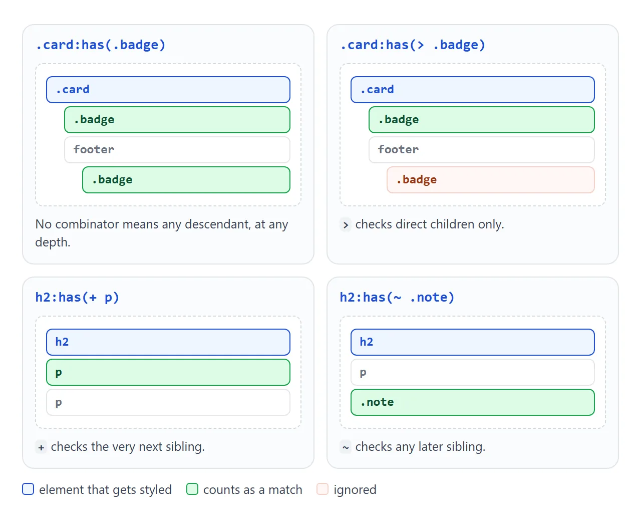
| Inside the brackets | Looks at | Example |
|---|---|---|
Nothing (:has(img)) |
Any descendant, at any depth | .card:has(img) |
> |
Direct children only | .card:has(> .badge) |
+ |
The very next sibling | h2:has(+ p) |
~ |
Any later sibling | h2:has(~ .note) |
Sibling look-ahead is the part many people miss.
Before :has(), CSS could style an element that comes after another one, but never the one before. Now li:has(+ li) matches every item that has another item after it, which is every item except the last.
/* a divider under each item, but not under the last one */
li:has(+ li) { border-bottom: 1px solid #e1e4ea; }

/* tighten the gap when a heading is followed straight by a paragraph */
h2:has(+ p) { margin-bottom: 4px; }
Form states without JavaScript
A form is where :has() pays off first. The fieldset, the label and the button can all react to the state of the inputs inside them.
<!doctype html>
<html lang="en">
<head>
<meta charset="utf-8">
<meta name="viewport" content="width=device-width, initial-scale=1">
<title>Form states with :has()</title>
<style>
  body { margin: 0; padding: 14px; font-family: system-ui, sans-serif; background: #f4f5f7; color: #1d2330; }
  form { max-width: 460px; }
  fieldset {
    border: 2px solid #e1e4ea; border-left-width: 6px; border-radius: 10px;
    background: #fff; margin: 0 0 10px; padding: 8px 14px 12px;
  }
  legend { font-weight: 700; padding: 0 4px; }
  input[type="email"], input[type="text"] {
    width: 100%; box-sizing: border-box; font: inherit; padding: 8px 10px;
    border: 1px solid #c9ced6; border-radius: 8px;
  }

  /* 1. A fieldset turns green when everything in it is valid,
        and orange once the user has left a field in a bad state */
  fieldset:not(:has(:invalid)) { border-color: #86d19c; }
  fieldset:has(:user-invalid) { border-color: #f59e0b; }

  /* 2. The chosen plan's label lights up */
  .plans { display: flex; gap: 8px; flex-wrap: wrap; }
  .plans label { flex: 1; min-width: 110px; border: 2px solid #e1e4ea; border-radius: 8px; padding: 8px; cursor: pointer; }
  .plans label:has(input:checked) { border-color: #2563eb; background: #eff6ff; }

  /* 3. Show the extra field only when its checkbox is ticked */
  .extra { display: none; margin-top: 8px; }
  form:has(#invoice:checked) .extra { display: block; }

  /* 4. The submit button looks inactive while anything is invalid */
  button { font: inherit; font-weight: 700; padding: 10px 18px; border: 0; border-radius: 8px; background: #16a34a; color: #fff; cursor: pointer; }
  form:has(:invalid) button { background: #9ca3af; }

  .hint { font-size: 13px; color: #5b6472; margin: 6px 0 0; }
  pre { background: #1d2330; color: #d1fae5; padding: 10px; border-radius: 8px; font-size: 13px; white-space: pre-wrap; min-height: 18px; }
</style>
</head>
<body>
<form id="form" novalidate>
  <fieldset>
    <legend>Contact</legend>
    <input type="email" name="email" placeholder="you@example.com" required>
    <p class="hint">Type an email, then click away.</p>
  </fieldset>

  <fieldset>
    <legend>Plan</legend>
    <div class="plans">
      <label><input type="radio" name="plan" value="basic" required> Basic</label>
      <label><input type="radio" name="plan" value="team"> Team</label>
    </div>
  </fieldset>

  <fieldset>
    <legend>Billing</legend>
    <label><input type="checkbox" id="invoice" name="invoice"> I need an invoice</label>
    <div class="extra">
      <input type="text" name="company" placeholder="Company name">
    </div>
  </fieldset>

  <button>Send</button>
</form>
<pre id="out">Nothing sent yet.</pre>

<script>
  // The styling above has no JavaScript. This only shows what would be sent.
  const form = document.getElementById('form');
  form.addEventListener('submit', (e) => {
    e.preventDefault();
    if (!form.checkValidity()) {
      document.getElementById('out').textContent = 'Not sent: a field is still invalid.';
      return;
    }
    const data = [...new FormData(form)].map(([k, v]) => k + ': ' + v).join('\n');
    document.getElementById('out').textContent = data;
  });
</script>
</body>
</html>
fieldset:not(:has(:invalid)) { border-color: #86d19c; }   /* all valid: green */
fieldset:has(:user-invalid)  { border-color: #f59e0b; }   /* touched and wrong: orange */
.plans label:has(input:checked) { background: #eff6ff; }  /* chosen option */
form:has(#invoice:checked) .extra { display: block; }     /* reveal a field */
form:has(:invalid) button { background: #9ca3af; }        /* looks inactive */
:invalidvs:user-invalid. A required field that is empty is:invalidas soon as the page loads.:user-invalidonly matches after the user has changed the field, so the form does not start out orange. Chromium supports it; check support in other browsers.- The grey button is only a look. It can still be clicked. The browser's own checks, or your submit handler, still decide whether the form is sent. HTML form validation covers those attributes and messages.
- Do not make the hidden field required. A required field hidden with
display: nonestill blocks the form, and the browser has nowhere to show its message. Leave it optional, or addrequiredwith a script when it appears.
For more on the checkbox itself, see checkbox HTML. The star rating guide uses the same label:has(input:checked) idea to light up stars.
Styling the whole page from one state
:has() also works on html or body, so a state deep in the page can restyle everything. The classic case is locking the scroll while a dialog is open:
html:has(dialog[open]) { overflow: hidden; }
We checked it in Chromium: the page stops scrolling while the dialog is open and scrolls again after it closes. No script has to add and remove a class. Our modal guide and lightbox guide show the dialog side.
The same trick powers a theme switch: html:has(#dark:checked) swaps a set of CSS variables when a checkbox is ticked. The finished example below uses it.
Quantity queries: style by how many items there are
:nth-child(6) only exists if there are at least six children. Put it inside :has() and the parent can ask "do I have six or more?"
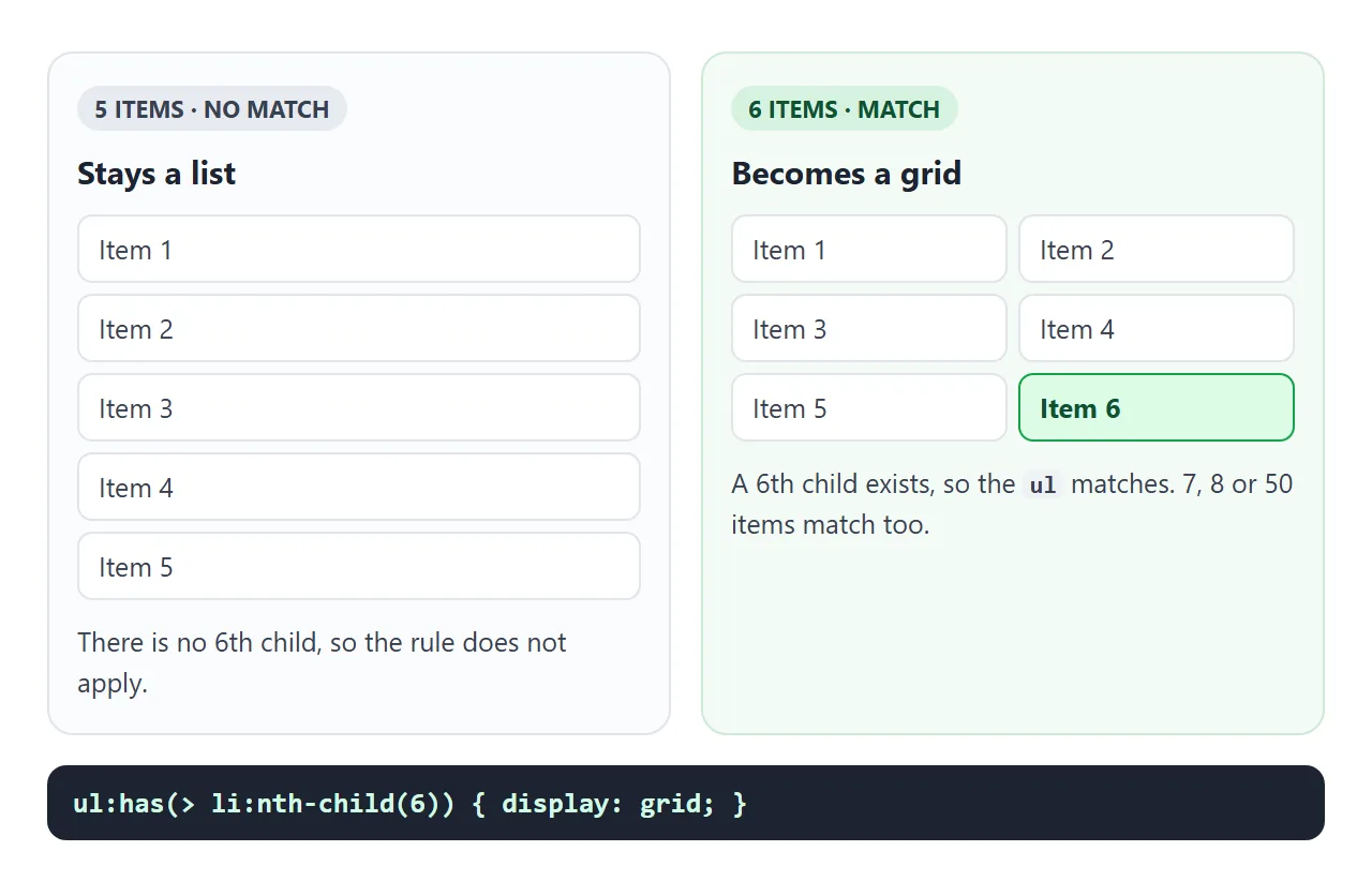
ul:has(> li:nth-child(6)) { display: grid; }         /* 6 or more */
ul:has(> li:nth-child(3)):not(:has(> li:nth-child(4))) { color: teal; } /* exactly 3 */
Keep the >. Without it, a nested list with six items would switch the outer list too.
A finished example: a to-do list
This list uses four :has() rules. The script only adds and removes items; every change you see comes from CSS.
<!doctype html>
<html lang="en">
<head>
<meta charset="utf-8">
<meta name="viewport" content="width=device-width, initial-scale=1">
<title>To-do list styled with :has()</title>
<style>
:root { --bg: #f4f5f7; --card: #fff; --text: #1d2330; --muted: #5b6472; --line: #e1e4ea; --accent: #2563eb; }
/* Theme switch: the page reacts to a checkbox anywhere inside it */
html:has(#dark:checked) { --bg: #14171f; --card: #1f2430; --text: #e8ebf1; --muted: #9aa3b2; --line: #333a48; --accent: #7aa7ff; }
body { margin: 0; padding: 14px; font-family: system-ui, sans-serif; background: var(--bg); color: var(--text); }
.top { display: flex; justify-content: space-between; align-items: center; gap: 10px; margin-bottom: 10px; }
h2 { margin: 0; font-size: 18px; }
.theme { font-size: 14px; color: var(--muted); }
form { display: flex; gap: 8px; margin-bottom: 12px; }
form input { flex: 1; min-width: 0; font: inherit; padding: 9px 10px; border: 1px solid var(--line); border-radius: 8px; background: var(--card); color: var(--text); }
form button { font: inherit; font-weight: 700; padding: 9px 14px; border: 0; border-radius: 8px; background: var(--accent); color: #fff; cursor: pointer; }
ul { list-style: none; margin: 0; padding: 0; display: flex; flex-direction: column; gap: 6px; }
/* Quantity query: 6 or more items switch the list to a grid */
ul:has(> li:nth-child(6)) { display: grid; grid-template-columns: repeat(auto-fill, minmax(140px, 1fr)); }
li { display: flex; align-items: center; gap: 8px; padding: 9px 10px; background: var(--card); border: 1px solid var(--line); border-radius: 8px; }
li label { flex: 1; display: flex; gap: 8px; align-items: center; cursor: pointer; overflow-wrap: anywhere; }
/* A ticked item is crossed out */
li:has(input:checked) label { text-decoration: line-through; color: var(--muted); }
li button { border: 0; background: none; color: var(--muted); font-size: 18px; cursor: pointer; line-height: 1; }
/* Empty state: shown only while the list has no items */
.empty { display: none; padding: 26px 10px; text-align: center; color: var(--muted); border: 2px dashed var(--line); border-radius: 10px; }
main:not(:has(li)) .empty { display: block; }
.note { font-size: 13px; color: var(--muted); margin-top: 10px; }
</style>
</head>
<body>
<main>
<div class="top">
<h2>To do</h2>
<label class="theme"><input type="checkbox" id="dark"> Dark theme</label>
</div>
<form id="add">
<input id="text" placeholder="Add a task" aria-label="New task">
<button>Add</button>
</form>
<ul id="list"></ul>
<p class="empty">Nothing to do. Add a task above.</p>
<p class="note">Add a 6th task and the list becomes a grid. Remove them all to see the empty state.</p>
</main>
<script>
// JavaScript only adds and removes items. Every layout change is CSS :has().
const list = document.getElementById('list');
const text = document.getElementById('text');
function addTask(name) {
const li = document.createElement('li');
li.innerHTML = '<label><input type="checkbox"> <span></span></label><button aria-label="Remove">×</button>';
li.querySelector('span').textContent = name;
li.querySelector('button').addEventListener('click', () => li.remove());
list.append(li);
}
document.getElementById('add').addEventListener('submit', (e) => {
e.preventDefault();
if (text.value.trim()) addTask(text.value.trim());
text.value = '';
text.focus();
});
['Write the brief', 'Review the copy', 'Book the room', 'Send the invoice'].forEach(addTask);
</script>
</body>
</html>
- Grid from six items:
ul:has(> li:nth-child(6)). - Crossed out when done:
li:has(input:checked) label. - Empty state:
main:not(:has(li)) .emptyshows the message only when no item is left. - Theme:
html:has(#dark:checked)changes the colour variables. The dark mode CSS guide covers following the system setting instead.
Specificity: :has() counts its heaviest argument
:has() adds no weight of its own. It takes the specificity of the most specific selector in its brackets, the same as :is() and :not(). An id inside it makes the whole rule as heavy as an id selector.
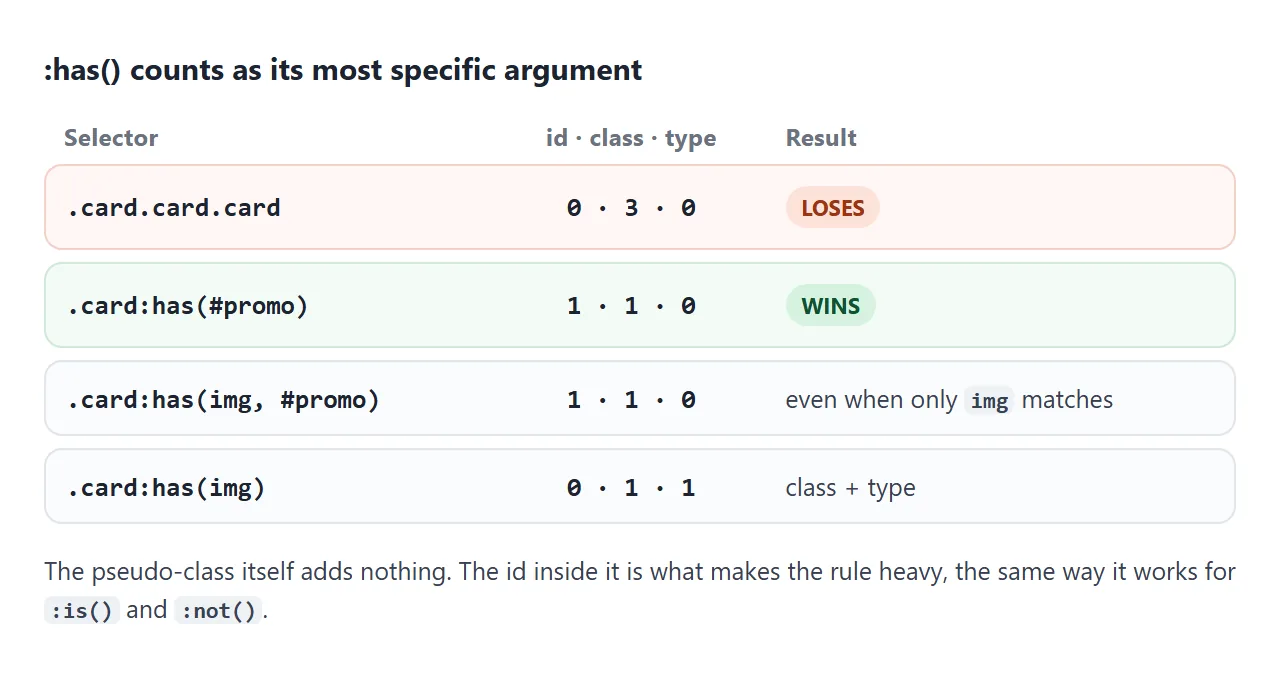
If a :has() rule wins when you did not expect it, look for an id in the brackets. id vs class explains how the weights add up.
A fallback for browsers without :has()
A browser that does not understand a selector drops the whole rule. Write the default first, then add the :has() version inside @supports:
.extra { display: block; }              /* everyone sees the field */

@supports selector(:has(a)) {
  .extra { display: none; }
  form:has(#invoice:checked) .extra { display: block; }
}
Also keep :has() out of a selector list you share with other selectors. a, b:has(c) in a browser without support drops the rule for a too.
When it does not work
| What you see | Cause | Fix |
|---|---|---|
| No effect at all in one browser | The browser does not support :has() and dropped the rule |
Check support; add an @supports selector(:has(a)) fallback |
| The whole rule is ignored | :has() nested inside :has(), or a pseudo-element such as ::before inside it |
Chain instead: .a:has(.b):has(.c) |
| One bad selector in the brackets kills the rule | A selector list inside :has() is dropped entirely if one item is invalid |
Fix or remove the invalid item |
A :has() rule beats a rule you thought was stronger |
It takes the specificity of its heaviest argument, such as an id | Remove the id from the brackets or use a class |
| The outer list changes too | :has(li:nth-child(6)) also sees nested lists |
Add >: :has(> li:nth-child(6)) |
| Fields are marked red or orange before anyone types | :invalid matches empty required fields on load |
Use :user-invalid |
| The page feels sluggish on a huge DOM | A broad rule such as body:has(...) is re-checked on many changes |
Scope the rule to a smaller container |
Share it as a link
:has() examples only make sense when someone can click them. A screenshot of a form cannot be filled in, and an .html attachment may open as plain code on a phone.
To send the working version, paste the page into a NOS document and choose Create share link. HTML to link walks through it.
The page renders as written and its scripts run, so the people you send it to can tick the boxes and switch the theme themselves. If you change the code later, the same link shows the new version.