A star rating in HTML is five radio buttons with the same name, each with a <label> that shows a star. Hide the round radio dots, colour the labels with CSS, and the browser handles one value, keyboard control and form submission for you.
Try it. Hover to preview, click to choose, then tab into it and use the arrow keys.
<!doctype html>
<html lang="en">
<head>
<meta charset="utf-8">
<meta name="viewport" content="width=device-width, initial-scale=1">
<title>CSS-only star rating</title>
<style>
body { margin: 0; padding: 24px; font-family: system-ui, sans-serif; background: #f6f7f9; color: #1d2330; }
fieldset { border: 0; padding: 0; margin: 0; }
legend { font-weight: 600; margin-bottom: 6px; }
/* Radios stay in the page (keyboard + screen readers) but are not drawn */
.rating input, .vh {
position: absolute; width: 1px; height: 1px;
overflow: hidden; clip-path: inset(50%); white-space: nowrap;
}
/* HTML order is 5,4,3,2,1. row-reverse draws it as 1,2,3,4,5 */
.rating { display: inline-flex; flex-direction: row-reverse; }
.rating label {
font-size: 40px; line-height: 1; padding: 0 3px;
color: #cfd4dc; cursor: pointer;
}
/* ~ selects the labels AFTER the checked radio in the HTML,
which are the stars drawn to its LEFT */
.rating:not(:hover) input:checked ~ label,
.rating label:hover,
.rating label:hover ~ label { color: #f5a623; }
/* Show where keyboard focus is */
.rating input:focus-visible + label { outline: 2px solid #2563eb; outline-offset: 2px; border-radius: 4px; }
/* Read out the value with CSS only (:has) */
.out::after { content: "No rating yet"; color: #6b7280; }
fieldset:has(input[value="1"]:checked) .out::after { content: "1 out of 5"; color: inherit; }
fieldset:has(input[value="2"]:checked) .out::after { content: "2 out of 5"; color: inherit; }
fieldset:has(input[value="3"]:checked) .out::after { content: "3 out of 5"; color: inherit; }
fieldset:has(input[value="4"]:checked) .out::after { content: "4 out of 5"; color: inherit; }
fieldset:has(input[value="5"]:checked) .out::after { content: "5 out of 5"; color: inherit; }
.out { margin-top: 8px; font-size: 18px; }
small { display: block; margin-top: 14px; color: #6b7280; line-height: 1.5; }
</style>
</head>
<body>
<form>
<fieldset>
<legend>Rate this recipe</legend>
<div class="rating">
<input type="radio" id="s5" name="rating" value="5"><label for="s5"><span aria-hidden="true">★</span><span class="vh">5 stars</span></label>
<input type="radio" id="s4" name="rating" value="4"><label for="s4"><span aria-hidden="true">★</span><span class="vh">4 stars</span></label>
<input type="radio" id="s3" name="rating" value="3"><label for="s3"><span aria-hidden="true">★</span><span class="vh">3 stars</span></label>
<input type="radio" id="s2" name="rating" value="2"><label for="s2"><span aria-hidden="true">★</span><span class="vh">2 stars</span></label>
<input type="radio" id="s1" name="rating" value="1"><label for="s1"><span aria-hidden="true">★</span><span class="vh">1 star</span></label>
</div>
<div class="out"></div>
</fieldset>
</form>
<small>No JavaScript. Hover to preview, click to pick. Then tab in and press the right arrow key: the choice moves left.</small>
</body>
</html>
The rest of this guide explains the trick that makes the hover work, where it goes wrong for keyboard users, and how to build the read-only "4.3 out of 5" display and a half-star version.
Start from radio buttons, not divs
Five divs with click handlers look the same, but they are not a control. A keyboard cannot reach them, a screen reader hears five unnamed stars, and nothing is sent with the form. Radio buttons give you all of that for free:
<fieldset>
<legend>Rate this recipe</legend>
<input type="radio" id="s5" name="rating" value="5">
<label for="s5"><span aria-hidden="true">★</span><span class="vh">5 stars</span></label>
<!-- ...4, 3, 2, 1 the same way -->
</fieldset>
- Same
namemakes them one group, so only one can be checked. valueis what gets submitted:rating=3.- The label makes the star clickable and gives the radio its spoken name. How labels connect to inputs covers
forandidin detail. <fieldset>and<legend>name the whole group, so a screen reader says "Rate this recipe" before the stars. See the fieldset guide.
The star character sits in an aria-hidden span, and the words "5 stars" sit in a visually hidden span. Sighted users see the star, and screen readers hear the words instead of "black star".
Hide the radios with a visually hidden class, not display: none. An element with display: none leaves the keyboard order and the accessibility tree, so the rating would work only with a mouse.
.rating input {
  position: absolute; width: 1px; height: 1px;
  overflow: hidden; clip-path: inset(50%); white-space: nowrap;
}
The row-reverse and ~ sibling trick
CSS has a selector for "every sibling after this one", ~, and no selector for "every sibling before". A star rating needs the stars before the hovered one. The classic trick is to write the stars backwards in the HTML and draw them forwards.
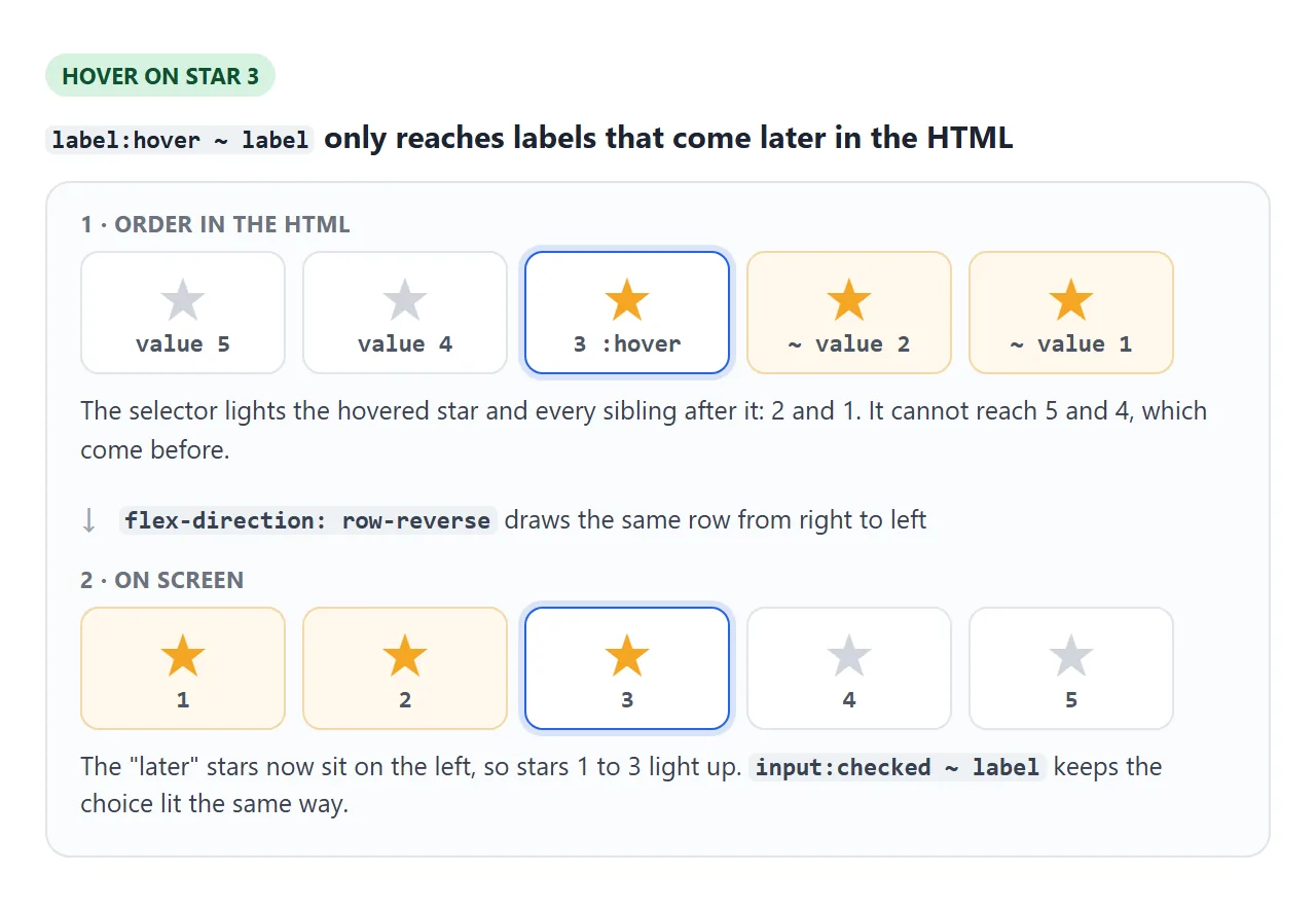
.rating { display: inline-flex; flex-direction: row-reverse; }

.rating:not(:hover) input:checked ~ label,
.rating label:hover,
.rating label:hover ~ label { color: #f5a623; }
label:hover ~ labellights every label after the hovered one in the HTML. On screen those are the stars to its left.input:checked ~ labeldoes the same for the chosen star, so the choice stays lit after the mouse leaves..rating:not(:hover)switches the kept choice off while the mouse is over the stars, so a lower hover preview is not mixed with a higher choice.
Keep the stars touching (padding inside the labels, no gap). If the pointer rests in a gap, no label is hovered and the preview flickers off.
The catch: keyboard and reading order run backwards
row-reverse changes only what is drawn. Keyboard focus and screen readers still follow the HTML, which now runs 5, 4, 3, 2, 1.
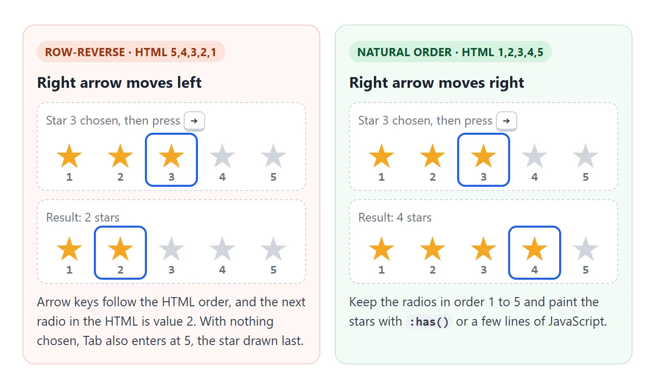
- Arrow keys: from star 3, the right arrow picks 2. You can check this in the first example.
- Tab: with nothing chosen, Tab stops on the first radio in the HTML, which is value 5, drawn at the far right.
- Screen readers list the options from 5 down to 1.
None of this breaks the rating, but it is confusing for anyone using a keyboard. There are two ways to keep the HTML in order 1 to 5.
CSS with :has(). :has() can look at later siblings, so you can colour every star and then turn off the ones after the hovered or checked star:
.rating:not(:hover):has(input:checked) label,
.rating:has(label:hover) label { color: #f5a623; }

.rating:not(:hover) input:checked + label ~ label,
.rating label:hover ~ label { color: #cfd4dc; }
A few lines of JavaScript. Listen for pointerover and change on the group, read the value, and paint the stars. The finished example below does this, which also makes half stars easy.
A read-only rating with partial fill
A product page usually shows an average, such as 4.3, not a control. There is nothing to choose, so no radios. Draw five grey stars, lay five gold stars on top, and cut the gold layer to the right width.
<!doctype html>
<html lang="en">
<head>
<meta charset="utf-8">
<meta name="viewport" content="width=device-width, initial-scale=1">
<title>Read-only star rating with partial fill</title>
<style>
body { margin: 0; padding: 20px; font-family: system-ui, sans-serif; background: #f6f7f9; color: #1d2330; }
h3 { font-size: 14px; margin: 0 0 8px; color: #4b5563; }
.row { display: flex; align-items: center; gap: 10px; margin: 6px 0; font-size: 15px; }
/* Two layers of the same five stars: grey underneath, gold on top.
Each star is one small SVG (a data: URI) repeated across 120px.
The gold layer is cut to --rating / 5 of the full width. */
.stars {
position: relative; display: inline-block; width: 120px; height: 24px;
background: url("data:image/svg+xml,%3Csvg xmlns='http://www.w3.org/2000/svg' viewBox='0 0 24 24'%3E%3Cpath fill='%23d7dbe2' d='M12 1.5l3.1 6.6 7.2.9-5.3 5 1.4 7.1L12 17.6 5.6 21.1 7 14 1.7 9l7.2-.9z'/%3E%3C/svg%3E") 0 0 / 24px 24px repeat-x;
}
.stars::after {
content: ""; position: absolute; inset: 0 auto 0 0;
width: calc(var(--rating) / 5 * 100%);
background: url("data:image/svg+xml,%3Csvg xmlns='http://www.w3.org/2000/svg' viewBox='0 0 24 24'%3E%3Cpath fill='%23f5a623' d='M12 1.5l3.1 6.6 7.2.9-5.3 5 1.4 7.1L12 17.6 5.6 21.1 7 14 1.7 9l7.2-.9z'/%3E%3C/svg%3E") 0 0 / 24px 24px repeat-x;
}
/* The same idea with the ★ character, for comparison */
.chars { position: relative; display: inline-block; font-size: 24px; line-height: 1; color: #d7dbe2; }
.chars::before { content: "\2605\2605\2605\2605\2605"; }
.chars::after {
content: "\2605\2605\2605\2605\2605"; color: #f5a623;
position: absolute; left: 0; top: 0; overflow: hidden; white-space: nowrap;
width: calc(var(--rating) / 5 * 100%);
}
.num { font-variant-numeric: tabular-nums; }
.count { color: #6b7280; }
hr { border: 0; border-top: 1px solid #e1e4ea; margin: 14px 0; }
input[type=range] { width: 160px; }
</style>
</head>
<body>
<h3>SVG stars, gold layer width set from --rating</h3>
<div class="row"><span class="stars" style="--rating: 4.3" role="img" aria-label="Rated 4.3 out of 5"></span><b class="num">4.3</b><span class="count">(128 reviews)</span></div>
<div class="row"><span class="stars" style="--rating: 3.5" role="img" aria-label="Rated 3.5 out of 5"></span><b class="num">3.5</b><span class="count">(41 reviews)</span></div>
<div class="row"><span class="stars" style="--rating: 2.8" role="img" aria-label="Rated 2.8 out of 5"></span><b class="num">2.8</b><span class="count">(9 reviews)</span></div>
<div class="row"><span class="stars" style="--rating: 5" role="img" aria-label="Rated 5 out of 5"></span><b class="num">5.0</b><span class="count">(3 reviews)</span></div>
<hr>
<h3>Try any value</h3>
<div class="row">
<input type="range" id="pick" min="0" max="5" step="0.1" value="4.3" aria-label="Rating to show">
<span class="stars" id="live" style="--rating: 4.3" role="img" aria-label="Rated 4.3 out of 5"></span>
<b class="num" id="liveNum">4.3</b>
</div>
<div class="row">
<span class="chars" id="liveChars" style="--rating: 4.3" role="img" aria-label="Rated 4.3 out of 5"></span>
<span class="count">same value with ★ characters</span>
</div>
<script>
// The slider only changes one CSS variable and the accessible text
const pick = document.getElementById('pick');
pick.addEventListener('input', () => {
const v = Number(pick.value).toFixed(1);
for (const id of ['live', 'liveChars']) {
const el = document.getElementById(id);
el.style.setProperty('--rating', v);
el.setAttribute('aria-label', `Rated ${v} out of 5`);
}
document.getElementById('liveNum').textContent = v;
});
</script>
</body>
</html>
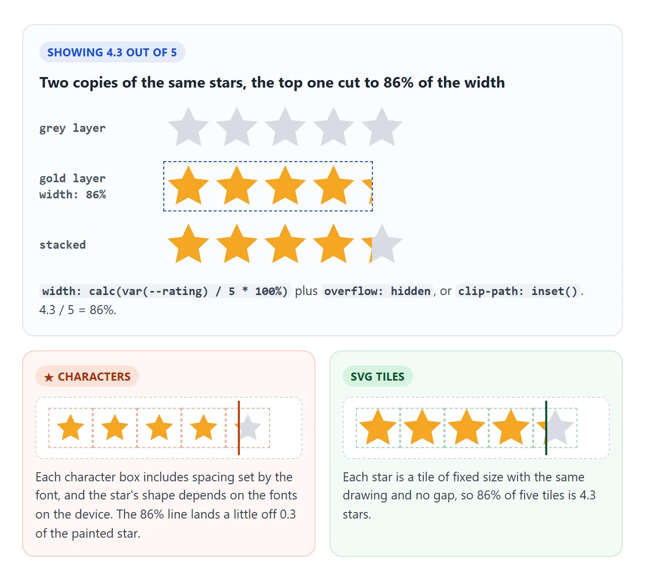
The width comes from one CSS variable:
<span class="stars" style="--rating: 4.3"
      role="img" aria-label="Rated 4.3 out of 5"></span>
.stars::after { width: calc(var(--rating) / 5 * 100%); overflow: hidden; }
Screen readers cannot read a width. role="img" with aria-label="Rated 4.3 out of 5" turns the stars into one image with a spoken name.
aria-label explains when that attribute is the right tool. If the number already sits next to the stars as text, you can hide the stars with aria-hidden="true" and write "4.3 out of 5" in the text instead.
Use SVG stars for partial fills. A ★ character is drawn by whatever font the device has, and each character box includes spacing around the glyph.
A cut at 86% of the text then lands a little off 0.3 of the last painted star. SVG stars of a fixed size, with no gap between them, line up exactly.
Half stars, hover preview and a live average
The finished widget asks for a rating in half steps and keeps a running average. It uses ten radios in natural order, 0.5 to 5, and a few lines of JavaScript to paint.
<!doctype html>
<html lang="en">
<head>
<meta charset="utf-8">
<meta name="viewport" content="width=device-width, initial-scale=1">
<title>Product review widget with half stars</title>
<style>
  body { margin: 0; padding: 18px; font-family: system-ui, sans-serif; background: #f6f7f9; color: #1d2330; }
  .card { max-width: 460px; background: #fff; border-radius: 14px; padding: 16px 18px; box-shadow: 0 4px 16px rgba(0,0,0,.08); }
  .vh { position: absolute; width: 1px; height: 1px; overflow: hidden; clip-path: inset(50%); white-space: nowrap; }

  /* Summary: average + partial stars */
  .summary { display: flex; align-items: center; gap: 12px; }
  .avg { font-size: 34px; font-weight: 700; }
  .count { color: #6b7280; font-size: 14px; }

  /* One star = grey SVG + gold SVG on top, the gold one clipped */
  .star { position: relative; display: inline-block; width: 30px; height: 30px; }
  .star svg { position: absolute; inset: 0; width: 100%; height: 100%; }
  .star .off { fill: #d7dbe2; }
  .star .on { fill: #f5a623; clip-path: inset(0 calc(100% - var(--fill, 0%)) 0 0); }
  .small .star { width: 18px; height: 18px; }

  /* Input: 10 radios, visually hidden. Each star has two label halves on top */
  fieldset { border: 0; padding: 0; margin: 16px 0 0; }
  legend { font-weight: 600; padding: 0; margin-bottom: 6px; }
  .pick { position: relative; display: inline-flex; border-radius: 6px; }
  .pick .star { width: 40px; height: 40px; margin-right: 4px; }
  .halves { position: absolute; inset: 0; display: flex; }
  .halves label { flex: 1; cursor: pointer; }
  .pick:has(input:focus-visible) { outline: 2px solid #2563eb; outline-offset: 4px; }
  .picked { display: block; margin-top: 4px; font-size: 15px; color: #4b5563; }

  textarea { width: 100%; box-sizing: border-box; margin-top: 10px; font: inherit; padding: 8px; border: 1px solid #d5d9e0; border-radius: 8px; resize: vertical; }
  button { margin-top: 8px; font: inherit; font-weight: 600; padding: 8px 16px; border: 0; border-radius: 8px; background: #1d2330; color: #fff; cursor: pointer; }
  .msg { font-size: 14px; color: #0f5132; margin-left: 8px; }
  ul { list-style: none; padding: 0; margin: 14px 0 0; border-top: 1px solid #eef0f3; }
  li { padding: 8px 0; border-bottom: 1px solid #eef0f3; font-size: 14px; display: flex; gap: 8px; align-items: center; }
</style>
</head>
<body>
<div class="card">
  <div class="summary">
    <span class="avg" id="avg">0.0</span>
    <div>
      <span class="stars" id="avgStars" role="img" aria-label=""></span>
      <div class="count" id="count"></div>
    </div>
  </div>

  <form id="form">
    <fieldset>
      <legend>Your rating</legend>
      <div class="pick" id="pick"></div>
      <span class="picked" id="picked" aria-hidden="true">Pick 0.5 to 5</span>
    </fieldset>
    <label class="vh" for="comment">Comment</label>
    <textarea id="comment" name="comment" rows="2" placeholder="What did you think? (optional)"></textarea>
    <button type="submit">Submit review</button><span class="msg" id="msg" role="status"></span>
  </form>
  <ul id="list"></ul>
</div>

<script>
  const STAR = '<path d="M12 1.5l3.1 6.6 7.2.9-5.3 5 1.4 7.1L12 17.6 5.6 21.1 7 14 1.7 9l7.2-.9z"/>';

  // Build one star. Its gold layer is clipped by --fill (0%, 50% or 100%, or anything between)
  function star() {
    const s = document.createElement('span');
    s.className = 'star';
    s.setAttribute('aria-hidden', 'true');
    s.innerHTML = `<svg class="off" viewBox="0 0 24 24">${STAR}</svg><svg class="on" viewBox="0 0 24 24">${STAR}</svg>`;
    return s;
  }

  // Fill five stars to show any value from 0 to 5
  function paint(stars, value) {
    stars.forEach((s, i) => {
      const part = Math.min(Math.max(value - i, 0), 1);  // 0..1 for this star
      s.style.setProperty('--fill', part * 100 + '%');
    });
  }

  // Input: 10 radios in natural order (0.5 first), so arrow keys go the right way
  const pick = document.getElementById('pick');
  const pickStars = [];
  for (let i = 1; i <= 5; i++) {
    const s = star();
    const halves = document.createElement('span');
    halves.className = 'halves';
    for (const v of [i - 0.5, i]) {
      const id = 'r' + v * 10;
      pick.insertAdjacentHTML('beforeend',
        `<input class="vh" type="radio" name="rating" id="${id}" value="${v}" required>`);
      halves.insertAdjacentHTML('beforeend',
        `<label for="${id}" data-v="${v}"><span class="vh">${v} stars</span></label>`);
    }
    s.append(halves);
    pick.append(s);
    pickStars.push(s);
  }

  const picked = document.getElementById('picked');
  const checkedValue = () => Number(document.querySelector('input[name=rating]:checked')?.value || 0);
  function show(v) {
    paint(pickStars, v);
    picked.textContent = v ? v + ' out of 5' : 'Pick 0.5 to 5';
  }

  // Hover preview, then fall back to the chosen value
  pick.addEventListener('pointerover', (e) => {
    const label = e.target.closest('label');
    if (label) show(Number(label.dataset.v));
  });
  pick.addEventListener('pointerleave', () => show(checkedValue()));
  // Mouse click, arrow keys and touch all end up as a change event
  pick.addEventListener('change', () => show(checkedValue()));

  // Reviews live in memory only
  const reviews = [
    { rating: 5, comment: 'Exactly as described.' },
    { rating: 4, comment: 'Good, shipping was slow.' },
    { rating: 3.5, comment: '' },
  ];
  const avgStars = [];
  const avgBox = document.getElementById('avgStars');
  for (let i = 0; i < 5; i++) { const s = star(); avgStars.push(s); avgBox.append(s); }

  function render() {
    const avg = reviews.reduce((sum, r) => sum + r.rating, 0) / reviews.length;
    const text = avg.toFixed(1);
    document.getElementById('avg').textContent = text;
    paint(avgStars, avg);
    avgBox.setAttribute('aria-label', `Average ${text} out of 5`);
    document.getElementById('count').textContent = reviews.length + ' reviews';

    const list = document.getElementById('list');
    list.innerHTML = '';
    reviews.slice().reverse().forEach((r) => {
      const li = document.createElement('li');
      const box = document.createElement('span');
      box.className = 'small';
      box.setAttribute('role', 'img');
      box.setAttribute('aria-label', r.rating + ' out of 5');
      const ss = [0, 1, 2, 3, 4].map(star);
      box.append(...ss);
      paint(ss, r.rating);
      li.append(box, r.comment || '(no comment)');
      list.append(li);
    });
  }

  // "Submit": read the form like a server would, but keep it on the page
  const form = document.getElementById('form');
  form.addEventListener('submit', (e) => {
    e.preventDefault();
    const data = new FormData(form);
    reviews.push({ rating: Number(data.get('rating')), comment: data.get('comment').trim() });
    document.getElementById('msg').textContent = `Sent rating=${data.get('rating')}`;
    form.reset();
    show(0);
    render();
  });

  render();
</script>
</body>
</html>
- Ten radios, two labels per star. Each star has a left label for x.5 and a right label for the whole number. The labels are invisible halves laid over the star.
- One paint function. For each star,
value - indexclamped to 0 to 1 gives its fill, set as--fill. The gold copy usesclip-path: inset(0 calc(100% - var(--fill)) 0 0). See clip-path for howinset()cuts. - Hover preview.
pointeroveron a label paints its value;pointerleavepaints the checked value again. - Keyboard. Nothing extra: the radios are in order, so the right arrow goes up half a star and the
changeevent repaints. - Required. One radio has
required, so the form will not submit without a rating. - Average. On submit,
new FormData(form).get('rating')reads the value like a server would. The script adds it to the list and repaints the partial-fill summary.
The example stops at preventDefault() so nothing leaves the page. On a real site, let the form post, or send the same data with fetch:
fetch('/reviews', { method: 'POST', body: new FormData(form) });
CSS only or JavaScript?
| CSS only (row-reverse) | CSS :has(), HTML in order |
JavaScript paint | |
|---|---|---|---|
| Works without scripts | Yes | Yes | No |
| Arrow keys match the picture | No, reversed | Yes | Yes |
| Half stars | Awkward | Awkward | Easy |
| Partial display (4.3) | Width or clip, no script | Width or clip, no script | Width or clip |
| Value sent with the form | Yes | Yes | Yes |
For a simple 1 to 5 input, the :has() version keeps everything in order without a script. Reach for JavaScript when you need half stars, a live average, or anything that reacts to the value.
When it does not work
| What you see | Cause | Fix |
|---|---|---|
| Hover lights the stars to the right instead of the left | HTML is 1 to 5 but the CSS uses label:hover ~ label |
Reverse the HTML and add row-reverse, or use the :has() rules |
| The right arrow lowers the rating | row-reverse flips only the drawing, not the keyboard order |
Keep the HTML 1 to 5 and paint with :has() or JavaScript |
| Tab skips the stars | Radios hidden with display: none or visibility: hidden |
Use a visually hidden class |
| Keyboard users cannot tell which star has focus | No focus style on the label | Style input:focus-visible + label |
| Screen readers announce nothing useful for the stars | Stars are divs with onclick |
Use radios with labels in a fieldset |
| 4.3 looks like 4.1 or 4.5 | Partial fill cut across ★ characters, or a gap between stars |
Use fixed-size SVG stars with no gap |
| The rating is missing from the submitted data | Radios have no name, different names, or no value |
One shared name, one value each |
| Two stars can be checked at once | Each radio has a different name |
Give all of them the same name |
Share it as a link
A rating widget is something people want to click, not look at. A screenshot cannot be clicked, and an .html attachment may open as plain code on a phone.
To send the working version, paste the page into a NOS document and choose Create share link. HTML to link walks through it.
The page renders as written and its scripts run, so the people you send it to can hover, pick half stars and submit test reviews themselves. If you change the code later, the same link shows the new version.