A radio button is <input type="radio">. Give several radios the same name and they become one group: checking one unchecks the others, and the form sends the name with the checked radio's value.
<fieldset>
  <legend>Size</legend>
  <label><input type="radio" name="size" value="small"> Small</label>
  <label><input type="radio" name="size" value="medium" checked> Medium</label>
  <label><input type="radio" name="size" value="large"> Large</label>
</fieldset>
Try the difference the name makes. Click radios on both sides, then use the arrow keys on the left.
<!doctype html>
<html lang="en">
<head>
<meta charset="utf-8">
<meta name="viewport" content="width=device-width, initial-scale=1">
<title>Radio groups: same name vs different names</title>
<style>
  body { margin: 0; padding: 14px; font-family: system-ui, sans-serif; background: #f4f5f7; color: #1d2330; }
  .row { display: grid; grid-template-columns: 1fr 1fr; gap: 12px; }
  fieldset { margin: 0; padding: 10px 12px 12px; border: 1px solid #d5d9e0; border-radius: 10px; background: #fff; min-width: 0; }
  legend { padding: 0 4px; font-weight: 700; font-size: 14px; }
  label { display: flex; align-items: center; gap: 8px; padding: 6px 0; font-size: 15px; }
  input { width: 18px; height: 18px; margin: 0; flex: none; accent-color: #2563eb; }
  code { font-size: 12px; background: #eef1f5; border-radius: 4px; padding: 0 3px; }
  .count { margin: 8px 0 0; font-size: 13px; color: #5b6270; }
  .hint { margin: 12px 0 0; font-size: 13px; line-height: 1.45; color: #374151; }
</style>
</head>
<body>
<div class="row">
  <fieldset id="same">
    <legend>Same name</legend>
    <label><input type="radio" name="size" value="s"> Small <code>size</code></label>
    <label><input type="radio" name="size" value="m"> Medium <code>size</code></label>
    <label><input type="radio" name="size" value="l"> Large <code>size</code></label>
    <p class="count">Checked: <b>0</b></p>
  </fieldset>
  <fieldset id="diff">
    <legend>Different names</legend>
    <label><input type="radio" name="size1" value="s"> Small <code>size1</code></label>
    <label><input type="radio" name="size2" value="m"> Medium <code>size2</code></label>
    <label><input type="radio" name="size3" value="l"> Large <code>size3</code></label>
    <p class="count">Checked: <b>0</b></p>
  </fieldset>
</div>
<p class="hint">Click one on the left, then press the arrow keys: the check moves with the focus. Tab leaves the group. On the right, each radio is a group of one, so all three can stay checked.</p>

<script>
  // Count the checked radios in each box after every change
  document.querySelectorAll('fieldset').forEach((box) => {
    box.addEventListener('change', () => {
      box.querySelector('.count b').textContent = box.querySelectorAll('input:checked').length;
    });
  });
</script>
</body>
</html>
The name attribute makes the group
The browser decides which radios belong together only by name, and only among radios in the same form. Radios that are not inside any form are grouped together by name across the page.
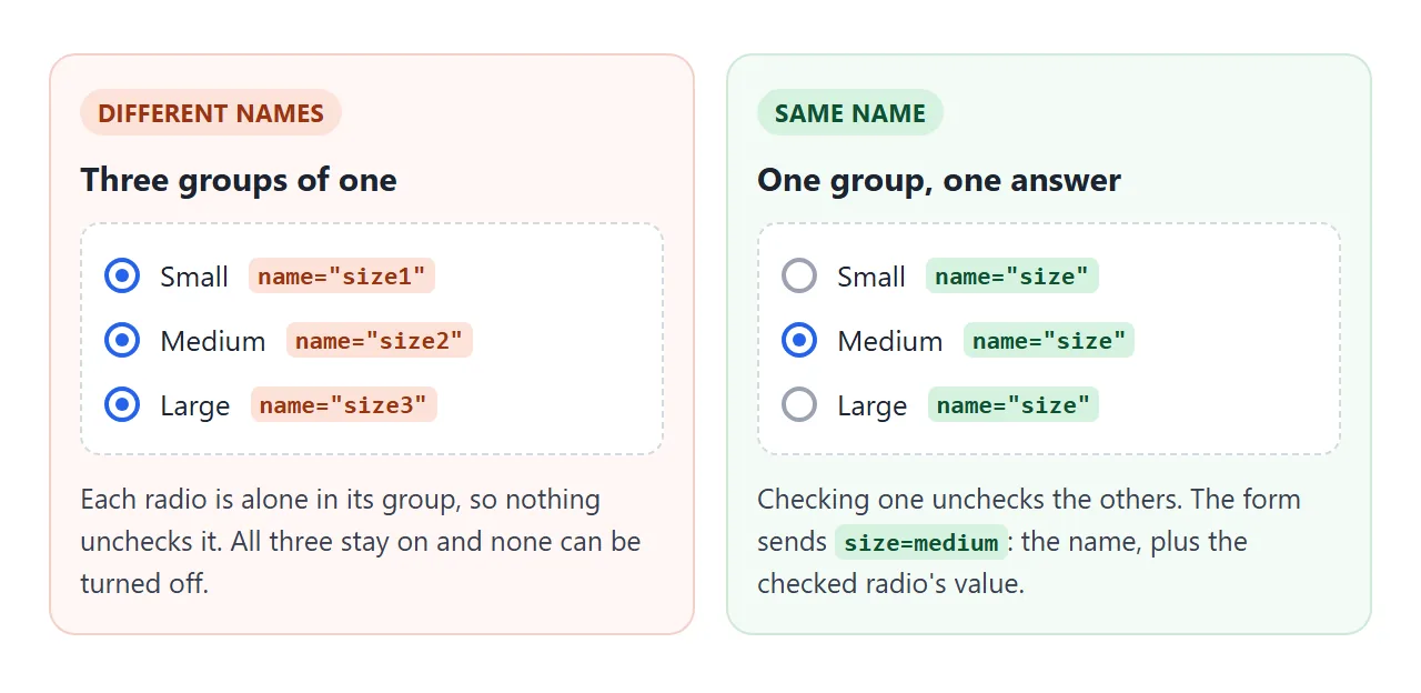
The mistake on the right side of the demo is common when radios are copied and renamed one by one. Each radio becomes a group of one. They all stay checked, and none can be turned off again, because a radio never unchecks itself.
The id does not group anything. It only connects a radio to a <label for> elsewhere in the page.
value, checked and what the form sends
Each radio needs its own value. When the form is submitted, only the checked radio in a group is sent, as name=value. With value="medium" checked, the request carries size=medium.
- No
valueattribute: a checked radio sendssize=on, which does not say which one was picked. - Nothing checked: the group sends nothing at all. The name is missing from the request, not empty.
checkedattribute: sets the default. It is also what a reset button returns to.
To stop a form going out with no answer, add required to one radio of the group. That makes the whole group required, and checking any radio in it satisfies the rule. Putting required on every radio does the same thing and is harmless.
The form submit guide covers what happens after the button is pressed.
Keyboard: Tab enters, arrows choose
A radio group is one stop in the Tab order, not three. Measured in Chromium:
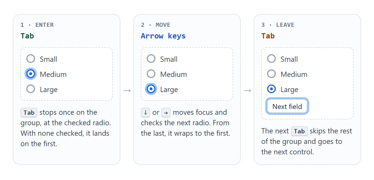
- Tab stops on the checked radio. When none is checked, it stops on the first one.
- Arrow keys move focus to the next or previous radio and check it at the same time. They wrap from the last radio to the first.
- Space checks the focused radio when none in the group is checked yet.
- Tab again leaves the group for the next control.
This behaviour only exists when the radios share a name. Radios with different names are separate Tab stops, and the arrow keys do not move between them.
Label every radio and ask the question in a legend
A radio on its own is an 18-pixel target. Wrap it in a <label>, or connect the two with for and id, and the text becomes clickable too. The label guide has both patterns.
The labels say "Small", "Medium" and "Large", but not the question. Put the group in a <fieldset> with a <legend> such as "Size", and assistive technology announces the question when focus enters the group. Fieldset and legend goes into the details and the CSS.
Get the checked radio value in JavaScript
There are three common ways to read a group. They differ only in what they return when nothing is checked.
<!doctype html>
<html lang="en">
<head>
<meta charset="utf-8">
<meta name="viewport" content="width=device-width, initial-scale=1">
<title>Read the checked radio value</title>
<style>
  body { margin: 0; padding: 14px; font-family: system-ui, sans-serif; background: #f4f5f7; color: #1d2330; }
  fieldset { margin: 0; padding: 10px 12px 12px; border: 1px solid #d5d9e0; border-radius: 10px; background: #fff; }
  legend { padding: 0 4px; font-weight: 700; font-size: 14px; }
  .opts { display: flex; flex-wrap: wrap; gap: 6px 18px; }
  label { display: flex; align-items: center; gap: 7px; font-size: 15px; }
  input { width: 18px; height: 18px; margin: 0; accent-color: #2563eb; }
  button { margin-top: 10px; font: inherit; font-size: 13px; padding: 5px 12px; border: 1px solid #c9cdd4; border-radius: 7px; background: #fff; cursor: pointer; }
  table { width: 100%; margin-top: 12px; border-collapse: collapse; background: #fff; border-radius: 10px; overflow: hidden; font-size: 13px; }
  td { padding: 8px 10px; border-top: 1px solid #eef0f3; vertical-align: top; }
  tr:first-child td { border-top: 0; }
  td:first-child { font-family: ui-monospace, Consolas, monospace; font-size: 12px; color: #374151; word-break: break-all; }
  td:last-child { width: 30%; font-family: ui-monospace, Consolas, monospace; font-weight: 700; color: #0f5132; }
</style>
</head>
<body>
<form id="order">
  <fieldset>
    <legend>Size</legend>
    <div class="opts">
      <label><input type="radio" name="size" value="small"> Small</label>
      <label><input type="radio" name="size" value="medium"> Medium</label>
      <label><input type="radio" name="size" value="large"> Large</label>
    </div>
    <button type="button" id="clear">Uncheck all</button>
  </fieldset>
</form>

<table>
  <tr><td>form.querySelector('input[name=size]:checked') then .value</td><td id="a"></td></tr>
  <tr><td>form.elements.size.value</td><td id="b"></td></tr>
  <tr><td>new FormData(form).get('size')</td><td id="c"></td></tr>
</table>

<script>
  const form = document.getElementById('order');

  function show() {
    const picked = form.querySelector('input[name=size]:checked');  // null when none is checked
    document.getElementById('a').textContent = picked ? JSON.stringify(picked.value) : 'null';
    document.getElementById('b').textContent = JSON.stringify(form.elements.size.value);  // a RadioNodeList
    document.getElementById('c').textContent = JSON.stringify(new FormData(form).get('size'));
  }

  form.addEventListener('change', show);

  document.getElementById('clear').addEventListener('click', () => {
    form.querySelectorAll('input[name=size]').forEach((r) => { r.checked = false; });
    show();  // setting .checked from code does not fire "change", so update by hand
  });

  show();
</script>
</body>
</html>
const form = document.querySelector('form');

// 1. Find the checked radio. null if none is checked.
form.querySelector('input[name=size]:checked')?.value;

// 2. RadioNodeList: "" if none is checked.
form.elements.size.value;

// 3. FormData: null if none is checked.
new FormData(form).get('size');
form.elements.size returns a RadioNodeList when several controls share the name. Its value is the checked radio's value, and assigning to it checks the matching radio: form.elements.size.value = 'large'.
To react to a choice, listen for change on the form or the fieldset. It fires once per new choice. It does not fire when code sets .checked, so update the page yourself after changing a radio in script.
The querySelector guide explains the :checked selector.
Styling radio buttons with CSS
For a colour change only, use accent-color. It tints the native radio and keeps its size, focus ring and keyboard behaviour.
input[type=radio] { accent-color: #2563eb; width: 18px; height: 18px; }
For a fully custom look, such as cards or pill buttons, hide the input visually and style the element right after it. The trap is how you hide it.
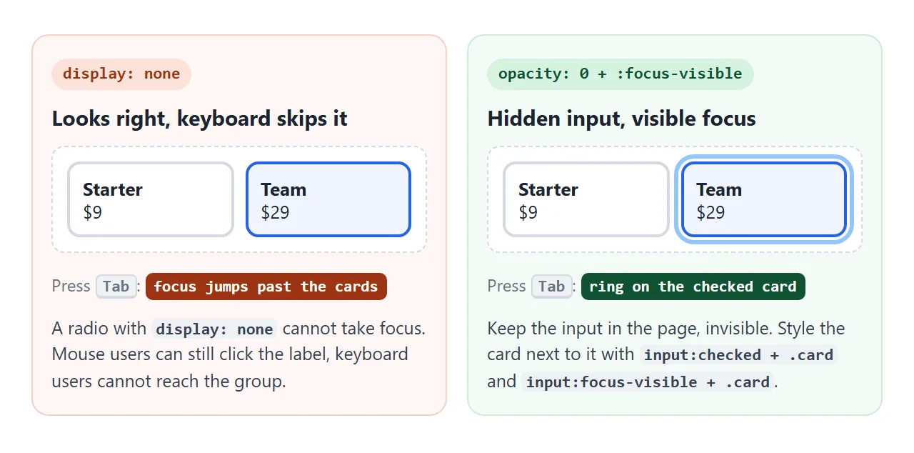
.sr { position: absolute; width: 1px; height: 1px; margin: 0; opacity: 0; }
input:checked + .card { border-color: #2563eb; }
input:focus-visible + .card { outline: 3px solid #93c5fd; }
The same technique drives a CSS toggle switch, which is a checkbox underneath.
A finished example: a plan picker with card radios
Two groups in one form. Billing is a pill-shaped pair with a default, and the plan cards are required with no default. Each card is a whole <label>, so clicking anywhere on it checks the radio.
<!doctype html>
<html lang="en">
<head>
<meta charset="utf-8">
<meta name="viewport" content="width=device-width, initial-scale=1">
<title>Plan picker with card-style radios</title>
<style>
body { margin: 0; padding: 14px; font-family: system-ui, sans-serif; background: #f4f5f7; color: #1d2330; }
fieldset { margin: 0 0 14px; padding: 0; border: 0; min-width: 0; }
legend { padding: 0; margin-bottom: 8px; font-weight: 700; font-size: 15px; }
label { position: relative; display: block; }
/* Hide the real input but keep it focusable. display: none would drop it from the keyboard. */
.sr { position: absolute; width: 1px; height: 1px; margin: 0; opacity: 0; }
.cards { display: grid; grid-template-columns: repeat(auto-fit, minmax(150px, 1fr)); gap: 10px; }
.card { display: block; height: 100%; box-sizing: border-box; padding: 12px 14px; border: 2px solid #d5d9e0; border-radius: 12px; background: #fff; cursor: pointer; }
.card b { display: block; font-size: 15px; }
.card .price { display: block; margin: 4px 0 6px; font-size: 20px; font-weight: 700; }
.card small { color: #5b6270; font-size: 13px; line-height: 1.4; }
input:checked + .card { border-color: #2563eb; background: #eff5ff; }
input:focus-visible + .card { outline: 3px solid #93c5fd; outline-offset: 2px; } /* keyboard focus ring */
.seg { display: inline-flex; border: 1px solid #c9cdd4; border-radius: 99px; background: #fff; padding: 3px; }
.seg span { display: block; padding: 6px 16px; border-radius: 99px; font-size: 14px; cursor: pointer; }
.seg input:checked + span { background: #1d2330; color: #fff; }
.seg input:focus-visible + span { outline: 3px solid #93c5fd; }
.summary { padding: 12px 14px; border-radius: 12px; background: #1d2330; color: #fff; font-size: 14px; line-height: 1.5; }
.summary strong { font-size: 18px; text-transform: capitalize; }
button { margin-top: 10px; width: 100%; padding: 10px; font: inherit; font-weight: 700; border: 0; border-radius: 9px; background: #2563eb; color: #fff; cursor: pointer; }
pre { margin: 8px 0 0; font-size: 12px; color: #a7f3d0; white-space: pre-wrap; word-break: break-all; }
</style>
</head>
<body>
<form id="plan">
<fieldset>
<legend>Billing</legend>
<div class="seg">
<label><input class="sr" type="radio" name="billing" value="monthly" checked><span>Monthly</span></label>
<label><input class="sr" type="radio" name="billing" value="yearly"><span>Yearly</span></label>
</div>
</fieldset>
<fieldset>
<legend>Choose a plan</legend>
<div class="cards">
<label><input class="sr" type="radio" name="plan" value="starter" data-price="9" required>
<span class="card"><b>Starter</b><span class="price">$9</span><small>1 project, email support</small></span></label>
<label><input class="sr" type="radio" name="plan" value="team" data-price="29">
<span class="card"><b>Team</b><span class="price">$29</span><small>10 projects, shared folders</small></span></label>
<label><input class="sr" type="radio" name="plan" value="business" data-price="79">
<span class="card"><b>Business</b><span class="price">$79</span><small>Unlimited projects, priority help</small></span></label>
</div>
</fieldset>
<div class="summary">
<div id="line">No plan chosen yet.</div>
<button type="submit">Continue</button>
<pre id="sent"></pre>
</div>
</form>
<script>
const form = document.getElementById('plan');
function update() {
const plan = form.querySelector('input[name=plan]:checked');
if (!plan) return;
const yearly = form.elements.billing.value === 'yearly';
const price = Number(plan.dataset.price);
const total = yearly ? price * 10 : price; // yearly: pay 10 months, get 12
document.getElementById('line').innerHTML =
'<strong>' + plan.value + '</strong> · $' + total + (yearly ? ' per year (2 months free)' : ' per month');
}
form.addEventListener('change', update);
// Demo only: show what the form would send instead of sending it
form.addEventListener('submit', (e) => {
e.preventDefault();
document.getElementById('sent').textContent =
'Would send: ' + new URLSearchParams(new FormData(form));
});
</script>
</body>
</html>
- Whole card clickable: the label wraps both the hidden input and the card.
- Checked style:
input:checked + .card. - Focus ring:
input:focus-visible + .card, shown for the keyboard and not for mouse clicks. - Summary: one
changelistener on the form reads both groups.
Radio, checkbox or select?
| Control | Choices the user can make | Good for |
|---|---|---|
| Radio buttons | Exactly one, all options visible | Two to about six options worth comparing side by side |
| Checkboxes | Any number, including none | Independent yes/no options, such as extras |
| Select dropdown | Exactly one, options hidden until opened | Long lists, such as countries |
| Single checkbox or switch | On or off | One setting, such as "Email me updates" |
Radios show every option at once, which helps when the options need comparing. A single yes/no question reads better as one checkbox than as two radios.
When it does not work
| What you see | Cause | Fix |
|---|---|---|
| Several radios checked at once | Different name values, or radios in different forms |
Give the set one name inside one form |
| The field is missing from the submitted data | No radio checked and no default | Add checked to a default, or required to one radio |
The server receives size=on |
The radios have no value |
Give each radio its own value |
| A radio cannot be unchecked | That is how radios work | Add a "None" option, or use a checkbox |
| Custom radios cannot be reached with Tab | The input is hidden with display: none |
Hide it with opacity: 0 and style :focus-visible |
| Clicking the text does nothing | The label's for does not match the radio's id |
Match them, or wrap the radio inside the label |
Code sets .checked and nothing updates |
change only fires for user actions |
Call your update function after setting it |
Share it as a link
A form is easier to judge when people can click it. A screenshot of a plan picker cannot be tried, and an .html attachment may open as plain code on a phone.
To send the working version, paste the page into a NOS document and choose Create share link. HTML to link walks through it.
The page renders as written and its scripts run, so the people you send it to can pick a plan and tab through the radios themselves. If you change the code later, the same link shows the new version.