The HTML <select> tag makes a dropdown. Inside it, each <option> has two parts: a value that the form sends and your script reads, and a text that the reader sees.
Add name to the select so the form sends it, and a <label> so people know what it asks.
<label for="drink">Drink</label>
<select id="drink" name="drink">
  <option value="espresso">Espresso</option>
  <option value="green">Green tea</option>
</select>
Here is a fuller one with groups, a sold-out option and a placeholder. Press Check before picking anything, then pick a drink and press it again.
<!doctype html>
<html lang="en">
<head>
<meta charset="utf-8">
<meta name="viewport" content="width=device-width, initial-scale=1">
<title>Select anatomy</title>
<style>
  body { margin: 0; padding: 18px; font-family: system-ui, sans-serif; background: #f4f5f7; color: #1d2330; }
  form { max-width: 420px; background: #fff; border-radius: 12px; padding: 16px 18px; box-shadow: 0 4px 16px rgba(0,0,0,.08); }
  label { display: block; font-weight: 600; margin-bottom: 6px; }
  select { width: 100%; font: inherit; padding: 8px; border: 1px solid #c9ced6; border-radius: 8px; background: #fff; }
  .buttons { display: flex; gap: 8px; margin-top: 12px; }
  button { font: inherit; padding: 8px 14px; border-radius: 8px; border: 1px solid #c9ced6; background: #fff; cursor: pointer; }
  button[type=submit] { background: #2563eb; border-color: #2563eb; color: #fff; }
  #out { margin-top: 12px; padding: 10px 12px; border-radius: 8px; background: #f4f5f7; font: 14px/1.5 ui-monospace, Consolas, monospace; white-space: pre-wrap; min-height: 44px; }
  #out.bad { background: #fff1ec; color: #9a3412; }
  #out.good { background: #ecf8f0; color: #0f5132; }
</style>
</head>
<body>
<form id="order">
  <label for="drink">Drink</label>
  <select id="drink" name="drink" required>
    <!-- placeholder: empty value, cannot be picked, hidden from the list -->
    <option value="" disabled selected hidden>Choose a drink</option>
    <optgroup label="Coffee">
      <option value="espresso">Espresso</option>
      <option value="flat-white">Flat white</option>
      <option value="mocha" disabled>Mocha (sold out)</option>
    </optgroup>
    <optgroup label="Tea">
      <option value="green">Green tea</option>
      <option value="chai">Chai latte</option>
    </optgroup>
    <!-- a disabled optgroup disables every option inside it -->
    <optgroup label="Cold drinks (from noon)" disabled>
      <option value="iced-latte">Iced latte</option>
      <option value="lemonade">Lemonade</option>
    </optgroup>
  </select>
  <div class="buttons">
    <button type="button" id="check">Check</button>
    <button type="submit">Order</button>
  </div>
  <div id="out">Pick a drink, or press Check first.</div>
</form>

<script>
  const form = document.getElementById('order');
  const drink = document.getElementById('drink');
  const out = document.getElementById('out');

  function show(text, cls) { out.textContent = text; out.className = cls; }

  document.getElementById('check').addEventListener('click', () => {
    if (drink.checkValidity()) {
      show('valid: true\nvalue: "' + drink.value + '"', 'good');
    } else {
      show('valid: false\nvalue: "' + drink.value + '" (the placeholder)', 'bad');
    }
  });

  // submit only fires when every required field is valid
  form.addEventListener('submit', (e) => {
    e.preventDefault(); // demo: show the data instead of sending it
    const data = new FormData(form);
    show('Would send: drink=' + data.get('drink'), 'good');
  });
</script>
</body>
</html>
Option value vs text
The value and the text do different jobs. Keep the value short and stable, because code and servers depend on it. The text can be reworded or translated at any time without breaking anything.
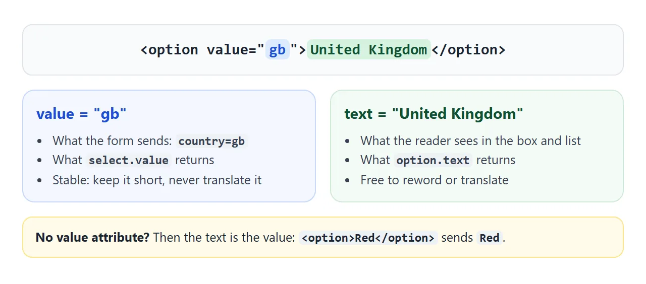
If you leave out the value attribute, the browser uses the option's text as its value. That is fine for quick lists, but a typo fix in the label then changes the data you receive.
In JavaScript, select.value is the chosen value and select.selectedOptions[0].text is the text the reader saw. select.selectedIndex is the position of the chosen option, starting at 0, and it is -1 when nothing is selected.
Grouping with optgroup
A long list is easier to scan in groups. Wrap related options in <optgroup> and give it a label. The label shows as a heading in the open list, and the reader cannot choose it.
<optgroup label="Tea">
  <option value="green">Green tea</option>
  <option value="chai">Chai latte</option>
</optgroup>
<optgroup label="Cold drinks (from noon)" disabled>
  <option value="lemonade">Lemonade</option>
</optgroup>
disabled works at both levels. On one <option>, it greys out that choice. On an <optgroup>, it switches off every option inside. Groups cannot be nested; a group inside a group is not allowed.
A placeholder that cannot be submitted
A select always has something selected. With no selected attribute, the first option that is not disabled is chosen, so a plain "Choose a size" line quietly becomes a real answer.
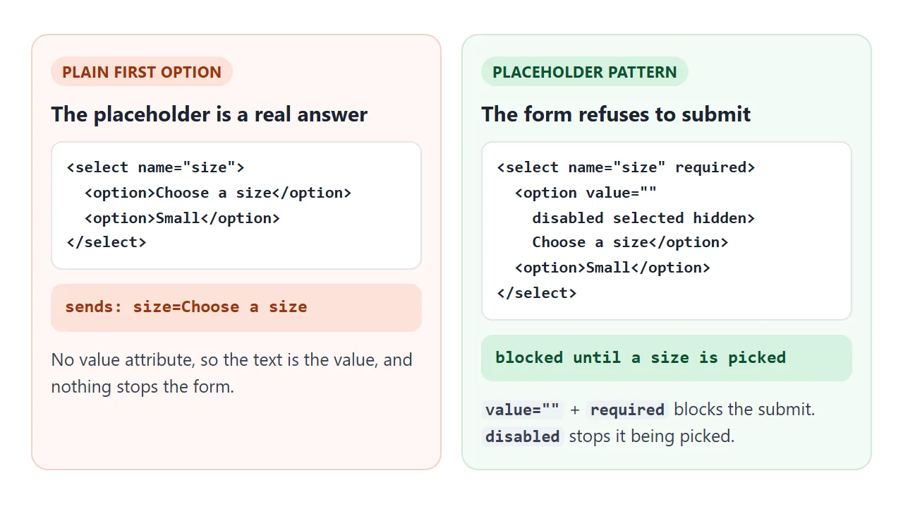
The pattern has four parts on the option and one on the select:
value=""so it carries no data.selectedso it starts chosen. Without it, the browser skips a disabled option and picks the next one.disabledso the reader cannot choose it again.hiddenasks the browser to leave it out of the open list.requiredon the select, so an empty value blocks the submit.
The first demo shows the result: checkValidity() returns false until a drink is picked, and the Order button does nothing.
Choosing a default instead, and why a reload can show the wrong option, is covered in HTML dropdown default selected. The error message itself comes from HTML form validation.
Multiple select and size
Add multiple and the select becomes a list box where more than one option can be chosen. On a computer, hold Ctrl (Cmd on a Mac) and click to add or remove options.
On a touch screen, the browser's picker lets each tap switch an option on or off.
size sets how many rows are visible. A multiple select shows 4 rows when size is missing. A single select with size above 1 also turns into a list box instead of a dropdown.
The form sends one pair per chosen option, so toppings=cheese&toppings=olives. Read them on the page with new FormData(form).getAll('toppings').
Reading the value in JavaScript
Try both boxes below. The numbers update as you choose.
<!doctype html>
<html lang="en">
<head>
<meta charset="utf-8">
<meta name="viewport" content="width=device-width, initial-scale=1">
<title>Reading select values</title>
<style>
  body { margin: 0; padding: 16px; font-family: system-ui, sans-serif; background: #f4f5f7; color: #1d2330; }
  .grid { display: grid; grid-template-columns: repeat(auto-fit, minmax(240px, 1fr)); gap: 12px; }
  .box { background: #fff; border-radius: 12px; padding: 14px; box-shadow: 0 4px 16px rgba(0,0,0,.08); }
  label { display: block; font-weight: 600; margin-bottom: 6px; }
  small { color: #6b7280; font-weight: 400; }
  select { width: 100%; font: inherit; padding: 6px; border: 1px solid #c9ced6; border-radius: 8px; }
  pre { margin: 10px 0 0; padding: 8px 10px; background: #f4f5f7; border-radius: 8px; font: 13px/1.5 ui-monospace, Consolas, monospace; white-space: pre-wrap; word-break: break-word; }
  button { font: inherit; font-size: 14px; margin-top: 10px; padding: 6px 10px; border-radius: 8px; border: 1px solid #c9ced6; background: #fff; cursor: pointer; }
  .warn { color: #9a3412; }
</style>
</head>
<body>
<div class="grid">
  <div class="box">
    <label for="size">Size <small>(one choice)</small></label>
    <select id="size">
      <option value="s">Small</option>
      <option value="m" selected>Medium</option>
      <option value="l">Large</option>
      <option>Extra large</option> <!-- no value: the text is the value -->
    </select>
    <pre id="sizeOut"></pre>
    <button type="button" id="setL">size.value = 'l'</button>
    <pre id="log">change events: 0</pre>
  </div>
  <div class="box">
    <label for="toppings">Toppings <small>(Ctrl or Cmd click, or tap)</small></label>
    <select id="toppings" multiple size="5">
      <option value="cheese" selected>Cheese</option>
      <option value="ham">Ham</option>
      <option value="olives" selected>Olives</option>
      <option value="basil">Basil</option>
      <option value="chilli">Chilli</option>
    </select>
    <pre id="topOut"></pre>
  </div>
</div>

<script>
  const size = document.getElementById('size');
  const toppings = document.getElementById('toppings');
  let changes = 0;

  function render() {
    const opt = size.selectedOptions[0];
    document.getElementById('sizeOut').textContent =
      'value:         "' + size.value + '"\n' +
      'selectedIndex: ' + size.selectedIndex + '\n' +
      'text:          "' + (opt ? opt.text : '') + '"';

    // .value on a multiple select gives only the FIRST selected option
    const all = [...toppings.selectedOptions].map(o => o.value);
    document.getElementById('topOut').innerHTML =
      '<span class="warn">value: "' + toppings.value + '"  (first only)</span>\n' +
      'selectedOptions: [' + all.map(v => '"' + v + '"').join(', ') + ']\n' +
      'count: ' + all.length;
  }

  size.addEventListener('change', () => {
    changes++;
    document.getElementById('log').textContent = 'change events: ' + changes;
    render();
  });
  toppings.addEventListener('change', render);

  // setting .value from a script does NOT fire change
  document.getElementById('setL').addEventListener('click', () => {
    size.value = 'l';
    render();
  });

  render();
</script>
</body>
</html>
| Property | Single select | Multiple select |
|---|---|---|
value |
The chosen value | The first chosen value only |
selectedIndex |
Position of the choice | Position of the first choice |
selectedOptions |
A list with one option | Every chosen option |
options |
All options | All options |
To react to a choice, listen for change:
const toppings = document.getElementById('toppings');
toppings.addEventListener('change', () => {
  const picked = [...toppings.selectedOptions].map(o => o.value);
  console.log(picked); // ["cheese", "olives"]
});
change fires when the user makes a choice. It does not fire when your own script sets select.value.
The button in the demo proves it: the box moves to Large, and the counter stays put. If other code depends on that event, dispatch it yourself:
size.value = 'l';
size.dispatchEvent(new Event('change', { bubbles: true }));
Styling the select
The closed box takes ordinary CSS: font, padding, border, radius and background. appearance: none removes the browser's arrow so you can draw your own. The open list is a different story.
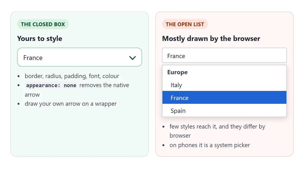
The arrow cannot go on the select itself, because a select has no ::after. Put it on a wrapper instead, and add pointer-events: none so a click on the arrow still opens the list:
.select { position: relative; }
.select::after { /* the arrow */ pointer-events: none; }
.select select { appearance: none; padding-right: 40px; }
Some newer browsers also offer an opt-in customizable select, turned on with appearance: base-select, that lets CSS reach the open list. Browsers without it show the standard select, so the dropdown still works everywhere.
A finished example: country and city
This one fills both lists from a small data object. The city list stays disabled until a country is chosen, and it is rebuilt every time the country changes.
<!doctype html>
<html lang="en">
<head>
<meta charset="utf-8">
<meta name="viewport" content="width=device-width, initial-scale=1">
<title>Country and city dropdowns</title>
<style>
  body { margin: 0; padding: 18px; font-family: system-ui, sans-serif; background: #eef1f6; color: #1d2330; }
  form { max-width: 440px; background: #fff; border-radius: 14px; padding: 18px; box-shadow: 0 6px 20px rgba(0,0,0,.08); }
  label { display: block; font-size: 14px; font-weight: 600; margin: 0 0 6px; }
  .field { margin-bottom: 14px; }

  /* the wrapper draws the arrow; the select itself has no native arrow */
  .select { position: relative; }
  .select::after {
    content: ''; position: absolute; right: 14px; top: 50%;
    width: 8px; height: 8px; margin-top: -6px;
    border-right: 2px solid #475569; border-bottom: 2px solid #475569;
    transform: rotate(45deg);
    pointer-events: none; /* clicks on the arrow go through to the select */
  }
  .select select {
    appearance: none; -webkit-appearance: none;
    width: 100%; font: inherit; font-size: 16px; color: inherit;
    padding: 10px 40px 10px 12px;
    border: 1.5px solid #cbd5e1; border-radius: 10px; background: #f8fafc;
    cursor: pointer;
  }
  .select select:focus-visible { outline: 3px solid #93c5fd; outline-offset: 1px; border-color: #2563eb; }
  .select select:disabled { opacity: .5; cursor: not-allowed; }

  button { font: inherit; width: 100%; padding: 10px; border: 0; border-radius: 10px; background: #2563eb; color: #fff; cursor: pointer; }
  #summary { margin-top: 12px; padding: 10px 12px; border-radius: 10px; background: #f1f5f9; font-size: 14px; min-height: 20px; }
</style>
</head>
<body>
<form id="trip">
  <div class="field">
    <label for="country">Country</label>
    <div class="select">
      <select id="country" name="country" required>
        <option value="" disabled selected hidden>Choose a country</option>
      </select>
    </div>
  </div>
  <div class="field">
    <label for="city">City</label>
    <div class="select">
      <select id="city" name="city" required disabled>
        <option value="" disabled selected hidden>Choose a country first</option>
      </select>
    </div>
  </div>
  <button type="submit">Continue</button>
  <div id="summary">No destination yet.</div>
</form>

<script>
  // the data: country code -> name and cities
  const places = {
    jp: { name: 'Japan', cities: ['Tokyo', 'Osaka', 'Kyoto'] },
    fr: { name: 'France', cities: ['Paris', 'Lyon', 'Nice', 'Bordeaux'] },
    br: { name: 'Brazil', cities: ['Sao Paulo', 'Rio de Janeiro'] },
  };
  const country = document.getElementById('country');
  const city = document.getElementById('city');
  const summary = document.getElementById('summary');

  // fill the first select from the data
  for (const [code, p] of Object.entries(places)) {
    country.add(new Option(p.name, code)); // new Option(text, value)
  }

  function placeholder(text) {
    const o = new Option(text, '');
    o.disabled = o.selected = o.hidden = true;
    return o;
  }

  country.addEventListener('change', () => {
    city.replaceChildren(placeholder('Choose a city'));
    for (const c of places[country.value].cities) city.add(new Option(c, c));
    city.disabled = false;
    summary.textContent = places[country.value].name + ': now pick a city.';
  });

  city.addEventListener('change', () => {
    summary.textContent = 'Destination: ' + city.value + ', ' +
      country.selectedOptions[0].text;
  });

  const form = document.getElementById('trip');
  form.addEventListener('submit', (e) => {
    e.preventDefault(); // demo: show the data instead of sending it
    const d = new FormData(form);
    summary.textContent = 'Would send: country=' + d.get('country') + '&city=' + d.get('city');
  });
</script>
</body>
</html>
- Filling from data:
select.add(new Option(text, value))creates each option. - Resetting:
replaceChildren()clears the old cities and puts a fresh placeholder back. - Reading both parts: the summary shows the city value and the country's text, because the country's value is only a code.
To show different fields depending on the choice, rather than different options, see show and hide a div based on a dropdown.
Select, radio buttons or datalist?
| You need | Use |
|---|---|
| One choice from a long list | <select> |
| One choice from a handful, all visible at once | Radio buttons |
| Several choices from a short list | Checkboxes |
| Free typing with suggestions | <datalist> |
| A menu of links in a site header | A navigation dropdown, not a select |
Radio buttons show every option without a click, which helps when there are only a few and the reader should compare them. A datalist lets people type something that is not on the list.
When it does not work
| What you see | Cause | Fix |
|---|---|---|
| The server receives "Choose a size" | The placeholder has no value, so its text is sent |
Use value="" with disabled and required |
| The form submits with the placeholder chosen | required is missing, or the placeholder value is not empty |
Add required and set value="" |
| The code gets "gb" but you expected "United Kingdom" | value returns the value, not the text |
Read selectedOptions[0].text |
| A multiple select gives only one value | select.value returns the first choice |
Map selectedOptions or use FormData.getAll |
| The select is missing from the submitted data | No name, or the select is disabled |
Add name; use a hidden input if it must stay disabled |
Setting value in code does not run the change handler |
change only fires for user choices |
Call the handler, or dispatchEvent(new Event('change')) |
| Clicking the custom arrow does nothing | The arrow sits on top of the select and catches the click | pointer-events: none on the arrow |
Share it as a link
A dropdown is easier to test than to describe. A screenshot cannot be opened, and a dependent list only proves itself when someone clicks through it.
To send the working version, paste the page into a NOS document and choose Create share link. HTML to link walks through it.
The page renders as written and its scripts run, so the people you send it to can pick options themselves. If you change the code later, the same link shows the new version.