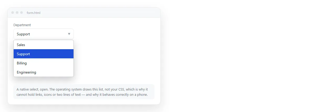
An HTML dropdown menu is one of two different components, and the word covers both. If the reader is picking a value, you want <select>. If the reader is going somewhere, you want a button that reveals a list of links.
Choosing the wrong one is the most common cause of a menu that looks right on a laptop and cannot be used on a phone.
Two things called an HTML dropdown menu
| You want the reader to | Component | Styling of the list |
|---|---|---|
| Pick one value to submit | <select> |
Controlled by the system |
| Pick one of two or three | Radio buttons | Fully yours |
| Navigate to another page | Button plus list of links | Fully yours |
| Run a command | Button plus list of buttons | Fully yours |
| Filter what is shown | <select> plus a listener |
Controlled by the system |
The third and fourth rows are the ones people call a menu. The first and last are what most tutorials show, which is why searches for this phrase return two unrelated answers.
The form dropdown
<label for="plan">Plan</label>
<select id="plan" name="plan">
  <option value="">Choose one</option>
  <option value="team">Team</option>
  <option value="org" selected>Organisation</option>
</select>
Three things this gives you for free: keyboard navigation with the arrow keys, type-ahead when the reader starts typing an option name, and the native picker on a phone.
Three things it does not give you: styled options, icons in the list, and multiple columns. The option list is rendered by the operating system. No CSS reaches inside it.
If the design needs those, you are building a menu, not using a select. Accept the extra work rather than styling a div to look like one.
Grouping long lists is worth doing:
<optgroup label="Europe">
  <option value="de">Germany</option>
  <option value="fr">France</option>
</optgroup>
Setting which option starts chosen has its own rules, covered in default selected option.
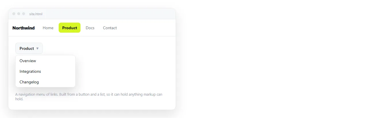
The navigation dropdown
<div class="menu">
  <button type="button" aria-expanded="false" aria-controls="m1">Products</button>
  <ul id="m1" hidden>
    <li><a href="/reports">Reports</a></li>
    <li><a href="/dashboards">Dashboards</a></li>
    <li><a href="/invoices">Invoices</a></li>
  </ul>
</div>
.menu { position: relative; }
.menu ul { position: absolute; top: 100%; left: 0; margin: 0; padding: .25rem;
           list-style: none; background: #16181d; border: 1px solid #2c2f36; min-width: 12rem; }
var b = document.querySelector('.menu button');
var m = document.getElementById('m1');
b.addEventListener('click', function () {
  var open = b.getAttribute('aria-expanded') === 'true';
  b.setAttribute('aria-expanded', String(!open));
  m.hidden = open;
});
document.addEventListener('keydown', function (e) {
  if (e.key === 'Escape' && !m.hidden) { m.hidden = true; b.setAttribute('aria-expanded', 'false'); b.focus(); }
});
Why hover menus fail
The classic CSS menu shows the list on :hover. It needs no script, and it has two problems that no amount of CSS fixes.
Phones and tablets have no hover state. A tap is synthesised as a hover in some browsers and not others, so the menu opens on the first tap sometimes and never opens other times.
Keyboard users never hover at all. Adding :focus-within helps, but the menu still cannot be dismissed without moving focus elsewhere.
A click trigger handles pointer, touch and keyboard with one code path. That is the reason to write the eight lines.
There is a third problem that only shows up in use. A hover menu opens when the pointer crosses it on the way somewhere else, so the reader gets a panel they did not ask for covering what they were reading.
Delays are the usual patch. They make the menu feel sluggish for the people who did want it, which trades one complaint for another.
The four rules a menu has to keep
- The trigger is a
<button>. A div is not focusable and is not announced as anything. A link withhref="#"jumps the page. aria-expandedmatches reality. Set it on every state change, not only on open.- Escape closes it and focus returns to the trigger. Otherwise the keyboard user is stranded after the last item.
- Clicking outside closes it. Bind on
documentand check whether the click landed inside the menu.
Labelling controls covers what to do when the trigger is an icon with no visible text.
Arrow key navigation inside the menu
A select gives you arrow keys. A button and list menu has to implement them, and it is about ten lines.
var items = m.querySelectorAll('a');
m.addEventListener('keydown', function (e) {
  var i = Array.prototype.indexOf.call(items, document.activeElement);
  if (e.key === 'ArrowDown') { e.preventDefault(); items[(i + 1) % items.length].focus(); }
  if (e.key === 'ArrowUp')   { e.preventDefault(); items[(i - 1 + items.length) % items.length].focus(); }
  if (e.key === 'Home')      { e.preventDefault(); items[0].focus(); }
  if (e.key === 'End')       { e.preventDefault(); items[items.length - 1].focus(); }
});
The preventDefault calls stop the page scrolling while the reader moves through the list, which is the part that makes an otherwise working menu feel wrong.
Focus the first item when the menu opens with the keyboard, and leave focus on the trigger when it opens with a click. That difference is small and it is what separates a menu that feels native from one that does not.
A select that navigates
A pattern worth naming so you can avoid it: a <select> whose change event sends the reader to another page.
It is compact and it breaks keyboard use, because arrowing through the options navigates away on every step before the reader reaches the one they wanted. If you must use it, act on a separate Go button rather than on change.
Positioning without a library
position: absolute on the list and position: relative on the wrapper puts the list under the button. Two adjustments handle the edges.
For a menu near the right edge, swap left: 0 for right: 0 so it opens inward. For a menu inside a scrolling container, the absolute list is clipped by overflow: hidden on the ancestor, so the ancestor needs overflow: visible.
Flexbox handles the row of triggers along the bar itself, and building the bar covers the rest of that layout.
Checking it
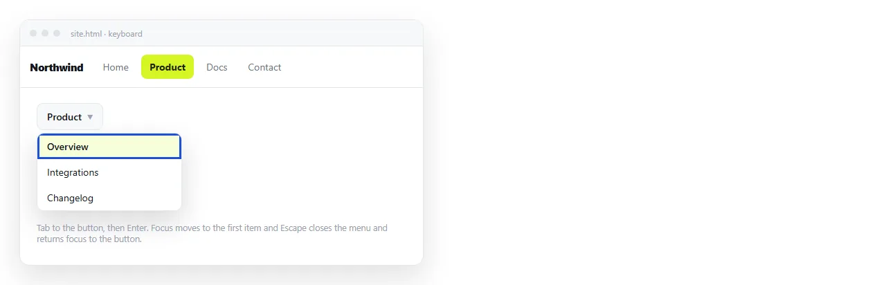
Open the page in the HTML file opener and use it without touching the mouse. Tab to the trigger, press Enter, arrow to an item, press Escape.
Then narrow the window to phone width and do it with taps only. Those two passes catch nearly everything.
When it works, paste the HTML into a NOS document. The menu renders and runs at the document's own address, so you send a link that opens on a phone rather than a file that does not.