HTML word break is a CSS property, word-break, that tells the browser whether it may split a word that is too long for its line.
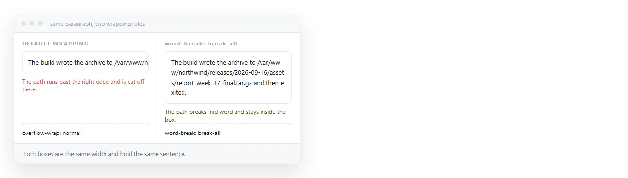
By default the browser breaks lines only at spaces and hyphens. A word with neither is kept whole, even when it runs past the edge of the box.
That default is correct for reading and wrong for URLs, file paths and hashes.
The four properties involved
| Property | Value | What it does |
|---|---|---|
word-break |
normal |
Break at spaces and hyphens only. The default. |
word-break |
break-all |
Break at any character when the line ends. |
word-break |
keep-all |
Never break within a run of CJK characters. |
overflow-wrap |
break-word |
Break inside a word only if it cannot fit alone. |
overflow-wrap |
anywhere |
Same, and the box may shrink to the narrower size. |
hyphens |
auto |
Break at syllables and insert a hyphen. Needs lang. |
Six rows, and for prose you will use exactly one of them.
The one to reach for first
.prose { overflow-wrap: anywhere; }
This is the sensible default for body text. Ordinary words are untouched, and a URL that cannot fit is broken rather than allowed to push the layout sideways.
Compare with break-all:
.dense { word-break: break-all; }
That breaks every line at whatever character lands at the edge, so "documentation" becomes "documenta" and "tion". It is the right choice in a narrow sidebar of identifiers and the wrong one in a paragraph.
break-word versus anywhere
They look identical in a simple test and differ in one important way.
overflow-wrap: break-word breaks the word but does not let the containing box become narrower than the unbroken word would have been. In a flex or grid layout that means the column still claims the full width.
overflow-wrap: anywhere allows the box to shrink to the broken size. In modern layouts that is usually what you want.
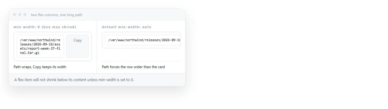
Pair it with min-width: 0 on flex children, which is the other half of the same problem. HTML text not wrapping covers why flex items refuse to shrink by default.
Hyphenation is a different thing
hyphens: auto uses the browser's dictionary for the declared language to break at syllable boundaries and add a hyphen.
<p lang="en" style="hyphens: auto">Internationalisation across distributed teams</p>
The lang attribute is required. Without it the browser does not know which dictionary to use and does nothing.
Hyphenation improves justified text and narrow columns. It does nothing for URLs, because a URL is not a word in any dictionary.
The wbr element
When you know where a long string should break, mark it in the HTML rather than guessing in CSS.
<code>/var/log<wbr>/application<wbr>/error.log</code>
<wbr> is a break opportunity. If the line fits, nothing is inserted. If it does not, the break lands where you chose.
There is also ­, a soft hyphen, which does the same and displays a hyphen at the break. Use <wbr> for paths and identifiers where a hyphen would be misread as part of the string.
When truncation beats breaking
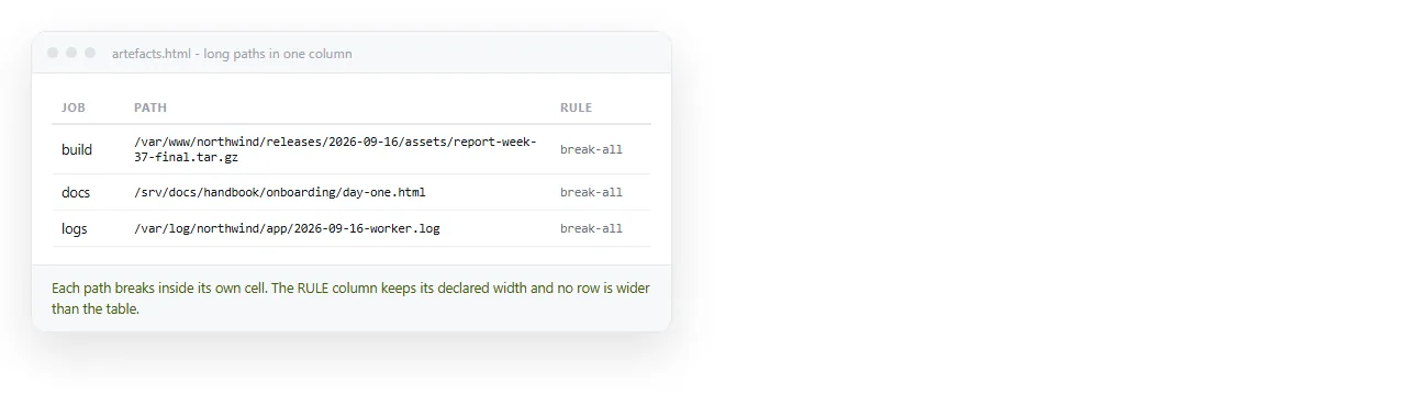
Sometimes a long value should not wrap at all. A file path in a table row is often better cut off than allowed to make the row three lines tall.
.path {
  white-space: nowrap;
  overflow: hidden;
  text-overflow: ellipsis;
}
All three declarations are needed. text-overflow does nothing without overflow: hidden and a reason for the text to overflow.
Give the element a title attribute with the full value so it is still recoverable on hover.
Choosing by content type
| Content | Use |
|---|---|
| Body text that may contain URLs | overflow-wrap: anywhere |
| Narrow column of identifiers or hashes | word-break: break-all |
| File path in a table row | nowrap plus text-overflow: ellipsis |
| Code block | white-space: pre-wrap |
| Justified narrow column of prose | hyphens: auto with lang |
| Known break points in a long token | <wbr> in the markup |
Table cells behave differently from everything else here, because a table sizes columns from their content. HTML word wrap in a table covers what changes.
What word-break does not fix
If text is running off the page and no long word is involved, word-break is not the answer and adding it hides the real cause.
Check these first:
- A
white-space: nowrapinherited from an ancestor. - A fixed pixel width on a container that needs to shrink.
- Padding on a
width: 100%box without border-box sizing. - A flex item at its default
min-width: auto. - A missing viewport meta tag, so a phone renders the page wide and scales it down.
Checking it at the right width
These rules matter on narrow screens and are invisible on a desktop.
Paste the page into a NOS document, open the link on a phone, and read it. The page renders at an address of its own, so one tap gets you the reader's view.
Turning HTML into a link is that step, and you can adjust the text in the document without returning to the file.