CSS flexbox arranges the children of an element along a single line, horizontal or vertical, and decides how they share the space: which ones keep their size, which one absorbs what is left, how they line up, and what goes between them.
It is the right tool for a row and the wrong tool for a grid of cards, which is what CSS grid is for.
This guide covers the four patterns that handle most rows, the shrinking trap that causes overflow on phones, alignment, and how flexbox and grid divide the work on a typical page.
.bar {
  display: flex;
  align-items: center;
  gap: 14px;
}
Items sit in a row, vertically centred, with even spacing. Three lines, and it replaces every float and vertical-centring trick that came before it.
The four flexbox patterns
A toolbar with something pushed right
.bar { display: flex; align-items: center; gap: 14px; }
.bar .right { margin-left: auto; }
margin-left: auto absorbs all remaining space, pushing that item and everything after it to the right. Cleaner than justify-content: space-between, which only works when there are exactly two groups.
Equal columns
.cols { display: flex; gap: 16px; }
.cols > * { flex: 1; min-width: 0; }
flex: 1 is shorthand for "grow, shrink, and start from zero" — so every child takes an equal share regardless of its content. The min-width: 0 is explained below and is not optional.
A sidebar that does not shrink
.layout { display: flex; gap: 20px; }
.side { flex: 0 0 220px; }   /* never grow, never shrink, 220px */
.main { flex: 1; min-width: 0; }
For a page-level layout, grid with grid-template-columns: 220px 1fr says the same thing more directly.
Wrapping chips
.chips { display: flex; flex-wrap: wrap; gap: 6px; }
flex-wrap: wrap is what stops a row of tags overflowing on a phone. Its absence is a routine cause of sideways scrolling.
The shrinking trap
This is the one that costs people an afternoon.
A flex item will not shrink below the size of its content. So a long URL, a long word or a wide table inside a flex item pushes the item wider than its share, and the row overflows.
/* broken: the text refuses to shrink */
.item { flex: 1; }

/* fixed */
.item { flex: 1; min-width: 0; }
Truncation depends on it too:
.title {
  min-width: 0;              /* without this, nothing below works */
  overflow: hidden;
  text-overflow: ellipsis;
  white-space: nowrap;
}
Rule: any flex item containing text gets min-width: 0.
Alignment, concisely
.box {
  display: flex;
  justify-content: center;   /* along the main axis */
  align-items: center;       /* across it */
}
| Property | Axis | Common values |
|---|---|---|
justify-content |
Main (the row, by default) | flex-start, center, space-between |
align-items |
Cross (down the row) | center, flex-start, stretch, baseline |
align-items: baseline is the underused one — it lines text up on its baseline rather than its box, which is what you want when a large number sits next to a small label.
Centring something both ways:
.center { display: grid; place-items: center; }
Grid does it in two words. Use it.
Flexbox or grid
| Situation | Use |
|---|---|
| A toolbar, a button row, a row of chips | Flexbox |
| A card's internal stack | Flexbox, flex-direction: column |
| Equal columns whose content varies | Either — grid is less fiddly |
| A card grid that reflows | Grid |
| Page layout | Grid |
| One item pushed to the far end | Flexbox with margin-left: auto |
The short version: flexbox distributes items along a line; grid defines the shape of a container. If you are describing the container, use grid.
The five things that go wrong
| Symptom | Cause | Fix |
|---|---|---|
| Text overflows its item | Items will not shrink below content | min-width: 0 on the item |
| Truncation does nothing | Same | min-width: 0, then text-overflow |
| A row of chips overflows | No wrapping | flex-wrap: wrap |
| A sidebar collapses | flex: 1 on it too |
flex: 0 0 220px |
| Uneven spacing at the edges | Margins instead of gap |
gap on the container |
The first two are the same cause and account for most flexbox debugging. A flex item's default minimum size is its content, which is reasonable and is almost never what you want for text.
Where grid is the better answer
/* centring, both axes */
.center { display: grid; place-items: center; }

/* a page layout */
.layout { display: grid; grid-template-columns: 220px 1fr; gap: 20px; }

/* cards that reflow with no media query */
.cards { display: grid; grid-template-columns: repeat(auto-fit, minmax(170px, 1fr)); gap: 10px; }
All three are shorter and less fragile in grid than in flexbox. Keep flexbox for rows of items — toolbars, button groups, a card's internal stack — and reach for grid when you are describing the container's shape. For the responsive behaviour specifically, the auto-fitting grid replaces a set of media queries entirely.
Three flexbox mistakes that cost the most
Forgetting min-width: 0. A flex child with long text refuses to shrink below the text's natural width, so the row overflows on a phone. min-width: 0 on the flexible child lets it shrink and wrap.
Using flex for a grid of cards. flex-wrap will wrap cards, but the last row stretches to fill or leaves awkward gaps, and every card needs a width. CSS grid with auto-fit does the job in one line.
Centring with margins. align-items: center and justify-content: center centre a child both ways in two lines; the old margin tricks are no longer needed.
Flexbox and grid on the same page
They are not competing. Grid sets out the regions of a page and the cards in a dashboard; flexbox arranges what is inside each card, a label on the left and a value on the right, an icon beside a heading, buttons in a row.
A typical document uses grid once or twice for the big structure and flexbox a dozen times for small rows. Reaching for the right one is mostly asking: is this one line, or a table of things?
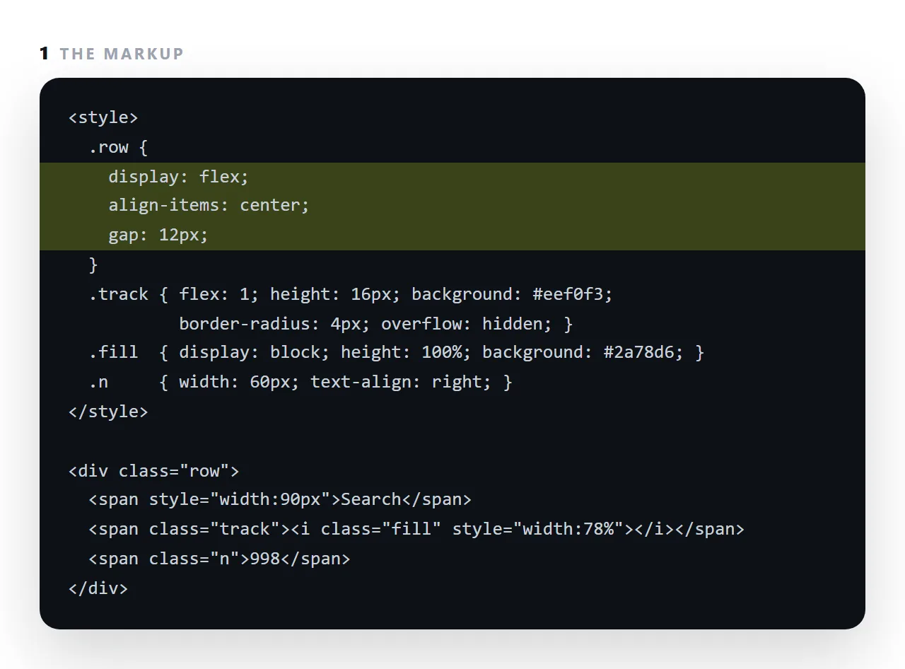
Building a row with flexbox: 4 steps
- Put
display: flexon the row's parent. The children line up horizontally by default. - Give one child
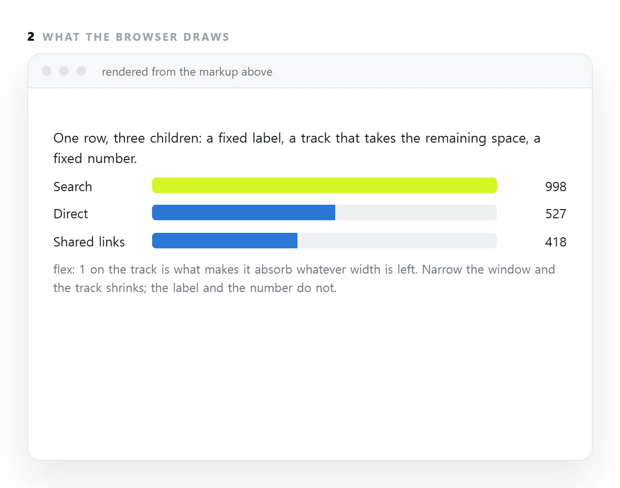
flex: 1. It takes whatever width is left after the fixed ones. That is the bar track, the search box, the title that should push the buttons to the right. - Centre and space with
align-itemsandgap.align-items: centerfor vertical centring;gapfor the space between children, with nothing doubling at the ends. - Let it survive a narrow screen.
min-width: 0on the flexible child so long text can shrink, andflex-wrap: wrapif the row is allowed to become two lines on a phone.