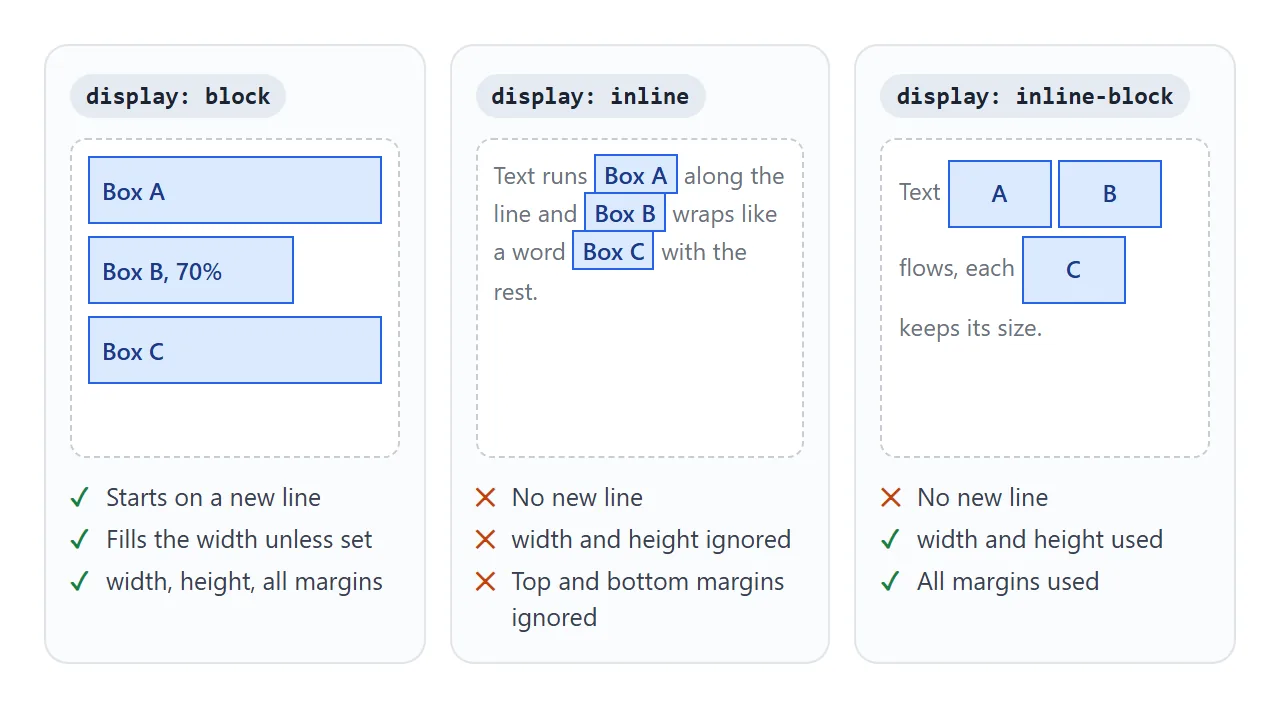
The CSS display property sets the kind of box an element makes. block takes its own line and accepts width, height and margins. inline flows inside a line of text and ignores width and height.
inline-block flows in the line but keeps its size. flex and grid change how the element's children are laid out, and none removes the element.
Try every value on the same three boxes. Each box asks for width: 120px, height: 60px and margin: 16px. The table under them measures what the browser actually drew.
<!doctype html>
<html lang="en">
<head>
<meta charset="utf-8">
<meta name="viewport" content="width=device-width, initial-scale=1">
<title>CSS display switcher</title>
<style>
  body { margin: 0; padding: 14px; font-family: system-ui, sans-serif; background: #f4f5f7; color: #1d2330; }
  .buttons { display: flex; flex-wrap: wrap; gap: 6px; margin-bottom: 10px; }
  .buttons button {
    font: inherit; font-size: 14px; padding: 6px 11px; border-radius: 8px;
    border: 1px solid #c9ced8; background: #fff; cursor: pointer;
  }
  .buttons button[aria-pressed="true"] { background: #1d2330; color: #fff; border-color: #1d2330; }
  code { font: 13px ui-monospace, Consolas, monospace; }
  .css { background: #fff; border-radius: 8px; padding: 8px 10px; margin: 0 0 10px; white-space: pre; overflow-x: auto; }

  /* the parent: dashed outline */
  .stage { outline: 2px dashed #9aa3b2; background: #fff; padding: 6px; }
  /* every box asks for the same size and margin */
  .item {
    width: 120px; height: 60px; margin: 16px;
    padding: 4px 8px; box-sizing: border-box;
    background: #dbeafe; outline: 2px solid #2563eb;
  }
  .after { margin: 10px 0; font-size: 14px; }

  table { border-collapse: collapse; background: #fff; font-size: 14px; width: 100%; }
  td { border: 1px solid #e1e4ea; padding: 5px 8px; }
  td:last-child { font-weight: 600; }
</style>
</head>
<body>
<div class="buttons" id="buttons">
  <button data-v="block">block</button>
  <button data-v="inline" aria-pressed="true">inline</button>
  <button data-v="inline-block">inline-block</button>
  <button data-v="flex">flex</button>
  <button data-v="grid">grid</button>
  <button data-v="none">none</button>
</div>
<pre class="css"><code id="css"></code></pre>

<div class="stage" id="stage">
  <span class="item">Box A</span>
  <span class="item">Box B</span>
  <span class="item">Box C</span>
</div>
<p class="after">This line comes after the parent.</p>

<table>
  <tr><td>Box A measured</td><td id="size"></td></tr>
  <tr><td>width: 120px and height: 60px used?</td><td id="wh"></td></tr>
  <tr><td>Each box starts a new line?</td><td id="lines"></td></tr>
</table>

<script>
  const stage = document.getElementById('stage');
  const items = stage.querySelectorAll('.item');
  const buttons = document.querySelectorAll('#buttons button');

  function show(value) {
    // flex and grid go on the PARENT; the others go on each box
    const onParent = value === 'flex' || value === 'grid';
    stage.style.display = onParent ? value : '';
    stage.style.flexWrap = value === 'flex' ? 'wrap' : '';
    stage.style.gridTemplateColumns = value === 'grid' ? 'repeat(2, 120px)' : '';
    items.forEach((el) => { el.style.display = onParent ? '' : value; });

    document.getElementById('css').textContent = onParent
      ? '.stage { display: ' + value + ';' + (value === 'flex' ? ' flex-wrap: wrap;' : '') + (value === 'grid' ? ' grid-template-columns: repeat(2, 120px);' : '') + ' }'
      : '.item { display: ' + value + '; }';

    // measure what the browser actually drew
    const r = items[0].getBoundingClientRect();
    const b = items[1].getBoundingClientRect();
    document.getElementById('size').textContent = Math.round(r.width) + ' x ' + Math.round(r.height) + ' px';
    document.getElementById('wh').textContent = value === 'none' ? 'not drawn'
      : (Math.round(r.width) === 120 && Math.round(r.height) === 60 ? 'yes' : 'no');
    document.getElementById('lines').textContent = value === 'none' ? 'not drawn'
      : (b.top >= r.bottom ? 'yes' : 'no, they share a line');

    buttons.forEach((btn) => btn.setAttribute('aria-pressed', btn.dataset.v === value));
  }

  buttons.forEach((btn) => btn.addEventListener('click', () => show(btn.dataset.v)));
  show('inline');
</script>
</body>
</html>
With inline, the size falls to the text inside. With block each box gets its own line. With flex and grid the value goes on the parent, not on the boxes, and the boxes sit side by side again at full size.
What each display value changes
Three questions sort out most of the values: does the element start a new line, do width and height apply, and do top and bottom margins push other things away?
| Value | Starts a new line | width and height | Top and bottom margins | Typical use |
|---|---|---|---|---|
block |
Yes | Used | Used | Sections, paragraphs, cards |
inline |
No | Ignored | Ignored | Words inside text: links, bold |
inline-block |
No | Used | Used | Buttons and badges inside a line |
flex |
Yes | Used | Used | A row or column of children |
grid |
Yes | Used | Used | Rows and columns of children |
inline-flex / inline-grid |
No | Used | Used | A small flex or grid group inside text |
none |
Not drawn | Not drawn | Not drawn | Hiding |
The last three columns describe the element itself. flex and grid also change the children: they become flex or grid items. The newer two-value syntax writes inline-flex as inline flex, which spells out the outside and inside roles.
Why width does nothing on an inline element
A span or a is inline by default. An inline box is a piece of a line of text, and it can even break across two lines.
The CSS rules say width and height do not apply to it, so the browser ignores them without an error.
The same goes for vertical space. Left and right margins and padding do push the neighbours apart. Top and bottom padding is painted, but top and bottom margins and padding do not move the lines above or below.
The fix depends on where the element should sit:
/* stays in the line, but takes a size */
.badge { display: inline-block; width: 120px; height: 40px; }

/* gets its own line */
.button-link { display: block; width: 200px; }
Images are an exception. An img is inline too, but it is a replaced element: its content comes from outside the page, so it does accept width and height.
The gap between inline-block elements
Put four inline-block boxes at width: 25% in a parent, and the fourth one drops to the next line. The row is wider than 100% by the width of three spaces.
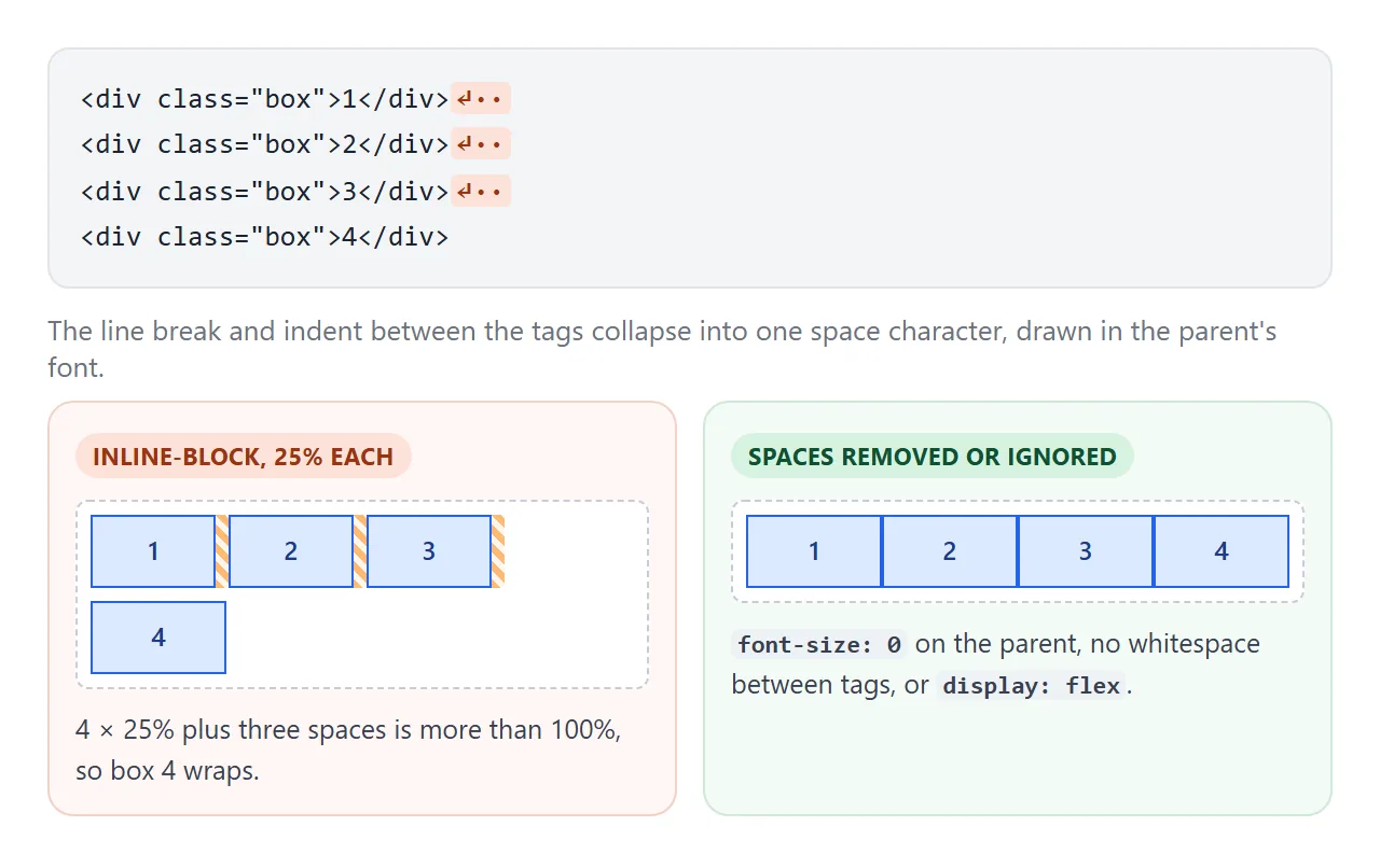
Inline-block boxes are laid out like words, so the whitespace between the tags in your HTML is drawn as a space between them. There are three common ways out:
<!doctype html>
<html lang="en">
<head>
<meta charset="utf-8">
<meta name="viewport" content="width=device-width, initial-scale=1">
<title>The inline-block gap and three fixes</title>
<style>
  body { margin: 0; padding: 12px; font-family: system-ui, sans-serif; background: #f4f5f7; color: #1d2330; }
  .grid { display: grid; grid-template-columns: repeat(auto-fit, minmax(300px, 1fr)); gap: 10px; }
  .panel { background: #fff; border: 1px solid #e1e4ea; border-radius: 10px; padding: 10px; }
  .panel h3 { margin: 0 0 4px; font-size: 15px; }
  .panel p { margin: 0 0 8px; font-size: 13px; color: #4b5563; }
  code { font: 12.5px ui-monospace, Consolas, monospace; }
  .status { font-size: 13px; font-weight: 600; margin-top: 6px; }
  .bad { color: #b45309; } .good { color: #15803d; }

  .row { outline: 2px dashed #9aa3b2; }
  /* four boxes at 25% each should fill exactly one line */
  .box {
    display: inline-block; width: 25%; height: 44px; box-sizing: border-box;
    background: #dbeafe; outline: 1px solid #2563eb; font-size: 13px; text-align: center; line-height: 44px;
  }

  /* Fix 1: no font size in the parent, so the spaces are 0 wide */
  .fix-font { font-size: 0; }
  .fix-font .box { font-size: 13px; }
  /* Fix 3: a flex parent; spaces between flex items are not drawn */
  .fix-flex { display: flex; }
</style>
</head>
<body>
<div class="grid">
  <div class="panel">
    <h3>The problem</h3>
    <p>Four <code>inline-block</code> boxes at 25%, one per line in the HTML.</p>
    <div class="row">
      <div class="box">1</div>
      <div class="box">2</div>
      <div class="box">3</div>
      <div class="box">4</div>
    </div>
    <div class="status"></div>
  </div>

  <div class="panel">
    <h3>Fix 1: parent font-size: 0</h3>
    <p>The spaces shrink to nothing. Set the size back on the boxes.</p>
    <div class="row fix-font">
      <div class="box">1</div>
      <div class="box">2</div>
      <div class="box">3</div>
      <div class="box">4</div>
    </div>
    <div class="status"></div>
  </div>

  <div class="panel">
    <h3>Fix 2: no whitespace in the HTML</h3>
    <p>Comments close the gaps between the tags.</p>
    <div class="row">
      <div class="box">1</div><!--
   --><div class="box">2</div><!--
   --><div class="box">3</div><!--
   --><div class="box">4</div>
    </div>
    <div class="status"></div>
  </div>

  <div class="panel">
    <h3>Fix 3: display: flex on the parent</h3>
    <p>Flex ignores the spaces between its children.</p>
    <div class="row fix-flex">
      <div class="box">1</div>
      <div class="box">2</div>
      <div class="box">3</div>
      <div class="box">4</div>
    </div>
    <div class="status"></div>
  </div>
</div>

<script>
  // Check each row: does box 4 sit on the same line as box 1?
  function check() {
    document.querySelectorAll('.row').forEach((row, i) => {
      const boxes = row.querySelectorAll('.box');
      const oneLine = boxes[3].offsetTop === boxes[0].offsetTop;
      const status = document.querySelectorAll('.status')[i];
      status.textContent = oneLine ? 'Fits on one line' : 'Box 4 wrapped to a new line';
      status.className = 'status ' + (oneLine ? 'good' : 'bad');
    });
  }
  check();
  addEventListener('resize', check);
</script>
</body>
</html>
font-size: 0on the parent, then set the font size back on the boxes. The spaces become zero wide.- No whitespace between the tags. Write them on one line, or close the gaps with HTML comments.
display: flexon the parent. Whitespace between flex items is not drawn, and the boxes keep their size.
For a new layout, option 3 is usually the simplest. The flexbox guide covers wrapping, gaps and alignment from there.
flex and grid go on the parent
display: flex and display: grid describe how an element arranges its children. The properties that go with them, such as justify-content, gap and grid-template-columns, also belong on that parent.
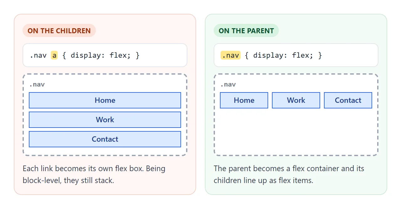
A child inside a flex or grid parent is treated as a block-level item even if it is a span, so width and height start working on it. That is why the switcher demo shows full-size boxes for flex and grid.
The demo also sets flex-wrap: wrap. Without it, flex items shrink below their width to fit on one line.
Pick flex for a single row or column, such as a nav bar or a toolbar. Pick grid when you place things in rows and columns at once, such as a card gallery. The CSS grid guide shows the one-line responsive gallery.
display: none, visibility: hidden, and toggling with JavaScript
display: none removes the element from the layout. Nothing is drawn, it takes no space, and the content after it moves up. Its children are hidden too, and no display value on a child can bring it back.
visibility: hidden keeps the space and only stops drawing. The CSS opacity guide compares display: none, visibility: hidden and opacity: 0 side by side, including which ones can fade.
To show and hide from JavaScript, toggle a class and let CSS decide what it means:
button.addEventListener('click', () => {
  const open = menu.classList.toggle('open');
  button.setAttribute('aria-expanded', open);
});
.menu { display: none; }
.menu.open { display: flex; }
This keeps the right display value in one place. Writing el.style.display = 'block' to show something can quietly turn a flex menu into a block. If you do set style.display = 'none', show it again with style.display = '', which falls back to the stylesheet.
The HTML hidden attribute works through the browser's own display: none rule. Any display rule you write for the element wins over it, so a hidden element with display: flex in your CSS stays visible. The show and hide guide covers more ways to hide.
display: contents
display: contents makes the element's own box disappear while its children stay. The children are laid out as if they belonged to the element's parent. It helps when a wrapper div sits between a grid and the items that should line up in it.
It has sharp edges. The element's own background, border, padding and size are gone, because it has no box.
Browsers have also had bugs where display: contents dropped the element from the accessibility tree, so screen readers lost it. Avoid it on buttons, links, lists and headings, or test with a screen reader.
A finished example: a nav that changes with the screen
This nav uses only display to change shape. On a narrow screen the links are a hidden column behind a Menu button. From 600px wide, the button gets display: none and the list becomes a display: flex row.
<!doctype html>
<html lang="en">
<head>
<meta charset="utf-8">
<meta name="viewport" content="width=device-width, initial-scale=1">
<title>Responsive nav with CSS display</title>
<style>
  body { margin: 0; font-family: system-ui, sans-serif; background: #f4f5f7; color: #1d2330; }
  header { background: #1d2330; color: #fff; padding: 10px 16px; }
  .bar { display: flex; align-items: center; justify-content: space-between; gap: 12px; }
  .brand { font-weight: 700; font-size: 18px; }
  .toggle {
    font: inherit; font-size: 15px; color: #fff; background: transparent;
    border: 1px solid #6b7280; border-radius: 8px; padding: 6px 12px; cursor: pointer;
  }

  /* Phones: the menu is a hidden column */
  .menu { display: none; flex-direction: column; list-style: none; margin: 10px 0 0; padding: 0; }
  .menu.open { display: flex; }
  .menu a { display: block; color: #fff; text-decoration: none; padding: 10px 4px; border-top: 1px solid #374151; }

  /* Wider screens: no button, the menu is always a row */
  @media (min-width: 600px) {
    header { display: flex; align-items: center; justify-content: space-between; }
    .toggle { display: none; }
    .menu, .menu.open { display: flex; flex-direction: row; gap: 4px; margin: 0; }
    .menu a { border-top: 0; padding: 6px 10px; border-radius: 6px; }
    .menu a:hover { background: #374151; }
  }

  main { padding: 16px; line-height: 1.5; }
  main h1 { font-size: 20px; margin: 0 0 6px; }
</style>
</head>
<body>
<header>
  <div class="bar">
    <span class="brand">Studio</span>
    <button class="toggle" id="toggle" aria-expanded="false" aria-controls="menu">Menu</button>
  </div>
  <ul class="menu" id="menu">
    <li><a href="#work">Work</a></li>
    <li><a href="#about">About</a></li>
    <li><a href="#prices">Prices</a></li>
    <li><a href="#contact">Contact</a></li>
  </ul>
</header>
<main>
  <h1>Resize the window</h1>
  <p>Narrower than 600px: a Menu button opens the links as a column. Wider: the button is hidden and the links sit in a row.</p>
</main>

<script>
  const toggle = document.getElementById('toggle');
  const menu = document.getElementById('menu');

  // Add or remove one class; the CSS decides what display that means
  toggle.addEventListener('click', () => {
    const open = menu.classList.toggle('open');
    toggle.setAttribute('aria-expanded', open);
    toggle.textContent = open ? 'Close' : 'Menu';
  });
</script>
</body>
</html>
The switch happens in a media query. Inside it, the wide-screen rule repeats .menu.open so an opened menu stays a row when the window gets wider:
.menu { display: none; flex-direction: column; }
.menu.open { display: flex; }

@media (min-width: 600px) {
  .toggle { display: none; }
  .menu, .menu.open { display: flex; flex-direction: row; }
}
For the full markup of a site header, see the HTML CSS navbar guide.
When it does not work
| What you see | Cause | Fix |
|---|---|---|
width or height has no effect |
The element is inline, such as a span or a |
Use inline-block or block |
| Top and bottom margins do nothing | Vertical margins do not move lines around an inline box | Use inline-block, or put the margin on a block parent |
| A fade or slide never plays when showing | A plain transition does not start from display: none |
Hide with opacity plus visibility instead |
| Measuring the element returns 0 | A display: none element has no box, so its size reads 0 |
Measure after showing it, or hide with visibility: hidden |
justify-content or gap is ignored |
The property is on the children, or display: flex is on the wrong element |
Put display and those properties on the parent |
The display value you set is not the one used |
A later rule, a more specific selector, or a media query overrides it | Check the computed style in the browser's DevTools |
An element with hidden still shows |
Your CSS sets display on it |
Add [hidden] { display: none; } or toggle a class |
| Inline-block boxes do not fit in one row | Whitespace between tags becomes spaces | Parent font-size: 0, remove the whitespace, or use flex |
Share it as a link
Layout differences are easier to see than to read about. A screenshot freezes one width, and an .html attachment may open as plain code on a phone. A live page lets people resize the window and press the buttons themselves.
To send the working version, paste the page into a NOS document and choose Create share link. HTML to link walks through it.
The page renders as written and its scripts run, so the people you send it to can switch display values and open the menu. If you change the code later, the same link shows the new version.