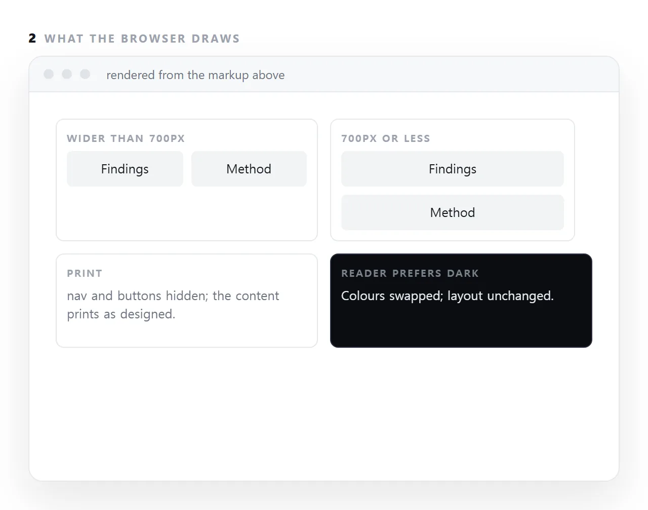
A CSS media query applies a block of rules only when a condition is true: the viewport is at most 700px wide, the page is being printed, the reader has asked for dark colours or reduced motion.
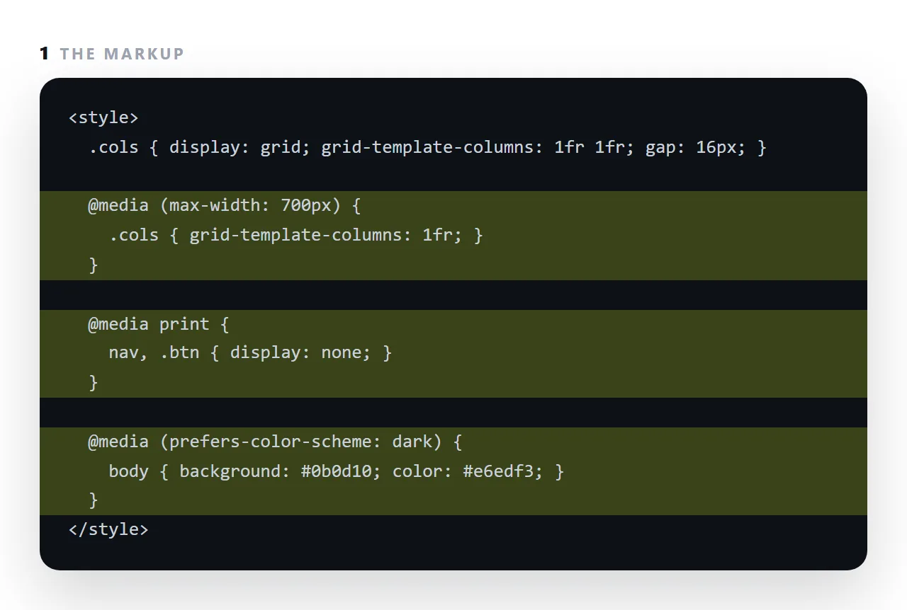
It is how one page adapts without a second page, and it is also the source of a great deal of brittle CSS when breakpoints are copied from a list of device widths.
This guide covers writing mobile-first, choosing breakpoints from the layout rather than from devices, the print and dark-mode queries every document should have, and the two techniques, auto-fit grids and clamp(), that remove most width queries entirely.
.cards { grid-template-columns: 1fr; }

@media (min-width: 700px) {
  .cards { grid-template-columns: repeat(3, 1fr); }
}
One column by default; three once there is room. That is the mobile-first shape, and the order matters — the simple case is the default, so a query that fails leaves the page usable.
Write media queries mobile-first
/* mobile first — recommended */
.side { display: none; }
@media (min-width: 900px) { .side { display: block; } }

/* desktop first — avoid */
.side { display: block; }
@media (max-width: 899px) { .side { display: none; } }
Both work. The first is safer: if the query never matches, the reader still gets a working single-column page. In the second, a failed query leaves a desktop layout on a phone.
Pick breakpoints from your layout, not from a device list
Copying a list of phone and tablet widths guarantees maintaining breakpoints that do not correspond to anything in your design — and missing the widths where your layout actually fails.
Instead: narrow the window slowly. Where something looks wrong, that is a breakpoint. Most pages need one or two.
The queries that are not about width
Colour scheme
@media (prefers-color-scheme: dark) {
  :root { --bg: #18181b; --fg: #e7e7ea; --line: #333; }
}
Arguably more valuable than any width query — many readers have their phone set dark, and a page that ignores it arrives as a white rectangle at night. See dark mode CSS.
Reduced motion
@media (prefers-reduced-motion: reduce) {
  * { animation: none !important; transition: none !important; }
}
Some people get motion sickness from parallax and large transitions. This is three lines and it is the single highest-value accessibility rule you can add.
@media print {
  nav, button { display: none; }
  body { min-height: auto; }
  table { break-inside: avoid; }
}
See print stylesheets.
Pointer precision
@media (hover: none) {
  .tooltip { display: none; }   /* nothing hovers on a touchscreen */
}
@media (pointer: coarse) {
  button { min-height: 44px; }  /* fingers need a bigger target */
}
More accurate than inferring touch from screen width — a touchscreen laptop is wide and coarse-pointered.
Needing fewer of them
Two modern features remove most width queries.
Auto-fitting grids
/* no query needed at all */
.cards { display: grid; grid-template-columns: repeat(auto-fit, minmax(170px, 1fr)); gap: 10px; }
The browser fits as many columns as will hold 170px. Four on a laptop, one on a phone. See CSS grid.
clamp() for type
h1 { font-size: clamp(24px, 5vw, 40px); }
body { font-size: clamp(15px, 2vw, 16.5px); }
A minimum, a size that scales with the viewport, and a maximum. One line per element instead of three rules across two queries.
Combining conditions
@media (min-width: 700px) and (max-width: 1100px) { … }
@media (min-width: 700px), print { … }          /* comma = or */
@media not all and (prefers-color-scheme: dark) { … }
If you find yourself writing long combinations, the layout is probably fighting you — reach for an auto-fitting grid instead.
Testing
Narrow the browser window rather than using a device emulator. It is faster, and it tests every width rather than a handful of presets. Roughly 360px is a small phone and the width worth being sure about.
Which query for which job
| Query | What it detects | Worth using |
|---|---|---|
min-width |
Viewport width | Yes, for layout changes |
prefers-color-scheme |
Light or dark preference | Yes — see dark mode |
prefers-reduced-motion |
Motion sensitivity | Yes, three lines |
print |
Printing or PDF export | Yes — see print stylesheets |
hover: none |
No hover capability | Yes, for tooltips |
pointer: coarse |
Finger rather than mouse | Yes, for target sizes |
orientation |
Portrait or landscape | Rarely — width is usually what you meant |
max-width device presets |
Nothing useful | No — pick breakpoints from your layout |
The bottom row is the habit worth dropping. A copied list of device widths means maintaining breakpoints that match nothing in your design while missing the widths where it actually fails.
Finding your own breakpoints
Narrow the browser window slowly and watch. The first width where something looks wrong is your first breakpoint. Most pages need one or two.
If you find yourself needing four or five, the layout is fighting you — an auto-fitting grid and clamp() for type sizes usually replace all of them.
The three queries every document should carry
@media print hides navigation and buttons, keeps rows and cards from splitting across pages, and prints link addresses after the link text; print stylesheets has the block. @media (prefers-color-scheme: dark) swaps the four colour variables so the page follows the reader's setting. @media (prefers-reduced-motion: reduce) turns off animations for readers who have asked for that.
None of the three is about width, and together they are about fifteen lines.
Why breakpoints from device lists go wrong
A list of phone and tablet widths is out of date the year it is published, and it says nothing about your layout.
The right breakpoint is where your content stops fitting: widen the window until the two-column layout starts to look cramped, and put the query there. Usually that produces one or two breakpoints, not six, and an auto-fit grid removes most of those.
Using media queries well: 4 steps
- Write the narrow layout first, with no query. One column, readable at 360px. That is the base every device gets.
- Add a
min-widthquery where the layout can use more room. Where a second column genuinely helps, not at a width copied from a device list. - Add the print and dark-mode queries.
@media printhides navigation and keeps rows whole;prefers-color-schemeswaps the colour variables. - Replace width queries with grid auto-fit and
clamp()where you can. Most card layouts and type sizes need no query at all; CSS grid does the wrapping.