To make an element respond to the space it has, put container-type: inline-size on its parent. Then write the new styles inside @container (min-width: 400px) { ... }.
The browser measures that parent, not the window, and applies the rules only when the parent is wide enough.
Here the same card sits in a sidebar and in a main column at the same time. Drag the grey handle between them.
<!doctype html>
<html lang="en">
<head>
<meta charset="utf-8">
<meta name="viewport" content="width=device-width, initial-scale=1">
<title>One card, two containers</title>
<style>
  body { margin: 0; padding: 12px; font-family: system-ui, sans-serif; background: #eceef1; color: #1d2330; }
  .layout { display: grid; grid-template-columns: 34% 12px 1fr; min-height: 300px; }
  .col { container-type: inline-size; background: #fff; border-radius: 10px; padding: 10px; min-width: 0; }
  .label { font: 12px ui-monospace, Consolas, monospace; color: #6b7280; margin-bottom: 8px; }
  .divider { cursor: col-resize; touch-action: none; display: grid; place-items: center; }
  .divider::after { content: ""; width: 4px; height: 44px; border-radius: 2px; background: #9aa3b2; }

  /* The card: narrow by default (stacked) */
  .card { display: grid; gap: 10px; border: 1px solid #e1e4ea; border-radius: 10px; padding: 10px; }
  .card .pic { aspect-ratio: 16 / 9; border-radius: 8px; background: linear-gradient(135deg, #7dd3fc, #6366f1); }
  .card h3 { margin: 0; font-size: 15px; }
  .card p { margin: 0; font-size: 13px; color: #4b5563; display: none; }
  .card button { justify-self: start; border: 0; border-radius: 6px; padding: 6px 10px; background: #1d4ed8; color: #fff; font: inherit; font-size: 13px; }

  /* Its column is 200px or wider: picture beside the text */
  @container (min-width: 200px) {
    .card { grid-template-columns: 80px 1fr; grid-template-rows: auto auto 1fr; align-items: start; }
    .card .pic { aspect-ratio: 1; grid-row: span 3; }
    .card p { display: block; }
  }
  /* Its column is 400px or wider: bigger picture and title */
  @container (min-width: 400px) {
    .card { grid-template-columns: 160px 1fr; padding: 14px; }
    .card h3 { font-size: 20px; }
  }
</style>
</head>
<body>
<div class="layout" id="layout">
  <aside class="col"><div class="label"></div>
    <div class="card"><div class="pic"></div><h3>Trail shoe</h3><p>Grippy sole, light upper.</p><button>Add to cart</button></div>
  </aside>
  <div class="divider" id="divider" title="Drag to resize"></div>
  <main class="col"><div class="label"></div>
    <div class="card"><div class="pic"></div><h3>Trail shoe</h3><p>Grippy sole, light upper.</p><button>Add to cart</button></div>
  </main>
</div>

<script>
  const layout = document.getElementById('layout');
  const divider = document.getElementById('divider');

  // Drag the divider to change the sidebar width
  divider.addEventListener('pointerdown', (e) => divider.setPointerCapture(e.pointerId));
  divider.addEventListener('pointermove', (e) => {
    if (!divider.hasPointerCapture(e.pointerId)) return;
    const box = layout.getBoundingClientRect();
    const side = Math.min(Math.max(e.clientX - box.left - 6, 90), box.width - 102);
    layout.style.gridTemplateColumns = side + 'px 12px 1fr';
  });

  // Show each column's width (only for the label; the CSS does the layout)
  const ro = new ResizeObserver((entries) => {
    for (const en of entries) {
      en.target.querySelector('.label').textContent = Math.round(en.contentRect.width) + 'px wide';
    }
  });
  document.querySelectorAll('.col').forEach((col) => ro.observe(col));
</script>
</body>
</html>
The window never changes size in that example, yet the cards change. A media query could not do this, because both cards live in the same window.
Why a component should ask its own box
A product card, a stats widget or a comment block gets reused. The same card might sit in a 900px main column, a 180px sidebar and a 300px modal. The window width says nothing about which of those it is in.
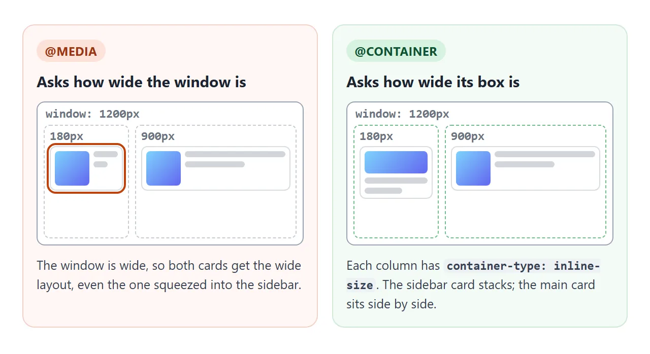
With media queries you end up writing one set of rules per place: .sidebar .card, .modal .card, and so on. With a container query, the card carries its own rules and works wherever you drop it.
How to write a container query
- Mark the container. Give the parent box
container-type: inline-size. In the example, both columns have it. - Write the default layout. Style the card for the narrowest box it may land in: picture on top, text below.
- Add @container rules. Change the layout when the container is wide enough.
- Name containers when they nest. Covered in its own section below.
.col { container-type: inline-size; }

/* default: stacked */
.card { display: grid; gap: 10px; }

/* the column is 200px or wider */
@container (min-width: 200px) {
  .card { grid-template-columns: 80px 1fr; }
}
An @container rule without a name uses the nearest ancestor that is a container. Inside it you can write any selectors, and the conditions work like media features: min-width, max-width, orientation, and the range form (width >= 400px).
container-type: inline-size, size or normal
| Value | What you can query | What it costs |
|---|---|---|
inline-size |
Width (in horizontal text) | The content can no longer set the box's width |
size |
Width and height | The content can set neither width nor height |
normal (default) |
No size queries; style queries only | Nothing |
For a block such as a column or a div, the width comes from the parent anyway, so inline-size usually costs nothing. That is why it is the one to reach for.
Boxes that take their width from their content, such as an inline-block, are the exception (see the table at the end).
size is different. The box stops taking its height from its content, and without a height of its own it becomes 0px tall. Its children still draw, spilling out over whatever comes next.
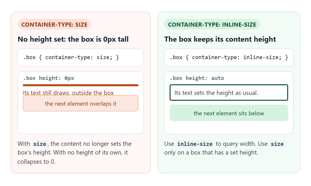
Use size only on a box that already has a height: a fixed-height panel, a grid cell with a set row height, or a full-screen section with height: 100vh.
An element cannot query itself
A container query looks for a container among the ancestors of the element being styled. If you put container-type on .card and then write @container (...) { .card { ... } }, the browser searches above the card, finds nothing, and skips the rule.
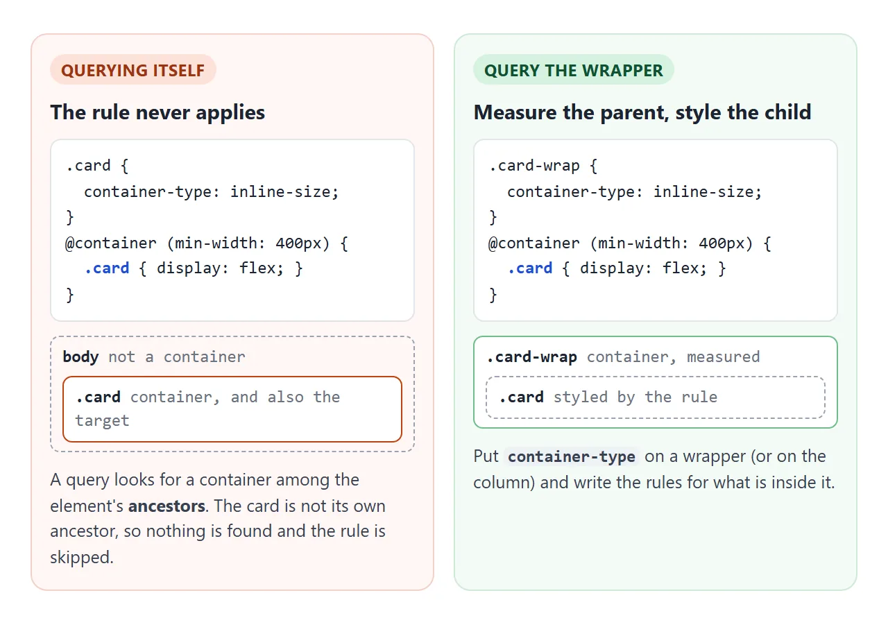
The fix is to measure one level up. Put container-type on a wrapper or on the column, and write the rules for the card and what is inside it.
If the card itself must be the box that is measured, style its children instead of the card.
Container query units: cqi, cqw, cqh
Container queries come with length units, like vw but measured against the container:
cqi– 1% of the container's inline size (its width, in horizontal text)cqb– 1% of its block size (height)cqwandcqh– 1% of its width and heightcqminandcqmax– the smaller or larger ofcqiandcqb
The sizes are taken from the container's content box, inside its padding. Move the slider below to see the difference from vw.
<!doctype html>
<html lang="en">
<head>
<meta charset="utf-8">
<meta name="viewport" content="width=device-width, initial-scale=1">
<title>cqi vs vw</title>
<style>
  body { margin: 0; padding: 12px; font-family: system-ui, sans-serif; background: #eceef1; color: #1d2330; }
  .ctrl { display: flex; align-items: center; gap: 10px; font-size: 14px; margin-bottom: 12px; }
  .ctrl input { flex: 1; }
  .box {
    container-type: inline-size;   /* makes cq units measure this box */
    width: 60%; background: #fff; border-radius: 10px; padding: 12px 14px; margin-bottom: 12px;
    border: 2px solid #cfe9d7; box-sizing: border-box;
  }
  .box.vw { border-color: #f3d1c8; }
  .tag { font: 12px ui-monospace, Consolas, monospace; color: #6b7280; }
  h2 { margin: 6px 0 0; line-height: 1.1; overflow-wrap: anywhere; }
  .cqi h2 { font-size: 9cqi; }   /* 9% of the box width */
  .vw h2 { font-size: 9vw; }     /* 9% of the window width */
</style>
</head>
<body>
<label class="ctrl">Box width <input type="range" id="w" min="30" max="100" value="60"> <span id="out">60%</span></label>

<div class="box cqi"><div class="tag">font-size: 9cqi <span class="px"></span></div><h2>Summer sale</h2></div>
<div class="box vw"><div class="tag">font-size: 9vw <span class="px"></span></div><h2>Summer sale</h2></div>

<script>
  const w = document.getElementById('w');
  const boxes = document.querySelectorAll('.box');

  function update() {
    boxes.forEach((b) => {
      b.style.width = w.value + '%';
      const size = getComputedStyle(b.querySelector('h2')).fontSize;
      b.querySelector('.px').textContent = '= ' + Math.round(parseFloat(size)) + 'px';
    });
    document.getElementById('out').textContent = w.value + '%';
  }
  w.addEventListener('input', update);
  window.addEventListener('resize', update);
  update();
</script>
</body>
</html>
A headline in cqi shrinks with the card it sits in. A headline in vw stays the same size however narrow its box gets.
Wrap it in clamp() to keep it readable at both ends: font-size: clamp(18px, 9cqi, 30px). CSS font-size covers clamp().
When no container fits, the units fall back to the small viewport units: 10cqi becomes 10svw. cqh and cqb need a size container, so inside an inline-size container they measure the viewport height instead.
Named containers for nested components
Containers nest. A page can be a container, its sidebar another, and a widget inside it a third. An unnamed @container always picks the nearest one, which may not be the box you meant.
Give each container a name with container-name, or with the container shorthand, and put the name in the rule:
.shelf { container: shelf / inline-size; }
.panel { container: panel / inline-size; }

@container shelf (min-width: 340px) {
  .grid { grid-template-columns: 1fr 1fr; }
}
@container panel (min-width: 280px) {
  .stats { grid-template-columns: repeat(3, 1fr); }
}
A named rule skips any nearer containers that have a different name. In the finished example below, a navbar, product cards and a stats widget each ask their own named box. Move the slider to change the page width.
<!doctype html>
<html lang="en">
<head>
<meta charset="utf-8">
<meta name="viewport" content="width=device-width, initial-scale=1">
<title>Components that fit their space</title>
<style>
  * { box-sizing: border-box; }
  body { margin: 0; padding: 12px; font-family: system-ui, sans-serif; background: #eceef1; color: #1d2330; }
  .ctrl { display: flex; align-items: center; gap: 10px; font-size: 14px; margin-bottom: 10px; }
  .ctrl input { flex: 1; }

  /* Four named containers */
  .page   { container: page / inline-size; background: #f8f9fb; border: 1px solid #d5d9e0; border-radius: 12px; padding: 10px; }
  .topbar { container: topbar / inline-size; }
  .shelf  { container: shelf / inline-size; }
  .panel  { container: panel / inline-size; }

  /* Page layout: stacked, then shelf + panel side by side */
  .content { display: grid; gap: 10px; margin-top: 10px; }
  @container page (min-width: 540px) {
    .content { grid-template-columns: 1fr 200px; align-items: start; }
  }

  /* Navbar: a Menu button when narrow, links when there is room */
  .nav { display: flex; align-items: center; gap: 14px; background: #1d2330; color: #fff; border-radius: 8px; padding: 8px 12px; }
  .nav b { margin-right: auto; }
  .nav a { color: #cbd5e1; text-decoration: none; font-size: 14px; display: none; }
  .nav button { border: 1px solid #64748b; background: none; color: #fff; border-radius: 6px; padding: 4px 10px; font: inherit; font-size: 13px; }
  @container topbar (min-width: 420px) {
    .nav a { display: inline; }
    .nav button { display: none; }
  }

  /* Product cards: stacked, then side by side, then picture beside text */
  .grid { display: grid; gap: 10px; }
  .product { background: #fff; border: 1px solid #e1e4ea; border-radius: 10px; padding: 10px; display: grid; gap: 6px; }
  .product .pic { height: 64px; border-radius: 7px; background: linear-gradient(135deg, #fcd34d, #f97316); }
  .product:nth-child(2) .pic { background: linear-gradient(135deg, #86efac, #0d9488); }
  .product h3 { margin: 0; font-size: 15px; }
  .product span { font-size: 13px; color: #4b5563; }
  @container shelf (min-width: 340px) {
    .grid { grid-template-columns: 1fr 1fr; }
  }
  @container shelf (min-width: 520px) {
    .product { grid-template-columns: 90px 1fr; grid-template-rows: auto 1fr; }
    .product .pic { height: 90px; grid-row: span 2; }
  }

  /* Stats widget: one column, then three across */
  .stats { display: grid; gap: 6px; background: #fff; border: 1px solid #e1e4ea; border-radius: 10px; padding: 10px; }
  .stat { display: flex; justify-content: space-between; align-items: baseline; font-size: 13px; color: #4b5563; }
  .stat b { font-size: 18px; color: #1d2330; }
  @container panel (min-width: 280px) {
    .stats { grid-template-columns: repeat(3, 1fr); text-align: center; }
    .stat { flex-direction: column-reverse; align-items: center; }
    .stat b { font-size: clamp(18px, 9cqi, 30px); }   /* grows with the panel */
  }
</style>
</head>
<body>
<label class="ctrl">Page width <input type="range" id="w" min="260" max="760" value="760"> <span id="out"></span></label>

<div class="page" id="page">
  <div class="topbar">
    <nav class="nav"><b>Shop</b><a href="#">New</a><a href="#">Men</a><a href="#">Women</a><button>Menu</button></nav>
  </div>
  <div class="content">
    <section class="shelf">
      <div class="grid">
        <article class="product"><div class="pic"></div><h3>Canvas tote</h3><span>$24 · 3 colours</span></article>
        <article class="product"><div class="pic"></div><h3>Rain jacket</h3><span>$89 · 5 sizes</span></article>
      </div>
    </section>
    <aside class="panel">
      <div class="stats">
        <div class="stat">Orders <b>128</b></div>
        <div class="stat">Returns <b>4</b></div>
        <div class="stat">Rating <b>4.8</b></div>
      </div>
    </aside>
  </div>
</div>

<script>
  const w = document.getElementById('w');
  const page = document.getElementById('page');
  function update() {
    page.style.width = w.value + 'px';
    page.style.maxWidth = '100%';
    document.getElementById('out').textContent = Math.round(page.getBoundingClientRect().width) + 'px';
  }
  w.addEventListener('input', update);
  window.addEventListener('resize', update);
  update();
</script>
</body>
</html>
Notice that .shelf does not style itself. Its grid lives on an inner .grid element, because a container cannot query its own width. The page layout itself uses CSS grid.
Container queries vs media queries
They do different jobs, and most pages use both.
| Media query | Container query | |
|---|---|---|
| Measures | The viewport or device | An ancestor you marked |
| Setup | None | container-type on the parent |
| Good for | Page layout, print, dark mode, reduced motion | Reusable components |
| Can test user settings | Yes, such as prefers-color-scheme |
No |
Use media queries to decide how many columns the page has. Use container queries for what goes inside those columns.
Style queries, briefly
@container can also test a custom property on the container: @container style(--variant: compact) { ... }. Every element is a style container by default, so no container-type is needed.
This works in Chromium-based browsers; check current support in the other browsers you target before depending on it.
The JavaScript alternative: ResizeObserver
Before container queries, components did this with a ResizeObserver: watch an element, read its width in the callback, and toggle a class. The first example uses one, only to print each column's width.
new ResizeObserver(([entry]) => {
  card.classList.toggle('wide', entry.contentRect.width >= 400);
}).observe(card);
It still has a place. It can react to an element's own size, and it can run any code, such as switching a chart to fewer labels. For layout alone, the CSS version is shorter and never runs a script.
When it does not work
| What you see | Cause | Fix |
|---|---|---|
The @container rules never apply |
No ancestor has container-type |
Add container-type: inline-size to the parent |
| Rules for the container element itself are ignored | An element cannot query itself | Style its children, or add a wrapper and mark that |
| A box is suddenly 0px tall and content overlaps | container-type: size without a height |
Use inline-size, or give the box a height |
| A named rule never applies | The name in @container does not match container-name |
Copy the name exactly; names are case-sensitive |
| An inline-block container shrinks to 0px wide | Its width came from its content, which inline-size blocks |
Give it a width, or make it a block |
cqi sizes follow the window |
No container above the element | Add container-type to an ancestor |
cqh follows the window height |
The container is inline-size |
Use size with a set height, or size by width |
Share it as a link
Container queries are hard to show in a screenshot, because the point is what happens when the space changes. A screenshot shows one width. A live page lets the reader drag the divider or the slider and watch the components rearrange.
To send the working version, paste the page into a NOS document and choose Create share link. HTML to link walks through it.
The page renders as written and its scripts run, so the people you send it to can resize the boxes themselves. If you change the code later, the same link shows the new version.