To detect when an element changes size in JavaScript, create a ResizeObserver and call observe() on the element.
The browser calls your function with the new size after layout and before paint, whatever caused the change: the window, a sidebar, a longer title or a CSS rule.
const ro = new ResizeObserver((entries) => {
  for (const entry of entries) {
    const { inlineSize, blockSize } = entry.contentBoxSize[0];
    console.log(entry.target, inlineSize, blockSize);
  }
});
ro.observe(document.querySelector('.panel'));
Try it. Drag the corner of the blue box (it uses CSS resize: both), or move the slider on a phone. The table shows what each entry reports.
<!doctype html>
<html lang="en">
<head>
<meta charset="utf-8">
<meta name="viewport" content="width=device-width, initial-scale=1">
<title>ResizeObserver size readout</title>
<style>
  body { margin: 0; padding: 14px; font-family: system-ui, sans-serif; background: #f4f5f7; color: #1d2330; }
  label { display: flex; gap: 8px; align-items: center; font-size: 14px; margin-bottom: 10px; }
  input[type=range] { flex: 1; max-width: 260px; }
  .box {
    width: 220px; height: 90px; min-width: 80px; min-height: 60px; max-width: calc(100% - 44px);
    padding: 16px; border: 6px solid #2563eb; border-radius: 10px; background: #fff;
    resize: both; overflow: auto;   /* resize only works when overflow is not visible */
    font-size: 13px; color: #5b6270;
  }
  table { margin-top: 12px; border-collapse: collapse; font-size: 14px; background: #fff; }
  td, th { padding: 6px 10px; border: 1px solid #dde1e7; text-align: left; }
  td:last-child { font: 600 14px ui-monospace, Consolas, monospace; }
  #count { font-size: 13px; color: #5b6270; margin-top: 8px; }
</style>
</head>
<body>
<label>Width <input type="range" id="w" min="80" max="320" value="220"></label>
<div class="box" id="box">Drag my bottom-right corner, or use the slider. Padding 16px, border 6px.</div>

<table>
  <tr><th>entry field</th><th>width x height</th></tr>
  <tr><td>contentRect</td><td id="cr"></td></tr>
  <tr><td>contentBoxSize[0]</td><td id="cb"></td></tr>
  <tr><td>borderBoxSize[0]</td><td id="bb"></td></tr>
</table>
<div id="count"></div>

<script>
  const box = document.getElementById('box');
  const r = (n) => Math.round(n);
  let calls = 0;

  const ro = new ResizeObserver((entries) => {
    for (const entry of entries) {
      const c = entry.contentBoxSize[0];   // inlineSize = width, blockSize = height
      const b = entry.borderBoxSize[0];    // adds padding and border
      document.getElementById('cr').textContent = r(entry.contentRect.width) + ' x ' + r(entry.contentRect.height);
      document.getElementById('cb').textContent = r(c.inlineSize) + ' x ' + r(c.blockSize);
      document.getElementById('bb').textContent = r(b.inlineSize) + ' x ' + r(b.blockSize);
    }
    document.getElementById('count').textContent = 'Callback ran ' + (++calls) + ' times';
  });
  ro.observe(box);  // the first callback arrives right after this, with the current size

  document.getElementById('w').addEventListener('input', (e) => {
    box.style.width = e.target.value + 'px';
  });
</script>
</body>
</html>
The callback also runs once right after observe(), with the current size. You do not need a separate "measure on load" step.
ResizeObserver vs the window resize event
The resize event on window only fires when the browser window changes. A chart inside a panel does not care about the window. It cares about the panel, and the panel can shrink while the window stays exactly the same.
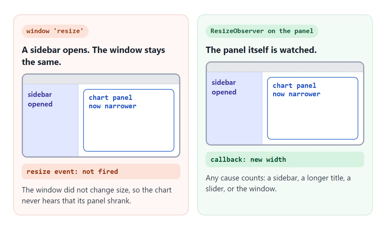
You also cannot observe the window itself. observe(window) throws a TypeError, because the method only accepts elements. Keep the resize event for the window, and use an observer for anything inside the page.
What an entry contains
Each entry has a target (the element) and the size in three forms. contentBoxSize and borderBoxSize are arrays; read item [0]. inlineSize is the width and blockSize the height in normal horizontal text.
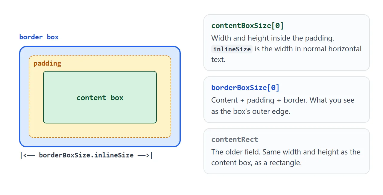
| Field | Measures | Use it for |
|---|---|---|
contentBoxSize[0] |
Inside the padding | Space available for content, such as a canvas |
borderBoxSize[0] |
Content + padding + border | The size the element takes on screen |
contentRect |
Content box as a rectangle | Older code; same width and height as the content box |
devicePixelContentBoxSize[0] |
Content box in device pixels | Exact canvas buffer size, where the browser provides it |
In the first demo the box is 220px wide with 16px padding and a 6px border, so the content width reads 220 and the border box reads 264.
The box option
The second argument to observe() picks which box triggers the callback:
ro.observe(el);                          // default: 'content-box'
ro.observe(el, { box: 'border-box' });
ro.observe(el, { box: 'device-pixel-content-box' });
The choice matters when only padding or border changes. With the default, changing padding alone does not call you, because the content box did not move. With border-box, the same padding change does. Every entry still carries all the sizes.
Element breakpoints, and when container queries are better
A card in a narrow sidebar and the same card in a wide main column need different layouts, even at the same window width. Media queries only see the viewport. ResizeObserver lets the card decide by its own width.
<!doctype html>
<html lang="en">
<head>
<meta charset="utf-8">
<meta name="viewport" content="width=device-width, initial-scale=1">
<title>Element breakpoints: ResizeObserver vs container queries</title>
<style>
  body { margin: 0; padding: 14px; font-family: system-ui, sans-serif; background: #f4f5f7; color: #1d2330; }
  label { display: flex; gap: 8px; align-items: center; font-size: 14px; margin-bottom: 4px; }
  input[type=range] { flex: 1; max-width: 280px; }
  h3 { font-size: 13px; margin: 14px 0 6px; color: #5b6270; font-weight: 600; }
  .slot { width: 420px; max-width: 100%; }
  .card {
    display: grid; gap: 12px; padding: 12px; border-radius: 12px;
    background: #fff; box-shadow: 0 3px 12px rgba(0, 0, 0, .1);
  }
  .pic { height: 70px; border-radius: 8px; background: linear-gradient(135deg, #60a5fa, #a78bfa); }
  .card b { display: block; margin-bottom: 4px; }
  .card p { margin: 0; font-size: 13px; color: #5b6270; }

  /* A: a class set by ResizeObserver */
  #js.wide { grid-template-columns: 110px 1fr; }
  #js.wide .pic { height: auto; min-height: 70px; }

  /* B: the same rule as a container query, no JavaScript */
  .cq { container-type: inline-size; }
  @container (min-width: 300px) {
    .card.css { grid-template-columns: 110px 1fr; }
    .card.css .pic { height: auto; min-height: 70px; }
  }
  .state { font: 600 12px ui-monospace, Consolas, monospace; color: #1d4ed8; }
</style>
</head>
<body>
<label>Slot width <input type="range" id="w" min="180" max="420" value="420"> <span id="wv"></span></label>

<h3>A · ResizeObserver adds a class <span class="state" id="st"></span></h3>
<div class="slot"><div class="card" id="js">
  <div class="pic"></div>
  <div><b>Weekly report</b><p>Side by side at 300px and wider, stacked below that.</p></div>
</div></div>

<h3>B · CSS container query, no script</h3>
<div class="slot cq"><div class="card css">
  <div class="pic"></div>
  <div><b>Weekly report</b><p>Side by side at 300px and wider, stacked below that.</p></div>
</div></div>

<script>
  const card = document.getElementById('js');

  // The card's own width picks the layout, not the window's width
  const ro = new ResizeObserver(([entry]) => {
    const width = entry.borderBoxSize[0].inlineSize;
    const wide = width >= 300;
    card.classList.toggle('wide', wide);
    document.getElementById('st').textContent = Math.round(width) + 'px, ' + (wide ? 'wide' : 'narrow');
  });
  ro.observe(card);

  // Resize both slots together
  const slider = document.getElementById('w');
  const label = document.getElementById('wv');
  slider.addEventListener('input', () => {
    document.querySelectorAll('.slot').forEach((s) => (s.style.width = slider.value + 'px'));
    label.textContent = slider.value + 'px';
  });
  label.textContent = slider.value + 'px';
</script>
</body>
</html>
new ResizeObserver(([entry]) => {
  const width = entry.borderBoxSize[0].inlineSize;
  card.classList.toggle('wide', width >= 300);
}).observe(card);
Both halves switch at the same point. If all you change is styling, the CSS version is shorter and runs without JavaScript:
.slot { container-type: inline-size; }
@container (min-width: 300px) {
  .card { grid-template-columns: 110px 1fr; }
}
Reach for ResizeObserver when script needs the actual number: how many columns of data to render, how many tabs fit before a "More" menu, or what size to draw a canvas. For viewport-wide rules, media queries remain the simpler tool.
Redraw a canvas chart to fit its box
A canvas has two sizes: its CSS size on the page and its pixel buffer (canvas.width, canvas.height).
When the box grows and only the CSS size follows, the browser stretches the old buffer and the chart goes soft. Why a canvas looks blurry explains the mismatch in detail.
<!doctype html>
<html lang="en">
<head>
<meta charset="utf-8">
<meta name="viewport" content="width=device-width, initial-scale=1">
<title>Canvas chart that fits its box</title>
<style>
  body { margin: 0; padding: 14px; font-family: system-ui, sans-serif; background: #f4f5f7; color: #1d2330; }
  label { display: flex; gap: 8px; align-items: center; font-size: 14px; margin-bottom: 12px; }
  input[type=range] { flex: 1; max-width: 280px; }
  .chart {
    width: 100%; height: 260px;
    background: #fff; border-radius: 12px; box-shadow: 0 3px 12px rgba(0, 0, 0, .1);
  }
  /* The canvas fills the box. Its CSS size never depends on its pixel buffer. */
  canvas { display: block; width: 100%; height: 100%; }
  #info { font: 13px ui-monospace, Consolas, monospace; color: #5b6270; margin-top: 10px; }
</style>
</head>
<body>
<label>Chart width <input type="range" id="w" min="30" max="100" value="100"> <span id="wv">100%</span></label>
<div class="chart" id="chart"><canvas id="c"></canvas></div>
<div id="info"></div>

<script>
  const box = document.getElementById('chart');
  const canvas = document.getElementById('c');
  const ctx = canvas.getContext('2d');
  const data = [12, 19, 8, 15, 22, 17, 25, 21, 28, 24, 31, 27];

  function draw(w, h) {
    const dpr = window.devicePixelRatio || 1;
    // Pixel buffer = CSS size x devicePixelRatio, so lines stay sharp
    canvas.width = Math.round(w * dpr);
    canvas.height = Math.round(h * dpr);
    ctx.setTransform(dpr, 0, 0, dpr, 0, 0);   // draw in CSS pixels from here on

    const pad = 28, max = Math.max(...data);
    const x = (i) => pad + (i * (w - pad * 2)) / (data.length - 1);
    const y = (v) => h - pad - (v / max) * (h - pad * 2);

    ctx.strokeStyle = '#e5e7eb'; ctx.lineWidth = 1;
    for (let g = 0; g <= 4; g++) {
      const gy = pad + (g * (h - pad * 2)) / 4;
      ctx.beginPath(); ctx.moveTo(pad, gy); ctx.lineTo(w - pad, gy); ctx.stroke();
    }
    ctx.strokeStyle = '#2563eb'; ctx.lineWidth = 2.5; ctx.lineJoin = 'round';
    ctx.beginPath();
    data.forEach((v, i) => (i ? ctx.lineTo(x(i), y(v)) : ctx.moveTo(x(i), y(v))));
    ctx.stroke();
    ctx.fillStyle = '#2563eb';
    data.forEach((v, i) => { ctx.beginPath(); ctx.arc(x(i), y(v), 3.5, 0, Math.PI * 2); ctx.fill(); });
    ctx.fillStyle = '#5b6270'; ctx.font = '12px system-ui, sans-serif';
    ctx.fillText('Weekly sign-ups', pad, 18);

    document.getElementById('info').textContent =
      'box ' + Math.round(w) + ' x ' + Math.round(h) + ' CSS px, buffer ' +
      canvas.width + ' x ' + canvas.height + ', dpr ' + dpr;
  }

  // Observe the box, not the canvas, so setting the buffer size cannot loop back
  new ResizeObserver(([entry]) => {
    const { inlineSize, blockSize } = entry.contentBoxSize[0];
    draw(inlineSize, blockSize);
  }).observe(box);

  document.getElementById('w').addEventListener('input', (e) => {
    box.style.width = e.target.value + '%';
    document.getElementById('wv').textContent = e.target.value + '%';
  });
</script>
</body>
</html>
The pattern in the demo:
- Give the canvas
width: 100%; height: 100%inside a sized box, and observe the box, not the canvas. - In the callback, set the buffer to the box size times
devicePixelRatio. - Call
setTransform(dpr, 0, 0, dpr, 0, 0)and draw in CSS pixels.
Setting canvas.width clears the canvas, so the callback has to draw everything again. Keep the data outside the draw function so a redraw is cheap.
Sync a growing textarea with the rest of the page
An auto-growing textarea sets its own height on input, as shown in the HTML textarea guide. The user can also drag its corner. An observer catches both, so a line-number gutter or a preview panel can match its height.
new ResizeObserver(([entry]) => {
  gutter.style.height = entry.borderBoxSize[0].blockSize + 'px';
}).observe(textarea);
This changes a different element, so it cannot feed back into the textarea. Changing the textarea's own height here is what starts the loop error below.
The loop error and how to avoid it
"ResizeObserver loop completed with undelivered notifications" appears when a callback resizes an element that the browser has already handled in the current frame, most often the observed element itself.
The browser holds that notification for the next frame and fires an error event on window. Error overlays and error trackers pick it up.
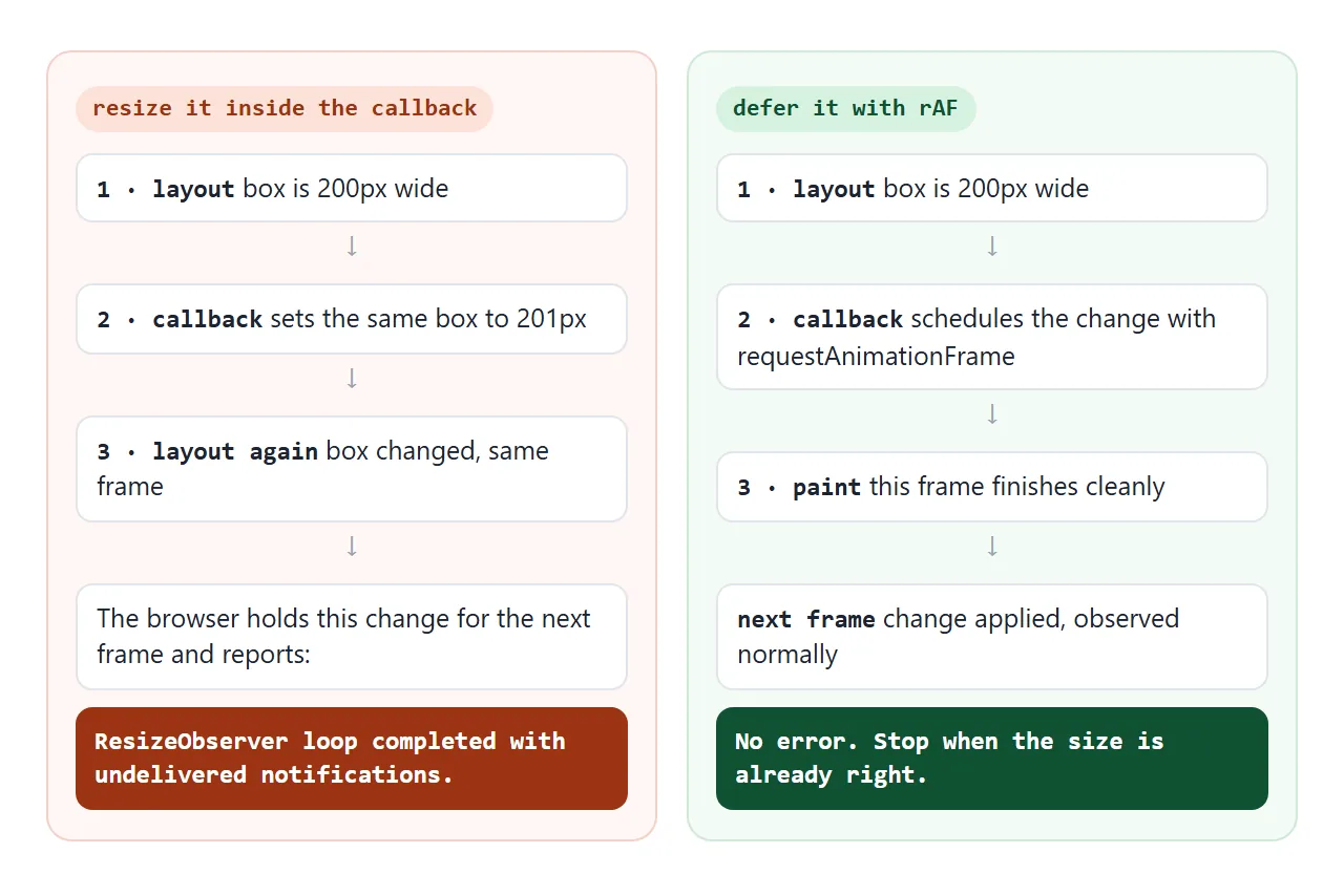
Three ways out, in order of preference:
- Change something else. Observe the container and resize a child, as the canvas demo does.
- Only change when needed. Compare with the last value and return early if nothing would change.
- Defer it. Wrap the change in
requestAnimationFrame, so it lands in the next frame and is observed normally.
new ResizeObserver(([entry]) => {
  requestAnimationFrame(() => {
    const want = Math.round(entry.contentBoxSize[0].inlineSize / 2);
    if (el.offsetHeight !== want) el.style.height = want + 'px';
  });
}).observe(el);
The guard matters. Without it, a deferred change can still resize the element every frame forever, just without the error. requestAnimationFrame covers how frame timing works.
Stop observing: unobserve and disconnect
ro.unobserve(el) stops watching one element. ro.disconnect() stops all of them. Call one of them when the element or component goes away, so the callback does not keep running for something nobody sees.
In React, the observer lives in an effect and disconnects in the cleanup:
function useSize(ref) {
  const [size, setSize] = useState(null);
  useEffect(() => {
    const ro = new ResizeObserver(([entry]) => {
      const { inlineSize, blockSize } = entry.borderBoxSize[0];
      setSize({ width: inlineSize, height: blockSize });
    });
    ro.observe(ref.current);
    return () => ro.disconnect();
  }, [ref]);
  return size;
}
To react when an element scrolls into view rather than when it changes size, use IntersectionObserver instead. To react when its children or attributes change, use MutationObserver.
When it does not work
| What you see | Cause | Fix |
|---|---|---|
| "ResizeObserver loop completed with undelivered notifications" | The callback resizes the element it observes | Resize a different element, add a guard, or defer with requestAnimationFrame |
TypeError on observe(window) |
Only elements can be observed | Use the resize event, or observe document.documentElement |
| Canvas blurry after the box grows | Only the CSS size changed, not the buffer | Set canvas.width and canvas.height to size times devicePixelRatio and redraw |
| Canvas keeps growing on its own | The observer watches the canvas, and the canvas size follows its buffer | Observe the wrapper; give the canvas width: 100% and height: 100% |
| First reading is 0 by 0 | The element has display: none or no size yet |
Wait: the callback runs again when it gets a size |
| Size read on page load is wrong | Measured before layout or fonts settled | Read sizes in the callback, not once on load |
| Changing padding does nothing | The default box is content-box |
Observe with { box: 'border-box' } |
| Resizing feels sluggish | Heavy work runs in every callback | Keep the callback to measuring and drawing; debounce expensive work with a timer |
Share it as a link
A resizing demo only makes sense when someone can drag the edge themselves. A screenshot is frozen at one width, and an .html file sent as an attachment may open as plain code on a phone.
Paste the page into a NOS document and choose Create share link. HTML to link walks through it.
The page renders as written and its scripts run, so the people you send it to can resize the boxes and watch the chart redraw. If you change the code later, the same link shows the new version.