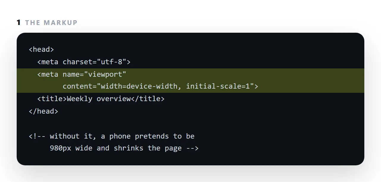
The viewport meta tag is one line in the head, <meta name="viewport" content="width=device-width, initial-scale=1">, and it is the difference between a page that reads on a phone and one that arrives as a shrunken postage stamp.
Without it, a phone browser assumes a desktop-width page, lays it out at about 980px, and scales the whole thing down to fit.
This guide covers why phones do that, what each value in the tag means, why disabling zoom is a mistake, and how to check a page has the line before sending it.
<meta name="viewport" content="width=device-width,initial-scale=1">
That line, in the <head>. It is the difference between a page that reads on a phone and one that does not.
Why the viewport meta tag is needed at all
When phones arrived, the web was full of pages built for desktop windows. Rendering those at 360px would have broken them, so mobile browsers pretended to be about 980px wide and scaled the result down — every page fitted, and everything was tiny but recognisable.
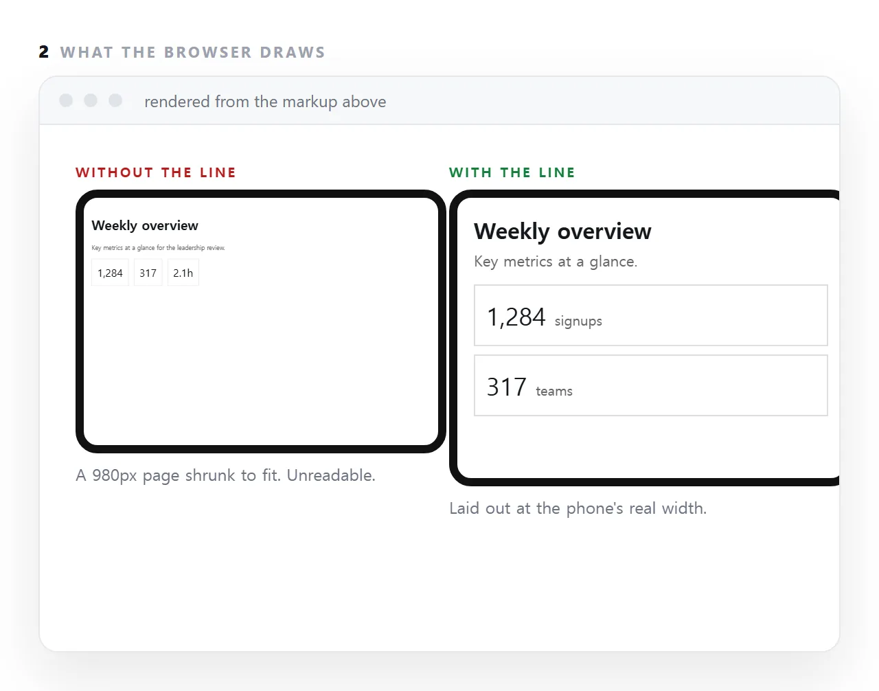
That behaviour is still the default. A page with no viewport line is being treated as a legacy desktop page.
What each value does
| Value | Meaning |
|---|---|
width=device-width |
Lay out at the device's real width |
initial-scale=1 |
Start at 100% zoom, no shrinking |
maximum-scale |
Cap how far the reader may zoom — do not use |
user-scalable=no |
Disable pinch-zoom entirely — do not use |
viewport-fit=cover |
Extend under notches and rounded corners |
Both width=device-width and initial-scale=1 are needed. Some older browsers ignored one or the other, and the combination is what works everywhere.
Do not disable zoom
<!-- do not do this -->
<meta name="viewport" content="width=device-width,initial-scale=1,maximum-scale=1,user-scalable=no">
It is a common copy-paste and it is a real harm: people with low vision zoom to read. Blocking that makes the page unusable for them, and the design problem it was added to hide — usually a form field that zooms on focus — is better fixed by setting a 16px font size on inputs, which is the actual trigger.
Safe areas, when you use viewport-fit
<meta name="viewport" content="width=device-width,initial-scale=1,viewport-fit=cover">
body {
  padding-left: env(safe-area-inset-left);
  padding-right: env(safe-area-inset-right);
  padding-bottom: env(safe-area-inset-bottom);
}
Without the padding, content sits under the notch and behind the home indicator. The env() variables report the hardware insets and are zero on devices without them, so the rule is safe everywhere.
The related unit problem
100vh on a phone means the viewport height including the area the browser toolbar sometimes occupies — so a full-height section is slightly taller than what you can see, and a sliver of the next section always shows.
.hero { min-height: 100svh; }
svh is the small viewport height: the height when the toolbars are visible. For full-screen sections and slides this is what you want.
Testing
Narrow your browser window to about 360 pixels. That catches the viewport problem and every other mobile fault at once, and it is faster than a device emulator.
If the text is present but minuscule, this line is missing. If the page scrolls sideways, this line is present and something inside is too wide.
Why it keeps being the first thing to check
Generated pages omit it regularly, because it was never mentioned in the request. And the symptom — an unreadably small page — looks like a design failure rather than a missing meta tag, so people start rewriting CSS. Check the head first.
What each value in the tag means
width=device-width sets the layout width to the device's real width in CSS pixels, so a page reflows instead of being scaled. initial-scale=1 starts at 100% zoom rather than zoomed out to fit.
Those two are the whole tag for almost every page. maximum-scale and user-scalable exist and should be left alone; a reader who needs to zoom needs to zoom. viewport-fit=cover matters only for pages that draw under a phone's notch.
Why the phone pretends to be 980px wide
Before phones had browsers worth the name, every page assumed a desktop, so the first mobile browsers laid pages out at a desktop-like width and shrank the result, which at least showed the whole page.
The viewport tag is how a page declares that it was designed for narrow screens and can be laid out at the real width.
Decades later, the default has not changed, which is why a generated page without the line still arrives as a postage stamp.
Pages that have the line and still fail
The tag sets the layout width; it does not make a 1,200px wrapper narrower.
If the page still scrolls sideways after the line is added, something inside has a fixed width larger than the screen: a container, a table, an image, a grid with a hard-coded column count.
Find it with the console one-liner in the mobile layout guide, and replace the fixed value with a maximum. The viewport line is necessary; it is not sufficient.
Adding and checking the viewport line: 4 steps
- Add the line to the head.
width=device-width, initial-scale=1. Nothing else is needed for most pages. - Do not add
user-scalable=no. It stops readers zooming, which some need in order to read at all, and browsers increasingly ignore it. - Check at 360px. Narrow the window in the HTML viewer. The page should reflow, not shrink.
- Fix what still overflows. Fixed widths, hard-coded column counts and images without
max-width: 100%. Generated HTML on mobile lists the five.