An SVG will scale to fit its container in HTML when it has a viewBox and no fixed width or height attribute. Add the viewBox, strip the size attributes, size it in CSS instead.
<!-- before: fixed at 512 by 512 -->
<svg width="512" height="512" xmlns="http://www.w3.org/2000/svg"> ... </svg>

<!-- after: scales to whatever contains it -->
<svg viewBox="0 0 512 512" xmlns="http://www.w3.org/2000/svg"> ... </svg>
svg { width: 100%; height: auto; display: block; }
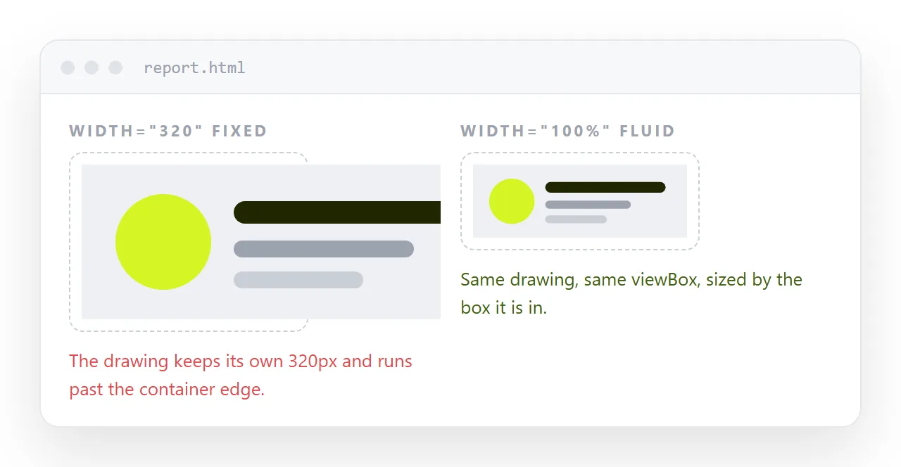
What viewBox actually declares
Four numbers, in order: min-x min-y width height. They describe a window onto the drawing's own coordinate space.
viewBox="0 0 512 512" says the interesting part of this drawing runs from 0 to 512 on both axes. The browser then maps that square onto however many real pixels the element occupies.
Without a viewBox, coordinates are read as CSS pixels. The drawing has a fixed intrinsic size and stretching the element just adds empty space around it.
The attributes that fight you
| What is on the svg tag | Result |
|---|---|
| viewBox only | Scales to the container, keeps its ratio |
| viewBox plus width and height | Fixed size, unless CSS overrides both |
| width and height only | Fixed size, no scaling at all |
| Neither | Defaults to 300 by 150, drawing clipped |
The last row catches people who deleted the size attributes without adding a viewBox. The SVG does not disappear, it collapses into a 300 by 150 box and cuts the drawing off.
Getting the viewBox from a file that lacks one
Design exports usually include it. Hand written SVG often does not.
- Open the file and find the largest coordinates used by any shape.
- Or open it in a browser and read the intrinsic size from dev tools.
- Write
viewBox="0 0 W H"using the originalwidthandheightvalues, then delete those two attributes.
Step three is the common case. If the tag said width="240" height="96", the viewBox is 0 0 240 96 and the drawing is unchanged.
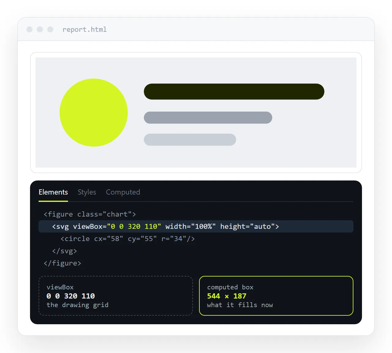
preserveAspectRatio: fit inside or cover
This attribute decides what happens when the container's ratio differs from the viewBox's.
<!-- default: whole drawing visible, empty space on one axis -->
<svg viewBox="0 0 16 9" preserveAspectRatio="xMidYMid meet"> ... </svg>

<!-- cover the box, crop the excess -->
<svg viewBox="0 0 16 9" preserveAspectRatio="xMidYMid slice"> ... </svg>

<!-- stretch, ignore the ratio -->
<svg viewBox="0 0 16 9" preserveAspectRatio="none"> ... </svg>
- meet is the default and behaves like
object-fit: contain. - slice behaves like
object-fit: coverand is what you want for a decorative banner. - none distorts. It is acceptable for a full width gradient or wave, and wrong for anything with text or circles in it.
The xMidYMid part is alignment. Change it to xMinYMin to pin the drawing to the top left instead of centring it.
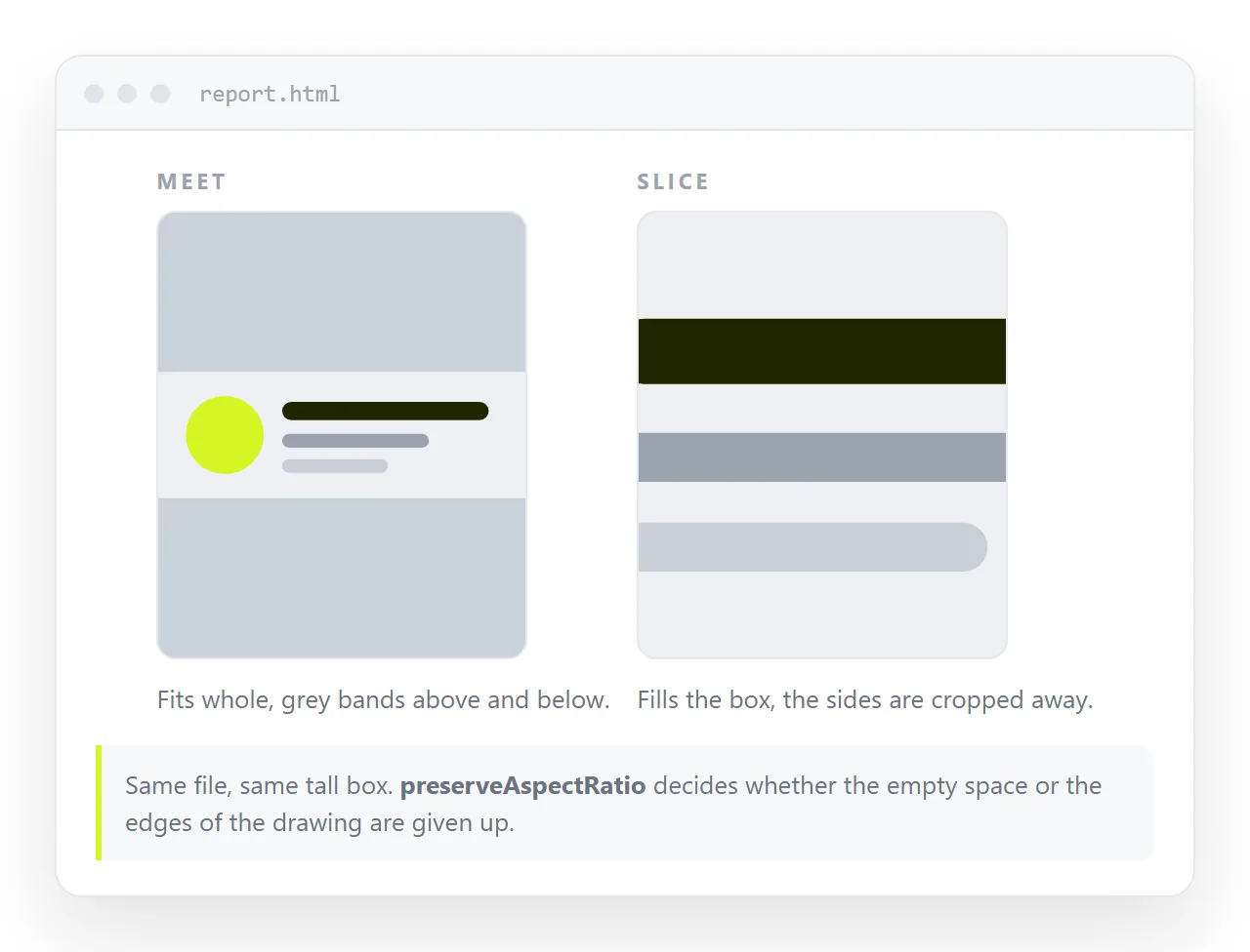
Three sizing recipes that cover most cases
Full width banner, height follows.
.banner svg { width: 100%; height: auto; display: block; }
Icon at a fixed size, colour from the text. Icons are the one case where fixed dimensions are correct. See SVG icons for the set level view.
.icon { width: 1em; height: 1em; fill: currentColor; vertical-align: -0.125em; }
Fill a fixed panel and crop.
.panel { aspect-ratio: 21 / 9; }
.panel svg { width: 100%; height: 100%; }
with preserveAspectRatio="xMidYMid slice" on the SVG itself.
Gaps and overflow
Two problems show up after the scaling works.
A few pixels of space below the SVG. It is an inline element sitting on the text baseline. display: block on the svg removes it.
Shapes spilling past the edge. Something is drawn outside the viewBox window. SVG clips to the viewBox by default, but overflow: visible in a stylesheet turns that off. Check for a blanket * { overflow: visible } rule.
Reserving the space before it loads
An SVG with a viewBox has an intrinsic ratio, so the browser can reserve the right height before the file arrives. That only holds for inline SVG and for an <img> whose file carries the viewBox.
For anything loaded late, state the ratio yourself so the page does not jump when it lands.
.figure svg, .figure img { width: 100%; height: auto; aspect-ratio: 16 / 9; }
The same line prevents the layout shift that shows up as content moving under the reader's cursor a second after the page appears.
Scaling inside a canvas or an image
If the SVG is loaded with <img>, the same viewBox rule applies, and you size the img like any picture with object-fit. You lose CSS access to the shapes, which matters if you also want to change the colour.
For a favicon the viewBox is what lets one file serve 16px and 180px without a second export.
Checking it at more than one width
Resize the window. That catches most of it. The rest shows up when the page is opened somewhere other than your editor, usually because the stylesheet did not travel and the SVG fell back to its attribute size.
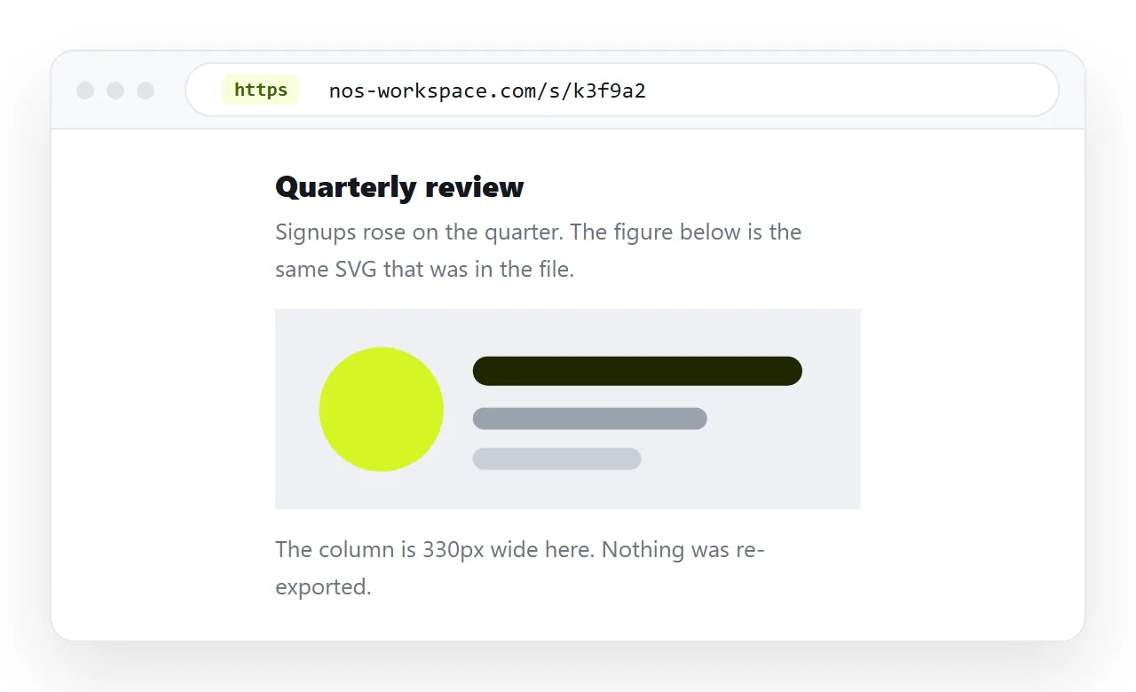
Paste the HTML into a NOS document and open the link on a phone. The markup renders as written, so what you see there is what the reader gets.
A wrong viewBox is obvious in one glance at a narrow width. Fixing it is an edit to the same page, and the link you already sent points at the fix.
Quick reference
| Symptom | Cause | Fix |
|---|---|---|
| Stuck at one size | width and height attributes |
Remove them, size in CSS |
| Collapses to a small box | No viewBox | Add viewBox="0 0 W H" |
| Letterboxed inside its container | Ratio mismatch, meet |
Use slice, or match the ratio |
| Distorted | preserveAspectRatio="none" |
Remove it |
| Small gap underneath | Inline element baseline | display: block |
| Shapes spill outside | overflow: visible inherited |
Remove the blanket rule |