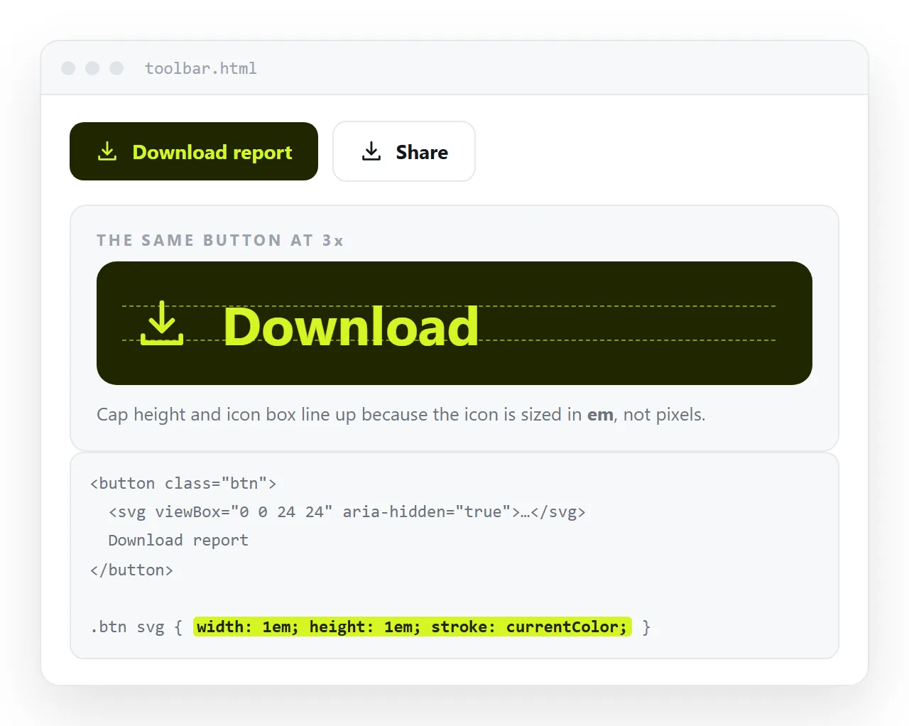
To use SVG icons in HTML, paste the icon markup inline, set its size in em and its colour to currentColor. The icon then follows the surrounding text on both counts.
<button>
  <svg viewBox="0 0 24 24" width="1em" height="1em" fill="currentColor" aria-hidden="true">
    <path d="M12 5v14M5 12h14" stroke="currentColor" stroke-width="2" fill="none"/>
  </svg>
  Add row
</button>
The three delivery methods
| Method | Styleable from CSS | Best for |
|---|---|---|
Inline <svg> |
Yes | A handful of icons, or any icon you restyle |
<symbol> sprite plus <use> |
Yes | The same icons repeated many times |
<img src="icon.svg"> |
No | Logos and fixed art that never change colour |
Icon fonts are a fourth option that still works. They download a whole typeface for a few glyphs and fall back to empty boxes when the font fails, so most sets have moved to SVG.
Sizing in em rather than pixels
Pixel sizes look right in one place and wrong two components later. Relative sizing removes the maintenance.
.icon {
  width: 1em;
  height: 1em;
  fill: currentColor;
  vertical-align: -0.125em;
  flex: none;
}
vertical-align fixes the icon sitting slightly high against the baseline. flex: none stops it being squashed when it is the first child of a flex row with long text beside it.
For an icon that should be larger than its label, set font-size on the icon rather than a pixel width. It stays proportional when the page is zoomed.
The sprite pattern
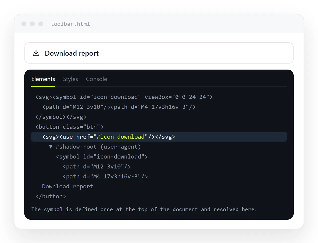
Repeat the same eight icons across a long document and inline markup becomes most of the file. Define each one once.
<svg width="0" height="0" style="position:absolute" aria-hidden="true">
  <symbol id="i-check" viewBox="0 0 24 24">
    <path d="M20 6 9 17l-5-5" fill="none" stroke="currentColor" stroke-width="2"/>
  </symbol>
  <symbol id="i-alert" viewBox="0 0 24 24">
    <path d="M12 3 2 21h20L12 3zm0 6v6m0 3v.01" fill="none" stroke="currentColor" stroke-width="2"/>
  </symbol>
</svg>
Then each use is one short tag:
<svg class="icon"><use href="#i-check"/></svg>
<svg class="icon" style="color:#ef4444"><use href="#i-alert"/></svg>
The viewBox lives on the symbol, so the instances do not need one. Because the paths use currentColor, each instance takes the colour of its own context, which is how changing SVG colour works at set level.
Accessibility in three rules
- Decorative icon beside a text label.
aria-hidden="true"on the svg. The label already says it. - Icon alone in a button or link. Name the control:
<button aria-label="Delete row">. See aria-label for the wording. - Icon carrying meaning in a table cell, a status tick for example. Give the svg
role="img"and anaria-label, or put visually hidden text beside it.
Never leave an icon only button unnamed. A screen reader reaches it and announces "button", with nothing else to go on.
Hover and state without extra markup
Because the icon inherits color, state changes are one rule on the parent.
.row-action { color: #94a3b8; transition: color 150ms ease; }
.row-action:hover,
.row-action:focus-visible { color: #38bdf8; }
The transition belongs on the resting state, not inside :hover, or the icon snaps back the moment the pointer leaves. CSS hover transition covers why.
Cleaning up exported icons
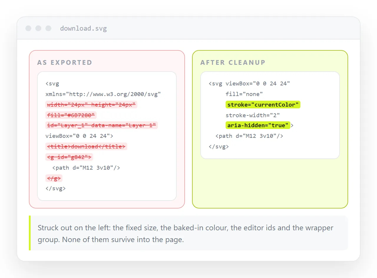
Design tools add material you do not need. Before pasting, strip:
widthandheightattributes, so the icon scales to fit.- Hard coded
fill="#000000", replaced withcurrentColor. - Generated
idvalues likeclip0_1_2, which collide when two icons land in the same page. <title>and<desc>blocks left over from the file name, which screen readers will read aloud.
The id collision is the one that produces a real bug. Two icons with the same clipPath id in one document, and the second one renders the first one's clip.
Most exported icons do not need a clip path at all. If the shape is a simple outline, delete the clip and the group wrapping it, then check the icon still draws. Fewer nodes means fewer collisions later.
Alignment inside buttons and rows
Most icon bugs are alignment, not drawing. Two patterns cover nearly everything.
.btn {
  display: inline-flex;
  align-items: center;
  gap: 0.5em;
}
inline-flex with align-items: center removes the baseline problem entirely, so the vertical-align hack above is only needed when the icon sits in running text.
gap in em keeps the spacing proportional to the label. A fixed pixel gap looks tight at 12px text and loose at 20px.
For an icon only button, give it a square hit area rather than relying on padding around a 16 pixel glyph.
.icon-btn {
  display: inline-grid;
  place-items: center;
  width: 2.25rem;
  height: 2.25rem;
}
That is roughly 36 pixels, which is close to the smallest comfortable touch target. Smaller than that and the control is hard to hit on a phone.
Consistency across a set
Icons from different sources rarely match, and the mismatch reads as sloppiness even when nobody can name the cause.
- One viewBox size across the set, usually 24 by 24.
- One stroke width, usually 1.5 or 2, and not mixed within a screen.
- One corner treatment, either
stroke-linecap="round"everywhere or nowhere. - The same optical weight. A solid icon beside line icons dominates the row.
If a borrowed icon does not match, redraw it rather than scaling it. A 16 by 16 icon scaled to 24 has a stroke that is half a pixel thicker than everything around it.
Checking the set in one place
Build a single page with every icon at three sizes, in light and dark, with one of them inside a button. Most problems are visible in that one view.
Paste it into a NOS document and keep the link. The markup renders as written, including the sprite, so the page works as a reference anyone on the team can open.
When an icon changes, edit the page. The address stays the same, so the link in the design notes does not need updating and nobody is looking at a stale export.