The <svg> tag puts a vector drawing straight into an HTML page. Inside it you place shapes such as <rect>, <circle> and <path>, positioned on a grid you declare with the viewBox attribute.
The browser scales that grid to the element's size, so the drawing stays sharp at any size.
Here is the smallest useful example:
<svg viewBox="0 0 200 100" width="300">
  <rect x="10" y="10" width="80" height="80" fill="#2563eb"/>
  <circle cx="150" cy="50" r="40" fill="#f59e0b"/>
</svg>
The quickest way to understand viewBox is to move it. Drag the sliders and watch the drawing pan, zoom and stretch.
<!doctype html>
<html lang="en">
<head>
<meta charset="utf-8">
<meta name="viewport" content="width=device-width, initial-scale=1">
<title>viewBox explorer</title>
<style>
  body { margin: 0; padding: 14px; font-family: system-ui, sans-serif; background: #f4f5f7; color: #1d2330; }
  .stage { background: #fff; border: 1px dashed #b8c0cc; display: inline-block; line-height: 0; }
  .controls { display: grid; grid-template-columns: 112px 1fr 40px; gap: 6px 10px; align-items: center; margin-top: 12px; max-width: 460px; font-size: 14px; }
  .controls input { width: 100%; margin: 0; }
  output { font: 600 13px ui-monospace, Consolas, monospace; text-align: right; }
  pre { background: #1d2330; color: #e6edf3; padding: 10px 12px; border-radius: 8px; font-size: 13px; white-space: pre-wrap; word-break: break-all; margin: 12px 0 0; max-width: 460px; }
</style>
</head>
<body>
<div class="stage">
  <!-- the drawing is made in a 200 x 100 coordinate space -->
  <svg id="pic" width="300" height="150" viewBox="0 0 200 100">
    <rect x="0" y="0" width="200" height="100" fill="#eef4ff"/>
    <circle cx="60" cy="50" r="35" fill="#2563eb"/>
    <rect x="110" y="20" width="70" height="60" rx="8" fill="#f59e0b"/>
    <text x="100" y="95" font-size="10" text-anchor="middle" fill="#1d2330">200 x 100 units</text>
  </svg>
</div>

<div class="controls">
  <label for="vx">viewBox x</label><input id="vx" type="range" min="-100" max="150" value="0"><output></output>
  <label for="vy">viewBox y</label><input id="vy" type="range" min="-50" max="80" value="0"><output></output>
  <label for="vw">viewBox width</label><input id="vw" type="range" min="40" max="400" value="200"><output></output>
  <label for="vh">viewBox height</label><input id="vh" type="range" min="20" max="200" value="100"><output></output>
  <label for="ew">element width</label><input id="ew" type="range" min="100" max="340" value="300"><output></output>
  <label for="eh">element height</label><input id="eh" type="range" min="50" max="220" value="150"><output></output>
</div>
<pre id="code"></pre>

<script>
  const pic = document.getElementById('pic');
  const val = (id) => document.getElementById(id).value;

  function update() {
    // viewBox picks which part of the drawing to show; width/height set the box on the page
    const vb = `${val('vx')} ${val('vy')} ${val('vw')} ${val('vh')}`;
    pic.setAttribute('viewBox', vb);
    pic.setAttribute('width', val('ew'));
    pic.setAttribute('height', val('eh'));
    document.querySelectorAll('.controls input').forEach((i) => { i.nextElementSibling.textContent = i.value; });
    document.getElementById('code').textContent =
      `<svg width="${val('ew')}" height="${val('eh')}" viewBox="${vb}">`;
  }

  document.querySelectorAll('.controls input').forEach((i) => i.addEventListener('input', update));
  update();
</script>
</body>
</html>
This guide covers the element itself: coordinates, shapes, paint, groups, text, CSS and accessibility. For using SVG as a page diagram, see SVG in HTML.
viewBox and the coordinate system
viewBox="min-x min-y width height" declares the drawing's own units. Every coordinate inside the <svg> is measured in those units, not in pixels.
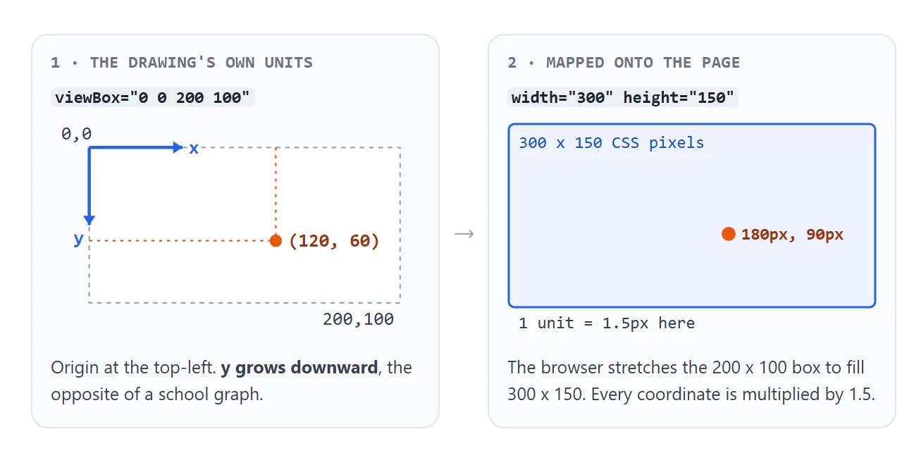
- The origin
0,0is the top-left corner, and y grows downward. - Raising
min-xormin-ypans the view. The shapes do not move; the window onto them does. - A smaller viewBox width zooms in, because fewer units fill the same box.
When the viewBox and the element have different proportions, the browser keeps the drawing's shape and centres it, leaving empty space. Try a tall element in the demo above to see it.
Changing that behaviour is the job of preserveAspectRatio, covered in SVG scale to fit.
width and height against viewBox
The two do different jobs. width and height set how big the box is on the page. viewBox sets what is drawn inside it.
| You set | What you get |
|---|---|
| Nothing | A 300 x 150 box, and shapes are drawn 1 unit = 1 pixel |
width and height only |
A fixed box; the drawing does not scale with it |
viewBox only |
Fills the container width, height from the viewBox proportions |
viewBox and a CSS width |
Scales to that width; the usual choice for responsive graphics |
| All three | A fixed-size box with the drawing scaled into it |
A good default is a viewBox on the element and the size in CSS, such as width: 100% or width: 1.2em for an icon.
The basic shapes
Six shapes cover most drawings, plus <path> for everything else. Add them in the playground and edit the numbers.
<!doctype html>
<html lang="en">
<head>
<meta charset="utf-8">
<meta name="viewport" content="width=device-width, initial-scale=1">
<title>SVG shape playground</title>
<style>
body { margin: 0; padding: 14px; font-family: system-ui, sans-serif; background: #f4f5f7; color: #1d2330; }
svg { display: block; width: 100%; max-width: 300px; background: #fff; border: 1px solid #d5d9e0; border-radius: 8px; }
.add { display: flex; flex-wrap: wrap; gap: 6px; margin: 10px 0; }
.add button { font: 600 13px ui-monospace, Consolas, monospace; padding: 6px 10px; border: 1px solid #c7ced8; border-radius: 6px; background: #fff; cursor: pointer; }
.item { background: #fff; border: 1px solid #e1e4ea; border-radius: 8px; padding: 5px 8px; margin-bottom: 5px; font-size: 13px; }
.item b { font-family: ui-monospace, Consolas, monospace; margin-right: 6px; }
.item label { display: inline-flex; gap: 3px; align-items: center; margin: 2px 8px 2px 0; font-family: ui-monospace, Consolas, monospace; }
.item input { width: 58px; font: 12px ui-monospace, Consolas, monospace; }
.item input.wide { width: 170px; }
pre { background: #1d2330; color: #e6edf3; padding: 10px 12px; border-radius: 8px; font-size: 12px; white-space: pre-wrap; word-break: break-all; max-height: 150px; overflow: auto; margin: 8px 0 0; }
</style>
</head>
<body>
<svg id="canvas" viewBox="0 0 200 120"></svg>
<div class="add">
<button data-shape="rect">+ rect</button>
<button data-shape="circle">+ circle</button>
<button data-shape="line">+ line</button>
<button data-shape="polygon">+ polygon</button>
<button data-shape="path">+ path</button>
</div>
<div id="list"></div>
<pre id="code"></pre>
<script>
const NS = 'http://www.w3.org/2000/svg'; // SVG elements must be created in this namespace
const canvas = document.getElementById('canvas');
// starting attributes for each shape
const DEFAULTS = {
rect: { x: 20, y: 20, width: 60, height: 40, fill: '#2563eb' },
circle: { cx: 140, cy: 45, r: 25, fill: '#f59e0b' },
line: { x1: 20, y1: 100, x2: 180, y2: 80, stroke: '#1d2330', 'stroke-width': 3 },
polygon: { points: '100,70 130,110 70,110', fill: '#16a34a' },
path: { d: 'M 20 70 Q 60 20 100 70 T 180 70', fill: 'none', stroke: '#db2777', 'stroke-width': 3 },
};
function addShape(type) {
const el = document.createElementNS(NS, type);
for (const [k, v] of Object.entries(DEFAULTS[type])) el.setAttribute(k, v);
canvas.appendChild(el);
// one row per shape, one input per attribute
const row = document.createElement('div');
row.className = 'item';
row.innerHTML = `<b><${type}></b>`;
for (const k of Object.keys(DEFAULTS[type])) {
const label = document.createElement('label');
const input = document.createElement('input');
input.value = el.getAttribute(k);
if (k === 'points' || k === 'd') input.className = 'wide';
input.addEventListener('input', () => { el.setAttribute(k, input.value); showCode(); });
label.append(k, input);
row.appendChild(label);
}
document.getElementById('list').appendChild(row);
showCode();
}
function showCode() {
// the svg's own markup, one element per line
document.getElementById('code').textContent = canvas.outerHTML
.replace(/><\/(rect|circle|line|polygon|path)>/g, '/>') // empty shapes as <rect ... />
.replace(/><(?!\/svg)/g, '>\n <').replace('></svg>', '>\n</svg>');
}
document.querySelectorAll('.add button').forEach((b) =>
b.addEventListener('click', () => addShape(b.dataset.shape)));
addShape('rect');
</script>
</body>
</html>
| Element | Key attributes | Draws |
|---|---|---|
<rect> |
x y width height rx |
A rectangle; rx rounds the corners |
<circle> |
cx cy r |
A circle from its centre |
<ellipse> |
cx cy rx ry |
An oval with two radii |
<line> |
x1 y1 x2 y2 |
One straight segment |
<polyline> |
points |
Joined segments, left open |
<polygon> |
points |
Joined segments, closed |
<path> |
d |
Any outline, from commands |
A <line> is invisible until it has a stroke, because the default stroke is none and a line has no inside to fill.
Paths: the d attribute
A <path> is a pen following commands. Each command is a letter followed by numbers.
<path d="M 10 80 L 50 20 L 90 80 Z" fill="#16a34a"/>
<path d="M 10 80 l 40 -60 l 40 60 z" fill="#16a34a"/>
Both lines draw the same triangle. M moves the pen, L draws a line, and Z closes back to the start. Upper-case letters use absolute coordinates. Lower-case letters are relative to where the pen stopped, so l 40 -60 means "40 right, 60 up".
Other commands you will meet: H and V for horizontal and vertical lines, Q and C for curves, and A for arcs. When a path shoots off in the wrong direction, check the case of its letters first.
Fill, stroke and stroke-width
fill paints the inside of a shape and defaults to black. stroke paints the outline and defaults to none. stroke-width sets the outline's thickness in viewBox units.
The stroke is centred on the shape's edge. Half of it falls inside the shape and half outside, which is why a shape touching the viewBox edge loses part of its outline.
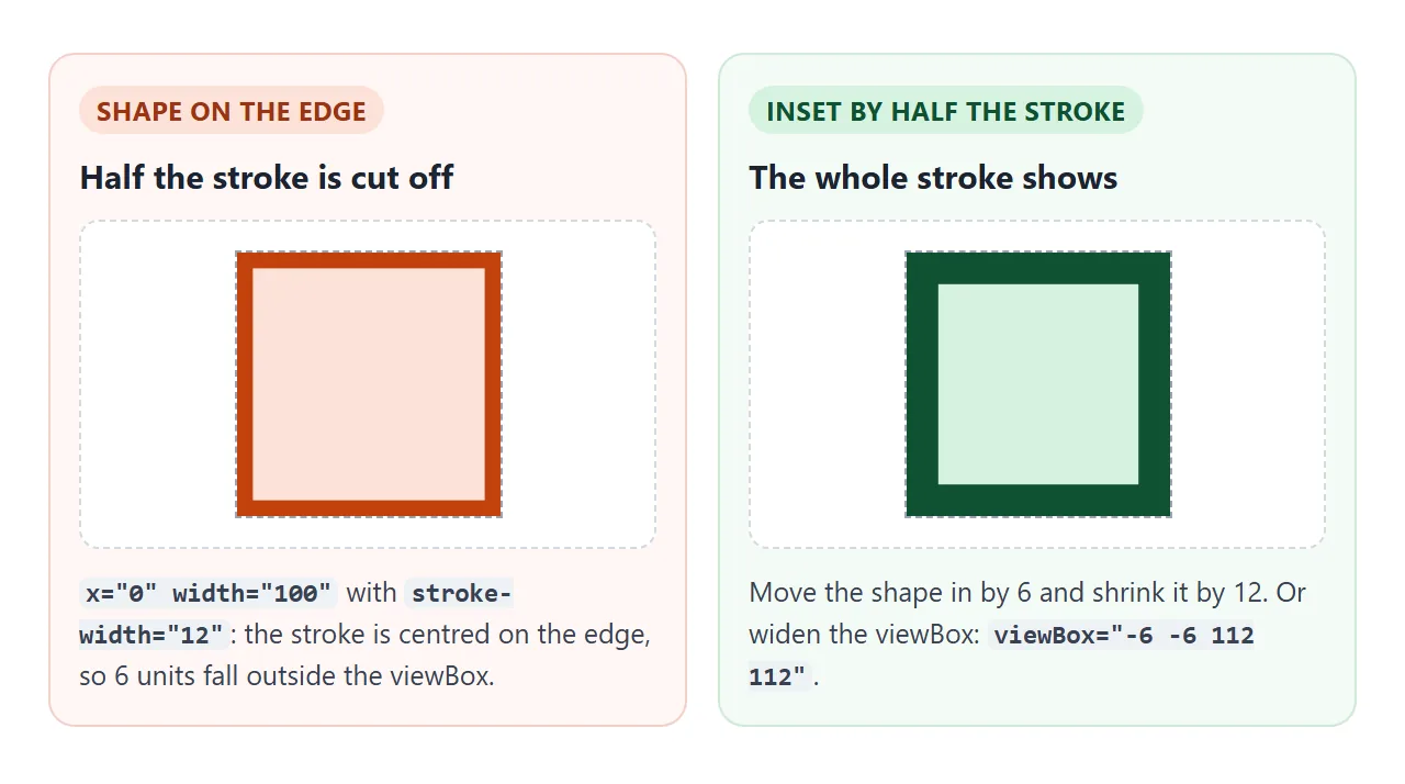
Other stroke attributes worth knowing: stroke-linecap="round" for rounded line ends, stroke-linejoin="round" for rounded corners, and fill="none" for an outline-only shape.
Groups, transform and text
<g> groups shapes. Attributes on a group, such as fill, are inherited by the shapes inside. A transform on the group moves them together:
<g transform="translate(60 0)" fill="#2563eb">
  <rect width="40" height="90"/>
  <text x="20" y="108" text-anchor="middle">Tue</text>
</g>
translate(x y) shifts, rotate(deg cx cy) turns around a point, and scale(n) resizes, including the stroke width.
<text> places a label with its baseline at y, not its top. text-anchor="middle" centres it on x. SVG text does not wrap lines on its own, and its font size is in viewBox units, so it grows and shrinks with the drawing.
Styling SVG with CSS
Inline SVG shapes are elements in your page, so ordinary CSS reaches them. Classes, :hover, media queries and CSS variables all work on fill and stroke.
.bar   { fill: var(--accent); }
.icon  { color: #2563eb; }
.icon circle { fill: currentColor; }
currentColor takes the element's CSS color, so an icon matches the text around it. The finished example below builds a badge and a chart from rectangles, a path and text, and recolours all of it by switching one class.
<!doctype html>
<html lang="en">
<head>
<meta charset="utf-8">
<meta name="viewport" content="width=device-width, initial-scale=1">
<title>SVG badge and chart</title>
<style>
  body { margin: 0; padding: 16px; font-family: system-ui, sans-serif; background: #f4f5f7; color: #1d2330; }
  /* the whole palette lives in three variables */
  .card { --accent: #2563eb; --track: #e5e9f0; --ink: #1d2330;
          background: #fff; border-radius: 12px; padding: 14px; max-width: 380px; }
  .card.green  { --accent: #16a34a; --track: #e3f3e8; }
  .card.orange { --accent: #ea580c; --track: #fdeadf; }
  .card.dark   { --accent: #60a5fa; --track: #334155; --ink: #e2e8f0; background: #1e293b; }

  svg { display: block; width: 100%; height: auto; }
  .bar   { fill: var(--accent); }
  .track { fill: var(--track); }
  .label { fill: var(--ink); font: 600 12px system-ui, sans-serif; }
  .value { fill: var(--ink); font: 700 26px system-ui, sans-serif; }
  .icon  { color: var(--accent); }  /* the icon paints with currentColor */

  .themes { display: flex; flex-wrap: wrap; gap: 6px; margin-top: 12px; }
  .themes button { padding: 6px 12px; border: 1px solid #c7ced8; border-radius: 6px; background: #fff; cursor: pointer; font-size: 14px; }
</style>
</head>
<body>
<div class="card" id="card">
  <svg viewBox="0 0 320 190" role="img" aria-labelledby="t1">
    <title id="t1">Weekly sign-ups: Mon 12, Tue 18, Wed 9, Thu 22, Fri 15. Total 76.</title>

    <!-- icon: a circle and a check mark, coloured by currentColor -->
    <g class="icon" transform="translate(10 10)">
      <circle cx="16" cy="16" r="16" fill="currentColor"/>
      <path d="M9 16 l5 5 l9 -10" fill="none" stroke="#fff" stroke-width="3" stroke-linecap="round" stroke-linejoin="round"/>
    </g>
    <text class="label" x="52" y="22">Weekly sign-ups</text>
    <text class="value" x="52" y="48">76</text>

    <!-- bar chart: each day is a group of track + bar + label, moved sideways with transform -->
    <g transform="translate(20 66)">
      <g transform="translate(0 0)"><rect class="track" width="40" height="90" rx="4"/><rect class="bar" y="41" width="40" height="49" rx="4"/><text class="label" x="20" y="108" text-anchor="middle">Mon</text></g>
      <g transform="translate(60 0)"><rect class="track" width="40" height="90" rx="4"/><rect class="bar" y="16" width="40" height="74" rx="4"/><text class="label" x="20" y="108" text-anchor="middle">Tue</text></g>
      <g transform="translate(120 0)"><rect class="track" width="40" height="90" rx="4"/><rect class="bar" y="53" width="40" height="37" rx="4"/><text class="label" x="20" y="108" text-anchor="middle">Wed</text></g>
      <g transform="translate(180 0)"><rect class="track" width="40" height="90" rx="4"/><rect class="bar" y="0" width="40" height="90" rx="4"/><text class="label" x="20" y="108" text-anchor="middle">Thu</text></g>
      <g transform="translate(240 0)"><rect class="track" width="40" height="90" rx="4"/><rect class="bar" y="29" width="40" height="61" rx="4"/><text class="label" x="20" y="108" text-anchor="middle">Fri</text></g>
    </g>
  </svg>
</div>

<div class="themes">
  <button data-theme="">Blue</button>
  <button data-theme="green">Green</button>
  <button data-theme="orange">Orange</button>
  <button data-theme="dark">Dark</button>
</div>

<script>
  const card = document.getElementById('card');
  // one class swaps the CSS variables; every shape follows
  document.querySelectorAll('.themes button').forEach((b) =>
    b.addEventListener('click', () => { card.className = ('card ' + b.dataset.theme).trim(); }));
</script>
</body>
</html>
A fill attribute on a shape counts less than any CSS rule that targets that shape, so .bar { fill: red } wins over fill="blue".
A rule on the <svg> itself, though, is only inherited, and a shape's own attribute beats inherited values. Changing SVG colour walks through the cases.
Accessibility
Decide first whether the drawing means something.
- It carries information (a chart, a status badge): add
role="img"to the<svg>and a<title>as its first child. Pointingaria-labelledbyat the title'sidmakes the name explicit. Put the actual values in the title, as the badge demo does. - It is decoration (an icon next to a visible word): add
aria-hidden="true"so screen readers skip it.
<svg viewBox="0 0 320 190" role="img" aria-labelledby="t1">
  <title id="t1">Weekly sign-ups: 76, highest on Thursday.</title>
  ...
</svg>
For icon-only buttons, label the button with aria-label and hide the SVG.
Inline svg against img src
The same file can go into a page two ways, and they behave differently.
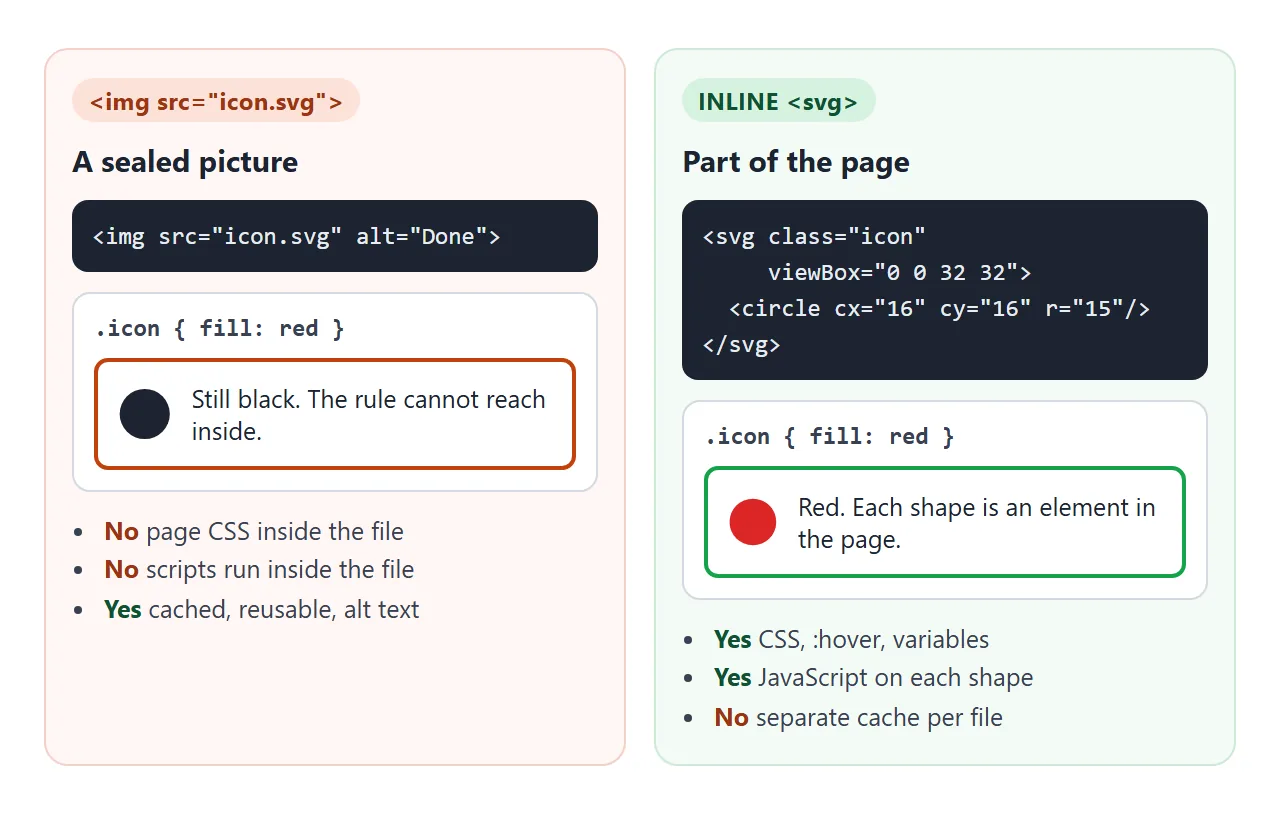
<img src="chart.svg" alt="..."> treats the file as a picture. It can be cached and reused across pages, but the page's CSS cannot restyle its shapes and scripts inside the file do not run.
Inline <svg> gives up that separate caching in exchange for full CSS and JavaScript reach.
Use <img> for large, fixed illustrations. Use inline for icons, charts and anything that changes colour or reacts to the user. If you are serving SVG files to others, read hosting an SVG file first.
When it does not work
| What you see | Cause | Fix |
|---|---|---|
| The SVG does not appear at all | It has only a viewBox and sits in a shrink-to-fit parent, such as an inline-block or absolutely positioned box, so its width collapses to zero | Give the <svg> a CSS width |
| A shape is missing | Its coordinates are outside the viewBox, or it is a line with no stroke | Check the numbers against the viewBox; add stroke |
| The outline is thinner on the edges | Half the stroke falls outside the viewBox | Inset the shape by half the stroke width, or widen the viewBox |
CSS fill has no effect |
The SVG is in an <img> tag, or a style="fill:..." on the shape beats the rule |
Inline the SVG; remove the inline style |
A rule on svg does not recolour shapes |
Each shape's own fill attribute beats the inherited value |
Target the shapes, or remove their fill attributes and use currentColor |
| Labels get tiny on a phone | Text is sized in viewBox units, so it shrinks with the drawing | Use a larger font size in units, or put labels in HTML beside the SVG |
| A path heads the wrong way | Lower-case (relative) and upper-case (absolute) commands are mixed up | Check the case of each letter in d |
Share it as a link
An SVG chart or badge is easy to break when sent as a file: an .html attachment may open as plain code, and a screenshot loses the hover states and the text screen readers use.
To send the working version, paste the page into a NOS document and choose Create share link. HTML to link walks through it.
The page renders as written and its scripts run, so the people you send it to can switch the colours and drag the sliders themselves. If you change the drawing later, the same link shows the new version.