To colour an SVG shape from CSS, select the shape and set fill for the inside and stroke for the edge. The SVG has to be inline in the page.
A CSS rule beats a fill="..." attribute written in the markup, so you do not need to edit the file.
.icon path {
  fill: #f5b301;
  stroke: #7a4b00;
  stroke-width: 4px;
}
Try it. The star's markup says fill="#bbb", and the CSS wins.
<!doctype html>
<html lang="en">
<head>
<meta charset="utf-8">
<meta name="viewport" content="width=device-width, initial-scale=1">
<title>CSS fill and stroke on SVG</title>
<style>
  body { margin: 0; padding: 14px; font-family: system-ui, sans-serif; background: #f4f5f7; color: #1d2330; }
  .wrap { display: flex; gap: 14px; align-items: center; }
  .stage { color: #2563eb; }          /* currentColor reads this */
  svg { width: 120px; height: 120px; display: block; }
  .controls input[type=range] { width: 110px; }

  /* CSS beats the fill="#bbb" attribute in the markup */
  .icon path {
    fill: #f5b301;
    stroke: #7a4b00;
    stroke-width: 4px;
    stroke-linejoin: round;
  }

  .controls { display: grid; gap: 8px; font-size: 14px; }
  .controls label { display: flex; align-items: center; gap: 8px; }
  input[type=color] { width: 40px; height: 28px; border: 0; padding: 0; background: none; }
  .swatches button { width: 28px; height: 28px; border-radius: 50%; border: 2px solid #fff; box-shadow: 0 0 0 1px #c9cdd4; cursor: pointer; }
  pre { margin: 12px 0 0; padding: 10px 12px; background: #fff; border-radius: 8px; font-size: 13px; line-height: 1.45; overflow-x: auto; }
</style>
</head>
<body>
<div class="wrap">
  <div class="stage" id="stage">
    <svg class="icon" id="icon" viewBox="0 0 120 120" aria-label="Star">
      <path fill="#bbb" d="M60 12 L72 46 L108 46 L79 68 L90 104 L60 82 L30 104 L41 68 L12 46 L48 46 Z"/>
    </svg>
  </div>
  <div class="controls">
    <label>fill <input type="color" id="fill" value="#f5b301"></label>
    <label>stroke <input type="color" id="stroke" value="#7a4b00"></label>
    <label>stroke-width <input type="range" id="width" min="0" max="12" value="4"></label>
    <label><input type="checkbox" id="cur"> fill: currentColor</label>
    <div class="swatches" id="swatches">
      <button style="background:#2563eb" data-c="#2563eb" aria-label="Blue"></button>
      <button style="background:#16a34a" data-c="#16a34a" aria-label="Green"></button>
      <button style="background:#db2777" data-c="#db2777" aria-label="Pink"></button>
    </div>
  </div>
</div>
<pre id="code"></pre>

<script>
  const path = document.querySelector('#icon path');
  const stage = document.getElementById('stage');
  const ui = { fill: document.getElementById('fill'), stroke: document.getElementById('stroke'),
               width: document.getElementById('width'), cur: document.getElementById('cur') };

  function render() {
    const fill = ui.cur.checked ? 'currentColor' : ui.fill.value;
    path.style.fill = fill;
    path.style.stroke = ui.stroke.value;
    path.style.strokeWidth = ui.width.value + 'px';
    document.getElementById('code').textContent =
      '.icon path {\n  fill: ' + fill + ';\n  stroke: ' + ui.stroke.value +
      ';\n  stroke-width: ' + ui.width.value + 'px;\n}' +
      (ui.cur.checked ? '\n.stage { color: ' + getComputedStyle(stage).color + '; }' : '');
  }

  Object.values(ui).forEach((el) => el.addEventListener('input', render));
  // the swatches set color on the parent; only a currentColor fill follows it
  document.getElementById('swatches').addEventListener('click', (e) => {
    if (!e.target.dataset.c) return;
    stage.style.color = e.target.dataset.c;
    render();
  });
  render();
</script>
</body>
</html>
Recolouring icons with currentColor, and why an SVG in an <img> ignores your CSS, are covered in HTML SVG change color. This guide is about the other paint properties: holes, fading and outlines.
fill and stroke are inherited CSS properties
fill, stroke, stroke-width and the rest are inherited. Set fill on the <svg> or a <g> and every shape inside picks it up, unless the shape has its own value.
That "unless" catches people. A path with fill="#000" in its markup has its own value, so a rule on the parent svg does not reach it. Target the shapes themselves:
svg.logo { fill: red; }        /* skipped by paths that carry fill="..." */
svg.logo path { fill: red; }   /* matches the path, beats its attribute */
The defaults matter too. With nothing set, a shape gets fill: black and stroke: none. That is why a line icon whose fill: none lived in a stylesheet you did not copy turns into a solid black shape.
| Property | What it paints | Default |
|---|---|---|
fill |
The inside | black |
stroke |
The edge line | none |
stroke-width |
Thickness of the edge | 1px |
fill-rule |
Which areas count as inside | nonzero |
clip-rule |
The same, inside a clipPath |
nonzero |
paint-order |
Whether fill or stroke goes on top | fill, then stroke |
fill-rule: nonzero vs evenodd, and where holes come from
One <path> can hold several subpaths, and its lines can cross. Something has to decide which areas are inside. That is fill-rule.
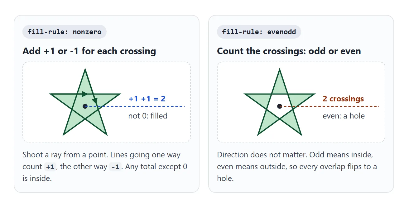
nonzero(the default): draw a ray from a point outward. Each line crossing it adds 1 or subtracts 1, depending on its direction. A total other than 0 means filled.evenodd: count the crossings and ignore direction. Odd means filled, even means empty.
For a star drawn as five crossing lines, nonzero fills the middle and evenodd leaves a pentagon hole. For a ring made of two circles, it depends on the direction of the inner circle.
<!doctype html>
<html lang="en">
<head>
<meta charset="utf-8">
<meta name="viewport" content="width=device-width, initial-scale=1">
<title>fill-rule nonzero vs evenodd</title>
<style>
body { margin: 0; padding: 14px; font-family: system-ui, sans-serif; background: #f4f5f7; color: #1d2330; }
.row { display: grid; grid-template-columns: repeat(3, 1fr); gap: 10px; }
figure { margin: 0; background: #fff; border-radius: 10px; padding: 8px; text-align: center; }
figcaption { font-size: 12px; color: #5b6270; margin-top: 4px; }
svg { width: 100%; max-width: 130px; height: auto; display: block; margin: 0 auto; }
.shape { fill: #16a34a; stroke: #0f5132; stroke-width: 2px; }
.bar { display: flex; flex-wrap: wrap; gap: 8px; align-items: center; margin: 12px 0 0; font-size: 14px; }
.bar button { font: inherit; padding: 6px 12px; border-radius: 8px; border: 1px solid #c9cdd4; background: #fff; cursor: pointer; }
.bar button.on { background: #1d2330; color: #fff; border-color: #1d2330; }
code { font: 600 13px ui-monospace, Consolas, monospace; }
#out { margin: 10px 0 0; font-size: 13px; color: #374151; }
</style>
</head>
<body>
<div class="row">
<figure>
<svg viewBox="0 0 120 120"><path id="star" class="shape" d="M60 8 L90 100 L12 43 L108 43 L30 100 Z"/></svg>
<figcaption>Star: lines cross</figcaption>
</figure>
<figure>
<svg viewBox="0 0 120 120"><path id="ring" class="shape"/></svg>
<figcaption>Ring: two circles</figcaption>
</figure>
<figure>
<svg viewBox="0 0 120 120">
<defs>
<clipPath id="cut"><path id="clip" d="M60 8 L90 100 L12 43 L108 43 L30 100 Z"/></clipPath>
<linearGradient id="sky" x2="1" y2="1"><stop offset="0" stop-color="#f59e0b"/><stop offset="1" stop-color="#db2777"/></linearGradient>
</defs>
<rect id="photo" width="120" height="120" fill="url(#sky)" clip-path="url(#cut)"/>
</svg>
<figcaption>Clip: same star</figcaption>
</figure>
</div>
<div class="bar">
<span>fill-rule / clip-rule:</span>
<button data-rule="nonzero" class="on">nonzero</button>
<button data-rule="evenodd">evenodd</button>
</div>
<div class="bar">
<label><input type="checkbox" id="flip"> draw the inner circle the other way</label>
</div>
<p id="out"></p>
<script>
const star = document.getElementById('star');
const ring = document.getElementById('ring');
const clip = document.getElementById('clip');
const flip = document.getElementById('flip');
let rule = 'nonzero';
// Outer circle clockwise. Inner circle clockwise too, unless flipped.
function ringPath(reverse) {
const s = reverse ? 0 : 1; // the arc sweep flag sets the direction
return 'M60 10 A50 50 0 1 1 60 110 A50 50 0 1 1 60 10 Z ' +
'M60 35 A25 25 0 1 ' + s + ' 60 85 A25 25 0 1 ' + s + ' 60 35 Z';
}
function render() {
ring.setAttribute('d', ringPath(flip.checked));
star.style.fillRule = rule;
ring.style.fillRule = rule;
clip.style.clipRule = rule; // inside a clipPath, clip-rule counts, not fill-rule
document.querySelectorAll('[data-rule]').forEach((b) => b.classList.toggle('on', b.dataset.rule === rule));
const hole = !ring.isPointInFill(new DOMPoint(60, 60));
document.getElementById('out').innerHTML =
'<code>' + rule + '</code> · inner circle ' +
(flip.checked ? 'reversed' : 'same direction') + ' → ring ' + (hole ? 'has a hole' : 'is solid');
}
document.querySelectorAll('[data-rule]').forEach((b) =>
b.addEventListener('click', () => { rule = b.dataset.rule; render(); }));
flip.addEventListener('change', render);
render();
</script>
</body>
</html>
With both circles drawn the same way, nonzero gives a solid disc. Reverse the inner circle and nonzero cuts the hole too, because the two directions cancel to 0.
This is a second way to cut a hole, so a path can have holes without any fill-rule set.
If a hole fills in after editing a path, set fill-rule: evenodd on it:
.logo path { fill-rule: evenodd; }
clip-rule: the same rule inside a clipPath
Shapes inside a <clipPath> are never painted. They only mark out an area, so their fill-rule is not used. The clipping area follows clip-rule instead, and it takes the same two values.
#cut path { clip-rule: evenodd; }
Put it on the shape inside the <clipPath>, not on the element being clipped. The third panel of the demo above shows it.
The CSS path() shape used with clip-path takes the rule as an optional first argument instead, as in path(evenodd, "M0 0 ..."). CSS clip-path covers that property.
opacity vs fill-opacity and stroke-opacity
A stroke is centred on the edge of the shape: half of stroke-width falls outside, half falls over the fill. That matters once you fade the shape.
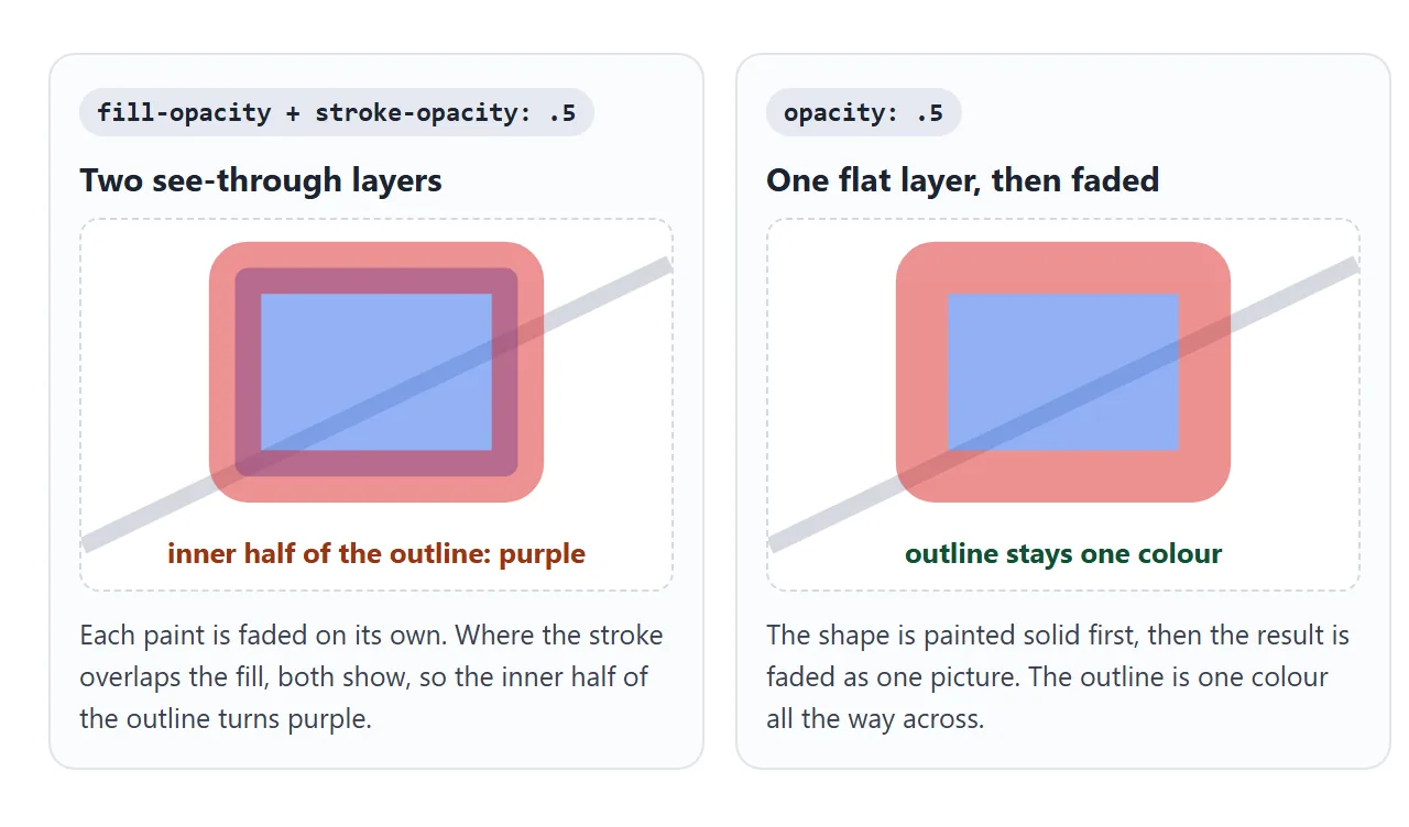
fill-opacityandstroke-opacityfade each paint on its own. Where the stroke covers the fill, you see both, as a band of mixed colour.opacitypaints the shape solid first, then fades the result as one picture. No band. It works the same way on HTML elements, as in CSS opacity.
Use opacity for "make this shape see-through". Use the pair when only one paint should fade, such as a faint fill inside a solid outline.
paint-order: outlined text without thin letters
By default the fill goes down first and the stroke on top. On text, the inner half of a thick stroke then covers the letters, and they get thinner as the outline grows.
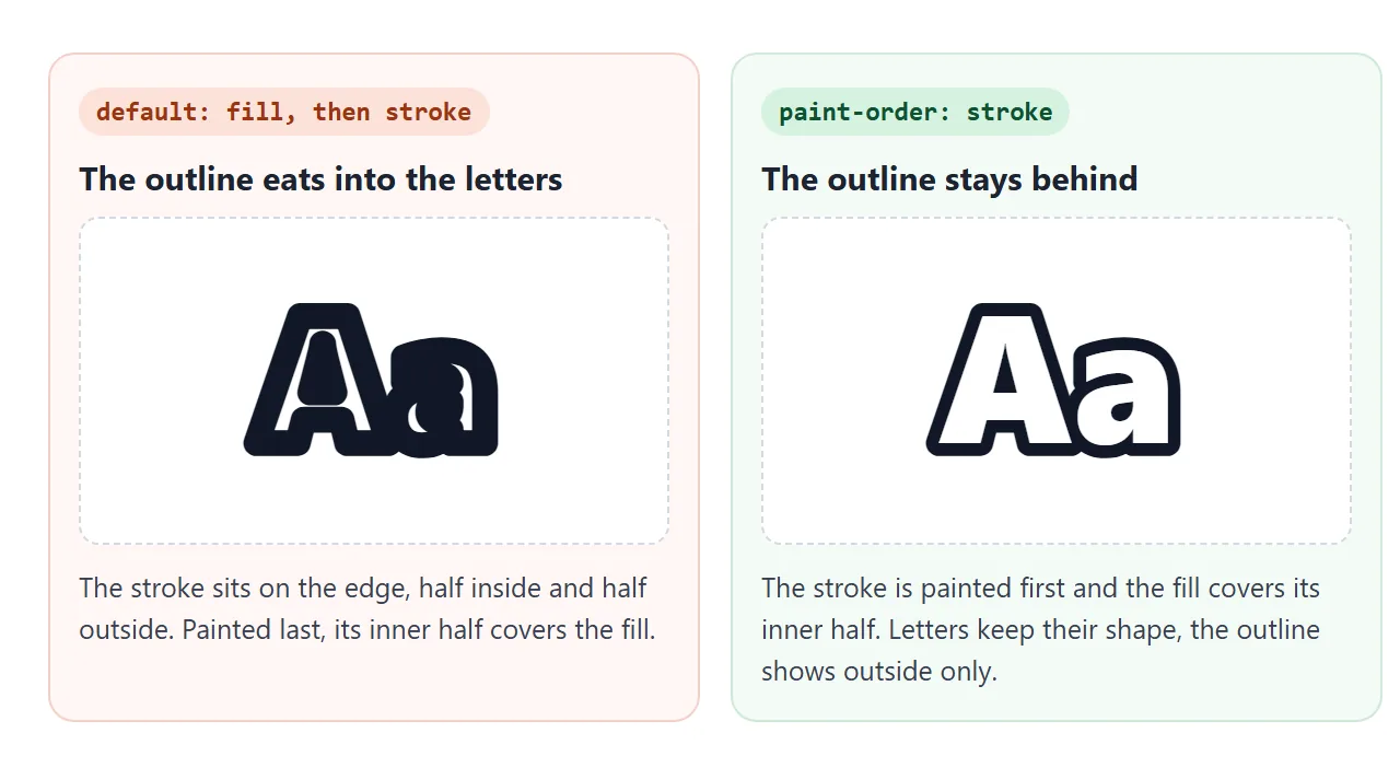
paint-order: stroke paints the stroke first and the fill over it. Only the outer half of the outline shows, so double stroke-width to get the thickness you want. stroke-linejoin: round smooths the sharp corners of letters like A and V.
.title {
  fill: #fff;
  stroke: #111827;
  stroke-width: 12px;      /* 6px shows outside the letters */
  stroke-linejoin: round;
  paint-order: stroke;
}
A finished example: a sticker label
This label puts the pieces together: a badge with a thick stroke, outlined text on top, and a fade you can switch between the two methods.
<!doctype html>
<html lang="en">
<head>
<meta charset="utf-8">
<meta name="viewport" content="width=device-width, initial-scale=1">
<title>Outlined SVG label</title>
<style>
  body { margin: 0; padding: 14px; font-family: system-ui, sans-serif; background: #f4f5f7; color: #1d2330; }
  .card { background: #fff; border-radius: 12px; padding: 10px; max-width: 420px; }
  svg { width: 100%; height: auto; display: block; }

  .badge { fill: #2563eb; stroke: #1e3a8a; stroke-width: 14px; }
  .title {
    font: 900 64px system-ui, sans-serif;
    fill: #fff;
    stroke: #111827;
    stroke-width: 12px;
    stroke-linejoin: round;
  }
  .title.under { paint-order: stroke; }   /* outline first, letters on top */
  .fade-opacity { opacity: .5; }
  .fade-parts { fill-opacity: .5; stroke-opacity: .5; }

  .controls { display: grid; gap: 8px; margin-top: 12px; font-size: 14px; }
  .controls label { display: flex; align-items: center; gap: 8px; flex-wrap: wrap; }
  input[type=text], select { font: inherit; padding: 5px 8px; border: 1px solid #c9cdd4; border-radius: 6px; }
  input[type=text] { width: 150px; }
</style>
</head>
<body>
<div class="card">
  <svg viewBox="0 0 360 160" id="art">
    <rect class="badge" id="badge" x="14" y="14" width="332" height="132" rx="24"/>
    <text class="title under" id="title" x="180" y="104" text-anchor="middle">SALE</text>
  </svg>
</div>
<div class="controls">
  <label>Text <input type="text" id="txt" value="SALE" maxlength="8"></label>
  <label>Outline <input type="range" id="w" min="0" max="20" value="12"> <span id="wv">12px</span></label>
  <label><input type="checkbox" id="po" checked> paint-order: stroke</label>
  <label>Fade the badge
    <select id="fade">
      <option value="">no fade</option>
      <option value="fade-opacity">opacity: .5</option>
      <option value="fade-parts">fill-opacity + stroke-opacity</option>
    </select>
  </label>
</div>

<script>
  const title = document.getElementById('title');
  const badge = document.getElementById('badge');
  const w = document.getElementById('w');

  document.getElementById('txt').addEventListener('input', (e) => { title.textContent = e.target.value; });
  w.addEventListener('input', () => {
    title.style.strokeWidth = w.value + 'px';
    document.getElementById('wv').textContent = w.value + 'px';
  });
  document.getElementById('po').addEventListener('change', (e) => title.classList.toggle('under', e.target.checked));
  document.getElementById('fade').addEventListener('change', (e) => {
    badge.classList.remove('fade-opacity', 'fade-parts');
    if (e.target.value) badge.classList.add(e.target.value);
  });
</script>
</body>
</html>
- Outline: the text has
paint-order: stroke. Untick it and the letters shrink as the stroke paints over them. - Fade: pick
fill-opacity + stroke-opacityand a lighter band appears inside the badge's border. Pickopacityand the border stays one colour. - Live text: the SVG
<text>is real text, so changingtextContentredraws it with the same styles.
When it does not work
| What you see | Cause | Fix |
|---|---|---|
| CSS changes nothing at all | The SVG is loaded with <img> or as a background |
Put the SVG inline (see why) |
Rule on svg skips some shapes |
Those shapes carry their own fill attribute |
Select the shapes: svg path |
| Your rule loses to the markup | The shape has style="fill: ..." inline |
Remove the inline style, or edit it |
| A hole in a logo fills in | Subpaths drawn the same way with nonzero |
fill-rule: evenodd |
fill-rule does nothing on a clip |
Clip shapes use a different property | clip-rule: evenodd |
| A darker or mixed band inside the outline | fill-opacity and stroke-opacity overlap |
opacity on the shape or group |
| Outline looks half as thick as set | paint-order: stroke hides the inner half |
Double stroke-width |
| Clicks fall through the middle of a shape | fill: none leaves no painted area to hit |
pointer-events: visible or fill: transparent |
Share it as a link
Paint properties are easier to judge on the real thing than in a screenshot, especially a fade or an outline. Send the page instead, so people can type into the label and flip the fill rule themselves.
Paste the page into a NOS document and choose Create share link. HTML to link walks through it. The page renders as written and its scripts run. If you change the CSS later, the same link shows the new version.