Two SVG rendering properties change what you see: shape-rendering: crispEdges switches off anti-aliasing so edges land on whole pixels, and vector-effect: non-scaling-stroke keeps a line the same width however large the SVG is drawn.
A third pair, color-interpolation and color-interpolation-filters, changes the maths behind gradients and filters.
Pick a value and look at the magnified pixels on the right.
<!doctype html>
<html lang="en">
<head>
<meta charset="utf-8">
<meta name="viewport" content="width=device-width, initial-scale=1">
<title>shape-rendering, magnified</title>
<style>
  body { margin: 0; padding: 14px; font-family: system-ui, sans-serif; background: #f4f5f7; color: #1d2330; }
  .opts { display: flex; flex-wrap: wrap; gap: 6px; margin-bottom: 12px; }
  .opts label {
    font: 600 13px ui-monospace, Consolas, monospace; padding: 7px 10px; border-radius: 8px;
    background: #fff; border: 1px solid #d5d9e0; cursor: pointer;
  }
  .opts input { margin: 0 4px 0 0; }
  .row { display: flex; gap: 14px; align-items: flex-start; flex-wrap: wrap; }
  .live { background: #fff; border: 1px solid #d5d9e0; }
  #zoom {
    width: 100%; max-width: 384px; background: #fff; border: 1px solid #d5d9e0;
    image-rendering: pixelated;  /* show each pixel as a square, no smoothing */
  }
  p { font-size: 13px; color: #4b5563; margin: 8px 0 0; }
  small { display: block; font-size: 12px; color: #6b7280; margin-bottom: 4px; }
</style>
</head>
<body>
<div class="opts" id="opts">
  <label><input type="radio" name="sr" value="auto" checked>auto</label>
  <label><input type="radio" name="sr" value="crispEdges">crispEdges</label>
  <label><input type="radio" name="sr" value="geometricPrecision">geometricPrecision</label>
  <label><input type="radio" name="sr" value="optimizeSpeed">optimizeSpeed</label>
</div>

<div class="row">
  <div>
    <small>Real size</small>
    <svg id="art" class="live" width="64" height="40" viewBox="0 0 64 40" shape-rendering="auto">
      <!-- a 1px line centred on y = 6: half of it falls in each of two pixel rows -->
      <line x1="2" y1="6" x2="62" y2="6" stroke="#111" stroke-width="1"/>
      <!-- a square that starts half-way into a pixel -->
      <rect x="4.5" y="12.5" width="14" height="14" fill="#1d4ed8"/>
      <circle cx="36" cy="22" r="10" fill="#0f766e"/>
      <line x1="50" y1="36" x2="62" y2="12" stroke="#b45309" stroke-width="1.5"/>
    </svg>
  </div>
  <div style="flex: 1; min-width: 240px;">
    <small>Same pixels, 6 times larger</small>
    <canvas id="zoom" width="64" height="40"></canvas>
  </div>
</div>
<p id="note"></p>

<script>
  const art = document.getElementById('art');
  const zoom = document.getElementById('zoom').getContext('2d');
  const note = document.getElementById('note');
  const notes = {
    auto: 'auto: edges are anti-aliased, so half-covered pixels turn grey.',
    crispEdges: 'crispEdges: each pixel is fully in or out. Hard edges, jagged curves.',
    geometricPrecision: 'geometricPrecision: a hint for accurate edges. Compare it with auto.',
    optimizeSpeed: 'optimizeSpeed: a hint for speed. Some engines draw it like crispEdges.'
  };

  // Draw the SVG into a small canvas, then CSS scales the canvas up
  function magnify() {
    const img = new Image();
    img.onload = () => { zoom.clearRect(0, 0, 64, 40); zoom.drawImage(img, 0, 0); };
    img.src = 'data:image/svg+xml,' + encodeURIComponent(new XMLSerializer().serializeToString(art));
  }

  document.getElementById('opts').addEventListener('change', (e) => {
    art.setAttribute('shape-rendering', e.target.value);  // inherited by every shape inside
    note.textContent = notes[e.target.value];
    magnify();
  });

  note.textContent = notes.auto;
  magnify();
</script>
</body>
</html>
With auto, the circle's edge is made of grey pixels and the thin line is two faint rows. With crispEdges, every pixel is fully coloured or empty.
What we measured, and where
All numbers on this page come from the Playwright builds of Chromium, Firefox and WebKit, run on Windows. We drew test shapes, took screenshots and counted pixels.
We did not test other browsers or older versions, so read the results as "what these three engines did", not as a support table.
| Property | Value tested | Visible change | Engines |
|---|---|---|---|
shape-rendering |
crispEdges |
Yes, no anti-aliasing | Chromium, Firefox, WebKit |
shape-rendering |
geometricPrecision |
None, same pixels as auto |
Chromium, Firefox, WebKit |
shape-rendering |
optimizeSpeed |
Same as crispEdges |
Chromium, Firefox |
shape-rendering |
optimizeSpeed |
None, same as auto |
WebKit |
vector-effect |
non-scaling-stroke |
Yes | Chromium, Firefox, WebKit |
color-interpolation |
linearRGB on a gradient |
Yes, brighter middle | Chromium, Firefox, WebKit |
color-interpolation-filters |
sRGB |
Yes, darker result | Chromium, Firefox, WebKit |
color-rendering |
optimizeSpeed, optimizeQuality |
None | Chromium, Firefox, WebKit |
buffered-rendering |
static |
None | Chromium, Firefox, WebKit |
shape-rendering: crispEdges for lines that sit on pixels
A shape edge rarely lines up with the pixel grid. When a pixel is only partly covered, the browser paints it at partial strength. That is anti-aliasing, and it is why curves look smooth.
It also blurs thin straight lines. A 1px stroke centred on y="260" spans from 259.5 to 260.5, so it covers half of two pixel rows.
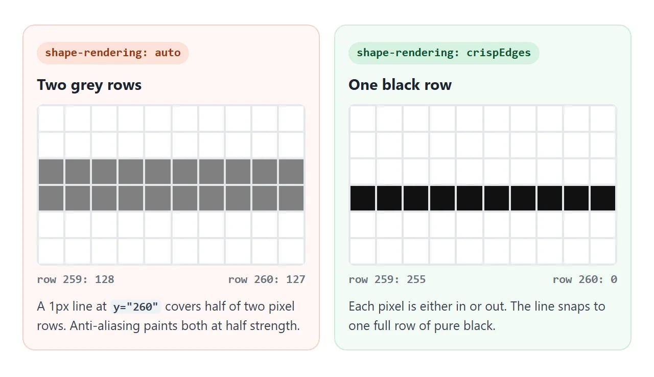
We measured exactly that. With auto, rows 259 and 260 came out as grey values 128 and 127 in all three engines. With crispEdges, row 260 was pure black (0) and row 259 white (255).
The cost shows on curves. A black circle drawn with auto produced 92 to 99 distinct grey levels, depending on the engine. With crispEdges it produced 2: black and white.
Use it on gridlines, borders, bars and axis ticks. Keep auto for icons, curves and diagonal lines.
The property is inherited, so one attribute on the root <svg> or a <g> covers every shape inside:
<svg viewBox="0 0 200 100" shape-rendering="crispEdges">
  <line x1="0" y1="50" x2="200" y2="50" stroke="#000"/>
</svg>
It is also a CSS property, so a stylesheet rule works the same way:
.grid { shape-rendering: crispEdges; }
Text is not affected. For the HTML image version of this idea, see image-rendering.
geometricPrecision and optimizeSpeed are only hints
The specification describes optimizeSpeed and geometricPrecision as hints. The browser may use them or not, and our measurements show both outcomes:
- geometricPrecision produced the same pixels as
autoin all three engines, at device pixel ratio 1 and 2. On our test scene, zero pixels differed. - optimizeSpeed gave exactly the same pixels as
crispEdgesin Chromium and Firefox. In WebKit it gave the same pixels asauto.
So if you want hard edges, write crispEdges. Do not rely on optimizeSpeed to mean the same thing everywhere.
vector-effect: non-scaling-stroke
stroke-width is measured in the units of the viewBox. When an SVG with a viewBox of 100 units is drawn 400 pixels wide, a stroke of 4 becomes 16 pixels thick. We measured 16 in all three engines.
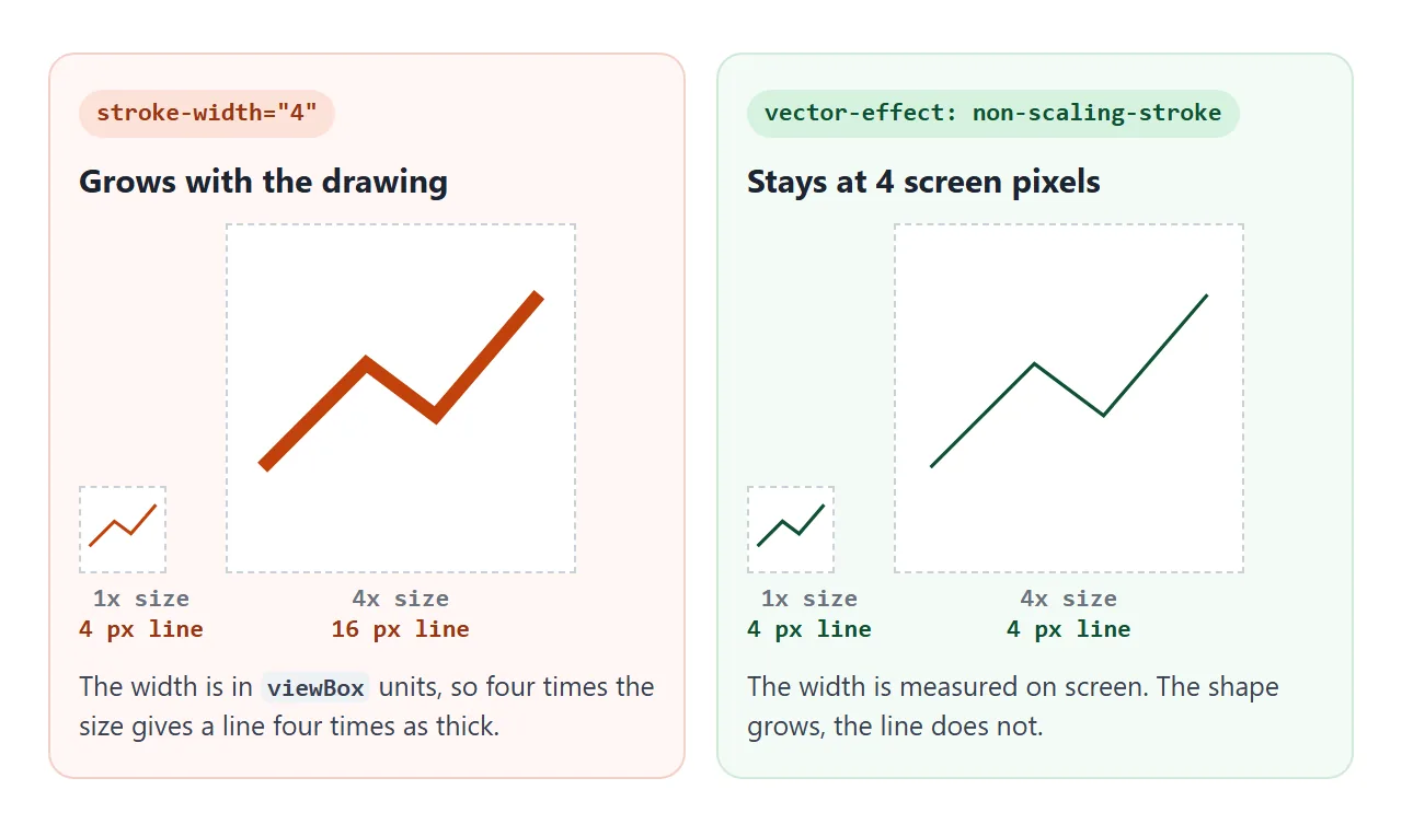
With vector-effect: non-scaling-stroke on the shape, the width is measured in screen pixels. The same line measured 4 pixels at 100 and at 400 pixels wide. This matters for charts and diagrams that scale to fit their box.
Four details we checked:
- It is not inherited. Set on a
<g>, the shapes inside still computenone. Put it on each shape, or select them in CSS. - Dashes follow it. With
stroke-dasharrayof 5 and 5, the dashes became 5 screen pixels long too. On a 400px line that meant 39 dashes instead of 9. More on dashes in stroke-dasharray. - A CSS transform on the
<svg>still thickens it. Withtransform: scale(4)on the<svg>element, the non-scaling line measured 16 pixels. Size the SVG withwidthandheightinstead. - Only one value works. The specification also lists
non-scaling-size,non-rotationandfixed-position.CSS.supports()returned false for all three in every engine we tested.
color-interpolation for gradients, color-interpolation-filters for filters
Colours can be mixed in two spaces. sRGB mixes the stored numbers directly. linearRGB first converts them to linear light, mixes, and converts back, which makes the middle of a mix brighter.
<!doctype html>
<html lang="en">
<head>
<meta charset="utf-8">
<meta name="viewport" content="width=device-width, initial-scale=1">
<title>color-interpolation: sRGB vs linearRGB</title>
<style>
  body { margin: 0; padding: 14px; font-family: system-ui, sans-serif; background: #f4f5f7; color: #1d2330; }
  h3 { font-size: 14px; margin: 0 0 6px; }
  code { font: 600 12px ui-monospace, Consolas, monospace; background: #e8ebf0; border-radius: 4px; padding: 0 3px; }
  svg { display: block; width: 100%; height: auto; background: #fff; border: 1px solid #d5d9e0; border-radius: 8px; }
  .lbl { font: 12px system-ui, sans-serif; fill: #374151; }
  section + section { margin-top: 14px; }
</style>
</head>
<body>
<section>
  <h3>Gradients: <code>color-interpolation</code></h3>
  <svg viewBox="0 0 360 150">
    <defs>
      <linearGradient id="bw"><stop offset="0" stop-color="#000"/><stop offset="1" stop-color="#fff"/></linearGradient>
      <!-- same stops, mixed in linear light -->
      <linearGradient id="bw-lin" color-interpolation="linearRGB"><stop offset="0" stop-color="#000"/><stop offset="1" stop-color="#fff"/></linearGradient>
      <linearGradient id="rb"><stop offset="0" stop-color="#f00"/><stop offset="1" stop-color="#00f"/></linearGradient>
      <linearGradient id="rb-lin" color-interpolation="linearRGB"><stop offset="0" stop-color="#f00"/><stop offset="1" stop-color="#00f"/></linearGradient>
    </defs>
    <text class="lbl" x="10" y="16">sRGB (default)</text>
    <rect x="10" y="22" width="340" height="22" fill="url(#bw)"/>
    <text class="lbl" x="10" y="60">linearRGB</text>
    <rect x="10" y="66" width="340" height="22" fill="url(#bw-lin)"/>
    <rect x="10" y="98" width="340" height="18" fill="url(#rb)"/>
    <rect x="10" y="120" width="340" height="18" fill="url(#rb-lin)"/>
    <!-- the midpoint -->
    <line x1="180" y1="18" x2="180" y2="142" stroke="#dc2626" stroke-dasharray="3 3"/>
  </svg>
</section>

<section>
  <h3>Filters: <code>color-interpolation-filters</code></h3>
  <svg viewBox="0 0 360 120">
    <defs>
      <pattern id="stripes" width="16" height="16" patternUnits="userSpaceOnUse">
        <rect width="8" height="16" fill="#e11d48"/><rect x="8" width="8" height="16" fill="#16a34a"/>
      </pattern>
      <!-- default colour space for filters is linearRGB -->
      <filter id="blur-lin"><feGaussianBlur stdDeviation="4"/></filter>
      <filter id="blur-srgb" color-interpolation-filters="sRGB"><feGaussianBlur stdDeviation="4"/></filter>
    </defs>
    <text class="lbl" x="10" y="16">linearRGB (default)</text>
    <text class="lbl" x="185" y="16">sRGB</text>
    <rect x="10" y="24" width="165" height="86" fill="url(#stripes)" filter="url(#blur-lin)"/>
    <rect x="185" y="24" width="165" height="86" fill="url(#stripes)" filter="url(#blur-srgb)"/>
  </svg>
</section>
</body>
</html>
The two properties have different defaults:
- Gradients mix in sRGB by default. Add
color-interpolation="linearRGB"to the<linearGradient>to switch. The middle of a black-to-white gradient measured 127 or 128 in sRGB and 187 or 188 in linearRGB, in all three engines. - Filters work in linearRGB by default. Add
color-interpolation-filters="sRGB"to the<filter>to switch. A white box through a filter that halves each channel measured 188 by default and 128 with sRGB.
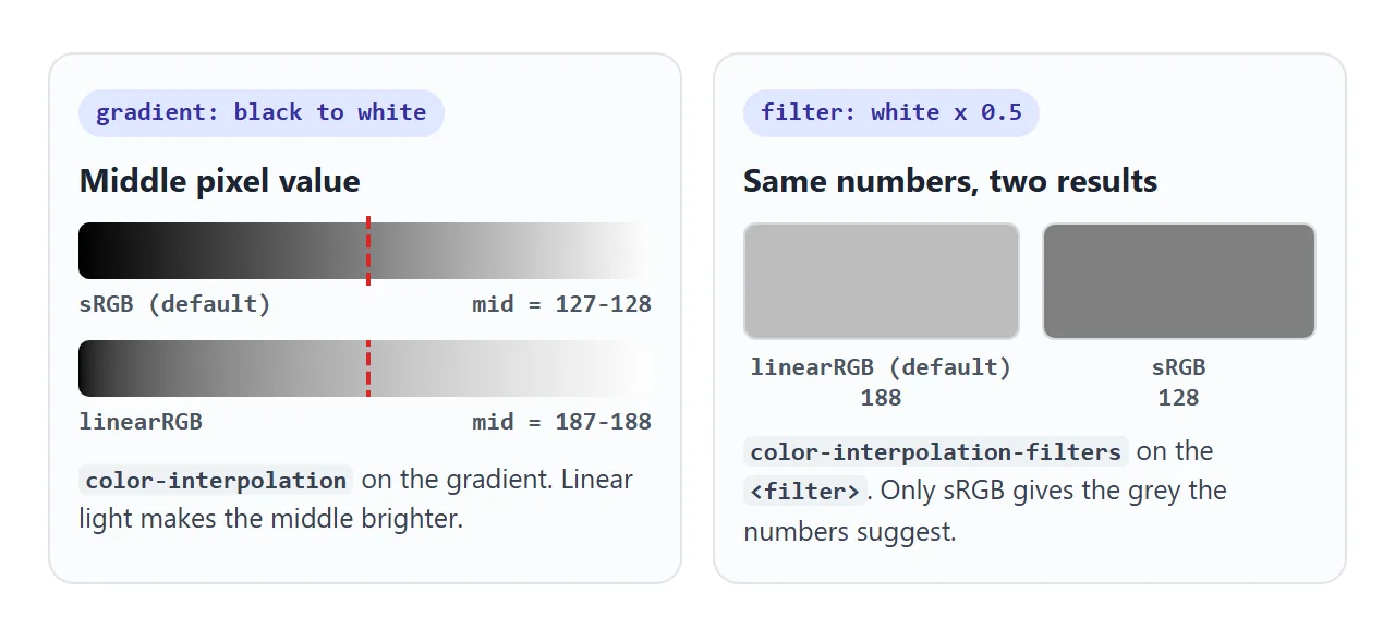
The filter needs the -filters property. Setting plain color-interpolation="sRGB" on the <filter> left the result at 188.
Both properties are inherited, so one attribute on a parent covers everything inside. The SVG filter guide shows where this matters in feColorMatrix, and SVG gradients covers stops and directions.
color-rendering and buffered-rendering
color-rendering is a hint about colour quality. We drew the same gradient, shapes and text with optimizeSpeed and with optimizeQuality and compared them with the default. No pixel changed in any of the three engines.
Chromium accepts the value through CSS.supports(). Firefox and WebKit returned false.
buffered-rendering is a hint that the content changes rarely and can be cached. It is not part of SVG 2. Chromium and WebKit accept static through CSS.supports(), Firefox does not, and no pixel changed in any engine. It is safe to delete from old files.
A finished example: a chart that stays sharp
The same two properties make a chart that stretches to any width. The viewBox is 100 by 50 units and preserveAspectRatio="none" stretches it to fill the box, so the drawing scales differently across and down.
<!doctype html>
<html lang="en">
<head>
<meta charset="utf-8">
<meta name="viewport" content="width=device-width, initial-scale=1">
<title>A chart that stays sharp at any size</title>
<style>
  body { margin: 0; padding: 14px; font-family: system-ui, sans-serif; background: #f4f5f7; color: #1d2330; }
  .ctl { display: flex; flex-wrap: wrap; gap: 8px 16px; align-items: center; font-size: 13px; margin-bottom: 12px; }
  .ctl code { font: 600 12px ui-monospace, Consolas, monospace; }
  input[type=range] { width: 150px; }
  .box { box-sizing: border-box; background: #fff; border: 1px solid #d5d9e0; border-radius: 10px; padding: 8px; }
  #chart { display: block; width: 100%; height: 220px; }
  .grid line { stroke: #64748b; stroke-width: 1; vector-effect: non-scaling-stroke; }
  .grid.crisp { shape-rendering: crispEdges; }     /* gridlines snap to whole pixels */
  #data { fill: none; stroke: #2563eb; stroke-width: 2; stroke-linejoin: round; }
  #data.fixed { vector-effect: non-scaling-stroke; } /* width stays 2 screen px */
  #out { font: 12px ui-monospace, Consolas, monospace; color: #4b5563; margin-top: 8px; }
</style>
</head>
<body>
<div class="ctl">
  <label>Width <input id="w" type="range" min="25" max="100" value="100"></label>
  <label><input id="ns" type="checkbox" checked> <code>non-scaling-stroke</code></label>
  <label><input id="ce" type="checkbox" checked> <code>crispEdges</code> grid</label>
</div>

<div class="box" id="box">
  <!-- 100 x 50 drawing units, stretched to fill the box -->
  <svg id="chart" viewBox="0 0 100 50" preserveAspectRatio="none">
    <g class="grid crisp" id="grid">
      <line x1="0" y1="10" x2="100" y2="10"/><line x1="0" y1="20" x2="100" y2="20"/>
      <line x1="0" y1="30" x2="100" y2="30"/><line x1="0" y1="40" x2="100" y2="40"/>
    </g>
    <polyline id="data" class="fixed" points="0,40 12,33 25,36 37,22 50,26 62,14 75,18 87,9 100,12"/>
  </svg>
</div>
<div id="out"></div>

<script>
  const box = document.getElementById('box');
  const chart = document.getElementById('chart');
  const data = document.getElementById('data');
  const grid = document.getElementById('grid');
  const out = document.getElementById('out');

  function report() {
    // how many screen pixels one drawing unit takes, across and down
    const r = chart.getBoundingClientRect();
    const sx = r.width / 100, sy = r.height / 50;
    const w = data.classList.contains('fixed') ? '2 px' : (2 * sy).toFixed(1) + ' px on flat parts, ' + (2 * sx).toFixed(1) + ' px on steep parts';
    out.textContent = 'Scale: x ' + sx.toFixed(2) + ', y ' + sy.toFixed(2) + ' | line width: ' + w;
  }

  document.getElementById('w').addEventListener('input', (e) => {
    box.style.width = e.target.value + '%';
    report();
  });
  document.getElementById('ns').addEventListener('change', (e) => {
    data.classList.toggle('fixed', e.target.checked);
    report();
  });
  document.getElementById('ce').addEventListener('change', (e) => {
    grid.classList.toggle('crisp', e.target.checked);
  });

  window.addEventListener('resize', report);
  report();
</script>
</body>
</html>
- Data line:
non-scaling-strokekeeps it 2 pixels thick. Untick it and the stroke stretches with the drawing, so its thickness changes from one segment to the next. - Gridlines: each one is a 1px non-scaling stroke on a whole-pixel position, so it straddles two rows.
crispEdgessnaps it to one.
.grid line { vector-effect: non-scaling-stroke; }
.grid { shape-rendering: crispEdges; }
#data { vector-effect: non-scaling-stroke; }
The line chart guide builds a complete chart around the same idea.
When it does not work
| What you see | Cause | Fix |
|---|---|---|
| Thin lines look grey and blurry | The line sits across two pixel rows | shape-rendering: crispEdges on the lines |
| Circles look jagged | crispEdges on curved shapes |
Limit it to a <g> of straight lines |
| Lines get thicker as the SVG grows | stroke-width is in viewBox units |
vector-effect: non-scaling-stroke |
non-scaling-stroke on a <g> does nothing |
The property is not inherited | Put it on the shapes |
| Line still thickens with non-scaling-stroke | A CSS transform scales the <svg> |
Size the SVG with width and height |
| The number of dashes changes as the SVG resizes | Dash lengths follow the non-scaling stroke | Give dash lengths in screen pixels |
| Filter colours look washed out | Filters default to linearRGB | Add color-interpolation-filters="sRGB" |
| geometricPrecision changes nothing | It is a hint, and the engines ignored it | Nothing to fix, auto is the same |
Share it as a link
Rendering differences are easy to miss in a screenshot, because the image gets resized and smoothed on the way. A live page shows the real pixels on the viewer's own screen.
To send the working version, paste the page into a NOS document and choose Create share link. HTML to link walks through it.
The page renders as written and its scripts run, so the people you send it to can switch the values and drag the slider themselves. If you change the code later, the same link shows the new version.