An SVG filter is a <filter> element with an id, filled with drawing steps called primitives: feGaussianBlur, feDropShadow, feColorMatrix and so on. Any element can use it. In CSS, write filter: url(#id). On an SVG shape, the filter="url(#id)" attribute does the same.
Try it first. Both filters below are applied to plain HTML divs. Move the slider to change stdDeviation on both.
<!doctype html>
<html lang="en">
<head>
<meta charset="utf-8">
<meta name="viewport" content="width=device-width, initial-scale=1">
<title>SVG filter: blur and drop shadow</title>
<style>
  body { margin: 0; padding: 18px; font-family: system-ui, sans-serif; background: #f4f5f7; color: #1d2330; }
  .row { display: flex; flex-wrap: wrap; gap: 14px; justify-content: center; }
  figure { margin: 0; width: 104px; text-align: center; font-size: 13px; }
  .tile {
    width: 84px; height: 84px; margin: 12px auto 8px; border-radius: 22px;
    background: linear-gradient(135deg, #34d399, #2563eb);
    color: #fff; font: 700 30px/84px system-ui, sans-serif;
  }
  /* the CSS filter property points at a <filter> by its id */
  .blur   { filter: url(#soft); }
  .shadow { filter: url(#shadow); }
  label { display: block; margin-top: 16px; text-align: center; font-size: 14px; }
  input { width: 200px; vertical-align: middle; }
</style>
</head>
<body>
<!-- the filters live in a zero-size SVG; do not use display: none on it -->
<svg width="0" height="0" style="position: absolute">
  <filter id="soft" x="-50%" y="-50%" width="200%" height="200%">
    <feGaussianBlur stdDeviation="3" />
  </filter>
  <filter id="shadow" x="-50%" y="-50%" width="200%" height="200%">
    <feDropShadow dx="0" dy="6" stdDeviation="3" flood-color="#1e3a8a" flood-opacity="0.5" />
  </filter>
</svg>

<div class="row">
  <figure><div class="tile">Aa</div>No filter</figure>
  <figure><div class="tile blur">Aa</div>feGaussianBlur</figure>
  <figure><div class="tile shadow">Aa</div>feDropShadow</figure>
</div>

<label>stdDeviation: <input id="sd" type="range" min="0" max="12" value="3"> <b id="out">3</b></label>

<script>
  const sd = document.getElementById('sd');
  sd.addEventListener('input', () => {
    // filter primitives are live elements: change an attribute and the picture redraws
    document.querySelectorAll('feGaussianBlur, feDropShadow')
      .forEach((el) => el.setAttribute('stdDeviation', sd.value));
    document.getElementById('out').textContent = sd.value;
  });
</script>
</body>
</html>
If you only need a ready-made blur, grayscale or brightness change, the CSS functions are shorter. CSS filter covers every one of them. Reach for an SVG filter when you want to combine steps into an effect of your own.
How an SVG filter is put together
A filter is a pipeline. Each primitive takes an image in, draws something, and passes its output on. You build it in four steps:
- Add a hidden SVG with a filter. An inline
<svg width="0" height="0">holds a<filter id="...">. - Add primitives in order. Each one takes the previous result, or an input you name.
- Size the filter region. Set
x,y,widthandheightso nothing is clipped. - Apply it with CSS.
filter: url(#id)on any element.
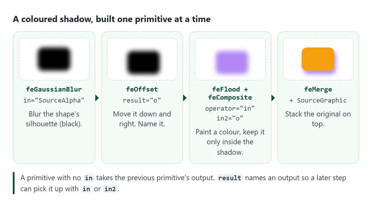
Three attributes wire the steps together:
inpicks the input.SourceGraphicis the element as drawn.SourceAlphais only its shape, in black.resultnames a primitive's output.in2is the second input for primitives that combine two images, such asfeComposite.
A primitive with no in uses the output of the one before it. The first primitive with no in uses SourceGraphic.
Applying it to HTML with filter: url(#id)
The filters must be in the same page as the element, inside an inline <svg>. Keep that SVG out of the layout with a zero size, not with display: none:
<svg width="0" height="0" style="position: absolute">
  <filter id="soft" x="-50%" y="-50%" width="200%" height="200%">
    <feGaussianBlur stdDeviation="3" />
  </filter>
</svg>

<img src="photo.jpg" style="filter: url(#soft)">
In our tests, putting the filters inside a display: none SVG broke them: Chromium and WebKit ignored the filter, and Firefox hid the filtered element. SVG in HTML covers inline SVG markup in more detail.
A url() reference can sit in the same list as CSS functions, so filter: url(#soft) grayscale(1) runs the SVG filter first, then the grayscale.
Blur and shadow: feGaussianBlur and feDropShadow
feGaussianBlur has one main setting, stdDeviation: the spread of the blur (the standard deviation of the Gaussian curve), in user units. Two numbers, such as stdDeviation="8 0", blur horizontally and vertically by different amounts.
feDropShadow is a shortcut for the chain in the picture above. It takes dx, dy, stdDeviation, flood-color and flood-opacity, and draws the element on top of its own shadow. Unlike box-shadow, it follows the visible shape. CSS drop shadow compares the two.
Both effects spread past the element, which runs into the filter region:
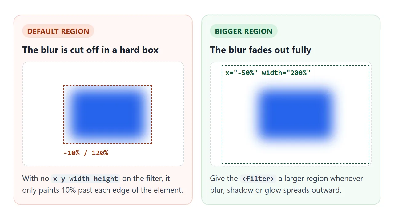
The default region is 10% larger than the element's box on every side. Anything drawn outside it is cut off with a hard edge. For blur, shadow and glow, widen it, as in the examples on this page:
<!-- default: x="-10%" y="-10%" width="120%" height="120%" -->
<filter id="glow" x="-50%" y="-50%" width="200%" height="200%">
Recolouring with feColorMatrix
feColorMatrix computes each output channel from the input channels. With type="matrix", the values attribute holds 20 numbers: four rows (red, green, blue, alpha out), each with five columns (red, green, blue, alpha in, plus a constant).
<!-- grayscale: each channel gets the same mix of R, G and B -->
<feColorMatrix type="matrix" values="
  0.2126 0.7152 0.0722 0 0
  0.2126 0.7152 0.0722 0 0
  0.2126 0.7152 0.0722 0 0
  0      0      0      1 0" />
Three shorter types cover common cases:
| type | values | What it does |
|---|---|---|
matrix |
20 numbers | Any mix of channels |
saturate |
One number, 0 to 1 | 0 is grey, 1 is unchanged |
hueRotate |
An angle in degrees | Turns every colour around the colour wheel |
luminanceToAlpha |
None | Brightness becomes transparency |
Switch between presets below. The Flood tint button uses two other primitives, explained in the next section.
<!doctype html>
<html lang="en">
<head>
<meta charset="utf-8">
<meta name="viewport" content="width=device-width, initial-scale=1">
<title>feColorMatrix and feFlood + feComposite</title>
<style>
  body { margin: 0; padding: 14px; font-family: system-ui, sans-serif; background: #f4f5f7; color: #1d2330; }
  .pic { display: block; width: 100%; max-width: 360px; height: 150px; margin: 0 auto; border-radius: 12px; }
  .btns { display: flex; flex-wrap: wrap; gap: 6px; justify-content: center; margin: 12px 0 8px; }
  button { font: 600 13px system-ui, sans-serif; padding: 7px 11px; border: 1px solid #cfd5de; border-radius: 8px; background: #fff; cursor: pointer; }
  button.on { background: #1d2330; color: #fff; border-color: #1d2330; }
  label { display: block; text-align: center; font-size: 13px; }
  pre { margin: 10px auto 0; max-width: 360px; padding: 10px; border-radius: 8px; background: #1d2330; color: #d1fae5;
        font: 12px/1.45 ui-monospace, Consolas, monospace; white-space: pre-wrap; word-break: break-all; }
</style>
</head>
<body>
<svg width="0" height="0" style="position: absolute">
  <!-- grayscale: every output channel gets the same weighted mix of R, G, B -->
  <filter id="gray">
    <feColorMatrix type="matrix" values="0.2126 0.7152 0.0722 0 0
                                         0.2126 0.7152 0.0722 0 0
                                         0.2126 0.7152 0.0722 0 0
                                         0      0      0      1 0" />
  </filter>
  <!-- swap red and blue -->
  <filter id="swap">
    <feColorMatrix type="matrix" values="0 0 1 0 0  0 1 0 0 0  1 0 0 0 0  0 0 0 1 0" />
  </filter>
  <filter id="hue">
    <feColorMatrix type="hueRotate" values="140" />
  </filter>
  <!-- tint: a flat colour, kept only where the picture is (operator atop) -->
  <filter id="tint">
    <feFlood flood-color="#db2777" flood-opacity="0.45" result="paint" />
    <feComposite in="paint" in2="SourceGraphic" operator="atop" />
  </filter>
</svg>

<svg class="pic" id="pic" viewBox="0 0 360 150" preserveAspectRatio="xMidYMid slice">
  <defs><linearGradient id="sky" x1="0" y1="0" x2="0" y2="1"><stop offset="0" stop-color="#38bdf8"/><stop offset="1" stop-color="#fde68a"/></linearGradient></defs>
  <rect width="360" height="150" fill="url(#sky)" />
  <circle cx="280" cy="48" r="24" fill="#f97316" />
  <path d="M0 150 L90 60 L160 125 L230 75 L360 150 Z" fill="#16a34a" />
  <path d="M0 150 L60 110 L130 150 Z" fill="#dc2626" />
</svg>

<div class="btns" id="btns">
  <button class="on" data-f="">None</button>
  <button data-f="gray">Grayscale</button>
  <button data-f="swap">Swap R and B</button>
  <button data-f="hue">hueRotate</button>
  <button data-f="tint">Flood tint</button>
</div>
<label><input type="checkbox" id="srgb"> color-interpolation-filters="sRGB"</label>
<pre id="code">filter: none</pre>

<script>
  const pic = document.getElementById('pic');
  const code = document.getElementById('code');
  let current = '';

  function show() {
    pic.style.filter = current ? 'url(#' + current + ')' : 'none';
    code.textContent = current
      ? document.getElementById(current).outerHTML.replace(/\s+/g, ' ')
      : 'filter: none';
  }

  document.getElementById('btns').addEventListener('click', (e) => {
    const b = e.target.closest('button');
    if (!b) return;
    document.querySelectorAll('#btns button').forEach((x) => x.classList.toggle('on', x === b));
    current = b.dataset.f;
    show();
  });

  // filters default to linearRGB; sRGB matches the CSS filter functions
  document.getElementById('srgb').addEventListener('change', (e) => {
    document.querySelectorAll('filter').forEach((f) => {
      // swap in an edited copy: WebKit keeps the old picture if only the attribute changes
      const copy = f.cloneNode(true);
      if (e.target.checked) copy.setAttribute('color-interpolation-filters', 'sRGB');
      else copy.removeAttribute('color-interpolation-filters');
      f.replaceWith(copy);
    });
    show();
  });
</script>
</body>
</html>
The checkbox matters. Primitives do their maths in the linearRGB colour space unless the filter says otherwise, so the same matrix gives a lighter grey than the CSS grayscale() function.
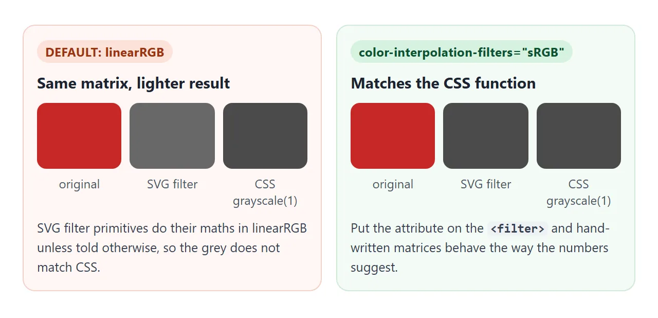
Add color-interpolation-filters="sRGB" to the <filter> when you want the numbers to match what CSS would do.
Painting a colour: feFlood and feComposite
feFlood fills the whole filter region with one colour. flood-color sets the colour and flood-opacity its opacity. On its own it just paints a rectangle, so it is usually followed by feComposite.
feComposite combines in with in2. The operator decides how:
| operator | Result |
|---|---|
over |
in drawn on top of in2 (the default) |
in |
The part of in that lies inside in2's shape |
out |
The part of in that lies outside in2's shape |
atop |
in over in2, kept only inside in2's shape |
xor |
Each where the other is not |
arithmetic |
A formula using k1 to k4 |
The tint in the demo floods pink at 45% opacity, then keeps it only on the picture:
<filter id="tint">
  <feFlood flood-color="#db2777" flood-opacity="0.45" result="paint" />
  <feComposite in="paint" in2="SourceGraphic" operator="atop" />
</filter>
With operator="in" and in2="SourceAlpha" instead, you get a flat silhouette in the flood colour. Blur that and you have a coloured glow.
Lighting: feDiffuseLighting and lighting-color
feDiffuseLighting treats the alpha channel of its input as a height map and shines a light on it. A blurred SourceAlpha makes soft slopes at the edges, which light up on one side and fall into shade on the other.
The light source is a child element. feDistantLight is a far-away light like the sun, set by azimuth (direction around the element) and elevation (height above it). fePointLight and feSpotLight are the other two.
lighting-color is the colour of the light, white by default. The finished example lights an HTML button, adds a glow with feFlood and feComposite, and ends with feDropShadow:
<!doctype html>
<html lang="en">
<head>
<meta charset="utf-8">
<meta name="viewport" content="width=device-width, initial-scale=1">
<title>Bevelled button with feDiffuseLighting</title>
<style>
  body { margin: 0; padding: 18px; font-family: system-ui, sans-serif; background: #eef1f5; color: #1d2330; text-align: center; }
  .stage { padding: 34px 0 28px; }
  .btn {
    font: 700 20px system-ui, sans-serif; color: #fff; letter-spacing: .3px;
    padding: 18px 34px; border: 0; border-radius: 16px; cursor: pointer;
    background: #2563eb;
    filter: url(#bevel);  /* the whole SVG filter chain, applied to an HTML button */
  }
  .btn:active { transform: translateY(2px); }
  .ctl { display: grid; gap: 10px; max-width: 300px; margin: 0 auto; font-size: 14px; text-align: left; }
  .ctl label { display: flex; align-items: center; justify-content: space-between; gap: 10px; }
  .ctl input[type=range] { width: 150px; }
  #msg { min-height: 20px; margin-top: 12px; font-size: 14px; color: #0f5132; }
</style>
</head>
<body>
<svg width="0" height="0" style="position: absolute">
  <filter id="bevel" x="-30%" y="-50%" width="160%" height="200%" color-interpolation-filters="sRGB">
    <!-- 1. a soft height map from the button's own shape -->
    <feGaussianBlur in="SourceAlpha" stdDeviation="4" result="bump" />
    <!-- 2. light that height map; lighting-color is the colour of the lamp -->
    <feDiffuseLighting in="bump" surfaceScale="5" diffuseConstant="1.1" lighting-color="#ffffff" result="light">
      <feDistantLight id="lamp" azimuth="225" elevation="50" />
    </feDiffuseLighting>
    <!-- 3. keep the light only inside the button -->
    <feComposite in="light" in2="SourceAlpha" operator="in" result="lit" />
    <!-- 4. button colour plus some light, minus a little so flat areas keep their colour -->
    <feComposite in="SourceGraphic" in2="lit" operator="arithmetic" k1="0" k2="1" k3="0.7" k4="-0.59" result="shaded" />
    <!-- 5. a flood + composite glow behind it, then a drop shadow -->
    <feFlood flood-color="#60a5fa" flood-opacity="0.8" result="glowColor" />
    <feComposite in="glowColor" in2="bump" operator="in" result="glow" />
    <feMerge result="both"><feMergeNode in="glow" /><feMergeNode in="shaded" /></feMerge>
    <feDropShadow in="both" dx="0" dy="5" stdDeviation="4" flood-color="#0f172a" flood-opacity="0.3" />
  </filter>
</svg>

<div class="stage"><button class="btn" id="btn">Get started</button></div>

<div class="ctl">
  <label>Button colour <input type="color" id="bg" value="#2563eb"></label>
  <label>lighting-color <input type="color" id="lc" value="#ffffff"></label>
  <label>Light angle <input type="range" id="az" min="0" max="360" value="225"></label>
</div>
<div id="msg"></div>

<script>
  const btn = document.getElementById('btn');
  const light = document.querySelector('feDiffuseLighting');
  const lamp = document.getElementById('lamp');

  document.getElementById('bg').addEventListener('input', (e) => { btn.style.background = e.target.value; });
  document.getElementById('lc').addEventListener('input', (e) => light.setAttribute('lighting-color', e.target.value));
  document.getElementById('az').addEventListener('input', (e) => lamp.setAttribute('azimuth', e.target.value));

  // the filter only changes pixels: the button is still a real, clickable button
  btn.addEventListener('click', () => {
    document.getElementById('msg').textContent = 'Clicked. The filter does not get in the way.';
  });
</script>
</body>
</html>
The lit result is mixed back into the button with operator="arithmetic", which computes each pixel as:
result = k1 * in * in2 + k2 * in + k3 * in2 + k4
Here k2="1" keeps the button colour, k3 adds some of the light, and a negative k4 takes back what the light adds to the flat face. Only the edges change.
The button still takes clicks, because a filter changes how an element looks, not where it is.
When it does not work
| What you see | Cause | Fix |
|---|---|---|
| Nothing changes at all | The id in url(#id) does not match any filter |
Check the spelling; the <filter> must be in the same page |
| The element vanishes in Firefox only | The id does not exist, or the SVG is display: none |
Fix the id; hide the SVG with width and height 0 |
| Blur or shadow ends in a hard, straight edge | The default filter region is too small | Set x, y, width and height on the <filter> |
| Colours are lighter than the numbers suggest | Default linearRGB colour space | Add color-interpolation-filters="sRGB" |
feFlood covers everything in a solid block |
The flood fills the whole region | Follow it with feComposite operator="in" |
| Lighting paints a solid rectangle around the element | The lighting output is not clipped to the shape | Follow it with feComposite operator="in" and in2="SourceAlpha" |
| Lighting looks flat, with no bevel | The height map has no slopes | Blur SourceAlpha first and raise surfaceScale |
| A later primitive uses the wrong image | Missing result or a typo in in |
Name outputs and check every in and in2 |
Share it as a link
Filters are hard to judge from a screenshot. The glow, the light angle and the colour mix only make sense when you can move the sliders. An .html attachment may open as plain code, or not at all, on a phone.
To send the working version, paste the page into a NOS document and choose Create share link. HTML to link walks through it.
The page renders as written and its scripts run, so the people you send it to can try the controls themselves. If you change the filter later, the same link shows the new version.