The CSS filter property applies visual effects to an element after it has been drawn. You list one or more functions, separated by spaces: filter: blur(4px) softens it, filter: grayscale(1) removes the colour, filter: brightness(1.2) lightens it.
It works on anything: an <img>, a video, an inline SVG, a card full of text. Try every function on one picture here. The line under the sliders is the CSS you would copy.
<!doctype html>
<html lang="en">
<head>
<meta charset="utf-8">
<meta name="viewport" content="width=device-width, initial-scale=1">
<title>CSS filter mixer</title>
<style>
  body { margin: 0; padding: 14px; font-family: system-ui, sans-serif; background: #f4f5f7; color: #1d2330; }
  .scene { display: block; width: 100%; max-width: 400px; height: auto; margin: 0 auto 14px; }
  .controls { display: grid; grid-template-columns: 1fr 1fr; gap: 4px 18px; max-width: 560px; margin: 0 auto; }
  label { font-size: 13px; }
  label span { display: flex; justify-content: space-between; }
  output { color: #6b7280; font-variant-numeric: tabular-nums; }
  input[type=range] { width: 100%; margin: 2px 0 6px; }
  .out { max-width: 560px; margin: 8px auto 0; display: flex; gap: 8px; align-items: flex-start; }
  pre {
    flex: 1; margin: 0; padding: 10px 12px; border-radius: 8px; background: #1d2330; color: #d1fae5;
    font: 13px/1.45 ui-monospace, Consolas, monospace; white-space: pre-wrap; word-break: break-word;
  }
  button { font: inherit; font-size: 13px; padding: 8px 12px; border: 1px solid #cbd2dc; border-radius: 8px; background: #fff; cursor: pointer; }
</style>
</head>
<body>

<!-- the "photo": an inline SVG, so no image file is needed -->
<svg class="scene" id="scene" viewBox="0 0 400 210" role="img" aria-label="A house on a hill at sunset">
  <defs>
    <linearGradient id="sky" x1="0" y1="0" x2="0" y2="1">
      <stop offset="0" stop-color="#3b82f6"/><stop offset=".6" stop-color="#f9a8d4"/><stop offset="1" stop-color="#fcd34d"/>
    </linearGradient>
  </defs>
  <rect width="400" height="210" rx="18" fill="url(#sky)"/>
  <circle cx="300" cy="80" r="34" fill="#fde047"/>
  <path d="M0 150 Q100 105 210 145 T400 135 V192 Q400 210 382 210 H18 Q0 210 0 192Z" fill="#16a34a"/>
  <path d="M0 175 Q140 150 260 178 T400 170 V192 Q400 210 382 210 H18 Q0 210 0 192Z" fill="#15803d"/>
  <rect x="92" y="112" width="62" height="46" fill="#f97316"/>
  <path d="M84 114 L123 84 L162 114Z" fill="#b91c1c"/>
  <rect x="116" y="132" width="15" height="26" fill="#7c2d12"/>
  <rect x="98" y="122" width="12" height="11" fill="#bae6fd"/>
  <rect x="226" y="120" width="8" height="32" fill="#78350f"/>
  <circle cx="230" cy="112" r="20" fill="#22c55e"/>
</svg>

<div class="controls" id="controls"></div>

<div class="out">
  <pre id="css">filter: none;</pre>
  <button id="reset" type="button">Reset</button>
</div>

<script>
  // name, min, max, step, neutral value, unit
  const fns = [
    ['blur', 0, 10, 0.5, 0, 'px'],
    ['brightness', 0, 2, 0.05, 1, ''],
    ['contrast', 0, 2, 0.05, 1, ''],
    ['grayscale', 0, 1, 0.05, 0, ''],
    ['sepia', 0, 1, 0.05, 0, ''],
    ['saturate', 0, 3, 0.1, 1, ''],
    ['hue-rotate', 0, 360, 5, 0, 'deg'],
    ['invert', 0, 1, 0.05, 0, ''],
    ['opacity', 0, 1, 0.05, 1, ''],
    ['drop-shadow', 0, 12, 1, 0, 'px'],
  ];
  const scene = document.getElementById('scene');
  const box = document.getElementById('controls');
  const css = document.getElementById('css');

  // build one slider per filter function
  fns.forEach(([name, min, max, step, neutral, unit]) => {
    box.insertAdjacentHTML('beforeend',
      `<label><span>${name}<output></output></span>
       <input type="range" data-fn="${name}" data-unit="${unit}" data-neutral="${neutral}"
              min="${min}" max="${max}" step="${step}" value="${neutral}"></label>`);
  });
  const sliders = box.querySelectorAll('input');

  function update() {
    const parts = [];
    sliders.forEach((s) => {
      const v = s.value + s.dataset.unit;
      s.previousElementSibling.querySelector('output').textContent = v;
      if (s.value === s.dataset.neutral) return;  // leave out functions that do nothing
      parts.push(s.dataset.fn === 'drop-shadow'
        ? `drop-shadow(0 ${v} ${v} rgb(0 0 0 / .45))`
        : `${s.dataset.fn}(${v})`);
    });
    const value = parts.length ? parts.join(' ') : 'none';
    scene.style.filter = value;
    css.textContent = `filter: ${value};`;
  }

  box.addEventListener('input', update);
  document.getElementById('reset').addEventListener('click', () => {
    sliders.forEach((s) => { s.value = s.dataset.neutral; });
    update();
  });
  update();
</script>
</body>
</html>
The ten filter functions
Each function takes one value. Most accept a number or a percentage, so grayscale(1) and grayscale(100%) mean the same.
| Function | What it does | No change at | Example |
|---|---|---|---|
blur() |
Softens, mixing each pixel with its neighbours | 0 |
blur(4px) |
brightness() |
Darker below 1, lighter above 1, black at 0 | 1 |
brightness(1.2) |
contrast() |
Flat grey at 0, harsher above 1 | 1 |
contrast(1.3) |
grayscale() |
Removes colour, fully grey at 1 | 0 |
grayscale(1) |
sepia() |
Warm brown tint, full at 1 | 0 |
sepia(.6) |
saturate() |
Duller below 1, more vivid above 1 | 1 |
saturate(1.8) |
hue-rotate() |
Turns every colour around the colour wheel | 0deg |
hue-rotate(90deg) |
invert() |
Swaps colours for their opposites, full at 1 | 0 |
invert(1) |
opacity() |
Makes the element see-through | 1 |
opacity(.5) |
drop-shadow() |
A shadow that follows the visible shape | leave it out | drop-shadow(0 4px 6px #0006) |
grayscale, sepia, invert and opacity stop at 1; a larger value is treated as 1. brightness, contrast and saturate can go above 1. Negative values are invalid, except for hue-rotate() angles and shadow offsets. blur() needs a length unit such as px.
Two of these have their own guides. CSS drop shadow covers drop-shadow() against box-shadow, and CSS opacity covers fading an element and the side effects that come with it.
Chaining filters: order matters
Write several functions in one filter value, separated by spaces, not commas. The browser applies them left to right, and each function works on the result of the one before it.
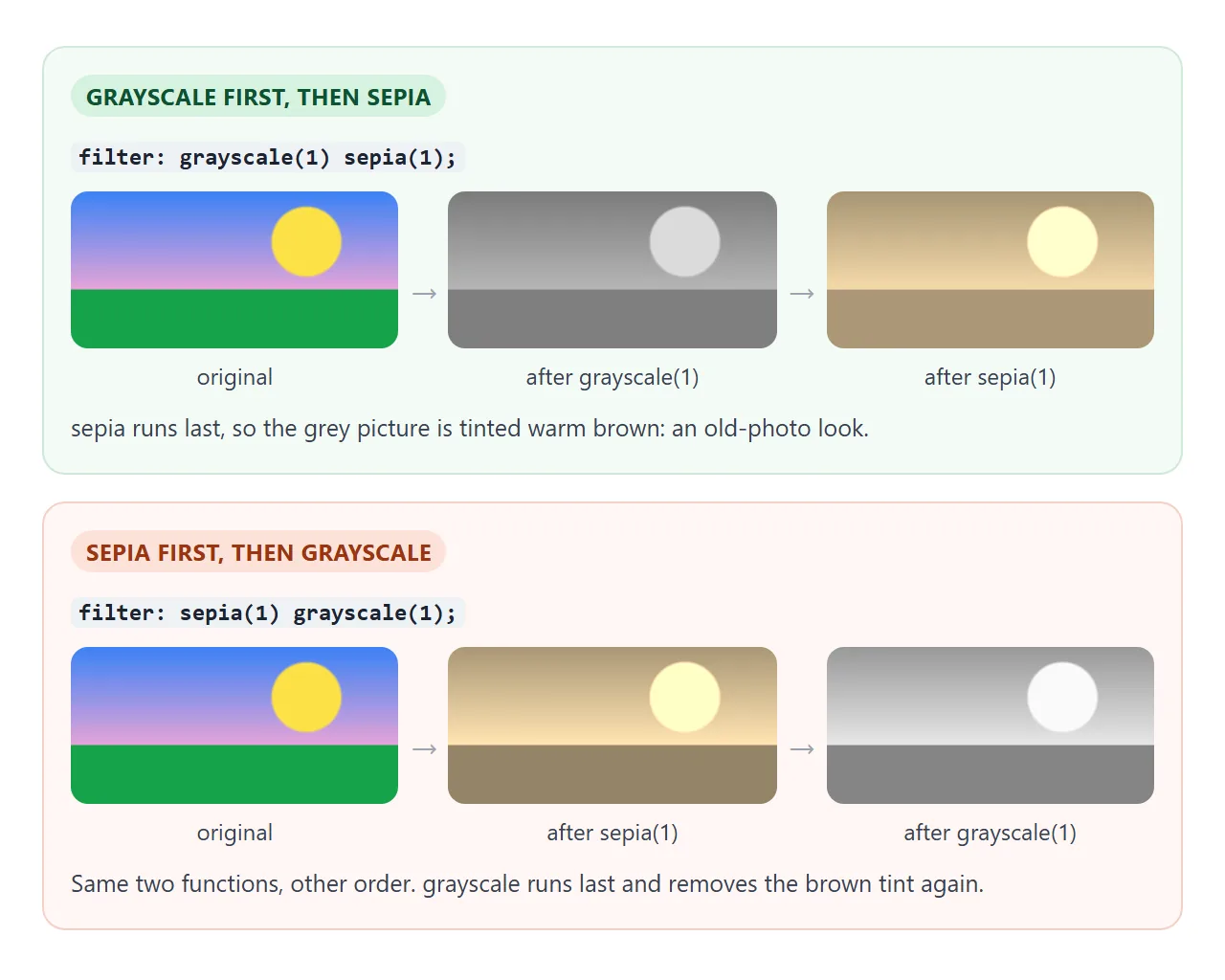
So grayscale(1) sepia(1) gives a warm old-photo look, while sepia(1) grayscale(1) ends plain grey, because the last step removes the tint. The same goes for a shadow: drop-shadow(...) invert(1) inverts the shadow too, turning a dark shadow into a light glow.
.old-photo { filter: grayscale(1) sepia(.8) contrast(1.1); }
.night     { filter: brightness(.6) saturate(.7) hue-rotate(200deg); }
A second filter declaration on the same element replaces the first one. It does not add to it. To combine, put every function in one value.
filter applies to the element and all its children
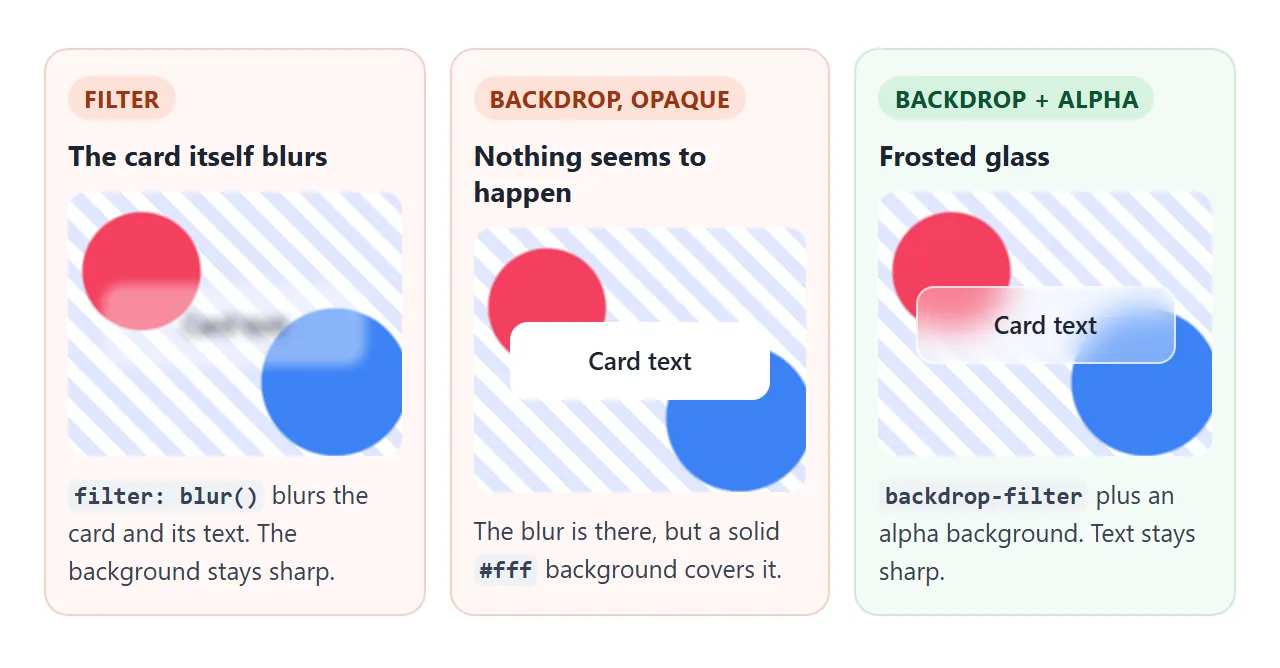
A filter is applied to the element as a whole, after its children are drawn. There is no way for a child to opt out. filter: blur(3px) on a card blurs the card's text and buttons along with its background.
If you want only the picture to change, put the filter on the picture: the <img>, an inner <div> that holds the background, or a ::before layer placed behind the text. The text then stays sharp in a sibling or a later layer.
backdrop-filter: frosted glass
backdrop-filter takes the same functions but applies them to whatever is behind the element. The element itself, and its text, stay untouched. This is how a frosted glass card or menu bar is made.
<!doctype html>
<html lang="en">
<head>
<meta charset="utf-8">
<meta name="viewport" content="width=device-width, initial-scale=1">
<title>backdrop-filter frosted glass</title>
<style>
  body { margin: 0; padding: 14px; font-family: system-ui, sans-serif; background: #f4f5f7; color: #1d2330; }

  /* something colourful and detailed to sit behind the glass */
  .stage {
    position: relative; height: 250px; border-radius: 14px; overflow: hidden;
    display: grid; place-items: center;
    background:
      radial-gradient(circle at 20% 30%, #f43f5e 0 16%, transparent 17%),
      radial-gradient(circle at 78% 70%, #3b82f6 0 20%, transparent 21%),
      radial-gradient(circle at 60% 20%, #facc15 0 11%, transparent 12%),
      repeating-linear-gradient(45deg, #ffffff 0 10px, #e0e7ff 10px 20px);
  }
  .stage::before {
    content: "BEHIND THE GLASS"; position: absolute; top: 50%; left: 0; right: 0;
    transform: translateY(-50%); text-align: center;
    font: 900 clamp(28px, 9vw, 44px)/1 system-ui, sans-serif; color: #7c3aed; letter-spacing: 2px;
  }

  .card {
    position: relative; width: min(78%, 300px); padding: 18px 20px; border-radius: 14px;
    border: 1px solid rgb(255 255 255 / .6);
    background: rgb(255 255 255 / var(--alpha, .35));   /* must let the backdrop show through */
    -webkit-backdrop-filter: blur(var(--blur, 12px));    /* older Safari */
    backdrop-filter: blur(var(--blur, 12px));
  }
  .card b { display: block; font-size: 18px; margin-bottom: 4px; }

  fieldset { border: 0; padding: 0; margin: 12px 0 0; display: flex; flex-wrap: wrap; gap: 6px; align-items: center; font-size: 13px; }
  legend { float: left; width: 118px; padding: 0; }
  fieldset label { padding: 6px 10px; border: 1px solid #cbd2dc; border-radius: 99px; background: #fff; cursor: pointer; }
  fieldset label:has(input:checked) { background: #1d2330; color: #fff; border-color: #1d2330; }
  fieldset input { position: absolute; opacity: 0; }
  fieldset label:has(input:focus-visible) { outline: 2px solid #2563eb; outline-offset: 2px; }
  pre { margin: 12px 0 0; padding: 10px 12px; border-radius: 8px; background: #1d2330; color: #d1fae5; font: 13px/1.5 ui-monospace, Consolas, monospace; white-space: pre-wrap; }
</style>
</head>
<body>

<div class="stage">
  <div class="card" id="card">
    <b>Frosted card</b>
    The text on the glass stays sharp. Only what is behind it gets blurred.
  </div>
</div>

<form id="opts">
  <fieldset>
    <legend>Blur amount</legend>
    <label><input type="radio" name="blur" value="0px">0</label>
    <label><input type="radio" name="blur" value="4px">4px</label>
    <label><input type="radio" name="blur" value="12px" checked>12px</label>
    <label><input type="radio" name="blur" value="24px">24px</label>
  </fieldset>
  <fieldset>
    <legend>Background alpha</legend>
    <label><input type="radio" name="alpha" value=".15">0.15</label>
    <label><input type="radio" name="alpha" value=".35" checked>0.35</label>
    <label><input type="radio" name="alpha" value=".7">0.7</label>
    <label><input type="radio" name="alpha" value="1">1 (opaque)</label>
  </fieldset>
</form>

<pre id="css"></pre>

<script>
  const card = document.getElementById('card');
  const form = document.getElementById('opts');
  const css = document.getElementById('css');

  function update() {
    const blur = form.elements.blur.value;
    const alpha = form.elements.alpha.value;
    card.style.setProperty('--blur', blur);
    card.style.setProperty('--alpha', alpha);
    css.textContent =
      `background: rgb(255 255 255 / ${alpha});\nbackdrop-filter: blur(${blur});` +
      (alpha === '1' ? '\n/* opaque: nothing behind shows, so the blur is invisible */' : '');
  }
  form.addEventListener('change', update);
  update();
</script>
</body>
</html>
The one rule: the element's own background must be at least partly transparent. The browser does blur the area behind it, but a solid background paints straight over the result.
To build the card:
- Place it over something with detail, such as an image, a gradient or text. Over a plain white page, a blur has nothing to show.
- Give it a see-through background, such as
rgb(255 255 255 / .35). - Add
backdrop-filter: blur(12px), plus a-webkit-backdrop-filterline for older Safari versions. - Add a thin, light border so the edge of the glass reads clearly.
.glass {
  background: rgb(255 255 255 / .35);
  -webkit-backdrop-filter: blur(12px);
  backdrop-filter: blur(12px);
  border: 1px solid rgb(255 255 255 / .6);
  border-radius: 14px;
}
Filters change stacking and fixed positioning
Any filter other than none has two side effects that are easy to miss. backdrop-filter has the same two.
First, the element becomes a stacking context. A child's z-index then only competes with other children inside it, so a dropdown inside a filtered card cannot rise above the card's later siblings. CSS z-index explains stacking contexts in full.
Second, the element becomes the containing block for fixed-position descendants. A position: fixed child is placed against the filtered element instead of the viewport, so it scrolls away with it.
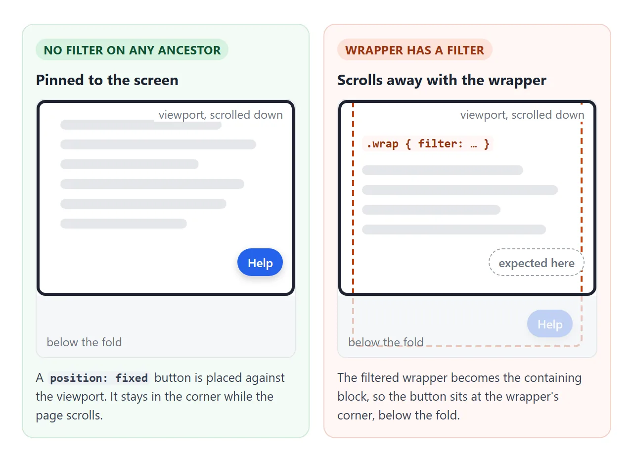
The fix is to move the fixed element out of the filtered ancestor, for example as a direct child of <body>, or to put the filter on an inner element that does not contain it.
transform causes the same behaviour. CSS position covers how fixed and absolute elements pick their reference box.
Animating filters on hover
filter can be transitioned like other properties. The fade is smooth when both states list the same functions in the same order, because the browser can then move each value from one to the other.
.thumb { filter: grayscale(1) brightness(.9); transition: filter .35s; }
.thumb:hover,
.thumb:focus-visible { filter: grayscale(0) brightness(1); }
Include :focus-visible so keyboard users get the same effect. On touch screens there is no real hover, so a @media (hover: hover) block keeps images in full colour there. The hover transition guide covers timing and easing.
On speed: filters are drawn pixel by pixel, and a large blur over a large area costs more than a small effect on a thumbnail. If a hover effect stutters, filter the image rather than the whole card and keep blur radii modest.
A finished example: grayscale gallery with a blurred lightbox
This puts the pieces together. Thumbnails are grey until you hover or Tab to them. Clicking one opens a lightbox built on a <dialog> element, and its ::backdrop uses backdrop-filter to blur the gallery behind it.
<!doctype html>
<html lang="en">
<head>
<meta charset="utf-8">
<meta name="viewport" content="width=device-width, initial-scale=1">
<title>Grayscale gallery with a blurred lightbox</title>
<style>
  body { margin: 0; padding: 14px; font-family: system-ui, sans-serif; background: #f4f5f7; color: #1d2330; }
  h1 { font-size: 16px; margin: 0 0 10px; }
  .grid { display: grid; grid-template-columns: repeat(3, 1fr); gap: 10px; max-width: 580px; }

  /* the "photos" are CSS gradients, set per tile with --img */
  .tile {
    aspect-ratio: 4 / 3; border: 0; border-radius: 10px; padding: 0; cursor: zoom-in;
    background: var(--img); display: flex; align-items: flex-end;
    font: 600 12px system-ui, sans-serif; color: #fff; text-shadow: 0 1px 3px rgb(0 0 0 / .6);
  }
  .tile span { padding: 6px 8px; }

  /* grey until hovered or focused; same functions in both states so it fades smoothly */
  @media (hover: hover) {
    .tile { filter: grayscale(1) brightness(.9); transition: filter .35s; }
    .tile:hover, .tile:focus-visible { filter: grayscale(0) brightness(1); }
  }
  .tile:focus-visible { outline: 3px solid #2563eb; outline-offset: 2px; }
  @media (prefers-reduced-motion: reduce) { .tile { transition: none; } }

  /* the lightbox: a modal <dialog>; its ::backdrop blurs the page behind it */
  dialog { padding: 0; border: 0; border-radius: 12px; width: min(92vw, 520px); overflow: hidden; }
  dialog::backdrop {
    background: rgb(15 23 42 / .35);
    -webkit-backdrop-filter: blur(6px);
    backdrop-filter: blur(6px);
  }
  .big { height: min(58vh, 320px); background: var(--img); }
  .bar { display: flex; justify-content: space-between; align-items: center; padding: 8px 12px; font-size: 14px; }
  .bar button { font: inherit; padding: 6px 12px; border: 1px solid #cbd2dc; border-radius: 8px; background: #fff; cursor: pointer; }
</style>
</head>
<body>
<h1>Hover or Tab to a photo, click to open</h1>

<div class="grid">
  <button class="tile" style="--img: linear-gradient(#fb923c, #f43f5e 55%, #1e1b4b 56%, #312e81)"><span>Sunset</span></button>
  <button class="tile" style="--img: radial-gradient(circle at 70% 30%, #fef9c3 0 12%, transparent 13%), linear-gradient(#22d3ee, #0e7490)"><span>Lagoon</span></button>
  <button class="tile" style="--img: linear-gradient(160deg, transparent 55%, #166534 56%), linear-gradient(20deg, #4ade80 40%, #bbf7d0)"><span>Forest</span></button>
  <button class="tile" style="--img: radial-gradient(ellipse at 30% 110%, #b45309 0 45%, transparent 46%), linear-gradient(#fde68a, #f59e0b)"><span>Desert</span></button>
  <button class="tile" style="--img: linear-gradient(115deg, transparent 30%, #34d399aa 45%, transparent 60%), linear-gradient(75deg, transparent 40%, #a78bfaaa 55%, transparent 70%), #0f172a"><span>Aurora</span></button>
  <button class="tile" style="--img: radial-gradient(circle at 25% 45%, #ef4444 0 12%, transparent 13%), radial-gradient(circle at 55% 40%, #f472b6 0 12%, transparent 13%), radial-gradient(circle at 80% 50%, #facc15 0 11%, transparent 12%), linear-gradient(transparent 55%, #15803d 56%), #bae6fd"><span>Tulips</span></button>
</div>

<dialog id="box" aria-labelledby="cap">
  <div class="big" id="big"></div>
  <div class="bar"><b id="cap"></b><button id="close" type="button">Close</button></div>
</dialog>

<script>
  const box = document.getElementById('box');
  const big = document.getElementById('big');
  const cap = document.getElementById('cap');
  let opener = null;

  document.querySelectorAll('.tile').forEach((tile) => {
    tile.addEventListener('click', () => {
      opener = tile;
      big.style.setProperty('--img', tile.style.getPropertyValue('--img'));
      cap.textContent = tile.textContent;
      box.showModal();  // Esc closes it for free
    });
  });

  document.getElementById('close').addEventListener('click', () => box.close());
  // a click on the blurred backdrop lands on the dialog element itself
  box.addEventListener('click', (e) => { if (e.target === box) box.close(); });
  box.addEventListener('close', () => opener && opener.focus());
</script>
</body>
</html>
The photos are CSS gradients so the example needs no image files, and the same CSS works on real <img> elements. For the gallery layout itself, see HTML image gallery.
When it does not work
| What you see | Cause | Fix |
|---|---|---|
| The whole filter line is ignored | Commas between functions, or a missing unit such as blur(4) |
Separate with spaces; give blur() a length like 4px |
backdrop-filter shows nothing |
The background is opaque, or nothing detailed is behind the element | Use an alpha colour below 1 and put it over an image or gradient |
| Frosted glass works in one browser but not in older Safari | Only the unprefixed property is set | Add -webkit-backdrop-filter with the same value |
| Text inside the card is blurred or grey | The filter is on the parent, which filters every child | Filter the image or a ::before layer; or use backdrop-filter |
| A fixed header or button scrolls with the page | A filtered ancestor became its containing block | Move it outside the filtered element |
A child's z-index cannot get above a sibling of its parent |
The filtered parent is a stacking context | Move the filter off the parent or restructure |
| Two filters give an unexpected colour | Chained functions run left to right | Change the order |
| The hover effect jumps instead of fading | The two states list different functions or a different order | Use the same functions in the same order in both |
| The hover effect stutters | A large area or large blur is filtered | Filter a smaller element; reduce the blur |
Share it as a link
Filters are easier to judge on screen than in a description, and a screenshot freezes one slider position. To let someone try the effect themselves, send the working page instead.
Paste the page into a NOS document and choose Create share link. HTML to link walks through it.
The page renders as written and its scripts run, so the people you send it to can move the sliders and hover the photos. If you change the code later, the same link shows the new version.