box-shadow draws a shadow around an element's box. You give it up to four lengths and a colour: box-shadow: x y blur spread colour. For a soft card shadow, box-shadow: 0 4px 12px rgba(0, 0, 0, .15) is a good start.
Move the sliders and watch the box. The line at the bottom is the CSS to copy.
<!doctype html>
<html lang="en">
<head>
<meta charset="utf-8">
<meta name="viewport" content="width=device-width, initial-scale=1">
<title>Box shadow generator</title>
<style>
  body {
    margin: 0; padding: 16px;
    font-family: system-ui, sans-serif; background: #eef1f5; color: #1d2330;
  }
  .wrap { display: grid; grid-template-columns: 1fr 1fr; gap: 16px; max-width: 640px; margin: 0 auto; }
  @media (max-width: 520px) { .wrap { grid-template-columns: 1fr; } }
  .stage {
    display: grid; place-items: center; min-height: 200px;
    background: #f8fafc; border-radius: 12px;
  }
  .box { width: 120px; height: 120px; border-radius: 16px; background: #fff; }
  .controls { display: grid; gap: 8px; }
  label { display: grid; grid-template-columns: 64px 1fr 44px; align-items: center; gap: 8px; font-size: 14px; }
  label span:last-child { text-align: right; font-variant-numeric: tabular-nums; }
  input[type=range] { width: 100%; }
  .check { grid-template-columns: auto 1fr; }
  pre {
    grid-column: 1 / -1; margin: 0; padding: 12px 14px; border-radius: 10px;
    background: #1d2330; color: #e5e7eb; font: 14px/1.4 ui-monospace, Consolas, monospace;
    white-space: pre-wrap; word-break: break-word;
  }
</style>
</head>
<body>
<div class="wrap">
  <div class="stage"><div class="box" id="box"></div></div>

  <form class="controls" id="form">
    <label>x <input type="range" name="x" min="-40" max="40" value="0"><span></span></label>
    <label>y <input type="range" name="y" min="-40" max="40" value="8"><span></span></label>
    <label>blur <input type="range" name="blur" min="0" max="80" value="24"><span></span></label>
    <label>spread <input type="range" name="spread" min="-30" max="30" value="0"><span></span></label>
    <label>opacity <input type="range" name="alpha" min="0" max="100" value="20"><span></span></label>
    <label class="check"><input type="checkbox" name="inset"> inset (draw inside the box)</label>
  </form>

  <pre id="out"></pre>
</div>

<script>
  const form = document.getElementById('form');
  const box = document.getElementById('box');
  const out = document.getElementById('out');

  function update() {
    const v = Object.fromEntries(new FormData(form));  // checkbox is missing when unchecked
    // show each slider's value next to it
    form.querySelectorAll('input[type=range]').forEach((r) => {
      r.nextElementSibling.textContent = r.name === 'alpha' ? r.value + '%' : r.value + 'px';
    });
    const shadow = (v.inset ? 'inset ' : '') +
      `${v.x}px ${v.y}px ${v.blur}px ${v.spread}px rgba(0, 0, 0, ${v.alpha / 100})`;
    box.style.boxShadow = shadow;
    out.textContent = `box-shadow: ${shadow};`;
  }

  form.addEventListener('input', update);
  update();
</script>
</body>
</html>
The shadow keeps the element's rounded corners. The box here has border-radius: 16px, and the shadow follows that curve without any extra code.
What each value does
Each value controls one thing, and they always come in the same order.
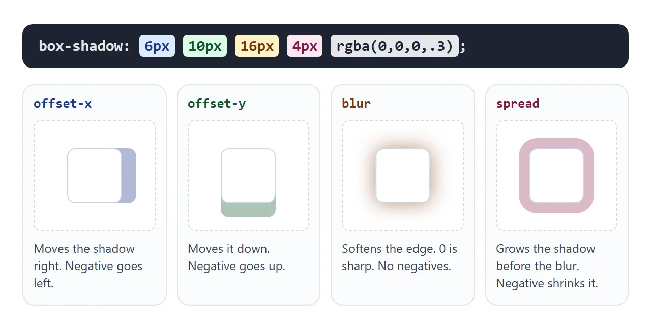
| Value | Required | What it does | Negative values |
|---|---|---|---|
| offset-x | Yes | Moves the shadow sideways | Move it left |
| offset-y | Yes | Moves the shadow down | Move it up |
| blur | No, default 0 | Softens the edge | Not allowed |
| spread | No, default 0 | Grows the shadow before blurring | Shrink it |
| colour | No | Shadow colour | – |
inset |
No | Draws the shadow inside the box | – |
If you leave out the colour, the shadow uses the element's text colour (currentColor). Write it out anyway, so the shadow does not change when the text colour does.
Spread is the value people skip, and it does the most unusual jobs. A negative spread tucks the shadow under the element so only the offset side shows. A spread with zero blur draws a solid ring.
/* shadow only below */
.bar  { box-shadow: 0 8px 6px -6px rgba(0, 0, 0, .3); }

/* a 2px ring that takes no layout space */
.ring { box-shadow: 0 0 0 2px #2563eb; }
Six presets to copy
Most interfaces need only a handful of shadows. Here are six common ones on the same tile.
<!doctype html>
<html lang="en">
<head>
<meta charset="utf-8">
<meta name="viewport" content="width=device-width, initial-scale=1">
<title>Box shadow presets</title>
<style>
  body {
    margin: 0; padding: 16px;
    font-family: system-ui, sans-serif; background: #eef1f5; color: #1d2330;
  }
  .grid {
    display: grid; grid-template-columns: repeat(auto-fill, minmax(140px, 1fr));
    gap: 28px 20px; max-width: 640px; margin: 0 auto;
  }
  figure { margin: 0; }
  .tile {
    height: 90px; border-radius: 12px; background: #fff;
    display: grid; place-items: center; font-weight: 600;
  }
  figcaption { margin-top: 10px; font: 12px/1.4 ui-monospace, Consolas, monospace; color: #475569; }

  /* the six presets */
  .subtle   { box-shadow: 0 1px 3px rgba(0, 0, 0, .12); }
  .raised   { box-shadow: 0 4px 12px rgba(0, 0, 0, .15); }
  .floating { box-shadow: 0 20px 40px -12px rgba(0, 0, 0, .35); }
  .pressed  { background: #e8ecf1; box-shadow: inset 0 2px 6px rgba(0, 0, 0, .25); }
  .glow     { background: #0f172a; color: #fff; box-shadow: 0 0 24px 4px rgba(56, 189, 248, .6); }
  .layered  {
    box-shadow:
      0 1px 2px rgba(0, 0, 0, .08),
      0 4px 8px rgba(0, 0, 0, .08),
      0 16px 32px rgba(0, 0, 0, .10);
  }
</style>
</head>
<body>
<div class="grid">
  <figure><div class="tile subtle">Subtle card</div>
    <figcaption>0 1px 3px rgba(0,0,0,.12)</figcaption></figure>
  <figure><div class="tile raised">Raised</div>
    <figcaption>0 4px 12px rgba(0,0,0,.15)</figcaption></figure>
  <figure><div class="tile floating">Floating</div>
    <figcaption>0 20px 40px -12px rgba(0,0,0,.35)</figcaption></figure>
  <figure><div class="tile pressed">Inner / pressed</div>
    <figcaption>inset 0 2px 6px rgba(0,0,0,.25)</figcaption></figure>
  <figure><div class="tile glow">Glow</div>
    <figcaption>0 0 24px 4px rgba(56,189,248,.6)</figcaption></figure>
  <figure><div class="tile layered">Layered</div>
    <figcaption>0 1px 2px rgba(0,0,0,.08),<br>0 4px 8px rgba(0,0,0,.08),<br>0 16px 32px rgba(0,0,0,.10)</figcaption></figure>
</div>
</body>
</html>
- Subtle is for resting cards and table rows. You notice the edge, not the shadow.
- Raised fits buttons and panels that sit above the page.
- Floating uses a negative spread, so the shadow stays under the tile and gathers at the bottom.
- Pressed uses
inset. The shadow falls inside the top edge, as if the tile were pushed in. - Glow is a coloured shadow with no offset. It needs a dark surface to show.
- Layered stacks three light shadows. It is covered next.
Layered shadows look softer
A single dark shadow tends to look like a grey sticker. Real shadows are sharp and dark close to the object and faint far from it. Stacking two or three shadows imitates that.
.card {
  box-shadow:
    0 1px 2px rgba(0, 0, 0, .08),   /* tight contact shadow */
    0 4px 8px rgba(0, 0, 0, .08),
    0 16px 32px rgba(0, 0, 0, .10); /* wide, faint ambient shadow */
}
Each layer has a larger offset and blur than the one before, and keeps the opacity low. Commas separate the shadows. The first one in the list is painted on top.
For a full elevation scale stored as custom properties, see CSS drop shadow vs box shadow, which also compares the filter version.
Inset shadows
Add inset and the shadow is drawn inside the padding box instead of outside the border. The offsets still work the same way, so inset 0 2px 6px darkens the top inner edge.
.input:focus { box-shadow: inset 0 1px 3px rgba(0, 0, 0, .2), 0 0 0 3px #93c5fd; }
Inner and outer shadows can sit in one list. The example above gives a text field a recessed look and a focus ring at the same time.
Animating the shadow on hover
box-shadow can be transitioned. The browser blends each shadow in the list with the shadow in the same position in the other state.
If one of a pair is inset and the other is not, that pair cannot blend and the shadow switches at once. Keeping the same number of shadows, in the same order, makes the blend predictable.
Hover a card or press Tab to reach one with the keyboard.
<!doctype html>
<html lang="en">
<head>
<meta charset="utf-8">
<meta name="viewport" content="width=device-width, initial-scale=1">
<title>Cards that lift on hover</title>
<style>
  body {
    margin: 0; padding: 24px 16px;
    font-family: system-ui, sans-serif; background: #eef1f5; color: #1d2330;
  }
  .cards {
    display: grid; grid-template-columns: repeat(auto-fill, minmax(170px, 1fr));
    gap: 20px; max-width: 640px; margin: 0 auto;
  }
  .card {
    display: block; padding: 18px; border-radius: 14px;
    background: #fff; color: inherit; text-decoration: none;
    /* resting: two soft layers */
    box-shadow: 0 1px 2px rgba(0, 0, 0, .08), 0 2px 6px rgba(0, 0, 0, .06);
    transition: box-shadow .25s ease, transform .25s ease;
  }
  /* lifted: the same two layers, larger and further down */
  .card:hover,
  .card:focus-visible {
    box-shadow: 0 4px 8px rgba(0, 0, 0, .08), 0 18px 36px rgba(0, 0, 0, .14);
    transform: translateY(-4px);
    outline: none;
  }
  .card:focus-visible { box-shadow: 0 0 0 3px #2563eb, 0 18px 36px rgba(0, 0, 0, .14); }
  .card h3 { margin: 10px 0 6px; font-size: 17px; }
  .card p { margin: 0; font-size: 14px; line-height: 1.45; color: #475569; }
  .icon { width: 36px; height: 36px; border-radius: 10px; }
  @media (prefers-reduced-motion: reduce) {
    .card { transition: none; }
  }
</style>
</head>
<body>
<div class="cards">
  <a class="card" href="#">
    <div class="icon" style="background: linear-gradient(135deg, #60a5fa, #2563eb)"></div>
    <h3>Starter</h3><p>Hover or press Tab to lift this card.</p>
  </a>
  <a class="card" href="#">
    <div class="icon" style="background: linear-gradient(135deg, #34d399, #059669)"></div>
    <h3>Team</h3><p>The shadow grows and the card moves up 4px.</p>
  </a>
  <a class="card" href="#">
    <div class="icon" style="background: linear-gradient(135deg, #fbbf24, #d97706)"></div>
    <h3>Business</h3><p>Both states have two shadows, so they blend smoothly.</p>
  </a>
</div>
</body>
</html>
.card {
  box-shadow: 0 1px 2px rgba(0, 0, 0, .08), 0 2px 6px rgba(0, 0, 0, .06);
  transition: box-shadow .25s ease, transform .25s ease;
}
.card:hover,
.card:focus-visible {
  box-shadow: 0 4px 8px rgba(0, 0, 0, .08), 0 18px 36px rgba(0, 0, 0, .14);
  transform: translateY(-4px);
}
Put the transition on the resting rule, not on :hover, so the card also eases back down. CSS hover transition explains why. The prefers-reduced-motion query in the example turns the motion off for people who ask their system for less movement.
Changing a shadow repaints the element. For a few cards that is fine. For a long grid, a common pattern puts the large shadow on a ::after pseudo-element and transitions its opacity instead.
box-shadow or drop-shadow
box-shadow always follows the element's box, including its border-radius. It never looks at what is inside. A transparent PNG logo or an SVG icon therefore gets a rectangle of shadow around it.
filter: drop-shadow() traces the visible pixels instead. It has no spread and no inset, so it is not a replacement for cards. CSS drop shadow covers when to reach for it.
When it does not work
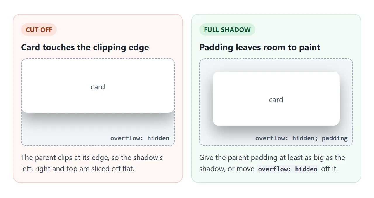
Two failures need a picture. The first is a parent with overflow: hidden, which clips anything painted outside its box, shadows included.
The second is a shadow on an inline element, such as a highlighted <span>, that wraps onto two lines. By default the browser treats the lines as pieces of one box.
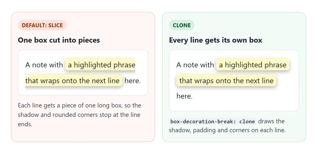
.highlight {
  -webkit-box-decoration-break: clone; /* some browsers still need the prefix */
  box-decoration-break: clone;
}
| What you see | Cause | Fix |
|---|---|---|
| Shadow is cut off flat on some sides | A parent has overflow: hidden (or auto) |
Add padding to the parent, or move overflow to an inner element |
| No shadow visible on a dark page | Black shadow on a near-black surface | Lighten the card surface, use a coloured glow, or add a faint light border. See dark mode CSS |
Shadow on a wrapped <span> looks broken at line ends |
Inline boxes are sliced across lines | box-decoration-break: clone, or display: inline-block |
| Shadow looks like a muddy grey haze | Very large blur at high opacity | Lower the opacity and layer a small sharp shadow with a large faint one |
| A square shadow around a transparent logo | box-shadow follows the box, not the pixels |
Use filter: drop-shadow() on the image |
Second box-shadow rule removed the first |
A later declaration replaces the whole list | Put both shadows in one rule, comma-separated |
| Hover shadow jumps instead of easing | transition only on :hover, or inset in one state and not the other |
Put transition on the resting rule and match inset in both lists |
Share it as a link
Shadows are easier to judge on screen than in a description, and a hover effect cannot be shown in a screenshot at all. An .html attachment may open as plain code on a phone.
To send the working version, paste the page into a NOS document and choose Create share link. HTML to link walks through it.
The page renders as written and its scripts run, so the people you send it to can move the sliders and hover the cards themselves. If you change the code later, the same link shows the new version.