A CSS gradient border cannot be written as border-color: linear-gradient(...), because border-color only accepts flat colour values.
Every gradient border is therefore a workaround. Four of them work in current browsers, and they differ mainly in how they handle rounded corners.
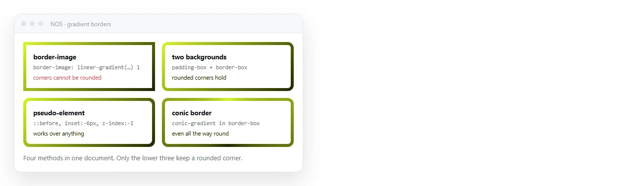
The four methods compared
| Method | Rounded corners | Content behind stays visible | Complexity |
|---|---|---|---|
border-image |
No | Yes | Lowest |
| Two background layers | Yes | No, needs a solid inner colour | Low |
| Pseudo-element ring | Yes | Yes | Medium |
| Padding on a gradient box | Yes | No | Lowest |
Pick by the first two columns. If the box has border-radius, border-image is out before you start.
Method 1: border-image
The shortest route when corners are square.
.card {
  border: 4px solid transparent;
  border-image: linear-gradient(120deg, #2563eb, #db2777) 1;
}
The trailing 1 is the slice value. It tells the browser to take the whole generated image and stretch it across the border box.
The limitation is absolute: border-image ignores border-radius. Add a radius and the corners stay square while the background curves.
Method 2: two background layers
This is the usual answer for rounded corners. One rule paints two layers with different clipping boxes.
.card {
  border: 4px solid transparent;
  border-radius: 14px;
  background-image:
    linear-gradient(#0b1220, #0b1220),
    linear-gradient(120deg, #2563eb, #db2777);
  background-origin: border-box;
  background-clip: padding-box, border-box;
}
The first layer is a flat colour clipped to the padding box, which covers the middle. The second is the gradient clipped to the border box, so only the four-pixel rim shows.
The first colour has to match whatever sits behind the card. That is the trade-off: the interior is opaque, so you cannot see a page background through it.
Method 3: pseudo-element ring
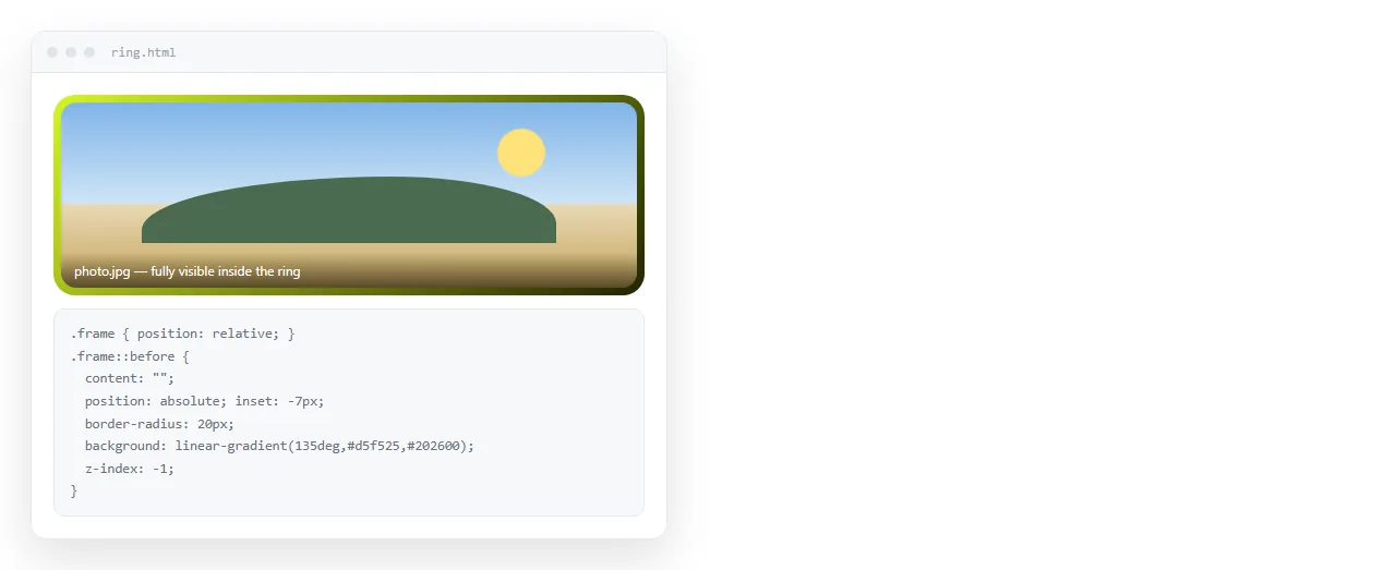
Use this when the interior must stay transparent, for example over a photograph.
.card { position: relative; border-radius: 14px; }
.card::before {
  content: "";
  position: absolute;
  inset: 0;
  border-radius: inherit;
  padding: 4px;
  background: linear-gradient(120deg, #22d3ee, #a78bfa);
  -webkit-mask:
    linear-gradient(#000 0 0) content-box,
    linear-gradient(#000 0 0);
  -webkit-mask-composite: xor;
          mask-composite: exclude;
}
The mask pair punches the middle out of the gradient, leaving a ring of exactly the padding width. inset: 0 makes it cover the parent without stated dimensions.
Method 4: padding on a gradient box
The least code, and it is fine when the inner area is a solid block anyway.
.wrap {
  padding: 4px;
  border-radius: 14px;
  background: linear-gradient(120deg, #f59e0b, #ef4444);
}
.wrap > .inner {
  border-radius: 10px;
  background: #0b1220;
}
Set the inner radius smaller than the outer one by the padding amount. If both are 14px the corners look pinched.
This needs an extra wrapper element, which is why it is not always the right answer inside content you do not control.
Choosing between the four
Work down these questions in order and you land on one method.
- Does the box have
border-radius? If no,border-imageis the shortest code and you are done. - Must the interior stay transparent? If yes, the pseudo-element ring is the only option, because the other two paint a solid inner layer.
- Can you add a wrapper element? If yes, padding on a gradient box is the least code with rounded corners.
- Otherwise, use the two background layers method. It needs no extra element and handles radius correctly.
Most real cases land on step four, which is why the background-layers version appears in so many component libraries.
Gradient borders on tables and inputs
Tables collapse their borders by default, which removes the border box the image needs.
table { border-collapse: separate; border-spacing: 0; }
Without that line a gradient border on a cell either disappears or renders on one side only. The trade-off is that adjacent cell borders no longer merge, so you get a double line unless you zero one side.
Inputs are simpler but have a second problem: the focus ring. If you replace the border with a gradient, keep a visible focus indicator.
.field:focus-within { outline: 2px solid #60a5fa; outline-offset: 2px; }
Removing the focus outline without replacing it makes the form unusable by keyboard, which is a larger cost than the border is worth.
Thickness and radius arithmetic
| Outer radius | Border width | Inner radius to use |
|---|---|---|
| 8px | 2px | 6px |
| 14px | 4px | 10px |
| 20px | 6px | 14px |
| 999px (pill) | Any | 999px |
Subtract the border width from the outer radius for the inner one. A pill is the exception, since a very large radius is clamped to half the height on both layers anyway.
Getting this wrong is what produces the pinched corner people describe as the gradient looking thicker at the corners than along the edges.
Common failures
- Border disappears entirely.
border: 4px solid transparentis missing, so there is no border box for the image to fill. - Corners are square despite border-radius. The page is using
border-image. Switch to method 2 or 3. - A grey ring appears. The inner flat colour does not match the surface behind the card.
- Layout shifts when the border appears. Set
box-sizing: border-box, covered in box sizing.
Animating the gradient
Gradients are images, so they do not interpolate on their own. Animate the position instead.
.card {
  background-size: 200% 200%;
  animation: slide 6s linear infinite;
}
@keyframes slide {
  to { background-position: 200% 0; }
}
Oversize the background and move it. The visible section changes, which reads as the gradient rotating.
Checking it survives outside your editor

Gradient borders use no external assets, so a page that works locally works for a reader. Confirm it in the HTML file opener, which has never seen your project.
Then paste the HTML into a document and create a link. The page keeps its address when you adjust the colours, so a correction does not mean resending anything.
For the underlying gradient syntax see CSS gradient background. For the other common decorative rule people ask about next, see CSS drop shadow.