A CSS gradient background is a generated image, so it belongs in background-image or the background shorthand, never in background-color.
That single rule is behind most reports of a gradient that refuses to appear. background-color accepts one flat colour and silently discards anything else.

The three gradient functions
| Function | Shape | Typical use |
|---|---|---|
linear-gradient() |
Straight band along an angle | Hero sections, buttons, headers |
radial-gradient() |
Circle or ellipse from a point | Spotlights, soft vignettes |
conic-gradient() |
Sweep around a centre point | Pie charts, colour wheels |
repeating-linear-gradient() |
Band repeated to fill | Stripes, hatching, rulers |
All four produce an image. All four can be stacked, comma separated, in a single background-image.
Linear gradient syntax
The shortest form takes two colours and defaults to a top-to-bottom blend.
.panel {
  background-image: linear-gradient(#1f2937, #0b1220);
}
Add an angle as the first argument to change direction. Angles start at the top and increase clockwise.
.panel {
  background-image: linear-gradient(120deg, #2563eb, #7c3aed 60%, #db2777);
}
The 60% is a colour stop position. It says the middle colour reaches full strength at sixty percent of the gradient line, which pushes the blend off centre.
You can also use keywords instead of degrees. to right, to bottom left and similar read more clearly than the equivalent numbers.
Angle reference
| Written | Direction of travel |
|---|---|
0deg or to top |
Bottom to top |
90deg or to right |
Left to right |
180deg or to bottom |
Top to bottom (the default) |
to bottom right |
Corner to corner, adjusted to the box |
Corner keywords are not the same as the matching angle. to bottom right recalculates so the gradient line meets the corner exactly, whatever the aspect ratio.
Radial and conic in practice
A radial gradient takes a shape, a size and a position before the colours.
.glow {
  background-image: radial-gradient(circle at 30% 20%, #3b82f6, transparent 70%);
}
The transparent 70% stop is what makes it a glow rather than a disc. Everything past seventy percent of the radius shows whatever is behind.
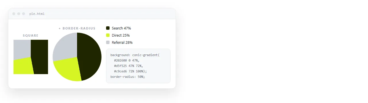
Conic gradients sweep angularly, which is why a two-line conic rule can draw a usable pie chart with no script.
.pie {
  background-image: conic-gradient(#22c55e 0 40%, #eab308 40% 75%, #ef4444 75% 100%);
  border-radius: 50%;
}
Hard stops, stripes and bands
Two stops at the same position produce an edge instead of a blend. This is the whole trick behind stripes.
.stripes {
  background-image: repeating-linear-gradient(
    45deg,
    #111827 0 12px,
    #1f2937 12px 24px
  );
}
Repeat length is the distance between the first stop and the last. Changing 24px changes the pitch of the whole pattern.
Stacking layers
Multiple gradients in one declaration stack front to back, first listed on top. Anything with transparency lets lower layers show through.
.hero {
  background-color: #0b1220;
  background-image:
    radial-gradient(circle at 80% 0%, rgba(124, 58, 237, .45), transparent 55%),
    linear-gradient(180deg, rgba(0, 0, 0, 0), rgba(0, 0, 0, .6));
}
Keep the background-color line. It is the fallback if a layer fails, and it is what shows at the edges when a gradient does not cover the whole box.
Gradient text
Text cannot take a gradient colour directly. The standard technique paints the gradient behind the text and clips it to the glyph shapes.
.headline {
  background-image: linear-gradient(90deg, #22d3ee, #a78bfa);
  -webkit-background-clip: text;
          background-clip: text;
  color: transparent;
}
Two cautions apply. The text is transparent, so a browser that drops the clip rule renders nothing visible. And selection highlighting behaves oddly, since there is no solid colour underneath.
Reserve it for one headline. A whole page of clipped text is hard to read and impossible to recolour for dark mode.
Sizing and positioning the gradient
A gradient is an image, so background-size, background-position and background-repeat all apply to it.
| Declaration | Effect on a gradient |
|---|---|
background-size: cover |
Scales the gradient to fill the box |
background-size: 200% 100% |
Doubles the horizontal run, so only half shows |
background-repeat: no-repeat |
Stops a sized gradient tiling |
background-attachment: fixed |
Gradient stays put while content scrolls |
background-position: 50% 0 |
Moves the visible window over the gradient |
Oversizing with background-size and then animating background-position is how a gradient appears to move without any repainting of the colours themselves.
Colour space and banding
By default a gradient interpolates in sRGB, which can dull the midpoint between two saturated colours. Specifying a different interpolation space produces a cleaner blend.
.panel {
  background-image: linear-gradient(in oklab, #2563eb, #f59e0b);
}
The in oklab and in oklch forms are supported in current browsers and degrade to the default elsewhere, since an unrecognised value invalidates only that declaration.
If a wide gradient shows visible steps, the cause is usually too few distinct values across too many pixels. Adding one intermediate stop near the middle almost always removes it.
When the gradient looks wrong
| Symptom | Cause | Fix |
|---|---|---|
| Nothing paints | Element has zero height | Set a height, padding, or content |
| Flat colour appears | Rule written in background-color |
Move it to background-image |
| Gradient repeats oddly | Background size smaller than box | Add background-size: cover |
| Visible stepping bands | Low colour contrast over a long run | Add a mid stop, or a faint noise layer |
| Gradient scrolls away | Applied to a short element | Apply to body, add background-attachment: fixed |
Banding on large hero panels is a display limitation, not a code error. An intermediate colour stop usually removes it.
Testing the result before you send it
Gradients need no external file, so a page using them stays self-contained. That makes it one of the safer things to put in an HTML file you intend to share.

Open the file in the HTML file opener to confirm the rule survives outside your editor. If it renders there, it will render for a reader.
To send it, paste the HTML into a document and turn it into a link. The gradient is part of the page, so nothing has to be attached separately, and edits to the colours keep the same address.
Related rules that interact with backgrounds are covered in inline CSS, dark mode CSS, and gradient borders, which needs a different technique entirely because border-color will not take an image.