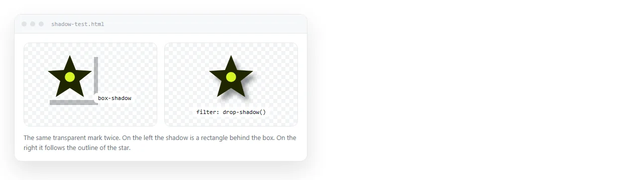
A CSS drop shadow written as filter: drop-shadow() follows the visible shape of an element, while box-shadow always follows its rectangle.
That is the whole decision. A transparent PNG logo, an SVG icon or a clipped shape needs the filter. A card, a button or a panel does not.
Syntax for both
/* follows the shape */
.logo { filter: drop-shadow(0 6px 12px rgba(0, 0, 0, .45)); }

/* follows the box */
.card { box-shadow: 0 6px 12px 0 rgba(0, 0, 0, .45); }
The arguments read the same way at first: horizontal offset, vertical offset, blur radius, colour.
The difference is the fourth length. box-shadow accepts a spread value that grows or shrinks the shadow before blurring. drop-shadow does not.
Feature comparison
filter: drop-shadow() |
box-shadow |
|
|---|---|---|
| Follows transparency | Yes | No |
| Spread value | No | Yes |
Inner shadow (inset) |
No | Yes |
| Multiple shadows | Chain the filter | Comma separated |
| Cost per element | Higher | Lower |
| Applies to text too | Yes, whole subtree | No |
The last row surprises people. A filter applies to the element and everything inside it, so text in a filtered container gets a shadow as well.
When only drop-shadow will do
Four cases where box-shadow produces a visibly wrong result:
- Transparent PNG. A logo on a transparent background gets a rectangular shadow from
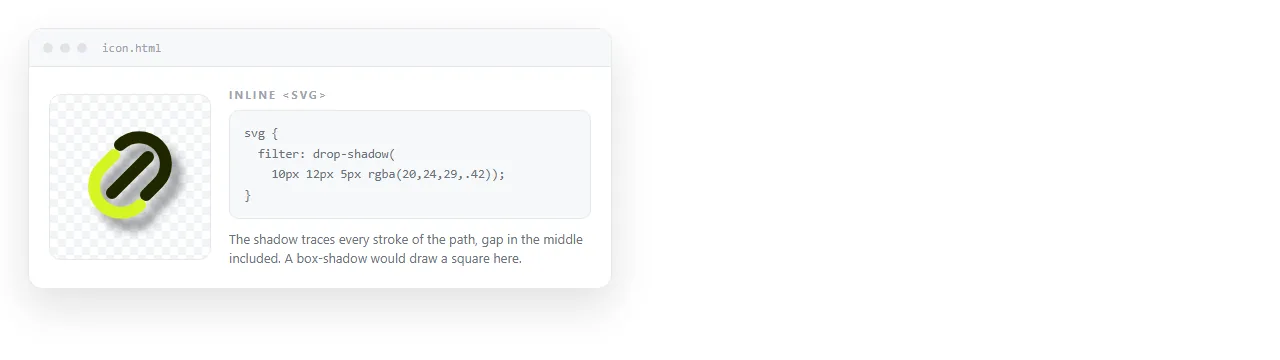
box-shadow, outlining the file rather than the mark. - Inline SVG. Icons and illustrations need the shadow to trace the paths. See SVG in HTML for how the markup sits in the page.
- Clipped shapes. Anything using
clip-pathorborder-radius: 50%on non-square content. - Text blocks with irregular line lengths, when you want each line shadowed rather than the paragraph box.
Values that look real
One hard shadow reads as a sticker. Stacked soft shadows read as depth.
.card {
  box-shadow:
    0 1px 2px rgba(0, 0, 0, .18),
    0 4px 10px rgba(0, 0, 0, .14),
    0 12px 28px rgba(0, 0, 0, .12);
}
Three rules of thumb:
- Vertical offset larger than horizontal. Light comes from above in most interfaces, so
0 6pxlooks natural and6px 0looks like a mistake. - Blur roughly twice the offset. A 6px drop with a 12px blur sits in the right range for a card.
- Low opacity, several layers. Three shadows at 0.12 to 0.18 beat one at 0.45.
Chaining the filter version follows the same pattern:
.mark {
  filter:
    drop-shadow(0 1px 1px rgba(0, 0, 0, .2))
    drop-shadow(0 6px 10px rgba(0, 0, 0, .18));
}
Each drop-shadow in the chain runs on the result of the previous one, so the second shadow also shadows the first. Keep chains to two or three.
Shadows on dark backgrounds
Black shadows disappear on dark surfaces. There is nothing darker to shade into.
Two substitutes work. Use a coloured glow keyed to the accent colour, or use a light one-pixel top border to suggest a raised edge.
@media (prefers-color-scheme: dark) {
  .card {
    box-shadow: 0 8px 24px rgba(0, 0, 0, .55);
    border-top: 1px solid rgba(255, 255, 255, .08);
  }
}
A dark theme needs a wider set of adjustments than shadows alone, covered in dark mode CSS.
Inset shadows
Only box-shadow can draw inward. The inset keyword flips the shadow inside the element box.
.well {
  box-shadow: inset 0 2px 6px rgba(0, 0, 0, .35);
  background: #0f172a;
  border-radius: 8px;
}
This is how a pressed button state or a recessed input well is drawn without any extra markup. filter: drop-shadow() has no equivalent, so a shape that needs both an inner and an outer shadow needs both properties.
Shadows as borders
A shadow with zero offset and zero blur is a solid ring, and unlike a border it does not affect layout.
.selected { box-shadow: 0 0 0 2px #60a5fa; }
Nothing shifts when the state changes, because shadows are painted outside the box model. That makes it the standard technique for selection rings and focus indicators on cards in a grid.
Stack it with a real shadow by comma separating, ring first.
.card.selected {
  box-shadow:
    0 0 0 2px #60a5fa,
    0 8px 20px rgba(0, 0, 0, .3);
}
A small elevation scale
Ad hoc shadow values across a document read as inconsistency. Define three levels and reuse them.
| Level | Use | Value |
|---|---|---|
| 1 | Resting cards, table rows | 0 1px 2px rgba(0,0,0,.14) |
| 2 | Hover, raised panels | 0 4px 12px rgba(0,0,0,.16) |
| 3 | Menus, dialogs, popovers | 0 16px 40px rgba(0,0,0,.24) |
Store them as custom properties so the whole document changes in one edit.
:root {
  --e1: 0 1px 2px rgba(0, 0, 0, .14);
  --e2: 0 4px 12px rgba(0, 0, 0, .16);
  --e3: 0 16px 40px rgba(0, 0, 0, .24);
}
.card { box-shadow: var(--e1); }
.card:hover { box-shadow: var(--e2); }
Three levels is usually enough. Beyond that the distinctions stop being visible and the scale becomes decoration rather than information.
Troubleshooting
| Symptom | Cause |
|---|---|
| Shadow is a rectangle around a logo | box-shadow on a transparent image |
| Shadow is clipped off | An ancestor has overflow: hidden |
| Text inside also gained a shadow | filter applies to the whole subtree |
| Shadow vanished in dark theme | Pure black on a near-black surface |
| Scrolling stutters | Filters on many repeated list items |
The overflow case is the most common one reported as a browser bug. The shadow is drawn, then cut by the ancestor.
Checking it before you share the page
Shadows need no external file, so a page using them travels intact.

Open the file in the HTML file opener to confirm it renders outside your project folder. Anything that survives there survives for a reader.
To send it, paste the HTML into a document and turn it into a link. The page keeps its address while you adjust the values, so tuning the shadow does not mean sending a new file.
For the other decorative rules that come up in the same pass, see CSS gradient background and CSS gradient border, Keeping the rules in a style block inside the file is what makes the page travel intact.