To cut an element into a shape in CSS, give it clip-path with a shape function. clip-path: polygon(50% 0, 100% 100%, 0 100%) turns any box into a triangle. Everything outside the shape disappears, including backgrounds, text, children and borders.
Try it first. Drag the white points, or pick a preset, and copy the value below the shape.
<!doctype html>
<html lang="en">
<head>
<meta charset="utf-8">
<meta name="viewport" content="width=device-width, initial-scale=1">
<title>clip-path polygon editor</title>
<style>
  body { margin: 0; padding: 18px; font-family: system-ui, sans-serif; background: #f4f5f7; color: #1d2330; }
  .stage {
    position: relative; max-width: 340px; height: 220px; margin: 12px auto 18px;
    outline: 1.5px dashed #a8b0bd;  /* the box the percentages refer to */
  }
  .shape {
    position: absolute; inset: 0;
    background: linear-gradient(135deg, #22c55e, #0ea5e9 60%, #6366f1);
  }
  /* Handles are siblings of the shape. As children they would be clipped away too. */
  .handle {
    position: absolute; width: 22px; height: 22px; margin: -11px 0 0 -11px;
    box-sizing: border-box; border-radius: 50%; background: #fff; border: 3px solid #1d2330;
    cursor: grab; touch-action: none;  /* a finger drags the point, not the page */
  }
  .presets { display: flex; flex-wrap: wrap; gap: 8px; justify-content: center; }
  button {
    font: 600 14px system-ui, sans-serif; padding: 8px 14px; border-radius: 8px;
    border: 1px solid #cfd4dc; background: #fff; color: #1d2330; cursor: pointer;
  }
  button.on { background: #1d2330; color: #fff; border-color: #1d2330; }
  code {
    display: block; margin-top: 14px; padding: 10px 12px; border-radius: 8px;
    background: #1d2330; color: #d1fae5; font: 13px/1.5 ui-monospace, Consolas, monospace;
    word-break: break-word;
  }
</style>
</head>
<body>
<div class="stage" id="stage"><div class="shape" id="shape"></div></div>

<div class="presets">
  <button data-p="triangle">Triangle</button>
  <button data-p="hexagon">Hexagon</button>
  <button data-p="star">Star</button>
  <button data-p="arrow">Arrow</button>
</div>
<code id="out"></code>

<script>
  const stage = document.getElementById('stage');
  const shape = document.getElementById('shape');
  const out = document.getElementById('out');

  // Each point is [x%, y%] of the box: x of the width, y of the height.
  const presets = {
    triangle: [[50, 0], [100, 100], [0, 100]],
    hexagon: [[25, 0], [75, 0], [100, 50], [75, 100], [25, 100], [0, 50]],
    star: [[50, 0], [61, 35], [98, 35], [68, 57], [79, 91], [50, 70], [21, 91], [32, 57], [2, 35], [39, 35]],
    arrow: [[0, 30], [60, 30], [60, 0], [100, 50], [60, 100], [60, 70], [0, 70]],
  };
  let points = [];
  let handles = [];

  const clamp = (v) => Math.min(100, Math.max(0, Math.round(v)));

  function render() {
    const value = 'polygon(' + points.map(([x, y]) => x + '% ' + y + '%').join(', ') + ')';
    shape.style.clipPath = value;
    out.textContent = 'clip-path: ' + value + ';';
    handles.forEach((h, i) => {
      h.style.left = points[i][0] + '%';
      h.style.top = points[i][1] + '%';
    });
  }

  function load(name) {
    points = presets[name].map((p) => [...p]);
    handles.forEach((h) => h.remove());
    handles = points.map((p, i) => {
      const h = document.createElement('div');
      h.className = 'handle';
      h.addEventListener('pointerdown', (e) => h.setPointerCapture(e.pointerId));
      h.addEventListener('pointermove', (e) => {
        if (!h.hasPointerCapture(e.pointerId)) return;  // not dragging
        const r = stage.getBoundingClientRect();
        points[i] = [clamp((e.clientX - r.left) / r.width * 100), clamp((e.clientY - r.top) / r.height * 100)];
        render();
      });
      stage.append(h);
      return h;
    });
    document.querySelectorAll('[data-p]').forEach((b) => b.classList.toggle('on', b.dataset.p === name));
    render();
  }

  document.querySelectorAll('[data-p]').forEach((b) => b.addEventListener('click', () => load(b.dataset.p)));
  load('hexagon');
</script>
</body>
</html>
The handles sit next to the shape, not inside it. Anything inside a clipped element is clipped as well, so handles placed inside would vanish as soon as they left the shape.
The four basic shapes
CSS has four shape functions that need no image or SVG. Each one describes an area, and only that area of the element stays visible.
| Function | What stays visible | Example |
|---|---|---|
inset() |
A rectangle pulled in from each edge, optionally rounded | inset(10% round 16px) |
circle() |
A circle with a radius and a center | circle(40% at 50% 50%) |
ellipse() |
An oval with two radii | ellipse(45% 30% at 50% 50%) |
polygon() |
Any shape with straight edges | polygon(50% 0, 100% 100%, 0 100%) |
Move the sliders to see what each value does. The dashed line is the element's box.
<!doctype html>
<html lang="en">
<head>
<meta charset="utf-8">
<meta name="viewport" content="width=device-width, initial-scale=1">
<title>clip-path basic shapes</title>
<style>
  body { margin: 0; padding: 14px; font-family: system-ui, sans-serif; background: #f4f5f7; color: #1d2330; }
  .grid { display: grid; grid-template-columns: repeat(auto-fit, minmax(160px, 1fr)); gap: 12px; }
  .tile { background: #fff; border: 1px solid #e1e4ea; border-radius: 12px; padding: 12px; min-width: 0; }
  h3 { margin: 0 0 8px; font: 700 15px ui-monospace, Consolas, monospace; }
  .frame { height: 110px; outline: 1.5px dashed #a8b0bd; }  /* the element's box */
  .fill { height: 100%; background: linear-gradient(135deg, #f59e0b, #ec4899 55%, #8b5cf6); }
  code {
    display: block; min-height: 3em; margin: 10px 0 6px; font: 12px/1.5 ui-monospace, Consolas, monospace;
    color: #0f5132; word-break: break-word;
  }
  label { display: block; font-size: 13px; color: #4b5563; margin-top: 4px; }
  input { display: block; width: 100%; margin: 2px 0 0; box-sizing: border-box; }
</style>
</head>
<body>
<div class="grid">
  <div class="tile" data-shape="inset">
    <h3>inset()</h3><div class="frame"><div class="fill"></div></div><code></code>
    <label>edges <input type="range" name="a" min="0" max="40" value="10"></label>
    <label>round <input type="range" name="b" min="0" max="50" value="16"></label>
  </div>
  <div class="tile" data-shape="circle">
    <h3>circle()</h3><div class="frame"><div class="fill"></div></div><code></code>
    <label>radius <input type="range" name="a" min="5" max="80" value="35"></label>
    <label>center x <input type="range" name="b" min="0" max="100" value="50"></label>
  </div>
  <div class="tile" data-shape="ellipse">
    <h3>ellipse()</h3><div class="frame"><div class="fill"></div></div><code></code>
    <label>x radius <input type="range" name="a" min="5" max="60" value="45"></label>
    <label>y radius <input type="range" name="b" min="5" max="60" value="30"></label>
  </div>
  <div class="tile" data-shape="polygon">
    <h3>polygon()</h3><div class="frame"><div class="fill"></div></div><code></code>
    <label>corner cut <input type="range" name="a" min="0" max="45" value="20"></label>
  </div>
</div>

<script>
  // One function per shape: slider values in, clip-path value out.
  const make = {
    inset: (a, b) => `inset(${a}% round ${b}px)`,
    circle: (a, b) => `circle(${a}% at ${b}% 50%)`,
    ellipse: (a, b) => `ellipse(${a}% ${b}% at 50% 50%)`,
    polygon: (c) => `polygon(${c}% 0, ${100 - c}% 0, 100% ${c}%, 100% ${100 - c}%, ` +
      `${100 - c}% 100%, ${c}% 100%, 0 ${100 - c}%, 0 ${c}%)`,
  };

  document.querySelectorAll('.tile').forEach((tile) => {
    const update = () => {
      const a = tile.querySelector('[name=a]').value;
      const b = tile.querySelector('[name=b]')?.value;
      const value = make[tile.dataset.shape](a, b);
      tile.querySelector('.fill').style.clipPath = value;
      tile.querySelector('code').textContent = 'clip-path: ' + value;
    };
    tile.addEventListener('input', update);
    update();
  });
</script>
</body>
</html>
inset() takes up to four values in the same order as margin: top, right, bottom, left. The keyword round adds rounded corners, written like border-radius. The before/after slider uses inset() to show only part of the top image.
circle() and ellipse() take a radius and an at position for the center. Without a radius, circle() uses closest-side, the distance from the center to the nearest edge.
Polygon points are percentages of the box
A polygon is a list of points, and the browser joins them in order. Each point is two values with a space between them: x across, then y down. Commas separate the points.
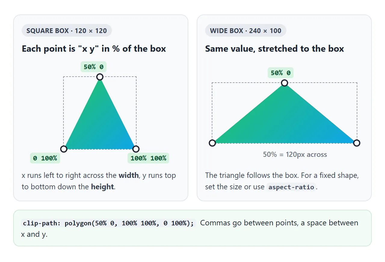
Percentages in x are measured against the element's width, and percentages in y against its height.
So the same value draws a taller or a flatter triangle depending on the box. For a shape that keeps its proportions, fix the box with width and height or aspect-ratio.
You can mix units. calc(100% - 24px) cuts a corner that stays 24 pixels wide on any card size. The finished example below uses exactly that.
There is also path(), which takes an SVG path string for curves. Its coordinates are in pixels, so the shape does not stretch with the element. Check current browser support before you rely on it.
Clipping also removes clicks, shadows and outlines
The clip is not only visual. Pointer events do not register on the cut-away part, so a click on a hidden corner goes to whatever is underneath. That is by design, and it makes non-rectangular buttons behave as they look.
The same cut applies to everything the element paints. A box-shadow sits outside the shape, so it is clipped away. So is an outline, including the focus ring that keyboard users rely on.
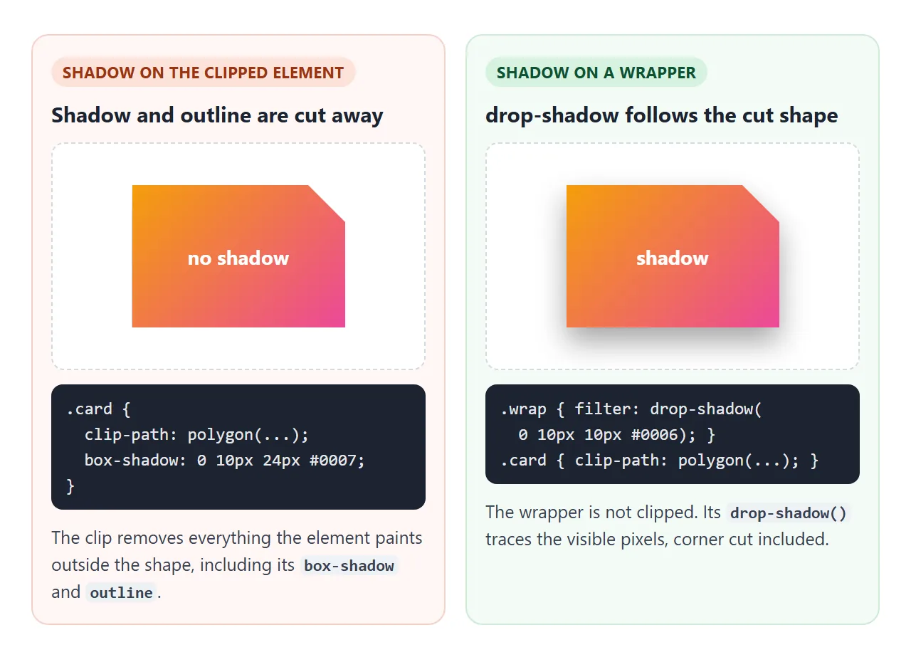
The fix is a wrapper element:
.wrap { filter: drop-shadow(0 6px 10px rgba(0, 0, 0, .18)); }
.card { clip-path: polygon(0 0, calc(100% - 24px) 0, 100% 24px, 100% 100%, 0 100%); }
drop-shadow() draws its shadow from the visible pixels of the wrapper's content, so it traces the cut edge. Drop shadow vs box shadow explains the difference in detail. For focus, draw the outline inside the shape with a negative outline-offset.
Animating clip-path between shapes
clip-path can be transitioned and animated with @keyframes. The browser moves each part of the first shape toward the matching part of the second.
That needs parts that match. Two circle() values animate smoothly, and so do two inset() values. Two polygon() values animate only if they have the same number of points.
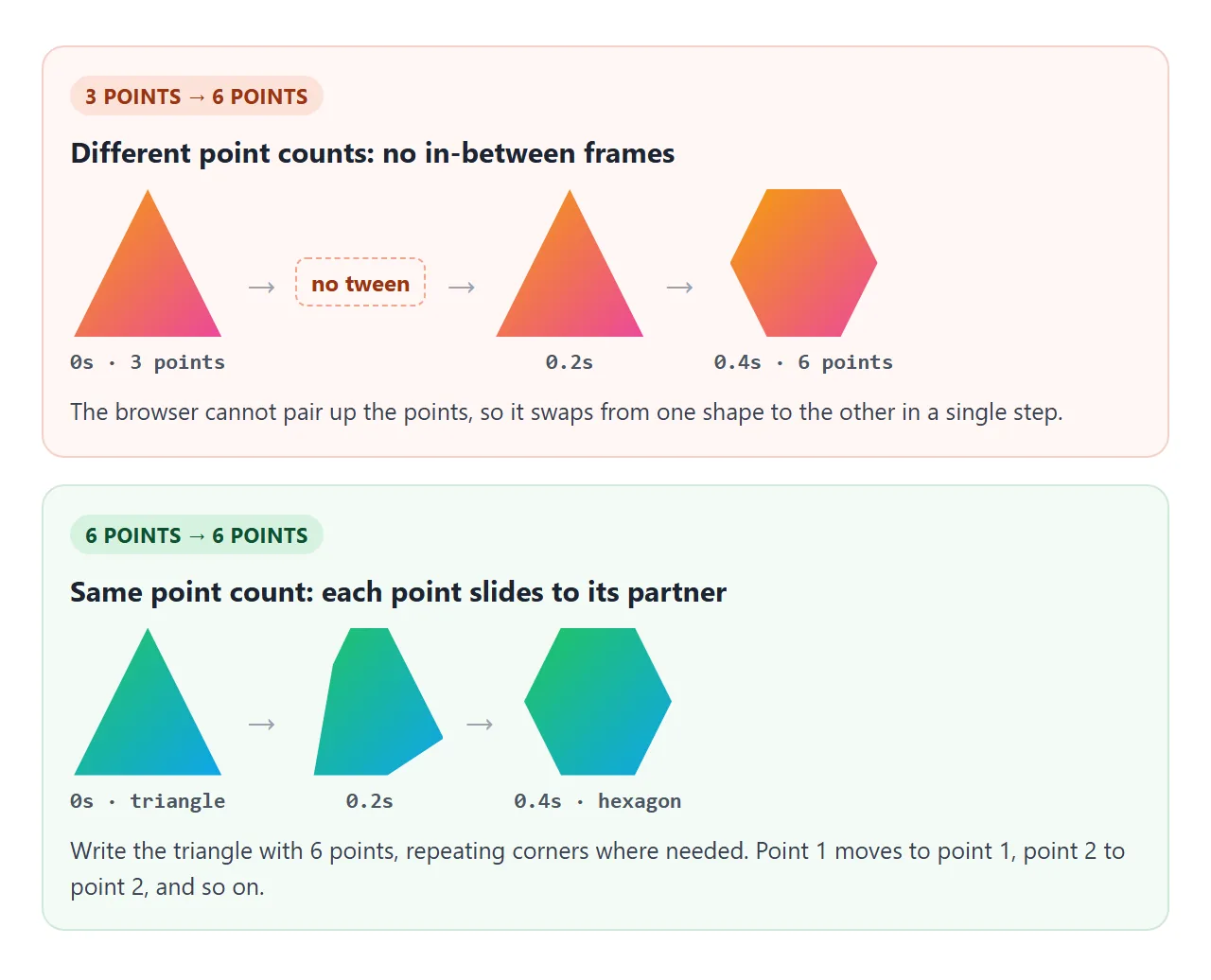
To morph a triangle into a hexagon, write the triangle with six points and let some of them sit on top of each other:
.shape { clip-path: polygon(50% 0, 50% 0, 100% 100%, 50% 100%, 0 100%, 50% 0); transition: clip-path .4s; }
.shape:hover { clip-path: polygon(25% 0, 75% 0, 100% 50%, 75% 100%, 25% 100%, 0 50%); }
The same rule applies when one side is none or a different function. none to circle(), or circle() to polygon(), switches in one step. Start a reveal from a zero-size shape of the same function instead.
Angled sections and reveal effects
Two patterns cover most real uses. An angled section edge is a four-point polygon on a full-width block. A reveal is a shape that grows from nothing to larger than the element.
<!doctype html>
<html lang="en">
<head>
<meta charset="utf-8">
<meta name="viewport" content="width=device-width, initial-scale=1">
<title>Angled section and reveal cards</title>
<style>
  body { margin: 0; font-family: system-ui, sans-serif; background: #f4f5f7; color: #1d2330; }

  /* Angled bottom edge: the right side ends 40px higher than the left. */
  .hero {
    padding: 28px 20px 64px; color: #fff;
    background: linear-gradient(120deg, #0f766e, #1d4ed8);
    clip-path: polygon(0 0, 100% 0, 100% calc(100% - 40px), 0 100%);
  }
  .hero h1 { margin: 0 0 6px; font-size: 26px; }
  .hero p { margin: 0; max-width: 32em; line-height: 1.5; opacity: .9; }

  .cards {
    display: grid; grid-template-columns: repeat(auto-fit, minmax(140px, 1fr));
    gap: 14px; padding: 4px 16px 20px;
  }
  /* The card is clipped, so its own box-shadow would be cut off.
     The wrapper draws a shadow around the clipped shape instead. */
  .wrap { filter: drop-shadow(0 6px 10px rgba(0, 0, 0, .18)); }

  .card {
    position: relative; display: block; width: 100%; height: 170px; padding: 0;
    border: 0; font: inherit; color: inherit; text-align: left; cursor: pointer;
    background: #fff;
    clip-path: polygon(0 0, calc(100% - 24px) 0, 100% 24px, 100% 100%, 0 100%);
  }
  .card:focus-visible { outline: 3px solid #f59e0b; outline-offset: -6px; }  /* drawn inside the shape */
  .img { position: absolute; inset: 0 0 40px; background: var(--g); }
  .name { position: absolute; left: 12px; bottom: 11px; font-weight: 700; }

  /* The reveal: a circle that grows from the bottom-right corner. */
  .more {
    position: absolute; inset: 0; padding: 16px 14px; color: #fff; background: #1d2330;
    font-size: 14px; line-height: 1.45;
    clip-path: circle(0% at 100% 100%);
    transition: clip-path .45s ease;
  }
  .more b { display: block; margin-bottom: 4px; font-size: 15px; }
  .card:focus-visible .more, .card.open .more { clip-path: circle(150% at 100% 100%); }
  /* Only on devices with a real hover. A tap would otherwise leave :hover stuck on. */
  @media (hover: hover) {
    .card:hover .more { clip-path: circle(150% at 100% 100%); }
  }

  @media (prefers-reduced-motion: reduce) {
    .more { transition: none; }  /* same end result, no movement */
  }
</style>
</head>
<body>
<section class="hero">
  <h1>Weekend routes</h1>
  <p>Four drives within three hours of the city. Hover a card, or tap it on a phone.</p>
</section>

<div class="cards">
  <div class="wrap"><button class="card" aria-expanded="false" style="--g: linear-gradient(160deg, #fde68a, #f97316)">
    <span class="img"></span><span class="name">Dune coast</span>
    <span class="more"><b>Dune coast</b>2 h 10 min. Park at the north lot and walk the ridge at sunset.</span>
  </button></div>
  <div class="wrap"><button class="card" aria-expanded="false" style="--g: linear-gradient(160deg, #bbf7d0, #15803d)">
    <span class="img"></span><span class="name">Pine valley</span>
    <span class="more"><b>Pine valley</b>1 h 40 min. A flat loop trail, good in any season.</span>
  </button></div>
  <div class="wrap"><button class="card" aria-expanded="false" style="--g: linear-gradient(160deg, #bae6fd, #1d4ed8)">
    <span class="img"></span><span class="name">Lake road</span>
    <span class="more"><b>Lake road</b>2 h 45 min. Three viewpoints and a ferry on the far side.</span>
  </button></div>
  <div class="wrap"><button class="card" aria-expanded="false" style="--g: linear-gradient(160deg, #e9d5ff, #7c3aed)">
    <span class="img"></span><span class="name">Old town</span>
    <span class="more"><b>Old town</b>1 h 15 min. Stone bridges and a market on Saturdays.</span>
  </button></div>
</div>

<script>
  // Hover does not exist on a touch screen, so a tap pins the card open.
  document.querySelectorAll('.card').forEach((card) => {
    card.addEventListener('click', () => {
      const open = card.classList.toggle('open');
      card.setAttribute('aria-expanded', open);
    });
  });
</script>
</body>
</html>
- Angled edge.
polygon(0 0, 100% 0, 100% calc(100% - 40px), 0 100%)lifts the bottom-right corner by 40px. Add extra bottom padding so no text sits in the cut. - Cut corner. One point at
calc(100% - 24px) 0and one at100% 24pxreplace the top-right corner with a diagonal. - Reveal. The overlay starts at
circle(0% at 100% 100%)and grows tocircle(150% at 100% 100%). The large radius covers the far corner. - Touch and keyboard. Hover does not exist on a touch screen, so a tap toggles a class. The card is a
<button>, so the keyboard can reach it too.
People who turn on reduced motion in their system settings get the same result without the movement:
@media (prefers-reduced-motion: reduce) {
  .more { transition: none; }
}
For more on where transition rules go, see CSS hover transition.
clip-path, border-radius or mask
Three properties hide parts of an element, and each suits a different job.
| Property | Edge | Shadow follows the shape | Good for |
|---|---|---|---|
border-radius |
Rounded corners only | Yes, box-shadow follows it |
Cards, buttons, avatars |
clip-path |
Hard edge, any shape | No, use a wrapper with drop-shadow() |
Polygons, angled sections, reveals |
mask-image |
Soft or hard, from an image or gradient | No, use a wrapper with drop-shadow() |
Fading edges, image-shaped cutouts |
If rounded corners are all you need, border-radius is simpler and keeps the shadow. Reach for clip-path when the shape has straight diagonal edges or needs to animate. Use mask-image when the edge should fade.
When it does not work
| What you see | Cause | Fix |
|---|---|---|
| Nothing is clipped | The value is invalid, often a missing comma between polygon points, so the declaration is ignored | Write x y, x y, x y with commas between points |
| The shadow disappears | box-shadow is outside the shape and gets clipped |
filter: drop-shadow() on a wrapper |
| The focus ring disappears | outline is clipped too |
Negative outline-offset, or style the wrapper |
| The animation jumps instead of morphing | Different point counts, different functions, or none at one end |
Same function and same point count at both ends |
| The shape is stretched or squashed | Percentages follow the box width and height | Fix the box size or use aspect-ratio |
circle(50%) is cut flat at the top and bottom |
On a wide box, a percentage radius is larger than half the height | Use circle(closest-side) or a square box |
| Clicking near the shape does nothing | Clicks on the cut-away part do not reach the element | Expected. Enlarge the shape or add padding inside it |
| Children are cut off at the shape | clip-path clips the element and everything inside it | Put things that must stay visible in a sibling, not a child |
Older WebKit-based browsers needed the prefixed -webkit-clip-path. If you support older versions, write both lines, prefixed first.
Share it as a link
A clipped shape is easy to show in a screenshot, but a hover reveal or a morph is not. The person you send it to needs to move the pointer themselves.
To send the working version, paste the page into a NOS document and choose Create share link. HTML to link walks through it.
The page renders as written and its scripts run, so people can drag the points and hover the cards. If you change the code later, the same link shows the new version.