A before/after slider is two pictures stacked in the same box. The top one is cut off at a position, and the reader moves that position.
In HTML that means one wrapper, two absolutely positioned layers, clip-path on the top layer, and an <input type="range"> laid over the whole thing.
Try it first. Drag across the picture with a mouse, or with a finger on a phone.
<!doctype html>
<html lang="en">
<head>
<meta charset="utf-8">
<meta name="viewport" content="width=device-width, initial-scale=1">
<title>Before/after slider with a range input</title>
<style>
  body { margin: 0; padding: 14px; font-family: system-ui, sans-serif; background: #f4f5f7; }
  .compare {
    --pos: 50%;                      /* where the divider sits */
    position: relative;              /* the layers are placed inside this box */
    max-width: 560px; aspect-ratio: 16 / 9; margin: 0 auto;
    border-radius: 12px; overflow: hidden;
  }
  /* both layers fill the same box, so they line up exactly */
  .layer { position: absolute; inset: 0; }
  /* a small landscape drawn with gradients: sun, two hills, sky */
  .scene {
    background:
      radial-gradient(circle at 76% 28%, #ffd43b 0 8%, transparent 8.5%),
      radial-gradient(ellipse 70% 48% at 18% 100%, #2b8a3e 0 99%, transparent 100%),
      radial-gradient(ellipse 85% 55% at 88% 108%, #40c057 0 99%, transparent 100%),
      linear-gradient(#339af0, #d0ebff 75%);
  }
  .before {
    filter: grayscale(1) contrast(.6) brightness(1.15);   /* the washed-out version */
    clip-path: inset(0 calc(100% - var(--pos)) 0 0);      /* show only the left part */
  }
  .line {
    position: absolute; top: 0; bottom: 0; left: var(--pos);
    width: 3px; margin-left: -1.5px; background: #fff; pointer-events: none;
  }
  /* the real control: an invisible range input over the whole picture */
  .compare input {
    position: absolute; inset: 0; width: 100%; height: 100%;
    margin: 0; opacity: 0; cursor: ew-resize;
  }
  p { text-align: center; font-size: 13px; color: #5b6270; }
</style>
</head>
<body>
<div class="compare" id="compare">
  <div class="layer scene after"></div>
  <div class="layer scene before"></div>
  <div class="line"></div>
  <input type="range" min="0" max="100" value="50" aria-label="Before and after divider" id="range">
</div>
<p>Drag across the picture. Grey is before, colour is after.</p>

<script>
  const compare = document.getElementById('compare');
  const range = document.getElementById('range');

  // one CSS variable moves both the clip and the white line
  range.addEventListener('input', () => {
    compare.style.setProperty('--pos', range.value + '%');
  });
</script>
</body>
</html>
The pictures here are drawn with CSS gradients, so the page needs no image files. The grey layer is the same scene with a filter. Swap in two <img> tags and nothing else changes.
How it is built: three layers in one box
Every version of this slider has the same structure. Build it in this order:
- Make a wrapper. A
divwithposition: relativeand anaspect-ratio, so it has a height before any picture loads. - Stack two layers. The after picture first, then the before picture. Both get
position: absolute; inset: 0, so each one fills the wrapper exactly. - Clip the top layer.
clip-path: inset()hides part of the before layer and lets the after layer show through. - Add the control. A range input over the box, or a handle you drag.
- Update one variable. Store the position in a CSS variable,
--pos, and let the clip and the divider line both read it.
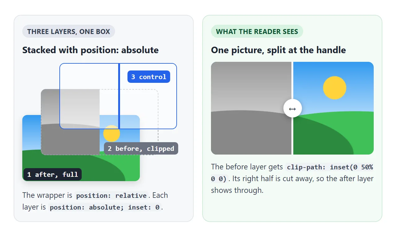
The clip is one line. inset() takes the amount to cut from the top, right, bottom and left:
.before { clip-path: inset(0 calc(100% - var(--pos)) 0 0); }
.line   { left: var(--pos); }
At --pos: 30%, the right 70% of the before layer is cut away. The line moves to 30% as well.
Why a range input is the robust choice
The first example has no drag code at all. The range input is stretched over the picture with opacity: 0.
The browser still handles it as a normal slider, so dragging works with a mouse and a finger, and the arrow keys work once it has focus.
The only script copies the value into the variable:
range.addEventListener('input', () => {
  compare.style.setProperty('--pos', range.value + '%');
});
The input event fires on every step of the drag, not only when the reader lets go. The aria-label on the input gives screen readers a name for the control.
A custom handle with pointer events
A range input's thumb is hard to restyle the same way in every browser. If you want a round knob and a click-to-jump picture, drop the input and listen to pointer events on the wrapper instead.
<!doctype html>
<html lang="en">
<head>
<meta charset="utf-8">
<meta name="viewport" content="width=device-width, initial-scale=1">
<title>Before/after slider with a drag handle</title>
<style>
  body { margin: 0; padding: 14px; font-family: system-ui, sans-serif; background: #f4f5f7; }
  .compare {
    --pos: 50%;
    position: relative; max-width: 560px; aspect-ratio: 16 / 9; margin: 0 auto;
    border-radius: 12px; overflow: hidden; cursor: ew-resize;
    touch-action: pan-y;   /* phones: vertical swipes scroll, sideways drags move the handle */
    user-select: none;
  }
  .layer { position: absolute; inset: 0; }
  .scene {
    background:
      radial-gradient(circle at 76% 28%, #ffd43b 0 8%, transparent 8.5%),
      radial-gradient(ellipse 70% 48% at 18% 100%, #2b8a3e 0 99%, transparent 100%),
      radial-gradient(ellipse 85% 55% at 88% 108%, #40c057 0 99%, transparent 100%),
      linear-gradient(#339af0, #d0ebff 75%);
  }
  .before {
    filter: grayscale(1) contrast(.6) brightness(1.15);
    clip-path: inset(0 calc(100% - var(--pos)) 0 0);
  }
  .handle {
    position: absolute; top: 0; bottom: 0; left: var(--pos);
    width: 3px; margin-left: -1.5px; background: #fff;
  }
  .handle::after {                /* the round knob in the middle of the line */
    content: '\2194'; position: absolute; top: 50%; left: 50%;
    width: 40px; height: 40px; margin: -20px 0 0 -20px; border-radius: 50%;
    background: #fff; box-shadow: 0 2px 10px rgba(0, 0, 0, .3);
    display: grid; place-items: center; font-size: 20px; color: #333;
  }
  p { text-align: center; font-size: 13px; color: #5b6270; }
</style>
</head>
<body>
<div class="compare" id="compare">
  <div class="layer scene after"></div>
  <div class="layer scene before"></div>
  <div class="handle"></div>
</div>
<p>Press anywhere on the picture and drag.</p>

<script>
  const compare = document.getElementById('compare');

  function moveTo(clientX) {
    const r = compare.getBoundingClientRect();
    const pct = Math.min(Math.max((clientX - r.left) / r.width * 100, 0), 100);
    compare.style.setProperty('--pos', pct + '%');
  }

  compare.addEventListener('pointerdown', (e) => {
    compare.setPointerCapture(e.pointerId);   // keep getting moves outside the box
    moveTo(e.clientX);                        // a click jumps the handle there
  });

  compare.addEventListener('pointermove', (e) => {
    if (compare.hasPointerCapture(e.pointerId)) moveTo(e.clientX);
  });
</script>
</body>
</html>
This is the same technique as a draggable div: pointerdown calls setPointerCapture, and pointermove updates the position while the capture lasts. The difference is what you compute. Here it is a percentage of the wrapper's width:
const r = compare.getBoundingClientRect();
const pct = Math.min(Math.max((e.clientX - r.left) / r.width * 100, 0), 100);
compare.style.setProperty('--pos', pct + '%');
The Math.min and Math.max keep the value between 0 and 100, so the handle cannot leave the picture. A percentage also keeps the handle in place when the page is resized.
Pictures that line up
The effect only works if the two layers match pixel for pixel. When one picture is smaller, or cropped differently, the scene breaks at the divider and the comparison says nothing.
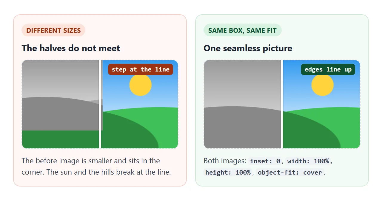
For real photos, give both <img> tags the same box and the same fit:
.layer img { width: 100%; height: 100%; object-fit: cover; display: block; }
Export both photos at the same size and framing. object-fit: cover crops them the same way, but it cannot fix photos taken from different spots. Keeping an image's aspect ratio covers the sizing rules in more detail.
Phones: let the page still scroll
On a touch screen, the browser uses finger movement to scroll the page. If it decides a drag on the slider is a scroll, it sends pointercancel and your pointermove listener stops hearing that finger.
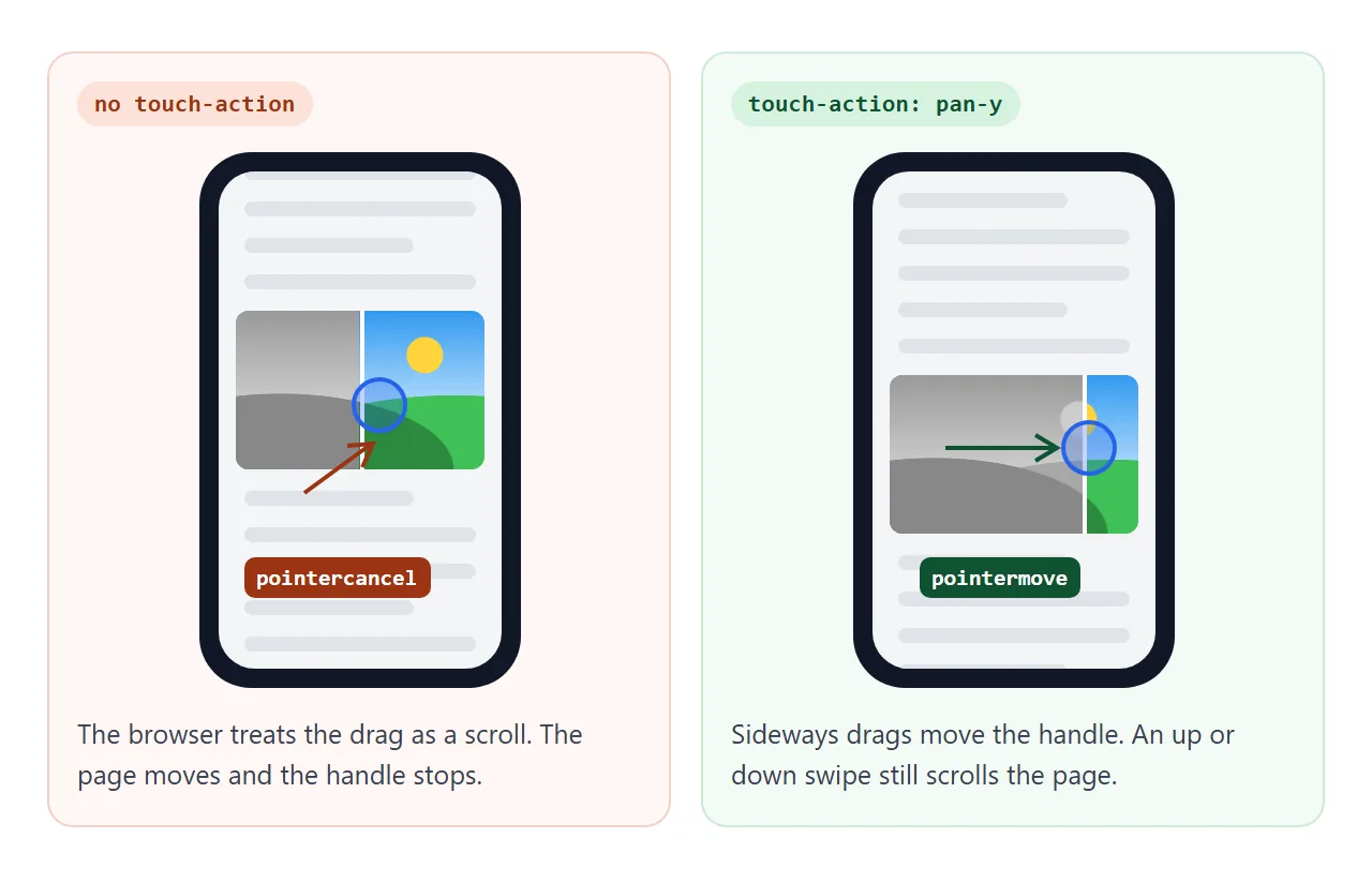
touch-action: none on the wrapper would fix the drag, but then a reader whose finger lands on the picture cannot scroll past it. pan-y is the better fit for a horizontal slider:
.compare { touch-action: pan-y; user-select: none; }
For a vertical slider, use pan-x. The page also needs the viewport meta tag, or a phone shows it zoomed out.
A finished slider: labels, keyboard and reset
The last example adds what a real page needs. The layers here are a wireframe and the finished product card, which is a common before/after for design work.
<!doctype html>
<html lang="en">
<head>
<meta charset="utf-8">
<meta name="viewport" content="width=device-width, initial-scale=1">
<title>Before/after slider: labels, keyboard, reset</title>
<style>
  body { margin: 0; padding: 14px; font-family: system-ui, sans-serif; background: #eceef1; }
  .compare {
    --pos: 50%;
    position: relative; max-width: 480px; aspect-ratio: 4 / 3; margin: 0 auto;
    border-radius: 12px; overflow: hidden; cursor: ew-resize;
    touch-action: pan-y; user-select: none;
  }
  .layer { position: absolute; inset: 0; padding: 7%; display: flex; }
  .before { clip-path: inset(0 calc(100% - var(--pos)) 0 0); }

  /* the same card layout in both layers, styled two ways */
  .card { flex: 1; display: flex; flex-direction: column; gap: 8px; padding: 14px; border-radius: 10px; }
  .pic { flex: 1; border-radius: 6px; }
  .title { font-weight: 700; font-size: 17px; }
  .text { font-size: 13px; }
  .btn { align-self: flex-start; padding: 7px 14px; border-radius: 6px; font-size: 13px; }

  .after { background: linear-gradient(135deg, #ffe8cc, #d0ebff); }
  .after .card { background: #fff; box-shadow: 0 8px 24px rgba(0, 0, 0, .12); }
  .after .pic { background: radial-gradient(circle at 70% 35%, #ffd43b 0 12%, transparent 13%),
                            linear-gradient(160deg, #4dabf7, #1864ab); }
  .after .btn { background: #e8590c; color: #fff; }

  .before { background: #f1f3f5; font-family: ui-monospace, Consolas, monospace; color: #868e96; }
  .before .card { border: 2px dashed #adb5bd; }
  .before .pic { border: 2px solid #adb5bd;   /* a crossed box: "image goes here" */
    background: linear-gradient(to top right, transparent 49.5%, #adb5bd 50%, transparent 50.5%),
                linear-gradient(to bottom right, transparent 49.5%, #adb5bd 50%, transparent 50.5%); }
  .before .btn { border: 2px solid #adb5bd; }

  .label {
    position: absolute; top: 10px; padding: 4px 9px; border-radius: 99px;
    background: rgba(0, 0, 0, .6); color: #fff; font: 600 12px system-ui, sans-serif;
  }
  .before .label { left: 10px; }
  .after .label { right: 10px; }

  .handle {
    position: absolute; top: 0; bottom: 0; left: var(--pos);
    width: 3px; margin-left: -1.5px; background: #fff; outline: none;
  }
  .handle::after {
    content: '\2194'; position: absolute; top: 50%; left: 50%;
    width: 40px; height: 40px; margin: -20px 0 0 -20px; border-radius: 50%;
    background: #fff; box-shadow: 0 2px 10px rgba(0, 0, 0, .3);
    display: grid; place-items: center; font-size: 20px; color: #333;
  }
  .handle:focus-visible::after { box-shadow: 0 0 0 4px #1c7ed6; }  /* visible keyboard focus */

  /* vertical variant: same variable, other axis */
  .compare.vertical { cursor: ns-resize; touch-action: pan-x; }
  .vertical .before { clip-path: inset(0 0 calc(100% - var(--pos)) 0); }
  .vertical .handle { left: 0; right: 0; bottom: auto; top: var(--pos);
                      width: auto; height: 3px; margin: -1.5px 0 0; }
  .vertical .handle::after { content: '\2195'; }
  .vertical .after .label { top: auto; bottom: 10px; }

  .bar { display: flex; gap: 14px; justify-content: center; align-items: center;
         margin-top: 12px; font-size: 14px; }
  button { font: inherit; padding: 6px 14px; border-radius: 8px; border: 1px solid #c9cdd4; background: #fff; cursor: pointer; }
</style>
</head>
<body>
<div class="compare" id="compare">
  <div class="layer after">
    <div class="card"><div class="pic"></div>
      <div class="title">Trail Pack 30L</div>
      <div class="text">Light, waterproof, ready for a weekend.</div>
      <div class="btn">Add to cart</div></div>
    <span class="label">After</span>
  </div>
  <div class="layer before">
    <div class="card"><div class="pic"></div>
      <div class="title">[Product title]</div>
      <div class="text">[One line of copy]</div>
      <div class="btn">[Button]</div></div>
    <span class="label">Before</span>
  </div>
  <div class="handle" id="handle" tabindex="0" role="slider" aria-label="Before and after divider"
       aria-valuemin="0" aria-valuemax="100" aria-valuenow="50"></div>
</div>
<div class="bar">
  <button id="reset" type="button">Reset</button>
  <label><input type="checkbox" id="vertical"> Vertical</label>
</div>

<script>
  const compare = document.getElementById('compare');
  const handle = document.getElementById('handle');
  let pos = 50;

  function set(p) {
    pos = Math.min(Math.max(p, 0), 100);
    compare.style.setProperty('--pos', pos + '%');
    handle.setAttribute('aria-valuenow', Math.round(pos));
  }

  function fromPointer(e) {
    const r = compare.getBoundingClientRect();
    const vertical = compare.classList.contains('vertical');
    set(vertical ? (e.clientY - r.top) / r.height * 100
                 : (e.clientX - r.left) / r.width * 100);
  }

  compare.addEventListener('pointerdown', (e) => {
    compare.setPointerCapture(e.pointerId);
    fromPointer(e);
    handle.focus();                 // so arrow keys work right after a click
  });
  compare.addEventListener('pointermove', (e) => {
    if (compare.hasPointerCapture(e.pointerId)) fromPointer(e);
  });

  // keyboard: arrows move 5%, Shift+arrow 1%, Home/End jump to the ends
  handle.addEventListener('keydown', (e) => {
    const step = e.shiftKey ? 1 : 5;
    const down = compare.classList.contains('vertical') ? step : -step;  // the line follows the arrow
    const keys = { ArrowLeft: -step, ArrowRight: step, ArrowUp: -down, ArrowDown: down };
    if (e.key in keys) set(pos + keys[e.key]);
    else if (e.key === 'Home') set(0);
    else if (e.key === 'End') set(100);
    else return;
    e.preventDefault();             // stop the arrow keys from scrolling the page
  });

  document.getElementById('reset').addEventListener('click', () => set(50));
  document.getElementById('vertical').addEventListener('change', (e) => {
    compare.classList.toggle('vertical', e.target.checked);
    handle.setAttribute('aria-orientation', e.target.checked ? 'vertical' : 'horizontal');
    set(50);
  });
</script>
</body>
</html>
- Labels: each label sits inside its own layer, so the Before tag disappears when its layer is clipped away. No extra script.
- Keyboard: the handle has
tabindex="0"androle="slider". Arrow keys move 5%, Shift plus an arrow moves 1%, Home and End jump to the ends.aria-valuenowis updated on every move. - Focus: a click focuses the handle, so the keys work right after it.
:focus-visibledraws a ring only for keyboard use. - Reset: a button that sets the position back to 50.
- Vertical: one class switches the clip to the bottom edge and the handle to a horizontal line.
| Range input | Custom handle | |
|---|---|---|
| Drag with mouse and finger | Built in | pointerdown and pointermove |
| Arrow keys | Built in | keydown listener |
| Screen reader name | aria-label on the input |
aria-label plus role="slider" |
| Knob styling | Limited, differs by browser | Any HTML and CSS |
| Code size | One listener | About 25 lines |
When it does not work
| What you see | Cause | Fix |
|---|---|---|
| The two halves do not meet at the line | The pictures have different sizes or framing | Same export size, and width: 100%; height: 100%; object-fit: cover on both |
| The layers sit one below the other | They are not position: absolute inside a position: relative wrapper |
Wrapper relative, layers absolute; inset: 0 |
| The layers spill out or the box has no height | The wrapper has no height of its own | Give the wrapper an aspect-ratio or a height |
| The handle moves but the picture does not change | The script updates the handle, not the clipped layer | Set one variable on the wrapper and read it in both rules |
| The before picture squeezes as you drag | Width method: the image shrinks with its layer | Use clip-path, or give the inner image the wrapper's full width |
| On a phone, the page scrolls instead | No touch-action on the wrapper |
touch-action: pan-y (or pan-x for vertical) |
| Clicks do nothing in the range version | The input is behind the layers | Put the input last in the wrapper, or give it a higher z-index |
Share it as a link
A comparison slider is hard to show in a screenshot, because the whole point is moving the divider. An .html attachment may open as plain code, or not at all, on a phone.
To send the working version, paste the page into a NOS document and choose Create share link. HTML to link walks through it.
The page renders as written and its script runs, so the people you send it to can drag the divider themselves. If you swap in new pictures later, the same link shows the new version.