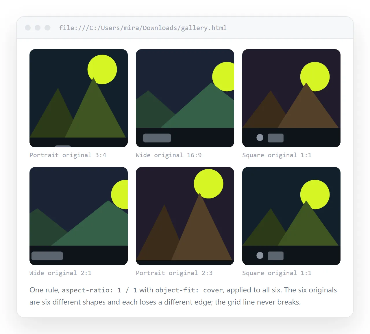
To keep an image at its aspect ratio in HTML, dictate one dimension and let the browser work out the other:
img { max-width: 100%; height: auto; }
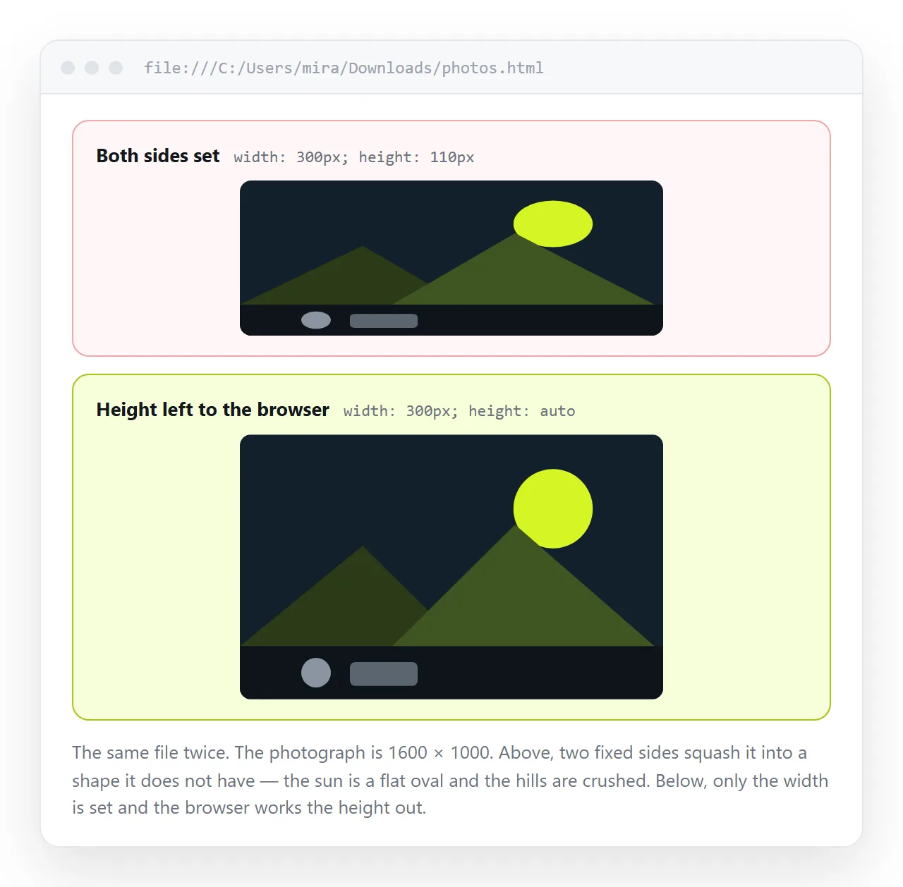
That single rule fixes most stretched images on most pages. The browser now scales the height to match whatever width the image ends up with.
Why images stretch
An image has its own proportions. Fix both dimensions in a way that disagrees with them and the browser does what you said, distorting the picture.
/* forces a 4:3 photo into a square */
img { width: 300px; height: 300px; }
The same happens with a stray inline style, or a global rule such as img { height: 200px } written for one component and inherited by another.
When something looks squashed, search for a second dimension before anything else. It is almost always there.
Fixed box, correct proportions
Sometimes the layout genuinely requires a fixed box. Cards in a grid look wrong when every image is a different height.
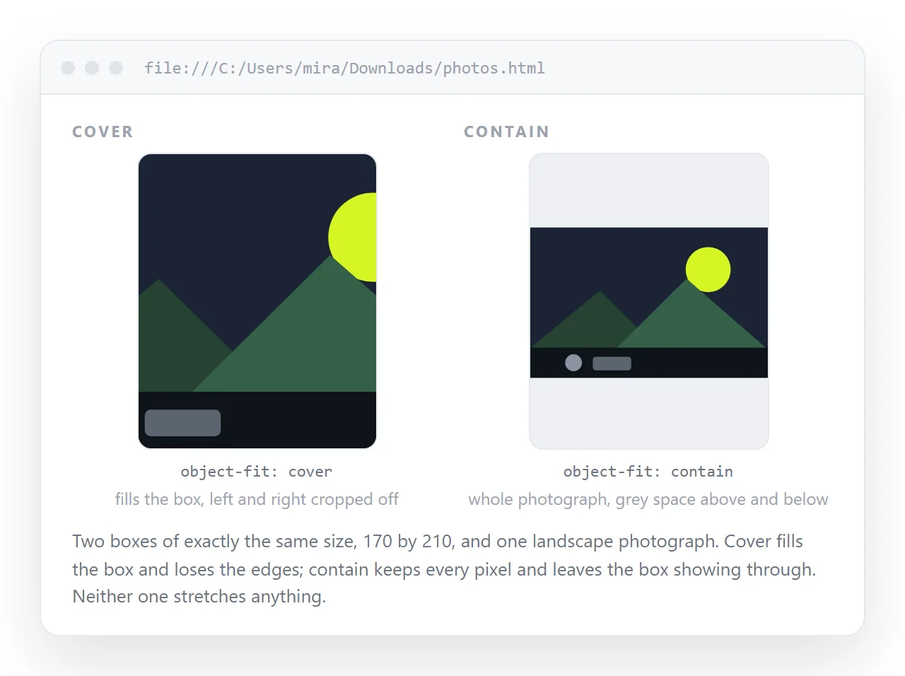
object-fit resolves it. The element keeps the size you set and the picture inside is scaled and cropped rather than squashed:
.card img {
  width: 100%;
  height: 220px;
  object-fit: cover;
  object-position: center;
  display: block;
}
| Value | Result |
|---|---|
fill |
Stretches to the box. The default, and the cause of most distortion |
cover |
Fills the box, crops the overflow, proportions intact |
contain |
Fits entirely inside, leaves empty space at two edges |
scale-down |
Like contain, but never enlarges a small image |
none |
Original size, cropped by the box |
Use cover for photographs, where losing an edge is acceptable. Use contain for logos, diagrams and screenshots, where cropping loses meaning.
object-position moves the crop. center top is worth setting on portraits, since a centred crop often takes the chin and leaves out the forehead.
Reserving space before the file arrives
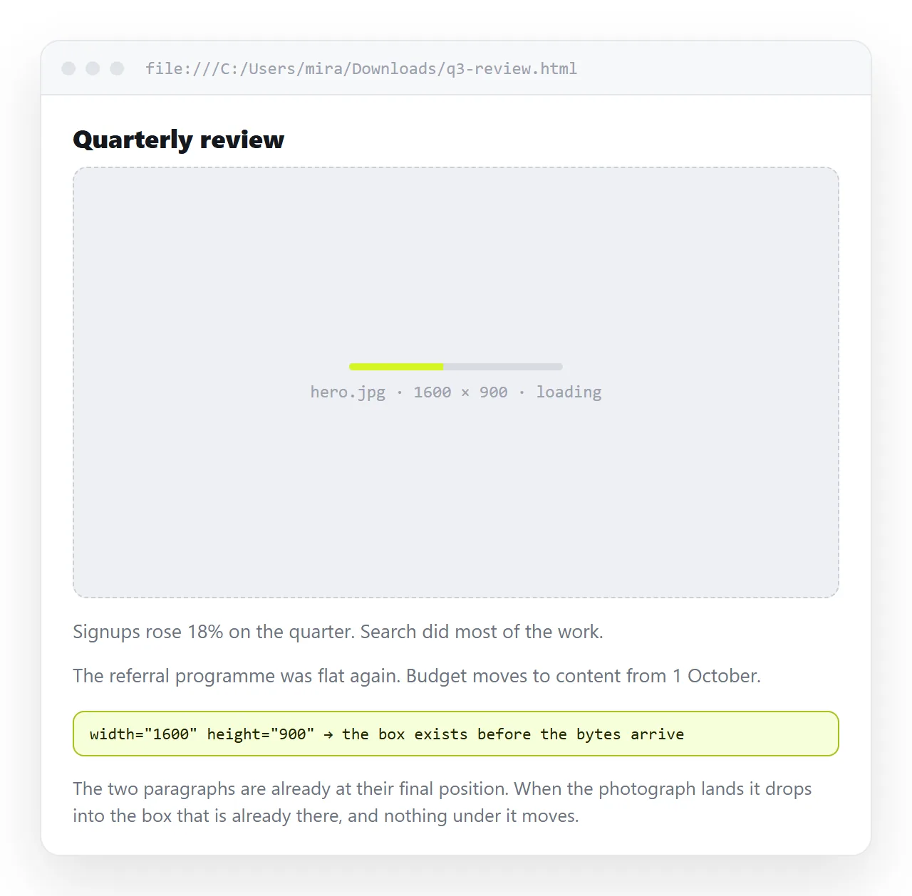
Put the real pixel dimensions on the tag:
<img src="chart.png" alt="Revenue by quarter" width="1200" height="675">
Browsers read the pair as a ratio and hold the right amount of space while the file downloads. Without it the page reflows as each image lands, and the reader loses their place mid-sentence.
The attributes do not conflict with responsive CSS, as long as you keep height: auto:
img { max-width: 100%; height: auto; }
Omit height: auto and the attribute wins, which reintroduces the stretch you were avoiding.
When the dimensions vary
For images whose size you do not know in advance, put the ratio on the container:
.thumb {
  aspect-ratio: 16 / 9;
  overflow: hidden;
}
.thumb img { width: 100%; height: 100%; object-fit: cover; }
The container holds its shape whatever arrives, and the image fills it without distortion. This is the pattern for user uploads and for lists built from a spreadsheet.
aspect-ratio works on the image itself too, which is useful when a picture must be cropped to a specific shape regardless of what it is:
.square img { aspect-ratio: 1 / 1; width: 100%; object-fit: cover; }
A checklist for keeping an image at its aspect ratio
- Is a second dimension set anywhere, including inline styles and inherited rules?
- Is
height: autopresent next tomax-width: 100%? - Does the box have to be fixed? If so, is
object-fitset? - Are the real
widthandheightattributes on the tag? - Is
display: blockset, to remove the baseline gap under the image?
That last one is cosmetic rather than proportional, but it explains the few stray pixels under images inside coloured containers.
Related sizing traps
Padding counting twice. A box with padding and a percentage width can exceed its column unless box-sizing: border-box is set. Box sizing covers it.
Images that never arrive. A perfectly proportioned image still shows nothing if the path does not travel with the file. Images not showing in HTML lists the causes, and embedding images as base64 is one way to prevent it.
Different sizes for different screens. When one file is wrong at both ends, making an image responsive covers srcset and sizes.
Checking it on a real screen
Proportion problems show up at widths you are not looking at. Resize the window to phone width and back before calling it done.
Paste the HTML into a NOS document and it renders as written, images and CSS included, at an address you can open on your own phone. That is a more honest test than a narrow desktop window.
The address does not change when you adjust the rules, so you can fix the ratio and reload the same link. Turning HTML into a link is that step, and the HTML editor online shows the effect of each object-fit value as you type it.
Ratios worth knowing
Picking a ratio deliberately beats accepting whatever the camera produced, especially in a grid where the shapes have to agree.
| Ratio | Where it fits |
|---|---|
16 / 9 |
Video frames, wide banners, screen recordings |
4 / 3 |
Ordinary photographs and most screenshots |
3 / 2 |
Camera output, article headers |
1 / 1 |
Avatars, product tiles, anything in a dense grid |
1 / 1.414 |
A4, for anything page-shaped |
Write them as two numbers with a slash rather than a decimal. 16 / 9 is readable six months later; 1.7778 is not.
One practical rule for grids. Choose the ratio from the content that would suffer most from cropping, then let the rest of the set adapt to it. Doing the reverse produces a tidy grid with a headless portrait in it.