box-sizing: border-box is the rule that makes a declared width mean the whole box, padding and border included, instead of just the content inside.
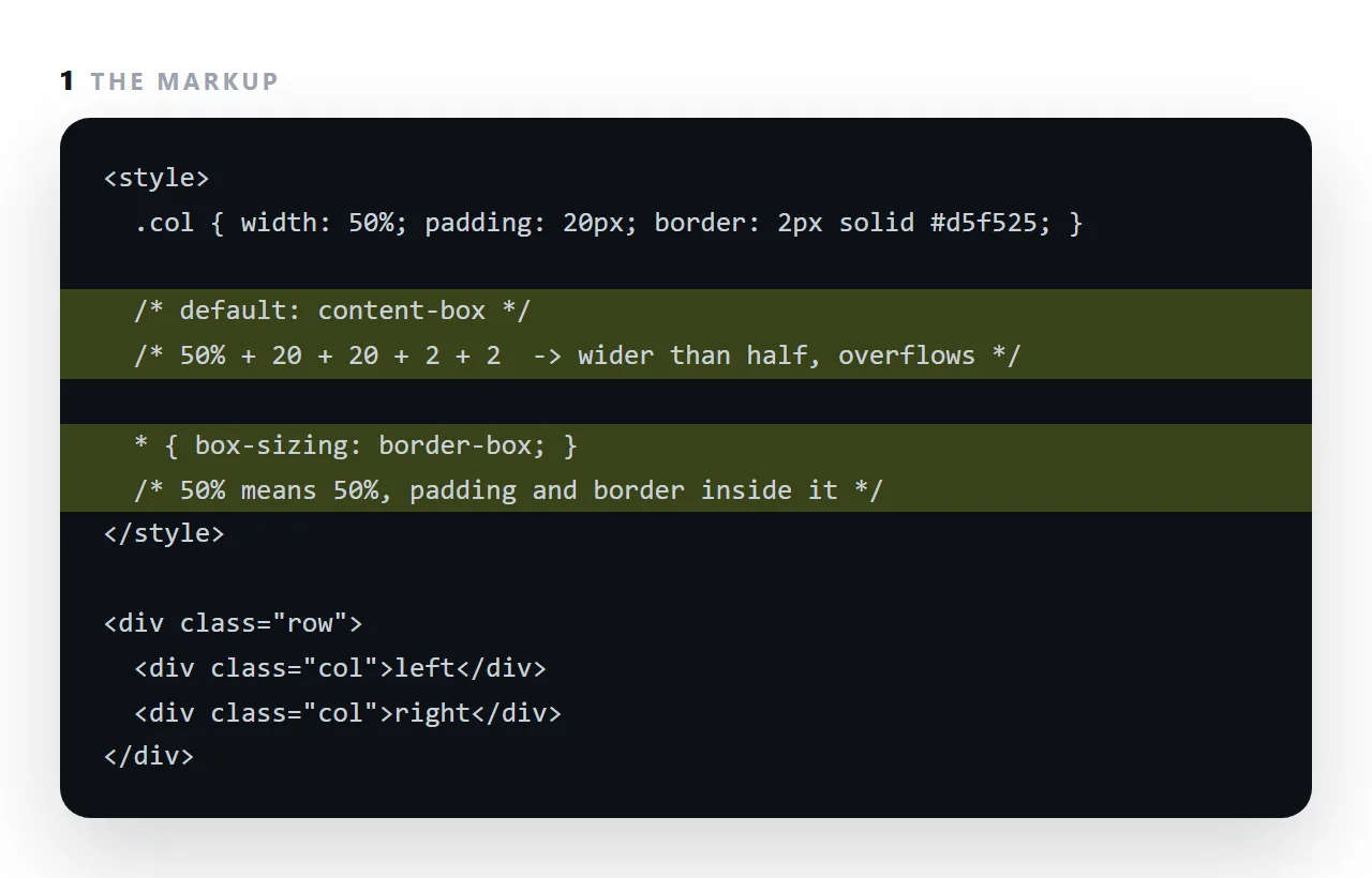
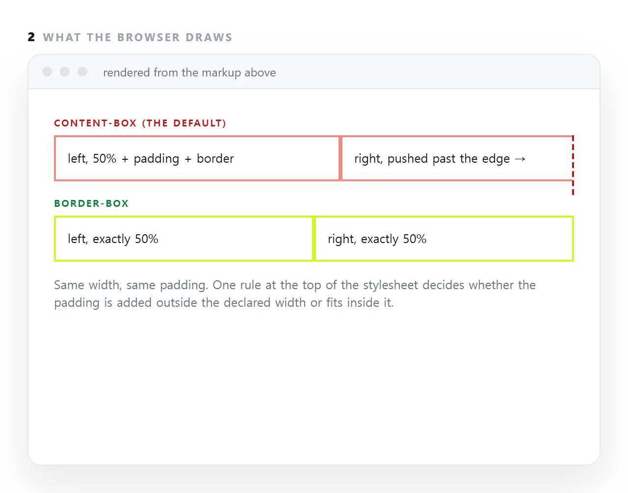
The default, content-box, adds padding and border on the outside, so two 50% columns with 20px of padding are together wider than their container and one of them wraps or overflows. Put * { box-sizing: border-box } at the top of the stylesheet and width means width everywhere.
This guide covers why the default is counter-intuitive, what the breakage looks like, the universal rule, and the one case where content-box is wanted.
*, *::before, *::after { box-sizing: border-box; }
First rule in the stylesheet. Here is what it changes.
Why the default box-sizing is counter-intuitive
.card { width: 300px; padding: 20px; border: 1px solid #ccc; }
| Setting | Actual width on screen |
|---|---|
content-box (default) |
300 + 40 + 2 = 342px |
border-box |
300px |
Under the default, width describes the content area only, and padding and border are added outside it. So a box you declared as 300 wide occupies 342.
Why it causes visible breakage
.col { width: 50%; padding: 20px; float: left; }
Two of those should fill a row. Under content-box each is 50% plus 40px, so together they are 100% plus 80px — and the row overflows, producing sideways scrolling on a phone.
Nothing reports an error. The page just scrolls in a direction you did not intend, and the cause is invisible in the markup. It is a recurring item in mobile layout problems.
Where border-box earns its place
/* full-width input that respects its padding */
input { width: 100%; padding: 10px 12px; }

/* a grid cell with internal spacing */
.card { padding: 16px; }

/* a bar chart track */
.track { width: 100%; padding: 2px; }
Under border-box all three behave as written. Under the default, each overflows its container by twice its horizontal padding.
Include the pseudo-elements
/* incomplete */
* { box-sizing: border-box; }

/* complete */
*, *::before, *::after { box-sizing: border-box; }
* does not match ::before and ::after. Those are commonly used for decorative boxes — timeline dots, badges, arrows — and inheriting the default while everything around them uses border-box produces small, hard-to-trace misalignments.
What it does not change
Margins. Always outside the box, under either setting. Space between elements is unaffected.
Percentage padding. Still resolved against the width of the containing block, even for top and bottom padding. That is unrelated and equally surprising — it is the basis of the trick for a fixed aspect ratio, though aspect-ratio now does that properly.
The related quirks-mode confusion
Without a doctype the browser uses a legacy mode in which width behaves roughly like border-box regardless of what you declare. So a page can look correct with no box-sizing rule and break as soon as someone adds the doctype.
If a layout shifts by an amount that looks like padding after an apparently unrelated change, check both the doctype and this rule.
The standard opening block
*, *::before, *::after { box-sizing: border-box; }

body {
  margin: 0;
  font-family: -apple-system, "Segoe UI", Roboto, sans-serif;
  line-height: 1.6;
  color: #18181b;
}

img, svg, video { max-width: 100%; height: auto; display: block; }
Four rules. The first removes the width surprise, the second removes the default body margin and sets readable text, and the third stops any media overflowing its container. Worth pasting into every single-file page — and worth asking for in any prompt.
Where the surprise shows up
| Pattern | Under content-box |
Under border-box |
|---|---|---|
width: 100% with padding |
Overflows by twice the padding | Fits |
Two width: 50% columns with padding |
Row overflows, page scrolls sideways | Fits |
| An input with padding inside a card | Wider than the card | Fits |
| A bar chart track with padding | Wider than its container | Fits |
| A grid cell with padding | Column pushed out of alignment | Aligned |
Every row is a real symptom people debug for an hour. None of them produces an error message, which is what makes the rule worth applying unconditionally rather than case by case.
Related measurement surprises
Two more that are not box-sizing and get blamed on it:
Percentage vertical padding is resolved against the container's width, not its height. Surprising, and it is what made the old fixed-aspect-ratio trick work. Use aspect-ratio now.
A flex item will not shrink below its content, so a long word or a wide table pushes the row out. That needs min-width: 0 — see flexbox. Similarly, a grid track defined as 1fr has an implicit content minimum, which is why CSS grid layouts sometimes need minmax(0, 1fr).
Same visible symptom as a box-sizing problem — sideways scrolling — and a different cause. Check the doctype and box-sizing first because they are one line each, then look at the flex and grid minimums.
Why the default is what it is
Early CSS defined width as the content area because that matched how the first browsers drew boxes, and changing the default later would have broken every page that relied on it.
So the sensible behaviour, width includes padding and border, arrived as an opt-in property instead. Every framework and every reset stylesheet opts in on the first line, which is why pages built with one never show the problem and pages generated from scratch often do.
Spotting a content-box page
The symptoms: a two-column layout where the second column wraps underneath the first, a card whose border sits a few pixels outside its neighbours', an input that is slightly wider than the button beside it, a page that scrolls sideways by exactly the padding of one element.
Any of them, with widths that look right in the CSS, means the box model is adding the padding outside. One line fixes all of them at once.
Fixing the box model once: 4 steps
- Put the universal rule at the top of the stylesheet.
* { box-sizing: border-box; }before anything else. - Include pseudo-elements if you use them.
*, *::before, *::after { box-sizing: border-box; }. - Re-check any width that was tuned to compensate. A column set to 46% to leave room for padding can go back to 50%.
- Leave
content-boxonly where an element's width must exclude padding. Rare; usually a replaced element with a fixed content size. Everywhere else, border-box, and the mobile overflow caused by it goes away.