CSS cannot transition height to auto because auto has no computed number to interpolate toward. The browser applies the end state at once and the panel jumps open.
Three fixes work. A grid row from 0fr to 1fr, a max-height approximation, or measuring the real height in script and setting it in pixels.

The three routes at a glance
| Route | Script needed | Timing accurate | Main drawback |
|---|---|---|---|
Grid 0fr to 1fr |
No | Yes | Needs one extra wrapper element |
max-height guess |
No | No | Duration is wrong unless the guess is close |
Measure scrollHeight |
Yes | Yes | Breaks if content changes while open |
Start with the grid version. Fall back to measurement only when you need the open panel to have an explicit height for some other reason.
Route one: grid rows
<div class="panel" data-open="false">
  <div class="panel-inner">
    <p>Content of any height, including images that load later.</p>
  </div>
</div>
.panel {
  display: grid;
  grid-template-rows: 0fr;
  transition: grid-template-rows 240ms cubic-bezier(.2,.7,.3,1);
}
.panel[data-open="true"] { grid-template-rows: 1fr; }
.panel-inner { overflow: hidden; min-height: 0; }
Both 0fr and 1fr are numeric, so the row height animates smoothly. The content keeps its natural size, so nothing is guessed and nothing is measured.
Two details that are not optional. overflow: hidden on the inner wrapper, or the content spills out during the collapse. And min-height: 0, because grid items default to a minimum of their content size and would refuse to shrink.
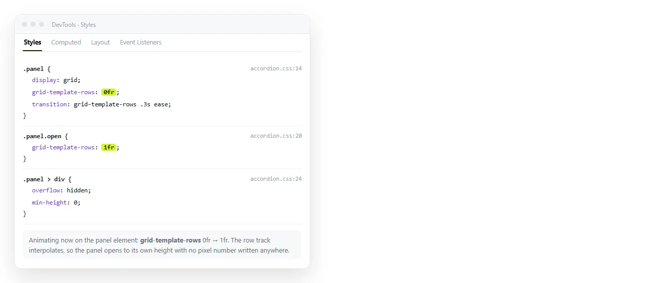
Route two: max-height
The old approach, still fine for short content of predictable length.
.panel { max-height: 0; overflow: hidden; transition: max-height 240ms ease; }
.panel[data-open="true"] { max-height: 400px; }
The problem is timing. If the real content is 120 pixels and the max-height is 400, the panel finishes moving in roughly a third of the duration and the remaining time animates empty space. Closing has the reverse problem, a visible pause before anything moves.
Keep the value close to the largest real height, and do not reach for 9999px.
Route three: measure in script
Exact, and worth it when the content height varies widely.
function toggle(panel) {
  const open = panel.dataset.open === 'true';
  if (open) {
    panel.style.height = panel.scrollHeight + 'px';
    requestAnimationFrame(() => { panel.style.height = '0px'; });
    panel.dataset.open = 'false';
  } else {
    panel.style.height = panel.scrollHeight + 'px';
    panel.dataset.open = 'true';
    panel.addEventListener('transitionend', function done() {
      panel.style.height = 'auto';
      panel.removeEventListener('transitionend', done);
    });
  }
}
.panel { height: 0; overflow: hidden; transition: height 240ms ease; }
Two things make this work. The requestAnimationFrame when closing, which forces the browser to register the explicit pixel height before it changes, and setting height: auto after opening so late loading images do not get clipped.
Accessibility of a collapsed panel
Zero height with overflow: hidden hides the content visually and nothing else. A screen reader still reads it and the keyboard still tabs into it.
<button aria-expanded="false" aria-controls="p1">Details</button>
<div class="panel" id="p1" inert>
  ...
</div>
aria-expandedon the trigger, updated when the state changes.aria-controlspointing at the panel id.inertorhiddenon the panel while closed, removed when it opens.
Using display: none instead removes the element from layout and kills the transition, which is the whole reason for this page. inert keeps the box and removes the interaction.
Fading the content as well
Height alone can look mechanical, because the content appears to be wiped rather than revealed. A short opacity transition on the inner wrapper softens it.
.panel-inner > * {
  opacity: 0;
  transition: opacity 160ms ease 80ms;
}
.panel[data-open="true"] .panel-inner > * { opacity: 1; }
The 80 millisecond delay means the fade starts after the box has begun opening. Closing should have no delay, so the content clears before the box collapses over it.
Keep the fade shorter than the height change. If it is longer, the panel finishes moving while the text is still half transparent, which reads as slow rather than smooth.
Animating the trigger too
A rotating chevron costs two lines and tells the reader which direction the panel is going.
.chevron { transition: transform 240ms cubic-bezier(.2,.7,.3,1); }
[aria-expanded="true"] .chevron { transform: rotate(90deg); }
Driving it from aria-expanded rather than a separate class means the visual state and the announced state cannot drift apart. Update one attribute and both follow.
Reduced motion
@media (prefers-reduced-motion: reduce) {
  .panel { transition: none; }
}
The open and closed states still work. Only the movement between them is dropped, which is the same guard used for a hover transition.
Width, and the same problem sideways
Everything above applies to width: auto as well, with one change. The grid trick uses grid-template-columns instead.
.drawer {
  display: grid;
  grid-template-columns: 0fr;
  transition: grid-template-columns 240ms ease;
}
.drawer[data-open="true"] { grid-template-columns: 1fr; }
.drawer-inner { overflow: hidden; min-width: 0; }
Note min-width: 0 rather than min-height. Horizontal collapses have an extra hazard: the content reflows as the column narrows, so text rewraps throughout the animation.
For a sidebar, set an explicit width on the inner wrapper so the content keeps its layout and is simply clipped. That looks like a panel sliding away rather than a paragraph being squeezed.
The native element, if you can use it
<details> and <summary> give you the open and close behaviour, keyboard handling and screen reader semantics with no CSS at all. Animating it takes the same grid trick applied to a wrapper inside, plus ::details-content in newer browsers.
For a plain expandable section in a report or a specification, the native element is less code and behaves correctly before any of your CSS loads.

Checking it with real content
Test with the longest content you actually have, and with an image inside that loads slowly. Those two cases expose the max-height guess and the missing height: auto respectively.
Paste the page into a NOS document and open the link on a phone. The CSS and any script render as written, so the panel behaves the way a reader will see it.
Correcting a duration is then an edit to the same page rather than a new file, and the link you already sent points at the corrected version.