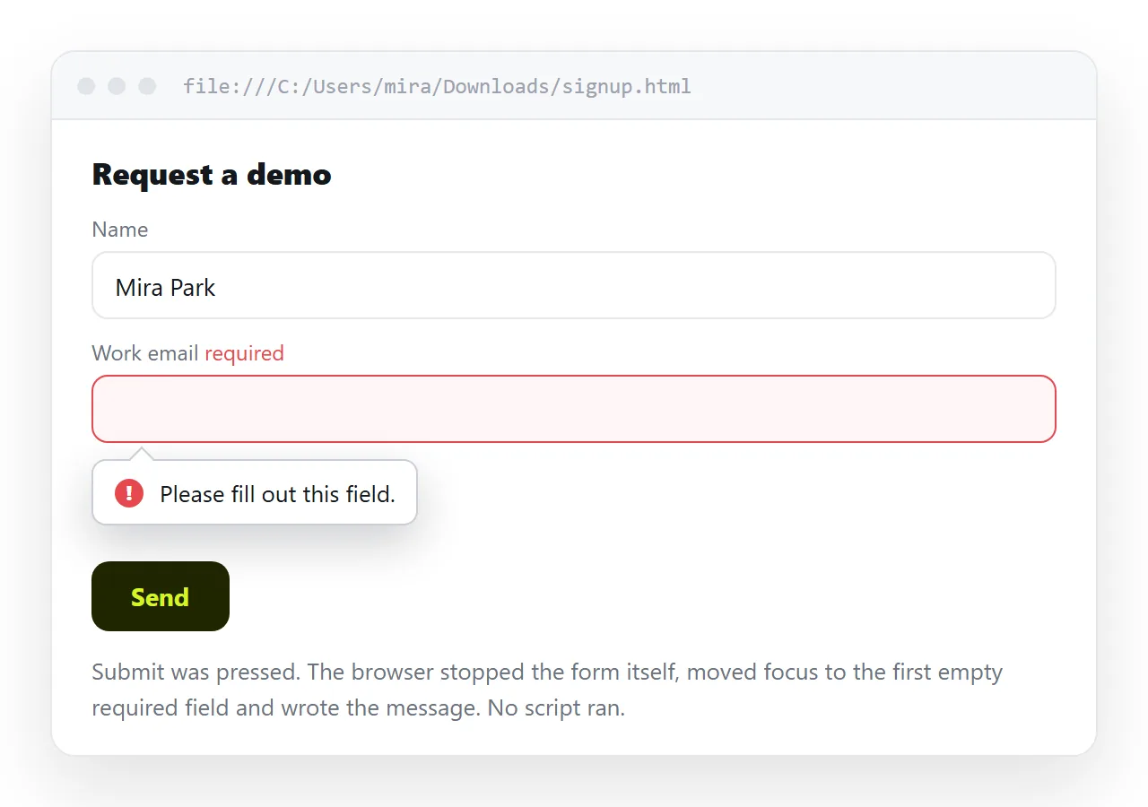
HTML form validation runs from attributes on the input elements, with no script involved. The browser blocks submission and shows a message on the first failing field.
<form>
  <label for="email">Work email</label>
  <input id="email" name="email" type="email" required>
  <button>Send</button>
</form>
Two attributes, type="email" and required, and the form already refuses an empty box and a string with no at sign.
Attribute reference
| Attribute | Applies to | Enforces |
|---|---|---|
required |
Most inputs, select, textarea | A value is present |
type="email" |
input | Basic address shape |
type="url" |
input | A parseable absolute URL |
type="number" |
input | Numeric value only |
min / max |
number, date, range | Value within bounds |
step |
number, date, time | Value on the interval |
minlength / maxlength |
text, textarea | Character count |
pattern |
text, tel, search, url | A regular expression match |
maxlength behaves differently from the rest. It prevents typing past the limit rather than reporting an error, so it silently truncates a paste.
Patterns
pattern takes a regular expression that must match the whole value. No anchors are needed, and they are implied.
<input name="code" pattern="[A-Z]{2}-\d{4}" title="Two letters, a hyphen, four digits">
The title attribute supplies the hint the browser appends to its message. It is one of the few places the title attribute has a defined job, though a visible hint under the field is better for touch users.
Keep patterns loose. A strict email regular expression rejects valid addresses, and type="email" already covers the useful case.
Styling validity without the red wall
:invalid matches from load, so an empty required field is red before the reader has done anything.
/* the trap */
input:invalid { border-color: #ef4444; }

/* what to use instead */
input:user-invalid { border-color: #ef4444; }
input:user-valid   { border-color: #22c55e; }
:user-invalid only matches after the reader has interacted with the field or tried to submit. That is the behaviour people expect from validation styling.
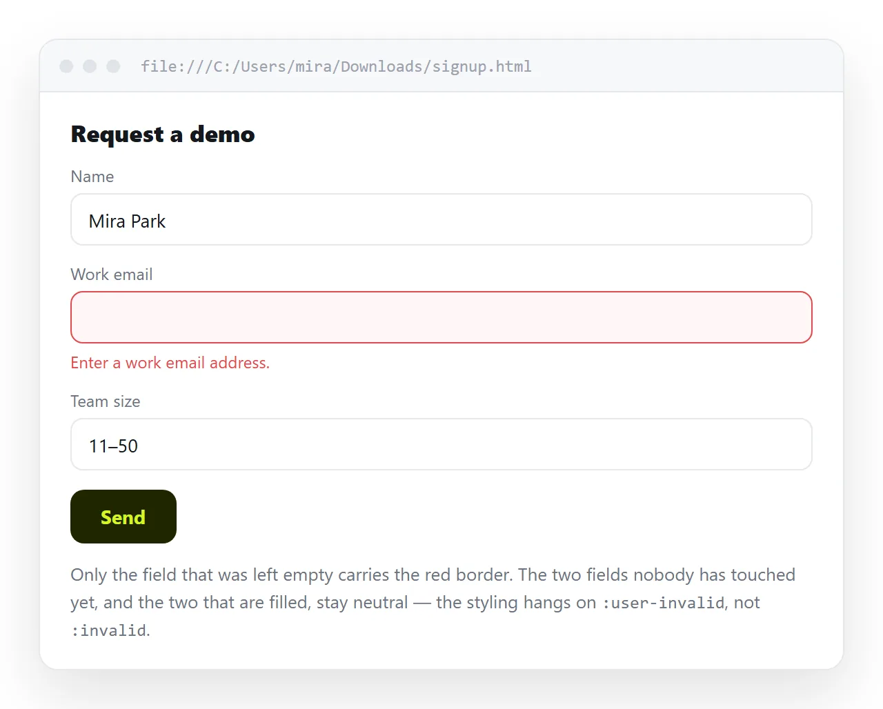
For required fields, mark them visibly in the label as well. Colour alone is not a usable signal.
Custom messages
The default wording is set by the browser and localised to its language. To replace it, use setCustomValidity.
<input id="code" name="code" pattern="[A-Z]{2}-\d{4}" required>
<script>
  const el = document.getElementById('code');
  el.addEventListener('invalid', () => {
    el.setCustomValidity(
      el.validity.valueMissing
        ? 'Enter the reference code from the invoice.'
        : 'Format is two letters, a hyphen, then four digits.'
    );
  });
  el.addEventListener('input', () => el.setCustomValidity(''));
</script>
The second listener is not optional. A non-empty custom message counts as a validity failure, so without clearing it the field can never become valid again.
el.validity exposes which rule failed: valueMissing, typeMismatch, patternMismatch, rangeUnderflow, tooShort and several more.
Turning the native messages off
Sometimes the design calls for messages in the page rather than browser bubbles.
<form novalidate>
novalidate suppresses the bubbles and the submit block, but the validity state is still computed. You can read form.checkValidity() and render your own errors from el.validity.
That is the supported way to take over. Removing the attributes instead loses the state as well.
Accessibility
- Every field needs a label. A placeholder is not a label; it disappears on typing. Use
<label for>, or aria-label where no visible text exists. - Link the error to the field with
aria-describedbypointing at the error element's id. - Mark the field with
aria-invalid="true"when it fails, so a screen reader announces the state. - Move focus to the first failing field on a failed submit.
<label for="qty">Quantity</label>
<input id="qty" type="number" min="1" max="99" aria-describedby="qty-err" required>
<p id="qty-err" class="err">Between 1 and 99.</p>
Rules the attributes cannot express
Four common requirements have no attribute, and each has a standard workaround.
- Two fields must match, for example a confirmation. Compare them in an
inputhandler and callsetCustomValidityon the second. - One field is required only if another is filled. Toggle the
requiredproperty in script when the first changes. - A date must be after another date. Set the second field's
minfrom the first field's value. - At least one checkbox in a group. Set
requiredon all of them, then clear it in script as soon as one is checked.
<script>
  const from = document.getElementById('from');
  const to   = document.getElementById('to');
  from.addEventListener('input', () => { to.min = from.value; });
</script>
Driving an attribute from script keeps the browser doing the enforcement, which means the messages, the focus behaviour and the :user-invalid styling all keep working.
Input types worth using
| Type | Keyboard on mobile | Validates |
|---|---|---|
email |
At sign visible | Address shape |
tel |
Numeric keypad | Nothing, pair with pattern |
url |
Slash and dot visible | Absolute URL |
number |
Numeric keypad | Numeric, plus min, max, step |
date |
Date picker | A real date |
search |
Search key | Nothing |
tel validates nothing on purpose, because phone number formats vary too widely. Use it for the keypad and add a loose pattern if a format is genuinely required.
Avoid type="number" for things that are not quantities. Order references and postal codes lose leading zeros and gain spinner arrows.
The form element's own attributes
<form action="/submit" method="post" novalidate autocomplete="on">
autocomplete deserves more attention than it gets. Naming the fields correctly lets the browser fill them, which removes more errors than any validation rule.
<input name="email" type="email" autocomplete="email">
<input name="org"   type="text"  autocomplete="organization">
The token list is defined, so autocomplete="email" is understood while autocomplete="work-email" is not and falls back to a guess.
Validation is not security
Everything above runs in the reader's browser and can be edited out in seconds. It exists to help someone fill the form correctly, not to guarantee what arrives.
Any form whose values reach a system must repeat every check on the receiving side.
Testing the form as a reader sees it
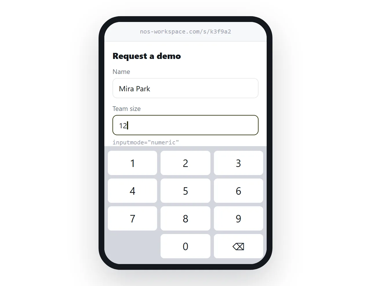
Input types change the on-screen keyboard on mobile. type="email" brings the at sign, type="number" brings the keypad. That only shows on a real device.
Open the file in the HTML file opener to confirm the markup renders outside your project. Then paste the HTML into a document and turn it into a link, and open that link on a phone to check the keyboards and the error wording.
Related: turning a form into a link, semantic HTML for the structure underneath, and editable HTML table when the input is tabular rather than a form.