aria-label is an attribute that gives an element a name for screen readers when nothing visible provides one: a button that is only an icon, a figure whose meaning is in the bars, a link that is only an arrow.
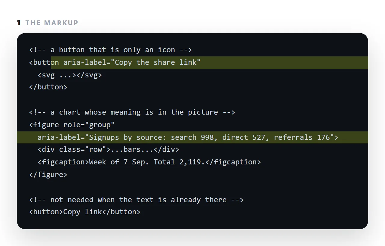
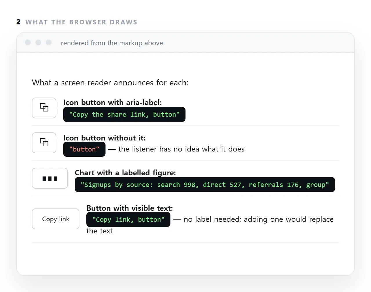
The screen reader announces the label instead of "button" or nothing at all.
It has one sharp edge: on an element that already has visible text, the label replaces that text in what is announced, so it belongs only where there is no text to begin with.
This guide covers the four cases where it is right, where it does nothing, where it does harm, and the alternatives that keep the name visible.
<button aria-label="Close">×</button>
Without the label, a screen reader announces "times" or "multiplication sign". With it, "Close, button".
The four cases where aria-label is right
An icon-only control
<button aria-label="Copy the HTML">
  <svg aria-hidden="true" viewBox="0 0 24 24">…</svg>
</button>
The label names the action; aria-hidden on the icon stops its contents being read as a stream of coordinates.
A field with no visible label
<input type="search" aria-label="Search guides" placeholder="Search">
A placeholder is not a label — it vanishes as soon as typing starts and is not reliably announced. If there is no room for a visible label, this is the minimum.
A frame
<iframe src="…" title="Quarterly report"></iframe>
Frames use title rather than aria-label. An unnamed frame is announced as "frame", which tells the listener nothing. See iframe.
Distinguishing two similar regions
<nav aria-label="Main">…</nav>
<nav aria-label="Breadcrumb">…</nav>
Two navigation landmarks are otherwise both announced as "navigation", so a screen reader user cannot tell which is which.
Where it does nothing
<!-- ignored: a div has no role to name -->
<div aria-label="Important section">…</div>

<!-- works: the role gives it something to name -->
<div role="region" aria-label="Signups by source">…</div>
aria-label names an element's role. An element with no meaningful role has nothing to name, so the attribute is discarded. Adding it to divs is a common and entirely ineffective habit.
It replaces the visible text
<!-- the reader hears "Submit". The visible word "Save" is never announced. -->
<button aria-label="Submit">Save</button>
This is a real trap. A sighted person is told to click "Save"; a screen reader user is looking for "Submit". Never let the two disagree — if there is visible text, either leave it to speak for itself or make the label start with the same words.
Prefer a visible label
<!-- fine -->
<button aria-label="Delete this row">🗑</button>

<!-- better -->
<button>🗑 Delete</button>
An icon whose meaning is obvious to you is frequently not obvious to a reader. A visible word helps everyone and removes the need for the attribute.
Use aria-label when space genuinely does not permit text — a dense toolbar — and not as the default.
aria-labelledby, when the text is already on the page
<h2 id="sources">Signups by source</h2>
<div role="region" aria-labelledby="sources">…</div>
Points at existing text instead of duplicating it, so the two cannot drift apart. Prefer it whenever a heading already says the thing.
The order to reach for
- A real element with real text.
<button>Save</button>needs nothing. - A real
<label>, for form fields. aria-labelledby, when the text exists elsewhere on the page.aria-label, when there is no text anywhere.
Most ARIA in the wild is at step four when step one was available — see semantic HTML. The first rule of ARIA is to not need it.
What it is not for
Three habits that look like accessibility work and are not.
| Habit | Why it does nothing | Instead |
|---|---|---|
aria-label on a <div> |
No role to name, so it is discarded | Give the element a real role, or use a real element |
aria-label duplicating visible text |
Announced twice, or replaces it | Leave the text to speak |
role="button" on a <button> |
Already a button | Nothing |
aria-hidden on something focusable |
Announced as an unnamed control | Remove it from the tab order too |
The last row is a real failure: an element hidden from screen readers but still reachable by Tab produces a stop where the listener is told nothing at all. If you hide something, hide it from the tab order as well.
The check that takes a minute
Turn on your operating system's screen reader and Tab through the page. You are listening for one thing: does every stop announce something that identifies it. A stop that says only "button" or "frame" needs a name; a stop that says nothing needs a real element — see semantic HTML.
aria-label, aria-labelledby, and visible labels
aria-label supplies a name as a string. aria-labelledby points at another element whose text is the name, which is better when that text is already on the page, because the two cannot drift apart.
A <label for> on a form field is better than either, because sighted readers see it too. Reach for aria-label only when there is nothing visible to point at.
Testing what is announced
Turn on the screen reader built into the operating system, or use the accessibility tree in the browser's inspector, and move through the page.
Every control should be announced with a name that says what it does; every chart should be announced with its values or a caption. A control announced as "button" with nothing after it is the one that needs a label.
Using aria-label: 4 steps
- Find the elements with no visible text. Icon-only buttons, arrow links, close controls, charts drawn from shapes.
- Write the purpose, not the picture. "Copy the share link", not "clipboard icon". For a chart, the values: "Signups by source: search 998, direct 527".
- Leave elements with visible text alone. An
aria-labelon a button that says Copy link replaces the words the reader can see with whatever you wrote. - Prefer visible text where it fits. A label everyone can see is better than one only a screen reader hears. Semantic HTML removes most of the need in the first place.