The HTML <label> tag connects a piece of text to one form control. Set for to the control's id, or put the control inside the label.
After that, clicking the text works the control, and screen readers read the text as the control's name.
Try it. Click the words on each side, not the boxes.
<!doctype html>
<html lang="en">
<head>
<meta charset="utf-8">
<meta name="viewport" content="width=device-width, initial-scale=1">
<title>Label click test</title>
<style>
  body { margin: 0; padding: 16px; font-family: system-ui, sans-serif; background: #f4f5f7; color: #1d2330; }
  .grid { display: grid; grid-template-columns: repeat(auto-fit, minmax(160px, 1fr)); gap: 12px; }
  .box { background: #fff; border-radius: 12px; padding: 14px; border: 2px solid #cfe9d7; }
  .box.no { border-color: #f3d1c8; }
  h2 { font-size: 13px; margin: 0 0 12px; text-transform: uppercase; letter-spacing: .4px; }
  .row { margin-bottom: 14px; }
  label, .fake { cursor: pointer; }
  input[type="text"] { display: block; width: 100%; box-sizing: border-box; margin-top: 4px; padding: 7px 9px; font: inherit; }
  #log { margin-top: 12px; padding: 10px 12px; border-radius: 10px; background: #1d2330; color: #e5e7eb; font: 13px/1.5 ui-monospace, Consolas, monospace; }
</style>
</head>
<body>
<div class="grid">
  <div class="box">
    <h2>Connected</h2>
    <!-- for="..." matches the id of the control -->
    <div class="row">
      <input type="checkbox" id="news-a">
      <label for="news-a">Send me the newsletter</label>
    </div>
    <div class="row">
      <label for="city-a">City</label>
      <input type="text" id="city-a">
    </div>
  </div>
  <div class="box no">
    <h2>Not connected</h2>
    <!-- plain text beside the control: nothing links them -->
    <div class="row">
      <input type="checkbox" id="news-b">
      <span class="fake">Send me the newsletter</span>
    </div>
    <div class="row">
      <span class="fake">City</span>
      <input type="text" id="city-b">
    </div>
  </div>
</div>
<div id="log" aria-live="polite">Click the words, not the boxes.</div>

<script>
  const log = document.getElementById('log');
  // report what each control did, so a click on the text is visible
  document.querySelectorAll('input').forEach((el) => {
    const side = el.id.endsWith('-a') ? 'Connected' : 'Not connected';
    el.addEventListener('change', () => {
      if (el.type === 'checkbox') log.textContent = side + ': checkbox is now ' + (el.checked ? 'ON' : 'OFF');
    });
    el.addEventListener('focus', () => {
      if (el.type === 'text') log.textContent = side + ': the City box has focus';
    });
  });
  document.querySelectorAll('.fake').forEach((t) => {
    t.addEventListener('click', () => { log.textContent = 'Not connected: you clicked text, the control did nothing'; });
  });
</script>
</body>
</html>
On the left, a click on "Send me the newsletter" toggles the checkbox and a click on "City" puts the cursor in the box. On the right the text looks the same, but nothing links it to the control.
Two ways to connect a label
There are two ways, and both are standard HTML. Pick one per control.
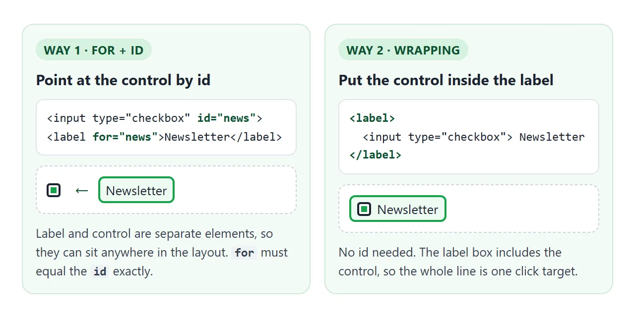
forandid: give the control anidand put the same value in the label'sfor. The two elements can sit in different places in the layout, such as table cells or grid columns.- Wrapping: put the control inside the
<label>. Noidis needed, which helps when the same snippet is repeated many times on a page.
<!-- 1. for + id -->
<input type="checkbox" id="news">
<label for="news">Send me the newsletter</label>

<!-- 2. wrapping -->
<label>
  <input type="checkbox" name="news"> Send me the newsletter
</label>
You can also do both at once: a wrapping label with a for that matches the wrapped control. If for names a different control, for wins.
What a connected label does
A connected label changes three things, and none of them need JavaScript.
| Control | Clicking the label | What a screen reader hears |
|---|---|---|
| Checkbox | Toggles it | "Send me the newsletter, checkbox, not checked" |
| Radio button | Selects it | The label text, then "radio button" and its state |
| Text box, select, textarea | Moves focus into it | The label text, then the kind of field |
The exact wording a screen reader uses differs between readers. The part that matters is that the label text is the control's accessible name, the name assistive technology uses for it. Without a label, the checkbox is announced with no name at all.
The same name is used by voice control software, so a user can say the label text to work the control. aria-label covers naming things that have no visible text. For form controls with visible text, a real label comes first.
A bigger click target for checkboxes and radios
A default checkbox is about the size of one letter. On a phone, a finger has to land on that square exactly. A connected label adds the text to the target.
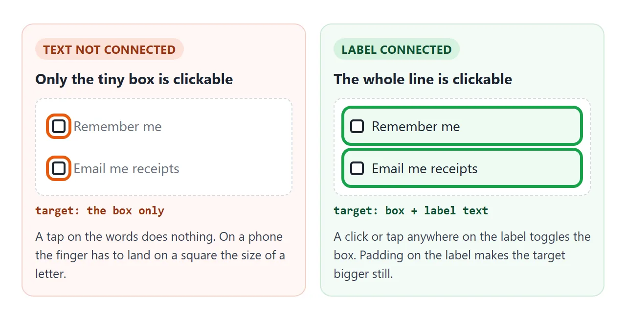
Wrapping the checkbox and making the label a flex row turns the whole line into one target. Add padding and the target grows without making the box itself bigger:
label.option {
  display: flex;
  align-items: center;
  gap: 8px;
  padding: 8px 0;
  cursor: pointer;
}
This matters most for groups of radio buttons. Put each radio in its own label, and group the set with a fieldset and legend so the question itself is announced too.
Laying out labels with CSS
A label is an inline element by default, so it sits on the same line as whatever comes next. Four layouts cover most forms.
<!doctype html>
<html lang="en">
<head>
<meta charset="utf-8">
<meta name="viewport" content="width=device-width, initial-scale=1">
<title>Label layouts</title>
<style>
  body { margin: 0; padding: 16px; font-family: system-ui, sans-serif; background: #f4f5f7; color: #1d2330; }
  .grid { display: grid; grid-template-columns: repeat(auto-fit, minmax(240px, 1fr)); gap: 12px; }
  section { background: #fff; border-radius: 12px; padding: 14px; }
  h2 { font-size: 12px; margin: 0 0 10px; color: #6b7280; text-transform: uppercase; letter-spacing: .4px; }
  input[type="text"], input[type="search"], input[type="email"] {
    width: 100%; box-sizing: border-box; padding: 8px 10px; font: inherit;
    border: 1px solid #c7ccd4; border-radius: 8px;
  }

  /* 1. Stacked: the label is a block above the box */
  .stacked label { display: block; font-weight: 600; margin-bottom: 4px; }

  /* 2. Inline: the control sits inside the label, so the whole line is clickable */
  .inline label { display: flex; align-items: center; gap: 8px; padding: 6px 0; cursor: pointer; }
  .inline input { width: 18px; height: 18px; margin: 0; }

  /* 3. Floating: placeholder=" " lets :placeholder-shown tell empty from filled */
  .float { position: relative; }
  .float input { padding: 18px 10px 6px; }
  .float label {
    position: absolute; left: 11px; top: 12px; color: #6b7280;
    pointer-events: none; transition: .15s;
  }
  .float input:focus + label,
  .float input:not(:placeholder-shown) + label { top: 4px; font-size: 11px; color: #2563eb; }

  /* 4. Visually hidden: invisible on screen, still read by screen readers */
  .visually-hidden {
    position: absolute; width: 1px; height: 1px; padding: 0; margin: -1px;
    overflow: hidden; clip: rect(0 0 0 0); white-space: nowrap; border: 0;
  }
  .search { display: flex; gap: 6px; }
  .search button { padding: 0 14px; border: 0; border-radius: 8px; background: #2563eb; color: #fff; font: inherit; }
</style>
</head>
<body>
<div class="grid">
  <section class="stacked">
    <h2>1. Stacked</h2>
    <label for="full-name">Full name</label>
    <input type="text" id="full-name" autocomplete="name">
  </section>

  <section class="inline">
    <h2>2. Inline (checkbox, radio)</h2>
    <label><input type="checkbox" name="terms"> I agree to the terms</label>
    <label><input type="radio" name="plan" value="month" checked> Monthly</label>
    <label><input type="radio" name="plan" value="year"> Yearly</label>
  </section>

  <section>
    <h2>3. Floating label</h2>
    <div class="float">
      <input type="email" id="mail" placeholder=" ">
      <label for="mail">Email</label>
    </div>
  </section>

  <section>
    <h2>4. Visually hidden (search box)</h2>
    <form class="search" role="search">
      <label for="q" class="visually-hidden">Search the docs</label>
      <input type="search" id="q" placeholder="Search">
      <button type="submit">Go</button>
    </form>
  </section>
</div>

<script>
  // keep the example on this page when the search form is sent
  document.querySelector('.search').addEventListener('submit', (e) => e.preventDefault());
</script>
</body>
</html>
- Stacked:
display: blockon the label puts it above the text box. It is the easiest to read on a narrow screen. - Inline: the checkbox or radio sits inside the label, before the text. Align the two with flexbox.
- Floating: the label sits inside the box and moves up when the box has focus or text. The text input guide explains the
:placeholder-showntrick behind it. - Visually hidden: the label is invisible on screen but still in the page, for a search box whose purpose is clear from the button next to it.
The visually hidden class is worth keeping in your stylesheet:
.visually-hidden {
  position: absolute;
  width: 1px; height: 1px;
  margin: -1px; padding: 0; border: 0;
  overflow: hidden;
  clip: rect(0 0 0 0);
  white-space: nowrap;
}
Do not use display: none or the hidden attribute for this. Both remove the label for screen readers as well.
A placeholder is not a label
A placeholder only shows while the box is empty. Once the user types, the name of the field is gone, and on a long form they have to delete their text to see what the box was for.
Clicking a placeholder is not a label click either. It lands on the box itself. Keep the name in a <label> and use the placeholder for an example, such as the format of a date.
One label, one control
A label is connected to exactly one control. If a label wraps two inputs, only the first one is connected. The second gets no label and no name.
The other direction is allowed: several labels can point at the same id. Clicking any of them works the control, and the accessible name joins the texts in page order.
That can produce an awkward name, so use it on purpose, for example for a unit such as "kg" after a number box.
Do not put a button or a second input inside a label. A label may only hold its own control.
A link is allowed. In "I agree to the terms", clicking the link opens it and does not toggle the box. Keep the link short so most of the line still toggles.
A finished example: toggle switches
A toggle switch is a checkbox with different paint. Keep the real <input type="checkbox">, hide it visually, and draw the switch from its state with :checked + .track. The label wraps everything, so the whole row is the click target.
<!doctype html>
<html lang="en">
<head>
<meta charset="utf-8">
<meta name="viewport" content="width=device-width, initial-scale=1">
<title>Settings toggles</title>
<style>
  body { margin: 0; padding: 16px; font-family: system-ui, sans-serif; background: #f4f5f7; color: #1d2330; }
  .panel { max-width: 420px; margin: 0 auto; background: #fff; border-radius: 14px; padding: 6px 16px; box-shadow: 0 4px 16px rgba(0,0,0,.08); }
  h1 { font-size: 16px; margin: 12px 0 4px; }

  /* the whole row is the label: text and switch are one click target */
  .toggle {
    display: flex; align-items: center; justify-content: space-between; gap: 12px;
    padding: 13px 0; border-top: 1px solid #eef0f3; cursor: pointer;
  }
  .toggle small { display: block; color: #6b7280; font-size: 12px; margin-top: 2px; }

  /* hide the real checkbox from the eye only: it stays focusable and clickable */
  .toggle input {
    position: absolute; width: 1px; height: 1px; margin: -1px;
    overflow: hidden; clip: rect(0 0 0 0); white-space: nowrap; border: 0;
  }

  /* the track and knob are drawn from the checkbox state */
  .track {
    flex: none; position: relative; width: 44px; height: 26px; border-radius: 99px;
    background: #c7ccd4; transition: background .15s;
  }
  .track::after {
    content: ""; position: absolute; left: 3px; top: 3px; width: 20px; height: 20px;
    border-radius: 50%; background: #fff; box-shadow: 0 1px 3px rgba(0,0,0,.3); transition: transform .15s;
  }
  .toggle input:checked + .track { background: #16a34a; }
  .toggle input:checked + .track::after { transform: translateX(18px); }
  .toggle input:focus-visible + .track { outline: 3px solid #2563eb; outline-offset: 2px; }
  .toggle input:disabled + .track { opacity: .45; }
  .toggle.off { cursor: not-allowed; color: #9ca3af; }

  #state { margin: 12px auto 0; max-width: 420px; box-sizing: border-box; padding: 10px 12px; border-radius: 10px; background: #1d2330; color: #e5e7eb; font: 13px/1.5 ui-monospace, Consolas, monospace; }
</style>
</head>
<body>
<form class="panel" id="settings">
  <h1>Notifications</h1>

  <label class="toggle">
    <span>Email updates<small>A summary once a week</small></span>
    <input type="checkbox" role="switch" name="email" checked>
    <span class="track" aria-hidden="true"></span>
  </label>

  <label class="toggle">
    <span>Push alerts<small>When someone replies</small></span>
    <input type="checkbox" role="switch" name="push">
    <span class="track" aria-hidden="true"></span>
  </label>

  <label class="toggle">
    <span>Sounds<small>Play a sound for new alerts</small></span>
    <input type="checkbox" role="switch" name="sound">
    <span class="track" aria-hidden="true"></span>
  </label>

  <label class="toggle off">
    <span>Text messages<small>Not available on your plan</small></span>
    <input type="checkbox" role="switch" name="sms" disabled>
    <span class="track" aria-hidden="true"></span>
  </label>
</form>
<div id="state" aria-live="polite"></div>

<script>
  const form = document.getElementById('settings');
  const state = document.getElementById('state');

  // list the switches that are on, the same way the form would send them
  function show() {
    const on = [...new FormData(form).keys()];
    state.textContent = 'On: ' + (on.length ? on.join(', ') : 'nothing');
  }
  form.addEventListener('change', show);
  show();
</script>
</body>
</html>
<label class="toggle">
  <span>Push alerts</span>
  <input type="checkbox" role="switch" name="push">
  <span class="track" aria-hidden="true"></span>
</label>
Because the input is real, the switch gets everything a checkbox has for free: Tab reaches it, Space toggles it, disabled works, and its value is sent with the form.
role="switch" tells screen readers to announce it as on or off instead of checked or not checked.
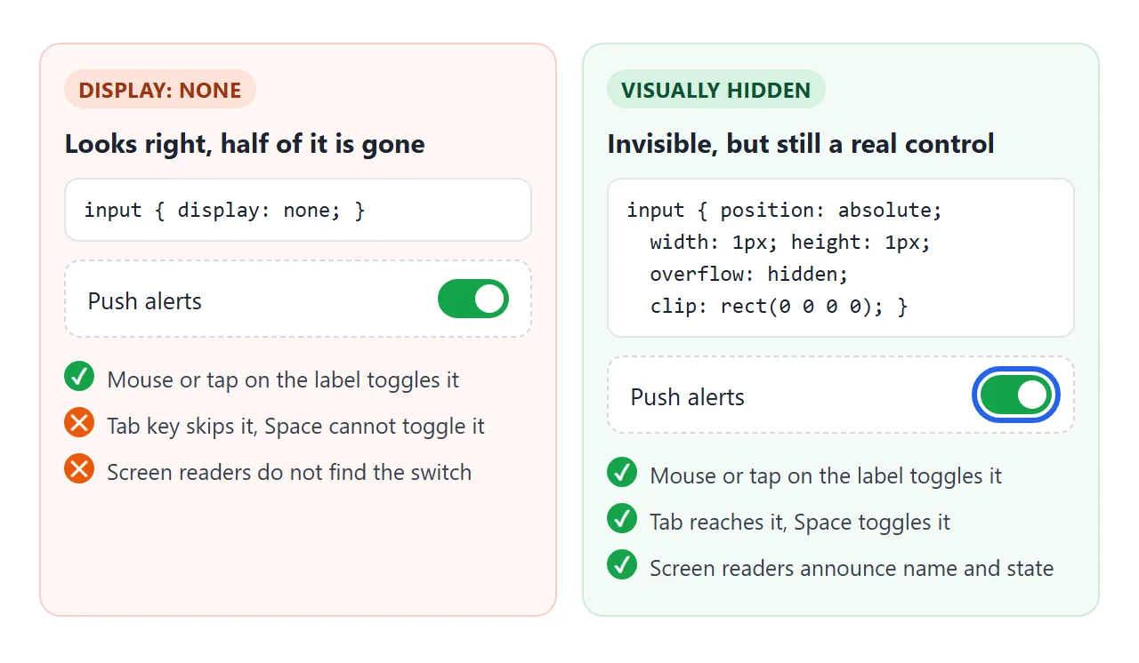
The common mistake is hiding the input with display: none. A click on the label still toggles it, so it looks fine with a mouse.
But the input can no longer get focus, so keyboard users cannot reach it, and screen readers do not find it.
Show focus on the drawn switch, since the real input is invisible:
.toggle input:focus-visible + .track {
  outline: 3px solid #2563eb;
  outline-offset: 2px;
}
When it does not work
| What you see | Cause | Fix |
|---|---|---|
| Clicking the label does nothing | for and id differ, often by case or a typo |
Make them identical; Email and email are different |
| Clicking the label works a different control | The same id is used twice; for finds the first one |
Make every id unique |
| The text is not clickable at all | The text is in a <span> or <p>, not a <label> |
Change it to a <label> |
| Only the first of two inputs reacts | One label wraps two controls | One label per control |
| Custom switch works with a mouse but Tab skips it | The input is display: none or visibility: hidden |
Hide it with the visually hidden class |
| Clicking the custom switch drawing does nothing | The drawn .track sits outside the label |
Move it inside the label |
| The field has no name once the user types | The name is only in the placeholder | Add a <label> |
| A button inside the label does not toggle the box | A label may hold only its own control, and a click on the button stays with the button | Move the button out of the label |
Share it as a link
Label bugs show up when someone clicks, not in a screenshot. A picture of a form looks correct whether the labels are connected or not.
To let someone click through the real thing, paste the page into a NOS document and choose Create share link. HTML to link walks through it.
The page renders as written and its scripts run, so the people you send it to can tap the labels and switches themselves. If you fix the code later, the same link shows the new version.