An HTML range slider is one element: <input type="range" min="0" max="100" value="50">. The browser draws the track and the thumb and handles mouse, touch and arrow keys. Two jobs are left to you: showing the current value, and giving the slider your own look.
Move the two sliders below. The numbers change while you drag, and the counter shows which event did it.
<!doctype html>
<html lang="en">
<head>
<meta charset="utf-8">
<meta name="viewport" content="width=device-width, initial-scale=1">
<title>Range slider with its value</title>
<style>
  body { margin: 0; padding: 18px; font-family: system-ui, sans-serif; background: #f4f5f7; color: #1d2330; }
  .field { background: #fff; border-radius: 12px; padding: 14px 16px; margin-bottom: 12px; box-shadow: 0 2px 8px rgba(0, 0, 0, .06); }
  .top { display: flex; justify-content: space-between; align-items: baseline; gap: 10px; }
  label { font-weight: 600; }
  output { font: 600 18px ui-monospace, Consolas, monospace; color: #1d4ed8; }
  input[type="range"] { width: 100%; margin: 10px 0 0; }
  .log { font-size: 13px; color: #5b6270; }
</style>
</head>
<body>
<div class="field">
  <div class="top">
    <label for="budget">Monthly budget</label>
    <output id="budgetOut" for="budget">$250</output>
  </div>
  <input type="range" id="budget" min="0" max="1000" step="50" value="250">
</div>

<div class="field">
  <div class="top">
    <label for="dist">Search radius</label>
    <output id="distOut" for="dist">5 km</output>
  </div>
  <!-- aria-valuetext: a screen reader says "5 kilometres", not just "5" -->
  <input type="range" id="dist" min="0.5" max="20" step="0.5" value="5" aria-valuetext="5 kilometres">
</div>

<p class="log">input events: <b id="nIn">0</b> · change events: <b id="nCh">0</b></p>

<script>
  const budget = document.getElementById('budget');
  const dist = document.getElementById('dist');
  const budgetOut = document.getElementById('budgetOut');
  const distOut = document.getElementById('distOut');
  let nIn = 0, nCh = 0;

  // "input" fires on every step while dragging
  budget.addEventListener('input', () => {
    // .value is a string ("250"); valueAsNumber is a number
    budgetOut.value = '$' + budget.valueAsNumber.toLocaleString('en-US');
  });

  dist.addEventListener('input', () => {
    const km = dist.valueAsNumber;
    distOut.value = km + ' km';
    dist.setAttribute('aria-valuetext', km + ' kilometres');
  });

  // count both events on both sliders, to see the difference
  document.querySelectorAll('input[type="range"]').forEach((s) => {
    s.addEventListener('input', () => { nIn++; document.getElementById('nIn').textContent = nIn; });
    // "change" fires once, when the user lets go
    s.addEventListener('change', () => { nCh++; document.getElementById('nCh').textContent = nCh; });
  });
</script>
</body>
</html>
min, max, step and value
Four attributes decide what the slider can hold.
| Attribute | Default | What it does |
|---|---|---|
min |
0 |
The value at the left end |
max |
100 |
The value at the right end |
step |
1 |
The size of each jump. step="any" allows any number |
value |
Halfway between min and max | Where the thumb starts |
The browser keeps the value valid. With max="1000" and step="50", setting the value to 1234 gives 1000, and setting 73 gives 50. The slider never reports a number it could not show.
The general field attributes are covered in HTML input types. This guide stays with the slider.
Show the current value
A slider with no number next to it leaves people guessing. Put an <output> beside it and update it when the slider moves:
<label for="budget">Monthly budget</label>
<output id="budgetOut" for="budget">$250</output>
<input type="range" id="budget" min="0" max="1000" step="50" value="250">

<script>
  const budget = document.getElementById('budget');
  const out = document.getElementById('budgetOut');
  budget.addEventListener('input', () => {
    out.value = '$' + budget.valueAsNumber.toLocaleString('en-US');
  });
</script>
Three details matter here.
- Use the
inputevent. It fires on every step while the thumb moves.changefires once, when the user lets go. The counter in the first example shows both. - The value is a string.
budget.valueis"250", sobudget.value + 50gives"25050". ReadvalueAsNumberwhen you need a number. - Format for people.
toLocaleStringadds the thousands separator, so 1000 shows as$1,000.
Label it and give it units
A slider needs a name, like any other field. Connect a <label> with for and id, as in HTML label. Clicking the label then focuses the slider, and screen readers announce the name.
A screen reader also reads the value, and by default that is a bare number. When the number has a unit, add aria-valuetext and keep it in step with the value:
dist.addEventListener('input', () => {
  dist.setAttribute('aria-valuetext', dist.value + ' kilometres');
});
The listener updates the attribute on each move, so the spoken text stays correct. Keyboard support comes free: the arrow keys move the slider one step, and Home and End jump to the ends.
Style the slider with CSS
Each engine draws the slider from its own parts, and each has its own names for them. Chrome, Edge and Safari use -webkit- pseudo-elements. Firefox uses -moz- ones.
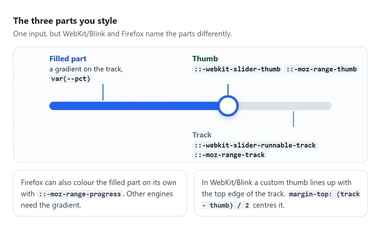
Start by removing the built-in look, then style each part:
.slider {
  -webkit-appearance: none; appearance: none;
  width: 100%; height: 22px; background: transparent;
}
.slider::-webkit-slider-runnable-track {
  height: 8px; border-radius: 99px; background: #dde1e7;
}
.slider::-webkit-slider-thumb {
  -webkit-appearance: none; appearance: none;
  width: 22px; height: 22px; border-radius: 50%; background: #2563eb;
  margin-top: -7px;   /* (8px track - 22px thumb) / 2 */
}
.slider::-moz-range-track {
  height: 8px; border-radius: 99px; background: #dde1e7;
}
.slider::-moz-range-thumb {
  width: 22px; height: 22px; border: 0; border-radius: 50%; background: #2563eb;
}
The margin-top line is there because a custom WebKit thumb lines up with the top edge of the track. Without it, a thumb taller than the track hangs below it. Firefox centres the thumb itself.
Why the rules are written twice
It is tempting to join the two thumb selectors with a comma. That rule then does nothing in any browser.
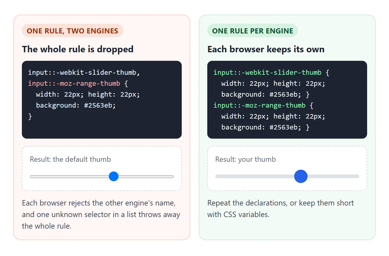
In CSS, a selector list with one invalid selector is thrown away as a whole. Chrome does not know ::-moz-range-thumb, and Firefox does not know ::-webkit-slider-thumb. So each engine gets its own rule, even though the declarations repeat.
Fill the track up to the thumb
A filled track shows how far along the value is. Firefox has a part for it, ::-moz-range-progress. For the other engines, paint the track with a hard-edged gradient and move the edge with a CSS variable:
.slider::-webkit-slider-runnable-track {
  background: linear-gradient(to right, #2563eb var(--pct), #dde1e7 var(--pct));
}
slider.addEventListener('input', () => {
  const pct = (slider.value - slider.min) / (slider.max - slider.min) * 100;
  slider.style.setProperty('--pct', pct + '%');
});
Try colours and sizes here. The CSS under the preview is rewritten as you change them, ready to copy. Untick Centre thumb to see the thumb drop off the track.
<!doctype html>
<html lang="en">
<head>
<meta charset="utf-8">
<meta name="viewport" content="width=device-width, initial-scale=1">
<title>Range slider style builder</title>
<style>
  body { margin: 0; padding: 16px; font-family: system-ui, sans-serif; background: #f4f5f7; color: #1d2330; }
  .preview { background: #fff; border-radius: 12px; padding: 18px 16px; box-shadow: 0 2px 8px rgba(0, 0, 0, .06); }
  .preview p { margin: 0 0 8px; font-size: 14px; }
  .controls { display: grid; grid-template-columns: repeat(auto-fit, minmax(150px, 1fr)); gap: 8px 14px; margin: 14px 0; font-size: 13px; }
  .controls label { display: flex; align-items: center; justify-content: space-between; gap: 8px; }
  .controls input[type="range"] { width: 90px; }
  pre { margin: 0; max-height: 250px; overflow: auto; padding: 12px; border-radius: 10px;
        background: #1d2330; color: #e6e9ef; font: 12px/1.45 ui-monospace, Consolas, monospace; }

  /* ---- the styled slider: every value comes from a CSS variable ---- */
  .slider {
    --track: #dde1e7; --fill: #2563eb; --thumb: #2563eb; --th: 8px; --ts: 22px; --pct: 40%;
    --bg: linear-gradient(to right, var(--fill) var(--pct), var(--track) var(--pct));
    -webkit-appearance: none; appearance: none;
    width: 100%; height: var(--ts); margin: 0; background: transparent; cursor: pointer;
  }
  .slider.flat { --bg: var(--track); }
  /* WebKit / Blink (Chrome, Edge, Safari) */
  .slider::-webkit-slider-runnable-track { height: var(--th); border-radius: 99px; background: var(--bg); }
  .slider::-webkit-slider-thumb {
    -webkit-appearance: none; appearance: none;
    width: var(--ts); height: var(--ts); border-radius: 50%; border: 0; background: var(--thumb);
    margin-top: calc((var(--th) - var(--ts)) / 2);   /* centre the thumb on the track */
  }
  .slider.nofix::-webkit-slider-thumb { margin-top: 0; }
  /* Firefox: separate rules, never in the same selector list */
  .slider::-moz-range-track { height: var(--th); border-radius: 99px; background: var(--bg); }
  .slider::-moz-range-thumb { width: var(--ts); height: var(--ts); border-radius: 50%; border: 0; background: var(--thumb); }
  .slider:focus-visible { outline: 2px solid var(--thumb); outline-offset: 4px; }
</style>
</head>
<body>
<div class="preview">
  <p>Preview: <b id="val">40</b></p>
  <input type="range" class="slider" id="s" min="0" max="100" value="40" aria-label="Preview slider">
</div>

<div class="controls">
  <label>Track <input type="color" id="cTrack" value="#dde1e7"></label>
  <label>Fill <input type="color" id="cFill" value="#2563eb"></label>
  <label>Thumb <input type="color" id="cThumb" value="#2563eb"></label>
  <label>Track height <input type="range" id="th" min="2" max="16" value="8"></label>
  <label>Thumb size <input type="range" id="ts" min="12" max="36" value="22"></label>
  <label>Filled track <input type="checkbox" id="filled" checked></label>
  <label>Centre thumb (WebKit) <input type="checkbox" id="fix" checked></label>
</div>

<pre id="css"></pre>

<script>
  const s = document.getElementById('s');
  const $ = (id) => document.getElementById(id);

  // the filled part: value as a percentage of the min-max span
  function paintFill() {
    const pct = (s.value - s.min) / (s.max - s.min) * 100;
    s.style.setProperty('--pct', pct + '%');
    $('val').textContent = s.value;
  }

  function update() {
    const v = { track: $('cTrack').value, fill: $('cFill').value, thumb: $('cThumb').value,
                th: $('th').value + 'px', ts: $('ts').value + 'px' };
    s.style.setProperty('--track', v.track);
    s.style.setProperty('--fill', v.fill);
    s.style.setProperty('--thumb', v.thumb);
    s.style.setProperty('--th', v.th);
    s.style.setProperty('--ts', v.ts);
    s.classList.toggle('flat', !$('filled').checked);
    s.classList.toggle('nofix', !$('fix').checked);
    printCss(v);
  }

  function printCss(v) {
    const bg = $('filled').checked
      ? `linear-gradient(to right, ${v.fill} var(--pct), ${v.track} var(--pct))` : v.track;
    const mt = $('fix').checked ? `\n  margin-top: calc((${v.th} - ${v.ts}) / 2);` : '';
    $('css').textContent =
`.slider {
  -webkit-appearance: none; appearance: none;
  width: 100%; height: ${v.ts}; background: transparent;
}
.slider::-webkit-slider-runnable-track {
  height: ${v.th}; border-radius: 99px;
  background: ${bg};
}
.slider::-webkit-slider-thumb {
  -webkit-appearance: none; appearance: none;
  width: ${v.ts}; height: ${v.ts}; border: 0;
  border-radius: 50%; background: ${v.thumb};${mt}
}
.slider::-moz-range-track {
  height: ${v.th}; border-radius: 99px;
  background: ${bg};
}
.slider::-moz-range-thumb {
  width: ${v.ts}; height: ${v.ts}; border: 0;
  border-radius: 50%; background: ${v.thumb};
}` + ($('filled').checked ? `
/* JS: slider.style.setProperty('--pct', percent + '%') on input */` : '');
  }

  s.addEventListener('input', paintFill);
  document.querySelectorAll('.controls input').forEach((c) => c.addEventListener('input', update));
  paintFill();
  update();
</script>
</body>
</html>
Tick marks and vertical sliders
Ticks. Point the slider at a <datalist> with list, and Chromium draws a tick at each option value:
<input type="range" min="0" max="100" step="25" list="marks">
<datalist id="marks">
  <option value="0"></option><option value="50"></option><option value="100"></option>
</datalist>
Not every browser draws them. In Chromium, the ticks also disappear once the slider has appearance: none. For styled sliders, print the step labels as plain text under the track. HTML datalist covers the element itself.
Vertical. Set a vertical writing mode on the slider and give it a height:
.vertical {
  writing-mode: vertical-lr;
  direction: rtl;   /* min at the bottom, max at the top */
  height: 180px;
}
With writing-mode: vertical-lr alone, the minimum sits at the top. direction: rtl flips it so the slider fills upward, like a volume control. Older guides use -webkit-appearance: slider-vertical or orient="vertical". Those are non-standard; writing-mode is the standard way.
A finished example: a price range filter
HTML has no slider with two thumbs. A min-max slider is two range inputs placed on the same track, one for each end. This filter hides the products outside the chosen price range.
<!doctype html>
<html lang="en">
<head>
<meta charset="utf-8">
<meta name="viewport" content="width=device-width, initial-scale=1">
<title>Price range filter</title>
<style>
  body { margin: 0; padding: 16px; font-family: system-ui, sans-serif; background: #f4f5f7; color: #1d2330; }
  .filter { background: #fff; border-radius: 12px; padding: 14px 16px 16px; box-shadow: 0 2px 8px rgba(0, 0, 0, .06); }
  .head { display: flex; justify-content: space-between; align-items: baseline; margin-bottom: 12px; }
  .head b { font-size: 15px; }
  output { font: 600 15px ui-monospace, Consolas, monospace; color: #1d4ed8; }

  /* two range inputs stacked on one track */
  .dual { position: relative; height: 24px; }
  .dual .rail, .dual .fill { position: absolute; top: 9px; height: 6px; border-radius: 99px; }
  .dual .rail { left: 0; right: 0; background: #dde1e7; }
  .dual .fill { background: #2563eb; }
  .dual input {
    position: absolute; left: 0; top: 0; width: 100%; height: 24px; margin: 0;
    -webkit-appearance: none; appearance: none; background: transparent;
    pointer-events: none;   /* the inputs ignore clicks... */
  }
  #hi { z-index: 1; }
  .dual input::-webkit-slider-thumb {
    -webkit-appearance: none; appearance: none; width: 22px; height: 22px; border-radius: 50%;
    background: #fff; border: 3px solid #2563eb; cursor: pointer;
    pointer-events: auto;   /* ...except on the thumbs */
  }
  .dual input::-moz-range-thumb {
    width: 16px; height: 16px; border-radius: 50%;
    background: #fff; border: 3px solid #2563eb; cursor: pointer;
    pointer-events: auto;
  }
  .dual input:focus-visible::-webkit-slider-thumb { outline: 2px solid #1d4ed8; outline-offset: 2px; }

  .count { margin: 14px 2px 8px; font-size: 13px; color: #5b6270; }
  ul { list-style: none; margin: 0; padding: 0; display: grid; grid-template-columns: repeat(auto-fill, minmax(150px, 1fr)); gap: 8px; }
  li { background: #fff; border-radius: 10px; padding: 10px 12px; font-size: 14px; display: flex; justify-content: space-between; gap: 8px; }
  li span { font-family: ui-monospace, Consolas, monospace; color: #5b6270; }
  li[hidden] { display: none; }
</style>
</head>
<body>
<div class="filter">
  <div class="head">
    <b>Price</b>
    <output id="out">$0 - $500</output>
  </div>
  <div class="dual">
    <div class="rail"></div>
    <div class="fill" id="fill"></div>
    <input type="range" id="lo" min="0" max="500" step="10" value="0" aria-label="Minimum price">
    <input type="range" id="hi" min="0" max="500" step="10" value="500" aria-label="Maximum price">
  </div>
</div>

<p class="count" id="count"></p>
<ul id="list">
  <li data-price="19">Phone case <span>$19</span></li>
  <li data-price="45">Desk lamp <span>$45</span></li>
  <li data-price="79">Backpack <span>$79</span></li>
  <li data-price="129">Headphones <span>$129</span></li>
  <li data-price="189">Office chair <span>$189</span></li>
  <li data-price="249">Monitor <span>$249</span></li>
  <li data-price="349">Tablet <span>$349</span></li>
  <li data-price="489">Camera <span>$489</span></li>
</ul>

<script>
  const lo = document.getElementById('lo');
  const hi = document.getElementById('hi');
  const fill = document.getElementById('fill');
  const items = document.querySelectorAll('#list li');
  const gap = 10;  // the two thumbs never cross

  function update(e) {
    let a = lo.valueAsNumber, b = hi.valueAsNumber;
    // push back the thumb the user is moving, so min stays below max
    if (b - a < gap) {
      if (e && e.target === lo) { a = b - gap; lo.value = a; }
      else { b = a + gap; hi.value = b; }
    }
    const max = Number(lo.max);
    // thumb centres run from 11px to (width - 11px), half of the 22px thumb
    fill.style.left = `calc(11px + (100% - 22px) * ${a / max})`;
    fill.style.right = `calc(11px + (100% - 22px) * ${1 - b / max})`;
    // near the right end, lift the min thumb so it can still be grabbed
    lo.style.zIndex = a > max / 2 ? 2 : 0;
    document.getElementById('out').value = `$${a} - $${b}`;

    let shown = 0;
    items.forEach((li) => {
      const p = Number(li.dataset.price);   // data-* values are strings too
      li.hidden = p < a || p > b;
      if (!li.hidden) shown++;
    });
    document.getElementById('count').textContent = `${shown} of ${items.length} products`;
  }

  lo.addEventListener('input', update);
  hi.addEventListener('input', update);
  update();
</script>
</body>
</html>
Stacking two inputs creates a problem. The top input covers the bottom one completely, so every press lands on the top input, even over the other thumb.
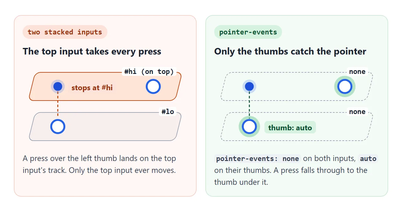
The fix is pointer-events:
.dual input { pointer-events: none; }
.dual input::-webkit-slider-thumb { pointer-events: auto; }
.dual input::-moz-range-thumb { pointer-events: auto; }
The inputs ignore the pointer, and their thumbs accept it. Three more details make it usable:
- Keep the thumbs apart. In the
inputhandler, if the minimum passes the maximum, push back the thumb being moved. - Lift the lower thumb near the right end. When both thumbs sit at the maximum, the lower input's thumb is under the other one. Raising its
z-indexkeeps it reachable. - Draw the range yourself. A separate bar between the two thumb positions shows the selected range.
When it does not work
| What you see | Cause | Fix |
|---|---|---|
| The CSS changes nothing | -webkit- and -moz- selectors share one rule |
One rule per engine |
| The thumb stays the default shape | appearance: none missing on the input or the WebKit thumb |
Add it to both |
| The thumb hangs below the track | WebKit lines a custom thumb up with the track top | margin-top: (track - thumb) / 2 on the thumb |
Adding to the value gives "25050" |
value is a string |
valueAsNumber or Number() |
| The number updates only on release | Listening to change |
Listen to input |
| Two-thumb slider: only one thumb moves | The top input covers the bottom one | pointer-events: none on inputs, auto on thumbs |
| Two-thumb slider: min passes max | Nothing stops the thumbs crossing | Clamp in the input handler |
| No tick marks | The browser does not draw them, or appearance: none hides them |
Text labels under the track |
Share it as a link
A slider has to be moved to be judged. A screenshot shows one position, and an .html attachment may open as plain code, or not at all, on a phone.
To send the working version, paste the page into a NOS document and choose Create share link. HTML to link walks through it.
The page renders as written and its scripts run, so the people you send it to can drag the sliders and watch the list filter. If you change the code later, the same link shows the new version.