To change the colour of a checkbox with CSS, set accent-color. One line recolours checked checkboxes, selected radio buttons, range sliders and progress bars, and the controls keep their native keyboard handling and focus ring:
:root { accent-color: #e11d48; }
Pick a colour below and watch which controls follow it and which do not.
<!doctype html>
<html lang="en">
<head>
<meta charset="utf-8">
<meta name="viewport" content="width=device-width, initial-scale=1">
<title>accent-color picker</title>
<style>
  body { margin: 0; padding: 14px; font-family: system-ui, sans-serif; background: #f4f5f7; color: #1d2330; }
  .bar { display: flex; align-items: center; gap: 10px; margin-bottom: 12px; font-size: 14px; }
  code { font: 13px ui-monospace, Consolas, monospace; background: #e8ebf0; padding: 2px 6px; border-radius: 5px; }
  form {
    accent-color: #e11d48;  /* one property, inherited by every control inside */
    display: grid; grid-template-columns: 1fr 1fr; gap: 10px;
  }
  fieldset { margin: 0; border: 1px solid #dfe3e8; border-radius: 10px; background: #fff; padding: 10px 12px; }
  legend { font-size: 12px; font-weight: 700; padding: 0 4px; }
  .yes legend { color: #0f5132; } .no legend { color: #9a3412; }
  label { display: flex; align-items: center; gap: 8px; font-size: 14px; margin: 6px 0; }
  input[type=range], progress, select, input[type=text], meter { width: 100%; box-sizing: border-box; }
  @media (max-width: 460px) { form { grid-template-columns: 1fr; } }
</style>
</head>
<body>
<div class="bar">
  <input type="color" id="pick" value="#e11d48" aria-label="Accent colour">
  <code id="out">accent-color: #e11d48;</code>
</div>

<form id="f">
  <fieldset class="yes">
    <legend>Changes colour</legend>
    <label><input type="checkbox" checked> Checkbox (checked)</label>
    <label><input type="radio" name="r" checked> Radio (selected)</label>
    <label>Range <input type="range" value="60"></label>
    <label>Progress <progress value="60" max="100"></progress></label>
  </fieldset>
  <fieldset class="no">
    <legend>Stays the same</legend>
    <label><input type="checkbox"> Checkbox (unchecked)</label>
    <label><select><option>Select</option></select></label>
    <label><input type="text" value="Text input"></label>
    <label>Meter <meter value="0.6"></meter></label>
    <label><button type="button">Button</button></label>
  </fieldset>
</form>

<script>
  const pick = document.getElementById('pick');
  const form = document.getElementById('f');
  const out = document.getElementById('out');

  pick.addEventListener('input', () => {
    form.style.accentColor = pick.value;  // set it once on the parent
    out.textContent = 'accent-color: ' + pick.value + ';';
  });
</script>
</body>
</html>
Which controls accent-color changes
The property only reaches controls that have an "accent" part the browser draws itself. Measured in Chromium, four do. Other browsers draw these controls differently, so the exact look varies.
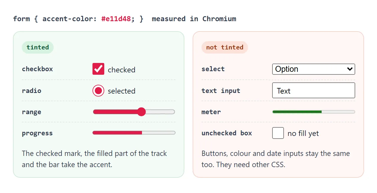
| Control | What takes the colour | Changes? |
|---|---|---|
input type="checkbox" |
The filled box when checked | Yes |
input type="radio" |
The dot and ring when selected | Yes |
input type="range" |
The thumb and the filled part of the track | Yes |
progress |
The bar | Yes |
select, text inputs, button |
Nothing | No |
meter, colour and date inputs |
Nothing | No |
An unchecked checkbox looks the same with or without accent-color. The colour appears once the box is ticked. For the other details of each control, see the guides to the HTML checkbox, the radio button and the range slider.
Set it once on :root
accent-color is inherited, like color. A rule on :root reaches every supported control on the page. A rule on one form or one wrapper covers only the controls inside it.
:root { --brand: #7c3aed; accent-color: var(--brand); }
.danger-zone { accent-color: #dc2626; }  /* override for one section */
The default value is auto, which lets the browser use its own accent, often the operating system's. Keeping the colour in a variable lets buttons and links share it.
The tick colour is picked for you
You set the fill colour. The browser decides the colour of the tick inside the box so that it stays readable against your fill.
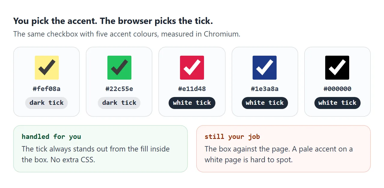
In Chromium, pale accents such as #fef08a get a dark tick. Saturated or dark ones such as #e11d48 get a white tick. With a pale accent, the empty part of a slider track also turns dark so the filled part still stands out.
<!doctype html>
<html lang="en">
<head>
<meta charset="utf-8">
<meta name="viewport" content="width=device-width, initial-scale=1">
<title>accent-color contrast</title>
<style>
  body { margin: 0; padding: 14px; font-family: system-ui, sans-serif; background: #f4f5f7; color: #1d2330; }
  button { font: inherit; font-size: 14px; padding: 7px 12px; border-radius: 8px; border: 1px solid #c9ced6; background: #fff; cursor: pointer; }
  .stage {
    color-scheme: light;  /* the toggle switches this to dark */
    background: Canvas; color: CanvasText;  /* system colours follow color-scheme */
    display: grid; grid-template-columns: 1fr 1fr; gap: 10px;
    margin-top: 12px; padding: 12px; border-radius: 12px; border: 1px solid #dfe3e8;
  }
  .stage.dark { color-scheme: dark; }
  .card { border: 1px solid color-mix(in srgb, CanvasText 18%, transparent); border-radius: 10px; padding: 10px 12px; }
  .card code { font: 12px ui-monospace, Consolas, monospace; }
  .light-accent { accent-color: #fde68a; }  /* very light */
  .dark-accent  { accent-color: #1e3a8a; }  /* very dark */
  label { display: flex; align-items: center; gap: 8px; margin: 8px 0; font-size: 14px; }
  input[type=checkbox], input[type=radio] { width: 22px; height: 22px; margin: 0; }
  input[type=range], progress { width: 100%; box-sizing: border-box; }
  @media (max-width: 420px) { .stage { grid-template-columns: 1fr; } }
</style>
</head>
<body>
<button id="scheme" type="button">color-scheme: light (switch to dark)</button>

<div class="stage" id="stage">
  <div class="card light-accent">
    <code>accent-color: #fde68a</code>
    <label><input type="checkbox" checked> Dark tick</label>
    <label><input type="radio" checked> Radio</label>
    <input type="range" value="65" aria-label="Range">
    <progress value="65" max="100"></progress>
  </div>
  <div class="card dark-accent">
    <code>accent-color: #1e3a8a</code>
    <label><input type="checkbox" checked> White tick</label>
    <label><input type="radio" checked> Radio</label>
    <input type="range" value="65" aria-label="Range">
    <progress value="65" max="100"></progress>
  </div>
</div>

<script>
  const stage = document.getElementById('stage');
  const btn = document.getElementById('scheme');

  btn.addEventListener('click', () => {
    const dark = stage.classList.toggle('dark');
    btn.textContent = dark ? 'color-scheme: dark (switch to light)' : 'color-scheme: light (switch to dark)';
  });
</script>
</body>
</html>
What the browser does not fix is the box against the page. A pale yellow checkbox on a white page is hard to see. Check the accent against your background, not only against the tick.
accent-color and dark mode
accent-color does not switch to a dark look by itself. color-scheme does that part: with color-scheme: dark, the browser draws native controls with dark backgrounds, borders and tracks.
The two work together. Set color-scheme for the surroundings and accent-color for the highlight. A brand colour that looks right on white often reads better one or two shades lighter on a dark panel:
:root { color-scheme: light; accent-color: #7c3aed; }
:root.dark { color-scheme: dark; accent-color: #a78bfa; }
For the full set of dark colours and the prefers-color-scheme media query, see dark mode CSS.
caret-color: the same idea for text inputs
Text inputs do not take accent-color. Their accent is the blinking text cursor, and a sibling property colours it:
input[type="text"], textarea { caret-color: var(--brand); }
caret-color also works on contenteditable elements. Its default, auto, usually follows the text colour. For the border and focus ring of a text field, use normal border and outline rules.
What accent-color can't do
accent-color changes colour, nothing else. The tick shape, the border, the corner radius and the thumb shape stay whatever the browser draws. For those, you have to switch the native look off.
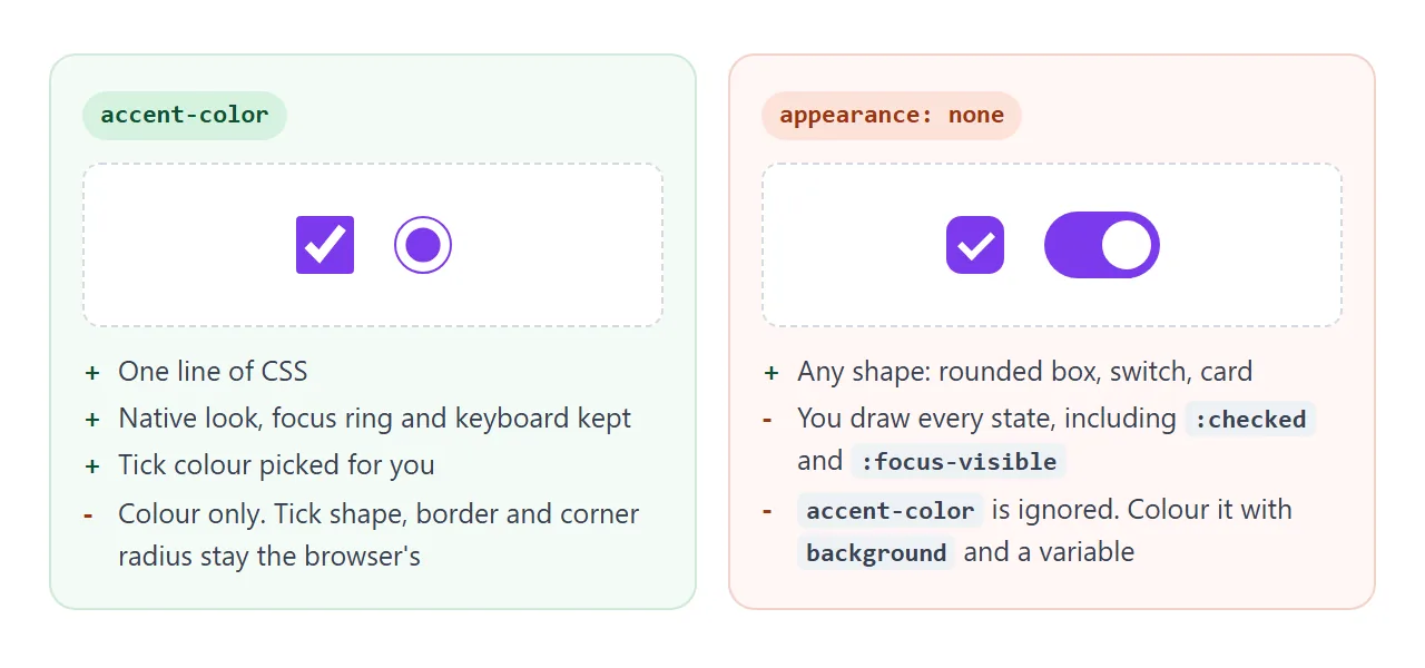
appearance: none removes the native drawing, and accent-color stops having any effect on that control. You then style :checked, :focus-visible and :disabled yourself, usually with background and the same brand variable. A CSS toggle switch is the classic example.
A finished example: a themed settings form
This form puts it together. One brand variable feeds accent-color on :root, caret-color on the text field and the background of a custom switch. Turning dark mode on flips color-scheme and the variable at once.
<!doctype html>
<html lang="en">
<head>
<meta charset="utf-8">
<meta name="viewport" content="width=device-width, initial-scale=1">
<title>Themed settings form</title>
<style>
  :root {
    --brand: #7c3aed;
    --bg: #f4f5f7; --panel: #fff; --text: #1d2330; --line: #dfe3e8;
    color-scheme: light;
    accent-color: var(--brand);  /* every checkbox, radio, range and progress */
  }
  :root.dark {
    --brand: #a78bfa;  /* a lighter shade reads better on a dark panel */
    --bg: #111318; --panel: #1b1e25; --text: #e7e9ee; --line: #2e333d;
    color-scheme: dark;  /* dark native controls and scrollbars */
  }
  body { margin: 0; padding: 14px; font-family: system-ui, sans-serif; background: var(--bg); color: var(--text); }
  form { background: var(--panel); border: 1px solid var(--line); border-radius: 12px; padding: 14px 16px; max-width: 460px; }
  h2 { margin: 0 0 10px; font-size: 17px; }
  label, .row { display: flex; align-items: center; gap: 8px; margin: 9px 0; font-size: 14px; }
  input[type=text] {
    flex: 1; font: inherit; padding: 7px 9px; border-radius: 8px;
    border: 1px solid var(--line); background: var(--bg); color: var(--text);
    caret-color: var(--brand);  /* the blinking text cursor */
  }
  input[type=range], progress { flex: 1; }
  /* Fully custom control: accent-color can't reach it, so use the variable */
  .switch { appearance: none; width: 38px; height: 22px; margin: 0; border-radius: 99px; background: var(--line); position: relative; cursor: pointer; }
  .switch::after { content: ""; position: absolute; top: 3px; left: 3px; width: 16px; height: 16px; border-radius: 50%; background: #fff; transition: left .15s; }
  .switch:checked { background: var(--brand); }
  .switch:checked::after { left: 19px; }
  .switch:focus-visible { outline: 2px solid var(--brand); outline-offset: 2px; }
  button { font: inherit; padding: 8px 14px; border: 0; border-radius: 8px; background: var(--brand); color: #fff; cursor: pointer; }
  .dark button { color: #1b1e25; }
  .note { font-size: 12px; opacity: .75; margin: 2px 0 12px; }
  pre { margin: 10px 0 0; font-size: 12px; white-space: pre-wrap; min-height: 2.6em; }
</style>
</head>
<body>
<form id="settings">
  <h2>Settings</h2>
  <label><input type="checkbox" class="switch" id="dark" name="dark"> Dark mode (custom switch)</label>
  <label>Display name <input type="text" name="name" value="Ada"></label>
  <label><input type="checkbox" name="email" checked> Email me a weekly summary</label>
  <div class="row" role="radiogroup" aria-label="Density">
    <label><input type="radio" name="density" value="compact"> Compact</label>
    <label><input type="radio" name="density" value="comfortable" checked> Comfortable</label>
  </div>
  <label>Volume <input type="range" name="volume" value="70"></label>
  <label>Storage <progress value="0.42">42%</progress></label>
  <p class="note">The switch uses appearance: none, so accent-color no longer reaches it. It reads var(--brand) instead.</p>
  <button type="submit">Save</button>
  <pre id="out"></pre>
</form>

<script>
  const form = document.getElementById('settings');
  const out = document.getElementById('out');

  document.getElementById('dark').addEventListener('change', (e) => {
    document.documentElement.classList.toggle('dark', e.target.checked);
  });

  form.addEventListener('submit', (e) => {
    e.preventDefault();  // demo only: show what would be sent
    out.textContent = [...new FormData(form)].map(([k, v]) => k + '=' + v).join('\n');
  });
</script>
</body>
</html>
:rootholds--brand,accent-colorandcolor-scheme..darkon<html>swaps the colours, including a lighter brand shade.- The switch uses
appearance: none, so it readsvar(--brand)directly. That is the fallback for any fully custom control.
When it does not work
| What you see | Cause | Fix |
|---|---|---|
| A select or text field keeps its colour | Those controls are not tinted by accent-color |
Style them with border, background and caret-color |
| Nothing changes on one checkbox | It has appearance: none |
Colour its :checked state with background |
| Unchecked boxes look the same | The accent only fills the checked state | Expected. Tick one to see it |
| No effect at all | Set on a sibling, not an ancestor | Set it on the input, its form, or :root |
| Colour looks different in another browser | Each browser and OS draws native controls its own way | Test in each one, or draw a custom control |
| The box is hard to see | A pale accent on a light page | Use a darker accent on light pages, a lighter one on dark pages |
Share it as a link
Colour choices are easier to judge on a real screen than in a screenshot, especially dark mode on a phone. A link lets the people you send it to tick the boxes and drag the slider themselves.
Paste the page into a NOS document and choose Create share link. HTML to link walks through it. The page renders as written and its scripts run, so the picker and the dark mode switch work.
If you change the brand colour later, the same link shows the new version.