appearance: none stops the browser from drawing a form control in its native style. On a checkbox, the box and tick go. On a select, the arrow goes. On a range slider, the track goes.
The control still works, still submits and still takes focus. You now draw every state yourself.
Press the button below. The same six controls switch between appearance: auto and appearance: none, and the numbers show each one's rendered size.
<!doctype html>
<html lang="en">
<head>
<meta charset="utf-8">
<meta name="viewport" content="width=device-width, initial-scale=1">
<title>appearance: auto vs none</title>
<style>
  body { margin: 0; padding: 14px; font-family: system-ui, sans-serif; background: #f4f5f7; color: #1d2330; }
  #flip {
    font: 600 14px system-ui, sans-serif; padding: 9px 14px; margin-bottom: 12px;
    border: 0; border-radius: 8px; background: #1d4ed8; color: #fff; cursor: pointer;
  }
  .set { background: #fff; border-radius: 12px; padding: 4px 14px; }
  .row {
    display: grid; grid-template-columns: 80px 1fr 64px; align-items: center; gap: 8px;
    min-height: 46px; border-bottom: 1px solid #eceef1; font-size: 14px;
  }
  .row:last-child { border-bottom: 0; }
  .row > :nth-child(2) { justify-self: start; max-width: 100%; }
  .size { font: 12px ui-monospace, Consolas, monospace; color: #6b7280; text-align: right; }

  /* the whole experiment: one declaration on every control */
  .set.none :is(input, select, button) {
    -webkit-appearance: none;
    appearance: none;
  }
</style>
</head>
<body>
<button id="flip" type="button">Switch to appearance: none</button>

<div class="set" id="set">
  <div class="row"><span>checkbox</span><input type="checkbox" checked><span class="size"></span></div>
  <div class="row"><span>radio</span><input type="radio" checked><span class="size"></span></div>
  <div class="row"><span>select</span><select><option>Monthly</option><option>Yearly</option></select><span class="size"></span></div>
  <div class="row"><span>range</span><input type="range"><span class="size"></span></div>
  <div class="row"><span>button</span><button type="button">Save</button><span class="size"></span></div>
  <div class="row"><span>search</span><input type="search" value="shoes"><span class="size"></span></div>
</div>

<script>
  const set = document.getElementById('set');
  const flip = document.getElementById('flip');

  // print each control's rendered width x height next to it
  function measure() {
    set.querySelectorAll('.row').forEach((row) => {
      const r = row.children[1].getBoundingClientRect();
      row.querySelector('.size').textContent = Math.round(r.width) + ' x ' + Math.round(r.height);
    });
  }

  flip.addEventListener('click', () => {
    const on = set.classList.toggle('none');
    flip.textContent = on ? 'Switch to appearance: auto' : 'Switch to appearance: none';
    measure();
  });

  measure();
</script>
</body>
</html>
The checkbox and the radio vanish completely. The select loses its arrow and shrinks. The button falls back to a plain grey face with a hard border. That is the starting point you style from.
What appearance: none removes on each control
The property only changes how a control is drawn. The element, its value and its keyboard behaviour stay the same. Anything the browser painted for you, though, is gone.
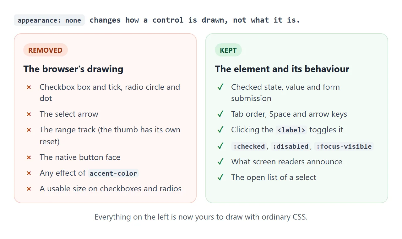
| Control | What disappears | What you add |
|---|---|---|
| Checkbox, radio | The box, tick, circle and dot, and the size | width, height, border, a :checked style |
<select> |
The arrow | Right padding and your own arrow |
| Range slider | The track | Track and thumb through their pseudo-elements |
| Button | The native face | border, background, padding, font |
| Search input | The native field style | A border and padding. The clear (x) is a separate part |
One more thing stops working: accent-color. It only tints the native drawing, so it has nothing left to colour. Use background on :checked instead.
Why the checkbox vanishes
A checkbox with appearance: none has no drawing and no default size. In the demo above it renders at 0 by 0 pixels.
The input is still there: a click on its label ticks it, and Space still toggles it once it has focus. Nobody can see it, though.
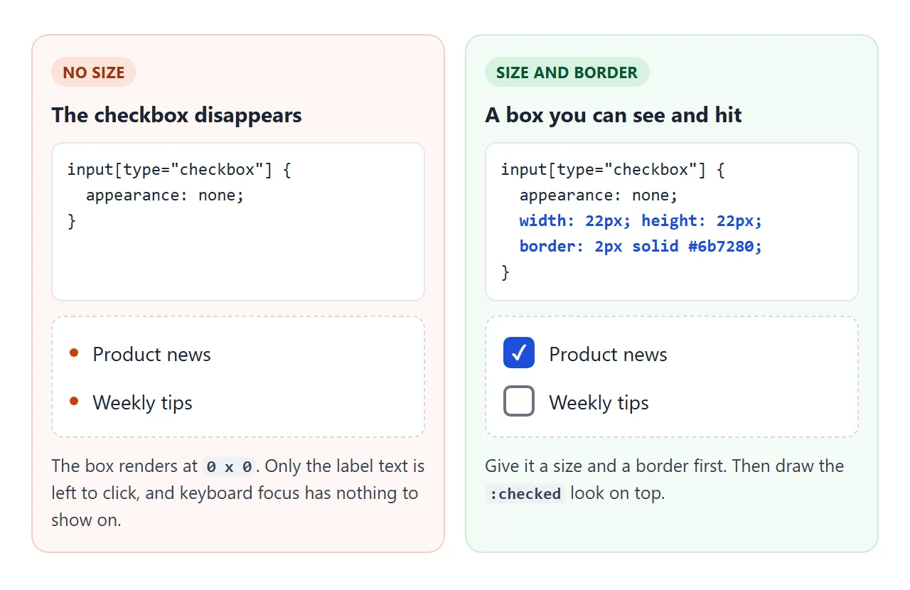
So the first three lines after appearance: none are always the same:
input[type="checkbox"] {
  appearance: none;
  width: 22px; height: 22px;
  border: 2px solid #6b7280;
}
The radio button works the same way, with border-radius: 50%. The checkbox guide covers values, labels and Select All. If you want an on/off switch instead of a tick, the toggle switch builds one from the same input.
Rebuild the states: checked, focus, disabled
Every state the browser used to show is now blank until you style it. Work through them in order.
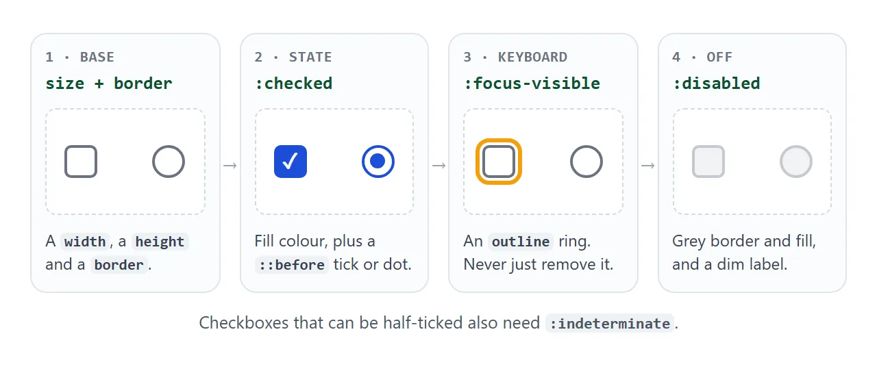
- Base. Width, height, border and radius, as above.
- Checked.
:checkedchanges the fill. A::beforepseudo-element draws the tick or the dot. It works on inputs onceappearanceisnone. - Focus. Keep a visible
:focus-visiblering. The browser's default focus outline still applies, but a reset that setsoutline: noneremoves it, and nothing replaces it. - Disabled.
:disabledgreys the box. Dim the label too, withlabel:has(input:disabled).
Try the result with the mouse, then with Tab and Space:
<!doctype html>
<html lang="en">
<head>
<meta charset="utf-8">
<meta name="viewport" content="width=device-width, initial-scale=1">
<title>Rebuild a checkbox and radio after appearance: none</title>
<style>
  body { margin: 0; padding: 16px; font-family: system-ui, sans-serif; background: #f4f5f7; color: #1d2330; }
  form { background: #fff; border-radius: 12px; padding: 14px 16px; }
  fieldset { border: 0; margin: 0 0 10px; padding: 0; }
  legend { font-weight: 700; font-size: 14px; margin-bottom: 6px; padding: 0; }
  label { display: flex; align-items: center; gap: 10px; padding: 5px 0; font-size: 15px; cursor: pointer; }

  input[type="checkbox"], input[type="radio"] {
    -webkit-appearance: none;
    appearance: none;
    margin: 0;
    /* 1. size: without it the box collapses to 0 x 0 */
    width: 22px; height: 22px; flex: none;
    border: 2px solid #6b7280; background: #fff;
    display: inline-grid; place-content: center;
    cursor: pointer;
  }
  input[type="checkbox"] { border-radius: 5px; }
  input[type="radio"] { border-radius: 50%; }

  /* 2. the mark, hidden until checked */
  input[type="checkbox"]::before {
    content: ""; width: 12px; height: 12px; transform: scale(0);
    background: #fff;
    clip-path: polygon(14% 44%, 0 65%, 50% 100%, 100% 16%, 80% 0, 43% 62%);
  }
  input[type="radio"]::before {
    content: ""; width: 10px; height: 10px; border-radius: 50%; transform: scale(0);
    background: #1d4ed8;
  }

  /* 3. checked state */
  input[type="checkbox"]:checked { background: #1d4ed8; border-color: #1d4ed8; }
  input[type="radio"]:checked { border-color: #1d4ed8; }
  input:checked::before { transform: scale(1); }

  /* 4. keyboard focus ring */
  input:focus-visible { outline: 3px solid #f59e0b; outline-offset: 2px; }

  /* 5. disabled */
  input:disabled { border-color: #c4c8cf; background: #f1f2f4; cursor: not-allowed; }
  label:has(input:disabled) { color: #9aa0a9; cursor: not-allowed; }

  button { font: 600 14px system-ui, sans-serif; padding: 9px 14px; border: 0; border-radius: 8px; background: #1d4ed8; color: #fff; cursor: pointer; }
  output { display: block; margin-top: 10px; font: 13px ui-monospace, Consolas, monospace; color: #0f5132; min-height: 1.4em; }
</style>
</head>
<body>
<form id="f">
  <fieldset>
    <legend>Email me about</legend>
    <label><input type="checkbox" name="topic" value="news" checked> Product news</label>
    <label><input type="checkbox" name="topic" value="tips"> Weekly tips</label>
    <label><input type="checkbox" name="topic" value="beta" disabled> Beta invites (closed)</label>
  </fieldset>
  <fieldset>
    <legend>How often</legend>
    <label><input type="radio" name="freq" value="daily"> Daily</label>
    <label><input type="radio" name="freq" value="weekly" checked> Weekly</label>
  </fieldset>
  <button>Submit</button>
  <output id="out"></output>
</form>

<script>
  // the inputs still submit like normal ones: read them with FormData
  document.getElementById('f').addEventListener('submit', (e) => {
    e.preventDefault();
    const data = new FormData(e.target);
    document.getElementById('out').textContent =
      'topic=' + data.getAll('topic').join(',') + '  freq=' + data.get('freq');
  });
</script>
</body>
</html>
The submit line proves the point of the whole technique. The custom boxes send the same topic and freq values as plain inputs, because they are plain inputs. If your checkbox can be half-ticked from script, add an :indeterminate style as well.
Select, range, search and button: the extra parts
Some controls are built from several parts, and appearance: none on the element does not reach all of them.
- Select. The arrow goes, so add
padding-rightand draw one with a background image. The open list is still drawn by the browser. The select tag guide covers what CSS can and cannot reach there. - Range. The track goes, but the thumb has its own reset. Target
::-webkit-slider-thumband::-moz-range-thumb. The range slider guide styles both parts in full. - Search. The clear (x) button that some browsers draw is a separate part. It stays until you hide it.
- Button. The browser's own background and border stay until you replace them. The button CSS guide starts from this reset.
The two lines that catch people out:
input[type="range"]::-webkit-slider-thumb { -webkit-appearance: none; appearance: none; }
input[type="search"]::-webkit-search-cancel-button { display: none; }
A finished form
Here all four kinds of control share one reset and get their own drawing back. Every control also gets the same amber focus ring, so Tab through it to check.
<!doctype html>
<html lang="en">
<head>
<meta charset="utf-8">
<meta name="viewport" content="width=device-width, initial-scale=1">
<title>A form styled from appearance: none</title>
<style>
  :root { --brand: #0f766e; --line: #c9cdd4; }
  body { margin: 0; padding: 16px; font-family: system-ui, sans-serif; background: #eef2f1; color: #1d2330; }
  form { background: #fff; border-radius: 14px; padding: 16px; display: grid; gap: 14px; max-width: 420px; }
  .field { display: grid; gap: 6px; font-size: 14px; font-weight: 600; }

  /* shared reset for the controls on this page */
  input, select, button {
    -webkit-appearance: none;
    appearance: none;
    font: inherit; font-weight: 400; color: inherit;
  }
  input[type="search"], select {
    border: 1.5px solid var(--line); border-radius: 10px; background-color: #fff;
    padding: 10px 12px;
  }

  /* search: the clear (x) button is a separate part */
  input[type="search"]::-webkit-search-cancel-button { display: none; }

  /* select: the arrow is gone, so draw one with two gradients */
  select {
    padding-right: 38px; cursor: pointer;
    background-image:
      linear-gradient(45deg, transparent 50%, #4b5563 50%),
      linear-gradient(135deg, #4b5563 50%, transparent 50%);
    background-position: right 18px center, right 12px center;
    background-size: 6px 6px; background-repeat: no-repeat;
  }

  /* range: the input and the thumb both need a reset */
  input[type="range"] { height: 24px; background: transparent; cursor: pointer; }
  input[type="range"]::-webkit-slider-runnable-track { height: 6px; border-radius: 3px; background: #d7dcdb; }
  input[type="range"]::-moz-range-track { height: 6px; border-radius: 3px; background: #d7dcdb; }
  input[type="range"]::-webkit-slider-thumb {
    -webkit-appearance: none; appearance: none;
    width: 22px; height: 22px; margin-top: -8px; border-radius: 50%;
    background: var(--brand); border: 3px solid #fff; box-shadow: 0 1px 4px rgba(0, 0, 0, .3);
  }
  input[type="range"]::-moz-range-thumb {
    width: 16px; height: 16px; border-radius: 50%;
    background: var(--brand); border: 3px solid #fff; box-shadow: 0 1px 4px rgba(0, 0, 0, .3);
  }

  /* button: the browser's own border and background stay until you replace them */
  button {
    border: 0; border-radius: 10px; padding: 11px 16px; background: var(--brand); color: #fff;
    font-weight: 600; cursor: pointer;
  }
  button:hover { filter: brightness(1.1); }

  /* every control gets a visible keyboard focus ring back */
  :is(input, select, button):focus-visible { outline: 3px solid #f59e0b; outline-offset: 2px; }

  output { font: 13px ui-monospace, Consolas, monospace; color: #0f5132; min-height: 1.4em; overflow-wrap: anywhere; }
</style>
</head>
<body>
<form id="f">
  <label class="field">Search products
    <input type="search" name="q" value="running shoes">
  </label>
  <label class="field">Plan
    <select name="plan">
      <option value="monthly">Monthly</option>
      <option value="yearly" selected>Yearly</option>
    </select>
  </label>
  <label class="field"><span>Budget: <span id="bv">60</span></span>
    <input type="range" name="budget" min="0" max="200" step="10" value="60" id="budget">
  </label>
  <button>Show results</button>
  <output id="out"></output>
</form>

<script>
  const budget = document.getElementById('budget');
  budget.addEventListener('input', () => { document.getElementById('bv').textContent = budget.value; });

  document.getElementById('f').addEventListener('submit', (e) => {
    e.preventDefault();  // demo only: show what would be sent
    const data = new FormData(e.target);
    document.getElementById('out').textContent = new URLSearchParams(data).toString();
  });
</script>
</body>
</html>
- One reset for
input, select, button, plusfont: inheritso controls use the page font. - The select arrow is two small gradients in the background, so no image file is needed.
- The focus ring uses
outlinewithoutline-offset. An outline takes no space, so the ring does not move the layout. The outline guide covers the details.
appearance: auto, the -webkit- prefix and base-select
Form controls get appearance: auto from the browser's own stylesheet. Setting it yourself hands drawing back to the browser. Use it to undo a global reset on one control, for example input.native { appearance: auto; }.
Older Safari versions only read -webkit-appearance. Writing both lines, prefixed first, costs nothing and covers them.
A newer value, appearance: base-select, is meant for <select>. It opts into a customizable select whose open list CSS can style. Browsers that do not support it ignore the value and show the normal select, so it is safe to add inside @supports (appearance: base-select).
When it does not work
| What you see | Cause | Fix |
|---|---|---|
| The checkbox or radio disappeared | No size after appearance: none |
Set width, height and border |
| Clicking changes nothing you can see | No :checked style |
Change the fill on :checked |
| Tab lands on the control but nothing shows | Focus outline removed and not replaced | Add a :focus-visible outline |
accent-color has no effect |
The native drawing it tints is gone | Colour :checked with background |
| The range thumb keeps its default shape | The thumb has its own appearance | Reset ::-webkit-slider-thumb, style ::-moz-range-thumb |
| The x still shows in a search box | The clear button is a separate part | ::-webkit-search-cancel-button { display: none; } |
| The button still has a grey face and border | Those are normal default styles, not the native drawing | Set border and background |
| The select opens with no arrow | The arrow was part of the native drawing | Draw one and add right padding |
Share it as a link
Custom form controls are hard to review from a screenshot. The reviewer needs to click the boxes, Tab through the fields and see the focus ring on their own device.
To send the working version, paste the page into a NOS document and choose Create share link. HTML to link walks through it.
The page renders as written and its scripts run, so the people you send it to can tick, slide and submit the form themselves. If you change the styles later, the same link shows the new version.