To make a button look good with HTML and CSS, start from a real <button> element, reset the browser's default look, then add padding, a border radius and a colour.
After that come the states: hover, pressed, keyboard focus and disabled. Each is one short rule.
Try it first. Tick the boxes one at a time and watch the button change. The CSS for each layer appears underneath.
<!doctype html>
<html lang="en">
<head>
<meta charset="utf-8">
<meta name="viewport" content="width=device-width, initial-scale=1">
<title>Button CSS, one layer at a time</title>
<style>
  body { margin: 0; padding: 16px; font-family: system-ui, sans-serif; background: #f4f5f7; color: #1d2330; }
  .controls { display: flex; flex-wrap: wrap; gap: 6px 14px; font-size: 14px; }
  .controls label { display: flex; align-items: center; gap: 6px; cursor: pointer; }
  .stage { display: grid; place-items: center; height: 96px; margin: 12px 0; border-radius: 12px; background: #fff; }
  pre { margin: 0; padding: 12px; border-radius: 10px; background: #1d2330; color: #e5e7eb;
        font: 12.5px/1.5 ui-monospace, Consolas, monospace; white-space: pre-wrap; min-height: 40px; }

  /* The six layers. Each one only applies while its box is ticked. */
  .reset .btn  { appearance: none; border: 0; background: none; font: inherit; }
  .pad .btn    { padding: 12px 22px; border-radius: 10px; }
  .colour .btn { background: #2563eb; color: #fff; font-weight: 600; cursor: pointer; }
  @media (hover: hover) {
    .hover .btn:hover { background: #1d4ed8; }
  }
  .active .btn:active { transform: translateY(1px) scale(.97); }
  .focus .btn:focus-visible { outline: 3px solid #93c5fd; outline-offset: 2px; }
</style>
</head>
<body>
<div class="controls" id="controls">
  <label><input type="checkbox" value="reset"> 1 Reset</label>
  <label><input type="checkbox" value="pad"> 2 Padding</label>
  <label><input type="checkbox" value="colour"> 3 Colour</label>
  <label><input type="checkbox" value="hover"> 4 Hover</label>
  <label><input type="checkbox" value="active"> 5 Pressed</label>
  <label><input type="checkbox" value="focus"> 6 Focus</label>
</div>

<div class="stage" id="stage">
  <button class="btn" type="button">Save changes</button>
</div>

<pre id="css"></pre>

<script>
  // The CSS each layer adds, shown under the button
  const rules = {
    reset:  '.btn { appearance: none; border: 0; background: none; font: inherit; }',
    pad:    '.btn { padding: 12px 22px; border-radius: 10px; }',
    colour: '.btn { background: #2563eb; color: #fff; font-weight: 600; cursor: pointer; }',
    hover:  '@media (hover: hover) { .btn:hover { background: #1d4ed8; } }',
    active: '.btn:active { transform: translateY(1px) scale(.97); }',
    focus:  '.btn:focus-visible { outline: 3px solid #93c5fd; outline-offset: 2px; }'
  };
  const stage = document.getElementById('stage');
  const css = document.getElementById('css');

  function update() {
    const on = [...document.querySelectorAll('#controls input:checked')].map(i => i.value);
    stage.className = 'stage ' + on.join(' ');
    css.textContent = on.length ? on.map(k => rules[k]).join('\n') : '/* No CSS yet: this is the browser default button. */';
  }
  document.getElementById('controls').addEventListener('change', update);
  update();
</script>
</body>
</html>
With nothing ticked, you see the browser's own button: small, grey and in a different font from the page. Six short rules turn it into something you would ship.
Button or link: pick the element first
Styling can make a link and a button look identical. They still behave differently, so choose by what the click does, not by how it should look.
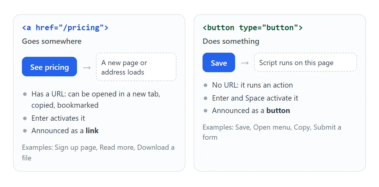
- Goes somewhere (another page, a file, a section): use
<a href="...">. It can be opened in a new tab and copied. - Does something (save, open a menu, copy, submit): use
<button type="button">, ortype="submit"inside a form.
Styling a link to look like a button is covered in HTML button with link. Everything below applies to both, since the CSS is the same.
Reset the browser defaults
Browsers draw buttons with their own border, background and font. Some also apply the operating system's native control look. These three lines clear it so your styles start from nothing:
.btn {
  appearance: none;   /* drop the native control look */
  border: 0;
  font: inherit;      /* use the page font, not the browser's button font */
}
font: inherit is the easiest line to forget. Without it, the button text stays in the browser's default size and family even when the rest of the page is styled.
Padding, shape and colour
Size a button with padding, not with a fixed width and height. Padding grows with the label, so a longer word never spills out.
.btn {
  padding: 12px 22px;
  border-radius: 10px;
  background: #2563eb;
  color: #fff;
  font-weight: 600;
  cursor: pointer;
}
Keep the text and background contrast high. White on a mid or dark blue reads well; white on a pale colour does not. cursor: pointer is optional, since buttons show the default arrow unless you set it.
The states: hover, pressed, focus, disabled
A button that never reacts feels broken. Each state is one selector.
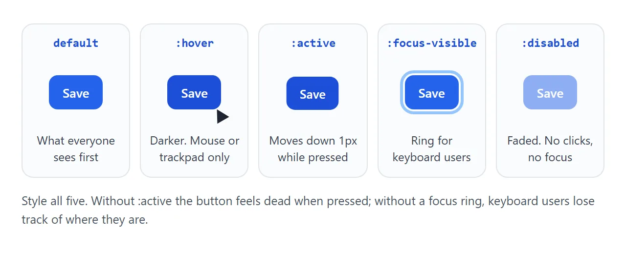
@media (hover: hover) {
  .btn:hover { background: #1d4ed8; }
}
.btn:active { transform: translateY(1px) scale(.97); }
.btn:focus-visible { outline: 3px solid #93c5fd; outline-offset: 2px; }
.btn:disabled { opacity: .5; cursor: not-allowed; }
:hoverdarkens the button under a mouse. The@media (hover: hover)wrapper limits it to devices that can hover, so it does not stick after a tap on a phone.:activeapplies while the button is held down. A one-pixel move is enough to feel like a press.:focus-visibleshows a ring when the browser decides focus should be visible, which covers keyboard users pressing Tab. A mouse click on a button usually does not trigger it.:disabledmatches buttons with thedisabledattribute. They cannot be clicked or focused, so fade them clearly.
To animate the colour change instead of switching it, add a transition; CSS hover transition covers that.
Variants: primary, outline, ghost, danger
A page with several actions needs more than one kind of button. Keep one base .btn rule for size and shape, and let each variant change only colours.
<!doctype html>
<html lang="en">
<head>
<meta charset="utf-8">
<meta name="viewport" content="width=device-width, initial-scale=1">
<title>Button variants</title>
<style>
  body { margin: 0; padding: 18px; font-family: system-ui, sans-serif; background: #fff; color: #1d2330; }
  .row { display: flex; flex-wrap: wrap; gap: 12px; }

  /* Shared base for every variant */
  .btn {
    appearance: none; font: inherit; font-weight: 600;
    display: inline-flex; align-items: center; justify-content: center; gap: 8px;
    min-height: 44px; padding: 10px 18px;
    border: 2px solid transparent; border-radius: 10px;
    cursor: pointer;
  }
  .btn svg { width: 18px; height: 18px; }
  .btn:focus-visible { outline: 3px solid #93c5fd; outline-offset: 2px; }
  .btn:not(:disabled):active { transform: translateY(1px); }
  .btn:disabled { opacity: .5; cursor: not-allowed; }

  /* Variants only change colours */
  .primary { background: #2563eb; color: #fff; }
  .outline { background: #fff; color: #2563eb; border-color: #2563eb; }
  .ghost   { background: transparent; color: #2563eb; }
  .danger  { background: #dc2626; color: #fff; }
  .icon    { padding: 10px; min-width: 44px; background: #f1f5f9; color: #334155; }

  /* Hover only where a mouse or trackpad can hover */
  @media (hover: hover) {
    .primary:not(:disabled):hover { background: #1d4ed8; }
    .outline:not(:disabled):hover, .ghost:not(:disabled):hover { background: #eff6ff; }
    .danger:not(:disabled):hover  { background: #b91c1c; }
    .icon:not(:disabled):hover    { background: #e2e8f0; }
  }

  #out { margin: 16px 0 0; font-size: 14px; color: #4b5563; }
</style>
</head>
<body>
<div class="row" id="row">
  <button class="btn primary" type="button">Primary</button>
  <button class="btn outline" type="button">Outline</button>
  <button class="btn ghost" type="button">Ghost</button>
  <button class="btn danger" type="button">Delete</button>
  <button class="btn primary" type="button">
    <svg viewBox="0 0 24 24" fill="none" stroke="currentColor" stroke-width="2.4" stroke-linecap="round" aria-hidden="true"><path d="M12 4v11M7 10l5 5 5-5M5 20h14"/></svg>
    Download
  </button>
  <button class="btn icon" type="button" aria-label="Settings">
    <svg viewBox="0 0 24 24" fill="none" stroke="currentColor" stroke-width="2.4" stroke-linecap="round" aria-hidden="true"><path d="M4 7h10M18 7h2M4 17h2M10 17h10"/><circle cx="16" cy="7" r="2"/><circle cx="8" cy="17" r="2"/></svg>
  </button>
  <button class="btn primary" type="button" disabled>Disabled</button>
</div>
<p id="out">Click a button, or press Tab to see the focus ring.</p>

<script>
  // Report which button was pressed. Disabled buttons never fire click.
  document.getElementById('row').addEventListener('click', (e) => {
    const btn = e.target.closest('button');
    if (btn) document.getElementById('out').textContent =
      'You clicked: ' + (btn.getAttribute('aria-label') || btn.textContent.trim());
  });
</script>
</body>
</html>
| Variant | Use it for | CSS that changes |
|---|---|---|
| Primary | The one main action on the screen | Solid brand background, white text |
| Outline (secondary) | A second choice next to the primary | White background, coloured border and text |
| Ghost | Low-key actions such as Cancel or Skip | No background or border, coloured text |
| Danger | Delete and other actions you cannot undo | Solid red background |
| Icon only | Toolbars with a familiar symbol | Square padding, plus aria-label |
For an icon next to text, make the button display: inline-flex with align-items: center and a gap. Draw the icon with stroke="currentColor" so it follows the text colour in every variant.
An icon-only button has no text for a screen reader to announce. Give it a name with aria-label:
<button class="btn icon" type="button" aria-label="Settings">
  <svg aria-hidden="true" ...></svg>
</button>
A pair of equal-looking choices, such as Yes and No, is covered in HTML yes no button.
Loading and success states
When a click starts something slow, the button should say so. Otherwise people click again, and the action runs twice.
<!doctype html>
<html lang="en">
<head>
<meta charset="utf-8">
<meta name="viewport" content="width=device-width, initial-scale=1">
<title>Button with loading and success states</title>
<style>
  body { margin: 0; padding: 18px; font-family: system-ui, sans-serif; background: #f4f5f7; color: #1d2330; }
  form { max-width: 420px; padding: 18px; border-radius: 12px; background: #fff; }
  label { display: block; font-size: 14px; margin-bottom: 12px; }
  input { display: block; width: 100%; box-sizing: border-box; margin-top: 6px; padding: 10px;
          font: inherit; border: 1px solid #cbd5e1; border-radius: 8px; }

  .btn {
    appearance: none; font: inherit; font-weight: 600;
    display: inline-flex; align-items: center; justify-content: center; gap: 8px;
    min-width: 160px; min-height: 44px; padding: 10px 20px;
    border: 0; border-radius: 10px; background: #2563eb; color: #fff; cursor: pointer;
    transition: background-color .2s;
  }
  @media (hover: hover) { .btn:not(:disabled):hover { background: #1d4ed8; } }
  .btn:not(:disabled):active { transform: translateY(1px); }
  .btn:focus-visible { outline: 3px solid #93c5fd; outline-offset: 2px; }
  .btn:disabled { cursor: progress; }
  .btn.done { background: #15803d; }

  /* Spinner: a ring with one coloured side, rotating */
  .spin { display: none; width: 16px; height: 16px; border-radius: 50%;
          border: 2px solid rgba(255, 255, 255, .4); border-top-color: #fff;
          animation: turn .7s linear infinite; }
  .btn.loading .spin { display: inline-block; }
  @keyframes turn { to { transform: rotate(360deg); } }
  @media (prefers-reduced-motion: reduce) { .spin { animation-duration: 2s; } }

  /* On phones, the main button fills the width */
  @media (max-width: 480px) { .btn { width: 100%; } }

  #status { min-height: 1.4em; margin: 10px 0 0; font-size: 14px; color: #15803d; }
</style>
</head>
<body>
<form id="form">
  <label>Display name <input name="name" value="Ada Lovelace"></label>
  <button class="btn" id="save" type="submit">
    <span class="spin" aria-hidden="true"></span><span class="label">Save changes</span>
  </button>
  <p id="status" role="status"></p>
</form>

<script>
  const form = document.getElementById('form');
  const btn = document.getElementById('save');
  const label = btn.querySelector('.label');
  const status = document.getElementById('status');

  form.addEventListener('submit', (e) => {
    e.preventDefault();  // no server here: the save is simulated below
    btn.disabled = true;               // blocks a second click while saving
    btn.classList.add('loading');
    label.textContent = 'Saving…';
    status.textContent = '';

    setTimeout(() => {                 // pretend the server answered after 1.5 s
      btn.classList.replace('loading', 'done');
      label.textContent = '✓ Saved';
      status.textContent = 'Saved "' + form.elements.name.value + '".';

      setTimeout(() => {               // back to normal after 2 s
        btn.classList.remove('done');
        btn.disabled = false;
        label.textContent = 'Save changes';
      }, 2000);
    }, 1500);
  });
</script>
</body>
</html>
The pattern has three steps:
- On click: set
disabledso a second click does nothing, add aloadingclass that shows the spinner, and change the label to "Saving…". - When the work finishes: swap
loadingfordone, show a check mark and a green background. - After a moment: remove
done, re-enable the button and restore the label.
A min-width on the button stops it from shrinking when the label changes. The status line under it has role="status", so screen readers announce the result. The same confirm-then-reset idea drives the HTML copy button.
Sizing buttons for phones
A fingertip is much larger than a mouse pointer. Small buttons placed side by side get mis-tapped.
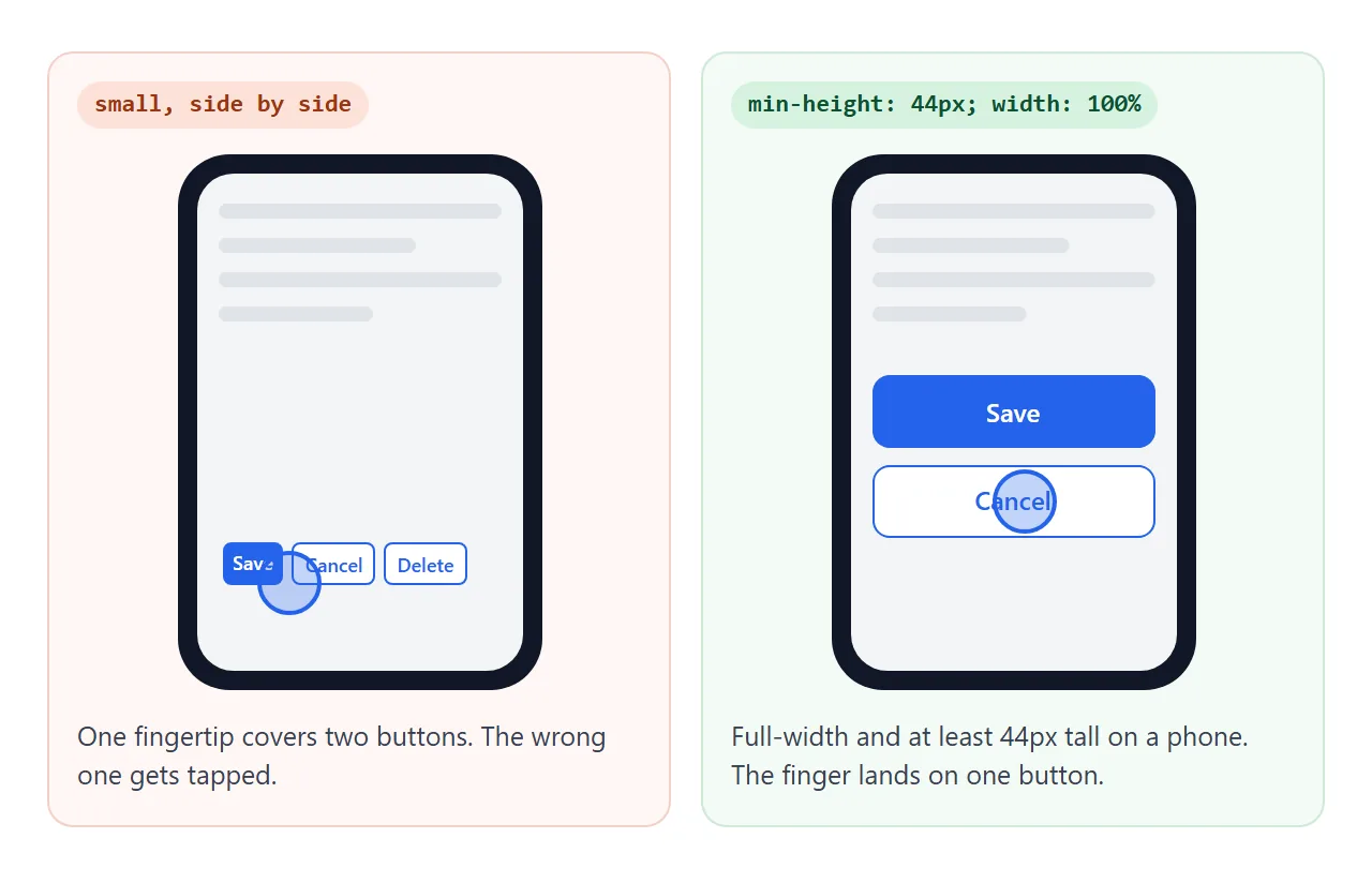
WCAG 2.2 asks for touch targets of at least 24 by 24 CSS pixels at level AA, and 44 by 44 at level AAA. A min-height: 44px meets both heights. On narrow screens, let the main button fill the row:
.btn { min-height: 44px; }
@media (max-width: 480px) {
  .btn { width: 100%; }
}
When it does not work
| What you see | Cause | Fix |
|---|---|---|
| Your styles barely change the button | The browser's default button look and font still apply | appearance: none, border: 0, font: inherit |
| Button text is a different font or size | Buttons do not inherit the page font by default | font: inherit on the button |
| Keyboard users cannot tell which button is selected | outline: none removed the focus ring with nothing in its place |
Add a :focus-visible outline |
| Clicking the button reloads the page or submits the form | A <button> in a form defaults to type="submit" |
Add type="button" |
| Opening in a new tab or copying the address does not work | A <button> with a script is doing a link's job |
Use <a href> styled as a button |
| On a phone, the button stays dark after a tap | :hover can stay active after a tap on touch screens |
Wrap hover rules in @media (hover: hover) |
| Nothing happens on click at all | Something covers the button, or it is disabled | See HTML button not clickable |
Share it as a link
Button states are easier to judge by pressing them than by looking at a screenshot, which cannot show hover, the pressed effect or the loading spinner.
To send a working version, paste the page into a NOS document and choose Create share link. HTML to link walks through it.
The page renders as written and its scripts run, so the people you send it to can click, tab and tap the buttons themselves. If you change the styles later, the same link shows the new version.