The CSS outline property draws a line around an element without taking any space. Nothing around it moves when it appears. That makes it the natural tool for focus rings: the line that shows which button, link or field the keyboard is on.
button:focus-visible {
  outline: 3px solid #1d4ed8;
  outline-offset: 2px;
}
Build one yourself. The same values go on a button and on a rounded card:
<!doctype html>
<html lang="en">
<head>
<meta charset="utf-8">
<meta name="viewport" content="width=device-width, initial-scale=1">
<title>CSS outline builder</title>
<style>
  body { margin: 0; padding: 14px; font-family: system-ui, sans-serif; background: #f4f5f7; color: #1d2330; }
  .stage {
    display: flex; flex-wrap: wrap; gap: 28px; align-items: center; justify-content: center;
    padding: 30px 16px; background: #fff; border-radius: 12px; margin-bottom: 12px;
  }
  /* the two targets share one set of outline values */
  .target {
    outline: var(--w) var(--s) var(--c);
    outline-offset: var(--o);
  }
  .btn {
    font: 600 15px system-ui, sans-serif; padding: 10px 18px;
    border: 0; border-radius: 8px; background: #2563eb; color: #fff;
  }
  .card {
    width: 150px; padding: 14px; border-radius: var(--r);
    background: #f8fafc; border: 1px solid #d5d9e0; font-size: 13px;
  }
  .controls { display: grid; grid-template-columns: repeat(auto-fit, minmax(160px, 1fr)); gap: 8px 14px; font-size: 13px; }
  .controls label { display: grid; gap: 3px; }
  .controls span b { font-family: ui-monospace, Consolas, monospace; }
  pre {
    margin: 12px 0 0; padding: 10px 12px; border-radius: 8px;
    background: #1d2330; color: #e5e7eb; font: 13px/1.5 ui-monospace, Consolas, monospace;
    white-space: pre-wrap;
  }
</style>
</head>
<body>
<div class="stage" id="stage">
  <button class="target btn" type="button">Button</button>
  <div class="target card">Card with<br>border-radius</div>
</div>

<div class="controls">
  <label><span>outline-width <b id="wOut"></b></span><input id="w" type="range" min="0" max="10" value="3"></label>
  <label><span>outline-offset <b id="oOut"></b></span><input id="o" type="range" min="-10" max="12" value="3"></label>
  <label><span>outline-style</span>
    <select id="s">
      <option>solid</option><option>dashed</option><option>dotted</option>
      <option>double</option><option>groove</option><option>ridge</option>
      <option>inset</option><option>outset</option><option>auto</option><option>none</option>
    </select>
  </label>
  <label><span>outline-color <b id="cOut"></b></span><input id="c" type="color" value="#f97316"></label>
  <label><span>card border-radius <b id="rOut"></b></span><input id="r" type="range" min="0" max="40" value="16"></label>
</div>

<pre id="css"></pre>

<script>
  const stage = document.getElementById('stage');
  const ids = ['w', 'o', 's', 'c', 'r'];
  const el = Object.fromEntries(ids.map((id) => [id, document.getElementById(id)]));

  function update() {
    const w = el.w.value + 'px', o = el.o.value + 'px', r = el.r.value + 'px';
    const s = el.s.value, c = el.c.value;
    // write the values into custom properties used by .target
    stage.style.setProperty('--w', w);
    stage.style.setProperty('--o', o);
    stage.style.setProperty('--s', s);
    stage.style.setProperty('--c', c);
    stage.style.setProperty('--r', r);
    document.getElementById('wOut').textContent = w;
    document.getElementById('oOut').textContent = o;
    document.getElementById('cOut').textContent = c;
    document.getElementById('rOut').textContent = r;
    document.getElementById('css').textContent =
      '.card {\n  border-radius: ' + r + ';\n  outline: ' + w + ' ' + s + ' ' + c + ';\n  outline-offset: ' + o + ';\n}';
  }

  ids.forEach((id) => el[id].addEventListener('input', update));
  update();
</script>
</body>
</html>
If you are after borders themselves, CSS border covers width, style and radius. This guide is about the outline and the focus ring built from it.
The four outline properties
outline is a shorthand for three properties, and a fourth one sets the gap.
| Property | What it sets | Example |
|---|---|---|
outline-width |
Thickness | 3px |
outline-style |
Line type: solid, dashed, dotted, double, auto and more |
solid |
outline-color |
Colour | #1d4ed8 |
outline-offset |
Gap between the border edge and the outline | 2px |
Unlike a border, the outline is one line for the whole box. There is no outline-top or outline-left. If you need a line on one side only, use a border or a box-shadow.
The style auto asks the browser to draw its own focus ring. In Chromium, a focused field's default outline has the computed style auto.
outline-offset, including negative values
Positive offsets push the outline away from the border, which makes a focus ring read as a separate ring. Zero is the default. Negative values pull the outline inside the element.
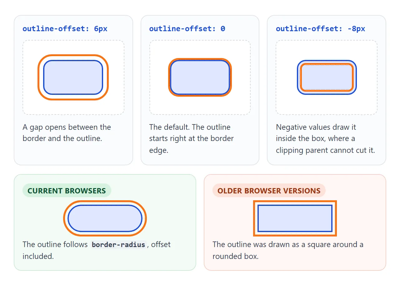
In current browsers, the outline follows border-radius, offset included. We checked this in Chromium with a pill shape and a 4px offset: the outline came out as a rounded pill. Older browser versions drew a square outline around rounded boxes.
:focus vs :focus-visible
:focus matches whenever an element has focus, however it got there. A mouse click on a button gives it focus, so a :focus ring flashes on every click. That is the usual reason people reach for outline: none.
:focus-visible matches when the browser decides focus should be shown. Try both in the lab below: click the buttons, then click an empty spot and press Tab.
<!doctype html>
<html lang="en">
<head>
<meta charset="utf-8">
<meta name="viewport" content="width=device-width, initial-scale=1">
<title>:focus vs :focus-visible lab</title>
<style>
  body { margin: 0; padding: 12px 14px; font-family: system-ui, sans-serif; background: #f4f5f7; color: #1d2330; font-size: 14px; }
  .row { background: #fff; border-radius: 10px; padding: 10px 12px; margin-bottom: 8px; }
  .row h3 { margin: 0 0 8px; font: 700 13px ui-monospace, Consolas, monospace; }
  .row h3 small { font: 400 12px system-ui, sans-serif; color: #5b6270; }
  .items { display: flex; flex-wrap: wrap; gap: 10px; }
  button, input { font: inherit; padding: 7px 12px; border-radius: 7px; border: 1px solid #9aa3b2; background: #fff; color: #1d2330; }
  input { width: 120px; }

  /* A: ring on every focus, mouse click included */
  .a :focus { outline: 3px solid #f97316; outline-offset: 2px; }

  /* B: ring only when the browser decides focus should be visible */
  .b :focus-visible { outline: 3px solid #16a34a; outline-offset: 2px; }

  /* C: the trap. Focus is still there, but nothing shows it */
  .c :focus { outline: none; }

  /* D: rings drawn with box-shadow */
  .d .shadow-only:focus-visible { outline: none; box-shadow: 0 0 0 3px #7c3aed; }
  .d .shadow-plus:focus-visible { outline: 3px solid transparent; box-shadow: 0 0 0 3px #7c3aed; }

  /* rough stand-in for forced colours: shadows dropped, colours replaced */
  .sim * { box-shadow: none !important; outline-color: CanvasText !important; }
  .sim .row, .sim button, .sim input { background: Canvas; color: CanvasText; border-color: CanvasText; }

  .out { background: #1d2330; color: #e5e7eb; border-radius: 10px; padding: 9px 12px; font: 13px/1.5 ui-monospace, Consolas, monospace; min-height: 40px; }
  .out b { color: #86efac; } .out i { color: #fdba74; font-style: normal; }
  .sim-row { margin: 8px 0 0; font-size: 13px; }
  .note { margin: 4px 0 0; font-size: 12px; color: #5b6270; }
</style>
</head>
<body>
<div id="lab">
  <div class="row a"><h3>A · :focus <small>ring on click and on Tab</small></h3>
    <div class="items"><button type="button">Button</button><input placeholder="Text field"></div></div>
  <div class="row b"><h3>B · :focus-visible <small>ring on Tab, not on a button click</small></h3>
    <div class="items"><button type="button">Button</button><input placeholder="Text field"></div></div>
  <div class="row c"><h3>C · outline: none <small>focus is there, you cannot see it</small></h3>
    <div class="items"><button type="button">Button</button><input placeholder="Text field"></div></div>
  <div class="row d"><h3>D · box-shadow rings <small>try the forced colours box</small></h3>
    <div class="items"><button type="button" class="shadow-only">Shadow only</button><button type="button" class="shadow-plus">Shadow + transparent outline</button></div></div>
</div>

<div class="out" id="out">Click something, or click the page and press Tab.</div>
<label class="sim-row"><input type="checkbox" id="sim" style="width:auto"> Simulate forced colours (rough preview)</label>
<p class="note" id="note">Real forced colours come from the system setting, or DevTools, Rendering, "Emulate CSS media feature forced-colors".</p>

<script>
  const out = document.getElementById('out');

  // report which element has focus and which pseudo-classes match
  document.addEventListener('focusin', (e) => {
    const t = e.target;
    if (t.id === 'sim') return;
    const row = t.closest('.row').querySelector('h3').firstChild.textContent.trim();
    const yes = (sel) => t.matches(sel) ? '<b>yes</b>' : '<i>no</i>';
    out.innerHTML = row + ' / ' + (t.textContent || t.placeholder) +
      '<br>:focus ' + yes(':focus') + ' · :focus-visible ' + yes(':focus-visible');
  });

  document.getElementById('sim').addEventListener('change', (e) => {
    document.getElementById('lab').classList.toggle('sim', e.target.checked);
  });

  // if the system really is in forced colours mode, say so
  if (matchMedia('(forced-colors: active)').matches) {
    document.getElementById('note').textContent = 'Forced colours are on for real on this device.';
  }
</script>
</body>
</html>
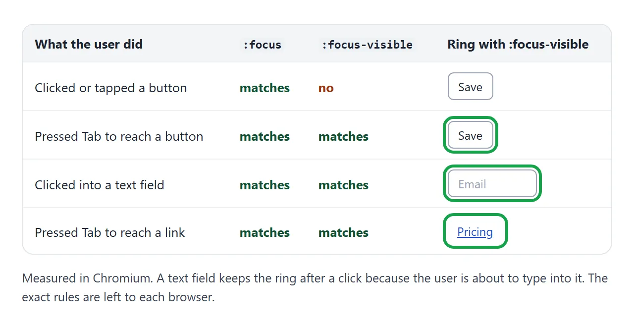
Text fields are the exception. Clicking into one also matches :focus-visible, because the user is about to type there. The exact rules are up to each browser, which is the point: you describe the ring, and the browser decides when it is needed.
Never outline: none without a replacement
Row C in the lab is the trap. The button still takes focus and still responds to Enter, but nothing on screen says so. Someone using a keyboard is now navigating blind.
The rule is simple: every focusable element needs a visible focus style. If you remove the default one, put another in its place. The buttons guide shows this for each button state.
WCAG, the web accessibility guidelines, says this in success criterion 2.4.7, Focus Visible (Level AA): keyboard focus must be visible.
WCAG 2.2 adds 2.4.13, Focus Appearance (Level AAA). It asks for an indicator at least as large as a 2px-thick line around the element, with a 3:1 contrast between focused and unfocused states.
WCAG 2.2 also adds 2.4.11, Focus Not Obscured (Minimum), at Level AA: the focused element should not be entirely hidden by things like sticky headers.
Forced colours: why outline beats box-shadow
Windows contrast themes switch the browser into forced colours mode. The browser replaces your colours with a small set chosen by the user, and it sets box-shadow to none.
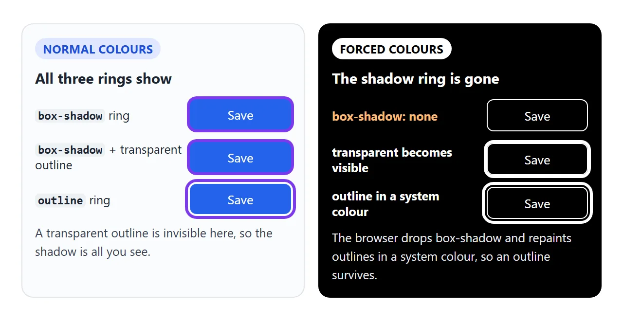
We checked this with Chromium's forced-colors emulation. A box-shadow ring computed to none. An outline with a custom colour was repainted in a system colour. An outline set to transparent became visible too.
That gives a well-known fix for shadow-based rings. Keep the shadow, and add a transparent outline that only shows up in forced colours:
.btn:focus-visible {
  box-shadow: 0 0 0 3px #7c3aed;
  outline: 3px solid transparent; /* visible only in forced colours */
}
The lab's forced colours box is a rough preview, not the real mode. For the real thing, open DevTools, go to Rendering, and set "Emulate CSS media feature forced-colors" to active. The box-shadow guide covers shadows in general.
A focus ring for light and dark backgrounds
A dark blue ring is easy to see on white and hard to see on navy. A white ring has the opposite problem. The fix is two colours: a dark outline with a thin white halo inside it.
:root {
  --ring: #1d4ed8;
  --ring-halo: #ffffff;
}
:is(a, button, input, [tabindex]):focus-visible {
  outline: 3px solid var(--ring);
  outline-offset: 2px;
  box-shadow: 0 0 0 2px var(--ring-halo); /* fills the gap */
}
The shadow spreads exactly 2px, so it fills the offset gap. On a light section, the blue ring does the work. On a dark section, the white halo does. In forced colours the shadow drops out and the outline stays.
<!doctype html>
<html lang="en">
<head>
<meta charset="utf-8">
<meta name="viewport" content="width=device-width, initial-scale=1">
<title>Two-colour focus ring</title>
<style>
  /* one focus style for the whole site */
  :root {
    --ring: #1d4ed8;       /* outer ring: shows on light backgrounds */
    --ring-halo: #ffffff;  /* inner halo: shows on dark backgrounds */
  }
  :is(a, button, input, [tabindex]):focus-visible,
  .show-all :is(a, button, input) {
    outline: 3px solid var(--ring);   /* stays visible in forced colours */
    outline-offset: 2px;
    box-shadow: 0 0 0 2px var(--ring-halo);  /* fills the 2px gap */
  }

  body { margin: 0; padding: 12px; font-family: system-ui, sans-serif; background: #e9ecf1; }
  .panels { display: grid; grid-template-columns: 1fr 1fr; gap: 12px; }
  @media (max-width: 560px) { .panels { grid-template-columns: 1fr; } }
  .panel { border-radius: 12px; padding: 16px; }
  .light { background: #fff; color: #1d2330; }
  .dark { background: #0f172a; color: #e5e7eb; }
  .panel h3 { margin: 0 0 6px; font-size: 15px; }
  .panel p { margin: 0 0 12px; font-size: 14px; line-height: 1.5; }
  .light a { color: #1d4ed8; } .dark a { color: #93c5fd; }
  .row { display: flex; flex-wrap: wrap; gap: 10px; margin-bottom: 12px; }
  button, input { font: inherit; font-size: 14px; border-radius: 8px; padding: 8px 14px; }
  button { border: 0; background: #2563eb; color: #fff; }
  button.ghost { background: transparent; color: inherit; border: 1px solid currentColor; }
  input { border: 1px solid #9aa3b2; background: #fff; color: #1d2330; width: 100%; box-sizing: border-box; margin-bottom: 12px; }
  .dark input { background: #1e293b; color: #e5e7eb; border-color: #475569; }
  a.card {
    display: block; text-decoration: none; color: inherit;
    padding: 12px 14px; border-radius: 12px; border: 1px solid #d5d9e0;
  }
  .dark a.card { border-color: #334155; background: #1e293b; }
  a.card b { display: block; margin-bottom: 2px; }
  a.card span { font-size: 13px; opacity: .8; }
  .toggle { display: block; margin-top: 12px; font-size: 14px; }
</style>
</head>
<body>
<div class="panels" id="panels">
  <section class="panel light">
    <h3>Light section</h3>
    <p>Press Tab to move through. Read the <a href="#guide">setup guide</a> first.</p>
    <input placeholder="Email address" aria-label="Email address">
    <div class="row"><button type="button">Subscribe</button><button type="button" class="ghost">Later</button></div>
    <a class="card" href="#pro"><b>Pro plan</b><span>The whole card is one link.</span></a>
  </section>
  <section class="panel dark">
    <h3>Dark section</h3>
    <p>Same CSS, no extra rule. See the <a href="#changelog">changelog</a>.</p>
    <input placeholder="Search" aria-label="Search">
    <div class="row"><button type="button">Search</button><button type="button" class="ghost">Clear</button></div>
    <a class="card" href="#team"><b>Team plan</b><span>The white halo carries the ring here.</span></a>
  </section>
</div>
<label class="toggle"><input type="checkbox" id="all" style="width:auto;margin:0 6px 0 0">Show every ring at once (for phones without a Tab key)</label>

<script>
  document.getElementById('all').addEventListener('change', (e) => {
    document.getElementById('panels').classList.toggle('show-all', e.target.checked);
  });
</script>
</body>
</html>
Put the rule on :focus-visible once, in your base styles, and every focusable element picks it up. Custom controls such as a toggle switch may need the ring moved to the visible part, because the real input is hidden.
When it does not work
| What you see | Cause | Fix |
|---|---|---|
| The ring is cut off at the edges | A parent has overflow: hidden |
Use a negative outline-offset, or add padding to the parent |
| A ring flashes on every mouse click | The rule is on :focus |
Move it to :focus-visible |
| No ring in high contrast mode | The ring is a box-shadow, which forced colours removes |
Use outline, or add outline: 3px solid transparent |
| A square outline around a rounded button | An older browser version | Accept it, or use a box-shadow ring plus a transparent outline |
| The next item covers part of the ring | The neighbour paints over the outline | position: relative; z-index: 1 on the focused element |
| Keyboard users cannot see focus at all | outline: none with no replacement |
Add a :focus-visible outline |
The neighbour case shows up in button groups and tab bars. In Chromium, a 6px outline on the first of two touching flex items was covered by the second one. Giving the focused item a z-index brought the ring back on top.
Flex and grid items accept z-index as they are. Other elements also need position: relative. The z-index guide explains the stacking rules.
Share it as a link
Focus rings are hard to review from a screenshot, because the whole point is what happens when you press Tab. Send a page that people can tab through themselves.
Paste the page into a NOS document and choose Create share link. HTML to link walks through it.
The page renders as written and its scripts run, so the people you send it to can click, tab and compare the rings. If you change the code later, the same link shows the new version.