The CSS border property draws a line around an element's box. It takes three values: a width, a style and a colour, as in border: 2px solid #4f46e5.
The style is the one that matters most. Without it the border is not drawn at all, whatever width and colour you set.
Move the sliders and pick a style. The code under the preview is the CSS to copy.
<!doctype html>
<html lang="en">
<head>
<meta charset="utf-8">
<meta name="viewport" content="width=device-width, initial-scale=1">
<title>CSS border builder</title>
<style>
  * { box-sizing: border-box; }
  body { margin: 0; padding: 14px; font-family: system-ui, sans-serif; background: #f4f5f7; color: #1d2330; }
  .stage { height: 150px; display: grid; place-items: center; background: #fff; border-radius: 12px; }
  #box {
    width: 150px; height: 96px; background: #eef2ff;
    display: grid; place-items: center; font-size: 13px; color: #4b5563;
  }
  .controls { display: grid; grid-template-columns: 1fr 1fr; gap: 8px 14px; margin-top: 12px; font-size: 13px; }
  label { display: flex; flex-direction: column; gap: 3px; }
  label span { display: flex; justify-content: space-between; }
  select, input[type=color] { width: 100%; height: 30px; font: inherit; }
  .presets { grid-column: 1 / -1; display: flex; gap: 6px; flex-wrap: wrap; }
  .presets button { font: inherit; padding: 5px 10px; border: 1px solid #c9cdd4; border-radius: 8px; background: #fff; cursor: pointer; }
  pre { margin: 12px 0 0; padding: 10px 12px; background: #1d2330; color: #e5e7eb; border-radius: 10px; font-size: 12.5px; white-space: pre-wrap; }
</style>
</head>
<body>
<div class="stage"><div id="box">preview</div></div>

<div class="controls">
  <label><span>Width <b id="wv"></b></span><input id="w" type="range" min="0" max="16" value="3"></label>
  <label><span>Style</span>
    <select id="s">
      <option>solid</option><option>dashed</option><option>dotted</option>
      <option>double</option><option>groove</option><option>ridge</option><option>none</option>
    </select>
  </label>
  <label><span>Colour</span><input id="c" type="color" value="#4f46e5"></label>
  <label><span>Top-left <b id="tlv"></b></span><input id="tl" type="range" min="0" max="80" value="12"></label>
  <label><span>Top-right <b id="trv"></b></span><input id="tr" type="range" min="0" max="80" value="12"></label>
  <label><span>Bottom-right <b id="brv"></b></span><input id="br" type="range" min="0" max="80" value="12"></label>
  <label><span>Bottom-left <b id="blv"></b></span><input id="bl" type="range" min="0" max="80" value="12"></label>
  <div class="presets">
    <button data-r="0,0,0,0">Square</button>
    <button data-r="80,80,80,80">Pill</button>
    <button data-r="40,0,40,0">Leaf</button>
  </div>
</div>

<pre id="out"></pre>

<script>
  const $ = (id) => document.getElementById(id);
  const box = $('box');
  const corners = ['tl', 'tr', 'br', 'bl'];  // same order as border-radius

  function update() {
    const r = corners.map((k) => $(k).value + 'px');
    // one value if all four corners match, otherwise four
    const radius = r.every((v) => v === r[0]) ? r[0] : r.join(' ');
    const border = $('w').value + 'px ' + $('s').value + ' ' + $('c').value;
    box.style.border = border;
    box.style.borderRadius = radius;
    $('wv').textContent = $('w').value + 'px';
    corners.forEach((k) => { $(k + 'v').textContent = $(k).value + 'px'; });
    $('out').textContent = 'border: ' + border + ';\nborder-radius: ' + radius + ';';
  }

  document.querySelectorAll('input, select').forEach((el) => el.addEventListener('input', update));
  document.querySelectorAll('[data-r]').forEach((b) => b.addEventListener('click', () => {
    b.dataset.r.split(',').forEach((v, i) => { $(corners[i]).value = v; });
    update();
  }));
  update();
</script>
</body>
</html>
Every corner has its own slider because border-radius can take four values. When all four match, the builder prints the short form with one value.
The three parts: width, style, colour
border is a shorthand for border-width, border-style and border-color. The three values can come in any order, and two of them can be left out.
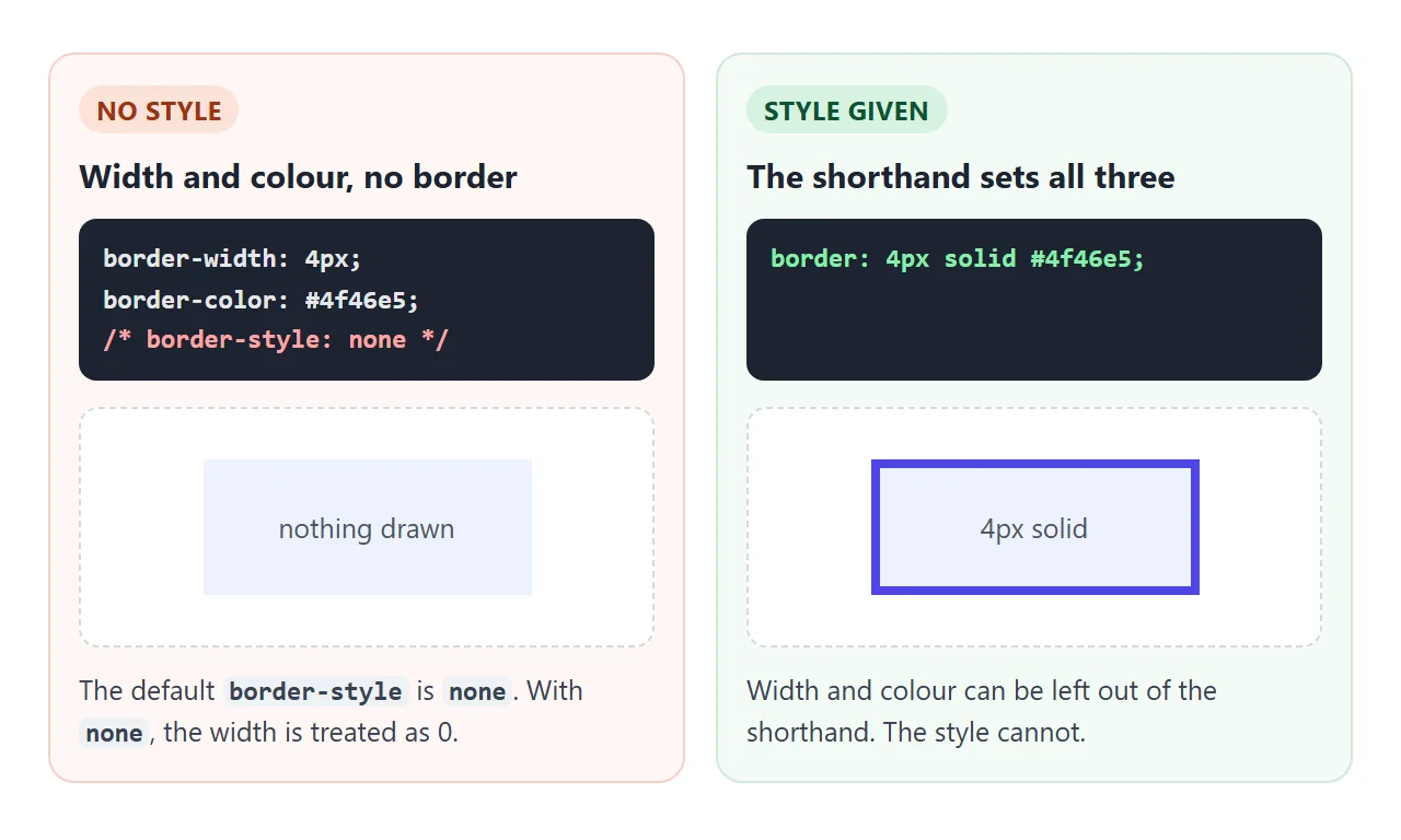
The style starts as none, and a border with style none is treated as having a width of 0. That is why border-width: 4px; border-color: red; on its own shows nothing. Put a style in, and the border appears.
| Value | Left out means | Examples |
|---|---|---|
| Width | medium (a few pixels) |
1px, 0.2em, thin, thick |
| Style | none, so no border |
solid, dashed, dotted, double |
| Colour | currentcolor, the text colour |
#e5e7eb, rgb(0 0 0 / .1), transparent |
The colour default is handy. border: 1px solid on a link or a button uses the text colour, so the border changes when the text colour does.
Dashed, dotted, double and the rest
solid covers most work. The other styles are useful in a few places:
dashed: drop zones, placeholders and "add new" boxes. The browser decides the dash length. For custom dashes, draw the line with arepeating-linear-gradientbackground or an SVG instead.dotted: light separators and underlines for abbreviations.double: two lines with a gap. The width covers both lines and the gap, so give it 3px or more, or there is no room for two lines.groove,ridge,inset,outset: 3D bevel effects, shaded from the border colour.hidden: likenone, but it wins over a neighbouring cell's border in a collapsed table.
One side at a time
Each side has its own property: border-top, border-right, border-bottom and border-left. They take the same three values.
.note {
  border: 1px solid #e1e4ea;       /* all four sides */
  border-left: 5px solid #4f46e5;  /* then override one */
}
Order matters. The shorthand resets all four sides, so write it first and the single side after it.
A hairline divider is one side on its own. For a list, give each item except the first a top border:
.list li + li { border-top: 1px solid #eceef2; }
The same line works for <hr>. Browsers draw <hr> with their own border styles, so reset those first: hr { border: 0; border-top: 1px solid #e5e7eb; }.
border-radius: rounded, pill, circle
border-radius rounds the corners of the box, and the border follows the curve. So do the background and the box shadow.
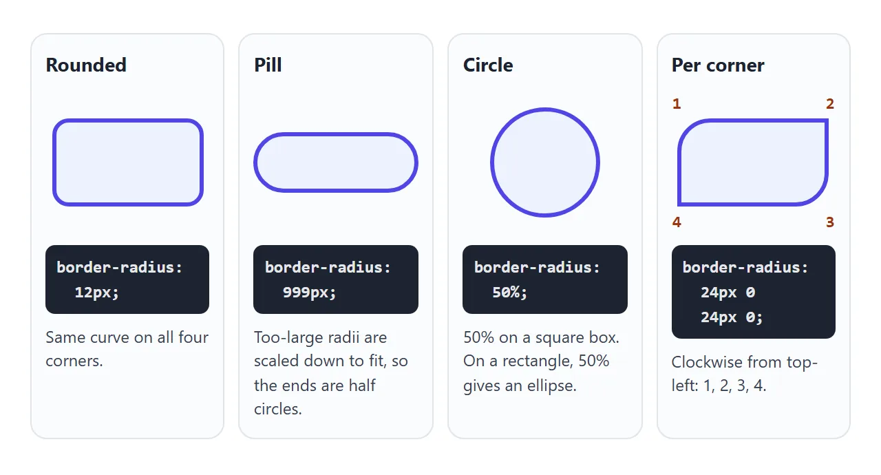
- One value rounds all four corners the same.
- Four values go clockwise from the top-left: top-left, top-right, bottom-right, bottom-left.
- A pill: a very large value such as
999px. When the radii are too big for the box, the browser scales them down to fit, which leaves round ends. - A circle:
50%on an element with equal width and height. On a rectangle,50%gives an ellipse.
There is also a slash form, border-radius: 40px / 20px, which sets the horizontal and vertical radius separately for oval corners.
The border adds to the size
With the default box-sizing: content-box, width sets the content only. The border and padding go outside it. A width: 200px box with a 10px border is 220px wide on screen.
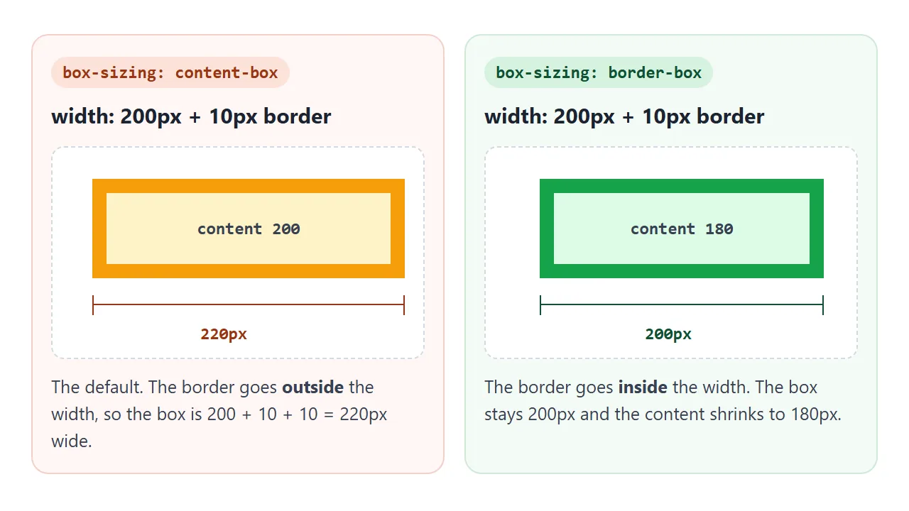
box-sizing: border-box puts the border and padding inside the width. The box stays 200px and the content area shrinks. It is often set on every element at the top of a stylesheet; the box-sizing guide explains the standard opening block.
border-box fixes set widths. It does not help an element whose width comes from its content, such as a button with no width. A border that appears on that button still makes it bigger.
Outline vs border
An outline looks like a border but is drawn outside it and takes no space in the layout. Adding one never moves anything around it. Hover each button, or tick the box on a phone:
<!doctype html>
<html lang="en">
<head>
<meta charset="utf-8">
<meta name="viewport" content="width=device-width, initial-scale=1">
<title>Border vs outline on hover</title>
<style>
  body { margin: 0; padding: 14px; font-family: system-ui, sans-serif; background: #f4f5f7; color: #1d2330; font-size: 13px; }
  .row { background: #fff; border-radius: 10px; padding: 10px 12px; margin-bottom: 10px; }
  .row h3 { margin: 0 0 8px; font-size: 13px; }
  .row h3 code { background: #eef1f5; padding: 0 4px; border-radius: 4px; }
  button {
    font: inherit; padding: 8px 14px; border-radius: 8px; cursor: pointer;
    background: #4f46e5; color: #fff; border: 0;
  }
  .after { color: #6b7280; }

  /* 1. bad: the border only exists on hover, so the button grows */
  .grow:hover, .on .grow { border: 3px solid #f59e0b; }

  /* 2. outline is drawn outside the box and takes no space */
  .ring:hover, .on .ring { outline: 3px solid #f59e0b; }

  /* 3. the border is always there, only its colour changes */
  .keep { border: 3px solid transparent; }
  .keep:hover, .on .keep { border-color: #f59e0b; }

  .toggle { display: flex; align-items: center; gap: 6px; margin-top: 4px; }
</style>
</head>
<body>
<div id="rows">
  <div class="row"><h3>1. <code>border</code> added on hover</h3>
    <button class="grow">Hover me</button> <span class="after">this text moves</span></div>
  <div class="row"><h3>2. <code>outline</code> on hover</h3>
    <button class="ring">Hover me</button> <span class="after">this text stays</span></div>
  <div class="row"><h3>3. transparent border, colour on hover</h3>
    <button class="keep">Hover me</button> <span class="after">this text stays</span></div>
</div>
<label class="toggle"><input type="checkbox" id="all"> Show the hover state on all three (for touch screens)</label>

<script>
  // a checkbox that applies the hover look, so it can be compared on a phone too
  document.getElementById('all').addEventListener('change', (e) => {
    document.getElementById('rows').classList.toggle('on', e.target.checked);
  });
</script>
</body>
</html>
border |
outline |
|
|---|---|---|
| Takes space | Yes, it adds to the box | No |
| One side only | Yes, border-left and so on |
No, all four sides |
| Gap from the box | No | outline-offset |
| Typical use | Cards, dividers, inputs | Focus rings, hover highlights |
Two ways to keep a hover border from moving the layout: give the element a transparent border of the same width from the start and only change its colour, or use outline for the hover look.
A box-shadow with a spread and no blur also works as a ring that takes no space.
Do not remove the focus outline from buttons and links without adding another visible focus style. Keyboard users rely on it to see where they are.
A finished set built from borders
Everything on this card set is a border: the grey card edge, the accent line, the row dividers, the dashed drop area, the pill tags and the circle avatar.
<!doctype html>
<html lang="en">
<head>
<meta charset="utf-8">
<meta name="viewport" content="width=device-width, initial-scale=1">
<title>Cards built with borders</title>
<style>
  * { box-sizing: border-box; }
  body { margin: 0; padding: 14px; font-family: system-ui, sans-serif; background: #f4f5f7; color: #1d2330; font-size: 14px; }
  .grid { display: grid; grid-template-columns: repeat(auto-fit, minmax(240px, 1fr)); gap: 12px; }
  h3 { margin: 0 0 6px; font-size: 15px; }
  p { margin: 0; color: #4b5563; line-height: 1.45; }

  /* plain card: a 1px border in a light grey does most of the work */
  .card { background: #fff; border: 1px solid #e1e4ea; border-radius: 12px; padding: 14px 16px; }

  /* accent: a thick left border, the other three stay thin */
  .accent { border-left: 5px solid #4f46e5; }

  /* hairline divider between rows: one side only, so lines never double */
  .list { list-style: none; margin: 8px 0 0; padding: 0; }
  .list li { padding: 7px 0; }
  .list li + li { border-top: 1px solid #eceef2; }

  /* drop area: dashed border, turns solid while a file is over it */
  .drop {
    border: 2px dashed #a8b0bd; border-radius: 12px; padding: 22px 16px;
    text-align: center; color: #5b6270; background: #fafbfc;
  }
  .drop.over { border-style: solid; border-color: #16a34a; color: #0f5132; background: #f4fbf6; }

  /* pill tags: a radius larger than half the height makes round ends */
  .tags { display: flex; flex-wrap: wrap; gap: 6px; margin-top: 10px; }
  .tag {
    border: 1px solid #c7d2fe; border-radius: 999px; padding: 3px 11px;
    font-size: 12.5px; color: #3730a3; background: #eef2ff; cursor: pointer; user-select: none;
  }
  .tag.picked { background: #4f46e5; border-color: #4f46e5; color: #fff; }

  /* avatar: 50% radius on a square gives a circle; overflow clips the child */
  .who { display: flex; align-items: center; gap: 10px; margin-top: 12px; }
  .avatar {
    width: 38px; height: 38px; border-radius: 50%; overflow: hidden;
    border: 2px solid #fff; outline: 1px solid #e1e4ea;
  }
  .avatar div { width: 100%; height: 100%; background: linear-gradient(135deg, #f59e0b, #4f46e5); }
</style>
</head>
<body>
<div class="grid">
  <div class="card">
    <h3>Plain card</h3>
    <p>One grey 1px border and a 12px radius.</p>
    <ul class="list"><li>Hairline between rows</li><li>Border on one side only</li><li>No doubled lines</li></ul>
  </div>

  <div class="card accent">
    <h3>Accent card</h3>
    <p>A thicker left border marks it as a note.</p>
    <div class="tags" id="tags">
      <span class="tag">design</span><span class="tag">css</span><span class="tag">borders</span><span class="tag">tips</span>
    </div>
    <div class="who"><div class="avatar"><div></div></div><p>Tap a tag to pick it.</p></div>
  </div>

  <div class="drop" id="drop">Drop a file here<br><small>(or tap to preview the active state)</small></div>
</div>

<script>
  // tags toggle on click
  document.querySelectorAll('.tag').forEach((t) =>
    t.addEventListener('click', () => t.classList.toggle('picked')));

  // drop area: solid border while a file is dragged over it
  const drop = document.getElementById('drop');
  drop.addEventListener('dragover', (e) => { e.preventDefault(); drop.classList.add('over'); });
  drop.addEventListener('dragleave', () => drop.classList.remove('over'));
  drop.addEventListener('drop', (e) => {
    e.preventDefault();
    drop.classList.remove('over');
    const f = e.dataTransfer.files[0];
    drop.textContent = f ? 'Got ' + f.name : 'Dropped';
  });
  drop.addEventListener('click', () => drop.classList.toggle('over'));
</script>
</body>
</html>
The drop area switches from border-style: dashed to solid when a file is over it. Changing the style keeps the width, so nothing jumps. The avatar uses overflow: hidden so the square gradient inside it is clipped to the circle.
Borders on tables and text
On a table, border on the <table> only draws around the outside. Each <td> and <th> needs its own border.
Neighbouring cells then show two lines side by side, which border-collapse: collapse merges into one. Table border collapse covers that and why rounded table corners need separate.
Borders are always rectangles around a box, rounded or not. They cannot follow the shape of letters. For an outline around text, use -webkit-text-stroke: 1px #1d2330, which is written with the -webkit- prefix. For a gradient instead of a flat colour, see CSS gradient border.
When it does not work
| What you see | Cause | Fix |
|---|---|---|
| No border at all | No border-style, so it is none |
Use the shorthand with a style: border: 1px solid |
| Layout jumps on hover | The border adds to the element's size | Transparent border from the start, or outline |
| Children poke out of rounded corners | border-radius does not clip the content |
overflow: hidden on the rounded element |
| An inline border breaks oddly across lines | The border is split, with left and right edges only at the ends | display: inline-block, or box-decoration-break: clone |
| 2px lines where two boxes meet | Each box draws its own 1px border | Border on one side only, such as li + li { border-top } |
double looks like solid |
The width is too thin for two lines | 3px or more |
| One side lost its border | A shorthand came after the side rule | Put border first, the side after |
An inline element such as a <span> or a link that wraps onto two lines gets its border split across the lines. The left edge appears only on the first line and the right edge only on the last.
box-decoration-break: clone draws a full border on each line. Add the prefixed -webkit-box-decoration-break: clone line as well, since some browsers read only that name.
Top and bottom borders on inline elements also do not push lines apart, so they can overlap the line above or below.
Share it as a link
Borders and radii are easier to judge in a browser than in a screenshot, especially hover states and the drop area. To show the live version, paste the page into a NOS document and choose Create share link. HTML to link walks through it.
The page renders as written and its scripts run, so the people you send it to can hover the buttons and tap the tags themselves. If you change the code later, the same link shows the new version.