CSS border-image replaces the border line with an image.
The browser cuts the image into nine pieces, puts the four corners in the four corners of the border, and stretches or tiles the four edge pieces along the sides. The image can be a file, an inline SVG or a gradient.
Try it first. Both boxes below use border-image, one with a gradient and one with a small SVG.
<!doctype html>
<html lang="en">
<head>
<meta charset="utf-8">
<meta name="viewport" content="width=device-width, initial-scale=1">
<title>border-image basics</title>
<style>
  body {
    margin: 0; padding: 18px; font-family: system-ui, sans-serif;
    background: #f4f5f7; color: #1d2330;
  }
  .row { display: flex; flex-wrap: wrap; gap: 18px; }
  .box { flex: 1 1 180px; min-height: 90px; padding: 14px; background: #fff; }

  /* 1. Gradient border: slice 1px off each side of the gradient */
  .gradient {
    border: 8px solid;
    border-image: linear-gradient(135deg, #2563eb, #db2777) 1;
  }

  /* 2. Frame from an inline SVG: cut 10 units from each side */
  .frame {
    border: 20px solid;
    border-image: url("data:image/svg+xml,<svg xmlns='http://www.w3.org/2000/svg' width='30' height='30'><rect x='10' y='10' width='10' height='10' fill='%23fde68a'/><g fill='%231e3a8a'><rect width='10' height='10'/><rect x='20' width='10' height='10'/><rect y='20' width='10' height='10'/><rect x='20' y='20' width='10' height='10'/></g><g fill='%23ea580c'><path d='M15 1l4 4-4 4-4-4z'/><path d='M15 21l4 4-4 4-4-4z'/><path d='M5 11l4 4-4 4-4-4z'/><path d='M25 11l4 4-4 4-4-4z'/></g></svg>") 10 round;
  }

  /* "fill" keeps the middle piece and paints it over the background */
  .gradient.fill { border-image-slice: 1 fill; color: #fff; }
  .frame.fill { border-image-slice: 10 fill; }

  label { display: inline-flex; gap: 6px; align-items: center; margin-top: 16px; font-size: 14px; }
</style>
</head>
<body>
<div class="row">
  <div class="box gradient"><b>Gradient border</b><br>linear-gradient, slice 1</div>
  <div class="box frame"><b>SVG frame</b><br>inline SVG, slice 10, round</div>
</div>
<label><input type="checkbox" id="fill"> Add the <code>fill</code> keyword</label>

<script>
  document.getElementById('fill').addEventListener('change', (e) => {
    document.querySelectorAll('.box').forEach((b) => b.classList.toggle('fill', e.target.checked));
  });
</script>
</body>
</html>
The element still needs a normal border. border-image only paints; the border width decides how much room the painting gets.
The shorthand and its five parts
The border-image shorthand sets five longhand properties in one line:
.frame {
  border: 20px solid;  /* reserves the room */
  border-image: url(frame.svg) 10 / 1 / 0 round;
  /*            source   slice width outset repeat */
}
| Longhand | What it does | Default |
|---|---|---|
border-image-source |
The image, SVG or gradient | none |
border-image-slice |
Where to cut the image, and fill |
100% |
border-image-width |
How thick the image is drawn | 1 |
border-image-outset |
How far it reaches past the border box | 0 |
border-image-repeat |
How edge pieces fill the sides | stretch |
Width and outset follow the slice, each after a slash. You can leave them out, which is the common case.
How border-image-slice cuts the image
border-image-slice takes up to four values, in the order top, right, bottom, left. Each one is a distance in from that side of the image. Four cuts make nine pieces.
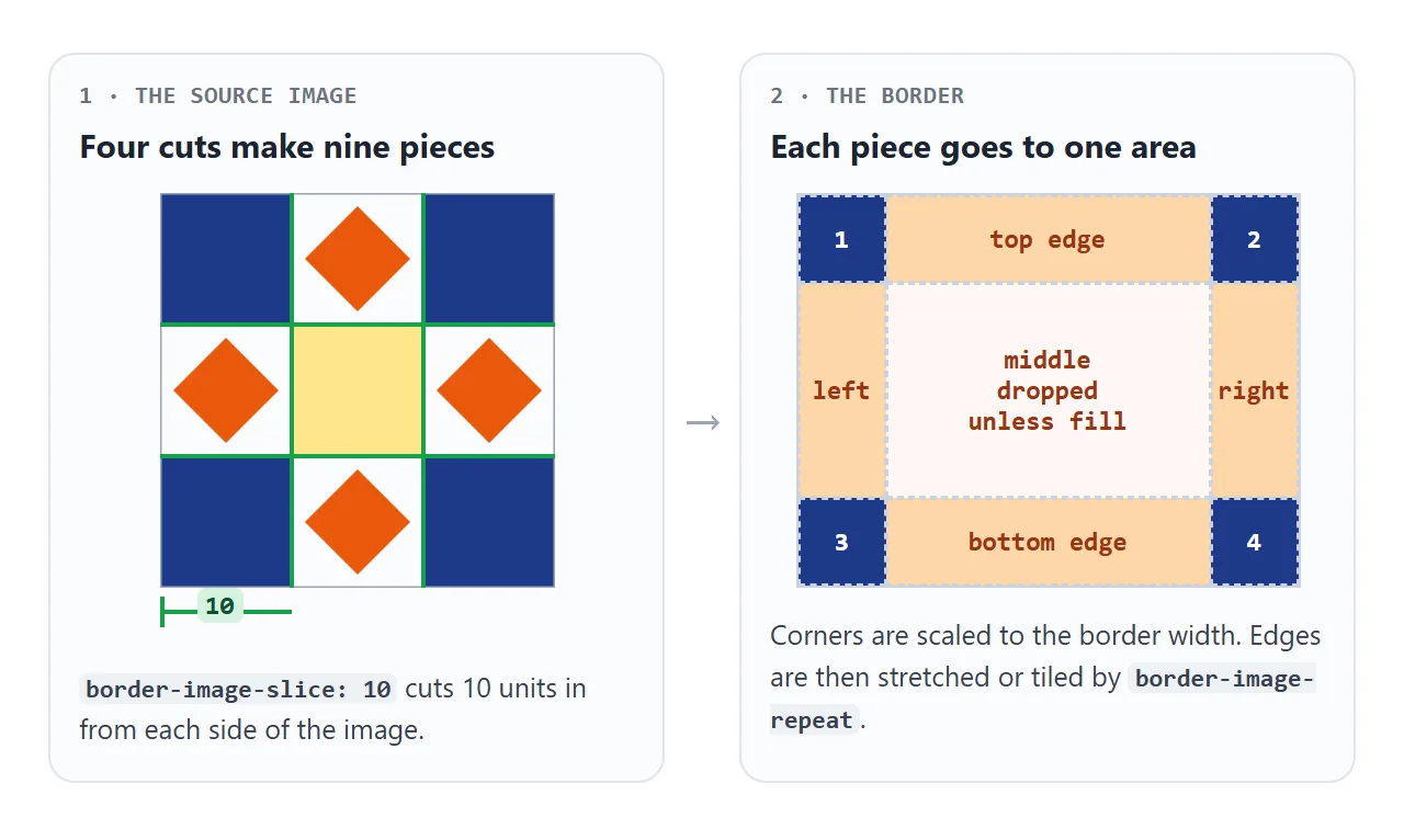
Plain numbers mean pixels in a raster image and coordinates in an SVG. Percentages are measured against the image size. The SVG in the examples is 30 units square, so 10 cuts it into three equal rows and columns.
The corner pieces are scaled to fit the border width. The edge pieces go along the sides. The middle piece is dropped, so the element's own background shows in the centre.
Add the keyword fill to keep the middle piece. It is drawn over the background and under the content, so text stays readable on top of it.
Gradient borders with border-image
A gradient has no size of its own. As a border image, it is sized to the element's border box, and a slice of 1 takes one pixel from each side:
.card {
  border: 8px solid;
  border-image: linear-gradient(135deg, #2563eb, #db2777) 1;
}
The one-pixel strips are stretched to the border width, so the sides show the gradient as it runs along the edge.
This is the shortest gradient border in CSS, and it works on square corners. CSS gradient border compares it with three other methods, including the ones that handle rounded corners.
Using an inline SVG as the source
A small SVG makes a crisp frame at any size, and it can live inside the CSS as a data: URI, with no extra file to host:
border-image-source: url("data:image/svg+xml,<svg xmlns='http://www.w3.org/2000/svg' width='30' height='30'><rect width='10' height='10' fill='%231e3a8a'/></svg>");
Two details matter. Use single quotes inside the SVG so they do not end the url("...") string. Write # as %23, because a bare # starts the fragment part of a URL and cuts the SVG short.
When the image fails to load, the browser falls back to the plain border-style and border-color.
Draw the corners in the outer squares and the edge motif in the middle of each side. SVG in HTML covers the other ways to put SVG on a page.
border-image-repeat: stretch, repeat, round and space
Before an edge piece is repeated, it is scaled so its height matches the border width. The repeat mode then decides how it fills the side.
<!doctype html>
<html lang="en">
<head>
<meta charset="utf-8">
<meta name="viewport" content="width=device-width, initial-scale=1">
<title>border-image-repeat</title>
<style>
  body {
    margin: 0; padding: 16px; font-family: system-ui, sans-serif;
    background: #f4f5f7; color: #1d2330; font-size: 14px;
  }
  .controls { display: flex; flex-wrap: wrap; gap: 8px 18px; margin-bottom: 14px; }
  .controls label { display: inline-flex; gap: 6px; align-items: center; }
  .grid { display: grid; grid-template-columns: repeat(auto-fill, minmax(230px, 1fr)); gap: 14px; }
  .box {
    width: var(--w, 200px); max-width: 100%; box-sizing: border-box;
    height: 84px; padding: 4px 6px; background: #d1fae5;
    border: 20px solid;
    border-image-source: url("data:image/svg+xml,<svg xmlns='http://www.w3.org/2000/svg' width='30' height='30'><g fill='%231e3a8a'><rect width='10' height='10'/><rect x='20' width='10' height='10'/><rect y='20' width='10' height='10'/><rect x='20' y='20' width='10' height='10'/></g><g fill='%23ea580c'><path d='M15 1l4 4-4 4-4-4z'/><path d='M15 21l4 4-4 4-4-4z'/><path d='M5 11l4 4-4 4-4-4z'/><path d='M25 11l4 4-4 4-4-4z'/></g></svg>");
    border-image-slice: 10;
  }
  .rounded .box { border-radius: 24px; }
  code { font-weight: 700; }
</style>
</head>
<body>
<div class="controls">
  <label>Box width <input type="range" id="w" min="120" max="300" value="200"> <span id="wv">200px</span></label>
  <label><input type="checkbox" id="r"> border-radius: 24px</label>
</div>
<div class="grid" id="grid">
  <div class="box" style="border-image-repeat: stretch"><code>stretch</code></div>
  <div class="box" style="border-image-repeat: repeat"><code>repeat</code></div>
  <div class="box" style="border-image-repeat: round"><code>round</code></div>
  <div class="box" style="border-image-repeat: space"><code>space</code></div>
</div>

<script>
  const grid = document.getElementById('grid');
  const w = document.getElementById('w');
  // one custom property sizes all four boxes
  w.addEventListener('input', () => {
    grid.style.setProperty('--w', w.value + 'px');
    document.getElementById('wv').textContent = w.value + 'px';
  });
  // border-radius rounds the green background, not the border image
  document.getElementById('r').addEventListener('change', (e) => {
    grid.classList.toggle('rounded', e.target.checked);
  });
</script>
</body>
</html>
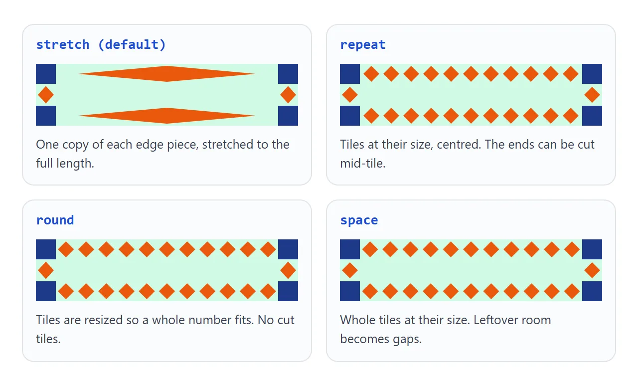
| Value | What happens along each side |
|---|---|
stretch |
One piece, stretched to the full length |
repeat |
Tiles at their scaled size, centred; the ends may be cut |
round |
Tiles resized so a whole number fits |
space |
Whole tiles at their size; the leftover becomes gaps |
Two values set the top and bottom sides first, then the left and right, for example round stretch. round never leaves a cut tile, which suits patterns with a clear motif.
border-image-width and border-image-outset
border-image-width sets how thick the image is drawn. A plain number is a multiple of the border width, so the default 1 matches the border exactly. A length such as 30px is used as it is.
If the image width is larger than the border width, the image spreads over the padding area. The layout does not change, and the content is still drawn on top.
border-image-outset pushes the image outward past the border box. The element keeps its size and position, so the image can overlap neighbours unless you leave margin for it.
Why border-radius does not round it
border-radius clips the background to the curve. The border image is not clipped: it is drawn in the border area with square outer corners, whatever radius you set.
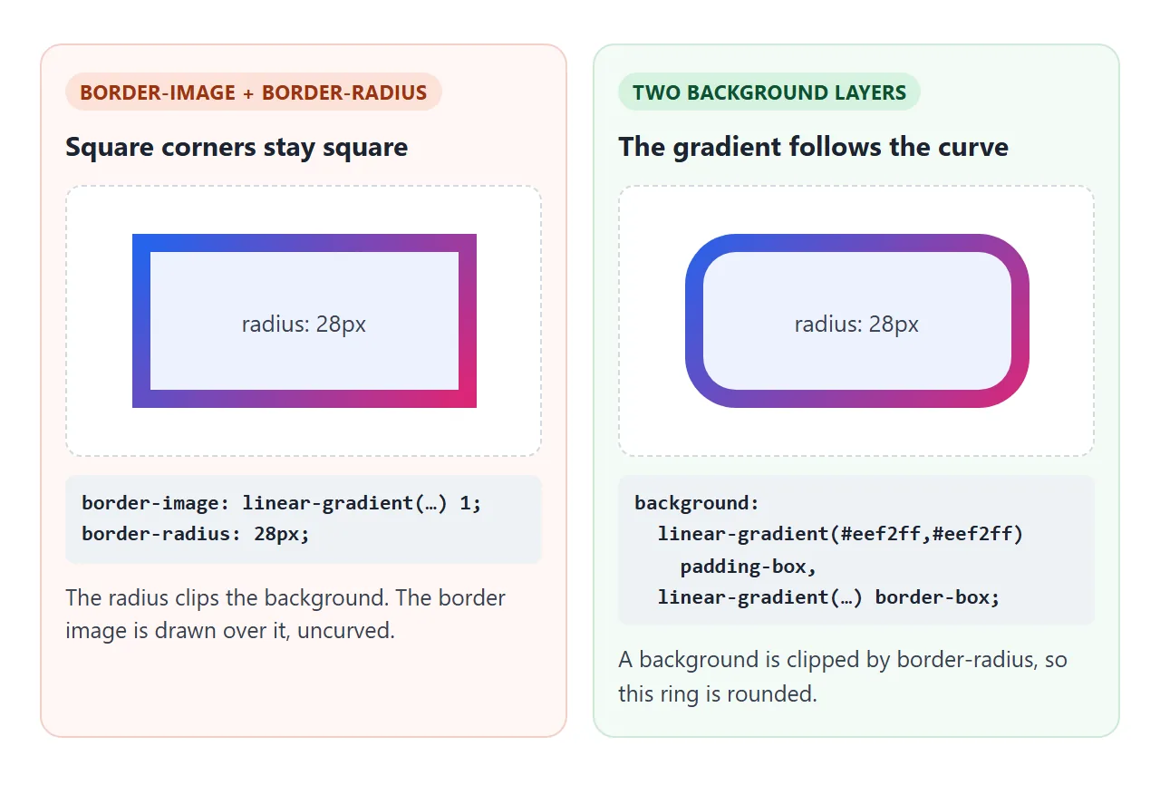
For a rounded gradient border, paint the gradient as a background instead. Put a solid layer on the padding box and the gradient on the border box, with a transparent border between them:
.ring {
  border: 8px solid transparent;
  border-radius: 20px;
  background:
    linear-gradient(#fff, #fff) padding-box,
    linear-gradient(135deg, #2563eb, #db2777) border-box;
}
CSS background-clip explains why this works, and CSS border-radius covers the radius values.
A finished example: a border-image playground
Every property from this guide in one place. Change a control and the frame and the CSS below it update together.
<!doctype html>
<html lang="en">
<head>
<meta charset="utf-8">
<meta name="viewport" content="width=device-width, initial-scale=1">
<title>border-image playground</title>
<style>
  body {
    margin: 0; padding: 16px; font-family: system-ui, sans-serif;
    background: #f4f5f7; color: #1d2330; font-size: 14px;
  }
  .controls { display: grid; grid-template-columns: repeat(auto-fill, minmax(165px, 1fr)); gap: 8px 16px; }
  .controls label { display: grid; gap: 3px; }
  .controls .check { display: flex; gap: 6px; align-items: center; }
  .stage { display: grid; place-items: center; height: 190px; margin: 14px 0; background: #fff; border-radius: 10px; }
  #box { width: 170px; height: 70px; padding: 10px; background: #e0e7ff; border: 20px solid #94a3b8; }
  pre {
    margin: 0; padding: 10px 12px; border-radius: 8px; background: #1d2330; color: #e5e7eb;
    font: 12.5px/1.5 ui-monospace, Consolas, monospace; white-space: pre-wrap; word-break: break-all;
  }
</style>
</head>
<body>
<div class="controls">
  <label>Source
    <select id="src">
      <option value="svg">Inline SVG frame</option>
      <option value="grad">linear-gradient</option>
    </select>
  </label>
  <label>border-image-repeat
    <select id="rep">
      <option>stretch</option><option>repeat</option><option selected>round</option><option>space</option>
    </select>
  </label>
  <label>border-image-slice: <span id="sv"></span>
    <input type="range" id="slice" min="1" max="15" value="10">
  </label>
  <label>border-width: <span id="bv"></span>
    <input type="range" id="bw" min="4" max="40" value="20">
  </label>
  <label>border-image-outset: <span id="ov"></span>
    <input type="range" id="out" min="0" max="20" value="0">
  </label>
  <div>
    <label class="check"><input type="checkbox" id="fill"> fill</label>
    <label class="check"><input type="checkbox" id="rad"> border-radius: 20px</label>
  </div>
</div>

<div class="stage"><div id="box">Your content</div></div>
<pre id="css"></pre>

<script>
  // 30x30 SVG: dark corners, orange diamonds on the edges, yellow middle
  const SVG = "url(\"data:image/svg+xml,<svg xmlns='http://www.w3.org/2000/svg' width='30' height='30'>" +
    "<rect x='10' y='10' width='10' height='10' fill='%23fde68a'/>" +
    "<g fill='%231e3a8a'><rect width='10' height='10'/><rect x='20' width='10' height='10'/>" +
    "<rect y='20' width='10' height='10'/><rect x='20' y='20' width='10' height='10'/></g>" +
    "<g fill='%23ea580c'><path d='M15 1l4 4-4 4-4-4z'/><path d='M15 21l4 4-4 4-4-4z'/>" +
    "<path d='M5 11l4 4-4 4-4-4z'/><path d='M25 11l4 4-4 4-4-4z'/></g></svg>\")";
  const GRAD = 'linear-gradient(135deg, #2563eb, #db2777)';
  const $ = (id) => document.getElementById(id);
  const box = $('box');

  function update() {
    const slice = $('slice').value + ($('fill').checked ? ' fill' : '');
    box.style.borderWidth = $('bw').value + 'px';
    box.style.borderImageSource = $('src').value === 'svg' ? SVG : GRAD;
    box.style.borderImageSlice = slice;
    box.style.borderImageOutset = $('out').value + 'px';
    box.style.borderImageRepeat = $('rep').value;
    box.style.borderRadius = $('rad').checked ? '20px' : '0';
    $('sv').textContent = $('slice').value;
    $('bv').textContent = $('bw').value + 'px';
    $('ov').textContent = $('out').value + 'px';
    // the rule you would copy (the SVG source is shortened to a file name)
    $('css').textContent =
      '.box {\n' +
      '  border: ' + $('bw').value + 'px solid;\n' +
      '  border-image: ' + ($('src').value === 'svg' ? 'url(frame.svg)' : GRAD) + '\n' +
      '    ' + slice + ' / 1 / ' + $('out').value + 'px ' + $('rep').value + ';\n' +
      ($('rad').checked ? '  border-radius: 20px; /* rounds the background only */\n' : '') +
      '}';
  }

  document.querySelectorAll('select, input').forEach((el) => el.addEventListener('input', update));
  update();
</script>
</body>
</html>
- Slice above 10 moves parts of the diamonds into the corners.
- fill turns the yellow SVG centre into a panel.
- border-radius rounds only the pale blue background.
When it does not work
| What you see | Cause | Fix |
|---|---|---|
| No border image at all | border-style is none, so the width is 0 |
Add border: 20px solid |
| The image vanished after adding a border rule | The border shorthand resets border-image |
Put border-image after border |
| The image appears only in the corners | No slice, so the default 100% applies |
Set a slice, such as 1 for gradients |
| A plain coloured border shows instead | The image failed to load | Encode # as %23 in a data URI |
Corners stay square with border-radius |
The radius does not clip border images | Use two background layers |
The sides are empty with space |
Not even one whole tile fits along the side | Use round, or a smaller slice |
| The background is covered | fill keeps the middle piece |
Remove fill |
| The image overlaps nearby elements | border-image-outset does not take space |
Add a margin of the same size |
Share it as a link
A border made from an image is easier to judge on screen than from a screenshot, especially the repeat modes, which change with the width. An .html attachment may open as plain code on a phone.
To send the working version, paste the page into a NOS document and choose Create share link. HTML to link walks through it.
The page renders as written and its scripts run, so the people you send it to can move the sliders themselves. If you change the code later, the same link shows the new version.