mask-image paints an element only where the mask image is opaque. Transparent parts of the mask hide the element, and half-transparent parts let it show through at half strength. The mask can be a CSS gradient, an SVG, or any image.
.fade {
  -webkit-mask-image: linear-gradient(to bottom, #000 60%, transparent);
  mask-image: linear-gradient(to bottom, #000 60%, transparent);
}
Try it below. The slider changes where the text fades, and the scroller fades only on the side that has more to scroll.
<!doctype html>
<html lang="en">
<head>
<meta charset="utf-8">
<meta name="viewport" content="width=device-width, initial-scale=1">
<title>Gradient masks</title>
<style>
  body { margin: 0; padding: 14px; font-family: system-ui, sans-serif; background: #f4f5f7; color: #1d2330; }
  h3 { margin: 0 0 8px; font-size: 15px; }
  .panel { background: #fff; border-radius: 12px; padding: 14px; margin-bottom: 12px; box-shadow: 0 2px 8px rgba(0, 0, 0, .06); }
  label { font-size: 13px; display: flex; align-items: center; gap: 8px; margin-top: 10px; flex-wrap: wrap; }
  input[type=range] { width: 150px; }
  code { display: block; margin-top: 8px; font: 12px/1.5 ui-monospace, Consolas, monospace; background: #eef1f5; border-radius: 6px; padding: 6px 8px; white-space: pre-wrap; word-break: break-all; }

  /* 1) Fade the bottom of a text block */
  .story {
    --fade: 60px;
    max-height: 110px; overflow: hidden; margin: 0; font-size: 14px; line-height: 1.55;
    /* black = visible, transparent = hidden */
    -webkit-mask-image: linear-gradient(to bottom, #000 calc(100% - var(--fade)), transparent);
    mask-image: linear-gradient(to bottom, #000 calc(100% - var(--fade)), transparent);
  }
  .story.open { max-height: 200px; overflow-y: auto; -webkit-mask-image: none; mask-image: none; }
  button { font: inherit; font-size: 13px; padding: 6px 12px; border-radius: 8px; border: 1px solid #cfd5de; background: #fff; cursor: pointer; margin-top: 8px; }

  /* 2) Fade the edges of a horizontal scroller */
  .strip {
    --l: 0px; --r: 40px;  /* fade width on each side, set by the script */
    display: flex; gap: 8px; overflow-x: auto; padding: 4px 0 8px;
    -webkit-mask-image: linear-gradient(to right, transparent, #000 var(--l), #000 calc(100% - var(--r)), transparent);
    mask-image: linear-gradient(to right, transparent, #000 var(--l), #000 calc(100% - var(--r)), transparent);
  }
  .chip { flex: none; padding: 8px 14px; border-radius: 99px; background: #e0ecff; color: #1e3a8a; font-size: 14px; white-space: nowrap; }
</style>
</head>
<body>
<div class="panel">
  <h3>Fade the bottom of a text block</h3>
  <p class="story" id="story">Masks do not change the text. The paragraph is still all there, and a screen reader still reads every word. The mask only decides how much of each pixel is painted. Where the gradient is solid black, the text shows. Where it turns transparent, the text fades to nothing. That makes a mask a neat way to hint that there is more to read, without cutting the sentence off mid-word. Drag the slider to make the fade longer or shorter. At 0px the text simply stops at the edge of the box, the same hard cut that overflow: hidden gives. Press the button to show the rest.</p>
  <button id="more" aria-expanded="false">Show all</button>
  <label>Fade length <input type="range" id="fade" min="0" max="110" value="60"> <span id="fadeOut">60px</span></label>
  <code id="storyCode"></code>
</div>

<div class="panel">
  <h3>Fade the edges of a scroller</h3>
  <div class="strip" id="strip">
    <span class="chip">Design</span><span class="chip">Layout</span><span class="chip">Gradients</span><span class="chip">Masks</span>
    <span class="chip">Icons</span><span class="chip">Typography</span><span class="chip">Motion</span><span class="chip">Colour</span>
    <span class="chip">Forms</span><span class="chip">Tables</span><span class="chip">Accessibility</span>
  </div>
  <label>Edge fade <input type="range" id="edge" min="0" max="80" value="40"> <span id="edgeOut">40px</span></label>
  <label><input type="checkbox" id="smart" checked> Fade only the side that has more to scroll</label>
</div>

<script>
  const story = document.getElementById('story');
  const fade = document.getElementById('fade');
  const more = document.getElementById('more');

  function showStory() {
    story.style.setProperty('--fade', fade.value + 'px');
    document.getElementById('fadeOut').textContent = fade.value + 'px';
    document.getElementById('storyCode').textContent = story.classList.contains('open')
      ? 'mask-image: none;'
      : 'mask-image: linear-gradient(to bottom, #000 calc(100% - ' + fade.value + 'px), transparent);';
  }
  fade.addEventListener('input', showStory);
  more.addEventListener('click', () => {
    const open = story.classList.toggle('open');
    more.textContent = open ? 'Show less' : 'Show all';
    more.setAttribute('aria-expanded', open);
    showStory();
  });
  showStory();

  const strip = document.getElementById('strip');
  const edge = document.getElementById('edge');
  const smart = document.getElementById('smart');

  // Set the fade width per side: no fade on a side that is already at its end
  function showStrip() {
    const w = edge.value + 'px';
    const max = strip.scrollWidth - strip.clientWidth;
    const atStart = strip.scrollLeft <= 1;
    const atEnd = strip.scrollLeft >= max - 1;
    strip.style.setProperty('--l', smart.checked && atStart ? '0px' : w);
    strip.style.setProperty('--r', smart.checked && atEnd ? '0px' : w);
    document.getElementById('edgeOut').textContent = w;
  }
  strip.addEventListener('scroll', showStrip);
  edge.addEventListener('input', showStrip);
  smart.addEventListener('change', showStrip);
  window.addEventListener('resize', showStrip);
  showStrip();
</script>
</body>
</html>
How a mask decides what shows
Picture the element painted as usual, then multiplied by the mask, pixel by pixel. Where the mask is opaque the pixel stays. Where it is transparent the pixel goes. Colour in the mask does not matter by default, only opacity.
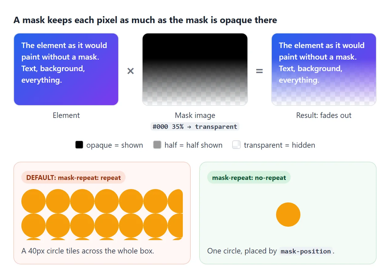
A few facts follow from that:
- The mask covers the whole element: background, border, text and every child.
- The text is still in the page. It can be selected, searched and read by a screen reader, even where it looks gone.
- By default one copy of the mask starts at the top-left of the border box, keeps its own size (a gradient has none, so it fills the box), and repeats to fill the box.
You will often see the same line twice, once with -webkit-. Current browsers read the standard mask-* properties, and older versions of some browsers only read the prefixed ones. Put the -webkit- line first and the standard one after it.
Fade edges with a gradient mask
A linear-gradient from black to transparent is the most common mask. It fades the bottom of a clipped paragraph, the edge of a scroller, or an image into the page.
/* Fade the last 60px of a text box */
.story {
  max-height: 110px;
  overflow: hidden;
  mask-image: linear-gradient(to bottom, #000 calc(100% - 60px), transparent);
}

/* Fade both ends of a horizontal list */
.strip {
  overflow-x: auto;
  mask-image: linear-gradient(to right, transparent, #000 40px, #000 calc(100% - 40px), transparent);
}
Using calc(100% - 60px) keeps the fade the same length however tall the box is. A percentage stop would make the fade grow with the box.
Because the mask is on the whole element, the fade stays put while you scroll the list.
The demo goes one step further: a small script sets --l and --r to 0px when the list is already at that end, so the first and last items are never faded.
A fade is a hint that there is more. For a single line that should end in "...", text-overflow: ellipsis is the simpler tool.
Recolour SVG icons with a mask
An SVG loaded with <img> or background-image keeps the colours drawn in the file. CSS cannot reach inside it. A mask turns that around: the element paints a flat colour, and the SVG only supplies the shape.
.icon {
  width: 1.25em;
  height: 1.25em;
  background-color: currentColor; /* the icon takes the text colour */
  -webkit-mask: url(star.svg) center / contain no-repeat;
  mask: url(star.svg) center / contain no-repeat;
}
<!doctype html>
<html lang="en">
<head>
<meta charset="utf-8">
<meta name="viewport" content="width=device-width, initial-scale=1">
<title>Recolour icons with a mask</title>
<style>
:root {
--brand: #2563eb;
/* Black SVG shapes as data URIs. Their colour does not matter, only their alpha. */
--i-home: url("data:image/svg+xml,%3Csvg xmlns='http://www.w3.org/2000/svg' viewBox='0 0 24 24'%3E%3Cpath d='M12 3 2 12h3v8h5v-6h4v6h5v-8h3z'/%3E%3C/svg%3E");
--i-star: url("data:image/svg+xml,%3Csvg xmlns='http://www.w3.org/2000/svg' viewBox='0 0 24 24'%3E%3Cpath d='M12 2l3.1 6.3 6.9 1-5 4.9 1.2 6.8L12 17.8 5.8 21l1.2-6.8-5-4.9 6.9-1z'/%3E%3C/svg%3E");
--i-heart: url("data:image/svg+xml,%3Csvg xmlns='http://www.w3.org/2000/svg' viewBox='0 0 24 24'%3E%3Cpath d='M12 21s-8-5.3-8-11a4.5 4.5 0 0 1 8-2.8A4.5 4.5 0 0 1 20 10c0 5.7-8 11-8 11z'/%3E%3C/svg%3E");
--i-bell: url("data:image/svg+xml,%3Csvg xmlns='http://www.w3.org/2000/svg' viewBox='0 0 24 24'%3E%3Cpath d='M12 22a2.5 2.5 0 0 0 2.5-2.5h-5A2.5 2.5 0 0 0 12 22zm7-6v-5a7 7 0 0 0-5.5-6.8V3a1.5 1.5 0 0 0-3 0v1.2A7 7 0 0 0 5 11v5l-2 2v1h18v-1z'/%3E%3C/svg%3E");
}
body { margin: 0; padding: 14px; font-family: system-ui, sans-serif; background: #f4f5f7; color: #1d2330; }
.panel { background: #fff; border-radius: 12px; padding: 14px; margin-bottom: 12px; box-shadow: 0 2px 8px rgba(0, 0, 0, .06); }
h3 { margin: 0 0 10px; font-size: 15px; }
/* The icon: a box painted with the text colour, cut out by the SVG */
.icon {
display: inline-block; width: 1.25em; height: 1.25em; vertical-align: -0.25em;
background-color: currentColor;
-webkit-mask: var(--svg) center / contain no-repeat;
mask: var(--svg) center / contain no-repeat;
}
.home { --svg: var(--i-home); } .star { --svg: var(--i-star); }
.heart { --svg: var(--i-heart); } .bell { --svg: var(--i-bell); }
body.lum .icon { mask-mode: luminance; }
.bar { display: flex; flex-wrap: wrap; gap: 8px; font-size: var(--size, 18px); }
.bar button {
font: inherit; display: inline-flex; align-items: center; gap: 6px; padding: 8px 12px;
border: 1px solid #d5dae2; border-radius: 10px; background: #fff; color: #4b5563; cursor: pointer;
}
.bar button:hover, .bar button:focus-visible { color: var(--brand); border-color: var(--brand); }
.bar button[aria-pressed=true] { background: var(--brand); color: #fff; border-color: var(--brand); }
.bar button span.t { font-size: 14px; }
.compare { display: flex; gap: 18px; align-items: center; font-size: 13px; flex-wrap: wrap; }
.compare div { display: flex; align-items: center; gap: 8px; }
.compare img, .compare .icon { width: 32px; height: 32px; }
.compare .icon { color: var(--brand); }
label { font-size: 13px; display: flex; align-items: center; gap: 8px; margin-top: 10px; flex-wrap: wrap; }
input[type=range] { width: 140px; }
</style>
</head>
<body>
<div class="panel">
<h3>One SVG, any colour</h3>
<div class="bar" id="bar">
<button><i class="icon home"></i><span class="t">Home</span></button>
<button aria-pressed="true"><i class="icon star"></i><span class="t">Saved</span></button>
<button><i class="icon heart"></i><span class="t">Likes</span></button>
<button><i class="icon bell"></i><span class="t">Alerts</span></button>
</div>
<label>Brand colour <input type="color" id="brand" value="#2563eb"></label>
<label>Icon size <input type="range" id="size" min="14" max="30" value="18"> <span id="sizeOut">18px</span></label>
<label><input type="checkbox" id="lum"> mask-mode: luminance (watch the icons disappear)</label>
</div>
<div class="panel">
<h3>The same SVG as an <img> and as a mask</h3>
<div class="compare">
<div><img src="data:image/svg+xml,%3Csvg xmlns='http://www.w3.org/2000/svg' viewBox='0 0 24 24'%3E%3Cpath d='M12 2l3.1 6.3 6.9 1-5 4.9 1.2 6.8L12 17.8 5.8 21l1.2-6.8-5-4.9 6.9-1z'/%3E%3C/svg%3E" alt="Star as an img"> <img>: stays black</div>
<div><i class="icon star"></i> mask: takes the colour</div>
</div>
</div>
<script>
const root = document.documentElement;
// Hover and pressed states use var(--brand), so one variable restyles every icon
document.getElementById('brand').addEventListener('input', (e) => root.style.setProperty('--brand', e.target.value));
const size = document.getElementById('size');
size.addEventListener('input', () => {
document.getElementById('bar').style.setProperty('--size', size.value + 'px');
document.getElementById('sizeOut').textContent = size.value + 'px';
});
document.getElementById('lum').addEventListener('change', (e) => document.body.classList.toggle('lum', e.target.checked));
document.querySelectorAll('.bar button').forEach((b) => b.addEventListener('click', () => {
document.querySelectorAll('.bar button').forEach((x) => x.setAttribute('aria-pressed', x === b));
}));
</script>
</body>
</html>
background-color: currentColor makes the icon follow color, so hover and active styles on a button recolour the icon for free. A CSS variable such as --brand does the same across a whole page.
The SVG can live in a file or inside the CSS as a data: URI.
If you write the SVG into the URI, encode <, > and # as %3C, %3E and %23. For icons written straight into the HTML, changing an inline SVG's colour with fill is the other route.
Size, position and repeat
The mask properties mirror the background ones. The defaults are the usual source of surprises: the mask keeps its own size and repeats.
| Property | Default | Common value | What it does |
|---|---|---|---|
mask-image |
none |
a gradient or url() |
The image whose opacity is used |
mask-size |
auto |
contain, cover, 100% 100% |
How big one copy of the mask is |
mask-position |
0% 0% |
center |
Where the first copy sits |
mask-repeat |
repeat |
no-repeat |
Whether copies tile to fill the box |
mask-mode |
match-source |
luminance |
Read opacity or brightness |
The mask shorthand takes them in background order: mask: url(shape.svg) center / contain no-repeat. It also resets anything you leave out, including mask-mode, so put single properties after it.
mask-position can be animated. The finished card below slides a wide gradient across a line of text on hover to reveal it.
Alpha or luminance: mask-mode
A mask can be read in two ways. Alpha mode uses only opacity. Luminance mode uses brightness multiplied by opacity, so white shows the element and black hides it.
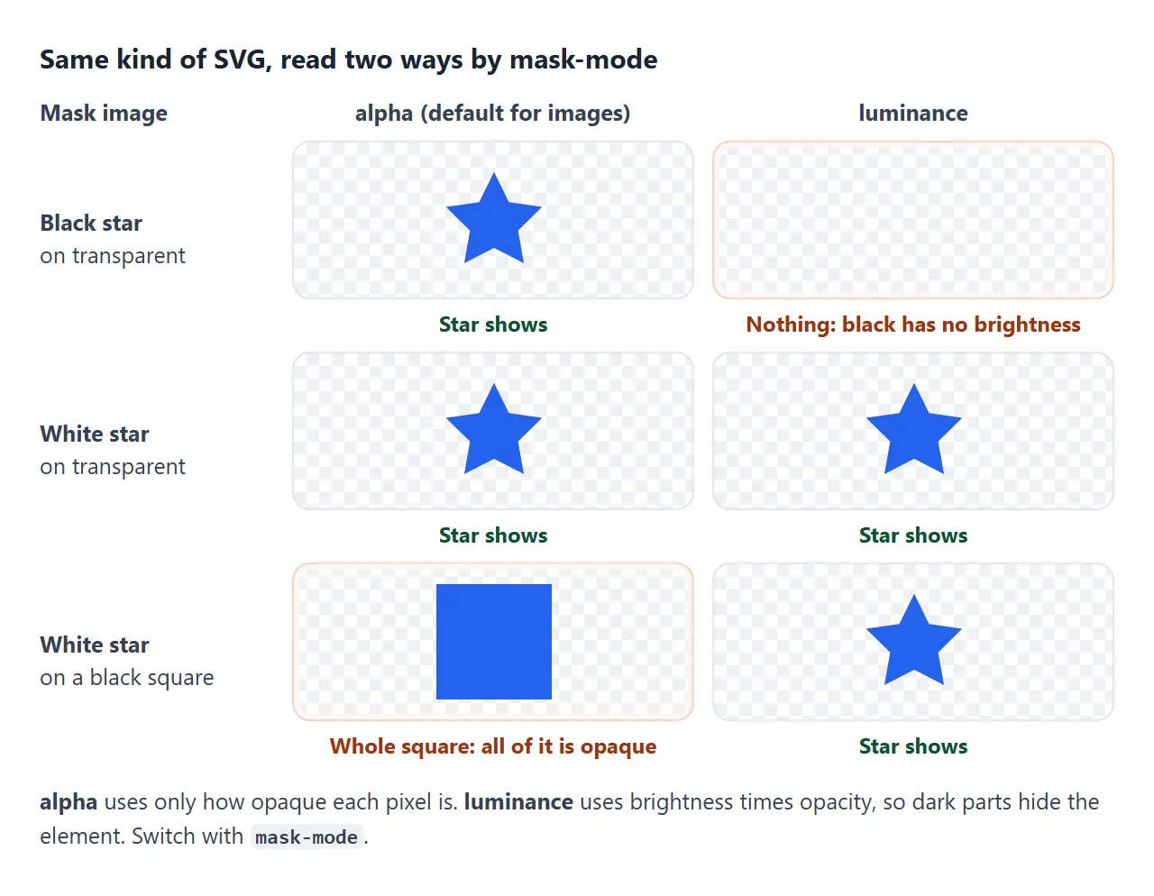
For images and gradients the default, match-source, means alpha. That is why black icon files work as masks without any extra setting.
Switch to mask-mode: luminance only when the mask is a white shape drawn on a black background, such as a black-and-white image exported from a design tool.
mask-image vs clip-path
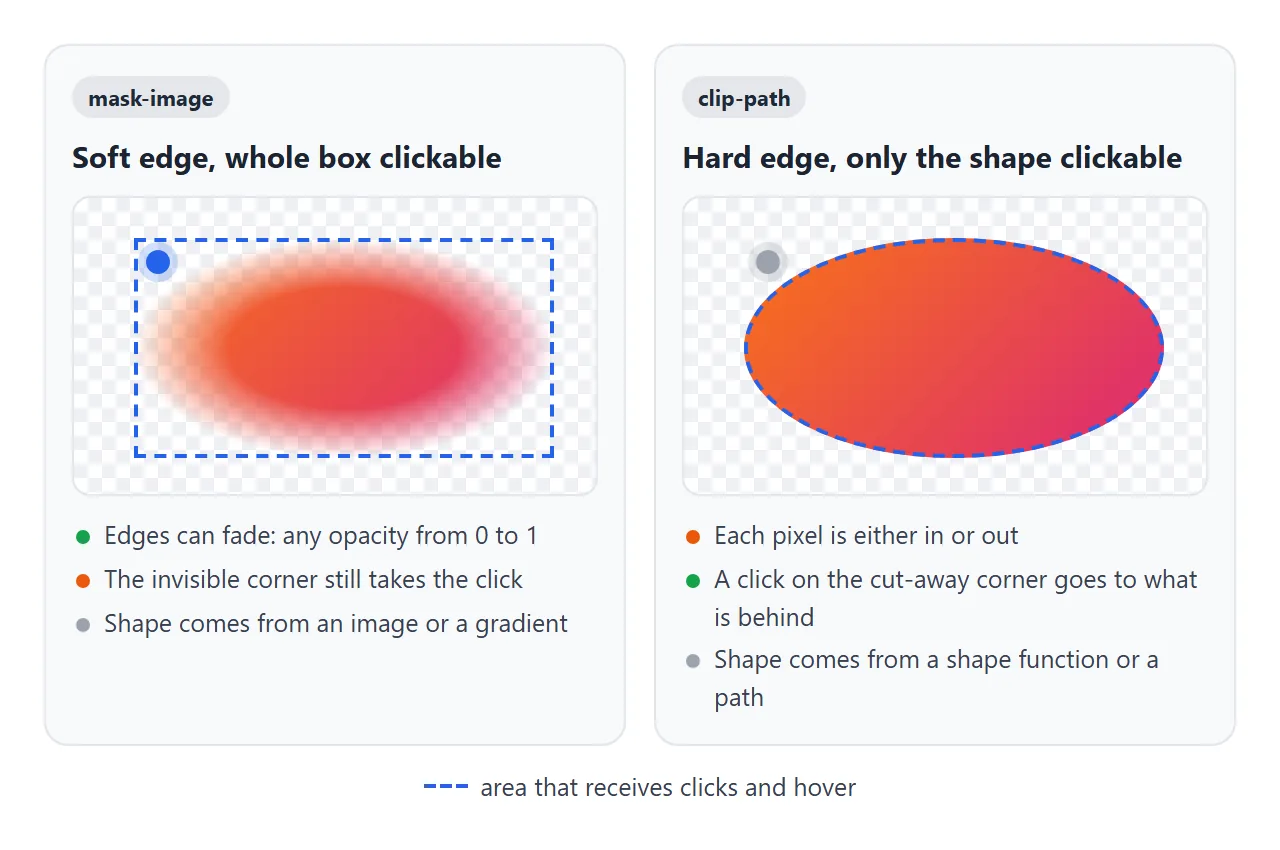
Both hide part of an element, and they suit different jobs. clip-path cuts along a geometric outline. A mask can use any opacity, so its edge can be soft.
mask-image |
clip-path |
|
|---|---|---|
| Edge | Soft or hard | Hard |
| Shape comes from | An image or gradient | circle(), polygon(), path() |
| Clicks on hidden parts | Still hit the element | Pass through to what is behind |
| Animating the shape | Move or resize the mask | Change the shape's points |
The click row matters for buttons and cards. A masked-out corner is invisible but still receives clicks and hover. If the visible shape should be the clickable shape, use clip-path, or put the mask on an inner element and the link on a smaller one.
Both properties also create a stacking context. A child with a high z-index cannot rise above elements outside the masked parent. How z-index works explains why.
A box-shadow outside the box is masked away too. Put the mask on an inner element, or use filter: drop-shadow() on a wrapper (CSS filter shows how).
A finished card
The last example puts three masks on one card: a blob-shaped picture, a tag strip that fades at the right, and a line of text revealed by a moving mask.
<!doctype html>
<html lang="en">
<head>
<meta charset="utf-8">
<meta name="viewport" content="width=device-width, initial-scale=1">
<title>Masked card</title>
<style>
  body { margin: 0; padding: 16px; font-family: system-ui, sans-serif; background: #eef0f4; color: #1d2330; }
  .card {
    max-width: 360px; margin: 0 auto; background: #fff; border-radius: 18px; padding: 18px;
    box-shadow: 0 8px 28px rgba(0, 0, 0, .1); outline: none; cursor: pointer;
  }
  .card:focus-visible { box-shadow: 0 0 0 3px #2563eb; }

  /* 1) Image cut to a blob shape. The "photo" is made of gradients. */
  .photo {
    height: 190px;
    background:
      radial-gradient(circle at 72% 30%, #fde68a 0 22px, transparent 23px),
      radial-gradient(110% 60% at 22% 108%, #166534 60%, transparent 60.5%),
      radial-gradient(90% 55% at 88% 100%, #22c55e 60%, transparent 60.5%),
      linear-gradient(#60a5fa, #bfdbfe);
    --blob: url("data:image/svg+xml,%3Csvg xmlns='http://www.w3.org/2000/svg' viewBox='0 0 200 120'%3E%3Cpath d='M38 8C70-6 118 4 150 10s52 30 44 58-40 50-86 48S14 108 6 78 6 22 38 8z'/%3E%3C/svg%3E");
    -webkit-mask: var(--blob) center / 100% 100% no-repeat;
    mask: var(--blob) center / 100% 100% no-repeat;
  }

  h2 { font-size: 20px; margin: 14px 0 4px; }
  p { margin: 0 0 12px; font-size: 14px; line-height: 1.5; color: #4b5563; }

  /* 2) Tag strip that fades out at the right edge */
  .tags {
    display: flex; gap: 6px; overflow-x: auto; scrollbar-width: none; padding-bottom: 2px;
    -webkit-mask-image: linear-gradient(to right, #000 75%, transparent);
    mask-image: linear-gradient(to right, #000 75%, transparent);
  }
  .tags span { flex: none; font-size: 13px; padding: 5px 11px; border-radius: 99px; background: #ecfdf5; color: #065f46; }

  /* 3) Text revealed by sliding a gradient mask across it */
  .reveal {
    margin-top: 14px; font-weight: 600; color: #2563eb;
    -webkit-mask-image: linear-gradient(to right, #000 40%, transparent 60%);
    mask-image: linear-gradient(to right, #000 40%, transparent 60%);
    -webkit-mask-size: 250% 100%; mask-size: 250% 100%;
    -webkit-mask-repeat: no-repeat; mask-repeat: no-repeat;
    -webkit-mask-position: 80% 0; mask-position: 80% 0;  /* mostly the transparent end: a faint start */
    transition: -webkit-mask-position .6s ease, mask-position .6s ease;
  }
  .card:focus-visible .reveal, .card.open .reveal {
    -webkit-mask-position: 0 0; mask-position: 0 0;       /* the black end covers the text */
  }
  @media (hover: hover) {  /* only where a real hover exists, so a tap can toggle it off */
    .card:hover .reveal { -webkit-mask-position: 0 0; mask-position: 0 0; }
  }
  @media (prefers-reduced-motion: reduce) {
    .reveal { transition: none; }
  }
  .hint { text-align: center; font-size: 12px; color: #6b7280; margin-top: 12px; }
</style>
</head>
<body>
<article class="card" id="card" tabindex="0" aria-describedby="more">
  <div class="photo" role="img" aria-label="Green hills under a blue sky with a yellow sun"></div>
  <h2>Weekend in the hills</h2>
  <p>Two days, three trails and a lot of fresh air.</p>
  <div class="tags">
    <span>Hiking</span><span>Camping</span><span>Photography</span><span>Picnic</span><span>Sunrise</span><span>Lakes</span>
  </div>
  <div class="reveal" id="more">Read the trip notes: routes, kit list and where to eat →</div>
</article>
<div class="hint">Hover, focus with Tab, or tap the card.</div>

<script>
  // Tap toggles the reveal on touch screens, where there is no hover
  const card = document.getElementById('card');
  card.addEventListener('click', () => card.classList.toggle('open'));
</script>
</body>
</html>
- Blob picture: the "photo" is layered gradients. An SVG blob with
mask-size: 100% 100%stretches over the box, so the shape fits any width. - Fading strip: a fixed gradient that goes transparent over the last quarter, so the cut-off tag reads as "more to scroll".
- Text reveal: the mask is 250% wide, half black and half transparent.
mask-positionmoves it from the transparent end to the black end. - Touch and motion: hover applies only inside
@media (hover: hover), and a tap toggles a class. Underprefers-reduced-motion: reducethe transition is turned off and the text simply appears.
When it does not work
| What you see | Cause | Fix |
|---|---|---|
| The mask has no effect in an older browser | It only reads the prefixed property | Add the -webkit-mask-* line before the standard one |
| The whole element disappears | The mask URL failed to load, which counts as fully transparent | Check the path and the network panel, or use a data: URI |
| The element disappears with a black SVG mask | mask-mode: luminance reads black as hidden |
Remove it; alpha is the default for images |
| The shape repeats across the element | mask-repeat defaults to repeat |
Add no-repeat |
| The shape is tiny or cropped | mask-size is auto, so the image's own size is used |
Set contain, cover or 100% 100% |
| Clicks land on the invisible part | Masks do not change the clickable area | Use clip-path, or shrink the clickable element |
A child's z-index stops working |
The mask created a stacking context | Move the child out of the masked element |
| The shadow is gone | The mask also covers the box-shadow |
Mask an inner element, or use drop-shadow() on a wrapper |
Share it as a link
A fade or a hover reveal is hard to judge from a screenshot, and a colour change on hover does not show in one at all. The person reviewing it should scroll the strip and move the pointer themselves.
To send the working version, paste the page into a NOS document and choose Create share link. HTML to link walks through it.
The page renders as written and its scripts run, so the people you send it to can try the masks themselves. If you change the code later, the same link shows the new version.