To cut a long line of text with "…" in CSS, put these three properties on an element that has a width:
.title {
  white-space: nowrap;      /* keep it on one line */
  overflow: hidden;         /* clip what does not fit */
  text-overflow: ellipsis;  /* draw "…" where it is clipped */
}
Try taking one away. Untick a box below and the ellipsis disappears, and the message names what is missing. Drag the width slider to see the cut move.
<!doctype html>
<html lang="en">
<head>
<meta charset="utf-8">
<meta name="viewport" content="width=device-width, initial-scale=1">
<title>text-overflow: ellipsis needs three properties</title>
<style>
  body { margin: 0; padding: 16px; font-family: system-ui, sans-serif; background: #f4f5f7; color: #1d2330; }
  .controls { display: flex; flex-wrap: wrap; gap: 8px 16px; font-size: 14px; }
  .controls label { display: flex; align-items: center; gap: 6px; }
  code { font: 13px ui-monospace, Consolas, monospace; }
  .width { margin: 12px 0 16px; font-size: 14px; }
  .width input { width: 180px; vertical-align: middle; }

  /* the element being truncated: a block with a set width */
  .title {
    width: 260px;
    padding: 10px 12px; border-radius: 8px;
    background: #fff; border: 2px dashed #9aa3b2;
    font-size: 15px;
  }
  .nowrap   { white-space: nowrap; }
  .hidden   { overflow: hidden; }
  .ellipsis { text-overflow: ellipsis; }

  #status { margin-top: 16px; font-size: 14px; padding: 8px 10px; border-radius: 6px; }
  #status.ok  { background: #d6f2df; color: #0f5132; }
  #status.bad { background: #fde2da; color: #9a3412; }
</style>
</head>
<body>
<div class="controls">
  <label><input type="checkbox" id="nowrap" checked> <code>white-space: nowrap</code></label>
  <label><input type="checkbox" id="hidden" checked> <code>overflow: hidden</code></label>
  <label><input type="checkbox" id="ellipsis" checked> <code>text-overflow: ellipsis</code></label>
</div>
<div class="width">
  <label>width: <input type="range" id="w" min="120" max="300" value="260"> <code id="wv">260px</code></label>
</div>

<div class="title nowrap hidden ellipsis" id="title">Quarterly revenue review for the northern region, final draft with comments</div>
<div id="status"></div>

<script>
  const title = document.getElementById('title');
  const status = document.getElementById('status');
  const names = { nowrap: 'white-space: nowrap', hidden: 'overflow: hidden', ellipsis: 'text-overflow: ellipsis' };

  function update() {
    const missing = [];
    for (const id of ['nowrap', 'hidden', 'ellipsis']) {
      const on = document.getElementById(id).checked;
      title.classList.toggle(id, on);   // each checkbox adds or removes one property
      if (!on) missing.push(names[id]);
    }
    const w = document.getElementById('w').value;
    title.style.width = w + 'px';
    document.getElementById('wv').textContent = w + 'px';

    // is the text wider than the box? then the ellipsis is (or should be) showing
    const cut = title.scrollWidth > title.clientWidth;
    if (missing.length) {
      status.className = 'bad';
      status.textContent = 'No ellipsis. Missing: ' + missing.join(', ');
    } else {
      status.className = 'ok';
      status.textContent = cut ? 'Ellipsis showing: all three are set.' : 'All three set. The text fits, so no ellipsis is needed.';
    }
  }

  document.querySelectorAll('input').forEach((i) => i.addEventListener('input', update));
  update();
</script>
</body>
</html>
The rest of this guide covers the cases where those three lines are not enough: several lines, flex rows, tables, and names that should be cut in the middle.
The three properties, one job each
text-overflow does not make text overflow. It only decides what to draw at the point where overflowing text is clipped. The other two properties have to create that point first.
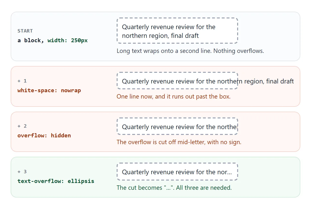
white-space: nowrapstops the text from wrapping, so a long line pushes past the right edge. Without it, the text wraps and nothing overflows sideways.overflow: hiddenclips the part outside the box. Without it, the text stays visible and runs over whatever sits next to it.text-overflow: ellipsisreplaces the clipped end with "…". Without it, the clip is a hard cut through a letter.
The element also needs a width to overflow. That can be a fixed width, a max-width, or the width a block gets from its parent. Max width in CSS covers how those differ.
It has to be a block or inline-block box. A plain <span> is inline: width and overflow do not apply to it, so nothing is clipped. Add display: block or display: inline-block, or put the rule on the parent block.
If your problem is the opposite, text that will not wrap when you want it to, see HTML text not wrapping.
Ellipsis after several lines: line-clamp
text-overflow only works on one line. For a card description that should stop after three lines with "…", use line clamping:
.desc {
  display: -webkit-box;
  -webkit-box-orient: vertical;
  -webkit-line-clamp: 3;   /* number of lines */
  overflow: hidden;
}
All four lines matter. -webkit-line-clamp on its own has no effect, because it only works on an element with display: -webkit-box and a vertical box orientation. Leave out overflow: hidden and the "…" appears on line 3 while the remaining lines still show underneath.
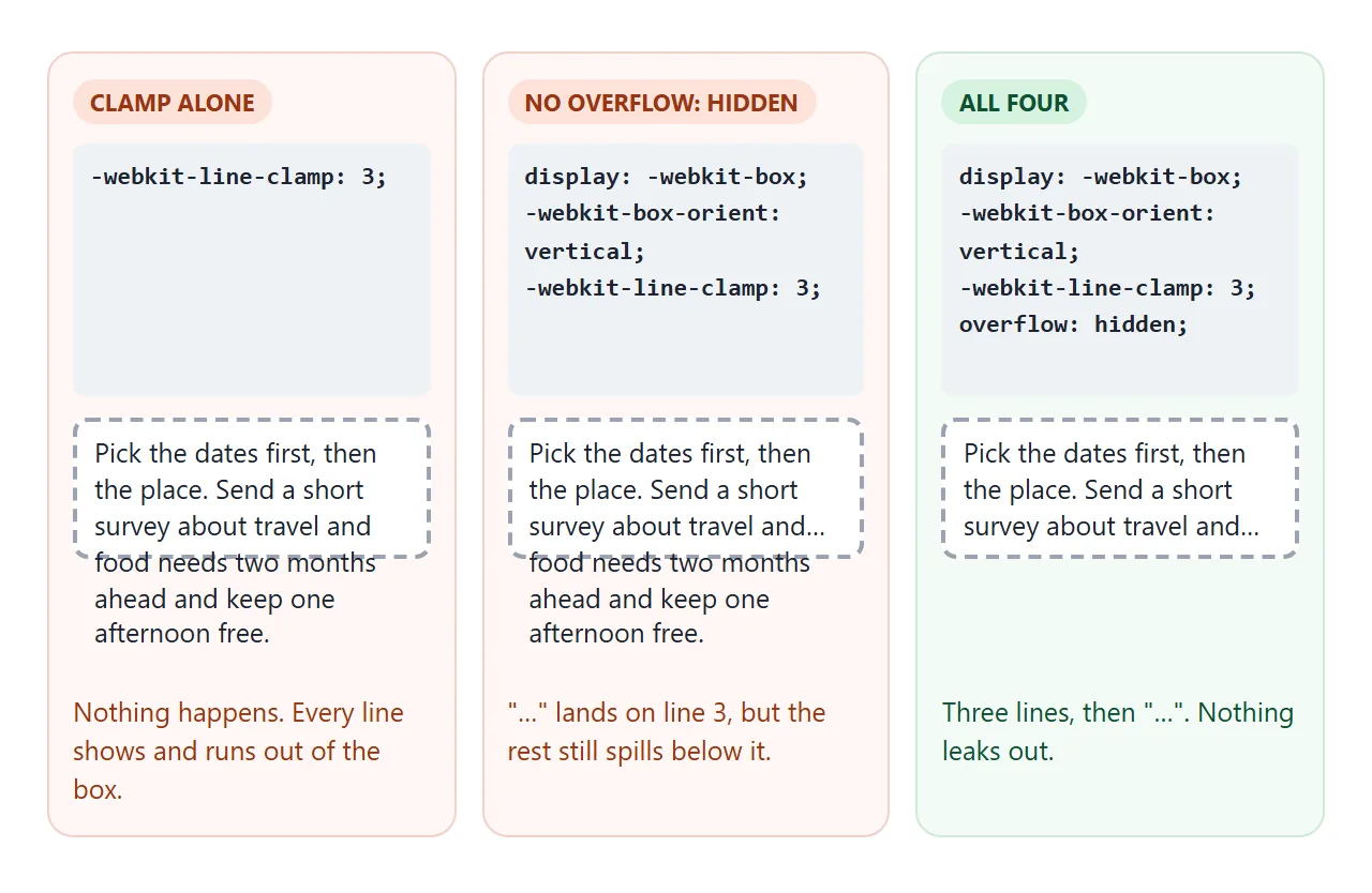
Do not add white-space: nowrap here. It would put everything on one line, and there would be only one line to clamp.
The prefixes look old, but this is the form written into the CSS Overflow specification for compatibility. Newer drafts of that specification also define an unprefixed line-clamp property. Browser support for it is not complete yet, so check support before relying on it alone.
Ellipsis inside flexbox: min-width: 0
A common layout breaks the recipe: an icon, a block with a title and a subtitle, and a button, all in a flex row. The title has all three properties, yet no "…" appears and the button gets pushed out of the row.
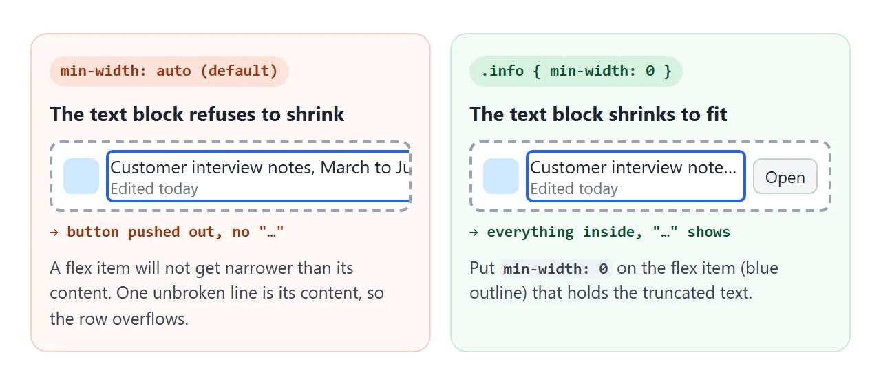
The cause is the flex item's default min-width: auto. It stops a flex item from shrinking below the width of its content. The content here is one long unwrapped line, so the item stays that wide, and the title never overflows its own box.
The fix goes on the flex item that contains the text, not on the text:
.row  { display: flex; }
.info { flex: 1; min-width: 0; }   /* the item that holds the title */
.info .title {
  white-space: nowrap;
  overflow: hidden;
  text-overflow: ellipsis;
}
If the truncated element is itself the flex item, it usually works without the extra rule. An item with overflow: hidden already has an automatic minimum width of zero.
Grid items have the same min-width: auto default, so a grid column may need min-width: 0 or minmax(0, 1fr). CSS flexbox explains how items shrink.
Tick the boxes to apply each fix:
<!doctype html>
<html lang="en">
<head>
<meta charset="utf-8">
<meta name="viewport" content="width=device-width, initial-scale=1">
<title>Ellipsis in flexbox and in a table cell</title>
<style>
  body { margin: 0; padding: 14px; font-family: system-ui, sans-serif; background: #f4f5f7; color: #1d2330; }
  h3 { margin: 0 0 6px; font-size: 15px; }
  label { font-size: 14px; display: flex; align-items: center; gap: 6px; margin-bottom: 8px; }
  code { font: 13px ui-monospace, Consolas, monospace; }
  .panel {
    max-width: 420px; margin-bottom: 18px; padding: 10px;
    background: #fff; border: 2px dashed #9aa3b2; border-radius: 8px;
    overflow: hidden;   /* anything that pushes past the panel is cut off here */
  }
  .truncate { white-space: nowrap; overflow: hidden; text-overflow: ellipsis; }

  /* flex row: icon, a text block that grows, a button */
  .row { display: flex; align-items: center; gap: 10px; }
  .icon { flex: none; width: 34px; height: 34px; border-radius: 8px; background: #cfe8ff; }
  .info { flex: 1; }
  .info.fix { min-width: 0; }          /* the fix: let the text block shrink */
  .meta { font-size: 12px; color: #6b7280; }
  .row button { flex: none; }

  /* table */
  table { width: 100%; border-collapse: collapse; font-size: 14px; }
  table.fix { table-layout: fixed; }   /* the fix: columns follow the widths below */
  th, td { text-align: left; padding: 6px 8px; border-bottom: 1px solid #e5e7eb; }
  col.size { width: 70px; } col.date { width: 96px; }
</style>
</head>
<body>
<h3>Flex item</h3>
<label><input type="checkbox" id="flexfix"> <code>min-width: 0</code> on the text block</label>
<div class="panel">
  <div class="row">
    <div class="icon"></div>
    <div class="info" id="info">
      <div class="truncate">Customer interview notes, March to June, all regions combined.docx</div>
      <div class="meta">Edited today</div>
    </div>
    <button>Open</button>
  </div>
</div>

<h3>Table cell</h3>
<label><input type="checkbox" id="tablefix"> <code>table-layout: fixed</code> on the table</label>
<div class="panel">
  <table id="table">
    <colgroup><col><col class="size"><col class="date"></colgroup>
    <tr><th>Name</th><th>Size</th><th>Date</th></tr>
    <tr><td class="truncate">Customer interview notes, March to June, all regions combined.docx</td><td>84 KB</td><td>12 Sep</td></tr>
    <tr><td class="truncate">Logo.svg</td><td>6 KB</td><td>3 Sep</td></tr>
  </table>
</div>

<script>
  document.getElementById('flexfix').addEventListener('change', (e) => {
    document.getElementById('info').classList.toggle('fix', e.target.checked);
  });
  document.getElementById('tablefix').addEventListener('change', (e) => {
    document.getElementById('table').classList.toggle('fix', e.target.checked);
  });
</script>
</body>
</html>
Ellipsis in a table cell
Tables have their own version of the problem. With the default table-layout: auto, the browser sizes each column to fit its content.
A cell set to nowrap asks for its whole line, so the column grows and the table becomes wider than its container instead of cutting the text.
Switch the table to fixed layout and give it a width:
table { width: 100%; table-layout: fixed; }
col.size { width: 70px; }
td.name {
  white-space: nowrap;
  overflow: hidden;
  text-overflow: ellipsis;
}
With table-layout: fixed, column widths come from the table width and the widths you set on columns or first-row cells, not from the content. Columns without a width share what is left.
The rule only takes effect when the table has a width, such as width: 100%.
If you would rather keep automatic layout, put a max-width on the cell. CSS 2.1 left max-width on table cells undefined, so results can vary. The dependable version is a <div> inside the cell with the max-width and the three properties.
Deciding which columns should wrap and which should truncate is covered in HTML word wrap in a table.
Showing the full text
Cutting text hides information, so give readers a way to see all of it.
| Method | How | Good for |
|---|---|---|
title attribute |
title="full text" on the element |
Desktop hover on names and paths |
| "Read more" button | Toggle a class that removes the clamp | Descriptions in cards |
| Wider layout | Let the text wrap on small screens | Content people actually read |
A title tooltip only appears on hover, and MDN notes it is a problem for touch-only devices and keyboard users. The HTML title attribute covers its limits. For anything important, add a visible button.
Show that button only when the text is actually cut. The browser can tell you:
const cutOneLine = el.scrollWidth > el.clientWidth;     // text-overflow
const cutLines   = el.scrollHeight > el.clientHeight;   // line-clamp
Ellipsis in the middle of a file name
text-overflow always cuts the end. For file names that drops the part people need most, the extension. File managers cut the middle instead, which CSS cannot do, so this takes JavaScript:
- Put the full name in the element and check whether it fits with
scrollWidth <= clientWidth. - If not, try keeping fewer characters: half from the start, "…", half from the end.
- Search for the largest count that fits, and run it again whenever the width changes, with a
ResizeObserver.
The finished example combines both techniques. File names are cut in the middle and keep their extension. Card descriptions stop at three lines, and only the cards that were clamped get a "Read more" button.
<!doctype html>
<html lang="en">
<head>
<meta charset="utf-8">
<meta name="viewport" content="width=device-width, initial-scale=1">
<title>File list and clamped cards</title>
<style>
  body { margin: 0; padding: 14px; font-family: system-ui, sans-serif; background: #f4f5f7; color: #1d2330; }
  h3 { margin: 0 0 8px; font-size: 15px; }

  /* file list: names cut in the middle so the extension stays visible */
  .files { list-style: none; margin: 0 0 20px; padding: 0; max-width: 460px; background: #fff; border-radius: 10px; }
  .files li { display: flex; gap: 10px; padding: 9px 12px; border-bottom: 1px solid #eceef1; font-size: 14px; }
  .files li:last-child { border-bottom: 0; }
  .fname { flex: 1; min-width: 0; white-space: nowrap; overflow: hidden; }
  .fsize { flex: none; color: #6b7280; }

  /* cards: descriptions clamped to three lines */
  .grid { display: grid; grid-template-columns: repeat(auto-fill, minmax(200px, 1fr)); gap: 12px; }
  .card { background: #fff; border-radius: 10px; padding: 12px 14px; box-shadow: 0 2px 8px rgba(0, 0, 0, .08); }
  .card h4 { margin: 0 0 6px; font-size: 15px; }
  .desc {
    margin: 0; font-size: 14px; line-height: 1.45;
    display: -webkit-box;
    -webkit-box-orient: vertical;
    -webkit-line-clamp: 3;
    overflow: hidden;
  }
  .desc.open { display: block; }        /* expanded: back to a normal block */
  .more { margin-top: 6px; padding: 0; border: 0; background: none; color: #1d4ed8; font: inherit; font-size: 13px; cursor: pointer; }
</style>
</head>
<body>
<h3>Files</h3>
<ul class="files">
  <li><span class="fname" data-full="2026-09 board meeting minutes, final version approved by finance.pdf"></span><span class="fsize">312 KB</span></li>
  <li><span class="fname" data-full="product-photos-autumn-campaign-high-resolution-originals.zip"></span><span class="fsize">48 MB</span></li>
  <li><span class="fname" data-full="Budget.xlsx"></span><span class="fsize">21 KB</span></li>
</ul>

<h3>Articles</h3>
<div class="grid">
  <div class="card">
    <h4>Planning a team offsite</h4>
    <p class="desc">Pick the dates first, then the place. Send a short survey about travel limits and food needs two months ahead, book rooms with a free cancellation window, and keep one afternoon open with nothing planned so people can talk.</p>
  </div>
  <div class="card">
    <h4>Short note</h4>
    <p class="desc">This one fits, so no button appears.</p>
  </div>
  <div class="card">
    <h4>Writing release notes</h4>
    <p class="desc">Lead with what changed for the reader, not what the team did. Group fixes under plain headings, link each item to the place in the product where it shows up, and keep internal ticket numbers out of the public version entirely.</p>
  </div>
</div>

<script>
  // Middle ellipsis: keep the start and the end (with the extension), cut the middle.
  function fitMiddle(el) {
    const full = el.dataset.full;
    el.textContent = full;
    el.title = full;                                   // full name on hover
    if (el.scrollWidth <= el.clientWidth) return;      // fits, nothing to do
    let lo = 1, hi = full.length - 1;                  // how many characters to keep
    const ELLIPSIS = String.fromCharCode(8230);   // the ... character
    // keep n characters: half from the start, half from the end
    const cut = (n) => full.slice(0, Math.ceil(n / 2)) + ELLIPSIS + full.slice(full.length - Math.floor(n / 2));
    while (lo < hi) {
      const n = Math.ceil((lo + hi) / 2);
      el.textContent = cut(n);
      if (el.scrollWidth <= el.clientWidth) lo = n; else hi = n - 1;
    }
    el.textContent = cut(lo);
  }
  const names = document.querySelectorAll('.fname');
  // re-fit whenever the list changes width (window resize, phone rotation)
  new ResizeObserver(() => names.forEach(fitMiddle)).observe(document.querySelector('.files'));

  // "Read more" only on cards whose text is actually cut
  function addButtons() {
    document.querySelectorAll('.desc').forEach((p) => {
      const btn = p.nextElementSibling;
      const clamped = p.scrollHeight > p.clientHeight;
      if (clamped && !btn) {
        const b = document.createElement('button');
        b.className = 'more';
        b.textContent = 'Read more';
        b.addEventListener('click', () => {
          const open = p.classList.toggle('open');
          b.textContent = open ? 'Show less' : 'Read more';
        });
        p.after(b);
      } else if (!clamped && btn && !p.classList.contains('open')) {
        btn.remove();                                  // widened enough to fit: no button
      }
    });
  }
  new ResizeObserver(addButtons).observe(document.querySelector('.grid'));
</script>
</body>
</html>
When it does not work
| What you see | Cause | Fix |
|---|---|---|
| Text wraps onto a second line | No white-space: nowrap |
Add it |
| Text runs over the next element | No overflow: hidden |
Add it |
| Text is cut mid-letter, no "…" | No text-overflow: ellipsis |
Add it |
| Nothing is clipped at all | The element is inline, or has no width | display: block or inline-block, and a width |
| In a flex row, a button is pushed out | The flex item holding the text has min-width: auto |
min-width: 0 on that item |
| The table grows wider than the page | Automatic table layout sizes to content | table-layout: fixed and width: 100% on the table |
-webkit-line-clamp does nothing |
Missing display: -webkit-box or the vertical orientation |
Add both |
| "…" on line 3 but more lines below | Line clamp without overflow: hidden |
Add it |
Share it as a link
Truncation depends on width, so the real test is someone else's screen. A screenshot shows one width, and it cannot show the tooltip or the "Read more" button working.
To send the working version, paste the page into a NOS document and choose Create share link. HTML to link walks through it.
The page renders as written and its scripts run, so people can resize it, hover the names and open the cards themselves. If you change the code later, the same link shows the new version.