Use max-width when a box should be no wider than some size, and width only when it must be exactly that size.
On a wide screen the two look the same. On a phone, width: 600px sticks out past the edge and max-width: 600px shrinks to fit.
Drag the slider to narrow the container and watch the three boxes.
<!doctype html>
<html lang="en">
<head>
<meta charset="utf-8">
<meta name="viewport" content="width=device-width, initial-scale=1">
<title>width vs max-width vs min()</title>
<style>
  * { box-sizing: border-box; }
  body {
    margin: 0; padding: 14px;
    font-family: system-ui, sans-serif; background: #f4f5f7; color: #1d2330;
  }
  .controls { display: flex; align-items: center; gap: 10px; font-size: 14px; margin-bottom: 12px; }
  .controls input { flex: 1; min-width: 0; }
  .stage { overflow: hidden; }  /* so the demo page itself never scrolls sideways */
  .container {
    padding: 10px; border: 2px dashed #6b7280; border-radius: 10px; background: #fff;
  }
  .box {
    margin: 8px 0; padding: 10px 12px; border-radius: 8px;
    background: #dbeafe; font: 13px/1.4 ui-monospace, Consolas, monospace;
    white-space: nowrap;
  }
  .fixed   { width: 600px; }             /* never changes */
  .capped  { max-width: 600px; }         /* up to 600px, shrinks below */
  .clamped { width: min(600px, 100%); }  /* same result in one line */
  .box.over { background: #fde2da; }
  .note { display: block; font: 12px system-ui, sans-serif; color: #4b5563; }
  .over .note { color: #9a3412; font-weight: 600; }
</style>
</head>
<body>
<div class="controls">
  <label for="w">Container</label>
  <input id="w" type="range" min="160" max="720" value="700">
  <b id="wOut">700px</b>
</div>

<div class="stage">
  <div class="container" id="c">
    <div class="box fixed">width: 600px<span class="note"></span></div>
    <div class="box capped">max-width: 600px<span class="note"></span></div>
    <div class="box clamped">width: min(600px, 100%)<span class="note"></span></div>
  </div>
</div>

<script>
  const slider = document.getElementById('w');
  const c = document.getElementById('c');

  function update() {
    // the slider can't go wider than the space we have (phones)
    slider.max = Math.min(720, document.querySelector('.stage').clientWidth);
    c.style.width = slider.value + 'px';
    document.getElementById('wOut').textContent = c.offsetWidth + 'px';

    const inner = c.clientWidth - 20;  // room inside the container's padding
    c.querySelectorAll('.box').forEach((box) => {
      const w = box.offsetWidth;
      const extra = w - inner;
      box.classList.toggle('over', extra > 0);
      box.querySelector('.note').textContent = extra > 0
        ? w + 'px wide, sticks out ' + extra + 'px'
        : w + 'px wide, fits';
    });
  }

  slider.addEventListener('input', update);
  window.addEventListener('resize', update);
  update();
</script>
</body>
</html>
The third box uses width: min(600px, 100%). It picks whichever value is smaller, so here it gives the same result as max-width: 600px, in one line.
width, max-width and min-width in one table
The three properties all set horizontal size, but they do different jobs.
| Property | What it does | Typical use |
|---|---|---|
width |
Sets the size the box asks for | Icons, buttons, fixed parts |
max-width |
Largest size allowed | Page columns, images, cards |
min-width |
Smallest size allowed | Buttons that must stay tappable, table cells |
width: min(a, b) |
The smaller of two values | One-line version of width plus max-width |
width: clamp(min, ideal, max) |
Ideal size, kept between a floor and a ceiling | A column that follows the screen within limits |
A block element such as a div already fills its parent when width is auto. Adding max-width to it is usually all you need. You rarely have to set width at all.
Why a fixed width breaks on phones
Many phones in portrait are well under 600 CSS pixels wide. A box with width: 600px keeps its 600px anyway. The page gets wider than the screen, and the reader has to scroll sideways.
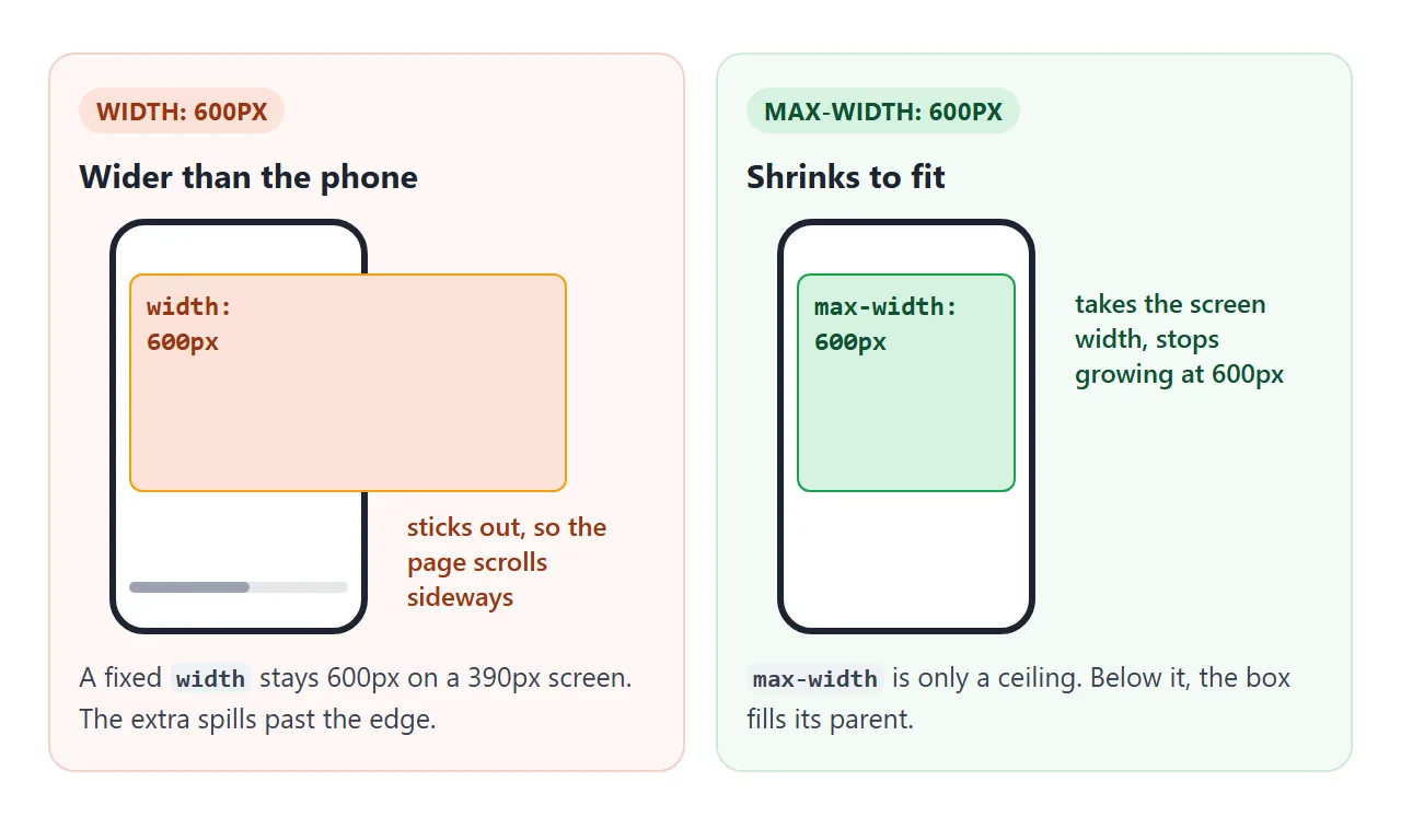
Changing width to max-width fixes most of these cases. The page also needs the viewport meta tag. Without it, a phone lays the page out at a wide desktop width and then zooms out.
Center a readable column with max-width and margin: auto
The classic page wrapper is three lines. The column grows with the window, stops at the ceiling, and centers itself.
main {
  max-width: 65ch;     /* ceiling */
  margin: 0 auto;      /* equal space on both sides */
  padding: 0 16px;     /* keep text off the screen edge on phones */
}
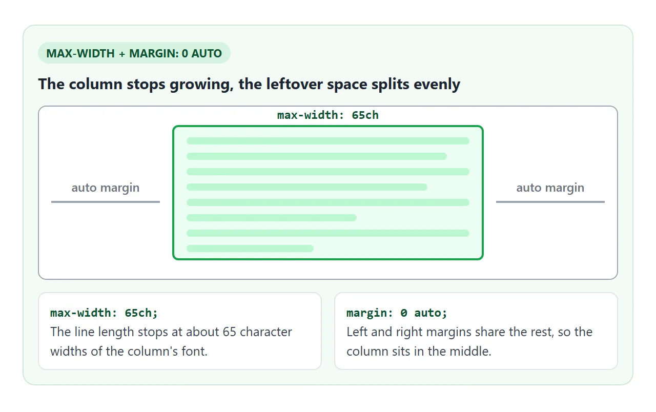
margin: auto only centers a block that is narrower than its parent. Without a width or max-width, the block already fills the parent, and there is nothing left to share.
Line length: use ch for text
The ch unit is the width of the character "0" in the element's font.
A column set in ch keeps about the same number of characters per line when the font size changes. A px column gets fewer characters per line as the text gets bigger.
Print typography has long recommended lines of 45 to 75 characters, a range given in Robert Bringhurst's The Elements of Typographic Style. Try values and see how the line feels.
<!doctype html>
<html lang="en">
<head>
<meta charset="utf-8">
<meta name="viewport" content="width=device-width, initial-scale=1">
<title>Readable line length with ch</title>
<style>
  * { box-sizing: border-box; }
  body {
    margin: 0; padding: 14px;
    font-family: Georgia, serif; background: #f4f5f7; color: #1d2330;
  }
  .controls {
    display: flex; flex-wrap: wrap; align-items: center; gap: 8px 12px;
    font: 14px system-ui, sans-serif; margin-bottom: 12px;
  }
  .controls input { flex: 1 1 160px; }
  .stat { font: 13px system-ui, sans-serif; color: #4b5563; margin-bottom: 10px; }
  .stat b { color: #1d2330; }
  .column {
    max-width: 65ch;   /* the line: about 65 zero-widths of this font */
    margin: 0 auto;    /* centered in whatever space is left */
    padding: 14px 18px; background: #fff; border-radius: 10px;
    font-size: 16px; line-height: 1.6;
  }
  .column p { margin: 0; }
</style>
</head>
<body>
<div class="controls">
  <label for="ch">max-width</label>
  <input id="ch" type="range" min="20" max="120" value="65">
  <b id="chOut">65ch</b>
</div>
<div class="stat" id="stat"></div>

<div class="column" id="col">
  <p id="text">A column of text is easiest to read when each line is neither too short nor too long. Short lines break phrases apart and make the eye jump back every few words. Long lines make it hard to find the start of the next line on the way back. Setting max-width in ch units ties the column to the size of the font, so the line length stays about the same when the font size changes. On a narrow screen the column simply fills the space it has.</p>
</div>

<script>
  const slider = document.getElementById('ch');
  const col = document.getElementById('col');
  const text = document.getElementById('text');

  function update() {
    col.style.maxWidth = slider.value + 'ch';
    document.getElementById('chOut').textContent = slider.value + 'ch';

    // count lines by their height, then characters per line on average
    const lineHeight = parseFloat(getComputedStyle(text).lineHeight);
    const lines = Math.round(text.offsetHeight / lineHeight);
    const perLine = Math.round(text.textContent.length / lines);
    document.getElementById('stat').innerHTML =
      'Column <b>' + col.offsetWidth + 'px</b> wide, <b>' + lines +
      '</b> lines, about <b>' + perLine + '</b> characters per line';
  }

  slider.addEventListener('input', update);
  window.addEventListener('resize', update);
  update();
</script>
</body>
</html>
In most fonts the average letter is narrower than "0". So 65ch usually fits somewhat more than 65 characters per line, as the counter shows.
Images: max-width: 100%
An image with its own large width will push out of a narrow column. Two lines keep it inside:
img {
  max-width: 100%;  /* never wider than its container */
  height: auto;     /* keep the proportions */
}
height: auto matters when the <img> has width and height attributes. Without it, the width shrinks and the height stays, so the picture gets squashed. Make an image responsive covers srcset and other sizes.
Percentages come from the parent
max-width: 50% means half the width of the containing block, usually the parent element. It is not half the screen. A 50% box inside a 400px card is at most 200px wide.
When the parent itself shrinks to fit its content, such as an inline-block, a float or an absolutely positioned box, its width depends on its children. A percentage inside it then has no fixed size to measure against.
Give the parent a width, or use vw for a size based on the viewport.
Flex items and min-width: 0
A flex item has min-width: auto by default.
For most items that means it will not shrink below its content's minimum size, such as its longest word or a long line of code. A long URL can then push the whole row wider than the screen.
.content {
  flex: 1;
  min-width: 0;   /* allow shrinking below the content's width */
}
With min-width: 0, the item can shrink, and the long content wraps or scrolls inside it. Flexbox explains the rest of the flex shorthand.
When min-width and max-width disagree
The browser settles the three properties in a fixed order. It starts from width, caps it with max-width, and then raises it to min-width if needed.
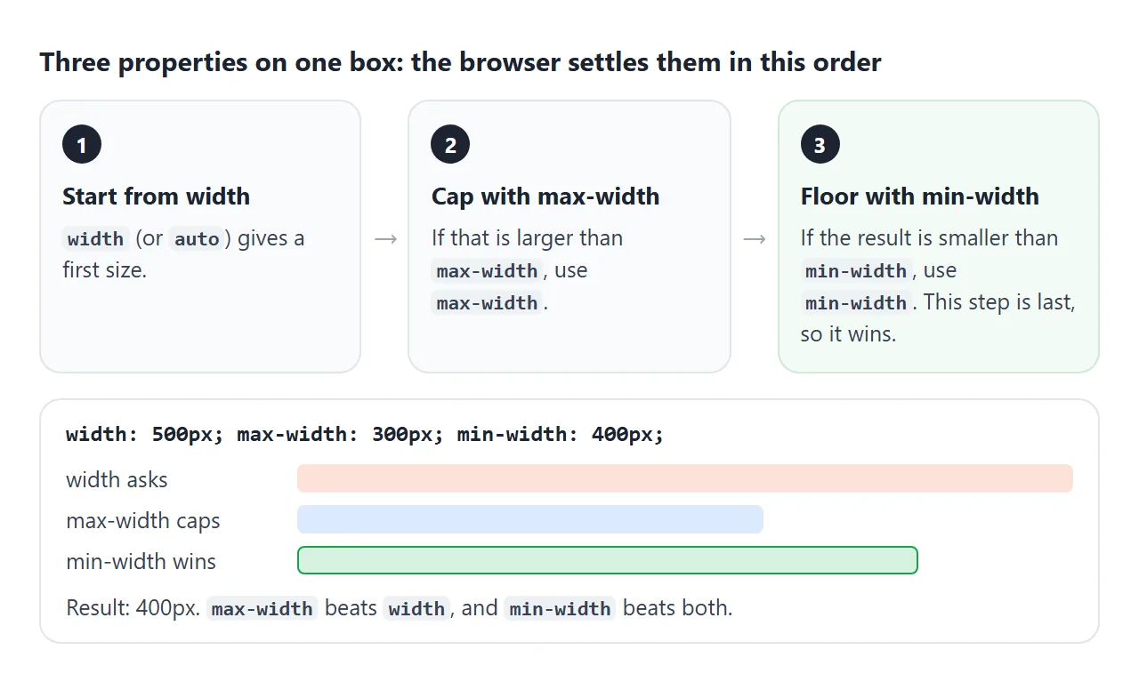
So max-width beats width, and min-width beats both. A box with width: 500px; max-width: 300px; min-width: 400px ends up 400px wide.
A finished example: a blog layout
This page puts the pieces together. The banner spans the full window. The content sits in a centered wrapper capped at 880px. The article and sidebar are flex items that wrap, so the sidebar drops below when the window gets narrow.
<!doctype html>
<html lang="en">
<head>
<meta charset="utf-8">
<meta name="viewport" content="width=device-width, initial-scale=1">
<title>Blog layout with max-width</title>
<style>
  * { box-sizing: border-box; }
  body { margin: 0; padding: 12px; font-family: system-ui, sans-serif; background: #e5e7eb; color: #1d2330; }
  .controls { display: flex; align-items: center; gap: 10px; font-size: 14px; margin-bottom: 10px; }
  .controls input { flex: 1; min-width: 0; }

  /* the "browser window" you resize with the slider */
  .frame { margin: 0 auto; background: #fff; border-radius: 10px; overflow: hidden; }

  .hero {                      /* full-bleed: sits outside the capped wrapper */
    height: 110px; display: grid; place-items: center;
    background: linear-gradient(120deg, #0f766e, #2563eb);
    color: #fff; font-size: 20px; font-weight: 700;
  }
  .wrap {
    max-width: 880px;          /* never wider than this */
    margin: 0 auto;            /* centered when there is room */
    padding: 16px;
    display: flex; flex-wrap: wrap; gap: 16px;
  }
  article {
    flex: 1 1 360px;           /* grows, prefers 360px, wraps below that */
    min-width: 0;              /* lets long words and code shrink it */
  }
  article p { max-width: 65ch; line-height: 1.6; margin: 0 0 12px; }
  article img { max-width: 100%; height: auto; display: block; border-radius: 8px; }
  aside {
    flex: 1 1 180px;           /* drops under the article when both don't fit */
    max-width: 100%;
    padding: 12px; border-radius: 8px; background: #f4f5f7; font-size: 14px;
  }
  aside h3 { margin: 0 0 6px; font-size: 14px; }
  aside ul { margin: 0; padding-left: 18px; line-height: 1.7; }
  h1 { font-size: 22px; margin: 0 0 10px; }
</style>
</head>
<body>
<div class="controls">
  <label for="w">Window</label>
  <input id="w" type="range" min="300" max="1000" value="1000">
  <b id="wOut"></b>
</div>

<div class="frame" id="frame">
  <div class="hero">Full-width banner</div>
  <div class="wrap">
    <article>
      <h1>A centered column</h1>
      <p>The wrapper has max-width: 880px and margin: 0 auto, so on a wide window it sits in the middle with equal space on both sides.</p>
      <!-- a 1200px-wide picture, drawn as inline SVG -->
      <img width="1200" height="400" alt="Wide picture"
        src="data:image/svg+xml,%3Csvg xmlns='http://www.w3.org/2000/svg' width='1200' height='400'%3E%3Crect width='1200' height='400' fill='%23fbbf24'/%3E%3Ccircle cx='600' cy='200' r='120' fill='%23f97316'/%3E%3C/svg%3E">
      <p>The picture is 1200px wide, but max-width: 100% keeps it inside the column. Narrow the window and the sidebar moves below the text.</p>
    </article>
    <aside>
      <h3>Sidebar</h3>
      <ul><li>Recent posts</li><li>Tags</li><li>About</li></ul>
    </aside>
  </div>
</div>

<script>
  const slider = document.getElementById('w');
  const frame = document.getElementById('frame');

  function update() {
    slider.max = Math.min(1000, document.body.clientWidth - 24);
    frame.style.width = slider.value + 'px';
    document.getElementById('wOut').textContent = frame.offsetWidth + 'px';
  }

  slider.addEventListener('input', update);
  window.addEventListener('resize', update);
  update();
</script>
</body>
</html>
- Full-bleed banner: it sits outside the capped wrapper, so it takes the full window width.
- Centered wrapper:
max-width: 880px; margin: 0 auto. - Sidebar drops below:
flex-wrap: wrapwithflex: 1 1 360pxon the article andflex: 1 1 180pxon the sidebar. When both do not fit on one line, the sidebar wraps. - Picture fits: a 1200px image with
max-width: 100%.
The layout needs no media query, because wrapping follows the space available. For layouts that must change at a set screen width, use a media query such as @media (max-width: 600px).
When it does not work
| What you see | Cause | Fix |
|---|---|---|
max-width does nothing on a span or a |
Width properties do not apply to inline elements | display: block or inline-block |
| The page scrolls sideways on a phone | A fixed width larger than the screen |
Use max-width or min(600px, 100%) |
| A percentage gives the wrong size | The parent shrinks to its content, so the percentage has nothing fixed to measure | Give the parent a width, or use vw |
| A flex item will not shrink | Default min-width: auto |
min-width: 0 on the item |
| The box is wider than its max-width | box-sizing: content-box adds padding and border on top |
box-sizing: border-box |
| max-width seems ignored | A later or more specific rule sets max-width again |
Check the computed value in developer tools |
Centering with margin: auto does nothing |
The block has no max-width, so it already fills the parent |
Add a max-width |
A later width rule does not undo max-width. The two are separate properties, and max-width still caps the result. box-sizing explains the padding case in detail.
Share it as a link
Width problems are easiest to judge on the device itself. A screenshot shows one width, and an .html attachment may open as plain code on a phone.
To send the working version, paste the page into a NOS document and choose Create share link. HTML to link walks through it.
The page renders as written and its scripts run, so the people you send it to can drag the sliders and open it on their own phones. If you change the code later, the same link shows the new version.