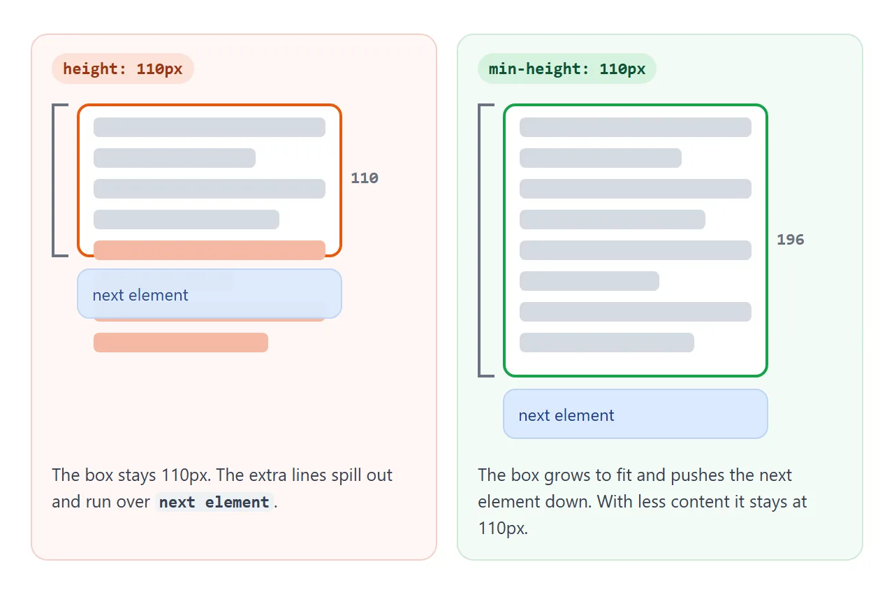
min-height sets the smallest height a box may have. The box is at least that tall, and when its content needs more room, it grows. height sets the size outright, and content that does not fit spills out of the box.
Add lines to the box below, then switch between the two properties.
<!doctype html>
<html lang="en">
<head>
<meta charset="utf-8">
<meta name="viewport" content="width=device-width, initial-scale=1">
<title>height vs min-height</title>
<style>
  body { margin: 0; padding: 14px; font-family: system-ui, sans-serif; background: #f4f5f7; color: #1d2330; }
  .bar { display: flex; flex-wrap: wrap; gap: 8px 14px; align-items: center; margin-bottom: 12px; font-size: 14px; }
  button { font: inherit; padding: 6px 12px; border-radius: 8px; border: 1px solid #c9cdd4; background: #fff; cursor: pointer; }
  label { display: inline-flex; gap: 4px; align-items: center; }
  .box {
    width: 260px; max-width: 100%; box-sizing: border-box;
    padding: 10px 12px; border-radius: 10px;
    background: #fff; outline: 2px solid #16a34a; outline-offset: -2px;  /* outline adds no size */
  }
  .box.grows { min-height: 120px; }                      /* 120px or taller */
  .box.fixed { height: 120px; outline-color: #ea580c; }   /* exactly 120px, never taller */
  .box p { margin: 0 0 6px; font-size: 14px; }
  .next {
    width: 260px; max-width: 100%; box-sizing: border-box; margin-top: 8px; padding: 8px 12px;
    border-radius: 10px; background: #dbeafe; font-size: 14px;
  }
  #out { margin-top: 12px; font: 13px ui-monospace, Consolas, monospace; }
</style>
</head>
<body>
<div class="bar">
  <label><input type="radio" name="mode" value="grows" checked> min-height: 120px</label>
  <label><input type="radio" name="mode" value="fixed"> height: 120px</label>
</div>
<div class="bar">
  <button id="add">Add a line</button>
  <button id="remove">Remove a line</button>
</div>

<div class="box grows" id="box"><p>Line 1</p><p>Line 2</p></div>
<div class="next">The next element on the page</div>
<div id="out"></div>

<script>
  const box = document.getElementById('box');
  const out = document.getElementById('out');

  function report() {
    // offsetHeight = the box itself, scrollHeight = what its content needs
    out.textContent = 'box: ' + box.offsetHeight + 'px, content needs: ' + box.scrollHeight + 'px';
  }

  document.querySelectorAll('input[name=mode]').forEach((r) =>
    r.addEventListener('change', () => { box.className = 'box ' + r.value; report(); }));

  document.getElementById('add').addEventListener('click', () => {
    const p = document.createElement('p');
    p.textContent = 'Line ' + (box.children.length + 1);
    box.append(p);
    report();
  });

  document.getElementById('remove').addEventListener('click', () => {
    if (box.children.length > 1) box.lastElementChild.remove();
    report();
  });

  report();
</script>
</body>
</html>
That one difference is why min-height is the usual choice for cards, panels and page sections. You get a tidy minimum when content is short and no overlap when it is long.
min-height vs height
With height: 120px the box is 120 pixels tall whatever is inside. Extra content overflows. It is drawn outside the box and does not push the next element down, so the two overlap.
With min-height: 120px the box is 120 pixels when the content is short and grows to fit when it is long. The next element moves down to make room.
height: 120px |
min-height: 120px |
|
|---|---|---|
| Short content | 120px, space left empty | 120px, space left empty |
| Long content | 120px, content spills out | Grows to fit the content |
| Next element | Stays put and gets overlapped | Moves down |
| Typical use | Fixed-size boxes such as thumbnails | Cards, panels, full-screen sections |
If both are set, the larger one wins: height: 50px; min-height: 120px gives 120 pixels. min-height also beats max-height when the two disagree. The same floor-and-ceiling idea for widths is in CSS max-width.
min-height: 100vh for full-screen sections
A hero or landing section often has to fill the screen and still grow if the text is long. That is min-height: 100vh. One vh is 1% of the viewport height, so 100vh is the full height of the window.
.hero {
  min-height: 100vh;   /* older browsers use this line */
  min-height: 100dvh;  /* newer browsers override it */
}
On a desktop, 100vh is exactly the visible area. On a phone it is often not.
Why 100vh is too tall on phones
Mobile browsers show an address bar that slides away as you scroll down. The visible area is shorter while the bar is showing and taller once it hides.
Mobile Chrome and Safari size vh to the taller one, so the height is stable while you scroll.
The cost is that a 100vh section is taller than what you see when the page first opens. Its bottom edge, often where a button sits, starts below the screen.
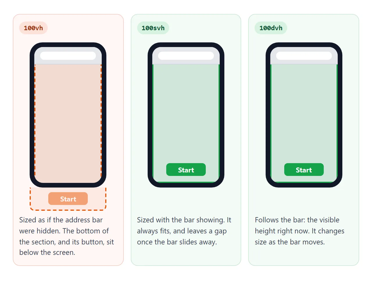
CSS added three sets of units to choose which height you mean:
| Unit | 100 of it means | Changes while scrolling |
|---|---|---|
svh |
Visible height with the browser bars showing (small) | No |
lvh |
Visible height with the bars hidden (large) | No |
dvh |
Visible height right now (dynamic) | Yes, as the bars move |
Current versions of the major browsers support them. A browser that does not know a unit ignores that line, which is why the vh line comes first as a fallback. The demo below measures all four in the frame it runs in.
<!doctype html>
<html lang="en">
<head>
<meta charset="utf-8">
<meta name="viewport" content="width=device-width, initial-scale=1">
<title>vh, svh, lvh and dvh</title>
<style>
  body { margin: 0; padding: 14px; font-family: system-ui, sans-serif; background: #f4f5f7; color: #1d2330; }
  /* hidden probes: each one is 100 of its unit tall */
  .probe { position: absolute; top: 0; left: 0; width: 1px; visibility: hidden; }
  .row { display: grid; grid-template-columns: 64px 1fr 64px; gap: 8px; align-items: center; margin: 8px 0; font-size: 14px; }
  .row code { font: 600 13px ui-monospace, Consolas, monospace; }
  .track { height: 18px; border-radius: 9px; background: #e5e7eb; overflow: hidden; }
  .fill { height: 100%; background: #16a34a; }
  .px { text-align: right; font: 13px ui-monospace, Consolas, monospace; }
  .note { font-size: 13px; line-height: 1.5; color: #374151; background: #fff; border-radius: 10px; padding: 10px 12px; margin-top: 12px; }
</style>
</head>
<body>
<div class="probe" id="vh" style="height: 100vh"></div>
<div class="probe" id="svh" style="height: 100svh"></div>
<div class="probe" id="lvh" style="height: 100lvh"></div>
<div class="probe" id="dvh" style="height: 100dvh"></div>

<div id="rows"></div>
<div class="note" id="note"></div>

<script>
  const units = ['vh', 'svh', 'lvh', 'dvh'];
  const rows = document.getElementById('rows');

  function measure() {
    const h = units.map((u) => document.getElementById(u).offsetHeight);
    const max = Math.max(...h, 1);
    rows.innerHTML = units.map((u, i) =>
      '<div class="row"><code>100' + u + '</code>' +
      '<div class="track"><div class="fill" style="width:' + (h[i] / max * 100) + '%"></div></div>' +
      '<span class="px">' + h[i] + 'px</span></div>').join('');

    const same = h.every((x) => x === h[0]);
    document.getElementById('note').textContent = same
      ? 'All four are equal here. Nothing on this screen slides in and out, so the small, large and dynamic viewports are the same size. A desktop browser window shows the same. On a phone, open the page on its own and scroll: svh is the height with the address bar showing, lvh with it hidden, and dvh follows the bar.'
      : 'The values differ, so this browser has a toolbar that slides in and out. svh is the height with it showing, lvh with it hidden, and dvh is the height right now.';
  }

  measure();
  addEventListener('resize', measure);  // dvh changes as the toolbar moves
</script>
</body>
</html>
Pick svh when the section should never be taller than the screen and should not change size while scrolling.
Pick dvh for app layouts that must always match the visible area. The page can then resize as the bar moves, which is fine for a shell but can shift a long page.
min-height: 0 on flex and grid children
A full-height app usually has a header, a footer and a middle part that scrolls. The layout is a flex column, and the scrolling list sits in the middle. Very often the list refuses to scroll and the whole page grows instead.
The cause is the default min-height of flex and grid items. It is auto, which for these items means "not shorter than my content".
A middle part holding fifty messages insists on being fifty messages tall, so the list inside never runs out of room and never scrolls.
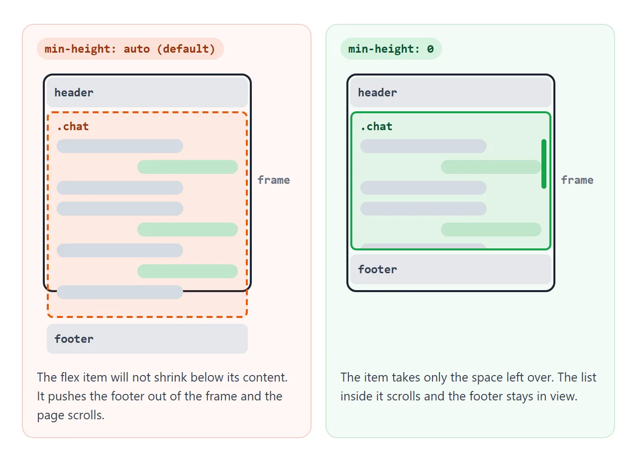
min-height: 0 on that middle item removes the floor. It takes only the space left over, and the list inside becomes the thing that scrolls. Try the checkbox in the finished example:
<!doctype html>
<html lang="en">
<head>
<meta charset="utf-8">
<meta name="viewport" content="width=device-width, initial-scale=1">
<title>App shell with a scrolling list</title>
<style>
  * { box-sizing: border-box; }
  body { margin: 0; font-family: system-ui, sans-serif; background: #f4f5f7; color: #1d2330; }

  .app {
    display: flex; flex-direction: column;
    height: 100vh;   /* fallback for older browsers */
    height: 100dvh;  /* the height you can see, also on phones */
  }
  header, footer { flex: none; padding: 10px 14px; background: #fff; }
  header { border-bottom: 1px solid #e1e4ea; font-weight: 700; display: flex; justify-content: space-between; gap: 8px; }
  header label { font-weight: 400; font-size: 13px; display: inline-flex; gap: 4px; align-items: center; }

  .chat {
    flex: 1;
    min-height: 0;   /* allow this flex item to be shorter than its content */
    display: flex; flex-direction: column;
  }
  .chat.no-fix { min-height: auto; }   /* the default, to compare */
  .day { flex: none; text-align: center; font-size: 12px; color: #6b7280; padding: 6px; }
  .list { flex: 1; overflow-y: auto; padding: 0 14px 10px; }
  .msg { max-width: 75%; margin: 6px 0; padding: 8px 11px; border-radius: 12px; background: #fff; font-size: 14px; }
  .msg.me { margin-left: auto; background: #dcfce7; }

  footer { border-top: 1px solid #e1e4ea; }
  form { display: flex; gap: 8px; }
  input[type=text] { flex: 1; min-width: 0; font: inherit; padding: 8px 10px; border: 1px solid #c9cdd4; border-radius: 8px; }
  button { font: inherit; padding: 8px 12px; border: 0; border-radius: 8px; background: #16a34a; color: #fff; cursor: pointer; }
  #status { font: 12px ui-monospace, Consolas, monospace; color: #374151; margin-top: 6px; }
</style>
</head>
<body>
<div class="app">
  <header>
    <span>Team chat</span>
    <label><input type="checkbox" id="fix" checked> min-height: 0</label>
  </header>

  <div class="chat" id="chat">
    <div class="day">Today</div>
    <div class="list" id="list"></div>
  </div>

  <footer>
    <form id="form">
      <input type="text" id="text" placeholder="Write a message" autocomplete="off">
      <button>Send</button>
    </form>
    <div id="status"></div>
  </footer>
</div>

<script>
  const list = document.getElementById('list');
  const chat = document.getElementById('chat');
  const status = document.getElementById('status');

  function report() {
    const page = document.documentElement.scrollHeight - innerHeight;
    const inner = list.scrollHeight - list.clientHeight;
    status.textContent = 'list scrolls: ' + (inner > 0 ? 'yes' : 'no') +
      ' | page scrolls: ' + (page > 0 ? 'yes, ' + page + 'px' : 'no');
  }

  function add(text, me) {
    const m = document.createElement('div');
    m.className = 'msg' + (me ? ' me' : '');
    m.textContent = text;
    list.append(m);
    list.scrollTop = list.scrollHeight;  // show the newest message
    report();
  }

  for (let i = 1; i <= 14; i++) add('Message ' + i, i % 3 === 0);

  document.getElementById('fix').addEventListener('change', (e) => {
    chat.classList.toggle('no-fix', !e.target.checked);
    report();
  });

  document.getElementById('form').addEventListener('submit', (e) => {
    e.preventDefault();  // nothing is sent anywhere
    const input = document.getElementById('text');
    if (input.value.trim()) add(input.value.trim(), true);
    input.value = '';
  });

  addEventListener('resize', report);
</script>
</body>
</html>
The fix belongs on the flex item that sits between the full-height parent and the scrolling list.
If the item itself has overflow: auto, it already works without it, because an item that scrolls has no content-sized floor. The trouble starts when the item is a wrapper, like .chat here, with the scrolling list one level down.
The finished layout is four rules:
- Make the outer box a flex column with
height: 100vhand thenheight: 100dvh. - Give the header and footer
flex: noneso they keep their size. - Give the middle part
flex: 1andmin-height: 0. - Put
overflow-y: autoon the list that should scroll.
.app  { display: flex; flex-direction: column; height: 100vh; height: 100dvh; }
header, footer { flex: none; }
.chat { flex: 1; min-height: 0; display: flex; flex-direction: column; }
.list { flex: 1; overflow-y: auto; }
Grid has the same default. In a layout with grid-template-rows: auto 1fr auto, give the middle item min-height: 0, or write the row as minmax(0, 1fr).
In a flex row the same problem shows up sideways, and the fix is min-width: 0. More on scroll boxes is in CSS overflow, and the flex rules behind flex: 1 are in Flexbox.
Percentage min-height and the parent
min-height: 100% means 100% of the parent's height. When the parent has no set height and simply wraps its content, there is no fixed number to take 100% of. The browser then treats the percentage as 0 and the rule does nothing.
A parent with only min-height does not count either: its real height still depends on content. Three ways out:
- Give the parent a real
height. For a page-level chain that meanshtml, body { height: 100%; }. - Skip the percentage and use
min-height: 100dvhdirectly. - Make the parent a flex column and let the child fill it with
flex: 1.
Sticky footer with min-height
The same pieces keep a footer at the bottom of a short page and below the content on a long one. The body becomes a flex column at least one screen tall, and the main part takes the spare space.
body { margin: 0; min-height: 100vh; min-height: 100dvh; display: flex; flex-direction: column; }
main { flex: 1; }
Unlike the app shell, this uses min-height, so a long page still grows and scrolls normally. The main tag guide walks through this layout with a live example.
When it does not work
| What you see | Cause | Fix |
|---|---|---|
| The inner list does not scroll, the whole page does | A flex or grid item between the parent and the list keeps the default min-height: auto |
min-height: 0 on that item |
min-height: 100% does nothing |
The parent's height depends on its content | Give the parent a height, or use dvh or flexbox |
| On a phone, the bottom of a full-screen section is hidden | 100vh is sized for the hidden address bar |
Add min-height: 100dvh or 100svh after the vh line |
| Text spills out of a box and overlaps the next one | A fixed height |
Change it to min-height |
min-height on a span or a changes nothing |
It does not apply to inline elements | display: inline-block or block |
The box is taller than its max-height |
min-height is larger, and min wins |
Lower min-height |
Share it as a link
Height problems show up differently on each screen, so the quickest check is to open the page on the phone itself. A screenshot hides the scrolling, and an .html file sent as an attachment may open as plain code.
Paste the page into a NOS document and choose Create share link. HTML to link walks through it.
The page renders as written and its scripts run, so the people you send it to can scroll the list and try the toggles on their own devices. If you change the code later, the same link shows the new version.