To center a div in both directions, put two lines on its parent: display: grid and place-items: center. The parent also needs a height that is larger than the div. For horizontal centering only, margin: 0 auto on a div with a width is enough.
.parent {
  display: grid;
  place-items: center;
  min-height: 100dvh;  /* or any height larger than the child */
}
Try all six methods on the same child below. Pick a method, then drag the sliders to resize the parent. The CSS shown is exactly the CSS applied.
<!doctype html>
<html lang="en">
<head>
<meta charset="utf-8">
<meta name="viewport" content="width=device-width, initial-scale=1">
<title>Six ways to center a div</title>
<style>
  body { margin: 0; padding: 14px; font-family: system-ui, sans-serif; background: #f4f5f7; color: #1d2330; }
  .tabs { display: flex; flex-wrap: wrap; gap: 6px; margin-bottom: 10px; }
  .tabs button {
    font: inherit; font-size: 13px; padding: 6px 10px; border-radius: 8px;
    border: 1px solid #c9cdd4; background: #fff; cursor: pointer;
  }
  .tabs button[aria-pressed="true"] { background: #1d4ed8; border-color: #1d4ed8; color: #fff; }
  .sizes { display: flex; flex-wrap: wrap; gap: 4px 16px; font-size: 13px; margin-bottom: 10px; }
  .sizes input { width: 130px; vertical-align: middle; }
  /* the parent: dashed outline so you can see its edges */
  #parent { border: 2px dashed #9aa3b2; background: #fff; box-sizing: border-box; }
  /* the child: the same size in every method */
  #child {
    width: 120px; height: 64px; border-radius: 10px; box-sizing: border-box;
    background: #2563eb; color: #fff; font-size: 13px; padding: 8px;
  }
  pre {
    margin: 10px 0 0; padding: 10px 12px; border-radius: 8px; background: #1d2330; color: #e6e9ef;
    font: 13px/1.5 ui-monospace, Consolas, monospace; white-space: pre-wrap;
  }
  .note { font-size: 13px; color: #5b6270; margin: 8px 0 0; }
</style>
</head>
<body>
<div class="tabs" id="tabs"></div>
<div class="sizes">
  <label>Parent width <input type="range" id="w" min="160" max="600" value="340"></label>
  <label>Parent height <input type="range" id="h" min="100" max="220" value="170"></label>
</div>
<div id="parent"><div id="child">child</div></div>
<pre id="code"></pre>
<p class="note" id="note"></p>

<script>
  // each method: CSS for the parent, CSS for the child, and what it centers
  const methods = {
    'margin: auto': {
      parent: '',
      child: 'margin: 0 auto;',
      note: 'Horizontal only. Needs a width. The child stays at the top.'
    },
    'text-align': {
      parent: 'text-align: center;',
      child: 'display: inline-block;',
      note: 'Horizontal only. Centers inline content: text, inline-block boxes, images.'
    },
    'flex': {
      parent: 'display: flex;\n  justify-content: center;\n  align-items: center;',
      child: '',
      note: 'Both axes. Goes on the parent.'
    },
    'grid': {
      parent: 'display: grid;\n  place-items: center;',
      child: '',
      note: 'Both axes in two lines. Goes on the parent.'
    },
    'inset + margin': {
      parent: 'position: relative;',
      child: 'position: absolute;\n  inset: 0;\n  margin: auto;',
      note: 'Both axes. Needs a width and a height. The child leaves the layout.'
    },
    'translate': {
      parent: 'position: relative;',
      child: 'position: absolute;\n  top: 50%; left: 50%;\n  transform: translate(-50%, -50%);',
      note: 'Both axes. Works when the child size is unknown. The child leaves the layout.'
    }
  };

  const parent = document.getElementById('parent');
  const child = document.getElementById('child');
  const tabs = document.getElementById('tabs');
  const w = document.getElementById('w');
  const h = document.getElementById('h');

  function size() {
    parent.style.width = w.value + 'px';
    parent.style.maxWidth = '100%';
    parent.style.height = h.value + 'px';
  }

  function pick(name) {
    const m = methods[name];
    parent.style.cssText = m.parent;  // apply exactly the CSS that is shown
    child.style.cssText = m.child;
    size();
    document.getElementById('code').textContent =
      '.parent {' + (m.parent ? '\n  ' + m.parent : '') + '\n}\n' +
      '.child {\n  width: 120px;\n  height: 64px;' + (m.child ? '\n  ' + m.child : '') + '\n}';
    document.getElementById('note').textContent = m.note;
    tabs.querySelectorAll('button').forEach(b => b.setAttribute('aria-pressed', b.textContent === name));
  }

  Object.keys(methods).forEach(name => {
    const b = document.createElement('button');
    b.textContent = name;
    b.addEventListener('click', () => pick(name));
    tabs.appendChild(b);
  });
  w.addEventListener('input', size);
  h.addEventListener('input', size);
  pick('flex');
</script>
</body>
</html>
Two of the six, margin: auto and text-align, only center left to right. The other four center both ways.
Which method to use
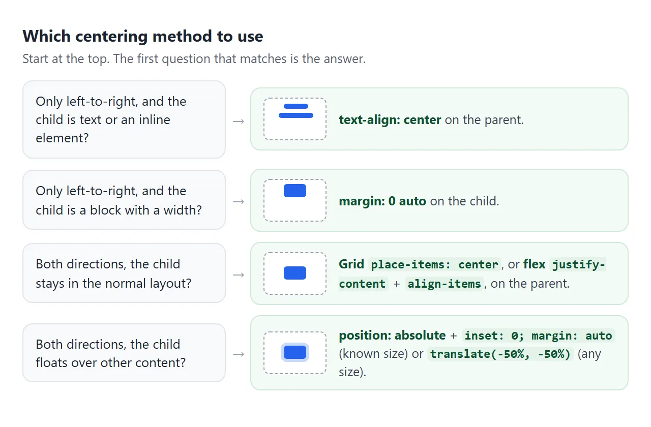
All six are correct CSS. They differ in what they need from the parent and child, and in whether the child stays in the normal page flow.
| Method | Axes | Goes on | Needs | Child stays in the flow |
|---|---|---|---|---|
margin: 0 auto |
Horizontal | Child | A width | Yes |
text-align: center |
Horizontal | Parent | Inline content | Yes |
| Flex, both properties center | Both | Parent | A parent height | Yes |
Grid, place-items: center |
Both | Parent | A parent height | Yes |
Absolute, inset: 0, margin: auto |
Both | Child | A width and height, a positioned parent | No |
Absolute, translate(-50%, -50%) |
Both | Child | A positioned parent | No |
A practical default: grid for a single child, flex when the parent already lines up several items, and absolute positioning only when the child must sit on top of other content.
Horizontal only: margin auto and text-align
margin: 0 auto sets the left and right margins to auto. The browser splits the leftover width equally between them. That only works when there is leftover width, so the block needs a width or max-width smaller than its parent.
.box {
  max-width: 480px;
  margin: 0 auto;
}
text-align: center works differently. It centers the inline content of a block: text, images, and elements with display: inline-block. It goes on the parent and is inherited, so text inside the child is centered too. The text-align guide covers every value.
Neither of these moves anything up or down. The CSS vertical-align property does not center a div either; it applies to inline content and table cells. CSS vertical-align explains where it does apply.
Both axes with flex or grid
Flex centering uses two properties on the parent. justify-content works along the main axis, left to right in a row, and align-items works across it.
.parent {
  display: flex;
  justify-content: center;
  align-items: center;
}
Grid does the same with place-items: center, a shorthand for align-items and justify-items. The flexbox and CSS grid guides go further, and justify-content shows each of its values live.
Both keep the child in the normal flow. Surrounding content still makes room for it, and it can grow with its text without overlapping anything.
Centering on top of content: absolute positioning
A badge over an image or a spinner over a card has to overlap other content. Here the child gets position: absolute, and the parent gets position: relative so the child is placed inside it. CSS position explains that pairing.
.parent { position: relative; }
.child {
  position: absolute;
  inset: 0;          /* top, right, bottom and left all 0 */
  margin: auto;
  width: 120px;
  height: 64px;
}
With all four edges at 0 and a fixed size, the auto margins share the leftover space evenly on every side. Without a width and height, the child stretches to fill the parent instead.
When the child's size is not known, use translate:
.child {
  position: absolute;
  top: 50%;
  left: 50%;
  transform: translate(-50%, -50%);
}
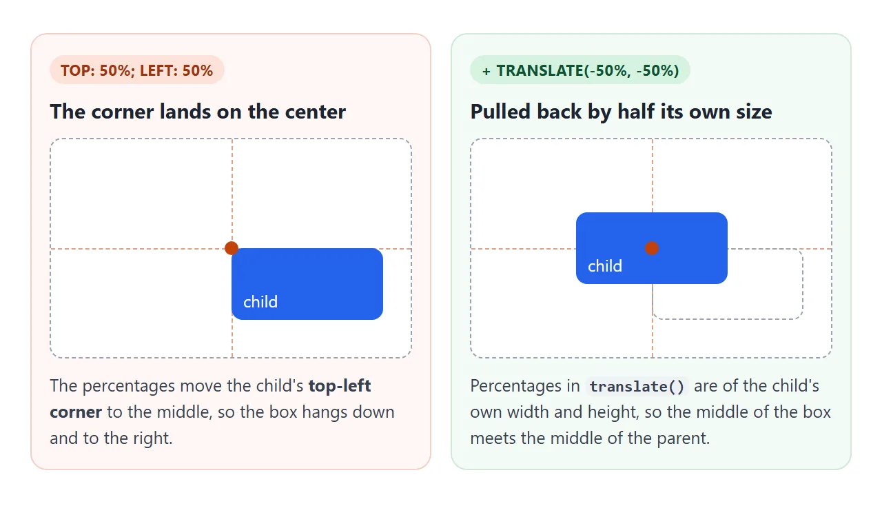
Percentages in top and left refer to the parent. Percentages in translate() refer to the child. That difference is what puts the middle of the child on the middle of the parent.
Centering in the middle of the screen
A div in the middle of the page needs a parent as tall as the screen. Often that parent is body:
body {
  margin: 0;
  min-height: 100vh;   /* fallback */
  min-height: 100dvh;
  display: grid;
  place-items: center;
}
margin: 0 matters. Browsers give body a default margin, and 100vh plus that margin is taller than the screen, which adds a scrollbar.
On phones, the address bar appears and hides as you scroll. 100vh is sized for the screen with the bar hidden, so the box can be taller than what is visible and the center drops.
100dvh follows the visible viewport. Writing 100vh first means a browser that does not know dvh still gets a height.
Use min-height rather than height. If the content grows taller than the screen, the page scrolls instead of cutting it off. The page also needs the viewport meta tag to be sized correctly on a phone.
Why centering is not working
Most failures come from the parent, not the method. The three below are the ones that show up again and again.
<!doctype html>
<html lang="en">
<head>
<meta charset="utf-8">
<meta name="viewport" content="width=device-width, initial-scale=1">
<title>Why centering fails</title>
<style>
  body { margin: 0; padding: 14px; font-family: system-ui, sans-serif; background: #f4f5f7; color: #1d2330; }
  .tabs { display: flex; flex-wrap: wrap; gap: 6px; margin-bottom: 10px; }
  .tabs button {
    font: inherit; font-size: 13px; padding: 6px 10px; border-radius: 8px;
    border: 1px solid #c9cdd4; background: #fff; cursor: pointer;
  }
  .tabs button[aria-pressed="true"] { background: #1d4ed8; border-color: #1d4ed8; color: #fff; }
  label { display: inline-block; font-size: 14px; margin-bottom: 10px; cursor: pointer; }
  .wrap { display: grid; grid-template-columns: repeat(auto-fit, minmax(220px, 1fr)); gap: 12px; }
  code {
    display: block; padding: 8px 10px; border-radius: 8px; background: #1d2330; color: #e6e9ef;
    font: 13px/1.5 ui-monospace, Consolas, monospace; white-space: pre;
  }
  /* the grey area stands in for the space the parent sits in */
  .page { height: 170px; background: #e4e8ee; border-radius: 8px; }
  .parent { outline: 2px dashed #6b7280; outline-offset: -2px; background: #fff; }
  .child { background: #2563eb; color: #fff; font-size: 13px; padding: 8px; border-radius: 8px; box-sizing: border-box; }
  .note { font-size: 13px; color: #5b6270; margin: 10px 0 0; }

  /* case 1: flex centering, but the parent is only as tall as the child */
  .c1 .parent { display: flex; justify-content: center; align-items: center; }
  .c1.fixed .parent { height: 100%; }
  .c1 .child { width: 90px; }

  /* case 2: the child fills the parent, so there is no space to share */
  .c2 .parent { height: 100%; display: flex; justify-content: center; align-items: center; }
  .c2 .child { width: 100%; }
  .c2.fixed .child { width: 60%; }

  /* case 3: margin auto on a block that already fills the line */
  .c3 .parent { height: 100%; }
  .c3 .child { margin: 0 auto; }
  .c3.fixed .child { width: 120px; }
</style>
</head>
<body>
<div class="tabs" id="tabs">
  <button data-case="c1">1. Parent has no height</button>
  <button data-case="c2">2. Child is width: 100%</button>
  <button data-case="c3">3. margin: auto, no width</button>
</div>
<label><input type="checkbox" id="fix"> Apply the fix</label>
<div class="wrap">
  <code id="code"></code>
  <div class="page" id="demo"><div class="parent"><div class="child">child</div></div></div>
</div>
<p class="note" id="note"></p>

<script>
  // each case: the CSS before and after the fix, and what went wrong
  const cases = {
    c1: {
      css: ['.parent {\n  display: flex;\n  justify-content: center;\n  align-items: center;\n  /* height: auto */\n}',
            '.parent {\n  display: flex;\n  justify-content: center;\n  align-items: center;\n  height: 100%;\n}'],
      note: 'The dashed parent is only as tall as the child, so there is no space above or below.'
    },
    c2: {
      css: ['.child {\n  width: 100%;\n}', '.child {\n  width: 60%;\n}'],
      note: 'A child as wide as its parent has no space on either side to center in.'
    },
    c3: {
      css: ['.child {\n  margin: 0 auto;\n  /* width: auto */\n}', '.child {\n  margin: 0 auto;\n  width: 120px;\n}'],
      note: 'A block with no width fills the line, so the auto margins are zero.'
    }
  };

  const demo = document.getElementById('demo');
  const fix = document.getElementById('fix');
  let current = 'c1';

  function show() {
    demo.className = 'page ' + current + (fix.checked ? ' fixed' : '');
    document.getElementById('code').textContent = cases[current].css[fix.checked ? 1 : 0];
    document.getElementById('note').textContent = fix.checked ? 'Fixed: the child is centered.' : cases[current].note;
    document.querySelectorAll('#tabs button').forEach(b => b.setAttribute('aria-pressed', b.dataset.case === current));
  }

  document.querySelectorAll('#tabs button').forEach(b => b.addEventListener('click', () => {
    current = b.dataset.case;
    fix.checked = false;  // each case starts broken
    show();
  }));
  fix.addEventListener('change', show);
  show();
</script>
</body>
</html>
The first is the most common. A block's height is auto by default, meaning only as tall as its content. A parent that hugs its child has no empty space above or below, so vertical centering has nothing to do.
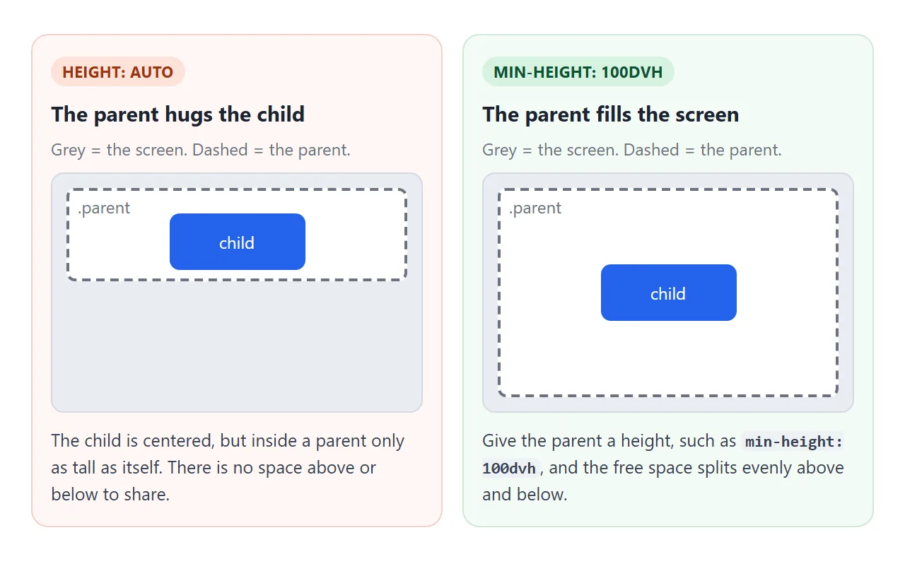
A related trap: height: 100% on a div only works if its own parent has a height. A percentage of an auto height is treated as auto. For full-screen centering, min-height: 100dvh avoids the whole chain.
A finished example: login card and modal
The same two lines center a whole page. The body below is a full-height grid with the card in its middle. Forgot password? opens a modal that uses the same trick on a fixed overlay.
<!doctype html>
<html lang="en">
<head>
<meta charset="utf-8">
<meta name="viewport" content="width=device-width, initial-scale=1">
<title>Centered login card and modal</title>
<style>
  * { box-sizing: border-box; }
  body {
    margin: 0;                /* drop the default 8px, or 100vh overflows */
    min-height: 100vh;        /* fallback for older browsers */
    min-height: 100dvh;       /* follows the mobile address bar */
    display: grid;
    place-items: center;      /* the card sits in the middle of the screen */
    padding: 16px;
    font-family: system-ui, sans-serif;
    background: linear-gradient(135deg, #dbeafe, #f5f3ff);
  }
  .card {
    width: 100%; max-width: 320px;   /* narrower than the screen, so there is room to center */
    background: #fff; border-radius: 14px; padding: 22px;
    box-shadow: 0 10px 30px rgba(30, 41, 59, .15);
  }
  .card h1 { margin: 0 0 6px; font-size: 20px; text-align: center; }
  .card label { display: block; font-size: 13px; margin: 10px 0 4px; }
  .card input { width: 100%; padding: 9px 10px; border: 1px solid #c9cdd4; border-radius: 8px; font: inherit; }
  .card button { width: 100%; margin-top: 12px; padding: 10px; border: 0; border-radius: 8px; font: inherit; cursor: pointer; }
  .primary { background: #1d4ed8; color: #fff; }
  .link { background: none; color: #1d4ed8; }
  #out { font-size: 13px; color: #0f5132; min-height: 1.3em; margin: 6px 0 0; text-align: center; }

  /* the modal: a full-screen layer that centers its box */
  .overlay {
    position: fixed; inset: 0;
    display: none; place-items: center;
    padding: 16px; background: rgba(15, 23, 42, .55);
  }
  .overlay.open { display: grid; }
  .modal { width: 100%; max-width: 300px; background: #fff; border-radius: 12px; padding: 20px; }
  .modal h2 { margin: 0 0 8px; font-size: 17px; }
  .modal p { margin: 0 0 14px; font-size: 14px; color: #475569; }
  .modal button { padding: 8px 14px; border: 0; border-radius: 8px; background: #1d4ed8; color: #fff; font: inherit; cursor: pointer; }
</style>
</head>
<body>
<form class="card" id="form">
  <h1>Sign in</h1>
  <label for="email">Email</label>
  <input id="email" name="email" type="email" value="sam@example.com" required>
  <label for="pw">Password</label>
  <input id="pw" name="password" type="password" value="secret123" required>
  <button class="primary" type="submit">Sign in</button>
  <button class="link" type="button" id="help">Forgot password?</button>
  <p id="out"></p>
</form>

<div class="overlay" id="overlay">
  <div class="modal" role="dialog" aria-modal="true" aria-labelledby="mt">
    <h2 id="mt">Reset your password</h2>
    <p>A reset link would go to your email. The overlay's grid keeps this box in the middle.</p>
    <button type="button" id="close">Close</button>
  </div>
</div>

<script>
  const form = document.getElementById('form');
  const overlay = document.getElementById('overlay');

  // demo only: show what would be sent instead of sending it
  form.addEventListener('submit', (e) => {
    e.preventDefault();
    const data = new FormData(form);
    document.getElementById('out').textContent =
      'Would send ' + data.get('email') + ' and a ' + data.get('password').length + '-character password';
  });

  const open = () => overlay.classList.add('open');
  const close = () => overlay.classList.remove('open');
  document.getElementById('help').addEventListener('click', open);
  document.getElementById('close').addEventListener('click', close);
  overlay.addEventListener('click', (e) => { if (e.target === overlay) close(); });  // click the dark area
  document.addEventListener('keydown', (e) => { if (e.key === 'Escape') close(); });
</script>
</body>
</html>
- The card:
width: 100%withmax-width: 320px, so it fills a small phone but leaves space to center on a wide screen. - The overlay:
position: fixed; inset: 0covers the screen, anddisplay: grid; place-items: centerputs the box in its middle. - Padding on the parent keeps the card and modal off the screen edges on a phone.
For more on the modal itself, including the built-in <dialog> element, see HTML CSS modal.
When it does not work
| What you see | Cause | Fix |
|---|---|---|
| Centered left to right, stuck at the top | The parent's height is auto |
Give the parent a height or min-height |
height: 100% on the parent changes nothing |
Its own parent has no height | Use min-height: 100dvh, or set heights up the chain |
| The child fills the row and looks left-aligned | The child is width: 100% |
Use a smaller width or a max-width |
margin: 0 auto does nothing |
The block has no width, or it is inline | Set a width, or display: block on an image or span |
| Flex properties change nothing | display: flex is on the child |
Put flex, and the centering properties, on the parent |
| The box jumps off-center on hover | A hover transform replaced the translate |
Repeat the translate in the hover transform, or use grid |
| Absolute child fills the whole parent | inset: 0 with no width or height |
Give the child a size, or use translate |
| Absolute child centers on the page, not the parent | No positioned parent | Add position: relative to the parent |
A scrollbar appears with 100vh |
body's default margin |
body { margin: 0; } |
| On a phone the box sits too low | 100vh counts the hidden address bar |
Add min-height: 100dvh after 100vh |
The hover case is easy to miss. transform is a single property, so transform: scale(1.05) on hover replaces translate(-50%, -50%) completely. Write both in one value:
.child:hover { transform: translate(-50%, -50%) scale(1.05); }
The CSS transform guide covers combining functions.
Share it as a link
Centering is easiest to judge on the real screen, especially on a phone with its address bar. A screenshot shows one size only, and an .html attachment may open as plain code on a phone.
To send the working version, paste the page into a NOS document and choose Create share link. HTML to link walks through it.
The page renders as written and its scripts run, so the people you send it to can open the modal and resize the window themselves. If you change the code later, the same link shows the new version.